Tag Archives: Data Science

Scaling marketing for merchants with targeted and intelligent promos

Post Syndicated from Grab Tech original https://engineering.grab.com/scaling-marketing-for-merchants

Introduction

A promotional campaign is a marketing effort that aims to increase sales, customer engagement, or brand awareness for a product, service, or company. The target is to have more orders and sales by assigning promos to consumers within a given budget during the campaign period.
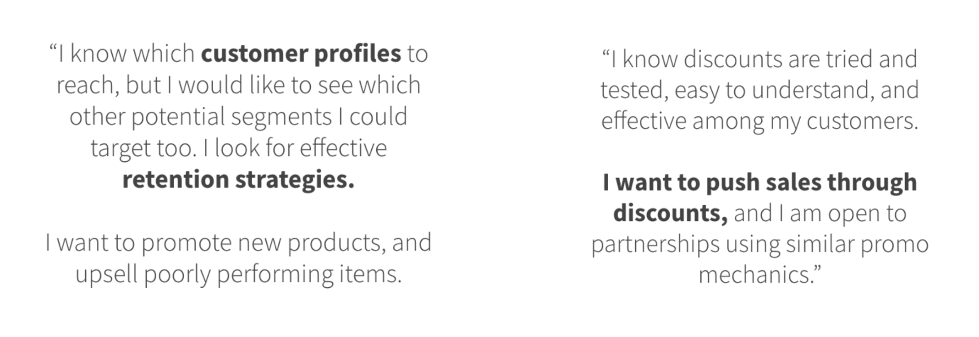
Figure 1 – Merchant feedback on marketing

From our research, we found that merchants have specific goals for the promos they are willing to offer. They want a simple and cost-effective way to achieve their specific business goals by providing well-designed offers to target the correct customers. From Grab’s perspective, we want to help merchants set up and run campaigns efficiently, and help them achieve their specific business goals.

Problem statement

One of Grab’s platform offerings for merchants is the ability to create promotional campaigns. With the emergence of AI technologies, we found that there are opportunities for us to further optimise the platform. The following are the gaps and opportunities we identified:

  • Globally assigned promos without smart targeting: The earlier method targeted every customer, so everyone could redeem until the promo reached the redemption limits. However, this method did not accurately meet business goals or optimise promo spending. The promotional campaign should intelligently target the best promo for each customer to increase sales and better utilise promo spending.
  • No customised promos for every merchant: To better optimise sales for each merchant, merchants should offer customised promos based on their historical consumer trends, not just a general offer set. For example, for a specific merchant, a 27% discount may be the appropriate offer to uplift revenue and sales based on user bookings. However, merchants do not always have the expertise to decide which offer to select to increase profit.
  • No AI-driven optimisation: Without AI models, it was harder for merchants to assign the right promos at scale to each consumer and optimise their business goals.

As shown in the following figure, AI-driven promotional campaigns are expected to bring higher sales with more promo spend than heuristic ones. Hence, at Grab we looked to introduce an automated, AI-driven tool that helps merchants intelligently target consumers with appropriate promos, while optimising sales and promo spending. That’s where Bullseye comes in.
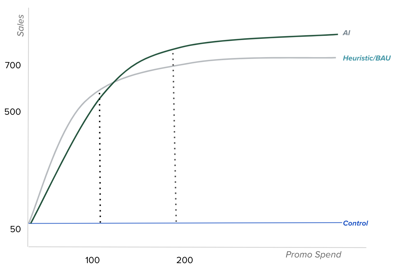
Figure 2 – Graph showing the sales expectations for AI-driven pomotional campaigns

Solution

Bullseye is an automated, AI-driven promo assignment system that leverages the following capabilities:

  • Automated user segmentation: Enables merchants to target new, churned, and active users or all users.
  • Automatic promo design: Enables a merchant-level promo design framework to customise promos for each merchant or merchant group according to their business goals.
  • Assign each user the optimal promo: Users will receive promos selected from an array of available promos based on the merchant’s business objective.
  • Achieve different Grab and merchant objectives: Examples of objectives are to increase merchant sales and decrease Grab promo spend.
  • Flexibility to optimise for an individual merchant brand or group of merchant brands: For promotional campaigns, targeting and optimisation can be performed for a single or group of merchants (e.g. enabling GrabFood to run cuisine-oriented promo campaigns).

Architecture
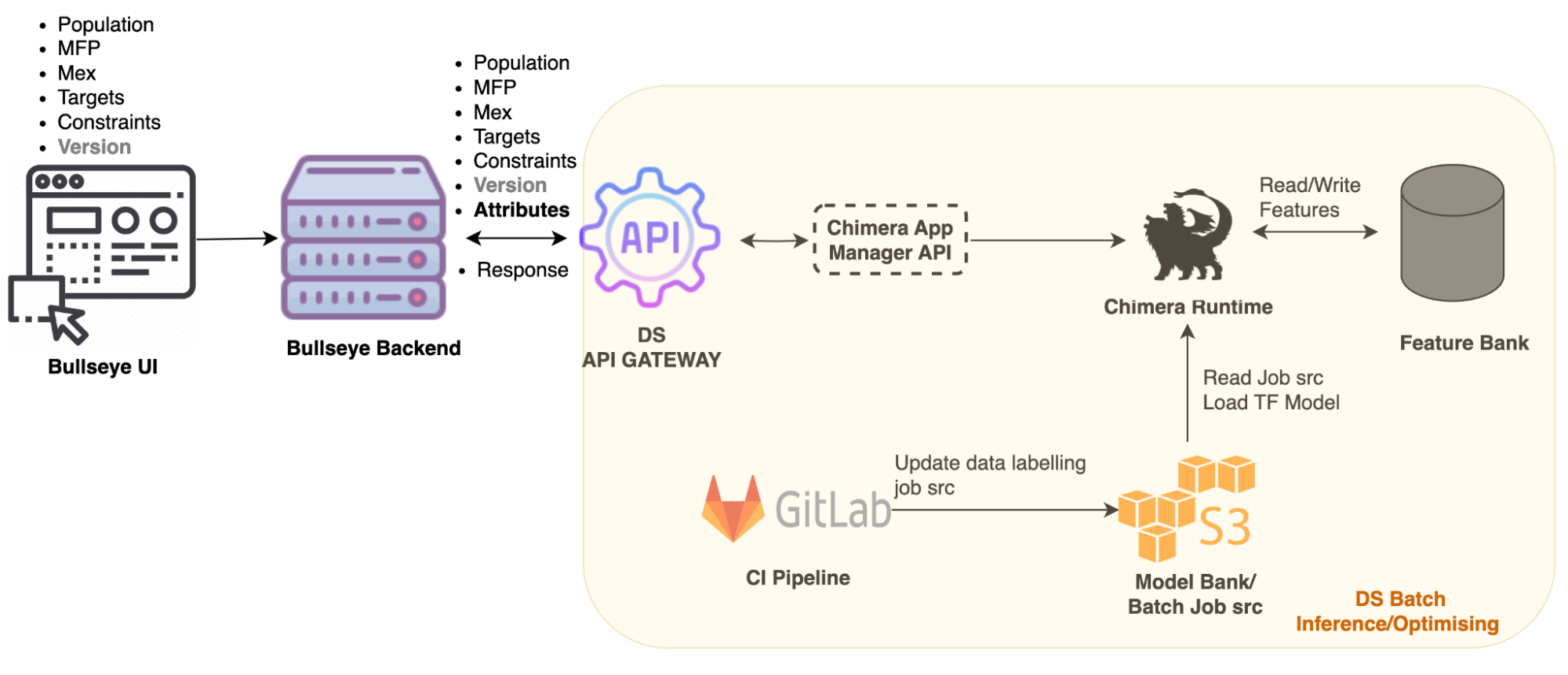
Figure 3 – Bullseye architecture

The Bullseye architecture consists of a user interface (UI) and a backend service to handle requests. To use Bullseye, our operations team inputs merchant information into the Bullseye UI. The backend service will then interact with APIs to process the information using the AI model. As we work with a large customer population, data is stored in S3 and the API service triggering Chimera Spark job is used to run the prediction model and generate promo assignments. During the assignment, the Spark job parses the input parameters, pre-validates the input, makes some predictions, and then returns the promo assignment results to the backend service.

Implementation

The key components in Bullseye are shown in the following figure:
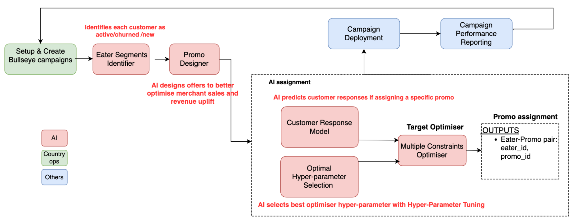
Figure 4 – Key components of Bullseye
  • Eater Segments Identifier: Identifies each user as active, churned, or new based on their historical orders from target merchants.
  • Promo Designer: We constructed a promo variation design framework to adaptively design promo variations for each campaign request as shown in the diagram below.
    • Offer Content Candidate Generation: Generates variant settings of promos based on the promo usage history.
    • Campaign Impact Simulator: Predicts business metrics such as revenue, sales, and cost based on the user and merchant profiles and offer features.
    • Optimal Promo Selection: Selects the optimal offer based on the predicted impact and the given campaign objective. The optimal would be based on how you define optimal. For example, if the goal is to maximise merchant sales, the model selects the top candidate which can bring the highest revenue. Finally, with the promo selection, the service returns the promo set to be used in the target campaign.

      Figure 5 – Optimal Promo Selection
  • Customer Response Model: Predicts customer responses such as order value, redemption, and take-up rate if assigning a specific promo. Bullseye captures various user attributes and compares it with an offer’s attributes. Examples of attributes are cuisine type, food spiciness, and discount amount. When there is a high similarity in the attributes, there is a higher probability that the user will take up the offer.

    Figure 6 – Customer Response Model

  • Hyper-parameter Selection: Optimises toward multiple business goals. Tuning of hyper-parameters allows the AI assignment model to learn how to meet success criteria such as cost per merchant sales (cpSales) uplift and sales uplift. The success criteria is the achieving of business goals. For example, the merchant wants the sales uplift after assigning promo, but cpSales uplift cannot be higher than 10%. With tuning, the optimiser can find optimal points to meet business goals and use AI models to search for better settings with high efficiency compared to manual specification. We need to constantly tune and iterate models and hyper-parameters to adapt to ever-evolving business goals and the local landscape.

    As shown in the image below, AI assignments without hyper-parameter tuning (HPT) leads to a high cpSales uplift but low sales uplift (red dot). So the hyper-parameters would help to fine-tune the assignment result to be in the optimal space such as the blue dot, which may have lower sales than the red dot but meet the success criteria.

    Figure 7 – Graph showing the impact of using AI assignments with HPT

Impact

We started using Bullseye in 2021. From its use we found that:

  • Hyper-parameters tuning and auto promo design can increase sales and reduce promo spend for food campaigns.
  • Promo Designer optimises budget utilisation and increases the number of promo redemptions for food campaigns.
  • The Customer Response Model reduced promo spending for Mart promotional campaigns.

Conclusion

We have seen positive results with the implementation of Bullseye such as reduced promo spending and maximised budget spending returns. In our efforts to serve our merchants better and help them achieve their business goals, we will continue to improve Bullseye. In the next phase, we plan to implement a more intelligent service, enabling reinforcement learning, and online assignment. We also aim to scale AI adoption by onboarding regional promotional campaigns as much as possible.

Special thanks to William Wu, Rui Tan, Rahadyan Pramudita, Krishna Murthy, and Jiesin Chia for making this project a success.

Join us

Grab is the leading superapp platform in Southeast Asia, providing everyday services that matter to consumers. More than just a ride-hailing and food delivery app, Grab offers a wide range of on-demand services in the region, including mobility, food, package and grocery delivery services, mobile payments, and financial services across 428 cities in eight countries.

Powered by technology and driven by heart, our mission is to drive Southeast Asia forward by creating economic empowerment for everyone. If this mission speaks to you, join our team today!
Stepping up marketing for advertisers: Scalable lookalike audience

Post Syndicated from Grab Tech original https://engineering.grab.com/scalable-lookalike-audiences

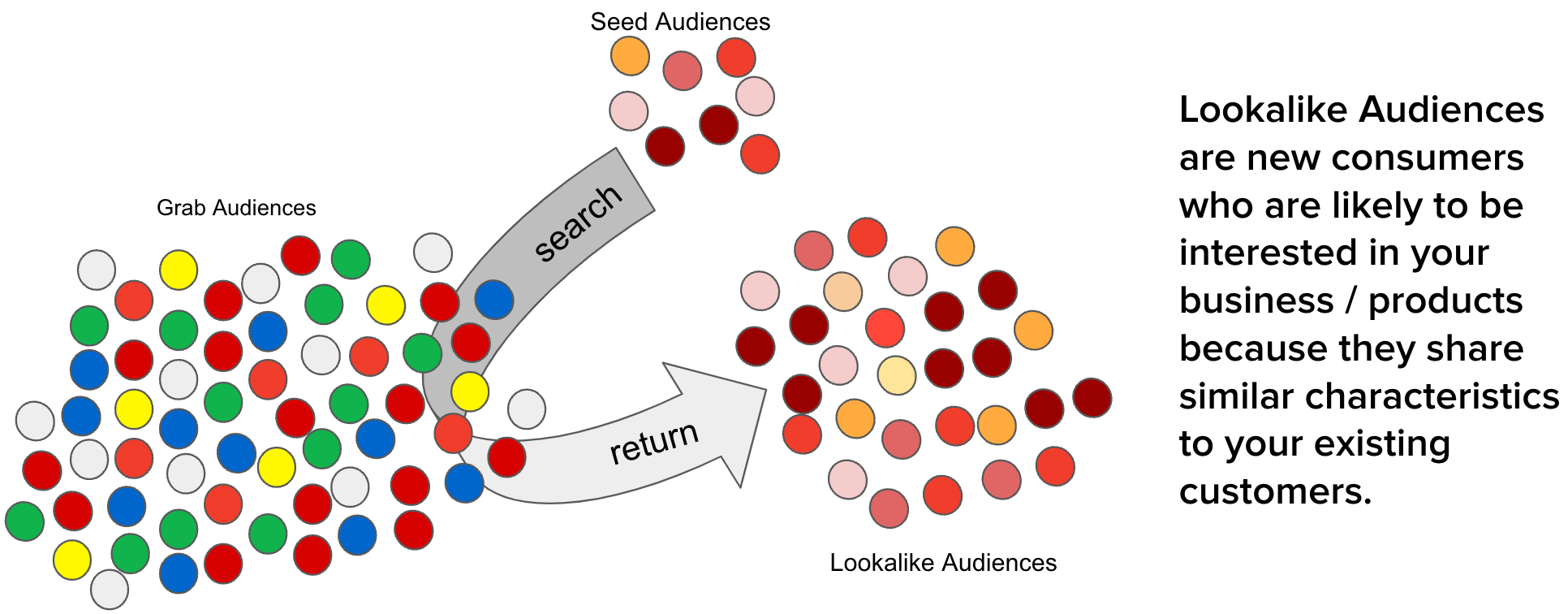
The advertising industry is constantly evolving, driven by advancements in technology and changes in consumer behaviour. One of the key challenges in this industry is reaching the right audience, reaching people who are most likely to be interested in your product or service. This is where the concept of a lookalike audience comes into play. By identifying and targeting individuals who share similar characteristics with an existing customer base, businesses can significantly improve the effectiveness of their advertising campaigns.

However, as the scale of Grab advertisements grows, there are several optimisations needed to maintain the efficacy of creating lookalike audiences such as high service level agreement (SLA), high cost of audience creation, and unstable data ingestion.

The need for an even more efficient and scalable solution for creating lookalike audiences was the motivation behind the development of the scalable lookalike audience platform. By developing a high-performance in-memory lookalike audience retrieval service and embedding-based lookalike audience creation and updating pipelines, t​his improved platform builds on the existing system and provides an even more effective tool for advertisers to reach their target audience.

Constant optimisation for greater precision

In the dynamic world of digital advertising, the ability to quickly and efficiently reach the right audience is paramount and a key strategy is targeted advertising. As such, we have to constantly find ways to improve our current approach to creating lookalike audiences that impacts both advertisers and users. Some of the gaps we identified included:

  • Long SLA for audience creation. Earlier, the platform stored results on Segmentation Platform (SegP) and it took two working days to generate a lookalike audience list. This is because inserting a single audience into SegP took three times longer than generating the audience. Extended creation times impacted the effectiveness of advertising campaigns, as it limited the ability of advertisers to respond quickly to changing market dynamics.

  • Low scalability. As the number of onboarded merchant-partners increased, the time and cost of generating lookalike audiences also increased proportionally. This limited the availability of lookalike audience generation for all advertisers, particularly those with large customer bases or rapidly changing audience profiles.

  • Low updating frequency of lookalike audiences. With automated updates only occurring on a weekly basis, this increased the likelihood that audiences may become outdated and ineffective. This meant there was scope to further improve to help advertisers more effectively reach their campaign goals, by targeting individuals who fit the desired audience profile.

  • High cost of creation. The cost of producing one segment can add up quickly for advertisers who need to generate multiple audiences. This could impact scalability for advertisers as they could hesitate to effectively use multiple lookalike audiences in their campaigns.

Solution

To efficiently identify the top N lookalike audiences for each Grab user from our pool of millions of users, we developed a solution that leverages user and audience representations in the form of embeddings. Embeddings are vector representations of data that utilise linear distances to capture structure from the original datasets. With embeddings, large sets of data are compressed and easily processed without affecting data integrity. This approach ensures high accuracy, low latency, and low cost in retrieving the most relevant audiences.

Our solution takes into account the fact that representation drift varies among entities as data is added. For instance, merchant-partner embeddings are more stable than passenger embeddings. By acknowledging this reality, we optimised our process to minimise cost while maintaining a desirable level of accuracy. Furthermore, we believe that having a strong representation learning strategy in the early stages reduced the need for complex models in the following stages.

Our solution comprises two main components:

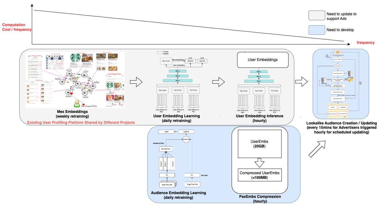
  1. Real-time lookalike audience retrieving: We developed an in-memory high-performance retrieving service that stores passenger embeddings, audience embeddings, and audience score thresholds. To further reduce cost, we designed a passenger embedding compression algorithm that reduces the memory needs of passenger embeddings by around 90%.

  2. Embedding-based audience creation and updating: The output of this part of the project is an online retrieving model that includes passenger embeddings, audience embeddings, and thresholds. To minimise costs, we leverage the passenger embeddings that are also utilised by other projects within Grab, beyond advertising, thus sharing the cost. The audience embeddings and thresholds are produced with a low-cost small neural network.

In summary, our approach to creating scalable lookalike audiences is designed to be cost-effective, accurate, and efficient, leveraging the power of embeddings and smart computational strategies to deliver the best possible audiences for our advertisers.

Solution architecture

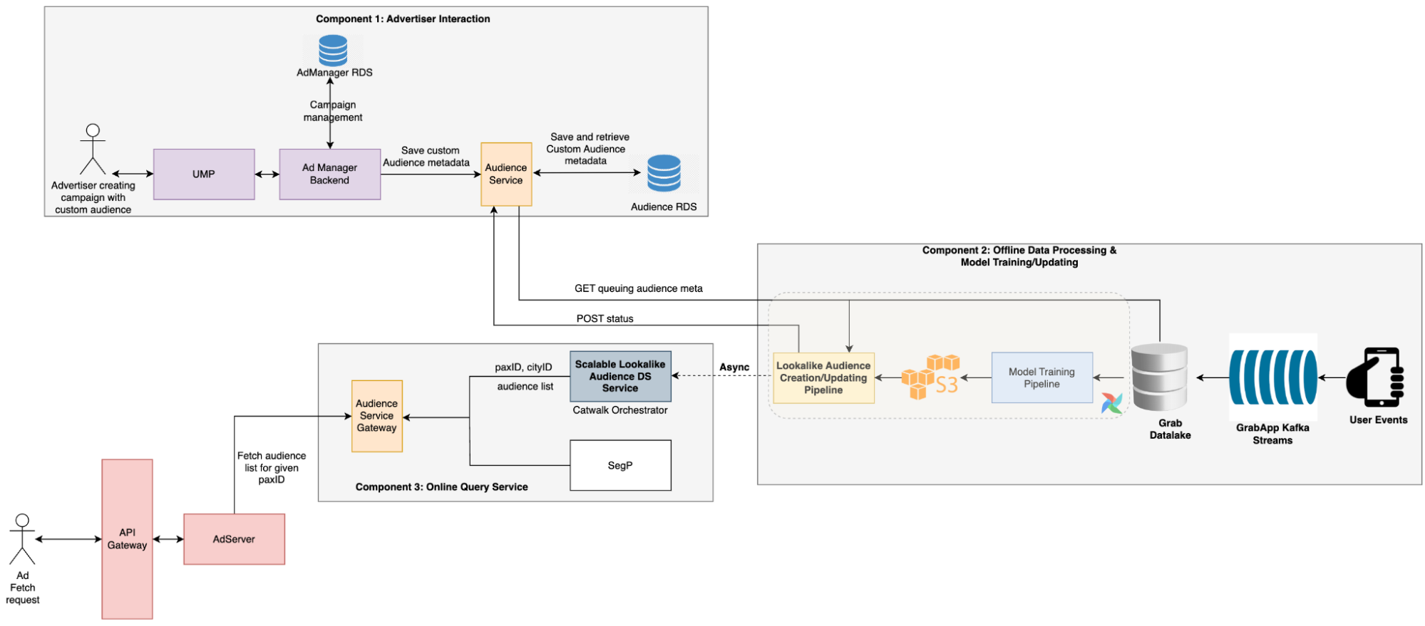
  • The advertiser creates a campaign with a custom audience, which triggers the audience creation process. During this process, the audience service stores the audience metadata provided by advertisers in a message queue.
  • A scheduled Data Science (DS) job then retrieves the pending audience metadata, creates the audience, and updates the TensorFlow Serving (TFS) model.
  • During the serving period, the Backend (BE) service calls the DS service to retrieve all audiences that include the target user. Ads that are targeting these audiences are then selected by the Click-Through Rate (CTR) model to be displayed to the user.

Implementation

To ensure the efficiency of the lookalike audience retrieval model and minimise the costs associated with audience creation and serving, we’ve trained the user embedding model using billions of user actions. This extensive training allows us to employ straightforward methods for audience creation and serving, while still maintaining high levels of accuracy.

Creating lookalike audiences

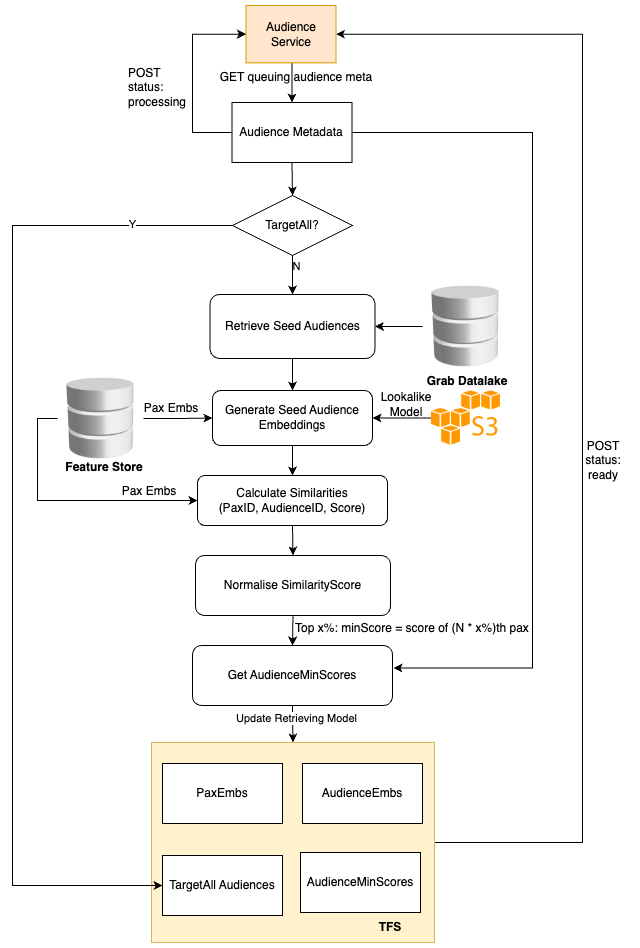
The Audience Creation Job retrieves the audience metadata from the online audience service, pulls the passenger embeddings, and then averages these embeddings to generate the audience embedding.

We use the cosine score of a user and the audience embedding to identify the audiences the user belongs to. Hence, it’s sufficient to store only the audience embedding and score threshold. Additionally, a global target-all-pax Audience list is stored to return these audiences for each online request.

Serving lookalike audiences

The online audience service is also tasked with returning all the audiences to which the current user belongs. This is achieved by utilising the cosine score of the user embedding and audience embeddings, and filtering out all audiences that surpass the audience thresholds.

To adhere to latency requirements, we avoid querying any external feature stores like Redis and instead, store all the embeddings in memory. However, the embeddings of all users are approximately 20 GB, which could affect model loading. Therefore, we devised an embedding compression method based on hash tricks inspired by Bloom Filter.

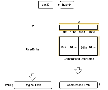
  • We utilise hash functions to obtain the hash64 value of the paxID, which is then segmented into four 16-bit values. Each 16-bit value corresponds to a 16-dimensional embedding block, and the compressed embedding is the concatenation of these four 16-dimensional embeddings.
  • For each paxID, we have both the original user embedding and the compressed user embedding. The compressed user embeddings are learned by minimising the Mean Square Error loss.
  • We can balance the storage cost and the accuracy by altering the number of hash functions used.

Impact

  • Users can see advertisements targeting a new audience within 15 mins after the advertiser creates a campaign.
  • This new system doubled the impressions and clicks, while also improving the CTR, conversion rate, and return on investment.
  • Costs for generating lookalike audiences decreased by 98%.

Learnings/Conclusion

To evaluate the effectiveness of our new scalable system besides addressing these issues, we conducted an A/B test to compare it with the earlier system. The results revealed that this new system effectively doubled the number of impressions and clicks while also enhancing the CTR, conversion rate, and return on investment.

Over the years, we have amassed over billions of user actions, which have been instrumental in training the model and creating a comprehensive representation of user interests in the form of embeddings.

What’s next?

While this scalable system has proved its effectiveness and demonstrated impressive results in CTR, conversion rate, and return on investment, there is always room for improvement.  

In the next phase, we plan to explore more advanced algorithms, refine our feature engineering process, and conduct more extensive hyperparameter tuning. Additionally, we will continue to monitor the system’s performance and make necessary adjustments to ensure it remains robust and effective in serving our advertisers’ needs.

References

Join us

Grab is the leading superapp platform in Southeast Asia, providing everyday services that matter to consumers. More than just a ride-hailing and food delivery app, Grab offers a wide range of on-demand services in the region, including mobility, food, package and grocery delivery services, mobile payments, and financial services across 428 cities in eight countries.

Powered by technology and driven by heart, our mission is to drive Southeast Asia forward by creating economic empowerment for everyone. If this mission speaks to you, join our team today!
Building hyperlocal GrabMaps

Post Syndicated from Grab Tech original https://engineering.grab.com/building-hyperlocal-grabmaps

Introduction

Southeast Asia (SEA) is a dynamic market, very different from other parts of the world. When travelling on the road, you may experience fast-changing road restrictions, new roads appearing overnight, and high traffic congestion. To address these challenges, GrabMaps has adapted to the SEA market by leveraging big data solutions. One of the solutions is the integration of hyperlocal data in GrabMaps.

Hyperlocal information is oriented around very small geographical communities and obtained from the local knowledge that our map team gathers. The map team is spread across SEA, enabling us to define clear specifications (e.g. legal speed limits), and validate that our solutions are viable.

Figure 1 – Map showing detections from images and probe data, and hyperlocal data.

Hyperlocal inputs make our mapping data even more robust, adding to the details collected from our image and probe detection pipelines. Figure 1 shows how data from our detection pipeline is overlaid with hyperlocal data, and then mapped across the SEA region. If you are curious and would like to check out the data yourself, you can download it here.

Processing hyperlocal data

Now let’s go through the process of detecting hyperlocal data.

Download data

GrabMaps is based on OpenStreetMap (OSM). The first step in the process is to download the .pbf file for Asia from geofabrick.de. This .pbf file contains all the data that is available on OSM, such as details of places, trees, and roads. Take for example a park, the .pbf file would contain data on the park name, wheelchair accessibility, and many more.

For this article, we will focus on hyperlocal data related to the road network. For each road, you can obtain data such as the type of road (residential or motorway), direction of traffic (one-way or more), and road name.

Convert data

To take advantage of big data computing, the next step in the process is to convert the .pbf file into Parquet format using a Parquetizer. This will convert the binary data in the .pbf file into a table format. Each road in SEA is now displayed as a row in a table as shown in Figure 2.

Figure 2 – Road data in Parquet format.

Identify hyperlocal data

After the data is prepared, GrabMaps then identifies and inputs all of our hyperlocal data, and delivers a consolidated view to our downstream services. Our hyperlocal data is obtained from various sources, either by looking at geometry, or other attributes in OSM such as the direction of travel and speed limit. We also apply customised rules defined by our local map team, all in a fully automated manner. This enhances the map together with data obtained from our rides and deliveries GPS pings and from KartaView, Grab’s product for imagery collection.

Figure 3 – Architecture diagram showing how hyperlocal data is integrated into GrabMaps.

Benefit of our hyperlocal GrabMaps

GrabNav, a turn-by-turn navigation tool available on the Grab driver app, is one of our products that benefits from having hyperlocal data. Here are some hyperlocal data that are made available through our approach:

  • Localisation of roads: The country, state/county, or city the road is in
  • Language spoken, driving side, and speed limit
  • Region-specific default speed regulations
  • Consistent name usage using language inference
  • Complex attributes like intersection links

To further explain the benefits of this hyperlocal feature, we will use intersection links as an example. In the next section, we will explain how intersection links data is used and how it impacts our driver-partners and passengers.

An intersection link is when two or more roads meet. Figure 4 and 5 illustrates what an intersection link looks like in a GrabMaps mock and in OSM.

Figure 4 – Mock of an intersection link.
Figure 5 – Intersection link illustration from a real road network in OSM.

To locate intersection links in a road network, there are computations involved. We would first combine big data processing (which we do using Spark) with graphs. We use geohash as the unit of processing, and for each geohash, a bi-directional graph is created.

From such resulting graphs, we can determine intersection links if:

  • Road segments are parallel
  • The roads have the same name
  • The roads are one way roads
  • Angles and the shape of the road are in the intervals or requirements we seek

Each intersection link we identify is tagged in the map as intersection_links. Our downstream service teams can then identify them by searching for the tag.

Impact

The impact we create with our intersection link can be explained through the following example.

Figure 6 – Longer route, without GrabMaps intersection link feature. The arrow indicates where the route should have suggested a U-turn.
Figure 7 – Shorter route using GrabMaps by taking a closer link between two main roads.

Figure 6 and Figure 7 show two different routes for the same origin and destination. However, you can see that Figure 7 has a shorter route and this is made available by taking an intersection link early on in the route. The highlighted road segment in Figure 7 is an intersection link, tagged by the process we described earlier. The route is now much shorter making GrabNav more efficient in its route suggestion.

There are numerous factors that can impact a driver-partner’s trip, and intersection links are just one example. There are many more features that GrabMaps offers across Grab’s services that allow us to “outserve” our partners.

Conclusion

GrabMaps and GrabNav deliver enriched experiences to our driver-partners. By integrating certain hyperlocal data features, we are also able to provide more accurate pricing for both our driver-partners and passengers. In our mission towards sustainable growth, this is an area that we will keep on improving by leveraging scalable tech solutions.

Join us

Grab is the leading superapp platform in Southeast Asia, providing everyday services that matter to consumers. More than just a ride-hailing and food delivery app, Grab offers a wide range of on-demand services in the region, including mobility, food, package and grocery delivery services, mobile payments, and financial services across 428 cities in eight countries.

Powered by technology and driven by heart, our mission is to drive Southeast Asia forward by creating economic empowerment for everyone. If this mission speaks to you, join our team today!
Unsupervised graph anomaly detection – Catching new fraudulent behaviours

Post Syndicated from Grab Tech original https://engineering.grab.com/graph-anomaly-model

Earlier in this series, we covered the importance of graph networks, graph concepts, graph visualisation, and graph-based fraud detection methods. In this article, we will discuss how to automatically detect new types of fraudulent behaviour and swiftly take action on them.

One of the challenges in fraud detection is that fraudsters are incentivised to always adversarially innovate their way of conducting frauds, i.e., their modus operandi (MO in short). Machine learning models trained using historical data may not be able to pick up new MOs, as they are new patterns that are not available in existing training data. To enhance Grab’s existing security defences and protect our users from these new MOs, we needed a machine learning model that is able to detect them quickly without the need for any label supervision, i.e., an unsupervised learning model rather than the regular supervised learning model.

To address this, we developed an in-house machine learning model for detecting anomalous patterns in graphs, which has led to the discovery of new fraud MOs. Our focus was initially on GrabFood and GrabMart verticals, where we monitored the interactions between consumers and merchants. We modelled these interactions as a bipartite graph (a type of graph for modelling interactions between two groups) and then performed anomaly detection on the graph. Our in-house anomaly detection model was also presented at the International Joint Conference on Neural Networks (IJCNN) 2023, a premier academic conference in the area of neural networks, machine learning, and artificial intelligence.

In this blog, we discuss the model and its application within Grab. For avid audiences that want to read the details of our model, you can access it here. Note that even though we implemented our model for anomaly detection in GrabFood and GrabMart, the model is designed for general purposes and is applicable to interaction graphs between any two groups.

Interaction-Focused Anomaly Detection on Bipartite Node-and-Edge-Attributed Graphs
By Rizal Fathony, Jenn Ng, Jia Chen
Presented at International Joint Conference on Neural Networks (IJCNN) 2023

Before we dive into how our model works, it is important to understand the process of graph construction in our application as the model assumes the availability of the graphs in a standardised format.

Graph construction 

We modelled the interactions between consumers and merchants in GrabFood and GrabMart platforms as bipartite graphs (G), where the first group of nodes (U) represents the consumers, the second group of nodes (V) represents the merchants, and the edges (E) connecting them means that the consumers have placed some food/mart orders to the merchants. The graph is also supplied with rich transactional information about the consumers and the merchants in the form of node features (Xu and Xv), as well as order information in the form of edge features (Xe).

Fig 1. Graph construction process

The goal of our anomaly model is to detect anomalous and suspicious behaviours from the consumers or merchants (node-level anomaly detection), as well as anomalous order interactions (edge-level anomaly detection). As mentioned, this detection needs to be done without any label supervision.

Model architecture

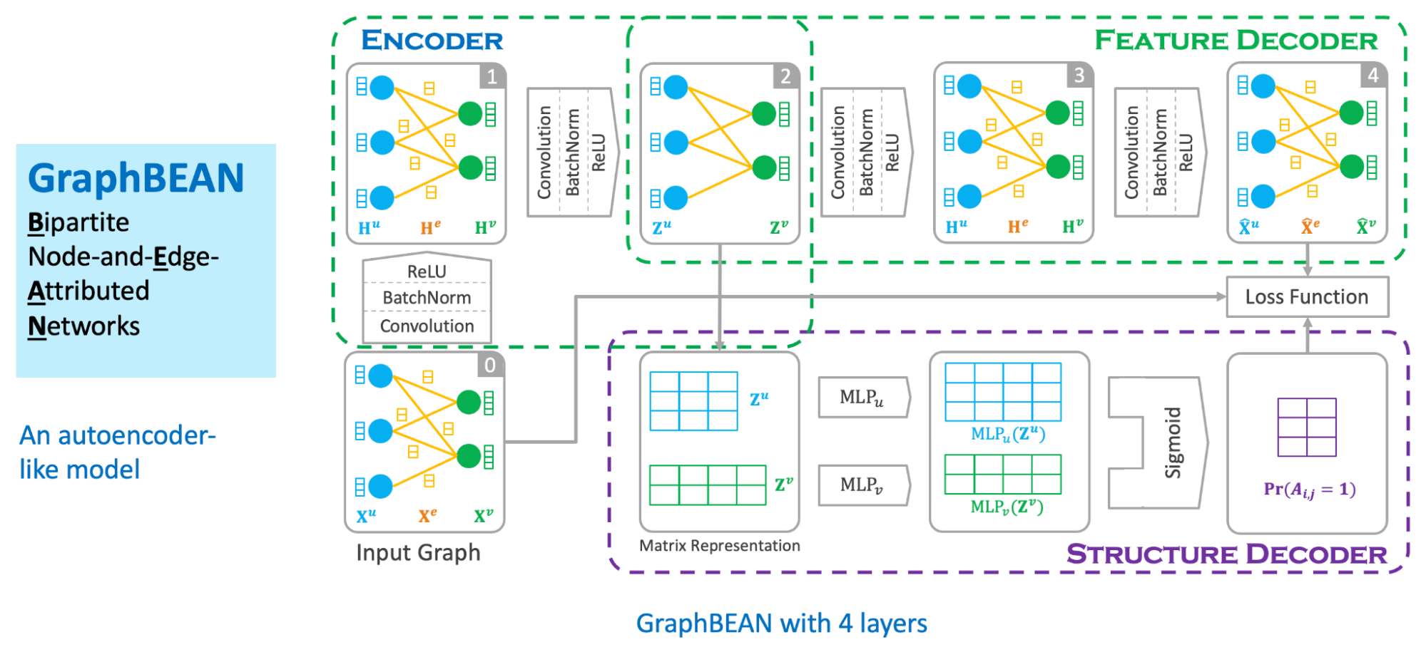
We designed our graph anomaly model as a type of autoencoder, with an encoder and two decoders – a feature decoder and a structure decoder. The key feature of our model is that it accepts a bipartite graph with both node and edge attributes as the input. This is important as both node and edge attributes encode essential information for determining if certain behaviours are suspicious. Many previous works on graph anomaly detection only support node attributes. In addition, our model can produce both node and edge level anomaly scores, unlike most of the previous works that produce node-level scores only. We named our model GraphBEAN, which is short for Bipartite Node-and-Edge-Attributed Networks.

From the input, the encoder then processes the attributed bipartite graph into a series of graph convolution layers to produce latent representations for both node groups. Our graph convolution layers produce new representations for each node in both node groups (U and V), as well as for each edge in the graph. Note that the last convolution layer in the encoder only produces the latent representations for nodes, without producing edge representations. The reason for this design is that we only put the latent representations for the active actors, the nodes representing consumers and merchants, but not their interactions.

Fig 2. GraphBEAN architecture

From the nodes’ latent representations, the feature decoder is tasked to reconstruct the original graph with both node and edge attributes via a series of graph convolution layers. As the graph structure is provided by the feature decoder, we task the structure decoder to learn the graph structure by predicting if there exists an edge connecting two nodes. This edge prediction, as well as the graph reconstructed by the feature decoder, are then compared to the original input graph via a reconstruction loss function.

The model is then trained using the bipartite graph constructed from GrabFood and GrabMart transactions. We use a reconstruction-based loss function as the training objective of the model. After the training is completed, we compute the anomaly score of each node and edge in the graph using the trained model.

Anomaly score computation

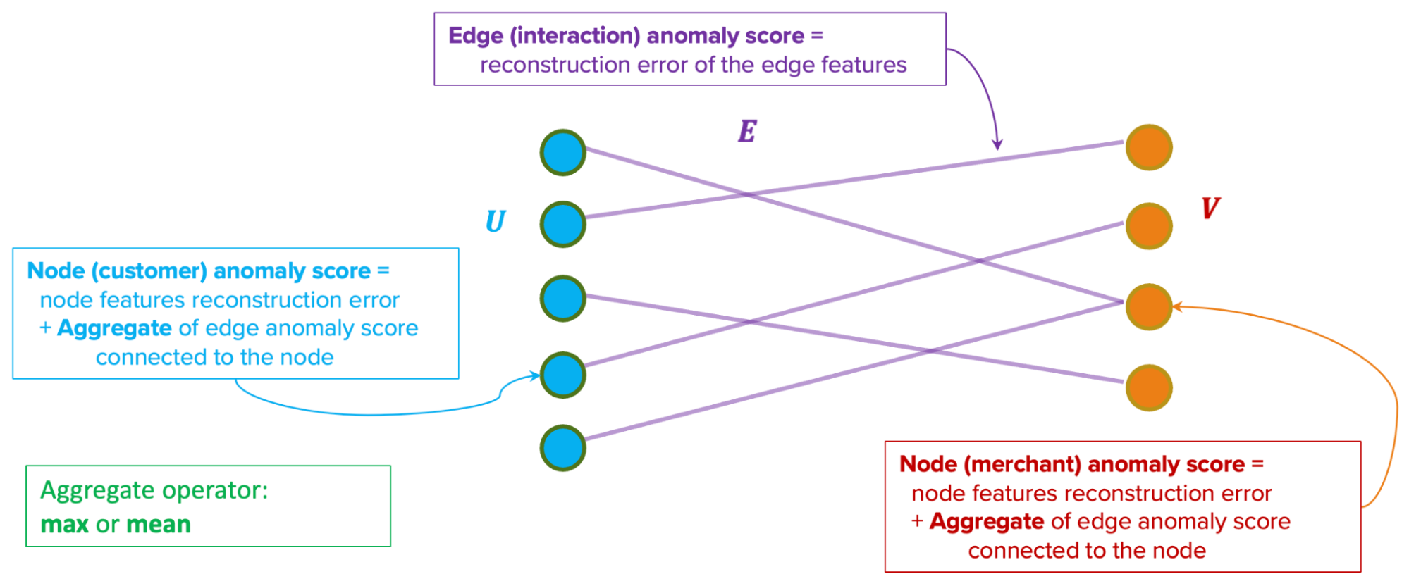
Our anomaly scores are reconstruction-based. The score design assumes that normal behaviours are common in the dataset and thus, can be easily reconstructed by the model. On the other hand, anomalous behaviours are rare. Therefore the model will have a hard time reconstructing them, hence producing high errors.

Fig 3. Edge-level and node-level anomaly scores computation

The model produces two types of anomaly scores. First, the edge-level anomaly scores, which are calculated from the edge reconstruction error. Second, the node-level anomaly scores, which are calculated from node reconstruction error plus an aggregate over the edge scores from the edges connected to the node. This aggregate could be a mean or max aggregate.

Actioning system

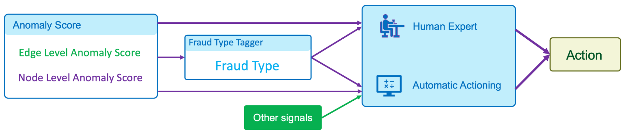
In our implementation of GraphBEAN within Grab, we designed a full pipeline of anomaly detection and actioning systems. It is a fully-automated system for constructing a bipartite graph from GrabFood and GrabMart transactions, training a GraphBEAN model using the graph, and computing anomaly scores. After computing anomaly scores for all consumers and merchants (node-level), as well as all of their interactions (edge-level), it automatically passes the scores to our actioning system. But before that, it also passes them through a system we call fraud type tagger. This is also a fully-automated heuristic-based system that tags some of the detected anomalies with some fraud tags. The purpose of this tagging is to provide some context in general, like the types of detected anomalies. Some examples of these tags are promo abuse or possible collusion.

Fig 4. Pipeline in our actioning system

Both the anomaly scores and the fraud type tags are then forwarded to our actioning system. The system consists of two subsystems:

  • Human expert actioning system: Our fraud experts analyse the detected anomalies and perform certain actioning on them, like suspending certain transaction features from suspicious merchants.
  • Automatic actioning system: Combines the anomaly scores and fraud type tags with other external signals to automatically do actioning on the detected anomalies, like preventing promos from being used by fraudsters or preventing fraudulent transactions from occurring. These actions vary depending on the type of fraud and the scores.

What’s next?

The GraphBEAN model enables the detection of suspicious behaviour on graph data without the need for label supervision. By implementing the model on GrabFood and GrabMart platforms, we learnt that having such a system enables us to quickly identify new types of fraudulent behaviours and then swiftly perform action on them. This also allows us to enhance Grab’s defence against fraudulent activity and actively protect our users.

We are currently working on extending the model into more generic heterogeneous (multi-entity) graphs. In addition, we are also working on implementing it to more use cases within Grab.

Join us

Grab is the leading superapp platform in Southeast Asia, providing everyday services that matter to consumers. More than just a ride-hailing and food delivery app, Grab offers a wide range of on-demand services in the region, including mobility, food, package and grocery delivery services, mobile payments, and financial services across 428 cities in eight countries.

Powered by technology and driven by heart, our mission is to drive Southeast Asia forward by creating economic empowerment for everyone. If this mission speaks to you, join our team today!
Zabbix in: exploratory data analysis rehearsal – Part 3

Post Syndicated from Paulo R. Deolindo Jr. original https://blog.zabbix.com/zabbix-in-exploratory-data-analysis-rehearsal-part-2-2/26266/

Abstract

This will be the last blog post of the “Zabbix in… exploratory data analysis rehearsal” series. To continue our initial proposal, we’ll close the third and fourth data distribution moments concept. This time, we’ll talk about Skewness and Kurtosis.

Remember the first and second articles of the series to be aware of what we are discussing here.

The four moments for a data distribution

While the first moment helps us with the location estimate for some data distribution, the second moment works with its variance. The third moment, called asymmetry, allows us to understand the value trends and the degree of the asymmetry. The fourth moment is called kurtosis and is about the probability of the peak’s existence (outliers).

These four moments are not the final study about the data distribution. There is so much to learn and apply to data science when considering statistical concepts, but for now we must finish the initial proposal and bring forward some insights for decision makers.

Let’s get started!

Asymmetry

Based on our web application scenario, we can see a certain asymmetry in response time in most cases. This is normal and expected – so far, no problems. But it is also true that some symmetry is also possible in certain cases. Again, no problems here.

So, where is the problem? When does it happen?

Sometimes, the web application response time can be too different from the previous one, and we have no control over it. In these cases, the outliers must be found, and the correct interpretation must be applied. At that point, we must consider anomalies in the environment. Sometimes, the outliers are just a deviation. In all cases, we must pay attention and monitor the metrics that can make the difference.

Speaking of asymmetry – why is this topic so special? One of the possible answers is that we need to understand the degree of the asymmetry – whether it is high or moderated and whether the values were in most cases smaller than or bigger than the mean or median. In other words, what does the asymmetry say about the web application performance?

Let’s check some implementations.

The key skewness

From version 6.0, Zabbix introduced the item key skewness.

For example, it can be used like this:

skewness(/host/key,1h) # the skewness for the last hour until now

Now, let’s see how this formula could be applied to our scenario:

skewness(//net.tcp.service.perf[http,”{HOST.CONN}”,”{$NGINX.STUB_STATUS.PORT}”],1h:now/h)

Using skewness and time shift “1h:now/h”, we are looking for some web application response time asymmetry at the previous hour.

The asymmetry can be negative (left skew), zero, positive (right skew) or undefined.

Definition: a left-skewed distribution is longer on the left side of its peak than on its right. In other words, a left-skewed distribution has a long tail on its left side.

Considering a left skew, it is possible to state that at the previous hour, the web application had more higher values than smaller values. This means that our web application does not perform as well as it should.

Look at the graph above. You can see some bars on the left side of the mean and other bars on the right side of the mean, with the same size as a mirror. We can consider this a normal distribution for web application response time, but it does not mean that the response times were good or bad – it only means that they had some balance and suggests more investigation.

Definition: a right-skewed distribution is longer on the right side of its peak than on its left. In other words, a right-skewed distribution has a long tail on its right side.

Considering a right skew, it is possible to state that at the previous hour, the web application had more smaller values than higher values. This means our web application performs as expected.

Value Map for Skewness

You must create in your template the following value map:

If you wish, the value map can also be as below:

“is greater than or equals”                                 0.1              à Mais tempos bons, se comparados à média

“equals”                                                               0               à Tempos de resposta simétricos ou bem distribuídos em bons e ruins

“is less than or equals”                                       0                à Mais tempos ruins, se comparados à média

Pearson Skewness Coefficient

The Pearson’s Coefficient is a very interesting indicator. Considering some skewness for a data distribution, it tells us if the asymmetry is strong or only moderate.

We can create a calculated item for the Pearson’s Coefficient:

(3*(avg-median))/stddevpop

In Zabbix, we need:

  • One item for the response time average considering the previous hour:
    • Key: resp.time.previous.hour
      • Formula: trendavg(//net.tcp.service.perf[http,”{HOST.CONN}”,”{$NGINX.STUB_STATUS.PORT}”],1h:now/h)
    • One item for calculating the median (for percentile, see the previous blog post):
      • Key: response.time.previous.hour
        • Formula: (last(//p51.previous.hour)+last(//p50.previous.hour))/2
      • One item for the standard deviation calculation:
        • Key:
          • Formula: response.time.previous.hour stddevpop(//net.tcp.service.perf[http,”{HOST.CONN}”,”{$NGINX.STUB_STATUS.PORT}”],1h:now/h)

Finally, a calculated item for a Pearson’s Coefficient:

  • Key: coefficient.requests.previous.hour
    • Formula:
      ((last(//trendavg.requests.per.minute)-
      last(//median.access.previous.hour))*3)
      /
      last(//stddevpop.requests.previous.hour)

To finish the exercise, create a value map:

Curtose

Kurtosis is the fourth data distribution and can indicate if the values are prone to peaks.

In Zabbix, you can implement or calculate kurtosis with other calculated items:

kurtosis(/host/key,1h)

Um valor negativo de curtose nos diz que a distribuição não está propensa ou produziu poucos outliers. Já um valor positivo de curtose nos diz que a distribuição está propensa ou produziu muitos outliers. Tudo gira em torno da média da distribuição de dados. Já um valor neutro, ou zero, nos diz que a distribuição é considerada simétrica.

Para nosso cenário web, temos:

kurtosis(//net.tcp.service.perf[http,”{HOST.CONN}”,”{$NGINX.STUB_STATUS.PORT}”],1h:now/h)

Explanatory Dashboard

Considering the image above, the data distribution for the web application response time at the previous hour has a left skew. This suggests that, when considering the response time mean at the previous hour, there were more higher values than smallest values. That’s sad – our web application performed poorly. Why?

However, because the skewness was moderated (considering the Pearson’s Coefficient), it means that the response time values were not so different from the others at the same hour.

As for kurtosis, we can say that the data distribution is prone to peaks because we have positive kurtosis. In basic statistics, the values are near the mean and there is a high probability of producing outliers.

This is a point to pay attention to if you are looking at a critical service.

Looking at other metrics

To check and validate our interpretation, let’s visualize the collected values on a simple Zabbix graph, using a graph widget.

Please consider using the following “time period” configuration:

The graph will show only the data collected at the previous hour – in this case, from 11:00 to 11:59.

The graph in Zabbix allows us to visualize the 50th percentile as well. We do not display the mean on the graph because it wouldn’t be well represented visually as it was collected only once, thus lacking an interesting visual trend line like the 50th percentile. However, notice that the mean and the 50th percentile values are very close, which will give us an idea of the data distribution around this measure.

Partial Conclusion

Skewness and Kurtosis, respectively, are the third and fourth moments of a data distribution. They help us understand the environment’s behavior and allow us to gain insight into a lot of things (in this case, we simply applied these concepts to IT infrastructure monitoring and focused on our web application to analyze its performance).

In most cases, the asymmetry will exist – it’s normal and expected. However, knowing some properties of the skewness can help us understand the response times, indicating good or poor performance. The skewness coefficient allows us to know if the asymmetry was strong or just moderated. Meanwhile, kurtosis helps us to understand if the data distribution produced some peaks considering an observation period or whether it is prone to produce peaks. We can then create some triggers for that and avoid some undesirable behaviors in the future, based on our data distribution observation. This is applied data science at its best.

Conclusion

Data science can be easily applied to (and bring up insights about) Zabbix and its Aggregate functions. It’s true that there are some special functions such as skewness, kurtosis, stddevpop, stddevsamp, mad, and so on, but there are old functions to help us too, such as percentile, forecast, timeleft, etc. All these functions must be used in calculated item formulas.

One of the interesting advantages of using Zabbix in data science and performing an exploratory data analysis is the fact that Zabbix can monitor everything. This means that the database already exists with the relevant date to analyze, in real time.

In the blog posts in this series, we took as a basis some data referring to the previous hour, the previous day, and so on, but we did nothing regarding the current hour. If we applied the concepts studied in real time data, we would have other “live” results, including support for decision-making. This is because we will not only study historical data, but instead will have the opportunity to change the course of events.

Zabbix is improving dashboards significantly. From Zabbix 6.4, we have many new out-of-the-box widgets and the possibility to create our own. However, there is a concern – Zabbix administrators sometimes show unnecessary data in dashboards, which can cloud the decision-making process. Zabbix administrators, in general, might want to learn storytelling techniques to rectify this situation. Maybe in a perfect world!

I hope you have enjoyed this blog post series.

Keep studying!


The post Zabbix in: exploratory data analysis rehearsal – Part 3 appeared first on Zabbix Blog.

Zabbix in: exploratory data analysis rehearsal – Part 2

Post Syndicated from Paulo R. Deolindo Jr. original https://blog.zabbix.com/zabbix-in-exploratory-data-analysis-rehearsal-part-2/26151/

Abstract

In the previous blog post, we just explored some of the basic statistic concepts to estimate KPIs for a web application response time: in that case, average, median and percentile. Additionally, we improved the nginx out-of-the-box template and showed some results in simple dashboards. Now we must continue our work but this time, analyzing some variances of the collected metrics, considering a certain period.

Please, read the previous blog post to understand the context in a better way. I wish you a good reading.

A little about basic statistic

In basic statistic, a data distribution has at least four moments:

  • Location estimate
  • Variance
  • Skewness
  • Kurtosis

In the previous blog post, we introduced the 1st moment, knowing some estimates of our data distribution. It means that we have analyzed some values of our web application response time. It reveals that the response time can have minimum and maximum values, average, a value that can represent a central value of the distribution and so on. Some metrics, such as average, can be influenced by outliers, but other metrics do not, such as 50th percentile or median. To conclude, now we know something about the variance of those values, but it isn’t enough. Let’s check the 2nd moment of the data distribution: Variance.

Variance

So, we have some notion about the variance of the web application response time, meaning that it can have some asymmetry (in most cases) and we also know that some KPIs must be considered but, which of them?

In exploratory data analysis, we can discover some key metrics but, in most cases, we won’t use all of them, so we have to know each one’s relevance to choose properly which metric can represent the reality of our scenario.

Yes! There are some cases when some metrics must be added to other metrics so that they make sense otherwise, we can discard them: we must create and understand the context for all those metrics.

Let’s check some concepts of the variance:

  • Variance
  • Standard deviation
  • Median absolute deviation (MAD)
  • Amplitude
  • IQR – Interquartile range

Amplitude

This concept is simple and its formula too: it is the difference between the maximum and the minimum value in a data distribution. In this case, we are talking about data distribution at the previous hour (,1h:now/h). We are interested in knowing the range of variation in response times in that period.

Let’s create a Calculated item to Amplitude metric in “Nginx by HTTP modified” template.

  • trendmax(//net.tcp.service.perf[http,”{HOST.CONN}”,”{$NGINX.STUB_STATUS.PORT}”],1h:now/h)
  • trendmin(//net.tcp.service.perf[http,”{HOST.CONN}”,”{$NGINX.STUB_STATUS.PORT}”],1h:now/h)

In other terms, it could be:

  • max(/host/key)-min(/host/key)

However, we are analysing a data distribution based on the previous hour, so…

  • trendmax(/host/key,1h:now/h)-trendmin(/host/key,1h:now/h)

Modifying our dashboard, we’ll see something like this:


This result interpretation could be: between the worst and the best response times, the variance is too small. It means, during that hour the response times had no significant differences.

However, amplitude itself is not enough to get some web application diagnosis at that moment. It’s necessary to combine this result with other results and we’ll see how to do it.

To complement, we can create some triggers based on it:

  • Fire if the response time amplitude was bigger than 5 seconds at the previous hour. It means that the web application did not perform as expected considering the web application requests.
    • Expression = last(/Nginx by HTTP modified/amplitude.previous.hour)>5
    • Level = Information
  • Fire if the response time amplitude reaches 5 seconds at least 3 consecutive times. It means at the last 3 hours, there was too much variance among the web application response times and it is not the expected.
    • Expression = max(/Nginx by HTTP modified/amplitude.previous.hour,#3)>5
    • Level = Warning

Remember, we are evaluating the previous hour and it makes no sense to generate this metric every single minute. Let’s create a Custom interval period for it.


By doing it, we are avoiding flapping on triggers environment.

IQR – Interquartile range

Consider these values below:

3, 5, 2, 1, 3, 3, 2, 6, 7, 8, 6, 7, 6

Open the shell environment. Create the file “vaules.txt” and insert each one, one per line. Now, read the file:

# cat values.txt

3
5
2
1
3
3
2
6
7
8
6
7
6

Now, send the value to Zabbix using Zabbix sender:

# for x in `cat values.txt`; do zabbix_sender -z 127.0.0.1 -s “Web server A” -k input.values -o $x; done

Look at the historical data using Zabbix frontend.


Now, let’s create some Calculated items to 75th  percentile and 25th  percentile.

  • Key: iqr.test.75
    Formula: percentile(//input.values,#13,75)
    Type: Numeric (float)
  • Key: iqr.test.25
    Formula: percentile(//input.values,#13,25)
    Type: Numeric (float)

If we apply it on a Linux terminal the command “sort values.txt”, we’ll get the same values ordered by size. Let’s check:

# sort values.txt


We’ll use the same concept here.

From the left to the right, go to the 25th percentile. You will get the number 3.

Do it again, but this time go to the 50th percentile. You will get the number 5.

And again, go to the 75th percentile. You will get the number 6.

The IQR is the difference between the 75th percentile (Q3) and the 25th percentile (Q1). So, we are excluding the outliers (the smallest values on the left and the biggest values on the right).

To calculate the IQR, you can create the following Calculate item:

  • key: iqr.test
    Formula: last(//iqr.test.75)-last(//iqr.test.25)

Now, we’ll apply this concept in Web Application Response Time.

The Calculated Item for the 75th percentile:

key: percentile.75.response.time.previous.hour
Formula: percentile(//net.tcp.service.perf[http,”{HOST.CONN}”,”{$NGINX.STUB_STATUS.PORT}”],1h:now/h,75)

The Calculated item for the 25th percentile:

key: percentile.25.response.time.previous.hour
Formula: percentile(//net.tcp.service.perf[http,”{HOST.CONN}”,”{$NGINX.STUB_STATUS.PORT}”],1h:now/h,25)

The Calculate item for the IQR:

key: iqr.response.time.previous.hour
Formula: last(//percentile.75.response.time.previous.hour)-last(//percentile.25.response.time.previous.hour)

Keep the monitoring schedule at the 1st minute for each hour, to avoid repetition (it’s very important) and adjust the dashboard.

Considering the worst web response time and the best web response time at the previous hour, the AMPLITUDE returns a big value in comparison to the IQR and it happens because the outliers were discarded in IQR calculation. So, just as the mean is a location estimate that is influenced by outliers and the median is not, so are the RANGE and IQR. The IQR is a robust indicator and allows us to know the difference between the web response time variance in a central position.

P.S.: we are considering only the previous hour, however, you can apply the IQR concept to an entire period, such as the previous day, or the previous week, the previous month and so on, using the correct time shift notation. You can use it to compare the web application response time variance between the periods you wish to observe and then, get some insights about the web application behavior at different times and situations.

Variance

The variance is a way to calculate the dispersion of data, considering its average. In Zabbix, calculating the variance is simple, since there is a specific formula for that, through a Calculated item.

The formula is the following:

  • Key: varpop.response.time.previous.hour
    Formula: varpop(//net.tcp.service.perf[http,”{HOST.CONN}”,”{$NGINX.STUB_STATUS.PORT}”],1h:now/h)

In this case, the formula returns the dispersion of data, however, there is a characteristic: at some point, the data is squared and then, the data scale changes.

Let’s check the steps for calculating the variance of the data:

1st) Calculate the mean;
2nd) Subtract the mean of each value;
3rd) Square each subtraction result;
4th) Perform the sum of all squares;
5th) Divide the result of the sum by the total observations.

At the 3rd step, we have the scale change. This new data can be used to other calculations in the future.

Standard Deviation

The root square of the variance.

Calculating the root square of the variance, the data can come back to its original scale!

There are at least two ways to do it:

  1. Using the root square key and formula in Zabbix:
    1. Key: varpop.previous.hour
    2. Formula: sqrt(last(//varpop.response.time.previous.hour))
  2. Using the standard deviation key and formula in Zabbix:
    1. Key:previous.hour
    2. Formula: stddevpop(//host,key,1h:now/h) # an example for the previous hour

A simple way to understand the standard deviation concept is: a way of knowing how “far” values are from the average. So, applying the specific formula, we’ll get that indicator.

Look at this:

The image above is a common image that can be found on the Internet, and it can help us understand some results. The standard deviation value must be near “zero”, otherwise, we’ll have serious deviations.

Let’s check the following Calculated item:

  • stddevpop(//net.tcp.service.perf[http,”{HOST.CONN}”,”{$NGINX.STUB_STATUS.PORT}”],1h:now/h)

We are calculating the standard deviation based on the collected values at the previous hour. Let’s check the Test item on the frontend:

The test returned some value less than 1, at about 0.000446. If this value is less than 1, we don’t have a complete deviation and it means that the collected values at the previous hour are near the average.

For a web application response time, it can represent a good behavior, with no significant variances and as expected, off course, other indicators must be checked to a complete and reliable diagnosis.

Important notes about standard deviation:

  • Sensitive to outliers
  • Can be calculated based on the population of a data distribution or based on its sample.
    • Using this formula: stddevsamp. In this case, it can return a different value from the the previous one.

Median Absolute Deviation (MAD)

While the Standard Deviation is a simple way to understand if the data of a distribution are far from its mean, MAD help us understand if these values are far from its median. So, MAD can be considered a robust estimate, because is not sensitive to outliers.

Warning: If you need to identify outliers or consider them in your analysis, the MAD function is not recommended, because it ignores them.

Let’s check our dashboard and compare different deviation calculations for the same data distribution:

Note that the last one is based on MAD function, and it is less than the other items, just because it is not considering outliers.

In this particular case, the web application is stable, and its response times are near to the mean or median (considering the MAD algorithm).

Exploratory Dashboard

Partial conclusion

In this post, we have just introduced the data distribution moments, presenting the variability or variance concept and then, we learned some techniques to achieve some KPIs or indicators.

What do we know? The response time for a web application can be different from the previous one and so on, so the knowledge of the variance can help us understand about the application behaviors using some extraordinary data. Then, we can decide if an application had a good or poor performance, for example.

Of course, it was a didactic example for some data distribution and the location estimate and variance concepts can be applied to other data exploratory analysis considering a long period, such as days, weeks, months, years, and so on. In those case, is very important consider using trends instead of history data.

Our goal is bringing to the light some extraordinary data and insights, instead of common data, allow us knowing better our application.

In the next posts, we’ll talk about Skewness and Kurtosis, the 3rd and 4th moments for a data distribution, respectively.

The post Zabbix in: exploratory data analysis rehearsal – Part 2 appeared first on Zabbix Blog.

Introducing data science concepts and skills to primary school learners

Post Syndicated from Katharine Childs original https://www.raspberrypi.org/blog/data-science-data-literacy-primary-school-scotland/

Every day, most of us both consume and create data. For example, we interpret data from weather forecasts to predict our chances of a good weather for a special occasion, and we create data as our carbon footprint leaves a trail of energy consumption information behind us. Data is important in our lives, and countries around the world are expanding their school curricula to teach the knowledge and skills required to work with data, including at primary (K–5) level.

In our most recent research seminar, attendees heard about a research-based initiative called Data Education in Schools. The speakers, Kate Farrell and Professor Judy Robertson from the University of Edinburgh, Scotland, shared how this project aims to empower learners to develop data literacy skills and succeed in a data-driven world.

“Data literacy is the ability to ask questions, collect, analyse, interpret and communicate stories about data.”

– Kate Farrell & Prof. Judy Robertson

Being a data citizen

Scotland’s national curriculum does not explicitly mention data literacy, but the topic is embedded in many subjects such as Maths, English, Technologies, and Social Studies. Teachers in Scotland, particularly in primary schools, have the flexibility to deliver learning in an interdisciplinary way through project-based learning. Therefore, the team behind Data Education in Schools developed a set of cross-curricular data literacy projects. Educators and education policy makers in other countries who are looking to integrate computing topics with other subjects may also be interested in this approach.

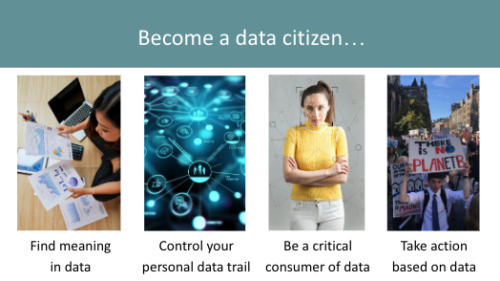
Becoming a data citizen involves finding meaning in data, controlling your personal data trail, being a critical consumer of data, and taking action based on data.
Data citizens have skills they need to thrive in a world shaped by digital technology.

The Data Education in Schools projects are aimed not just at giving learners skills they may need for future jobs, but also at equipping them as data citizens in today’s world. A data citizen can think critically, interpret data, and share insights with others to effect change.

Kate and Judy shared an example of data citizenship from a project they had worked on with a primary school. The learners gathered data about how much plastic waste was being generated in their canteen. They created a data visualisation in the form of a giant graph of types of rubbish on the canteen floor and presented this to their local council.

A child arranges objects to visualise data.
Sorting food waste from lunch by type of material

As a result, the council made changes that reduced the amount of plastic used in the canteen. This shows how data citizens are able to communicate insights from data to influence decisions.

A cycle for data literacy projects

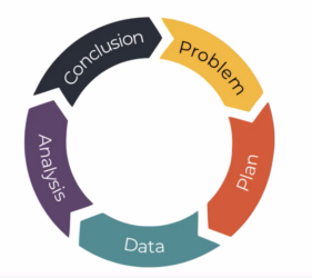
Across its projects, the Data Education in Schools initiative uses a problem-solving cycle called the PPDAC cycle. This cycle is a useful tool for creating educational resources and for teaching, as you can use it to structure resources, and to concentrate on areas to develop learner skills.

The PPDAC project cycle.
The PPDAC data problem-solving cycle

The five stages of the cycle are: 

  1. Problem: Identifying the problem or question to be answered
  2. Plan: Deciding what data to collect or use to answer the question
  3. Data: Collecting the data and storing it securely
  4. Analysis: Preparing, modelling, and visualising the data, e.g. in a graph or pictogram
  5. Conclusion: Reviewing what has been learned about the problem and communicating this with others 

Smaller data literacy projects may focus on one or two stages within the cycle so learners can develop specific skills or build on previous learning. A large project usually includes all five stages, and sometimes involves moving backwards — for example, to refine the problem — as well as forwards.

Data literacy for primary school learners

At primary school, the aim of data literacy projects is to give learners an intuitive grasp of what data looks like and how to make sense of graphs and tables. Our speakers gave some great examples of playful approaches to data. This can be helpful because younger learners may benefit from working with tangible objects, e.g. LEGO bricks, which can be sorted by their characteristics. Kate and Judy told us about one learner who collected data about their clothes and drew the results in the form of clothes on a washing line — a great example of how tangible objects also inspire young people’s creativity.

In a computing classroom, a girl laughs at what she sees on the screen.

As learners get older, they can begin to work with digital data, including data they collect themselves using physical computing devices such as BBC micro:bit microcontrollers or Raspberry Pi computers.

Free resources for primary (and secondary) schools

For many attendees, one of the highlights of the seminar was seeing the range of high-quality teaching resources for learners aged 3–18 that are part of the Data Education in Schools project. These include: 

  • Data 101 videos: A set of 11 videos to help primary and secondary teachers understand data literacy better.
  • Data literacy live lessons: Data-related activities presented through live video.
  • Lesson resources: Lots of projects to develop learners’ data literacy skills. These are mapped to the Scottish primary and secondary curriculum, but can be adapted for use in other countries too.

More resources are due to be published later in 2023, including a set of prompt cards to guide learners through the PPDAC cycle, a handbook for teachers to support the teaching of data literacy, and a set of virtual data-themed escape rooms.  

You may also be interested in the units of work on data literacy skills that are part of The Computing Curriculum, our complete set of classroom resources to teach computing to 5- to 16-year-olds.

Join our next seminar on primary computing education

At our next seminar we welcome Aim Unahalekhaka from Tufts University, USA, who will share research about a rubric to evaluate young learners’ ScratchJr projects. If you have a tablet with ScratchJr installed, make sure to have it available to try out some activities. The seminar will take place online on Tuesday 6 June at 17.00 UK time, sign up now to not miss out.

To find out more about connecting research to practice for primary computing education, you can see a list of our upcoming monthly seminars on primary (K–5) teaching and learning and watch the recordings of previous seminars in this series.

The post Introducing data science concepts and skills to primary school learners appeared first on Raspberry Pi Foundation.

Zabbix in: exploratory data analysis rehearsal – Part 1

Post Syndicated from Paulo R. Deolindo Jr. original https://blog.zabbix.com/zabbix-in-exploratory-data-analysis-rehearsal-part-1/25802/

Abstract

Imagine your happiness when you start a new enterprise device and application monitoring project using Zabbix[i]. Indeed, doing this is so easy that the first results bring up a lot of satisfaction very quickly. For example, when you apply a specific template [ii]in a specific host and the data comes (like magic) and you can create some dashboards with these data and visualize then.

If you haven’t done this yet, you must try it as soon as possible. You can create a web server host using both Apache or Nginx web services, applying the appropriate template and getting metrics by HTTP checks: “Apache by HTTP” template or “Nginx by HTTP” template. You will see interesting metrics being collected and you will be able to create and view some graphs or dashboards. But the work is not finished yet, because using Zabbix, you can do much more!

In this article, I’ll talk about how we can think of new metrics, new use cases, how to support our business and help the company with important results and insights using exploratory data analysis introducing and implementing some data science concepts using only Zabbix.

What is our goal?

Testing and learning some new Zabbix functions introduced from 6.0 version, compare some results and discuss insights.

Contextualizing

Let’s keep the focus on the web server metrics. However, all the results of this study can be used later in different scenarios.

The web server runs nginx version 1.18.0 and we are using “Nginx by HTTP” template to collect the following metrics:

  • HTTP agent master item: get_stub_status
  • Dependent items[i]:

Nginx: Connections accepted per second

Nginx: Connections active

Nginx: Connections dropped per second

Nginx: Connections handled per second

Nginx: Connections reading

Nginx: Connections waiting

Nginx: Connections writing

Nginx: Requests per second

Nginx: Requests total

Nginx: Version

  • Simple check items:

Nginx: Service response time

Nginx: Service status


That are the possibilities at the moment and below we have a simple dashboard created to view the initial results:

All widgets are reflecting metrics collected by using out-of-the-box “Nginx by HTTP” template.

Despite being Zabbix specialist and having some knowledge about our monitored application, there are some questions we need to ask ourselves. These questions do not need to be exhaustive, but they are relevant for our exercise. So, let’s jump to the next topic.

Generating new metrics! Bringing up some thoughts!

Let’s think about the collected metrics in the beginning of this monitoring project:

  1. Why the does number of requests only increase?
  2. When did we have more or fewer connections, considering for example, the last hour?
  3. What’s the percentage change comparing the current hour with the previous one?
  4. Which value can be representing the best or the worst response time performance?
  5. Considering some collected values, can we predict an application downtime?
  6. Can we detect anomalies in the application based on the amount of collected values and application behavior?
  7. How to stablish a baseline? Is it possible?

These are some questions we need to answer using this article and the next ones to come.

Generating new metrics

1st step: Let’s create a new template. From “nginx by HTTP”, clone it and change its name to “Nginx by HTTP modified”;

2nd step: Modify the “Nginx: Requests total” item, adding a new pre-processing step: “Simple change”. It will look like the image below:

It’s a Dependent item from the Master item “Nginx: Get stub status page” and the last one is based on HTTP agent to retrieve the main metric. So, if the number of the total connections always increase, the current value will be decreased from the last collected value. A simple mathematical operation: subtraction. And then, from this moment on we’ll have the number of new connections per minute.

The formula for the “Simple change” pre-processing step can be represented using the following images:

I also suggest you change the name of the item to: “Nginx: Requests at last minute”.

I can add some Tags[i] too. These tags can be used in the future to filter the views and so on.

Same metrics variations

With the modified nginx template we can retrieve how many new connections our web application receives per minute and then, we can create new metrics from the previous one. Using Zabbix timeshift[i] [ii]function, we can create metrics such as the number of connections:

  • At the last hour
  • Today so far and Yesterday
  • This week and at the previous week
  • This month and the previous month
  • This year and at the previous year
  • Etc

This exercise can be very interesting. Let’s create some Calculated items with the following formulas:

sum(//nginx.requests.total,1h:now/h)                                                    # Somatório de novas conexões na hora anterior

sum(//nginx.requests.total,1h:now/h+1h)                                              # Somatório de novas conexões da hora atual

In Zabbix official documentation we have lots of examples to creating Calculated items using “time shift” parameter. Please, see this link.

Improving our dashboard

Using the new metrics, we can improve our dashboard and enhance the data visualization. Briefly:

The same framework could be used to show the daily, weekly, monthly and yearly data, depending on your business rule, of course. Please, be patient because some items will have some delay in collecting operation (monthly, yearly, etc).

Basic statistics metrics using Zabbix

As we know, it is perfectly possible to generate some statistics values with Zabbix by using Calculated items. However, there are questions that can guide us to other thoughts and some answers will come in format of metrics, again.

  1. Today, which response time was the best?
  2. And if we think about the worst response time?
  3. And about the average?

We can start with these basic statistics and then, growing up latter.

All data in dashboard above were retrieved using simple Zabbix functions.


The best response time today so far.

min(//net.tcp.service.perf[http,”{HOST.CONN}”,”{$NGINX.STUB_STATUS.PORT}”],1d:now/d+1d)

The worst response time today so far.

max(//net.tcp.service.perf[http,”{HOST.CONN}”,”{$NGINX.STUB_STATUS.PORT}”],1d:now/d+1d)

The average of the response time today so far.

avg(//net.tcp.service.perf[http,”{HOST.CONN}”,”{$NGINX.STUB_STATUS.PORT}”],1d:now/d+1d)


It’s ok. Nothing is new, so far. But let’s check some thoughts.

Why we are Looking for the best, the worst and the average using min, max e avg functions, instead of  trendmin, trendmax e trendavg functions? The Trend-based functions retrieve data from trends tables, while History-based functions calculates in “real time”. If you wish to use History-based functions to calculate something in a short period, ok. But if you wish to use it to calculate some values considering a long period such as month or year… hum! It can be complicated, and it can take a lot of resources of your infrastructure power.

We need to remember an important thing: to use Trend-based functions, we must consider only data retrieved until the last full hour, because we have to consider the trend-cache sync process.

Look at the dashboard below, this time, using Trend-based Functions for the statistics.

Look at the current results. Basically, they are the same. There aren’t so many differences and, I guess, using it’s an intelligent way to retrieve the desired values.

Insights

If a response time is too short such as 0.06766 (the best of the day) and another value is too big and is representing the worst response time, such as 3.1017, can you imagine which and how many values exist between then?

How to calculate de average? You know: the sum of all collected values within a period, divided by the number of values.

So far, so good. The avg or trendavg functions can retrieve this average based on the desired period. However, if you look at the graph above, you will see some “peaks” in certain periods. These “peaks” are called “outliers”. The outliers are influencers of the average.

The outliers are important but because it exists, the average sometimes may not represent the reality. Think about this: a response time of the web application having stayed between 0.0600 and 0.0777 at the previous hour. During a specific minute within the same monitored period, for some reason, the response time was 3.0123. In this case, the average will increase. But, what if we discard the outlier? Obviously, the average will be as expected. In this case, the outlier was a deviation, “an error in the matrix”. So, we need to be able to calculate de average or other estimative location for our values, without the outlier.

And we cannot forget: if we are looking for anomalies based on the web application response time, we need to consider the outliers. If not, I guess, outliers can be removed on the calculation for now.

Ok! Outliers can influence the common average. So, how can we calculate something without the outliers?

Introduction to Median

About data timeline, we can affirm that the database is respecting the collected timestamp. Look at the collected data below:

2023-04-06 16:24:50 1680809090 0.06977
2023-04-06 16:23:50 1680809030 0.06981
2023-04-06 16:22:50 1680808970 0.07046
2023-04-06 16:21:50 1680808910 0.0694
2023-04-06 16:20:50 1680808850 0.06837
2023-04-06 16:19:50 1680808790 0.06941
2023-04-06 16:18:53 1680808733 3.1101
2023-04-06 16:17:51 1680808671 0.06942
2023-04-06 16:16:50 1680808610 0.07015
2023-04-06 16:15:50 1680808550 0.06971
2023-04-06 16:14:50 1680808490 0.07029

For the average, the timestamp or the collected order will not be important. However, if we ignore its timestamp and order the values from smallest to biggest, we’ll get something like this:

0.06837 0.0694 0.06941 0.06942 0.06971 0.06977 0.06981 0.07015 0.07029 0.07046 3.1101

Table 1.0 – 11 collected values, ordered by from smallest to biggest

In this case, the values are ordered by from the smallest one to the biggest one, ignoring their timestamp.

Look at the outlier at the end. It’s not important for us right now.

The timeline has an odd number of values and the value in green, is the central value. The Median. And what if it was an even number of values? How could we calculate the median? There is a formula for it.

0.0694 0.06941 0.06942 0.06971 0.06977 0.06981 0.07015 0.07029 0.07046 3.1101

Table 2.0 – 10 collected values, ordered by from smallest to biggest

Now, we have two groups of values. There is not a central position.

This time, we can use the median formula (in general): Calculate de average for the last value for the “Group A” and the first value for the “Group B”. Look at the timeline below and the values in green and orange colors.

Percentile in Zabbix

Despite considering the concept of median, we can also use the percentile calculation.

In most of cases, the median has a synonymous: “50th percentile”.

I’m proposing you an exercise:


1. You must create a Zabbix trapper item and send to it the following values using zabbix-sender:

0.06837, 0.0694, 0.06941, 0.06942, 0.06971, 0.06977, 0.06981, 0.07015, 0.07029, 0.07046, 3.1101

# for x in `cat numbers.txt`; do zabbix_sender -z 159.223.145.187 -s “Web server A” -k percentile.test -o “$x”; done

At the end, we’ll have 11 values in Zabbix database, and we’ll calculate the 50th percentile


2. You must create a Zabbix Calculated item with the following formula:

percentile(//percentile.test,#11,50)

In this case, we can read it: consider the last 11 values and return the value in the 50th position in the array. And you can check in advance the result using “Test” button in Zabbix.

Now, we’ll work with an even number of values, excluding the value 0.06837. Our values for the next test will be:

0.0694, 0.06941, 0.06942, 0.06971, 0.06977, 0.06981, 0.07015, 0.07029, 0.07046, 3.1101

Please, before sending the values with zabbix-sender again, clear the history and trends for this Calculated item and then, adjust the formula:

percentile(//percentile.test,#10,50)

Checking the result, something curious happened: the 50th percentile was the same value.

There is a simple explanation for this.

Considering the last 10 values, in green we have the “Group A” and in orange, we have the “Group B”. The value retrieved using 50th percentile formula occupies the same position in both first and second tests.

We can test it again but this time, let’s change the formula to 51st percentile. The next value will be the first value for the second group.

percentile(//percentile.test,#10,51)

The result was changed. Now, we have something different to work and then, in the next steps, we’ll retrieve the median.

So, the percentile can be considered the central value for an odd number of values, but when we have an even number of values, the result cannot be the expected.

Average ou Percentile?

Two different calculations. Two different results. Neither the first is wrong nor the second. Both values can be considered correct, but we need some context for this affirmation.

The average is considering the outliers. The last one, percentile, is not.

Let’s update our dashboard.

We don’t need to prove anything to anyone about the values, but we need to show the values and their context.

Median

It’s simple: If the median is the central value, we can retrieve the average for the 50th percentile and 51st percentile, in this case. Remember, our new connections are being collected every minute, so at the end of each hour, we’ll have an even number of values.

Fantastic. We can calculate de median in a simple way:

(last(//percentile.50.input.values)+last(//percentile.51.input.values))/2


This is the median formula in this case using Zabbix. Let’s check the results in our dashboard.

Partial conclusion

In this article, we have just explored some Zabbix functions to calculate basic statistics and bring up some insights about a symbolic web application and its response time.

There is no absolute truth about those metrics but each one of them needs a context.

In Exploratory Data Analysis, asking questions can guide us to interesting answers, but remember that we need to know where we are going or what we wish.

With Zabbix, you and me can perform a Data Scientist function, knowing Zabbix too and knowing it very well.

You don’t need to use python or R for all tasks in Data Science. We’ll talk about it in next articles for this series.

Keep in mind: Zabbix is your friend. Let’s learn Zabbix and get wonderful results!

_____________

[1] Infográfico Zabbix (unirede.net)

[1] [1] https://www.unirede.net/zabbix-templates-onde-conseguir/

[1] https://www.unirede.net/monitoramento-de-certificados-digitais-de-websites-com-zabbix-agent2/

[1] Tagging: Monitorando todos os serviços! – YouTube

[1] [1] Timeshift – YouTube

Discovering Creative Insights in Promotional Artwork

Post Syndicated from Netflix Technology Blog original https://netflixtechblog.com/discovering-creative-insights-in-promotional-artwork-295e4d788db5

By Grace Tang, Aneesh Vartakavi, Julija Bagdonaite, Cristina Segalin, and Vi Iyengar

When members are shown a title on Netflix, the displayed artwork, trailers, and synopses are personalized. That means members see the assets that are most likely to help them make an informed choice. These assets are a critical source of information for the member to make a decision to watch, or not watch, a title. The stories on Netflix are multidimensional and there are many ways that a single story could appeal to different members. We want to show members the images, trailers, and synopses that are most helpful to them for making a watch decision.

In a previous blog post we explained how our artwork personalization algorithm can pick the best image for each member, but how do we create a good set of images to choose from? What data would you like to have if you were designing an asset suite?

In this blog post, we talk about two approaches to create effective artwork. Broadly, they are:

  1. The top-down approach, where we preemptively identify image properties to investigate, informed by our initial beliefs.
  2. The bottom-up approach, where we let the data naturally surface important trends.

The role of promotional artwork

Great promotional media helps viewers discover titles they’ll love. In addition to helping members quickly find titles already aligned with their tastes, they help members discover new content. We want to make artwork that is compelling and personally relevant, but we also want to represent the title authentically. We don’t want to make clickbait.

Here’s an example: Purple Hearts is a film about an aspiring singer-songwriter who commits to a marriage of convenience with a soon-to-deploy Marine. This title has storylines that might appeal to both fans of romance as well as military and war themes. This is reflected in our artwork suite for this title.

Images for the title “Purple Hearts”

Creative Insights

To create suites that are relevant, attractive, and authentic, we’ve relied on creative strategists and designers with intimate knowledge of the titles to recommend and create the right art for upcoming titles. To supplement their domain expertise, we’ve built a suite of tools to help them look for trends. By inspecting past asset performance from thousands of titles that have already been launched on Netflix, we achieve a beautiful intersection of art & science. However, there are some downsides to this approach: It is tedious to manually scrub through this large collection of data, and looking for trends this way could be subjective and vulnerable to confirmation bias.

Creators often have years of experience and expert knowledge on what makes a good piece of art. However, it is still useful to test our assumptions, especially in the context of the specific canvases we use on the Netflix product. For example, certain traditional art styles that are effective in traditional media like movie posters might not translate well to the Netflix UI in your living room. Compared to a movie poster or physical billboard, Netflix artwork on TV screens and mobile phones have very different size, aspect ratios, and amount of attention paid to them. As a consequence, we need to conduct research into the effectiveness of artwork on our unique user interfaces instead of extrapolating from established design principles.

Given these challenges, we develop data-driven recommendations and surface them to creators in an actionable, user-friendly way. These insights complement their extensive domain expertise in order to help them to create more effective asset suites. We do this in two ways, a top-down approach that can find known features that have worked well in the past, and a bottom-up approach that surfaces groups of images with no prior knowledge or assumptions.

Top-down approach

In our top-down approach, we describe an image using attributes and find features that make images successful. We collaborate with experts to identify a large set of features based on their prior knowledge and experience, and model them using Computer Vision and Machine Learning techniques. These features range from low level features like color and texture, to higher level features like the number of faces, composition, and facial expressions.

An example of the features we might capture for this image include: number of people (two), where they’re facing (facing each other), emotion (neutral to positive), saturation (low), objects present (military uniform)

We can use pre-trained models/APIs to create some of these features, like face detection and object labeling. We also build internal datasets and models for features where pre-trained models are not sufficient. For example, common Computer Vision models can tell us that an image contains two people facing each other with happy facial expressions — are they friends, or in a romantic relationship? We have built human-in-the-loop tools to help experts train ML models rapidly and efficiently, enabling them to build custom models for subjective and complex attributes.

Once we describe an image with features, we employ various predictive and causal methods to extract insights about which features are most important for effective artwork, which are leveraged to create artwork for upcoming titles. An example insight is that when we look across the catalog, we found that single person portraits tend to perform better than images featuring more than one person.

Single Character Portraits

Bottom-up approach

The top-down approach can deliver clear actionable insights supported by data, but these insights are limited to the features we are able to identify beforehand and model computationally. We balance this using a bottom-up approach where we do not make any prior guesses, and let the data surface patterns and features. In practice, we surface clusters of similar images and have our creative experts derive insights, patterns and inspiration from these groups.

One such method we use for image clustering is leveraging large pre-trained convolutional neural networks to model image similarity. Features from the early layers often model low level similarity like colors, edges, textures and shape, while features from the final layers group images depending on the task (eg. similar objects if the model is trained for object detection). We could then use an unsupervised clustering algorithm (like k-means) to find clusters within these images.

Using our example title above, one of the characters in Purple Hearts is in the Marines. Looking at clusters of images from similar titles, we see a cluster that contains imagery commonly associated with images of military and war, featuring characters in military uniform.

An example cluster of imagery related to military and war.

Sampling some images from the cluster above, we see many examples of soldiers or officers in uniform, some holding weapons, with serious facial expressions, looking off camera. A creator could find this pattern of images within the cluster below, confirm that the pattern has worked well in the past using performance data, and use this as inspiration to create final artwork.

A creator can draw inspiration from images in the cluster to the left, and use this to create effective artwork for new titles, such as the image for Purple Hearts on the right.

Similarly, the title has a romance storyline, so we find a cluster of images that show romance. From such a cluster, a creator could infer that showing close physical proximity and body language convey romance, and use this as inspiration to create the artwork below.

On the flip side, creatives can also use these clusters to learn what not to do. For example, here are images within the same cluster with military and war imagery above. If, hypothetically speaking, they were presented with historical evidence that these kinds of images didn’t perform well for a given canvas, a creative strategist could infer that highly saturated silhouettes don’t work as well in this context, confirm it with a test to establish a causal relationship, and decide not to use it for their title.

A creator can also spot patterns that didn’t work in the past, and avoid using it for future titles.

Member clustering

Another complementary technique is member clustering, where we group members based on their preferences. We can group them by viewing behavior, or also leverage our image personalization algorithm to find groups of members that positively responded to the same image asset. As we observe these patterns across many titles, we can learn to predict which user clusters might be interested in a title, and we can also learn which assets might resonate with these user clusters.

As an example, let’s say we are able to cluster Netflix members into two broad clusters — one that likes romance, and another that enjoys action. We can look at how these two groups of members responded to a title after its release. We might find that 80% of viewers of Purple Hearts belong to the romance cluster, while 20% belong to the action cluster. Furthermore, we might find that a representative romance fan (eg. the cluster centroid) responds most positively to images featuring the star couple in an embrace. Meanwhile, viewers in the action cluster respond most strongly to images featuring a soldier on the battlefield. As we observe these patterns across many titles, we can learn to predict which user clusters might be interested in similar upcoming titles, and we can also learn which themes might resonate with these user clusters. Insights like these can guide artwork creation strategy for future titles.

Conclusion

Our goal is to empower creatives with data-driven insights to create better artwork. Top-down and bottom-up methods approach this goal from different angles, and provide insights with different tradeoffs.

Top-down features have the benefit of being clearly explainable and testable. On the other hand, it is relatively difficult to model the effects of interactions and combinations of features. It is also challenging to capture complex image features, requiring custom models. For example, there are many visually distinct ways to convey a theme of “love”: heart emojis, two people holding hands, or people gazing into each others’ eyes and so on, which are all very visually different. Another challenge with top-down approaches is that our lower level features could miss the true underlying trend. For example, we might detect that the colors green and blue are effective features for nature documentaries, but what is really driving effectiveness may be the portrayal of natural settings like forests or oceans.

In contrast, bottom-up methods model complex high-level features and their combinations, but their insights are less explainable and subjective. Two users may look at the same cluster of images and extract different insights. However, bottom-up methods are valuable because they can surface unexpected patterns, providing inspiration and leaving room for creative exploration and interpretation without being prescriptive.

The two approaches are complementary. Unsupervised clusters can give rise to observable trends that we can then use to create new testable top-down hypotheses. Conversely, top-down labels can be used to describe unsupervised clusters to expose common themes within clusters that we might not have spotted at first glance. Our users synthesize information from both sources to design better artwork.

There are many other important considerations that our current models don’t account for. For example, there are factors outside of the image itself that might affect its effectiveness, like how popular a celebrity is locally, cultural differences in aesthetic preferences or how certain themes are portrayed, what device a member is using at the time and so on. As our member base becomes increasingly global and diverse, these are factors we need to account for in order to create an inclusive and personalized experience.

Acknowledgements

This work would not have been possible without our cross-functional partners in the creative innovation space. We would like to specifically thank Ben Klein and Amir Ziai for helping to build the technology we describe here.


Discovering Creative Insights in Promotional Artwork was originally published in Netflix TechBlog on Medium, where people are continuing the conversation by highlighting and responding to this story.

Graph service platform

Post Syndicated from Grab Tech original https://engineering.grab.com/graph-service-platform

Introduction

In earlier articles of this series, we covered the importance of graph networks, graph concepts, how graph visualisation makes fraud investigations easier and more effective, and how graphs for fraud detection work. In this article, we elaborate on the need for a graph service platform and how it works.

In the present age, data linkages can generate significant business value. Whether we want to learn about the relationships between users in online social networks, between users and products in e-commerce, or understand credit relationships in financial networks, the capability to understand and analyse large amounts of highly interrelated data is becoming more important to businesses.

As the amount of consumer data grows, the GrabDefence team must continuously enhance fraud detection on mobile devices to proactively identify the presence of fraudulent or malicious users. Even simple financial transactions between users must be monitored for transaction loops and money laundering. To preemptively detect such scenarios, we need a graph service platform to help discover data linkages. 

Background

As mentioned in an earlier article, a graph is a model representation of the association of entities and holds knowledge in a structured way by marginalising entities and relationships. In other words, graphs hold a natural interpretability of linked data and graph technology plays an important role. Since the early days, large tech companies started to create their own graph technology infrastructure, which is used for things like social relationship mining, web search, and sorting and recommendation systems with great commercial success.

As graph technology was developed, the amount of data gathered from graphs started to grow as well, leading to a need for graph databases. Graph databases1 are used to store, manipulate, and access graph data on the basis of graph models. It is similar to the relational database with the feature of Online Transactional Processing (OLTP), which supports transactions, persistence, and other features.

A key concept of graphs is the edge or relationship between entities. The graph relates the data items in the store to a collection of nodes and edges, the edges representing the relationships between the nodes. These relationships allow data in the store to be linked directly and retrieved with one operation.

With graph databases, relationships between data can be queried fast as they are perpetually stored in the database. Additionally, relationships can be intuitively visualised using graph databases, making them useful for heavily interconnected data. To have real-time graph search capabilities, we must leverage the graph service platform and graph databases.

Architecture details

Graph services with graph databases are Platforms as a Service (PaaS) that encapsulate the underlying implementation of graph technology and support easier discovery of data association relationships with graph technologies.

They also provide universal graph operation APIs and service management for users. This means that users do not need to build graph runtime environments independently and can explore the value of data with graph service directly.

Fig. 1 Graph service platform system architecture

As shown in Fig. 1, the system can be divided into four layers:

  1. Storage backend – Different forms of data (for example, CSV files) are stored in Amazon S3, graph data stores in Neptune and meta configuration stores in DynamoDB.
  2. Driver – Contains drivers such as Gremlin, Neptune, S3, and DynamoDB.
  3. Service – Manages clusters, instances, databases etc, provides management API, includes schema and data load management, graph operation logic, and other graph algorithms.
  4. RESTful APIs – Currently supports the standard and uniform formats provided by the system, the Management API, Search API for OLTP, and Analysis API for online analytical processing (OLAP).

How it works

Graph flow

Fig. 2 Graph flow

CSV files stored in Amazon S3 are processed by extract, transform, and load (ETL) tools to generate graph data. This data is then managed by an Amazon Neptune DB cluster, which can only be accessed by users through graph service. Graph service converts user requests into asynchronous interactions with Neptune Cluster, which returns the results to users.

When users launch data load tasks, graph service synchronises the entity and attribute information with the CSV file in S3, and the schema stored in DynamoDB. The data is only imported into Neptune if there are no inconsistencies.

The most important component in the system is the graph service, which provides RESTful APIs for two scenarios: graph search for real-time streams and graph analysis for batch processing. At the same time, the graph service manages clusters, databases, instances, users, tasks, and meta configurations stored in DynamoDB, which implements features of service monitor and data loading offline or stream ingress online.

Use case in fraud detection

In Grab’s mobility business, we have come across situations where multiple accounts use shared physical devices to maximise their earning potential. With the graph capabilities provided by the graph service platform, we can clearly see the connections between multiple accounts and shared devices.

Historical device and account data are stored in the graph service platform via offline data loading or online stream injection. If the device and account data exists in the graph service platform, we can find the adjacent account IDs or the shared device IDs by using the device ID or account ID respectively specified in the user request.

In our experience, fraudsters tend to share physical resources to maximise their revenue. The following image shows a device that is shared by many users. With our Graph Visualisation platform based on graph service, you can see exactly what this pattern looks like.

Fig 3. Example of a device being shared with many users

Data injection

Fig. 4 Data injection

Graph service also supports data injection features, including data load by request (task with a type of data load) and real-time stream write by Kafka.  

When connected to GrabDefence’s infrastructure, Confluent with Kafka is used as the streaming engine.  The purpose of using Kafka as a streaming write engine is two-fold: to provide primary user authentication and to relieve the pressure on Neptune.

Impact

Graph service supports data management of Labelled Property Graphs and provides the capability to add, delete, update, and get vertices, edges, and properties for some graph models. Graph traversal and searching relationships with RESTful APIs are also more convenient with graph service.

Businesses usually do not need to focus on the underlying data storage, just designing graph schemas for model definition according to their needs. With the graph service platform, platforms or systems can be built for personalised search, intelligent Q&A, financial fraud, etc.

For big organisations, extensive graph algorithms provide the power to mine various entity connectivity relationships in massive amounts of data. The growth and expansion of new businesses is driven by discovering the value of data.

What’s next?

Fig. 5 Graph-centric ecosystems

We are building an integrated graph ecosystem inside and outside Grab. The infrastructure and service, or APIs are key components in graph-centric ecosystems; they provide graph arithmetic and basic capabilities of graphs in relation to search, computing, analysis etc. Besides that, we will also consider incorporating applications such as risk prediction and fraud detection in order to serve our current business needs.

Join us

Grab is the leading superapp platform in Southeast Asia, providing everyday services that matter to consumers. More than just a ride-hailing and food delivery app, Grab offers a wide range of on-demand services in the region, including mobility, food, package and grocery delivery services, mobile payments, and financial services across 428 cities in eight countries.

Powered by technology and driven by heart, our mission is to drive Southeast Asia forward by creating economic empowerment for everyone. If this mission speaks to you, join our team today!
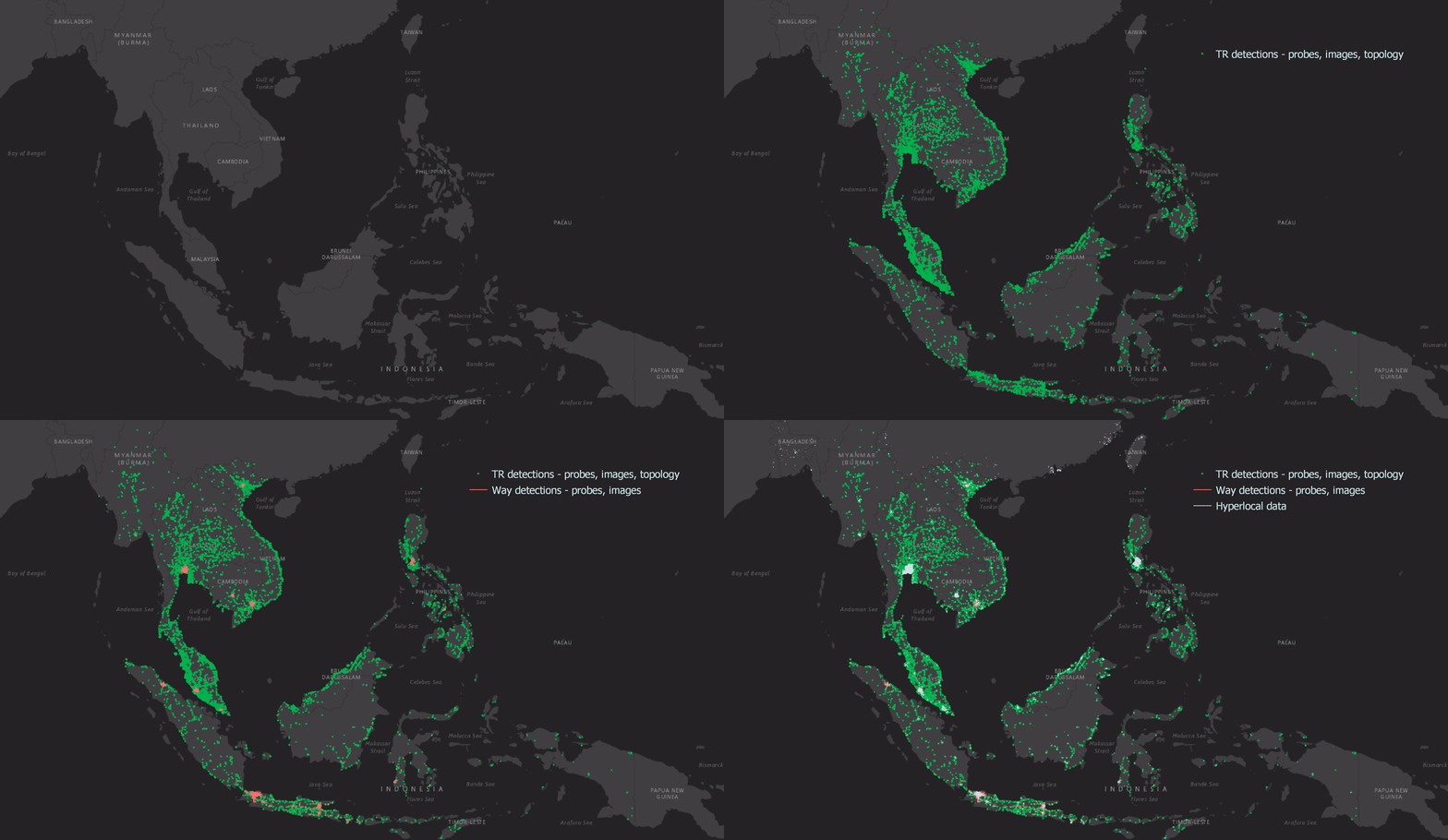
References

Graph for fraud detection

Post Syndicated from Grab Tech original https://engineering.grab.com/graph-for-fraud-detection

Grab has grown rapidly in the past few years. It has expanded its business from ride hailing to food and grocery delivery, financial services, and more. Fraud detection is challenging in Grab, because new fraud patterns always arise whenever we introduce a new business product. We cannot afford to develop a new model whenever a new fraud pattern appears as it is time consuming and introduces a cold start problem, that is no protection at the early stage. We need a general fraud detection framework to better protect Grab from various unknown fraud risks.

Our key observation is that although Grab has many different business verticals, the entities within those businesses are connected to each other (Figure 1. Left), for example, two passengers may be connected by a Wi-Fi router or phone device, a merchant may be connected to a passenger by a food order, and so on. A graph provides an elegant way to capture the spatial correlation among different entities in the Grab ecosystem. A common fraud shows clear patterns on a graph, for example, a fraud syndicate tends to share physical devices, and collusion happens between a merchant and an isolated set of passengers (Figure 1. Right).

Figure 1. Left: The graph captures different correlations in the Grab ecosystem.
Right: The graph shows that common fraud has clear patterns.

We believe graphs can help us discover subtle traces and complicated fraud patterns more effectively. Graph-based solutions will be a sustainable foundation for us to fight against known and unknown fraud risks.

Why graph?

The most common fraud detection methods include the rule engine and the decision tree-based models, for example, boosted tree, random forest, and so on. Rules are a set of simple logical expressions designed by human experts to target a particular fraud problem. They are good for simple fraud detection, but they usually do not work well in complicated fraud or unknown fraud cases.

Fraud detection methods

Utilises correlations
(Higher is better)
Detects unknown fraud
(Higher is better)
Requires feature engineering
(Lower is better)
Depends on labels
(Lower is better)
Rule engine Low N/A N/A Low
Decision tree Low Low High High
Graph model High High Low Low

Table 1. Graph vs. common fraud detection methods.

Decision tree-based models have been dominating fraud detection and Kaggle competitions for structured or tabular data in the past few years. With that said, the performance of a tree-based model is highly dependent on the quality of labels and feature engineering, which is often hard to obtain in real life. In addition, it usually does not work well in unknown fraud which has not been seen in the labels.

On the other hand, a graph-based model requires little amount of feature engineering and it is applicable to unknown fraud detection with less dependence on labels, because it utilises the structural correlations on the graph.

In particular, fraudsters tend to show strong correlations on a graph, because they have to share physical properties such as personal identities, phone devices, Wi-Fi routers, delivery addresses, and so on, to reduce cost and maximise revenue as shown in Figure 2 (left). An example of such strong correlations is shown in Figure 2 (right), where the entities on the graph are densely connected, and the known fraudsters are highlighted in red. Those strong correlations on the graph are the key reasons that make the graph based approach a sustainable foundation for various fraud detection tasks.

Figure 2. Fraudsters tend to share physical properties to reduce cost (left), and they are densely connected as shown on a graph (right).

Semi-supervised graph learning

Unlike traditional decision tree-based models, the graph-based machine learning model can utilise the graph’s correlations and achieve great performance even with few labels. The semi-supervised Graph Convolutional Network model has been extremely popular in recent years 1. It has proven its success in many fraud detection tasks across industries, for example, e-commerce fraud, financial fraud, internet traffic fraud, etc.
We apply the Relational Graph Convolutional Network (RGCN) 2 for fraud detection in Grab’s ecosystem. Figure 3 shows the overall architecture of RGCN. It takes a graph as input, and the graph passes through several graph convolutional layers to get node embeddings. The final layer outputs a fraud probability for each node. At each graph convolutional layer, the information is propagated along the neighbourhood nodes within the graph, that is nodes that are close on the graph are similar to each other.

Fig 3. A semi-supervised Relational Graph Convolutional Network model.

We train the RGCN model on a graph with millions of nodes and edges, where only a few percentages of the nodes on the graph have labels. The semi-supervised graph model has little dependency on the labels, which makes it a robust model for tackling various types of unknown fraud.

Figure 4 shows the overall performance of the RGCN model. On the left is the Receiver Operating Characteristic (ROC) curve on the label dataset, in particular, the Area Under the Receiver Operating Characteristic (AUROC) value is close to 1, which means the RGCN model can fit the label data quite well. The right column shows the low dimensional projections of the node embeddings on the label dataset. It is clear that the embeddings of the genuine passenger are well separated from the embeddings of the fraud passenger. The model can distinguish between a fraud and a genuine passenger quite well.

Fig 4. Left: ROC curve of the RGCN model on the label dataset.
Right: Low dimensional projections of the graph node embeddings.

Finally, we would like to share a few tips that will make the RGCN model work well in practice.

  • Use less than three convolutional layers: The node feature will be over-smoothed if there are many convolutional layers, that is all the nodes on the graph look similar.
  • Node features are important: Domain knowledge of the node can be formulated as node features for the graph model, and rich node features are likely to boost the model performance.

Graph explainability

Unlike other deep network models, graph neural network models usually come with great explainability, that is why a user is classified as fraudulent. For example, fraudulent accounts are likely to share hardware devices and form dense clusters on the graph, and those fraud clusters can be easily spotted on a graph visualiser 3.

Figure 5 shows an example where graph visualisation helps to explain the model prediction scores. The genuine passenger with a low RGCN score does not share devices with other passengers, while the fraudulent passenger with a high RGCN score shares devices with many other passengers, that is, dense clusters.

Figure 5. Upper left: A genuine passenger with a low RGCN score has no device sharing with other passengers. Bottom right: A fraudulent user with a high RGCN score shares devices with many other passengers.

Closing thoughts

Graphs provide a sustainable foundation for combating many different types of fraud risks. Fraudsters are evolving very fast these days, and the best traditional rules or models can do is to chase after those fraudsters given that a fraud pattern has already been discovered. This is suboptimal as the damage has already been done on the platform. With the help of graph models, we can potentially detect those fraudsters before any fraudulent activity has been conducted, thus reducing the fraud cost.

The graph structural information can significantly boost the model performance without much dependence on labels, which is often hard to get and might have a large bias in fraud detection tasks. We have shown that with only a small percentage of labelled nodes on the graph, our model can already achieve great performance.

With that said, there are also many challenges to making a graph model work well in practice. We are working towards solving the following challenges we are facing.

  • Feature initialisation: Sometimes, it is hard to initialise the node feature, for example, a device node does not carry many semantic meanings. We have explored self-supervised pre-training 4 to help the feature initialisation, and the preliminary results are promising.
  • Real-time model prediction: Realtime graph model prediction is challenging because real-time graph updating is a heavy operation in most cases. One possible solution is to do batch real-time prediction to reduce the overhead.
  • Noisy connections: Some connections on the graph are inherently noisy on the graph, for example, two users sharing the same IP address does not necessarily mean they are physically connected. The IP might come from a mobile network. One possible solution is to use the attention mechanism in the graph convolutional kernel and control the message passing based on the type of connection and node profiles.

Join us

Grab is the leading superapp platform in Southeast Asia, providing everyday services that matter to consumers. More than just a ride-hailing and food delivery app, Grab offers a wide range of on-demand services in the region, including mobility, food, package and grocery delivery services, mobile payments, and financial services across 428 cities in eight countries.

Powered by technology and driven by heart, our mission is to drive Southeast Asia forward by creating economic empowerment for everyone. If this mission speaks to you, join our team today!

References

  1. T. Kipf and M. Welling, “Semi-supervised classification with graph convolutional networks,” in ICLR, 2017 ↩

  2. Schlichtkrull, Michael, et al. “Modeling relational data with graph convolutional networks.” European semantic web conference. Springer, Cham, 2018. ↩

  3. Fujiao Liu, Shuqi Wang, et al.. “Graph Networks – 10X investigation with Graph Visualisations”. Grab Tech Blog. ↩

  4. Wang, Chen, et al.. “Deep Fraud Detection on Non-attributed Graph.” IEEE Big Data conference, PSBD, 2021. ↩

Query expansion based on user behaviour

Post Syndicated from Grab Tech original https://engineering.grab.com/query-expansion-based-on-user-behaviour

Introduction

Our consumers used to face a few common pain points while searching for food with the Grab app. Sometimes, the results would include merchants that were not yet operational or locations that were out of the delivery radius. Other times, no alternatives were provided. The search system would also have difficulties handling typos, keywords in different languages, synonyms, and even word spacing issues, resulting in a suboptimal user experience.

Over the past few months, our search team has been building a query expansion framework that can solve these issues. When a user query comes in, it expands the query to a few related keywords based on semantic relevance and user intention. These expanded words are then searched with the original query to recall more results that are high-quality and diversified. Now let’s take a deeper look at how it works.

Query expansion framework

Building the query expansion corpus

We used two different approaches to produce query expansion candidates: manual annotation for top keywords and data mining based on user rewrites.

Manual annotation for top keywords

Search has a pronounced fat head phenomenon. The most frequent thousand of keywords account for more than 70% of the total search traffic. Therefore, handling these keywords well can improve the overall search quality a lot. We manually annotated the possible expansion candidates for these common keywords to cover the most popular merchants, items and alternatives. For instance, “McDonald’s” is annotated with {“burger”, “western”}.

Data mining based on user rewrites

We observed that sometimes users tend to rewrite their queries if they are not satisfied with the search result. As a pilot study, we checked the user rewrite records within some user search sessions and found several interesting samples:

{Ya Kun Kaya Toast,Starbucks}
{healthy,Subway}
{Muni,Muji}
{奶茶,koi}
{Roti,Indian}

We can see that besides spelling corrections, users’ rewrite behaviour also reveals deep semantic relations between these pairs that cannot be easily captured by lexical similarity, such as similar merchants, merchant attributes, language differences, cuisine types, and so on. We can leverage the user’s knowledge to build a query expansion corpus to improve the diversity of the search result and user experience. Furthermore, we can use the wisdom of the crowd to find some common patterns with higher confidence.

Based on this intuition, we leveraged the high volume of search click data available in Grab to generate high-quality expansion pairs at the user session level. To augment the original queries, we collected rewrite pairs that happened to multiple users and multiple times in a time period. Specifically, we used the heuristic rules below to collect the rewrite pairs:

  • Select the sessions where there are at least two distinct queries (rewrite session)
  • Collect adjacent query pairs in the search session where the second query leads to a click but the first does not (effective rewrite)
  • Filter out the sample pairs with time interval longer than 30 seconds in between, as users are more likely to change their mind on what to look for in these pairs (single intention)
  • Count the occurrences and filter out the low-frequency pairs (confidence management)

After we have the mining pairs, we categorised and annotated the rewrite types to gain a deeper understanding of the user’s rewrite behaviour. A few samples mined from the Singapore area data are shown in the table below.

Original query Rewrite query Frequency in a month Distinct user count Type
playmade by 丸作 playmade 697 666 Drop keywords
mcdonald’s burger 573 535 Merchant -> Food
Bubble tea koi 293 287 Food -> Merchant
Kfc McDonald’s 238 234 Merchant -> Merchant
cake birthday cake 206 205 Add words
麦当劳 mcdonald’s 205 199 Locale change
4 fingers 4fingers 165 162 Space correction
krc kfc 126 124 Spelling correction
5 guys five guys 120 120 Number synonym
koi the koi thé 45 44 Tone change

We further computed the percentages of some categories, as shown in the figure below.

Figure 1. The donut chart illustrates the percentages of the distinct user counts for different types of rewrites.

Apart from adding words, dropping words and spelling corrections, a significant portion of the rewrites are in the category of Other. It is more semantic driven, such as merchant to merchant, or merchant to cuisine. Those rewrites are useful for capturing deeper connections between queries and can be a powerful diversifier to query expansion.

Grouping

After all the rewrite pairs were discovered offline through data mining, we grouped the query pairs by the original query to get the expansion candidates of each query. For serving efficiency, we limited the max number of expansion candidates to three.

Query expansion serving

Expansion matching architecture

The expansion matching architecture benefits from the recent search architecture upgrade, where the system flow is changed to a query understanding, multi-recall and result fusion flow. In particular, a query goes through the query understanding module and gets augmented with additional information. In this case, the query understanding module takes in the keyword and expands it to multiple synonyms, for example, KFC will be expanded to fried chicken. The original query together with its expansions are sent together to the search engine under the multi-recall framework. After that, results from multiple recallers with different keywords are fused together.

Continuous monitoring and feedback loop

It’s important to make sure the expansion pairs are relevant and up-to-date. We run the data mining pipeline periodically to capture the new user rewrite behaviours. Meanwhile, we also monitor the expansion pairs’ contribution to the search result by measuring the net contribution of recall or user interaction that the particular query brings, and eliminate the obsolete pairs in an automatic way. This reflects our effort to build an adaptive system.

Results

We conducted online A/B experiments across 6 countries in Southeast Asia to evaluate the expanded queries generated by our system. We set up 3 groups:

  • Control group, where no query is expanded.
  • Treatment group 1, where we expanded the queries based on manual annotations only.
  • Treatment group 2, where we expanded the queries using the data mining approach.

We observed decent uplift in click-through rate and conversion rate from both treatment groups. Furthermore, in treatment group 2, the data mining approach produced even better results.

Future work

Data mining enhancement

Currently, the data mining approach can only identify the pairs from the same search session by one user. This limits the number of linked pairs. Some potential enhancements include:

  • Augment expansion pairs by associating queries from different users who click on the same merchant/item, for example, using a click graph. This can capture relevant queries across user sessions.
  • Build a probabilistic model on top of the current transition pairs. Currently, all the transition pairs are equally weighted but apparently, the transitions that happen more often should carry higher probability/weights.

Ads application

Query expansion can be applied to advertising and would increase ads fill rate. With “KFC” expanded to “fried chicken”, the sponsored merchants who buy the keyword “fried chicken” would be eligible to show up when the user searches “KFC”. This would enable Grab to provide more relevant sponsored content to our users, which helps not only the consumers but also the merchants.

Special thanks to Zhengmin Xu and Daniel Ng for proofreading this article.

Join us

Grab is the leading superapp platform in Southeast Asia, providing everyday services that matter to consumers. More than just a ride-hailing and food delivery app, Grab offers a wide range of on-demand services in the region, including mobility, food, package and grocery delivery services, mobile payments, and financial services across 428 cities in eight countries.

Powered by technology and driven by heart, our mission is to drive Southeast Asia forward by creating economic empowerment for everyone. If this mission speaks to you, join our team today!
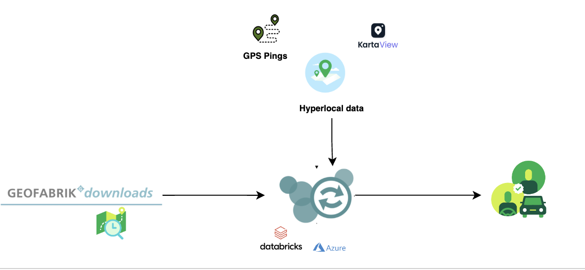
Using mobile sensor data to encourage safer driving

Post Syndicated from Grab Tech original https://engineering.grab.com/using-mobile-sensor-data-to-encourage-safer-driving

“Telematics”, a cross between the words telecommunications and informatics, was coined in the late 1970s to refer to the use of communication technologies in facilitating exchange of information. In the modern day, such technologies may include cloud platforms, mobile networks, and wireless transmissions (e.g., Bluetooth). Although the initial intention is for a more general scope, telematics is now specifically used to refer to vehicle telematics where details of vehicle movements are tracked for use cases such as driving safety, driver profiling, fleet optimisation, and productivity improvements.

We’ve previously published this article to share how Grab uses telematics to improve driver safety. In this blog post, we dive deeper into how telematics technology is used at Grab to encourage safer driving for our driver and delivery partners.

Background

At Grab, the safety of our users and their experience on our platform is our highest priority. By encouraging safer driving habits from our driver and delivery partners, road traffic accidents can be minimised, potentially reducing property damage, injuries, and even fatalities. Safe driving also helps ensure smoother rides and a more pleasant experience for consumers using our platform.

To encourage safer driving, we should:

  1. Have a data-driven approach to understand how our driver and delivery partners are driving.
  2. Help partners better understand how to improve their driving by summarising key driving history into a personalised Driving Safety Report.

Understanding driving behaviour

One of the most direct forms of driving assessment is consumer feedback or complaints. However, the frequency and coverage of this feedback is not very high as they are only applicable to transport verticals like JustGrab or GrabBike and not delivery verticals like GrabFood or GrabExpress. Plus, most driver partners tend not to receive any driving-related feedback (whether positive or negative), even for the transport verticals.

A more comprehensive method of assessing driving behaviour is to use the driving data collected during Grab bookings. To make sense of these data, we focus on selected driving manoeuvres (e.g., braking, acceleration, cornering, speeding) and detect the number of instances where our data shows unsafe driving in each of these areas.

We acknowledge that the detected instances may be subjected to errors and may not provide the complete picture of what’s happening on the ground (e.g., partners may be forced to do an emergency brake due to someone swerving into their lane).

To address this, we have incorporated several fail-safe checks into our detection logic to minimise erroneous detection. Also, any assessment of driving behaviour will be based on an aggregation of these unsafe driving instances over a large amount of driving data. For example, individual harsh braking instances may be inconclusive but if a driver partner displays multiple counts consistently across many bookings, it is likely that the partner may be used to unsafe driving practices like tailgating or is distracted while driving.

Telematics for detecting unsafe driving

For Grab to consistently ensure our consumers’ safety, we need to proactively detect unsafe driving behaviour before an accident occurs. However, it is not feasible for someone to be with our driver and delivery partners all the time to observe their driving behaviour. We should leverage sensor data to monitor these driving behaviour at scale.

Traditionally, a specialised “black box” inertial measurement unit (IMU) equipped with sensors such as accelerometers, gyroscopes, and GPS needs to be installed in alignment with the vehicle to directly measure vehicular acceleration and speed. In this manner, it would be straightforward to detect unsafe driving instances using this data. Unfortunately, the cost of purchasing and installing such devices for all our partners is prohibitively high and it would be hard to scale.

Instead, we can leverage a device that all partners already have: their mobile phone. Modern smartphones already contain similar sensors to those in IMUs and data can be collected through the telematics SDK. More details on telematics data collection can be found in a recently published Grab tech blog article1.

It’s important to note that telematics data are collected at a sufficiently high sampling frequency (much more than 1 Hz) to minimise inaccuracies in detecting unsafe driving instances characterised by sharp acceleration impulses.

Processing mobile sensor data to detect unsafe driving

Unlike specialised IMUs installed in vehicles, mobile sensor data have added challenges to detecting unsafe driving.

Accounting for orientation: Phone vs. vehicle

The phone is usually in a different orientation compared to the vehicle. Strictly speaking, the phone accelerometer sensor measures the accelerations of the phone and not the vehicle acceleration. To infer vehicle acceleration from phone sensor data, we developed a customised processing algorithm optimised specifically for Grab’s data.

First, the orientation offset of the phone with respect to the vehicle is defined using Euler angles: roll, pitch and yaw. In data windows with no net acceleration of the vehicle (e.g., no braking, turning motion), the only acceleration measured by the accelerometer is gravitational acceleration. Roll and pitch angles can then be determined through trigonometric manipulation. The complete triaxial accelerations of the phone are then rotated to the horizontal plane and the yaw angle is determined by principal component analysis (PCA).

An assumption here is that there will be sufficient braking and acceleration manoeuvring for PCA to determine the correct forward direction. This Euler angles determination is done periodically to account for any movement of phones during the trip. Finally, the raw phone accelerations are rotated to the vehicle orientation through a matrix multiplication with the rotation matrix derived from the Euler angles (see Figure 1).

Figure 1: Inference of vehicle acceleration from the phone sensor data. Smartphone and car images modified from designs found in Freepik.com.

Handling variations in data quality

Our processing algorithm is optimised to be highly robust and handle large variations in data quality that is expected from bookings on the Grab platform. There are many reported methods for processing mobile data to reorientate telematics data for four wheel vehicles23.

However, with the prevalent use of motorcycles on our platform, especially for delivery verticals, we observed that data collected from two wheel vehicles tend to be noisier due to differences in phone stability and vehicular vibrations. Data noise can be exacerbated if partners hold the phone in their hand or place it in their pockets while driving.

In addition, we also expect a wide variation in data quality and sensor availability from different phone models, such as older, low-end models to the newest, flagship models. A good example to illustrate the robustness of our algorithm is having different strategies to handle different degrees of data noise. For example, a simple low-pass filter is used for low noise data, while more complex variational decomposition and Kalman filter approaches are used for high noise data.

Detecting behaviour anomalies with thresholds

Once the vehicular accelerations are inferred, we can use a thresholding approach (see Figure 2) to detect unsafe driving instances.

For unsafe acceleration and braking, a peak finding algorithm is used to detect acceleration peaks beyond a threshold in the longitudinal (forward/backward) direction. For unsafe cornering, older and lower end phones are usually not equipped with gyroscope sensors, so we should look for peaks of lateral (sidewards) acceleration (which constitutes the centripetal acceleration during the turn) beyond a threshold. GPS bearing data that coarsely measures the orientation of the vehicle is then used to confirm that a cornering and not lane change instance is being detected. The thresholds selected are fine-tuned on Grab’s data using initial values based on published literature4 and other sources.

To reduce false positive detection, no unsafe driving instances will be flagged when:

  1. Large discrepancies are observed between speeds derived from integrating the longitudinal (forward/backward) acceleration and speeds directly measured by the GPS sensor.
  2. Large phone motions are detected. For example, when the phone falls to the seat from the dashboard, accelerations recorded on the phone sensor will deviate significantly from the vehicle accelerations.
  3. GPS speed is very low before and after the unsafe driving instance is detected. This is limited to data collected from motorcycles which is usually used by delivery partners. It implies that the partner is walking and not in a vehicle. For example, a GrabFood delivery partner may be collecting the food from the merchant partner on foot, so no unsafe driving instances should be detected.
Figure 2: Animation showing unsafe driving detection by thresholding. Dotted lines in acceleration charts indicate selected thresholds. Map tiles by stamen design.

Detecting speeding instances from GPS speeds and map data

To define speeding along a stretch of road, we used a rule-based method by comparing raw speeds from GPS pings with speeding thresholds for that road. Although GPS speeds are generally accurate (subjected to minimal GPS errors), we need to take more precautions to ensure the right speeding thresholds are determined.

These thresholds are set using known speed limits from available map data or hourly aggregated speed statistics where speed limits are not available. The coverage and accuracy of known speed limits is continuously being improved by our in-house mapping initiatives and validated comprehensively by the respective local ground teams in selected cities.

Aggregating GPS pings from Grab driver and delivery partners can be a helpful proxy to actual speed limits by defining speeding violations as outliers from socially acceptable speeds derived from partners collectively. To reliably compute aggregated speed statistics, a representative speed profile for each stretch of road must first be inferred from raw GPS pings (see Figure 3).

As ping sampling intervals are fixed, more pings tend to be recorded for slower speeds. To correct the bias in the speed profile, we reweigh ping counts by using speed values as weights. Furthermore, to minimise distortions in the speed profile from vehicles driving at lower-than-expected speeds due to high traffic volumes, only pings from free-flowing traffic are used when inferring the speed profile.

Free-flowing traffic is defined by speeds higher than the median speed on each defined road category (e.g., small residential roads, normal primary roads, large expressways). To ensure extremely high speeds are flagged regardless of the speed of other drivers, maximum threshold values for aggregated speeds are set for each road category using heuristics based on the maximum known speed limit of that road category.

Figure 3: Steps to infer a representative speed profile for computing aggregated speed statistics.

Besides a representative speed profile, hourly aggregation should also include data from a sufficient number of unique drivers depending on speed variability. To obtain enough data, hourly aggregations are performed on the same day of the week over multiple weeks. This way, we have a comprehensive time-specific speed profile that accounts for traffic quality (e.g., peak hour traffic, traffic differences between weekdays/weekends) and driving conditions (e.g., visibility difference between day/night).

When detecting speeding violations, the GPS pings used are snapped-to-road and stationary pings, pings with unrealistic speeds, while pings with low GPS accuracy (e.g., when the vehicle is in a tunnel) are excluded. A speeding violation is defined as a sequence of consecutive GPS pings that exceed the speeding threshold. The following checks were put in place to minimise erroneous flagging of speeding violations:

  1. Removal of duplicated (or stale) GPS pings.
  2. Sufficient speed buffer given to take into account GPS errors.
  3. Sustained speeding for a prolonged period of time is required to exclude transient speeding events (e.g., during lane change).

Driving safety report

The driving safety report is a platform safety product that driver and delivery partners can access via their driver profile page on the Grab Driver Application (see Figure 4). It is updated daily and aims to create awareness regarding driving habits by summarising key information from the processed data into a personalised report that can be easily consumed.

Individual reports of each driving manoeuvre (e.g., braking, acceleration, cornering and speeding) are available for daily and weekly views. Partners can also get more detailed information of each individual instance such as when these unsafe driving instances were detected.

Figure 4: Driving safety report for driver and delivery partners using four wheel vehicles. a) Actionable insights feature circled by red dotted lines. b) Daily view of various unsafe driving instances where more details of each instance can be viewed by tapping on “See details”.

Actionable insights

Besides compiling the instances of unsafe driving in a report to create awareness, we are also using these data to provide some actionable recommendations for our partners to improve their driving.

With unsafe driving feedback from consumers and reported road traffic accident data from our platform, we also train machine learning models to identify patterns in the detected unsafe driving instances and estimate the likelihood of partners receiving unsafe driving feedback or getting into accidents. One use case is to compute a safe driving score that equates a four-wheel partner’s driving behaviour to a numerical value where a higher score indicates a safer driver.

Additionally, we use Shapley additive explanation (SHAP) approaches to determine which driving manoeuvre contributes the most to increasing the likelihood of partners receiving unsafe driving feedback or getting into accidents. This information is included as an actionable insight in the driving safety report and helps partners to identify the key area to improve their driving.

What’s next?

At the moment, Grab performs telematics processing and unsafe driving detections after the trip and updates the report the next day. One of the biggest improvements would be to share this information with partners faster. We are actively working on developing a real-time processing algorithm that addresses this and also, satisfies the robustness requirements such that partners are immediately aware after an unsafe driving instance is detected.

Besides detecting typical unsafe driving manoeuvres, we are also exploring other use cases for mobile sensor data in road safety such as detection of poor road conditions, counterflow driving against traffic, and phone usage leading to distracted driving.

Join us

Grab is the leading superapp platform in Southeast Asia, providing everyday services that matter to consumers. More than just a ride-hailing and food delivery app, Grab offers a wide range of on-demand services in the region, including mobility, food, package and grocery delivery services, mobile payments, and financial services across 428 cities in eight countries.

Powered by technology and driven by heart, our mission is to drive Southeast Asia forward by creating economic empowerment for everyone. If this mission speaks to you, join our team today!
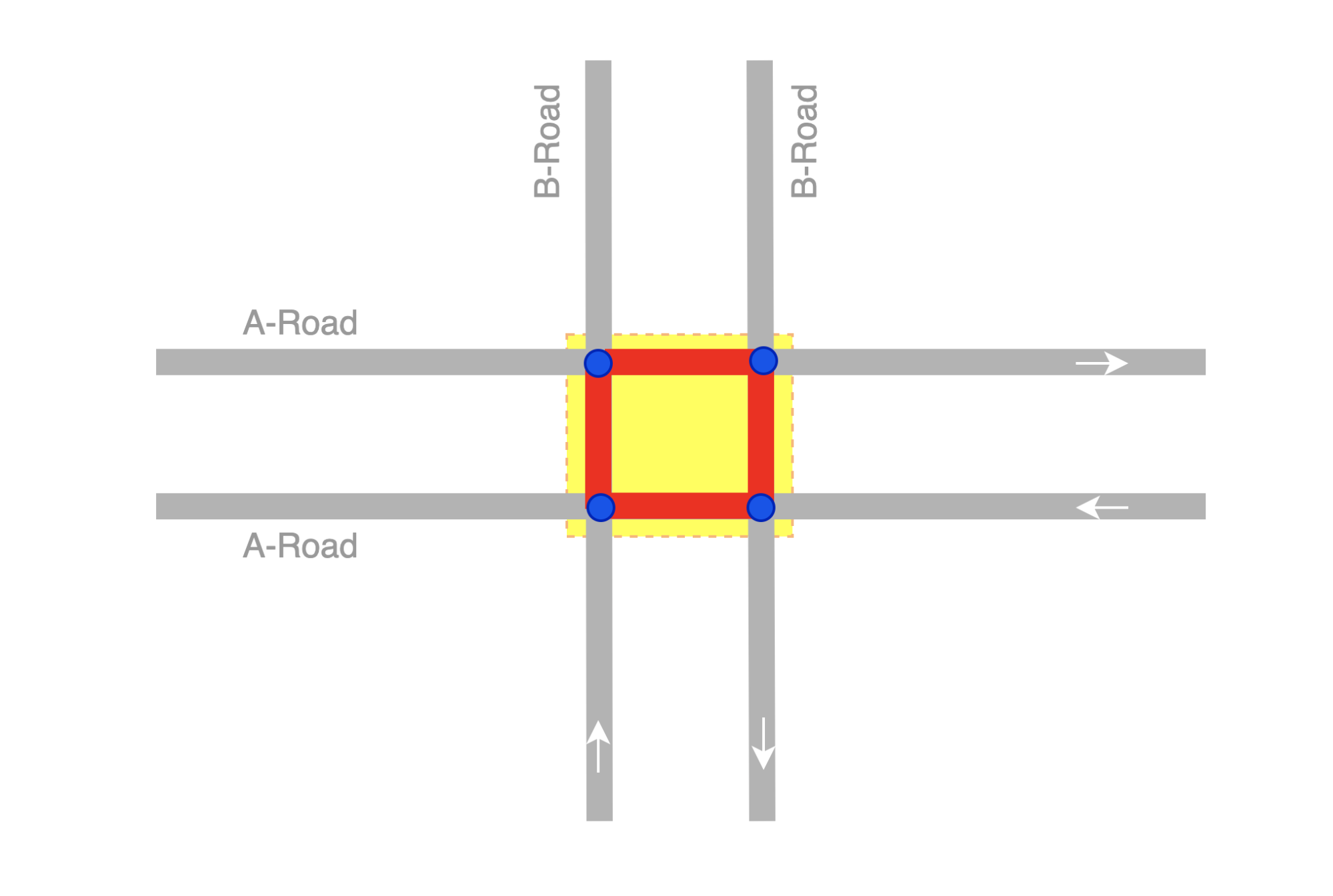
References

  1. Burhan, W. (2022). How telematics helps Grab to improve safety. Grab Tech Blog. https://engineering.grab.com/telematics-at-grab ↩

  2. Mohan, P., Padmanabhan, V.N. and Ramjee, R. (2008).Nericell: rich monitoring of road and traffic conditions using mobile smartphones. SenSys ‘08: Proceedings of the 6th ACM conference on Embedded network sensor systems, 312-336. https://doi.org/10.1145/1460412.1460444 ↩

  3. Sentiance (2016). Driving behavior modeling using smart phone sensor data. Sentiance Blog. https://sentiance.com/2016/02/11/driving-behavior-modeling-using-smart-phone-sensor-data/ ↩

  4. Yarlagadda, J. and Pawar, D.S. (2022). Heterogeneity in the Driver Behavior: An Exploratory Study Using Real-Time Driving Data. Journal of Advanced Transportation. vol. 2022, Article ID 4509071. https://doi.org/10.1155/2022/4509071 ↩

Data ethics for computing education through ballet and biometrics

Post Syndicated from Sue Sentance original https://www.raspberrypi.org/blog/data-ethics-computing-education-ballet-biometrics-research-seminar/

For our seminar series on cross-disciplinary computing, it was a delight to host Genevieve Smith-Nunes this September. Her research work involving ballet and augmented reality was a perfect fit for our theme.

Genevieve Smith-Nunes.
Genevieve Smith-Nunes

Genevieve has a background in classical ballet and was also a computing teacher for several years before starting Ready Salted Code, an educational initiative around data-driven dance. She is now coming to the end of her doctoral studies at the University of Cambridge, in which she focuses on raising awareness of data ethics using ballet and brainwave data as narrative tools, working with student Computing teachers.

Why dance and computing?

You may be surprised that there are links between dance, particularly ballet, and computing. Genevieve explained that classical ballet has a strict repetitive routine, using rule-based choreography and algorithms. Her work on data-driven dance had started at the time of the announcement of the new Computing curriculum in England, when she realised the lack of gender balance in her computing classroom. As an expert in both ballet and computing, she was driven by a desire to share the more creative elements of computing with her learners.

Two photographs of data-driven ballets.
Two of Genevieve’s data-driven ballet dances: [arra]stre and [PAIN]byte

Genevieve has been working with a technologist and a choreographer for several years to develop ballets that generate biometric data and include visualisation of such data — hence her term ‘data-driven dance’. This has led to her developing a second focus in her PhD work on how Computing students can discuss questions of ethics based on the kind of biometric and brainwave data that Genevieve is collecting in her research. Students need to learn about the ethical issues surrounding data as part of their Computing studies, and Genevieve has been working with student teachers to explore ways in which her research can be used to give examples of data ethics issues in the Computing curriculum.

Collecting data during dances

Throughout her talk, Genevieve described several examples of dances she had created. One example was [arra]stre, a project that involved a live performance of a dance, plus a series of workshops breaking down the computer science theory behind the performance, including data visualisation, wearable technology, and images triggered by the dancers’ data.

A presentation slide describing technologies necessary for motion capture of ballet.

Much of Genevieve’s seminar was focused on the technologies used to capture movement data from the dancers and the challenges this involves. For example, some existing biometric tools don’t capture foot movement — which is crucial in dance — and also can’t capture movements when dancers are in the air. For some of Genevieve’s projects, dancers also wear headsets that allow collection of brainwave data.

A presentation slide describing technologies necessary for turning motion capture data into 3D models.

Due to interruptions to her research design caused by the COVID-19 pandemic, much of Genevieve’s PhD research took place online via video calls. New tools had to be created to capture dance performances within a digital online setting. Her research uses webcams and mobile phones to record the biometric data of dancers at 60 frames per second. A number of processes are then followed to create a digital representation of the dance: isolating the dancer in the raw video; tracking the skeleton data; using post pose estimation machine learning algorithms; and using additional software to map the joints to the correct place and rotation.

A presentation slide describing technologies necessary turning a 3D computer model into an augmented reality object.

Are your brainwaves personal data?

It’s clear from Genevieve’s research that she is collecting a lot of data from her research participants, particularly the dancers. The projects include collecting both biometric data and brainwave data. Ethical issues tied to brainwave data are part of the field of neuroethics, which comprises the ethical questions raised by our increasing understanding of the biology of the human brain.

A graph of brainwaves placed next to ethical questions related to brainwave data.

Teaching learners to be mindful about how to work with personal data is at the core of the work that Genevieve is doing now. She mentioned that there are a number of ethics frameworks that can be used in this area, and highlighted the UK government’s Data Ethics Framework as being particularly straightforward with its three guiding principles of transparency, accountability, and fairness. Frameworks such as this can help to guide a classroom discussion around the security of the data, and whether the data can be used in discriminatory ways.

Brainwave data visualisation using the Emotiv software.

Data ethics provides lots of material for discussion in Computing classrooms. To exemplify this, Genevieve recorded her own brainwaves during dance, research, and rest activities, and then shared the data during workshops with student computing teachers. In our seminar Genevieve showed two visualisations of her own brainwave data (see the images above) and discussed how the student computing teachers in her workshops had felt that one was more “personal” than the other. The same brainwave data can be presented as a spreadsheet, or a moving graph, or an image. Student computing teachers felt that the graph data (shown above) felt more medical, and more like permanent personal data than the visualisation (shown above), but that the actual raw spreadsheet data felt the most personal and intrusive.

Watch the recording of Genevieve’s seminar to see her full talk:

You can also access her slides and the links she shared in her talk.

More to explore

There are a variety of online tools you can use to explore augmented reality: for example try out Posenet with the camera of your device.

Genevieve’s seminar used the title ME++, which refers to the data self and the human self: both are important and of equal value. Genevieve’s use of this term is inspired by William J. Mitchell’s book Me++: The Cyborg Self and the Networked City. Within his framing, the I in the digital world is more than the I of the physical world and highlights the posthuman boundary-blurring of the human and non-human. 

Genevieve’s work is also inspired by Luciani Floridi’s philosophical work, and his book Ethics of Information might be something you want to investigate further. You can also read ME++ Data Ethics of Biometrics Through Ballet and AR, a paper by Genevieve about her doctoral work

Join our next seminar

In our final two seminars for this year we are exploring further aspects of cross-disciplinary computing. Just this week, Conrad Wolfram of Wolfram Technologies joined us to present his ideas on maths and a core computational curriculum. We will share a summary and recording of his talk soon.

On 2 November, Tracy Gardner and Rebecca Franks from our team will close out this series by presenting work we have been doing on computing education in non-formal settings. Sign up now to join us for this session:

We will shortly be announcing the theme of a brand-new series of seminars starting in January 2023.  

The post Data ethics for computing education through ballet and biometrics appeared first on Raspberry Pi.

Automatic rule backtesting with large quantities of data

Post Syndicated from Grab Tech original https://engineering.grab.com/automatic-rule-backtesting

Introduction

Analysts need to analyse and simulate a rule on historical data to check the performance and accuracy of the rule. Backtesting enables analysts to run simulations of the rules and manage the results from the rule engine UI.

Backtesting helps analysts to:

  • Define the desired impact of the rule for our business and users.
  • Evaluate the accuracy of the rule based on historical data.
  • Compare and analyse results with data points, such as known false positives, user segments, risk profile of a user or transaction, and so on.

Currently, the analytics process to test performance of a rule is not standardised, and is inaccurate and inefficient. Analysts from different teams have different approaches:

  • Offline process using Presto tables. This process is lengthy and inaccurate.
  • Offline process based on the rule engine payload. The setup takes time, and the process is not streamlined.
  • Running rules in shadow mode. This process takes days to get the desired result.
  • A team in Grab uses different rule engines to manage rules and do backtesting. This doubles the effort for analysts and engineers.

In our vision for backtesting, it should allow analysts to:

  • Efficiently run and manage their jobs.
  • Create custom metrics, reports and dimensions for backtesting.
  • Add external data points and metrics to do a deep dive.

For the purpose of establishing a minimum viable product (MVP), backtesting will support basic capabilities and enable analysts to access required metrics and data points. Thus, analysts can:

  • Run backtesting jobs from the rule engine UI.
  • Get fixed reports and dimensions for every checkpoint.
  • Get access to relevant data to analyse backtesting results.

Background

Assume a simple use case: A rule to detect the transaction risk. 

Each transaction has a transaction_id, user_id, currency, amount, timestamp. The rule engine also provides a treatment (Approve or Decline) based on the rule logic for the transaction.

In this specific use case, we would like to see what will be the aggregation number of the total transactions, total distinct users, and the sum of the amount, based on the dimensions of date, treatment, and currency in the last couple of weeks.

The result may look like the following data:

Dimension     Dimension     Dimension     metric     metric        metric    
Date Treatment Currency Total tx Distinct user     Total amount
2020-05-1 Approve SGD 100 80 10020
2020-05-1 Decline SGD 50 40 450
2020-05-1 Approve MYR 110 100 1200
2020-05-1 Decline MYR 30 15 400

* This data does not reflect actual Grab data and is for illustrative purposes only.

Solution

  • Use a cloud-agnostic Spark-based data pipeline to replay any existing or proposed rule to check performance.
  • Use a Web Portal to:
    • Create or select a rule to replay, with replay time range.
    • Display and download the result, such as total events and hit counts.
  • Replay any existing or proposed rule for checking performance.
  • Allow users to create or select a rule to replay in the rule engine UI, with provided replay time range.
  • Display the replay result in the rule engine UI, such as total events and hit counts.
  • Provide a way to download all testing results in the rule engine UI (for example, all rule responses).
  • Remove dependency on the specific cloud provider stack, so other teams in Grab can use it instead of Google Cloud Platform (GCP).

Architecture details

The rule editor UI reacts to the user input. Its engine sends a job command to the Amazon Simple Queue Service (SQS) to initialise the job. After that, the rule editor also performs the following processes in the background:

  • Lambda listens to the request SQS queue and invokes a job via the Spark jobs API.
  • The job fetches the executable artifacts, data source. After the job is completed, the job script saves the result sheet as required to S3.
  • The Spark script pushes the job final status (success, failure, timeout) through the shutdown hook to respond to the SQS queue.
  • The rule editor engine listens to response callback messages, and processes the job metadata to the database, or sends notifications.
  • The rule editor displays the job metadata on the UI.
  • The package pipeline builds and deploys the executable artifacts to S3 as a manageable structure.
  • The Spark script takes the filter logic as its input parameters.

Workflow

Historical data preparation

The historical events are published by the rule engine through Kafka, and stored into the S3 bucket based on time. The Backtesting system then fetches these data for testing based on the time range requested.

By using a Kubernetes stream pipeline, we also save the trust inference stream to Trust AWS subaccount. With the customer bucket and file format, we can improve the efficiency of the data processing, and also avoid any delay from the data lake.

Engineering specifications

  • Target location:
    s3a://stg-trust-inference-event/<engine-name>/<predict-name>/<YYYY>/MM/DD/hh/mm/ss/<000001>.snappy.parquet
    s3a://prd-trust-inference-event/<engine-name>/<predict-name>/<YYYY>/MM/DD/hh/mm/ss/<000001>.snappy.parquet

Description: Following the fields of steam definition, the engine name would be ruleengine, or catwalk. The predict-name would be preride (checkpoint name), or cnpu (model name).

  • File Format: avro
  • File Compression: Snappy
  • There is no auto retention on sub-account S3. We will implement the archive process in the future. 
  • The default pipeline and the new pipeline will run in parallel until the Data Engineering team is ready to retire the default pipeline.

Backtesting

  • Upon scheduling, the Backtesting Portal sends a message to SQS, which is then captured by the listening Lambda.
  • Lambda invokes a Spark job over the AWS elastic mapreduce engine (EMR).
  • The EMR engine fetches the executable artifacts containing the rule script and historical data from S3, and starts a Spark job to apply the rule script over historical data. Depending on the size of data, the Spark cluster will scale automatically to ensure timely completion.
  • Once completed, a report file is generated and available on Backtesting UI.

UI

Learnings and conclusions

After the release, here’s what our data analysers had to say:

  • For trust analysts, testing a rule on historical data happens outside the rule engine UI and is not user-friendly, leading to analysts wasting significant time.
  • For financial analysts, as analysts migrate to the rule engine UI, the existing solution will be deprecated with no other solution.
  • An alternative to simulate a rule;  we no longer need to run a rule in shadow mode because we can use historical data to determine the outcome. This new approach saves us weeks of effort on the rule onboarding process.

What’s next?

The underlying Spark jobs in this tool were developed by knowledgeable data engineers, which is a disadvantage because it requires a high level of expertise to modify the analytics. To mitigate this restriction, we are looking into using domain-specific language (DSL) to allow users to input desired attributes and dimensions, and provide the job release pipeline for self-serving jobs.


Thanks to Jia Long Loh for the support on the offline infrastructure engineering.

Join us

Grab is the leading superapp platform in Southeast Asia, providing everyday services that matter to consumers. More than just a ride-hailing and food delivery app, Grab offers a wide range of on-demand services in the region, including mobility, food, package and grocery delivery services, mobile payments, and financial services across 428 cities in eight countries.

Powered by technology and driven by heart, our mission is to drive Southeast Asia forward by creating economic empowerment for everyone. If this mission speaks to you, join our team today!
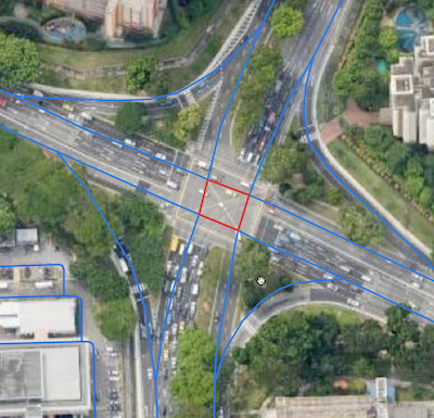
Improving the accuracy of our machine learning WAF using data augmentation and sampling

Post Syndicated from Vikram Grover original https://blog.cloudflare.com/data-generation-and-sampling-strategies/

Improving the accuracy of our machine learning WAF using data augmentation and sampling

Improving the accuracy of our machine learning WAF using data augmentation and sampling

At Cloudflare, we are always looking for ways to make our customers’ faster and more secure. A key part of that commitment is our ongoing investment in research and development of new technologies, such as the work on our machine learning based Web Application Firewall (WAF) solution we announced during security week.

In this blog, we’ll be discussing some of the data challenges we encountered during the machine learning development process, and how we addressed them with a combination of data augmentation and generation techniques.

Let’s jump right in!

Introduction

The purpose of a WAF is to analyze the characteristics of a HTTP request and determine whether the request contains any data which may cause damage to destination server systems, or was generated by an entity with malicious intent. A WAF typically protects applications from common attack vectors such as cross-site-scripting (XSS), file inclusion and SQL injection, to name a few. These attacks can result in the loss of sensitive user data and damage to critical software infrastructure, leading to monetary loss and reputation risk, along with direct harm to customers.

How do we use machine learning for the WAF?

The Cloudflare ML solution, at a high level, trains a classifier to distinguish between various traffic types and attack vectors, such as SQLi, XSS, Command Injection, etc. based on structural or statistical properties of the content. This is achieved by performing the following operations:

  1. We inspect the raw HTTP input and perform some number of transformations on it such as normalization, content substitutions, or de-duplication.
  2. Decompose or partition it via some process of tokenization, generate statistical information about the content, or extract structural data.
  3. Compute optimal internal numerical representations of the inputs via the process of training the model. The nature of these internal representations depends on the class of model and architecture.
  4. Learn to map internal content representations against classes (XSS, SQLi or others), scores or some other target of interest.
  5. At run-time, use previously learned representations and mappings to analyze a new input and provide the most likely label or score for it. The score ranges from 1 to 99, with 1 indicating that the request is almost certainly malicious and 99 indicating that the request is probably clean.
Improving the accuracy of our machine learning WAF using data augmentation and sampling

This reasonable starting point stumbles immediately upon a critical challenge right from the start: we need high quality labeled data, and lots of it as that has the biggest impact on model performance. Contrary to well-researched fields like image recognition, text sentiment analysis, or classification, large datasets of HTTP requests with malicious payloads embedded are difficult to get.

To make matters even harder, strict implementation requirements for a production-quality WAF restrict the complexity of our potential ML models or architectures to ones that are relatively simple and light-weight, implying that we cannot simply pave over shortcomings of the data.

Data and challenges

The selection of a dataset is likely the most difficult of all the aspects that contribute to the final set of attributes of a machine learning model. In most cases, the model is tasked with learning the distribution of the data in some statistical sense, thus choosing and curating the dataset to ensure that the desired properties of the final solution are even possible to learn is incredibly crucial! ML models are only as reliable as the data used to train them. If we train an ML model on an incomplete dataset, or on data that doesn’t accurately represent the population, predictions might be inaccurate as they will be a direct reflection of the data.

To build a strong ML WAF, a good dataset must have large volumes of heterogeneous data covering malicious samples for all attack categories, a diverse set of negative/benign samples, and samples representing a broad spectrum of obfuscation techniques.

Due to those constraints, creating a solid dataset has a number of challenges:

Privacy

Privacy requirements limit data availability and how it can be used. Cloudflare has strict privacy guidelines and does not keep all request data – it simply isn’t available, and what is available must be carefully selected, anonymised, and stripped of sensitive information.

Heterogeneity of samples

Due to the wide assortment of potential request content types and forms, finding enough benign samples is difficult. Furthermore, it is challenging to collect data that represents requests with various charsets and content-encodings. Covering all attack configurations is also important because some attacks can be inserted into essentially any kind of request (e.g. five bytes in a huge “regular” request)

Sample difficulty

We want a dataset with a good mix of attack techniques and isn’t dominated by the ones that are easily generated by tools which simply swap out constants, transform expressions through invariants, and so on (sqli-fuzzer). Additionally, the vast majority of freely available samples in the wild are fairly trivial auto-generated payloads as part of indiscriminate scanning and discovery tools. They have very similar structural and statistical characteristics. Some of them are fairly old as well and do not reflect the current software landscape. How to “grade” the sample difficulty is not immediately obvious! What’s easy to a human may not be easy for a particular preprocessor/model, and vice-versa.

Noisy labels

Label noise affects results a lot, especially when it comes to esoteric, specific, or unusual attacks which are likely to be classified as benign by rules WAF.

What’s the strategy to overcome this?

Data augmentation

In simple terms, Data Augmentation is a process of generating artificial (but realistic) data to increase the diversity of our data by studying statistical distribution of existing real-world data.

This is crucial for us because one of the biggest concerns with rules-based WAFs is false positives. False positives are a serious challenge for WAFs because the risk of accidentally filtering legitimate traffic deters users from employing very strict rulesets. Data augmentation is used to build a solution that does not rely on observing specific high-risk keywords or character sequences, but instead uses a more holistic analysis of content and context, making it considerably less likely to block legitimate requests.

There are many sequences of characters which appear almost exclusively in payloads, but are themselves not dangerous. In order to reduce false positives and improve overall performance, we focussed on generating a lot of heterogeneous negative samples to force the model to consider the structural, semantic, and statistical properties of the content when making a classification decision.

In the context of our data and use cases, data augmentation means that we mutate benign content in a variety of ways as the content will remain benign (this isn’t going to accidentally turn it into a valid payload, with probability 1). For instance, we can add random character noise, permute keywords, merge benign content together from multiple sources, and so on. Alternatively, we can seed benign content with ‘dangerous’ keywords or ngrams frequently occuring in payloads – this results in a benign sample, but ideally will teach the model not to be too sensitive to the presence of malicious tokens lacking the proper semantics and structure.

Benign content

First and foremost, generating benign content is way easier. Mutating a malicious block of content into different malicious blocks is difficult because malicious payloads have a stricter grammar and syntax than general HTTP content due to the fact that it has code, therefore they must be manipulated in a specific manner.

However, there are a few options  if we want to do this in the future. Tools like sqli-fuzzer,  automates the process of fuzzing a given payload by applying transformations which preserve the underlying semantics while changing the representation or adding obfuscation. Outside existing third-party tools, it’s possible to generate our own malicious payloads using various “append malicious content to non-malicious content” techniques, with the trade off that this doesn’t actually generate *new* malicious content, just puts it into a different context.

Pseudo-random noise samples

A useful approach we identified for bolstering the number of negative training samples was to generate large quantities of pseudo-random strings of increasing complexity.

The probability of any pseudo-random string (drawn from essentially any token distribution) being a valid payload or malicious attack is essentially zero, but we can build a series of token sampling distributions that make it increasingly difficult for the model to distinguish them from a real payload, and we discovered that this resulted in dramatically better performance in terms of false positive rate, robustness, and overall model properties.

This approach works by taking a collection of tokens and a probability distribution over these tokens, and independently sampling a stream of tokens from it to create our ‘sample’. Each sample length is selected from a separate discrete sample length distribution.

For an extremely simple example, we could take a token collection consisting of ASCII characters and a uniform sampling distribution:

['a', 'b', 'c', 'd', 'e', 'f', 'g', 'h', 'i', 'j', 'k', 'l', 'm', 'n', 'o', 'p', 'q', 'r', 's', 't', 'u', 'v', 'w', 'x', 'y', 'z', '0', '1', '2', '3', '4', '5', '6', '7', '8', '9']

We sample random strings of length 0-32 from this to get some (uninteresting) negative samples:

8hwk1d740hfstbb4aogbpi4qayppvdl41b6blornuzktp4yl

1deq7rug1zftmn9tjr73yttjnye99zh2140z2x9lr8n6sxhucdgn6bmqvfv7auw8fwbkrtxilk45ht-

We wouldn’t expect even a very simple model to struggle to learn that these samples are benign,  but as we increase the complexity of the token collections, we can move towards much more ‘difficult’ noise examples, including elements such as: fragments of valid URIs, user agents, XML/XSLT content or even restricted language identifiers, or keywords.

Here are some examples of more complex token collections and the kinds of random strings they produce as our negative samples:

Ascii_script: alphanumeric characters plus  ‘<‘, ‘>’, ‘/’, ‘</’, ‘-‘, ‘+’, ‘=’, ‘< ‘, ‘ >’, ‘ ‘, ‘ />’

Improving the accuracy of our machine learning WAF using data augmentation and sampling

alphanumerics, plus special characters, plus a variant of full javascript or sql keywords and (multi-character) sub-token fragments

Improving the accuracy of our machine learning WAF using data augmentation and sampling

It’s fairly straightforward to construct a suite of these noise generators of varying complexity, and targeting different types of content: JSON, XML, URIs with SQL-esque ‘noise’, and so on. As the strings get sufficiently long, the probability that they will contain at least some dangerous looking subsequences grows, so it’s also an excellent test of model robustness.

We make extensive use of noise strings to enhance the core dataset used for training and testing the model by directly training the model on increasingly difficult noise before fine-tuning on exclusively real data, appending noise of varying complexity to malicious(real) samples or benign samples to both induce and test for model robustness for padding attacks, and estimating false positive rate for certain classes of benign content.

Beyond independent sampling of random strings?

A natural extension to the above method for generating pseudo-random strings is to drop the ‘independence’ assumption for sampling tokens. This means that we’re starting to emulate the process by which real data is generated, to some extent, yielding samples with increasingly realistic local (and eventually global) structure. Some approaches for this might include a simple Markov chain, and extend all the way to state-of-the-art Large Language Models.

We experimented with using contemporary autoregressive language models trained on our corpus of real malicious payloads and found it extremely effective at generating novel payloads, as well as transforming payloads into sophisticated obfuscated representations. As the language models approached convergence on the data the likelihood of each sample being a valid payload approached 100%, allowing us to use early samples as ‘extremely strong negatives’ and the later samples as positive samples. The success of this work has suggested that deeper investigation into the use of language models for security analysis may be fruitful, not only for training classifiers, but also for creating powerful adversarial pen-testing agents.

Results summary

Let’s see a comparative summary of results and improvements, before and after the augmentation:

Model performance on evaluation metrics

The effectiveness of machine learning models for classification problems can be evaluated using a wide range of metrics, including accuracy, precision, recall, F1 Score, and others. It is important to note that in addition to using quantitative metrics, we also consider the model’s general properties and behavioral constraints. This criteria and metrics-based approach is especially important in our domain where data is inherently noisy, labels are not trustworthy, the domain of the inputs is extremely large, and hard to cover with samples.

For this post, we will concentrate on key quantitative metrics like F1 score even though we examine a variety of metrics to assess the model performance. F1 score is the weighted average (harmonic mean) of precision and recall. We can represent the F1 score with the formula:

Improving the accuracy of our machine learning WAF using data augmentation and sampling

Where,

True Positives (TP): malicious content classified correctly by the model

False Positives (FP): benign content that the model classified as malicious

True Negatives (TN): benign content classified correctly by the model

False Negatives (FN): malicious content that the model classified as benign

Since this formula takes false positives and false negatives into consideration, this score is more reliable than other metrics. There are a few methods to calculate this for multi-class problems, like Macro F1 Score, Micro F1 Score and Weighted F1 Score. Although each method has advantages and disadvantages, we obtained nearly identical results with all three methods. Below are the numbers:

Without Augmentation With Augmentation
Class Precision Recall F1 Score Precision Recall F1 Score
Benign 0.69 0.17 0.27 0.98 1.00 0.99
SQLi 0.77 0.96 0.85 1.00 1.00 1.00
XSS 0.56 0.94 0.70 1.00 0.98 0.99
Total(Micro Average) 0.67 0.99
Total(Macro Average) 0.67 0.69 0.61 0.99 0.99 0.99
Total(Weighted Average) 0.68 0.67 0.60 0.99 0.99 0.99

The important takeaway is that the range of this F1 score is best at 1 and worst at 0.

The model after augmentation appears to have similar precision and recall with good overall performance, as indicated by a value of 0.99 after augmentation, compared to 0.61 for Macro F1.

So far in the results summary, we’ve only discussed F1 Score; however, there are other improvements in characteristics that we’ve observed in the model that are listed below:

False positive characteristics

  • Estimated false positive rate reduced by approximately 80% on test data sets. There are significantly fewer false positives involving PromQL and other SQL-structured analogues. PromQL examples result in high scores and are classified correctly:
Improving the accuracy of our machine learning WAF using data augmentation and sampling

Today, the only major category of false positives are literal SQL or JavaScript files.

  • General false positive rate on noise from JSON-esque, XML/SOAP-esque, and SQL-esque content-generators reduced to about a 1/100,000 rate from about 1/50 to 1/1.

True positive characteristics

  • True positive rate for highly fuzzed content is vastly improved. Models trained solely on real data were easily bypassed by advanced fuzzing tools, whereas models trained on real plus augmented data are extremely resistant, with many payloads receiving higher risk scores as fuzzing increases. Examples:
Improving the accuracy of our machine learning WAF using data augmentation and sampling

These yield approximately same scores as they are a result of only a few byte   alterations

  • Proportion of client-provided test sets that primarily contain payloads not blocked by rules-waf for XSS/SQLi successfully classified is about 97.5% (with the remaining 2.5% being arguable) up from about 91%.
  • Padding a payload with almost any amount of ASCII, JSON-esque, special-characters, or other content will not reduce the risk score substantially. Due to the addition of hard noise long length augmented training samples, even a six byte payload in a 100 kilobyte string will be caught. Examples:
Improving the accuracy of our machine learning WAF using data augmentation and sampling

They both generate similar scores even though the latter has junk padding around the payload.

Execution performance

  • Runtime characteristics are unchanged for inference.

On top of that, we validated the model against the Cloudflare’s highly mature signature-based WAF and confirmed that machine learning WAF performs comparable to signature WAF, with the ML WAF demonstrating its strength particularly in cases of correctly handling highly obfuscated or irregularly fuzzed content (as well as avoiding some rules-based engine false positives). ​​Finally, we were able to conclude that augmentation helps in improving the model performance and induce the right set of properties.

Conclusion

We built a machine learning powered WAF, with the substantial challenge to gather a diversified training set, given constraints to avoid sensitive real customer data for privacy and regulatory considerations. To create a broader and diversified dataset without requiring vast amounts of sensitive data, we used techniques such as fuzzing, data augmentation, and synthetic data generation. This allowed us to improve the solution’s false positive robustness and overall model performance.

Furthermore, these techniques reduced the time complexity required to retrieve/clean real data, and helped induce the correct model behavior. In the future, we intend to investigate autoregressive language models to generate synthetic pseudo-valid payloads.

How we store and process millions of orders daily

Post Syndicated from Grab Tech original https://engineering.grab.com/how-we-store-millions-orders

Introduction

In the real world, after a passenger places a GrabFood order from the Grab App, the merchant-partner will prepare the order. A driver-partner will then collect the food and deliver it to the passenger. Have you ever wondered what happens in the backend system? The Grab Order Platform is a distributed system that processes millions of GrabFood or GrabMart orders every day. This post aims to share the journey of how we designed the database solution that powers the order platform.

Background

What are the design goals when building the database solution? We collected the requirements by analysing query patterns and traffic patterns.

Query patterns

Here are some important query examples that the Order Platform supports:

  1. Write queries:

    a. Create an order.

    b. Update an order.

  2. Read queries:

    a. Get order by id.

    b. Get ongoing orders by passenger id.

    c. Get historical orders by various conditions.

    d. Get order statistics (for example, get the number of orders)

We can break down queries into two categories: transactional queries and analytical queries. Transactional queries are critical to online order creation and completion, including the write queries and read queries such as 2a or 2b. Analytical queries like 2c and 2d retrieves historical orders or order statistics on demand. Analytical queries are not essential to the oncall order processing.

Traffic patterns

Grab’s Order Platform processes a significant amount of transaction data every month.

During peak hours, the write Queries per Second (QPS) is three times of primary key reads; whilst the range Queries per Second are four times of the primary key reads.

Design goals

From the query and traffic patterns, we arrived at the following three design goals:

  1. Stability – the database solution must be able to handle high read and write QPS. Online order processing queries must have high availability. Even when some part of the system is down, we must be able to provide a degraded experience to the end users allowing them to still be able to create and complete an order.
  2. Scalability and cost – the database solution must be able to support fast evolution of business requirements, given now we handle up to a million orders per month. The solution must also be cost effective at a large scale.
  3. Consistency – strong consistency for transactional queries, and eventually consistency for analytical queries.

Solution

The first design principle towards a stable and scalable database solution is to use different databases to serve transactional and analytical queries, also known as OLTP and OLAP queries. An OLTP database serves queries critical to online order processing. This table keeps data for only a short period of time. Meanwhile, an OLAP database has the same set of data, but serves our historical and statistical queries. This database keeps data for a longer time.

What are the benefits from this design principle? From a stability point of view, we can choose different databases which can better fulfil our different query patterns and QPS requirements. An OLTP database is the single source of truth for online order processing; any failure in the OLAP database will not affect online transactions. From a scalability and cost point of view, we can choose a flexible database for OLAP to support our fast evolution of business requirements. We can maintain less data in our OLTP database while keeping some older data in our OLAP database.

To ensure that the data in both databases are consistent, we introduced the second design principle – data ingestion pipeline. In Figure 1, Order Platform writes data to the OLTP database to process online orders and asynchronously pushes the data into the data ingestion pipeline. The data ingestion pipeline ensures that the OLAP database data is eventually consistent.

Figure 1: Order Platform database solution overview

Architecture details

OLTP database

There are two categories of OLTP queries, the key-value queries (for example, load by order id) and the batch queries (for example, Get ongoing orders by passenger id). We use DynamoDB as the database to support these OLTP queries.

Why DynamoDB?

  1. Scalable and highly available: the tables of DynamoDB are partitioned and each partition is three-way replicated.
  2. Support for strong consistent reads by primary key.
  3. DynamoDB has a mechanism called adaptive capacity to handle hotkey traffic. Internally, DynamoDB will distribute higher capacity to high-traffic partitions, and isolate frequently accessed items to a dedicated partition. This way, the hotkey can utilise the full capacity of an entire partition, which is up to 3000 read capacity units and 1000 write capacity units.
Figure 2: DynamoDB table structure overview. Source: Amazon Web Services (2019, 28 April)

In each DynamoDB table, it has many items with attributes. In each item, it has a partition key and sort key. The partition key is used for key-value queries, and the sort key is used for range queries. In our case, the table contains multiple order items. The partition key is order ID. We can easily support key-value queries by the partition key.

order_id (PK) state pax_id created_at pax_id_gsi
order1 Ongoing Alice 9:00am
order2 Ongoing Alice 9:30am
order3 Completed Alice 8:30am

Batch queries like ‘Get ongoing orders by passenger id’ are supported by DynamoDB Global Secondary Index (GSI). A GSI is like a normal DynamoDB table, which also has keys and attributes.

In our case, we have a GSI table where the partition key is the pax_id_gsi. The attribute pax_id_gsi is linked to the main table. It is eventually consistent with the main table that is maintained by DynamoDB. If the Order Platform queries ongoing orders for Alice, two items will be returned from the GSI table.

pax_id_gsi (PK) created_at (SK) order_id
Alice 9:00am order1
Alice 9:30am order2

We also make use of an advanced feature of GSI named sparse index to support ongoing order queries. When we update order status from ongoing to completed, at the same time, we set the pax_id_gsi to empty, so that the linked item in the GSI will be automatically deleted by DynamoDB. At any time, the GSI table only stores the ongoing orders. We use a sparse index mechanism to control our table size for better performance and to be more cost effective.

The next problem is data retention. This is achieved with the DynamoDB Time To Live (TTL) feature. DynamoDB will auto-scan expired items and delete them. But the challenge is when we add TTL to big tables, it will bring a heavy load to the background scanner and might result in an outage. Our solution is to only add a TTL attribute to the new items in the table. Then, we manually delete the items without TTL attributes, and run a script to delete items with TTL attributes that are too old. After this process, the table size will be quite small, so we can enable the TTL feature on the TTL attribute that we previously added without any concern. The retention period of our DynamoDB data is three months.

Costwise, DynamoDB is charged by storage size and the provision of the read write capability. The provision capability is actually auto scalable. The cost is on-demand. So it’s generally cheaper than RDS.

OLAP database

We use MySQL RDS as the database to support historical and statistical OLAP queries.

Why not Aurora? We choose RDS mainly because it is a mature database solution. Even if Aurora can provide better high-availability, RDS is enough to support our less critical use cases. Costwise, Aurora charges by data storage and the number of requested Input/Output Operations per Second (IOPS). RDS charges only by data storage. As we are using General Purpose (SSD) storage, IOPS is free and supports up to 16k IOPS.

We use MySQL partitioning for data retention. The order table is partitioned by creation time monthly. Since the data access pattern is mostly by month, the partition key can reduce cross-partition queries. Partitions older than six months are dropped at the beginning of each month.

Data ingestion pipeline

Figure 3: Data Ingestion Pipeline Architecture.

A Kafka stream is used to process data in the data ingestion pipeline. We choose the Kafka stream, because it has 99.95% SLA. It is not restricted by the OLTP and OLAP database types.

Even if Kafka can provide 99.95% SLA, there is still the chance of stream producer failures. When the producer fails, we will store the message in an Amazon Simple Queue Service (SQS) and retry. If the retry also fails, it will be moved to the SQS dead letter queue (DLQ), to be consumed at a later time.

On the stream consumer side, we use back-off retry at both stream and database levels to ensure consistency. In a worst-case scenario, we can rewind the stream events from Kafka.

It is important for the data ingestion pipeline to handle duplicate messages and out-of-order messages.

Duplicate messages are handled by the database level unique key (for example, order ID + creation time).

For the out-of-order messages, we implemented the following two mechanisms:

  1. Version update: we only update the most recently updated data. The precision of the update time is in microseconds, which is enough for most of the use cases.
  2. Upsert: if the update events occur before the create events, we simulate an upsert operation.

Impact

After launching our solution this year, we have saved significantly on cloud costs. In the earlier solution, Order Platform synchronously writes to DynamoDB and Aurora and the data is kept forever.

Conclusion

In terms of stability, we use DynamoDB as the critical OLTP database to ensure high availability for online order processing. Scalability wise, we use RDS as the OLAP database to support our quickly evolving business requirements by using a rich, multiple index. Cost efficiency is achieved by data retention in both databases. For consistency, we built a single source of truth OLTP database and an OLAP database that is eventually consistent with the help of the data ingestion pipeline.

What’s next?

Currently, the database solution is running on the production environment. Even though the database solution is proven to be stable, scalable and consistent, we still see some potential areas of improvement.

We use MySQL RDS for OLAP data storage. Even though MySQL is stable and cost effective, it is difficult to serve more complicated queries like free text search. Hence, we plan to explore other NoSQL databases like ElasticSearch.

We hope this post helps you understand how we store Grab orders and fulfil the queries from the Grab Order Platform.

References

Amazon Web Services. (2019, 28 April) Build with DynamoDB: S1 E1 – Intro to Amazon DynamoDB [Video]. YouTube.

Join us

Grab is the leading superapp platform in Southeast Asia, providing everyday services that matter to consumers. More than just a ride-hailing and food delivery app, Grab offers a wide range of on-demand services in the region, including mobility, food, package and grocery delivery services, mobile payments, and financial services across 428 cities in eight countries.

Powered by technology and driven by heart, our mission is to drive Southeast Asia forward by creating economic empowerment for everyone. If this mission speaks to you, join our team today!
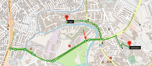
Graph Networks – 10X investigation with Graph Visualisations

Post Syndicated from Grab Tech original https://engineering.grab.com/graph-visualisation

Introduction

Detecting fraud schemes used to require investigations using large amounts and varying types of data that come from many different anti-fraud systems. Investigators then need to combine the different types of data and use statistical methods to uncover suspicious claims, which is time consuming and inefficient in most cases.

We are always looking for ways to improve fraud investigation methods and stay one step ahead of our ever-growing fraudsters. In the introductory blog of this series, we’ve mentioned experimenting with a set of Graph Network technologies, including Graph Visualisation.

In this post, we will introduce our Graph Visualisation Platform and briefly illustrate how it makes fraud investigations easier and more effective.

Why visualise a graph?

If you’re a fan of crime shows, you would have come across scenes like a detective putting together evidence, such as pictures, notes and articles, on a board and connecting them with thumb tacks and yarn. When you look at the board, it’s easy to see the relationships between the different pieces of evidence. That’s what graphs do, especially in fraud detection.

In the same way, while graph data is the raw material of an investigation, some of the most interesting relationships are often inferred rather than modelled directly in the data. Visualising these relationships can give a unique “big picture” of the data that is difficult or impossible to obtain with traditional relational tables and business intelligence tools.

On the other hand, graph visualisation enhances the quick identification of relationships and significant structures because it is an intuitive way to help detect patterns. Plus, the human brain processes visual information much faster; that’s where our Graph Visualisation platform comes in.

What is the Graph Visualisation platform?

Graph Visualisation platform is a full-featured investigation platform that can reveal hidden connections and context in data by transforming raw records into highly visual and interactive maps. From there, investigators can grab any data point and quickly see relationships, patterns, and anomalies, and if necessary, drill down to investigate further.

This is all done without writing a manual query, switching between anti-fraud systems, or having to think about data science! These are some of the interactions on the platform that easily make anomalies or relevant patterns stand out.

Expanding the data

To date, we have over three billion nodes and edges in our storage system. It is not possible (nor necessary) to show all of the data at once. The platform allows the user to grab any data point and easily expand to view the relationships.

Timeline tracking and history replay

The Graph Visualisation platform’s interactive time filter lets you see temporal relationships within your data and clearly reveals the chronological progression of events. You can start with a specific time of interest, track everything that happens after, then quickly focus on the time and relationships that matter most.

10X investigations

Here are a few examples of how the Graph Visualisation platform facilitates fraud investigations.

Appeal confirmation

The following image shows the difference between a true fraudster and a falsely identified one. On the left, we have a Grab rental corporate account that was falsely detected by a fraud rule. Upon review, we discovered that there is no suspicious connection to this account, thus the account got unblocked.

On the right, we have a passenger that was blocked by the system and they appealed. Investigations showed that the passenger is, in fact, part of an extremely dense device-sharing network, so we maintained our decision to block.

Modus operandi discovery

Passenger sharing device

Fraudsters tend to share physical resources to maximise their revenue. With our Graph Visualisation platform, you can see exactly how this pattern looks like. The image below shows a device that is shared by a lot of fraudsters.

Anti-money laundering (AML)

On the left, we see a pattern of healthy spending on Grab. However, on the right, we can see that passengers are highly connected, and it has frequent large amount transfers to other payment providers.

Closing thoughts

Graph Visualisation is an intuitive way to investigate suspicious connections and potential patterns of crime. Investigators can directly interact with any data point to get the details they need and literally view the relationships in the data to make fast, accurate, and defensible decisions.

While fraud detection is a good use case for Graph Visualisation, it’s not the only possibility. Graph Visualisation can help make anything more efficient and intelligent, especially if you have highly connected data.

In the next part of this blog series, we will talk about the Graph service platform and the importance of building graph services with graph databases. Check out the other articles in this series:

Join us

Grab is the leading superapp platform in Southeast Asia, providing everyday services that matter to consumers. More than just a ride-hailing and food delivery app, Grab offers a wide range of on-demand services in the region, including mobility, food, package and grocery delivery services, mobile payments, and financial services across 428 cities in eight countries.

Powered by technology and driven by heart, our mission is to drive Southeast Asia forward by creating economic empowerment for everyone. If this mission speaks to you, join our team today!
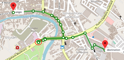
How facial recognition technology keeps you safe

Post Syndicated from Grab Tech original https://engineering.grab.com/facial-recognition

Facial recognition technology is one of the many modern technologies that previously only appeared in science fiction movies. The roots of this technology can be traced back to the 1960s and have since grown dramatically due to the rise of deep learning techniques and accelerated digital transformation in recent years.

In this blog post, we will talk about the various applications of facial recognition technology in Grab, as well as provide details of the technical components that build up this technology.

Application of facial recognition technology  

At Grab, we believe in prevention, protection, and action to create a safer every day for our consumers, partners, and the community as a whole. All selfies collected by Grab are handled according to Grab’s Privacy Policy and securely protected under privacy legislation in the countries in which we operate. We will elaborate in detail in a section further below.

One key incident prevention method is to verify the identity of both our consumers and partners:

  • From the perspective of protecting the safety of passengers, having a reliable driver authentication process can avoid unauthorized people from delivering a ride. This ensures that trips on Grab are only completed by registered licensed driver-partners that have passed our comprehensive background checks.
  • From the perspective of protecting the safety of driver-partners, verifying the identity of new passengers using facial recognition technology helps to deter crimes targeting our driver-partners and make incident investigations easier.


Safety incidents that arise from lack of identity verification

Facial recognition technology is also leveraged to improve Grab digital financial services, particularly in facilitating the “electronic Know Your Customer” (e-KYC) process. KYC is a standard regulatory requirement in the financial services industry to verify the identity of customers, which commonly serves to deter financial crime, such as money laundering.

Traditionally, customers are required to visit a physical counter to verify their government-issued ID as proof of identity. Today, with the widespread use of mobile devices, coupled with the maturity of facial recognition technologies, the process has become much more seamless and can be done entirely digitally.

Figure 1: GrabPay wallet e-KYC regulatory requirements in the Philippines

Overview of facial recognition technology

Figure 2: Face recognition flow

The typical facial recognition pipeline involves multiple stages, which starts with image preprocessing, face anti-spoof, followed by feature extraction, and finally the downstream applications – face verification or face search.

The most common image preprocessing techniques for face recognition tasks are face detection and face alignment. The face detection algorithm locates the face region in an image, and is usually followed by face alignment, which identifies the key facial landmarks (e.g. left eye, right eye, nose, etc.) and transforms them into a standardised coordinate space. Both of these preprocessing steps aim to ensure a consistent quality of input data for downstream applications.

Face anti-spoof refers to the process of ensuring that the user-submitted facial image is legitimate. This is to prevent fraudulent users from stealing identities (impersonating someone else by using a printed photo or replaying videos from mobile screens) or hiding identities (e.g. wearing a mask). The main approach here is to extract low-level spoofing cues, such as the moiré pattern, using various machine learning techniques to determine whether the image is spoofed.

After passing the anti-spoof checks, the user-submitted images are sent for face feature extraction, where important features that can be used to distinguish one person from another are extracted. Ideally, we want the feature extraction model to produce embeddings (i.e. high-dimensional vectors) with small intra-class distance (i.e. faces of the same person) and large inter-class distance (i.e. faces of different people), so that the aforementioned downstream applications (i.e. face verification and face search) become a straightforward task – thresholding the distance between embeddings.

Face verification is one of the key applications of facial recognition and it answers the question, “Is this the same person?”. As previously alluded to, this can be achieved by comparing the distance between embeddings generated from a template image (e.g. government-issued ID or profile picture) and a query image submitted by the user. A short distance indicates that both images belong to the same person, whereas a large distance indicates that these images are taken from different people.

Face search, on the other hand, tackles the question, “Who is this person?”, which can be framed as a vector/embedding similarity search problem. Image embeddings belonging to the same person would be highly similar, thus ranked higher, in search results. This is particularly useful for deterring criminals from re-onboarding to our platform by blocking new selfies that match a criminal profile in our criminal denylist database.

Face anti-spoof

For face anti-spoof, the most common methods used to attack the facial recognition system are screen replay and printed paper. To distinguish these spoof attacks from genuine faces, we need to solve two main challenges.

The first challenge is to obtain enough data of spoof attacks to enable the training of models. The second challenge is to carefully train the model to focus on the subtle differences between spoofed and genuine cases instead of overfitting to other background information.

Figure 3: Original face (left), screen replay attack (middle), synthetic data with a moiré pattern (right)

Source 1

Collecting large volumes of spoof data is naturally hard since spoof cases in product flows are very rare. To overcome this problem, one option is to synthesise large volumes of spoof data instead of collecting the real spoof data. More specifically, we synthesise moiré patterns on genuine face images that we have, and use the synthetic data as the screen replay attack data. This allows our model to use small amounts of real spoof data and sufficiently identify spoofing, while collecting more data to train the model.

Figure 4: Data preparation with patch data

On the other hand, a spoofed face image contains lots of information with subtle spoof cues such as moiré patterns that cannot be detected by the naked eye. As such, it’s important to train the model to identify spoof cues instead of focusing on the possible domain bias between the spoof data and genuine data. To achieve this, we need to change the way we prepare the training data.

Instead of using the entire selfie image as the model input, we firstly detect and crop the face area, then evenly split the cropped face area into several patches. These patches are used as input to train the model. During inference, images are also split into patches the same way and the final result will be the average of outputs from all patches. After this data preprocessing, the patches will contain less global semantic information and more local structure features, making it easier for the model to learn and distinguish spoofed and genuine images.

Face verification

“Data is food for AI.” – Andrew Ng, founder of Google Brain

The key success factors of artificial intelligence (AI) models are undoubtedly driven by the volume and quality of data we hold. At Grab, we have one of the largest and most comprehensive face datasets, covering a wide range of demographic groups in Southeast Asia. This gives us a strong advantage to build a highly robust and unbiased facial recognition model that serves the region better.

As mentioned earlier, all selfies collected by Grab are securely protected under privacy legislation in the countries in which we operate. We take reasonable legal, organisational and technical measures to ensure that your Personal Data is protected, which includes measures to prevent Personal Data from getting lost, or used or accessed in an unauthorised way. We limit access to these Personal Data to our employees on a need to know basis. Those processing any Personal Data will only do so in an authorised manner and are required to treat the information with confidentiality.

Also, selfie data will not be shared with any other parties, including our driver, delivery partners or any other third parties without proper authorisation from the account holder. They are strictly used to improve and enhance our products and services, and not used as a means to collect personal identifiable data. Any disclosure of personal data will be handled in accordance with Grab Privacy Policy.

Figure 5: Semi-Siamese architecture (source)

Other than data, model architecture also plays an important role, especially when handling less common face verification scenarios, such as ”selfie to ID photo” and “selfie to masked selfie” verifications.  

The main challenge of “selfie to ID photo” verification is the shallow nature of the dataset, i.e. a large number of unique identities, but a low number of image samples per identity. This type of dataset lacks representation in intra-class diversity, which would commonly lead to model collapse during model training. Besides, “selfie to ID photo” verification also poses numerous challenges that are different from general facial recognition, such as aging (old ID photo), attrited ID card (normal wear and tear), and domain difference between printed ID photo and real-life selfie photo.

To address these issues, we leveraged a novel training method named semi-Siamese training (SST) 2, which is proposed by Du et al. (2020). The key idea is to enlarge intra-class diversity by ensuring that the backbone Siamese networks have similar parameters, but are not entirely identical, hence the name “semi-Siamese”.

Just like typical Siamese network architecture, feature vectors generated by the subnetworks are compared to compute the loss functions, such as Arc-softmax, Triplet loss, and Large margin cosine loss, all of which aim to reduce intra-class distance while increasing the inter-class distances. With the usage of the semi-Siamese backbone network, intra-class diversity is further promoted as it is guaranteed by the difference between the subnetworks, making the training convergence more stable.

Figure 6: Masked face verification

Another type of face verification problem we need to solve these days is the “selfie to masked selfie” verification. To pass this type of face verification, users are required to take off their masks as previous face verification models are unable to verify people with masks on. However, removing face masks to do face verification is inconvenient and risky in a crowded environment, which is a pain for many of our driver-partners who need to do verification from time to time.

To help ease this issue, we developed a face verification model that can verify people even while they are wearing masks. This is done by adding masked selfies into the training data and training the model with both masked and unmasked selfies. This not only enables the model to perform verification for people with masks on, but also helps to increase the accuracy of verifying those without masks. On top of that, masked selfies act as data augmentation and help to train the model with stronger ability of extracting features from the face.


As previously mentioned, once embeddings are produced by the facial recognition models, face search is fundamentally no different from face verification. Both processes use the distance between embeddings to decide whether the faces belong to the same person. The only difference here is that face search is more computationally expensive, since face verification is a 1-to-1 comparison, whereas face search is a 1-to-N comparison (N=size of the database).

In practice, there are many ways to significantly reduce the complexity of the search algorithm from O(N), such as using Inverted File Index (IVF) and Hierarchical Navigable Small World (HNSW) graphs. Besides, there are also various methods to increase the query speed, such as accelerating the distance computation using GPU, or approximating the distances using compressed vectors. This problem is also commonly known as Approximate Nearest Neighbor (ANN). Some of the great open-sourced vector similarity search libraries that can help to solve this problem are ScaNN3 (by Google), FAISS4(by Facebook), and Annoy (by Spotify).

What’s next?

In summary, facial recognition technology is an effective crime prevention and reduction tool to strengthen the safety of our platform and users. While the enforcement of selfie collection by itself is already a strong deterrent against fraudsters misusing our platform, leveraging facial recognition technology raises the bar by helping us to quickly and accurately identify these offenders.

As technologies advance, face spoofing patterns also evolve. We need to continuously monitor spoofing trends and actively improve our face anti-spoof algorithms to proactively ensure our users’ safety.

With the rapid growth of facial recognition technology, there is also a growing concern regarding data privacy issues. At Grab, consumer privacy and safety remain our top priorities and we continuously look for ways to improve our existing safeguards.

In May 2022, Grab was recognised by the Infocomm Media Development Authority in Singapore for its stringent data protection policies and processes through the award of Data Protection Trustmark (DPTM) certification. This recognition reinforces our belief that we can continue to draw the benefits from facial recognition technology, while avoiding any misuse of it. As the saying goes, “Technology is not inherently good or evil. It’s all about how people choose to use it”.

Join us

Grab is the leading superapp platform in Southeast Asia, providing everyday services that matter to consumers. More than just a ride-hailing and food delivery app, Grab offers a wide range of on-demand services in the region, including mobility, food, package and grocery delivery services, mobile payments, and financial services across 428 cities in eight countries.

Powered by technology and driven by heart, our mission is to drive Southeast Asia forward by creating economic empowerment for everyone. If this mission speaks to you, join our team today!

References

  1. Niu, D., Guo R., and Wang, Y. (2021). Moiré Attack (MA): A New Potential Risk of Screen Photos. Advances in Neural Information Processing Systems. https://papers.nips.cc/paper/2021/hash/db9eeb7e678863649bce209842e0d164-Abstract.html ↩

  2. Du, H., Shi, H., Liu, Y., Wang, J., Lei, Z., Zeng, D., & Mei, T. (2020). Semi-Siamese Training for Shallow Face Learning. European Conference on Computer Vision, 36–53. Springer. ↩

  3. Guo, R., Sun, P., Lindgren, E., Geng, Q., Simcha, D., Chern, F., & Kumar, S. (2020). Accelerating Large-Scale Inference with Anisotropic Vector Quantization. International Conference on Machine Learning. https://arxiv.org/abs/1908.10396 ↩

  4. Johnson, J., Douze, M., & Jégou, H. (2019). Billion-scale similarity search with GPUs. IEEE Transactions on Big Data, 7(3), 535–547. ↩

Automated Experiment Analysis – Making experimental analysis scalable

Post Syndicated from Grab Tech original https://engineering.grab.com/automated-experiment-analysis

Introduction

Trustworthy experiments are key to making sound decisions, so analysts and data scientists put a lot of effort into analysing them and making business impacts. An extension of Grab’s Experimentation (GrabX) platform, Automated Experiment Analysis is one of Grab’s data products that helps automate statistical analyses of experiments. It also provides automatic experimental data pipelines and customised tests for different types of experiments.

Designed to help Grab in its journey of innovation and data-driven decision making, the data product helps to:

  1. Standardise and automate the basic experiment analysis process on Grab experiments.
  2. Ensure post-experiment results are reproducible under a company-wide standard, and easily reviewed by each other.
  3. Democratise the institutional knowledge of experimentation across functions.

Background

Today, the GrabX platform provides the ability to define, configure, and execute online controlled experiments (OCEs), often called A/B tests, to gather trustworthy data and make data-driven decisions about how to improve our products.

Before the automated analysis, each experiment was analysed manually on an ad-hoc basis. This manual and federated model brings in several challenges at the company level:

  1. Inefficiency: Repetitive nature of data pipeline building and basic post-experiment analyses incur large costs and deplete the analysts’ bandwidth from running deeper analyses.
  2. Lack of quality control: Risk of unstandardised, inaccurate or late results as the platform cannot exercise data-governance/control or extend offerings to Grab’s other entities.
  3. Lack of scalability and availability: GrabX users have varied backgrounds and skills, making their approaches to experiments different and not easily transferable/shared. E.g. Some teams may use more advanced techniques to speed up their experiments without using too much resources but these techniques are not transferable without considerable training.

Solution

Architecture details

Point multiplier
Architecture diagram

When users set up experiments on GrabX, they can configure the success metrics they are interested in. These metrics configurations are then stored in the metadata as “bronze”, “silver”, and “gold” datasets depending on the corresponding step in the automated data pipeline process.

Metrics configuration and “bronze” datasets

In this project, we have developed a metrics glossary that stores information about what the metrics are and how they are computed. The metrics glossary is stored in CosmoDB and serves as an API Endpoint for GrabX so users can pick from the list of available metrics. If a metric is not available, users can input their custom metrics definition.

This metrics selection, as an analysis configuration, is then stored as a “bronze” dataset in Azure Data Lake as metadata, together with the experiment configurations. Once the experiment starts, the data pipeline gathers all experiment subjects and their assigned experiment groups from our clickstream tracking system.

In this case, the experiment subject refers to the facets of the experiment. For example, if the experiment subject is a user, then the user will go through the same experience throughout the entire experimentation period.

Metrics computation and “silver” datasets

In this step, the metrics engine gathers all metrics data based on the metrics configuration and computes the metrics for each experiment subject. This computed data is then stored as a “silver” dataset and is the foundation dataset for all statistical analyses.

“Silver” datasets are then passed through the “Decision Engine” to get the final “gold” datasets, which contain the experiment results.

Results visualisation and ”gold” datasets

In “gold” datasets, we have the result of the experiment, along with some custom messages we want to show our users. These are saved in sets of fact and dim tables (typically used in star schemas).

For users to visualise the result on GrabX, we leverage the embedded Power BI visualisation. We build the visualisation using a “gold” dataset and embed it to each experiment page with a fixed filter. By doing so, users can experience the end-to-end flow directly from GrabX.

Implementation

The implementation consists of four key engineering components:

  1. Analysis configuration setup
  2. A data pipeline
  3. Automatic analysis
  4. Results visualisation

Analysis configuration is part of the experiment setup process where users select success metrics they are interested in. This is an essential configuration for post-experiment analysis, in addition to the usual experiment configurations (e.g. sampling strategies).

It ensures that the reported experiment results will align with the hypothesis setup, which helps avoid one of the common pitfalls in OCEs 1.

There are three types of metrics available:

  1. Pre-defined metrics: These metrics are already defined in the Scribe datamart, e.g. Gross Merchandise Value (GMV) per pax.
  2. Event-based metrics: Users can specify an ad-hoc metric in the form of a funnel with event names for funnel start and end.
  3. Build your own metrics: Users have the flexibility to define a metric in the form of a SQL query.

A data pipeline here mainly consists of data sourcing and data processing. We use Azure Data Factory to schedule ETL pipelines so we can calculate the metrics and statistical analysis. ETL jobs are written in spark and run using Databricks.

Data pipelines are streamlined to the following:

  1. Load experiments and metrics metadata, defined at the experiment creation stage.
  2. Load experiment and clickstream events.
  3. Load experiment assignments. An experiment assignment maps a randomisation unit ID to the corresponding experiment or variant IDs.
  4. Merge the data mentioned above for each experiment variant, and obtain sufficient data to do a deeper results analysis.

Automatic analysis uses an internal python package “Decision Engine”, which decouples the dataset and statistical tests, so that we can incrementally improve applications of advanced techniques. It provides a comprehensive set of test results at the variant level, which include statistics, p-values, confidence intervals, and the test choices that correspond to the experiment configurations. It’s a crowdsourced project which allows all to contribute what they believe should be included in fundamental post-experiment analysis.

Results visualisation leverages PowerBI, which is embedded in the GrabX UI, so users can run the experiments and review the results on a single platform. 

Impact

At the individual user level, Automated Experiment Analysis is designed to enable analysts and data scientists to associate metrics with experiments, and present the experiment results in a standardised and comprehensive manner. It speeds up the decision-making process and frees up the bandwidths of analysts and data scientists to conduct deeper analyses.

At the user community level, it improves the efficiency of running experimental analysis by capturing all experiments, their results, and the launch decision within a single platform.

Learnings/Conclusion

Automated Experiment Analysis is the first building block to boost the trustworthiness of OCEs in Grab. Not all types of experiments are fully onboard, and they might not need to be. Through this journey, we believe these key learnings would be useful for experimenters and platform teams:

  1. To standardise and simplify several experimental analysis steps, there needs to be automation data pipelines, analytics tools, and a metrics store in the infrastructure.
  2. The “Decision Engine” analytics tool should be decoupled from the other engineering components, so that it can be incrementally improved in future.
  3. To democratise knowledge and ensure service coverage, many components need to have a crowdsourcing feature, e.g. the metrics store has a BYOM function, and “Decision Engine” is an open-sourced internal python package.
  4. Tracking implementation is important. To standardise data pipelines and achieve scalability, we need to standardise the way we implement tracking.

What’s next?

A centralised metric store –  We built a metric calculation dictionary, which currently contains around 30-40 basic business metrics, but its functionality is limited to GrabX Experimentation use case.

If the metric store is expected to serve more general uses, it needs to be further enriched by allowing some “smarts”, e.g. fabric-agnostic metrics computations 2, other types of data slicing, and some considerations with real-time metrics or signals.

An end-to-end experiment guide rail – Currently, we provide automatic data analysis after an experiment is done, but no guardrail features at multiple experiment stages, e.g. sampling strategy choices, sample size recommendation from the planning stage, and data quality check during/after the experiment windows. Without the end-to-end guardrails, running experiments will be very prone to pitfalls. We therefore plan to add some degree of automation to ensure experiments adhere to the standards used by the post-experimental analysis.

A more comprehensive analysis toolbox – The current state of the project mainly focuses on infrastructure development, so it starts with basic frequentist’s A/B testing approaches. In future versions, it can be extended to include sequential testing, CUPED 3, attribution analysis, Causal Forest, heterogeneous treatment effects, etc.

Join us

Grab is the leading superapp platform in Southeast Asia, providing everyday services that matter to consumers. More than just a ride-hailing and food delivery app, Grab offers a wide range of on-demand services in the region, including mobility, food, package and grocery delivery services, mobile payments, and financial services across 428 cities in eight countries.

Powered by technology and driven by heart, our mission is to drive Southeast Asia forward by creating economic empowerment for everyone. If this mission speaks to you, join our team today!
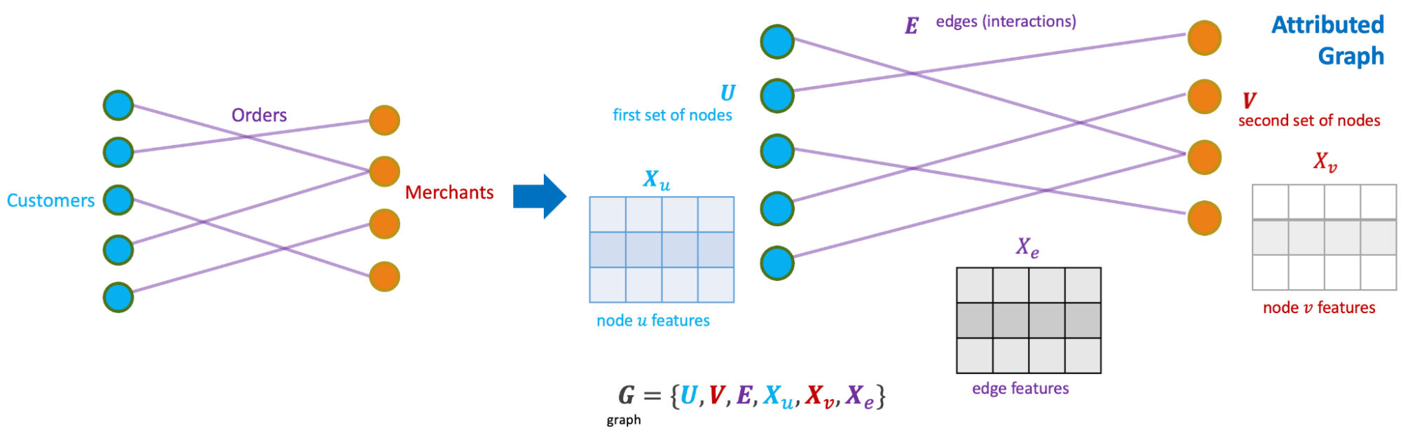
References

  1. Dmitriev, P., Gupta, S., Kim, D. W., & Vaz, G. (2017, August). A dirty dozen: twelve common metric interpretation pitfalls in online controlled experiments. In Proceedings of the 23rd ACM SIGKDD international conference on knowledge discovery and data mining (pp. 1427-1436). ↩

  2. Metric computation for multiple backends, Craig Boucher, Ulf Knoblich, Dan Miller, Sasha Patotski, Amin Saied, Microsoft Experimentation Platform ↩

  3. Deng, A., Xu, Y., Kohavi, R., & Walker, T. (2013, February). Improving the sensitivity of online controlled experiments by utilising pre-experiment data. In Proceedings of the sixth ACM international conference on Web search and data mining (pp. 123-132). ↩