Post Syndicated from The History Guy: History Deserves to Be Remembered original https://www.youtube.com/watch?v=1OGyKka62zo
What’s Up, Home? – Thumbs up!
Post Syndicated from Janne Pikkarainen original https://blog.zabbix.com/whats-up-home-thumbs-up/20677/
In my previous blog post, I wrote about how I monitor my home with Zabbix. This week, I am showing how I utilize Grafana to visualize the data collected by Zabbix and what are my plans to further improve all this.

What’s on TV, honey?
First of all, one of the reasons I am building my home Grafana dashboards is that they can look fantastic. Combine that with the fact that nowadays it is super easy to cast your screen to the living room TV — or even access Grafana by using TV’s built-in web browser –, and you have one heck of a situational awareness screen. Not that it would really be needed at home, but hey, a real-time dashboard easily beats your average soap opera. I am sure my wife would not appreciate the idea that we would stare at Grafana all night long, but that is a different story altogether. I digress.
The other reason why I am building all this? I have monitored all kinds of IT stuff since 2001, and have done some very creative gymnastics with Nagios and Zabbix, so now it’s time to try out monitoring The Real World . So far I have found out it is very similar to monitoring IT (duh).
Let’s dive into details

Above you can see a glimpse of my overall status Grafana dashboard. That’s actually all I have now, though it scrolls down for a page or two more.
The page provides me some really interesting information from battery levels to light status to firmware status of our devices. I will create some sub-dashboards and a Grafana playlist (slideshow), so our living room Mission Control TV can then show all the nuts and bolts of our home. Actually, we only have one TV and again, I am sure my wife would not appreciate The Grafana TV Show for too long, but one can dream.
Implemented so far:
- Smart power outlet on/off status
- Smart light bulbs on/off status
- Info if our kitchen speaker is playing or not
- Reachability status of different IoT devices we have around
- Firmware status (is an upgrade needed or not) of our IoT devices
- Amount of light (lux) status reported by Philips Hue motion sensors
- Battery level monitoring of IoT devices; very good info to know especially about the smoke alarm device
- Temperature monitoring in different rooms and outdoors
- Humidity monitoring in different rooms and outdoors
- Tons of details about our home Internet router; operational status of network ports, incoming/outgoing bandwidth, uplink status, errors, uptime, memory, CPU, disk and so on reported over SNMP
Let’s Explore!
For now, for the panels I chose to show a single stat and would like to see the timeline history of the values, I can quickly click on Explore and see my data in a different way. Explore is a very powerful feature of Grafana, so if you are a Grafana user and have not yet realized its potential, try it out!


Still to come
This public blog about monitoring my home kind of forces me to progress with it. So, here’s what is still to come:
- Create a sensible Zabbix template; I have made some progress on investigating the JSON provided by Cozify, so stay tuned!
- Buy a Raspberry Pi (that rhymes, yo) and move this setup from two virtual machines running on my ages-old MacBook Pro Retina mid-2012 to it. And, I gotta say, for a ten-year-old machine this MacBook is still fantastic!
- For a Finn, a catastrophic, show-stopping missing feature is that our sauna is not monitored. AIEEE! Need to fix that.
- The spring is coming and so is the gardening time. Not that I would understand anything about it, but I’m sure that this is an area my wife would totally approve — I’ll buy some sensors so we get alerted if our flowers and other plants are threatened by excessive heat and dryness.
- Buy some air quality sensors so I can track the air quality both indoors and outdoors.
- Extend the monitoring to cover not only our home, but nearby services as well. I already have a Python script that can tell me if our local train is gonna be late or is canceled, but that was for different reasons a long time ago and not even used in Zabbix or Grafana. However, inserting that data into Zabbix is trivial, so I will add that.
- Add upcoming/active weather alerts to Grafana
- Grafana is perfectly capable to display for example the lunch menus of the nearby restaurants, so why not?
I have worked at Forcepoint since 2014 and never get bored of visualizing and analyzing data. — Janne Pikkarainen
The post What’s Up, Home? – Thumbs up! appeared first on Zabbix Blog.
Bluetooth Flaw Allows Remote Unlocking of Digital Locks
Post Syndicated from Bruce Schneier original https://www.schneier.com/blog/archives/2022/05/bluetooth-flaw-allows-remote-unlocking-of-digital-locks.html
Locks that use Bluetooth Low Energy to authenticate keys are vulnerable to remote unlocking. The research focused on Teslas, but the exploit is generalizable.
In a video shared with Reuters, NCC Group researcher Sultan Qasim Khan was able to open and then drive a Tesla using a small relay device attached to a laptop which bridged a large gap between the Tesla and the Tesla owner’s phone.
“This proves that any product relying on a trusted BLE connection is vulnerable to attacks even from the other side of the world,” the UK-based firm said in a statement, referring to the Bluetooth Low Energy (BLE) protocol—technology used in millions of cars and smart locks which automatically open when in close proximity to an authorised device.
Although Khan demonstrated the hack on a 2021 Tesla Model Y, NCC Group said any smart locks using BLE technology, including residential smart locks, could be unlocked in the same way.
Another news article.
Архитектурата не е въпрос на ляво или дясно. Разговор с Оливер Елзер от #SOSBrutalism
Post Syndicated from Слава Савова original https://toest.bg/oliver-elser-sosbrutalism-interview/
Как опазваме недвижимите паметници на културата в условия на динамични политически, икономически и социални промени? И конкретно как да преосмислим архитектурното наследство от втората половина на ХХ век в Европа? В настоящата поредица „Опазване и граждански мобилизации“ разговаряме с представители на граждански инициативи в Германия и обсъждаме процеса на опазване „отдолу нагоре“ и взаимодействието между граждани и институции.
Оливер Елзер е куратор в Немския архитектурен музей във Франкфурт и един от основателите на платформата #SOSBrutalism. През 2016 г. курира немския павилион на Архитектурното биенале във Венеция, озаглавен Making Heimat, а през 2019-та проучва наследството на брутализма в Хонконг като изследовател към M+ Museum. Той е един от основателите на Центъра за критични изследвания в архитектурата – съвместен проект на Немския архитектурен музей, Университета „Гьоте“ във Франкфурт и Техническия университет в Дармщат.
През изминалите няколко години гласът на гражданските инициативи се чува все по-настойчиво и отчетливо в дебатите за опазване. Дали това е знак, че функциите на официалните институции се променят, или по-скоро наблюдаваме бързо разширяване на обсега на това, което дефинираме като наследство?
Бих казал, от позицията на своя опит, че това е разширяване на традиционния фокус на институциите, занимаващи се с опазване. В Германия културното наследство се управлява от държавата, но въпреки това и тук през изминалите няколко години все повече граждани се мобилизират. Те се включват в процеси, започнали още през 70-те години на миналия век, когато се заражда реакция срещу модернизма, срещу бързо променящата се градска среда. Погледнато в днешния контекст, бих казал, че тази първа вълна се заражда в една по-консервативна среда. След 1989-та, след падането на Берлинската стена, се появяват инициативи, които се опитват да запазят сгради в някогашното ГДР.
Най-известният и злощастен пример се намираше на мястото на новопостроения дворец в Берлин, който отвори врати през юли 2021 г. Някогашният Берлински дворец е разрушен през Втората световна война, а останките му впоследствие са доразрушени, като единствено подземията оцеляват. На негово място властите в ГДР построяват т.нар. Дворец на републиката, който по някакъв начин се опитваше да смекчи разрухата след войната. Това беше достъпно за всички място, където се провеждаха не само политически, но и много културни събития. Там винаги можеше да се иде и без повод, имаше ресторанти и барове. Днес на негово място стои новопостроен замък. И бих казал, че битката срещу построяването му е една от най-значимите и дискутирани инициативи от 90-те години.


Голяма част от инициативите за опазване днес са се насочили в тази посока – следвоенната архитектура. Във Франкфурт, където живея в момента, е започнала инициатива за опазването на Schauspielhaus, в който се помещава градският театър и опера. Сградата не е застрашена от политически обстоятелства, подобно на проектите в ГДР, за които споменах, но се смята, че е остаряла и е необходимо да бъде обновена. Това именно е другият вид заплаха за следвоенната архитектура, може би най-сериозната – необходимостта от ремонт. От едната страна е аргументът за запазване на културната стойност на сградата, а от другата – енергийната ѝ ефективност. И двата аспекта са еднакво важни, но са свързани и с промени. В този продължаващ дебат участват и гражданското общество, и местните власти.
В дебатите, свързани с наследството, се включват все повече и по-разнообразни участници. И често някои от неформалните гласове имат по-голямо влияние благодарение на по-достъпния език, чрез който комуникират. Например фотографи на изоставени сгради, активисти във Facebook, изследователи на градски потайности. Тяхното послание за наследство в риск достига до много широк кръг от хора и често мобилизира гражданска реакция. Дали бихме могли да определим този процес като деинституционализация на наследството?
Бих казал: и да, и не. Активистите имат голям принос към дебата чрез изображенията, които създават. Но същевременно, имайки предвид собствения си опит, зад всяка значителна инициатива стоят в по-голяма или по-малка степен професионалисти от сферата на архитектурата, които се занимават задълбочено с конкретната тема и чрез своя опит и познания насърчават дискусията. И в този дебат участват не само архитекти, но и сериозни изследователи, които са приели позицията на активисти. Можем да говорим обаче и за промяна, защото изследователите днес намират реализация не само в академичните среди.
Вие сте един от създателите на инициативата #SOSBrutalism. Как се зароди този проект и какъв е неговият фокус?
Проектът започна с нашето недоволство и тревога, че толкова много важни сгради във Франкфурт, повечето от които обществени, бяха разрушени. Започнахме съвместна работа с Фондация „Вюстенрот“ и решихме, че е важно не само да организираме изложба, но и да създадем отворена платформа, за която да могат да допринасят и други инициативи. Така създадохме хаштага #SOSBrutalism, който може да се ползва от всеки – от работещи в областта на опазването, активисти, хора по цял свят. През 2015 г. започнахме да събираме информация, която искахме да направим достъпна, и две години по-късно направихме изложбата. След откриването ѝ във Франкфурт тя гостува и в други държави, като при всяко посещение се добавят нови глави. Например от Тайван, където изложбата беше показана в Музея за изкуства „Джут“ в Тайпе.
Макар че платформата не функционира като Wikipedia, всеки може да даде своя принос, като ни изпрати снимки и текст, а ние ги добавяме към архива си. Паралелно с това развихме и сериозна научна дейност, благодарение на което създадохме каталога. Днес с помощта на социалните мрежи продължаваме да допълваме информацията в платформата ни.
Какъв е обсегът на вашите проучвания?
Намерението ни беше да събираме примери от цял свят. Един от най-далечните обекти е например пощенски офис в Папуа Нова Гвинея, за който доста трудно получихме информация оттам.
Изпратиха ни проекти от Южна Америка, които, разбира се, са много важни заради школата в Сао Пауло. Имаме и примери от Африка. Един интересен пример е сградата на Националния музей на Етиопия, построена по проект на местен архитект, но интериорите са създадени съвместно с екип от Източна Германия в рамките на обмен на държавите от социалистическия блок. По това време подобно пътуване е било рядка възможност за немските архитекти, които са събрали богат снимков материал. Това е едновременно история за глобализацията и за Студената война.


По-рано в предварителния ни разговор споменахте предложението за нов хаштаг #SOSPostwarArchitecture. Опазването на следвоенното наследство е проблематично навсякъде по света. А проблемите, изглежда, са много: краткият живот на строителните материали от този период, характерната естетика, често асоциирана с определени политически режими, натискът за ново строителство в градовете. Как успявате да приобщите широката общественост към дебата за стойността на следвоенната архитектура?
Бих казал, че първият и най-важен аспект от този процес на преосмисляне е погледът отблизо – документиране на дадения проект в днешния му вид, съпоставяне с архивни материали и нещо много важно – поставянето му в по-широк контекст. Когато видите, че сгради в южната част на Съветския съюз са подобни на други в Латинска Америка например, може би ще установите, че причината да не харесвате този вид архитектура е свързана с авторитарните режими, с които я асоциирате. Но този предразсъдък започва да се променя, когато видите, че почти същите сгради съществуват и на много други места по света, създадени в по-различен политически контекст.
Обясняването на архитектура през определен политически режим е ограничаващо. И разбира се, трудно е да се освободим от него, защото много от тези сгради продължават да бъдат възприемани като част от номенклатурата на дадени авторитарни режими, а архитектите, които са създали проектите – като близки до властта, от която искаме да се разграничим.
Основната ни цел е да окуражим историци, писатели и активисти от цял свят да допринесат със своите познания за създаването на глобална база данни. Оказва се, че архитектурата не е въпрос на ляво или дясно, на демократично или авторитарно. В Съветския съюз има много случаи, в които въпреки привилегированата си позиция архитектите пак е трябвало да се борят за по-големи бюджети, за реализирането на по-сложни и по-амбициозни проекти. Макар че не са били в опозиция на режима, всъщност са били част от вътрешни битки за по-добра архитектура. Важно е да достигнем и до тази част от историята.
В началото на разговора ни споменахте открития през 2021 г. чисто нов дворец в Берлин, а във Франкфурт преди няколко години се появява Нов стар град. Какво стои зад повсеместното желание да строим ново минало?
Това на пръв поглед може би изглежда като политическа реакция, като част от процеси, свързани с десни или консервативни тенденции. Не съм сигурен, че това е така, защото същевременно е знак за по-плуралистичен подход. Идеята за реконструиране на сгради, които са били напълно разрушени, е била табу сред архитектите в продължение на много години, а същевременно е добре приета сред широката общественост.
Тези процеси са започнали веднага след войната и се ускориха през изминалите няколко години, макар че причините са различни на различните места. В Берлин това е в някаква степен победата на Запада над Изтока. Дворецът на Изтока бе съборен и заменен с дворец, който преминава отвъд делението „Изток–Запад“. Сега обаче има много проблеми с него, например какво да се случва там. Бе решено сградата да стане музей, посветен на световните култури. Това, разбира се, е смешна идея. Защото „световни култури“ означава културата на колониалния свят – цялата колекция, която трябваше да бъде представена, се състои от артефакти, откраднати от тези „световни култури“ през последните 300 години. Експонатите в двореца се превърнаха в дебат за престъпните начини, чрез които това наследство е попаднало в Германия.
Аз не симпатизирам на концепцията за цялостна реконструкция, но намирам за интересна идеята да се направи опит да се възстанови гъстотата на застрояване на старите градове – с нови строителни технологии, нови сгради и т.н. Реконструкцията, в известен смисъл, е все още експеримент. И ми се иска това да е експеримент за един гъсто застроен град, но не непременно с копия на стари фасади. Да е експеримент за нови подходи в съвременната архитектура.
Заглавна снимка: Санаториум „Дружба“ на Кримския полуостров, построен в началото на 80-те години на миналия век по проект на арх. Игор Василевски © William Veerbeek, 2014, CC BY-NC-SA 2.0 / Flickr
Wendy Komadina: No one excited me more than Cloudflare, so I joined.
Post Syndicated from Wendy Komadina original https://blog.cloudflare.com/wendy-komadina-no-one-excited-me-more-than-cloudflare-so-i-joined/


I joined Cloudflare in March to lead Partnerships & Alliances for Asia Pacific, Japan, and China (APJC). In the last month I’ve been asked many times: “Why Cloudflare?” I’ll be honest, I’ve had opportunities to join other technology companies, but no other organization excited me more than Cloudflare. So I jumped. And I couldn’t be more thrilled for the opportunity to build a strong partner ecosystem for APJC.

When I considered joining Cloudflare, I recall consistently reading the message around “Helping to Build a Better Internet”. At first those words didn’t connect with me, but they sounded like an important mission.
I did my research and read analyst reports to learn about Cloudflare’s market position, and then it dawned on me, Cloudflare is leading a transformation. Taking traditional on-premise networking and security hardware and building a transformational cloud-based solution, so customers don’t need to worry about which company supplied their kit. I was excited to learn that Cloudflare customers can simply access the vast global network that has been designed to make everything that customers connect to on the Internet secure, private, fast, and reliable. So hasn’t this been done before? For compute and storage that transformation is almost a commodity now, but for networking and security, Cloudflare is leading that transformation and I want to be part of that.
As I continued to learn more about Cloudflare, I connected with the mission of Project Galileo, Cloudflare’s response to cyber attacks launched against important, yet vulnerable groups such as social activists, humanitarian organizations, minority groups and the voices of political dissent, who are repeatedly flooded with malicious cyber attacks in an attempt to take them offline. I was inspired that Cloudflare was part of something beyond a technology transformation. Vulnerable groups and communities who are part of Project Galileo, have access to Cloudflare security services at no cost.
So now that I’m on the inside I shouldn’t be surprised that I continue to find reasons why Cloudflare is the place to work for. Female leadership is well represented, including our President, COO, and co-founder, Michelle Zatlyn, who took the time to meet me during the interview process, and Jen Taylor our Chief Product Officer, whom I met while she was in Sydney meeting customers and partners, gave me a warm welcome.
In my third week in the company, I met a new colleague at a team gathering. We immediately hit it off chatting and getting to know each other. She had built a career in the sports industry which was ripped from under her during the pandemic, where she was one of the many who lost their jobs. What inspired me about her story was how Cloudflare embraced this as an opportunity to bring diverse talent into the company. They opened their virtual arms and doors to offer her an opportunity to build a career. Cloudflare crafted a path that led her into a Business Development role and now into an Associate Solutions Engineer role. Who does that? Cloudflare does, and I’m working with inspiring leaders who are committed to making that happen.
Finally, early in my career I learned the importance of working with Partners. It is important to commit to joint goals, build trust, celebrate success and carry each other through the trenches when things get tough. As a freshly anointed Cloudflare employee, my top priority is to build a strong culture of partnering. Partners are an important extension of our team and through Partners we can provide customers with deeper engagement and expert knowledge on Cloudflare products and services. My initial priority will be to focus on building Zero Trust Partner Practices supporting a significant number of APJC businesses who are planning a Zero Trust strategy, driven by an increase in cyber attacks. This year, we are rolling out sales and technical enablement, in addition to marketing funding to accelerate the ramp up of our Zero Trust partners.
In addition, the team will lean into partnerships who offer professional services and consulting practices that can support customer implementations. Our partners are critical to our joint success, and together we can support customers in their journey through network and security transformation. Finally, I’m excited to share that our co-founders Matthew Prince and Michelle Zatlyn will be in Sydney in September for Cloudflare Connect. I look forward to leveraging that platform to share more detail on the APJC Partnerships strategy and launching the APJC Partner Advisory Board.
Angular Diameter Turnaround
Post Syndicated from original https://xkcd.com/2622/

Rust 1.61.0 released
Post Syndicated from original https://lwn.net/Articles/895814/
Version
1.61.0 of the Rust language has been released. Changes this time
around include more flexibility in main-program exit codes, a number of new
features for const functions, a number of newly stabilized APIs, and more.
The Experiment Podcast: Who Remembers Mississippi Burning?
Post Syndicated from The Atlantic original https://www.youtube.com/watch?v=OX0Nu6c6ZaU
My EV road trip return had two small hiccups, and the state of the Bolt EV (and Volt, too)
Post Syndicated from Technology Connextras original https://www.youtube.com/watch?v=NCkyQuKjpVc
Modernization pathways for a legacy .NET Framework monolithic application on AWS
Post Syndicated from Ramakant Joshi original https://aws.amazon.com/blogs/architecture/modernization-pathways-for-a-legacy-net-framework-monolithic-application-on-aws/
Organizations aim to deliver optimal technological solutions based on their customers’ needs. Although they may be at any stage in their cloud adoption journey, businesses often end up managing and building monolithic applications. However, there are many challenges to this solution. The internal structure of a monolithic application makes it difficult for developers to maintain code. This creates a steep learning curve for new developers and increases costs. Monoliths require multiple teams to coordinate a single large release, which increases the collaboration and knowledge transfer burden. As a business grows, a monolithic application may struggle to meet the demands of an expanding user base. To address these concerns, customers should evaluate their readiness to modernize their applications in the AWS Cloud to meet their business and technical needs.
We will discuss an approach to modernizing a monolithic three-tier application (MVC pattern): a web tier, an application tier using a .NET Framework, and a data tier with a Microsoft SQL (MSSQL) Server relational database. There are three main modernization pathways for .NET applications: rehosting, replatforming, and refactoring. We recommend following this decision matrix to assess and decide on your migration path, based on your specific requirements. For this blog, we will focus on a replatform and refactor strategy to design loosely coupled microservices, packaged as lightweight containers, and backed by a purpose-built database.
Your modernization journey
The outcomes of your organization’s approach to modernization gives you the ability to scale optimally with your customers’ demands. Let’s dive into a guided approach that achieves your goals of a modern architecture, and at the same time addresses scalability, ease of maintenance, rapid deployment cycles, and cost optimization.
This involves four steps:
- Break down the monolith
- Containerize your application
- Refactor to .NET 6
- Migrate to a purpose-built, lower-cost database engine.
1. Break down the monolith
Migration to the Amazon Web Services (AWS) Cloud has many advantages. These can include increased speed to market and business agility, new revenue opportunities, and cost savings. To take full advantage, you should continuously modernize your organization’s applications by refactoring your monolithic applications into microservices.
Decomposing a monolithic application into microservices presents technical challenges that require a solid understanding of the existing code base and context of the business domains. Several patterns are useful to incrementally transform a monolithic application into microservices and other distributed designs. However, the process of refactoring the code base is manual, risky, and time consuming.
To help developers accelerate the transformation, AWS introduced AWS Microservice Extractor for .NET. This helps breakdown architecting and refactoring applications into smaller code projects. Read how AWS Microservice Extractor for .NET helped our partner, Kloia, accelerate the modernization journey of their customers and decompose a monolith.
The next modernization pathway is to containerize your application.
2. Containerize
Why should you move to containers? Containers offer a way to help you build, test, deploy, and redeploy applications on multiple environments. Specifically, Docker Containers provide you with a reliable way to gather your application components and package them together into one build artifact. This is important because modern applications are often composed of a variety of pieces besides code, such as dependencies, binaries, or system libraries. Moving legacy .NET Framework applications to containers helps to optimize operating system utilization and achieve runtime consistency.
To accelerate this process, containerize these applications to Windows containers with AWS App2Container (A2C). A2C is a command line tool for modernizing .NET and java applications into containerized applications. A2C analyzes and builds an inventory of all applications running in virtual machines, on-premises, or in the cloud. Select the application that you want to containerize and A2C packages the application artifact and identified dependencies into container images. Here is a step-by-step article and self-paced workshop to get you started using A2C.
Once your app is containerized, you can choose to self-manage by using Amazon EC2 to host Docker with Windows containers. You can also use Amazon Elastic Container Service (ECS) or Amazon Elastic Kubernetes Service (Amazon EKS). These are fully managed container orchestration services that frees you to focus on building and managing applications instead of your underlying infrastructure. Read Amazon ECS vs Amazon EKS: making sense of AWS container services.
In the next section, we’ll discuss two primary aspects to optimizing costs in our modernization scenario:
- Licensing costs of running workloads on Windows servers.
- SQL Server licensing cost.
3. Refactor to .NET 6
To address Windows licensing costs, consider moving to a Linux environment by adopting .NET Core and using the Dockerfile for a Linux Container. Customers such as GoDataFeed benefit by porting .NET Framework applications to more recent .NET 6 and running them on AWS. The .NET team has significantly improved performance with .NET 6, including a 30–40% socket performance improvement on Linux. They have added ARM64-specific optimizations in the .NET libraries, which enable customers to run on AWS Graviton.
You may also choose to switch to a serverless option using AWS Lambda (which supports .NET 6 runtime), or run your containers on ECS with Fargate, a serverless, pay-as-you-go compute engine. AWS Fargate powered by AWS Graviton2 processors can reduce cost by up to 20%, and increase performance by up to 40% versus x86 Intel-based instances. If you need full control over an application’s underlying virtual machine (VM), operating system, storage, and patching, run .NET 6 applications on Amazon EC2 Linux instances. These are powered by the latest-generation Intel and AMD processors.
To help customers port their application to .NET 6 faster, AWS added .NET 6 support to Porting Assistant for .NET. Porting Assistant is an analysis tool that scans .NET Framework (3.5+) applications to generate a target .NET Core or .NET 6 compatibility assessment. This helps you to prioritize applications for porting based on effort required. It identifies incompatible APIs and packages from your .NET Framework applications, and finds known replacements. You can refer to a demo video that explains this process.
4. Migrate from SQL Server to a lower-cost database engine
AWS advocates that you build use case-driven, highly scalable, distributed applications suited to your specific needs. From a database perspective, AWS offers 15+ purpose-built engines to support diverse data models. Furthermore, microservices architectures employ loose coupling, so each individual microservice can independently store and retrieve information from its own data store. By deploying the database-per-service pattern, you can choose the most optimal data stores (relational or non-relational databases) for your application and business requirements.
For the purpose of this blog, we will focus on a relational database alternate for SQL Server. To address the SQL Server licensing costs, customers can consider a move to an open-source relational database engine. Amazon Relational Database Service (Amazon RDS) supports MySQL, MariaDB, and PostgreSQL. We will focus on PostgreSQL with a well-defined migration path. Amazon RDS supports two types of Postgres databases: Amazon RDS for PostgreSQL and Amazon Aurora PostgreSQL-Compatible Edition. To help you choose, read Is Amazon RDS for PostgreSQL or Amazon Aurora PostgreSQL a better choice for me?
Once you’ve decided on the Amazon RDS flavor, the next question would be “what’s the right migration strategy for me?” Consider the following:
- Convert your schema
- Migrate the data
- Refactor your application
Schema conversion
AWS Schema Conversion Tool (SCT) is a free tool that can help you convert your existing database from one engine to another. AWS SCT supports a number of source databases, including Microsoft SQL Server, Oracle, and MySQL. You can choose from target database engines such as Amazon Aurora PostgreSQL-Compatible Edition, or choose to set up a data lake using Amazon S3. AWS SCT provides a graphical user interface that directly connects to the source and target databases to fetch the current schema objects. When connected, you can generate a database migration assessment report to get a high-level summary of the conversion effort and action items.
Data migration
When the schema migration is complete, you can move your data from the source database to the target database. Depending on your application availability requirements, you can run a straightforward extraction job that performs a one-time copy of the source data into the new database. Or, you can use a tool that copies the current data and continues to replicate all changes until you are ready to cut over to the new database. One such tool is AWS Database Migration Service (AWS DMS) that helps you migrate relational databases, data warehouses, NoSQL databases, and other types of data stores.
With AWS DMS, you can perform one-time migrations, and you can replicate ongoing changes to keep sources and targets in sync. When the source and target databases are in sync, you can take your database offline and move your operations to the target database. Read Microsoft SQL Server To Amazon Aurora with PostgreSQL Compatibility for a playbook or use this self-guided workshop to migrate to a PostgreSQL compatible database using SCT and DMS.
Application refactoring
Each database engine has its differences and nuances, and moving to a new database engine such as PostgreSQL from MSSQL Server will require code refactoring. After the initial database migration is completed, manually rewriting application code, switching out database drivers, and verifying that the application behavior hasn’t changed requires significant effort. This involves potential risk of errors when making extensive changes to the application code.
AWS built Babelfish for Aurora PostgreSQL to simplify migrating applications from SQL Server to Amazon Aurora PostgreSQL-Compatible Edition. Babelfish for Aurora PostgreSQL is a new capability for Amazon Aurora PostgreSQL-Compatible Edition that enables Aurora to understand commands from applications written for Microsoft SQL Server. With Babelfish, Aurora PostgreSQL now understands T-SQL, Microsoft SQL Server’s proprietary SQL dialect. It supports the same communications protocol, so your apps that were originally written for SQL Server can now work with Aurora. Read about how to migrate from SQL Server to Babelfish for Aurora PostgreSQL. Make sure you run the Babelfish Compass tool to determine whether the application contains any SQL features not currently supported by Babelfish.
Figure 1 shows the before and after state for your application based on the modernization path described in this blog. The application tier consists of microservices running on Amazon ECS Fargate clusters (or AWS Lambda functions), and the data tier runs on Amazon Aurora (PostgreSQL flavor).

Figure 1. A modernized microservices-based rearchitecture
Summary
In this post, we showed a migration path for a monolithic .NET Framework application to a modern microservices-based stack on AWS. We discussed AWS tools to break the monolith into microservices, and containerize the application. We also discussed cost optimization strategies by moving to Linux-based systems, and using open-source database engines. If you’d like to know more about modernization strategies, read this prescriptive guide.
Complete Home Setup with TP-Link Omada – Best Bang for Your Buck Enterprise-Level WiFi
Post Syndicated from Crosstalk Solutions original https://www.youtube.com/watch?v=UBtPme0RQ2U
Better Backup Practices: What Is the Grandfather-Father-Son Approach?
Post Syndicated from Kari Rivas original https://www.backblaze.com/blog/better-backup-practices-what-is-the-grandfather-father-son-approach/

They say the older you get, the more you become your parents. It’s so true, Progressive Insurance built an entire marketing campaign around it. (Forcing food on your family? Guilty.) But when it comes to backups, generational copies are a good thing. In fact, there’s a widely-used backup approach based on the idea—grandfather-father-son (GFS) backups.
In this post, we’ll explain what GFS is and how GFS works, we’ll share an example GFS backup plan, and we’ll show you how you can use GFS to organize your backup approach.
What Are Grandfather-Father-Son Backups?
Whether you’re setting up your first cloud backup or researching how to enhance your data security practices, chances are you’ve already got the basics figured out, like using at least a 3-2-1 backup strategy, if not a 3-2-1-1-0 or a 4-3-2. You’ve realized you need at least three total copies of your data, two of which are local but on different media, and one copy stored off-site. The next part of your strategy is to consider how often to perform full backups, with the assumption that you’ll fill the gap between full backups with incremental (or differential) backups.
One way to simplify your decision-making around backup strategy, including when to perform full vs. incremental backups, is to follow the GFS backup scheme. GFS provides recommended, but flexible, rotation cycles for full and incremental backups and has the added benefit of providing layers of data protection in a manageable framework.
Refresher: Full vs. Incremental vs. Differential vs. Synthetic Backups
There are four different types of backups: full, incremental, synthetic full, and differential. And choosing the right mix of types helps you maximize efficiency versus simply performing full backups all the time and monopolizing bandwidth and storage space. Here’s a quick refresher on each type:
- Full backups: A complete copy of your data.
- Incremental backups: A copy of data that has changed or has been added since your last full backup or since the last incremental backup.
- Synthetic full backups: A synthesized “full” backup copy created from the full backup you have stored in the cloud plus your subsequent incremental backups. Synthetic full backups are much faster than full backups.
- Differential backups: A specialized type of backups popular for database applications like Microsoft SQL but not used frequently otherwise. Differential backups copy all changes since the last full backup every time (versus incrementals which only contain changes or additions since the last incremental). As you make changes to your data set, your differential backup grows.
Check out our complete guide on the difference between full, incremental, synthetic full, and differential backups here.
How Do GFS Backups Work?
In the traditional GFS approach, a full backup is completed on the same day of each month (for example, the last day of each month or the fourth Friday of each month—however you want to define it). This is the “grandfather” cycle. It’s best practice to store this backup off-site or in the cloud. This also helps satisfy the off-site requirement of a 3-2-1 strategy.
Next, another full backup is set to run on a more frequent basis, like weekly. Again, you can define when exactly this full backup should take place, keeping in mind your business’s bandwidth requirements. (Because full backups will most definitely tie up your network for a while!) This is the “father” cycle, and, ideally, your backup should be stored locally and/or in hot cloud storage, like Backblaze B2 Cloud Storage, where it can be quickly and easily accessed if needed.
Last, plan to cover your bases with daily incremental backups. These are the “son” backups, and they should be stored in the same location as your “father” backups.
GFS Backups: An Example
In the example month shown below, the grandfather backup is completed on the last day of each month. Father full backups run every Sunday, and incremental son backups run Monday through Saturday.
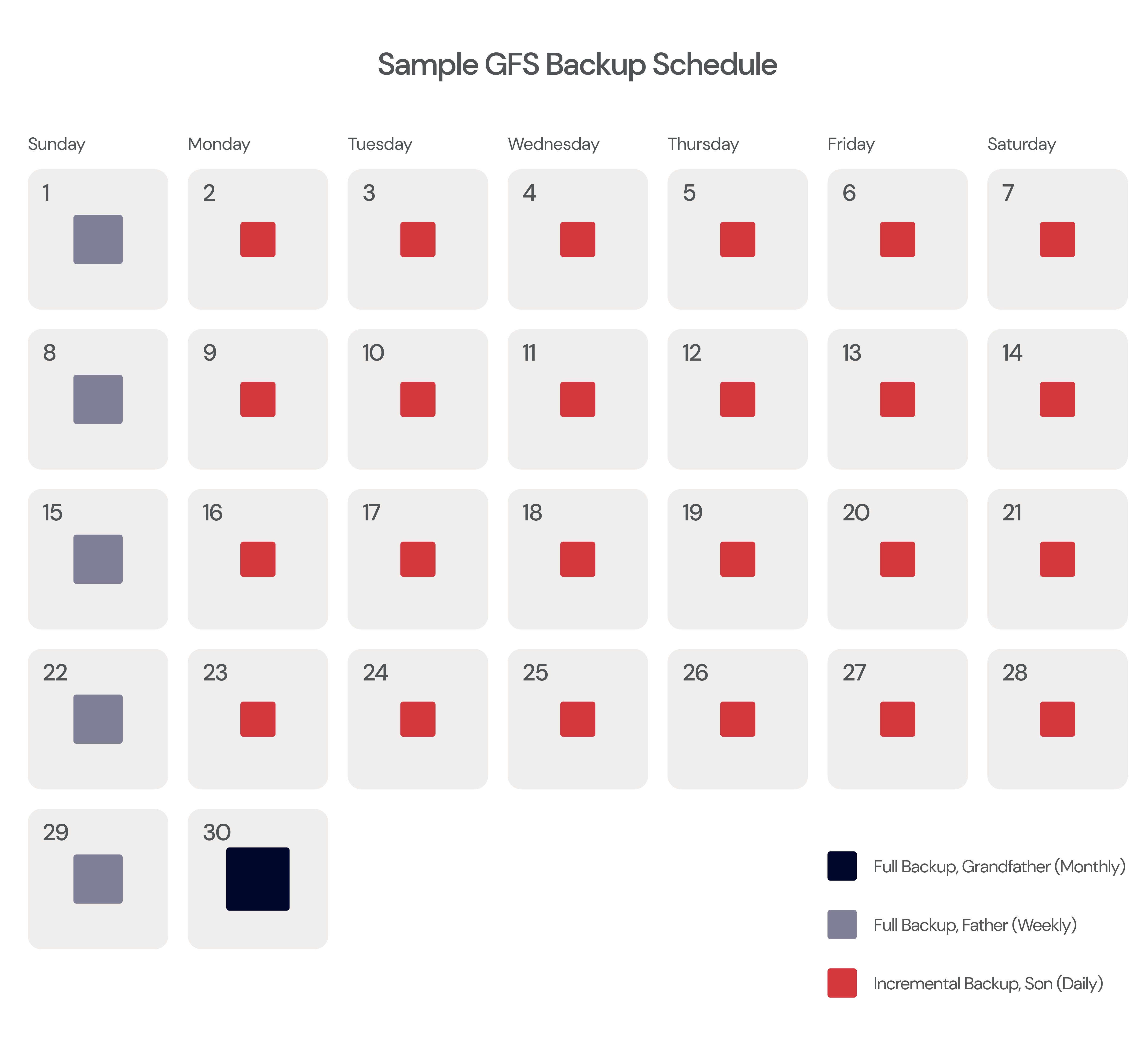
It’s important to note that the daily-weekly-monthly cadence is a common approach, but you could perform your incremental son backups even more often than daily (Like hourly!) or you could set your grandfather backups to run yearly instead of monthly. Some choose to run grandfather backups monthly and “great-grandfather” backups yearly. Essentially, you just want to create three regular backup cycles (one full backup to off-site storage; one full backup to local or hot storage; and incremental backups to fill the gaps) with your grandfather full backup cycle being performed less often than your father full backup cycle.
How Long Should You Retain GFS Backups?
Last, it’s important to also consider your retention policy for each backup cycle. In other words, how long do you want to keep your monthly grandfather backups, in case you need to restore data from one? How long do you want to keep your father and son backups? Are you in an industry that has strict data retention requirements?
You’ll want to think about how to balance regulatory requirements with storage costs. By the way, you might find us a little biased towards Backblaze B2 Cloud Storage because, at $5/TB/month, you can afford to keep your backups in quickly accessible hot storage and keep them archived for as long as you need without worrying about an excessive cloud storage bill.
Ultimately, you’ll find that grandfather-father-son is an organized approach to creating and retaining full and incremental backups. It takes some planning to set up but is fairly straightforward to follow once you have a system in place. You have multiple fallback options in case your business is impacted by ransomware or a natural disaster, and you still have the flexibility to set backup cycles that meet your business needs and storage requirements.
Ready to Get Started With GFS Backups and Backblaze B2?
Check out our Business Backup solutions and safeguard your GFS backups in the industry’s leading independent storage cloud.
The post Better Backup Practices: What Is the Grandfather-Father-Son Approach? appeared first on Backblaze Blog | Cloud Storage & Cloud Backup.
Monitoring our monitoring: how we validate our Prometheus alert rules
Post Syndicated from Lukasz Mierzwa original https://blog.cloudflare.com/monitoring-our-monitoring/

Background

We use Prometheus as our core monitoring system. We’ve been heavy Prometheus users since 2017 when we migrated off our previous monitoring system which used a customized Nagios setup. Despite growing our infrastructure a lot, adding tons of new products and learning some hard lessons about operating Prometheus at scale, our original architecture of Prometheus (see Monitoring Cloudflare’s Planet-Scale Edge Network with Prometheus for an in depth walk through) remains virtually unchanged, proving that Prometheus is a solid foundation for building observability into your services.
One of the key responsibilities of Prometheus is to alert us when something goes wrong and in this blog post we’ll talk about how we make those alerts more reliable – and we’ll introduce an open source tool we’ve developed to help us with that, and share how you can use it too. If you’re not familiar with Prometheus you might want to start by watching this video to better understand the topic we’ll be covering here.
Prometheus works by collecting metrics from our services and storing those metrics inside its database, called TSDB. We can then query these metrics using Prometheus query language called PromQL using ad-hoc queries (for example to power Grafana dashboards) or via alerting or recording rules. A rule is basically a query that Prometheus will run for us in a loop, and when that query returns any results it will either be recorded as new metrics (with recording rules) or trigger alerts (with alerting rules).
Prometheus alerts
Since we’re talking about improving our alerting we’ll be focusing on alerting rules.
To create alerts we first need to have some metrics collected. For the purposes of this blog post let’s assume we’re working with http_requests_total metric, which is used on the examples page. Here are some examples of how our metrics will look:
http_requests_total{job="myserver", handler="/", method=”get”, status=”200”}
http_requests_total{job="myserver", handler="/", method=”get”, status=”500”}
http_requests_total{job="myserver", handler="/posts", method=”get”, status=”200”}
http_requests_total{job="myserver", handler="/posts", method=”get”, status=”500”}
http_requests_total{job="myserver", handler="/posts/new", method=”post”, status=”201”}
http_requests_total{job="myserver", handler="/posts/new", method=”post”, status=”401”}
Let’s say we want to alert if our HTTP server is returning errors to customers.
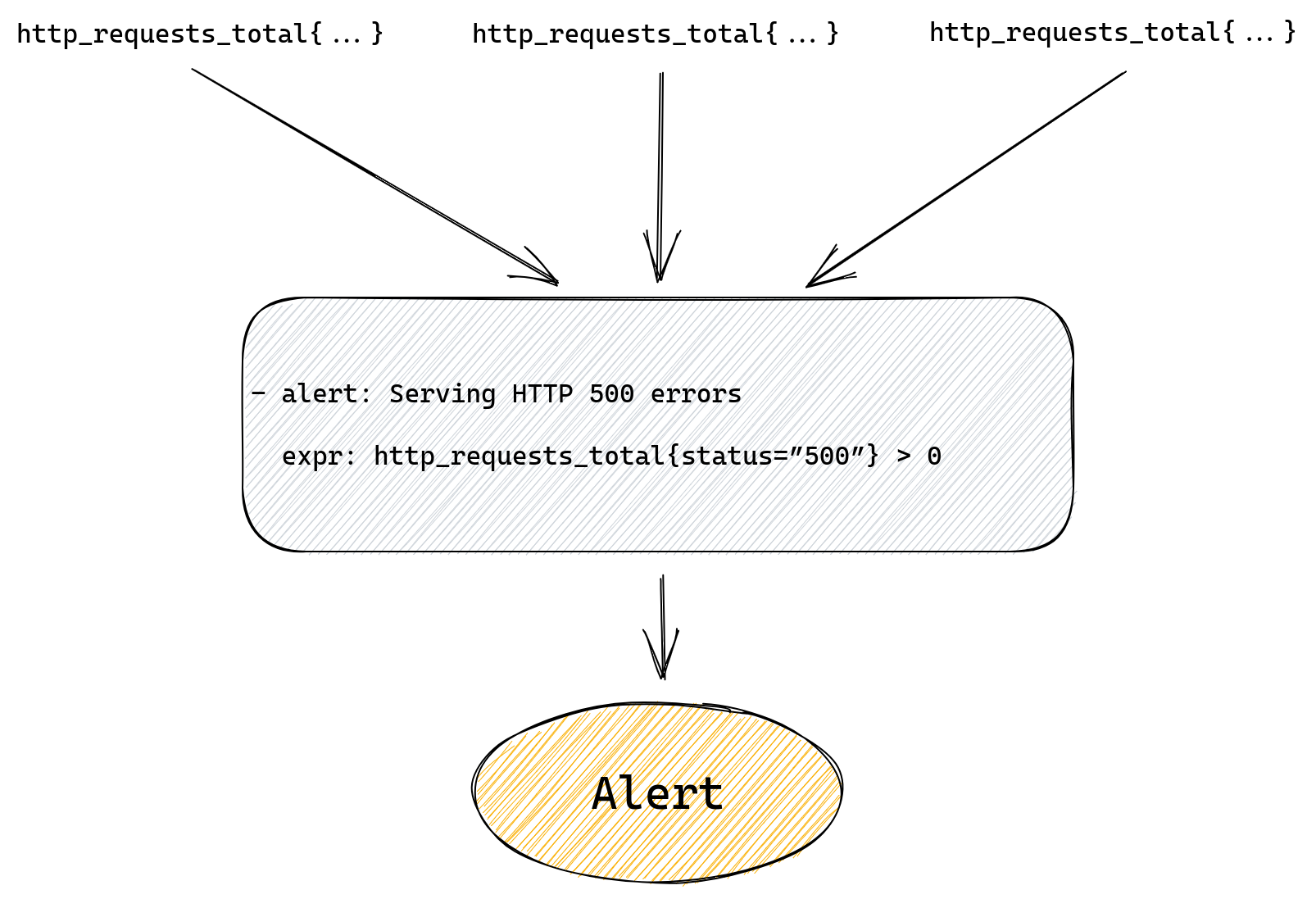
Since, all we need to do is check our metric that tracks how many responses with HTTP status code 500 there were, a simple alerting rule could like this:
- alert: Serving HTTP 500 errors
  expr: http_requests_total{status=”500”} > 0
This will alert us if we have any 500 errors served to our customers. Prometheus will run our query looking for a time series named http_requests_total that also has a status label with value “500”. Then it will filter all those matched time series and only return ones with value greater than zero.
If our alert rule returns any results a fire will be triggered, one for each returned result.
If our rule doesn’t return anything, meaning there are no matched time series, then alert will not trigger.
The whole flow from metric to alert is pretty simple here as we can see on the diagram below.
If we want to provide more information in the alert we can by setting additional labels and annotations, but alert and expr fields are all we need to get a working rule.
But the problem with the above rule is that our alert starts when we have our first error, and then it will never go away.
After all, our http_requests_total is a counter, so it gets incremented every time there’s a new request, which means that it will keep growing as we receive more requests. What this means for us is that our alert is really telling us “was there ever a 500 error?” and even if we fix the problem causing 500 errors we’ll keep getting this alert.
A better alert would be one that tells us if we’re serving errors right now.
For that we can use the rate() function to calculate the per second rate of errors.
Our modified alert would be:
- alert: Serving HTTP 500 errors
  expr: rate(http_requests_total{status=”500”}[2m]) > 0
The query above will calculate the rate of 500 errors in the last two minutes. If we start responding with errors to customers our alert will fire, but once errors stop so will this alert.
This is great because if the underlying issue is resolved the alert will resolve too.
We can improve our alert further by, for example, alerting on the percentage of errors, rather than absolute numbers, or even calculate error budget, but let’s stop here for now.
It’s all very simple, so what do we mean when we talk about improving the reliability of alerting? What could go wrong here?
Maybe a spot for a subheading here as you move on from the intro?
What could go wrong?
We can craft a valid YAML file with a rule definition that has a perfectly valid query that will simply not work how we expect it to work. Which, when it comes to alerting rules, might mean that the alert we rely upon to tell us when something is not working correctly will fail to alert us when it should. To better understand why that might happen let’s first explain how querying works in Prometheus.
Prometheus querying basics
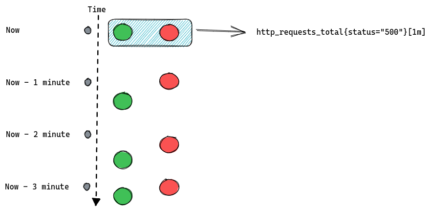
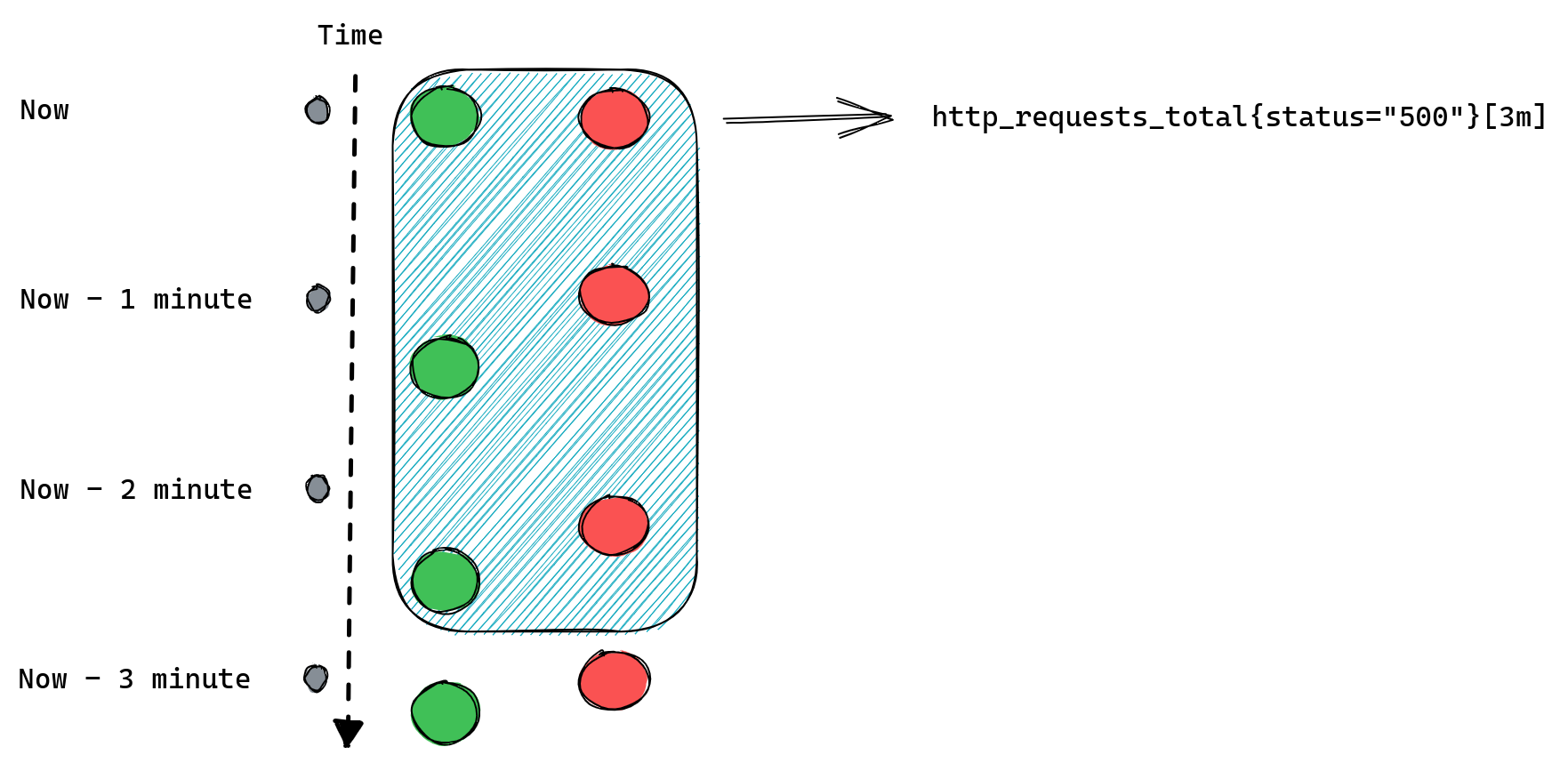
There are two basic types of queries we can run against Prometheus. The first one is an instant query. It allows us to ask Prometheus for a point in time value of some time series. If we write our query as http_requests_total we’ll get all time series named http_requests_total along with the most recent value for each of them. We can further customize the query and filter results by adding label matchers, like http_requests_total{status=”500”}.
Let’s consider we have two instances of our server, green and red, each one is scraped (Prometheus collects metrics from it) every one minute (independently of each other).
This is what happens when we issue an instant query:
There’s obviously more to it as we can use functions and build complex queries that utilize multiple metrics in one expression. But for the purposes of this blog post we’ll stop here.
The important thing to know about instant queries is that they return the most recent value of a matched time series, and they will look back for up to five minutes (by default) into the past to find it. If the last value is older than five minutes then it’s considered stale and Prometheus won’t return it anymore.
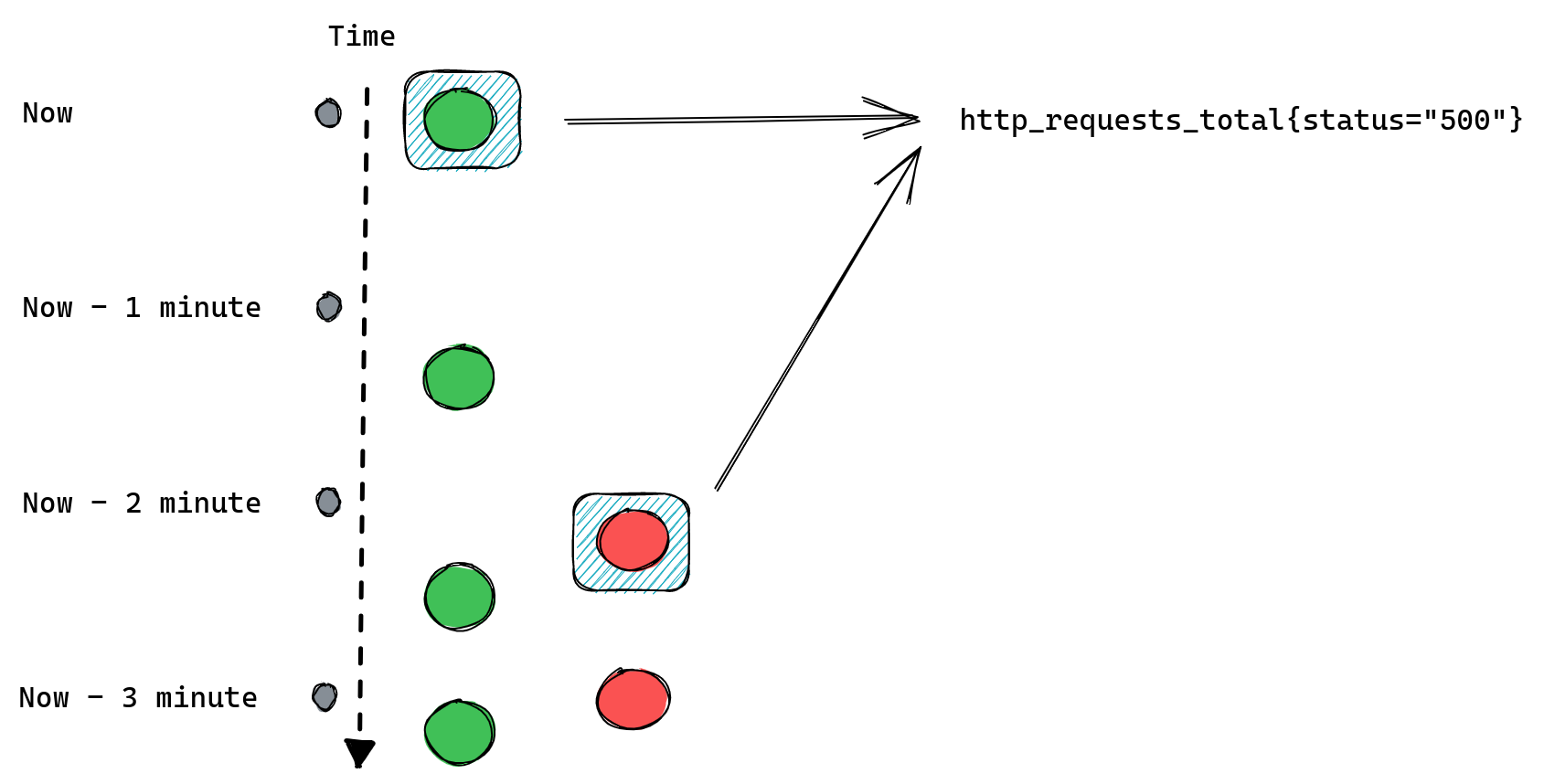
The second type of query is a range query – it works similarly to instant queries, the difference is that instead of returning us the most recent value it gives us a list of values from the selected time range. That time range is always relative so instead of providing two timestamps we provide a range, like “20 minutes”. When we ask for a range query with a 20 minutes range it will return us all values collected for matching time series from 20 minutes ago until now.
An important distinction between those two types of queries is that range queries don’t have the same “look back for up to five minutes” behavior as instant queries. If Prometheus cannot find any values collected in the provided time range then it doesn’t return anything.
If we modify our example to request [3m] range query we should expect Prometheus to return three data points for each time series:
When queries don’t return anything
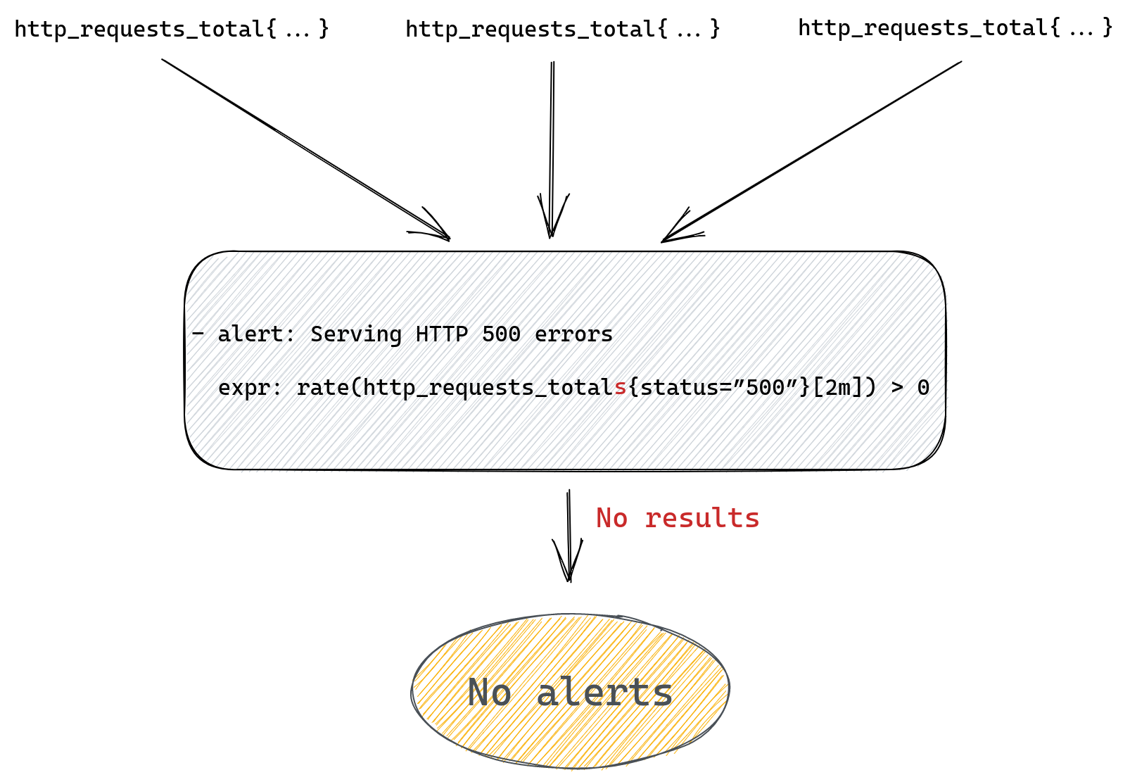
Knowing a bit more about how queries work in Prometheus we can go back to our alerting rules and spot a potential problem: queries that don’t return anything.
If our query doesn’t match any time series or if they’re considered stale then Prometheus will return an empty result. This might be because we’ve made a typo in the metric name or label filter, the metric we ask for is no longer being exported, or it was never there in the first place, or we’ve added some condition that wasn’t satisfied, like value of being non-zero in our http_requests_total{status=”500”} > 0 example.
Prometheus will not return any error in any of the scenarios above because none of them are really problems, it’s just how querying works. If you ask for something that doesn’t match your query then you get empty results. This means that there’s no distinction between “all systems are operational” and “you’ve made a typo in your query”. So if you’re not receiving any alerts from your service it’s either a sign that everything is working fine, or that you’ve made a typo, and you have no working monitoring at all, and it’s up to you to verify which one it is.
For example, we could be trying to query for http_requests_totals instead of http_requests_total (an extra “s” at the end) and although our query will look fine it won’t ever produce any alert.
Range queries can add another twist – they’re mostly used in Prometheus functions like rate(), which we used in our example. This function will only work correctly if it receives a range query expression that returns at least two data points for each time series, after all it’s impossible to calculate rate from a single number.
Since the number of data points depends on the time range we passed to the range query, which we then pass to our rate() function, if we provide a time range that only contains a single value then rate won’t be able to calculate anything and once again we’ll return empty results.
The number of values collected in a given time range depends on the interval at which Prometheus collects all metrics, so to use rate() correctly you need to know how your Prometheus server is configured. You can read more about this here and here if you want to better understand how rate() works in Prometheus.
For example if we collect our metrics every one minute then a range query http_requests_total[1m] will be able to find only one data point. Here’s a reminder of how this looks:
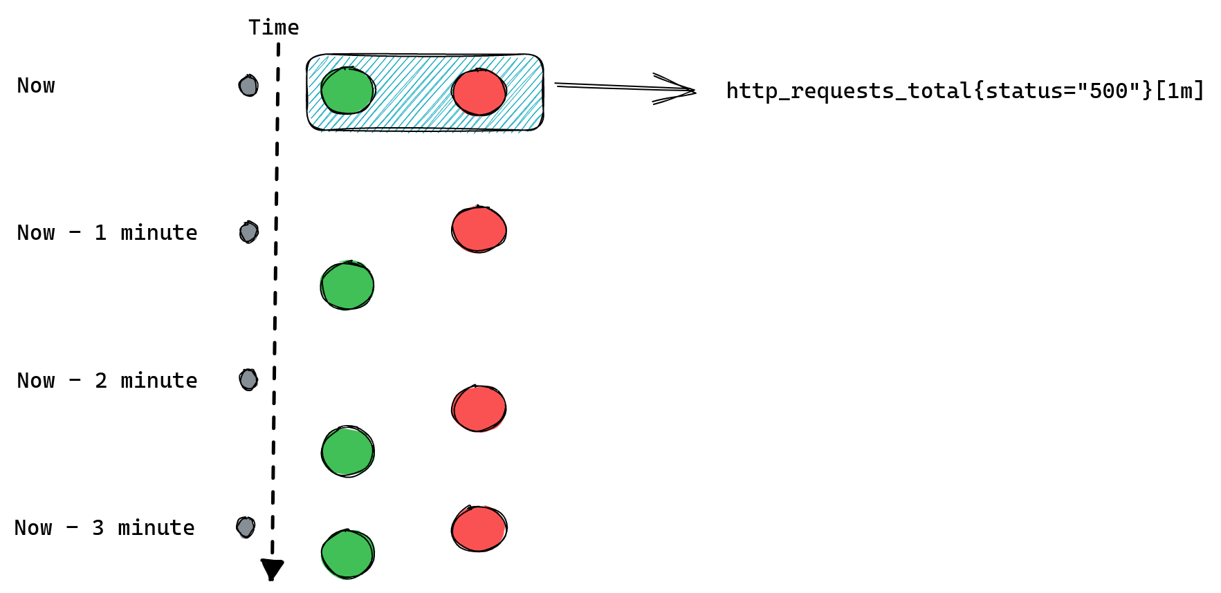
Since, as we mentioned before, we can only calculate rate() if we have at least two data points, calling rate(http_requests_total[1m]) will never return anything and so our alerts will never work.
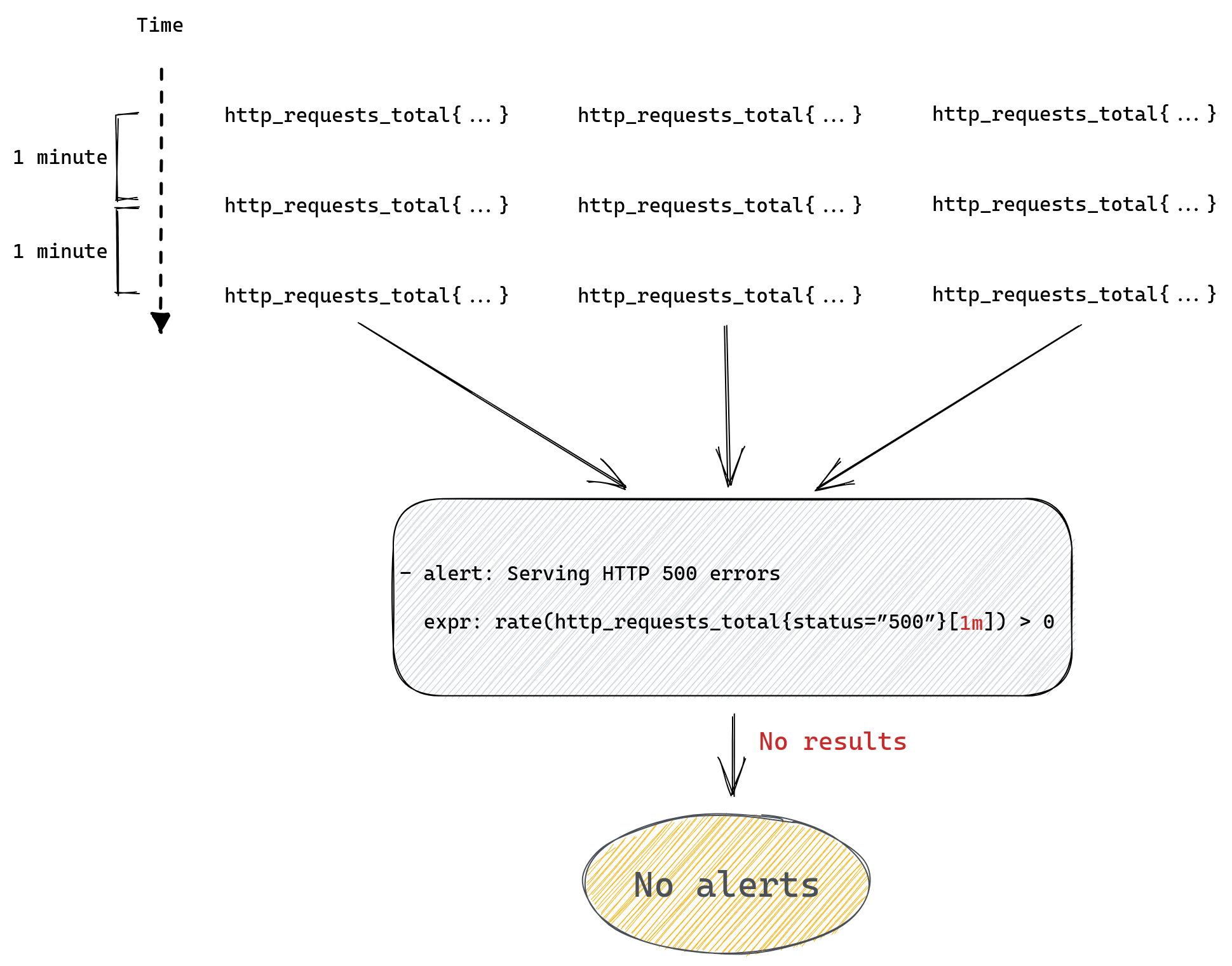
There are more potential problems we can run into when writing Prometheus queries, for example any operations between two metrics will only work if both have the same set of labels, you can read about this here. But for now we’ll stop here, listing all the gotchas could take a while. The point to remember is simple: if your alerting query doesn’t return anything then it might be that everything is ok and there’s no need to alert, but it might also be that you’ve mistyped your metrics name, your label filter cannot match anything, your metric disappeared from Prometheus, you are using too small time range for your range queries etc.
Renaming metrics can be dangerous
We’ve been running Prometheus for a few years now and during that time we’ve grown our collection of alerting rules a lot. Plus we keep adding new products or modifying existing ones, which often includes adding and removing metrics, or modifying existing metrics, which may include renaming them or changing what labels are present on these metrics.
A lot of metrics come from metrics exporters maintained by the Prometheus community, like node_exporter, which we use to gather some operating system metrics from all of our servers. Those exporters also undergo changes which might mean that some metrics are deprecated and removed, or simply renamed.
A problem we’ve run into a few times is that sometimes our alerting rules wouldn’t be updated after such a change, for example when we upgraded node_exporter across our fleet. Or the addition of a new label on some metrics would suddenly cause Prometheus to no longer return anything for some of the alerting queries we have, making such an alerting rule no longer useful.
It’s worth noting that Prometheus does have a way of unit testing rules, but since it works on mocked data it’s mostly useful to validate the logic of a query. Unit testing won’t tell us if, for example, a metric we rely on suddenly disappeared from Prometheus.
Chaining rules
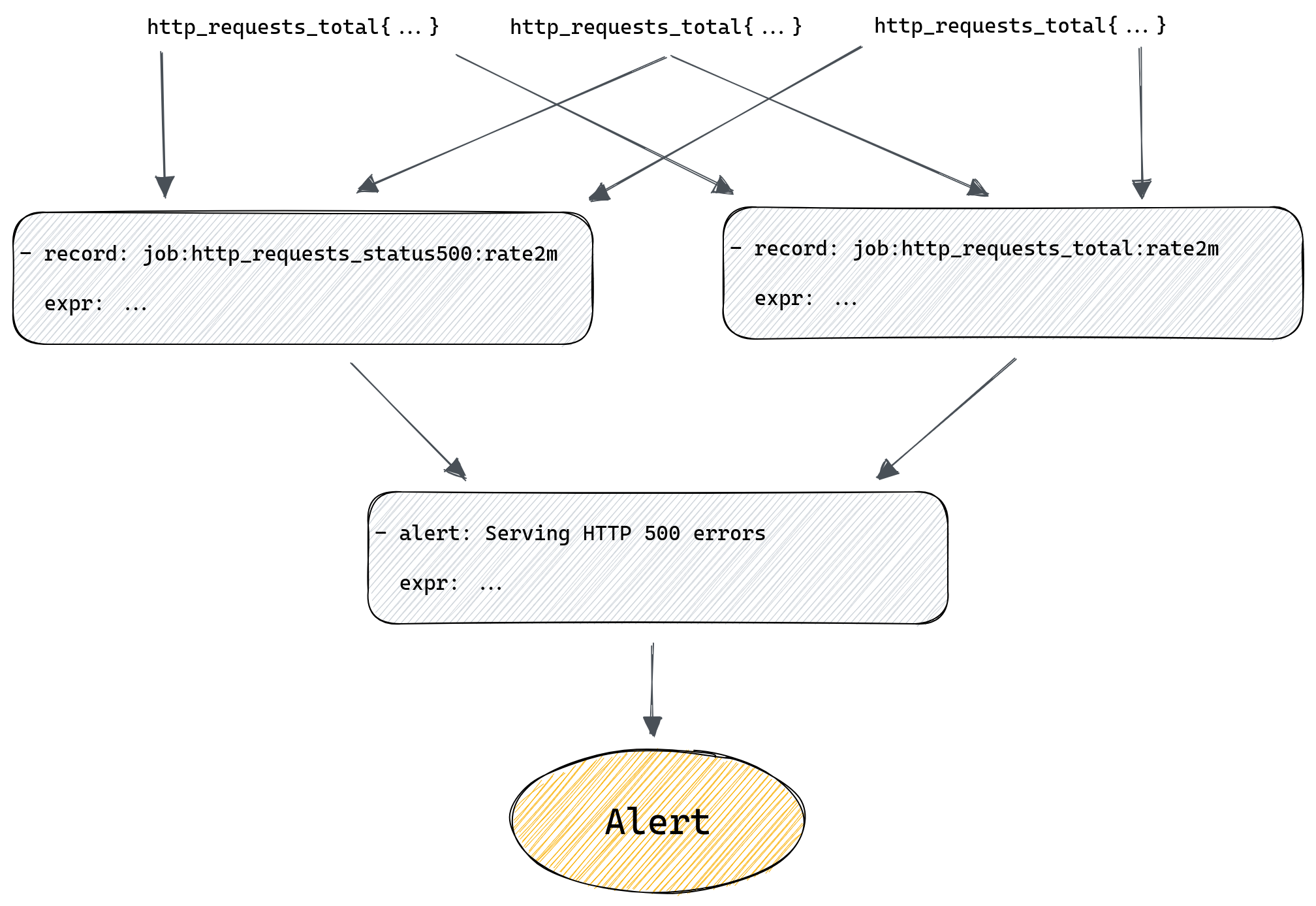
When writing alerting rules we try to limit alert fatigue by ensuring that, among many things, alerts are only generated when there’s an action needed, they clearly describe the problem that needs addressing, they have a link to a runbook and a dashboard, and finally that we aggregate them as much as possible. This means that a lot of the alerts we have won’t trigger for each individual instance of a service that’s affected, but rather once per data center or even globally.
For example, we might alert if the rate of HTTP errors in a datacenter is above 1% of all requests. To do that we first need to calculate the overall rate of errors across all instances of our server. For that we would use a recording rule:
- record: job:http_requests_total:rate2m
  expr: sum(rate(http_requests_total[2m])) without(method, status, instance)

- record: job:http_requests_status500:rate2m
  expr: sum(rate(http_requests_total{status=”500”}[2m])) without(method, status, instance)
First rule will tell Prometheus to calculate per second rate of all requests and sum it across all instances of our server. Second rule does the same but only sums time series with status labels equal to “500”. Both rules will produce new metrics named after the value of the record field.
Now we can modify our alert rule to use those new metrics we’re generating with our recording rules:
- alert: Serving HTTP 500 errors
  expr: job:http_requests_status500:rate2m / job:http_requests_total:rate2m > 0.01
If we have a data center wide problem then we will raise just one alert, rather than one per instance of our server, which can be a great quality of life improvement for our on-call engineers.
But at the same time we’ve added two new rules that we need to maintain and ensure they produce results. To make things more complicated we could have recording rules producing metrics based on other recording rules, and then we have even more rules that we need to ensure are working correctly.
What if all those rules in our chain are maintained by different teams? What if the rule in the middle of the chain suddenly gets renamed because that’s needed by one of the teams? Problems like that can easily crop up now and then if your environment is sufficiently complex, and when they do, they’re not always obvious, after all the only sign that something stopped working is, well, silence – your alerts no longer trigger. If you’re lucky you’re plotting your metrics on a dashboard somewhere and hopefully someone will notice if they become empty, but it’s risky to rely on this.
We definitely felt that we needed something better than hope.
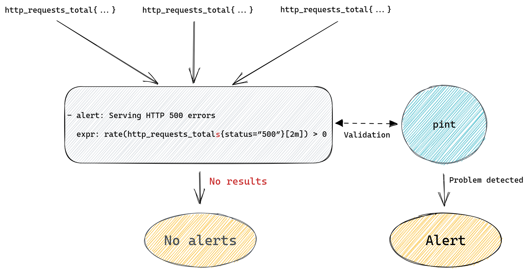
Introducing pint: a Prometheus rule linter
To avoid running into such problems in the future we’ve decided to write a tool that would help us do a better job of testing our alerting rules against live Prometheus servers, so we can spot missing metrics or typos easier. We also wanted to allow new engineers, who might not necessarily have all the in-depth knowledge of how Prometheus works, to be able to write rules with confidence without having to get feedback from more experienced team members.
Since we believe that such a tool will have value for the entire Prometheus community we’ve open-sourced it, and it’s available for anyone to use – say hello to pint!
You can find sources on github, there’s also online documentation that should help you get started.
Pint works in 3 different ways:
- You can run it against a file(s) with Prometheus rules
- It can run as a part of your CI pipeline
- Or you can deploy it as a side-car to all your Prometheus servers
It doesn’t require any configuration to run, but in most cases it will provide the most value if you create a configuration file for it and define some Prometheus servers it should use to validate all rules against. Running without any configured Prometheus servers will limit it to static analysis of all the rules, which can identify a range of problems, but won’t tell you if your rules are trying to query non-existent metrics.
First mode is where pint reads a file (or a directory containing multiple files), parses it, does all the basic syntax checks and then runs a series of checks for all Prometheus rules in those files.
Second mode is optimized for validating git based pull requests. Instead of testing all rules from all files pint will only test rules that were modified and report only problems affecting modified lines.
Third mode is where pint runs as a daemon and tests all rules on a regular basis. If it detects any problem it will expose those problems as metrics. You can then collect those metrics using Prometheus and alert on them as you would for any other problems. This way you can basically use Prometheus to monitor itself.
What kind of checks can it run for us and what kind of problems can it detect?
All the checks are documented here, along with some tips on how to deal with any detected problems. Let’s cover the most important ones briefly.
As mentioned above the main motivation was to catch rules that try to query metrics that are missing or when the query was simply mistyped. To do that pint will run each query from every alerting and recording rule to see if it returns any result, if it doesn’t then it will break down this query to identify all individual metrics and check for the existence of each of them. If any of them is missing or if the query tries to filter using labels that aren’t present on any time series for a given metric then it will report that back to us.
So if someone tries to add a new alerting rule with http_requests_totals typo in it, pint will detect that when running CI checks on the pull request and stop it from being merged. Which takes care of validating rules as they are being added to our configuration management system.
Another useful check will try to estimate the number of times a given alerting rule would trigger an alert. Which is useful when raising a pull request that’s adding new alerting rules – nobody wants to be flooded with alerts from a rule that’s too sensitive so having this information on a pull request allows us to spot rules that could lead to alert fatigue.
Similarly, another check will provide information on how many new time series a recording rule adds to Prometheus. In our setup a single unique time series uses, on average, 4KiB of memory. So if a recording rule generates 10 thousand new time series it will increase Prometheus server memory usage by 10000*4KiB=40MiB. 40 megabytes might not sound like but our peak time series usage in the last year was around 30 million time series in a single Prometheus server, so we pay attention to anything that’s might add a substantial amount of new time series, which pint helps us to notice before such rule gets added to Prometheus.
On top of all the Prometheus query checks, pint allows us also to ensure that all the alerting rules comply with some policies we’ve set for ourselves. For example, we require everyone to write a runbook for their alerts and link to it in the alerting rule using annotations.
We also require all alerts to have priority labels, so that high priority alerts are generating pages for responsible teams, while low priority ones are only routed to karma dashboard or create tickets using jiralert. It’s easy to forget about one of these required fields and that’s not something which can be enforced using unit testing, but pint allows us to do that with a few configuration lines.
With pint running on all stages of our Prometheus rule life cycle, from initial pull request to monitoring rules deployed in our many data centers, we can rely on our Prometheus alerting rules to always work and notify us of any incident, large or small.
GitHub: https://github.com/cloudflare/pint
Putting it all together
Let’s see how we can use pint to validate our rules as we work on them.
We can begin by creating a file called “rules.yml” and adding both recording rules there.
The goal is to write new rules that we want to add to Prometheus, but before we actually add those, we want pint to validate it all for us.
groups:
- name: Demo recording rules
  rules:
  - record: job:http_requests_total:rate2m
    expr: sum(rate(http_requests_total[2m])) without(method, status, instance)

  - record: job:http_requests_status500:rate2m
    expr: sum(rate(http_requests_total{status="500"}[2m]) without(method, status, instance)
Next we’ll download the latest version of pint from GitHub and run check our rules.
$ pint lint rules.yml
level=info msg="File parsed" path=rules.yml rules=2
rules.yml:8: syntax error: unclosed left parenthesis (promql/syntax)
    expr: sum(rate(http_requests_total{status="500"}[2m]) without(method, status, instance)

level=info msg="Problems found" Fatal=1
level=fatal msg="Execution completed with error(s)" error="problems found"
Whoops, we have “sum(rate(…)” and so we’re missing one of the closing brackets. Let’s fix that and try again.
groups:
- name: Demo recording rules
  rules:
  - record: job:http_requests_total:rate2m
    expr: sum(rate(http_requests_total[2m])) without(method, status, instance)

  - record: job:http_requests_status500:rate2m
    expr: sum(rate(http_requests_total{status="500"}[2m])) without(method, status, instance)
$ pint lint rules.yml
level=info msg="File parsed" path=rules.yml rules=2
Our rule now passes the most basic checks, so we know it’s valid. But to know if it works with a real Prometheus server we need to tell pint how to talk to Prometheus. For that we’ll need a config file that defines a Prometheus server we test our rule against, it should be the same server we’re planning to deploy our rule to. Here we’ll be using a test instance running on localhost. Let’s create a “pint.hcl” file and define our Prometheus server there:
prometheus "prom1" {
  uri     = "http://localhost:9090"
  timeout = "1m"
}
Now we can re-run our check using this configuration file:
$ pint -c pint.hcl lint rules.yml
level=info msg="Loading configuration file" path=pint.hcl
level=info msg="File parsed" path=rules.yml rules=2
rules.yml:5: prometheus "prom1" at http://localhost:9090 didn't have any series for "http_requests_total" metric in the last 1w (promql/series)
    expr: sum(rate(http_requests_total[2m])) without(method, status, instance)

rules.yml:8: prometheus "prom1" at http://localhost:9090 didn't have any series for "http_requests_total" metric in the last 1w (promql/series)
    expr: sum(rate(http_requests_total{status="500"}[2m])) without(method, status, instance)

level=info msg="Problems found" Bug=2
level=fatal msg="Execution completed with error(s)" error="problems found"
Yikes! It’s a test Prometheus instance, and we forgot to collect any metrics from it.
Let’s fix that by starting our server locally on port 8080 and configuring Prometheus to collect metrics from it:
scrape_configs:
  - job_name: webserver
    static_configs:
      - targets: ['localhost:8080’]
Let’ re-run our checks once more:
$ pint -c pint.hcl lint rules.yml
level=info msg="Loading configuration file" path=pint.hcl
level=info msg="File parsed" path=rules.yml rules=2
This time everything works!
Now let’s add our alerting rule to our file, so it now looks like this:
groups:
- name: Demo recording rules
  rules:
  - record: job:http_requests_total:rate2m
    expr: sum(rate(http_requests_total[2m])) without(method, status, instance)

  - record: job:http_requests_status500:rate2m
    expr: sum(rate(http_requests_total{status="500"}[2m])) without(method, status, instance)

- name: Demo alerting rules
  rules:
  - alert: Serving HTTP 500 errors
    expr: job:http_requests_status500:rate2m / job:http_requests_total:rate2m > 0.01
And let’s re-run pint once again:
$ pint -c pint.hcl lint rules.yml
level=info msg="Loading configuration file" path=pint.hcl
level=info msg="File parsed" path=rules.yml rules=3
rules.yml:13: prometheus "prom1" at http://localhost:9090 didn't have any series for "job:http_requests_status500:rate2m" metric in the last 1w but found recording rule that generates it, skipping further checks (promql/series)
    expr: job:http_requests_status500:rate2m / job:http_requests_total:rate2m > 0.01

rules.yml:13: prometheus "prom1" at http://localhost:9090 didn't have any series for "job:http_requests_total:rate2m" metric in the last 1w but found recording rule that generates it, skipping further checks (promql/series)
    expr: job:http_requests_status500:rate2m / job:http_requests_total:rate2m > 0.01

level=info msg="Problems found" Information=2
It all works according to pint, and so we now can safely deploy our new rules file to Prometheus.
Notice that pint recognised that both metrics used in our alert come from recording rules, which aren’t yet added to Prometheus, so there’s no point querying Prometheus to verify if they exist there.
Now what happens if we deploy a new version of our server that renames the “status” label to something else, like “code”?
$ pint -c pint.hcl lint rules.yml
level=info msg="Loading configuration file" path=pint.hcl
level=info msg="File parsed" path=rules.yml rules=3
rules.yml:8: prometheus "prom1" at http://localhost:9090 has "http_requests_total" metric but there are no series with "status" label in the last 1w (promql/series)
    expr: sum(rate(http_requests_total{status="500"}[2m])) without(method, status, instance)

rules.yml:13: prometheus "prom1" at http://localhost:9090 didn't have any series for "job:http_requests_status500:rate2m" metric in the last 1w but found recording rule that generates it, skipping further checks (promql/series)
    expr: job:http_requests_status500:rate2m / job:http_requests_total:rate2m > 0.01

level=info msg="Problems found" Bug=1 Information=1
level=fatal msg="Execution completed with error(s)" error="problems found"
Luckily pint will notice this and report it, so we can adopt our rule to match the new name.
But what if that happens after we deploy our rule? For that we can use the “pint watch” command that runs pint as a daemon periodically checking all rules.
Please note that validating all metrics used in a query will eventually produce some false positives. In our example metrics with status=”500” label might not be exported by our server until there’s at least one request ending in HTTP 500 error.
The promql/series check responsible for validating presence of all metrics has some documentation on how to deal with this problem. In most cases you’ll want to add a comment that instructs pint to ignore some missing metrics entirely or stop checking label values (only check if there’s “status” label present, without checking if there are time series with status=”500”).
Summary
Prometheus metrics don’t follow any strict schema, whatever services expose will be collected. At the same time a lot of problems with queries hide behind empty results, which makes noticing these problems non-trivial.
We use pint to find such problems and report them to engineers, so that our global network is always monitored correctly, and we have confidence that lack of alerts proves how reliable our infrastructure is.
Tips and tricks for high-performant dashboards in Amazon QuickSight
Post Syndicated from Shekhar Kopuri original https://aws.amazon.com/blogs/big-data/tips-and-tricks-for-high-performant-dashboards-in-amazon-quicksight/
Amazon QuickSight is cloud-native business intelligence (BI) service. QuickSight automatically optimizes queries and execution to help dashboards load quickly, but you can make your dashboard loads even faster and make sure you’re getting the best possible performance by following the tips and tricks outlined in this post.
Data flow and execution of QuickSight dashboard loads
The data flow in QuickSight starts from the client browser to the web server and then flows to the QuickSight engine, which in some cases executes queries against SPICE—a Super-fast, Parallel, In-memory Calculation Engine—or in other cases directly against the database. SPICE uses a combination of columnar storage, in-memory technologies enabled through the latest hardware innovations, and machine code generation to run interactive queries on large datasets and get rapid responses.
The web server, QuickSight engine, and SPICE are auto scaled by QuickSight. This is a fully managed service—you don’t need to worry about provisioning or managing infrastructure when you want to scale up a particular dashboard from tens to thousands of users on SPICE. Dashboards built against direct query data sources may require provisioning or managing infrastructure on the customer side.
The following diagram illustrates the data flow:
Let’s look at the general execution process to understand the implications:
- A request is triggered in the browser, leading to several static assets such as JavaScript, fonts, and images being downloaded.
- All the metadata (such as visual configurations and layout) is fetched for the dashboard.
- Queries are performed, which may include setting up row-level and column-level security, or fetching dynamic control values, default parameters, and all values of drop-downs in filter controls.
- Up to your concurrency limit, the queries to render your visuals run in a specific sequence (described later in this post). If you’re using SPICE, the concurrency of queries is much higher. Pagination within visuals may lead to additional queries.
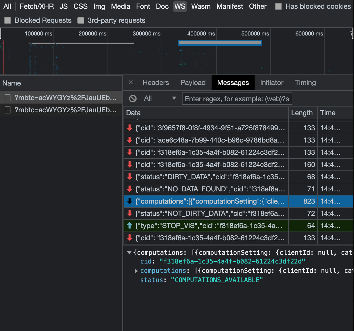
The actual execution is more complex and depends on how dashboards are configured and other factors such as the data source types, Direct Query vs. SPICE, cardinality of fields and how often data is getting refreshed etc. Many operations run in parallel and all visual-related queries are run via WebSocket, as shown in the following screenshot. Many of the steps run in the end-user’s browser, therefore there are limitations such as the number of sequences and workloads that can be pushed onto the browser. Performance may also be slightly different based on the browser type because each browser handles contention differently.
Now let’s look at many great tips that can improve your dashboard’s performance!
SPICE
Utilizing the capabilities of SPICE when possible is a great way to boost overall performance because SPICE manages scaling as well as caching results for you. We recommend using SPICE whenever possible.
Metadata
As seen in the preceding execution sequence, QuickSight fetches metadata up front for a given dashboard during the initial load. We recommend the following actions regarding metadata.
Remove unused datasets from analysis
Datasets that may have been used in the past but have no visual associated with the dashboard anymore add to the metadata payload unnecessarily. It’s likely to impact to dashboard performance.
Make sure your row-level and column-level security is performant
Row-Level security, column-level security and dynamic default parameters each require lookups to take place before the visual queries are issued. When possible, try to limit the number and the complexity of your rules datasets to help these lookups execute faster. Use SPICE for your rules dataset when possible. If you must use a direct query, make sure that the queries are optimal and that the data source you’re querying is scaled appropriately up front.
For embedded dashboards, a great way to optimize row-level security lookups is by utilizing session tags for row-level security paired with an anonymous identity. Similarly, dynamic default parameters, if used, can be evaluated in the host application up front and passed using the embedding SDK.
Calculated functions
In this section, we offer tips regarding calculated functions.
Move calculations to the data prep stage
QuickSight allows you to add calculated fields in the data prep or analysis experiences. We strongly encourage you to move as many calculations as possible to the data prep stage which will allow QuickSight to materialize calculations which do not contain aggregation or parameters into the SPICE dataset. Materializing calculated fields in the dataset helps you reduce the runtime calculations, which improves query performance. Even if you are using aggregation or parameters in your calculation, it might still be possible to move parts of the calculations to data prep. For instance, if you have a formula like the following:
![]()
You can remove the sum() and just keep the ifelse(), which will allow QuickSight to materialize (precompute) it and save it as a real field in your SPICE dataset. Then you can either add another calculation which sums it up, or just use sum aggregation once you add it to your visuals.
Generally materializing calculations that use complex ifelse logic or do string manipulation/lookups will result in the greatest improvements in dashboard performance.
Implement the simplified ifelse syntax
The ifelse function supports simplified statements. For example, you might start with the following statement:

The following simplified statement is more performant:
![]()
Use the toString() function judiciously
The toString() function has a much lower performance and is much heavier on the database engine than a simple integer or number-based arithmatic calculations. Therefore, you should use it sparingly.
Know when nulls are returned by the system and use null value customization
Most authors make sure that null conditions on calculated fields are handled gracefully. QuickSight often handles nulls gracefully for you. You can use that to your advantage and make the calculations simpler. In the following example, the division by 0 is already handled by QuickSight:
![]()
You can write the preceding code as the following:
![]()
If you need to represent nulls on visuals with a static string, QuickSight allows you to set custom values when a null value is returned in a visual configuration. In the preceding example, you could just set a custom value of 0 in the formatting option. Removing such handling from the calculated fields can significantly help query performance.

On-sheet filters vs. parameters
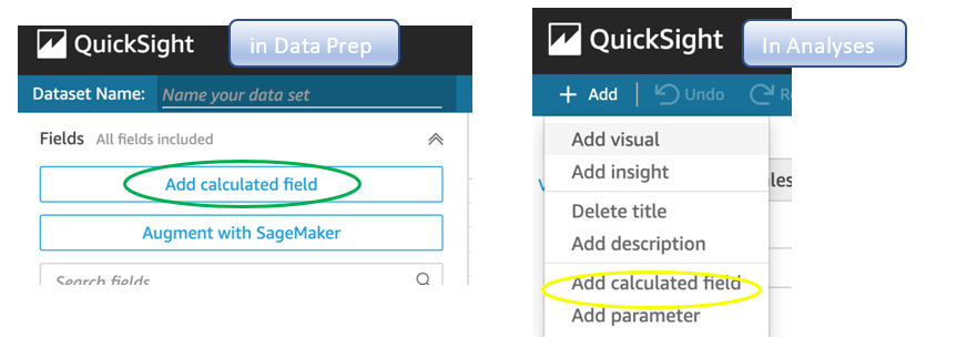
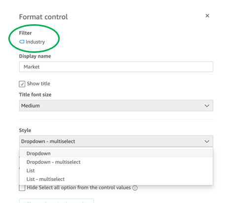
Parameters are seemingly a very simple construct but they can quickly get complicated, especially when used in nested calculation functions or when used in controls. Parameters are all evaluated on the fly, forcing all the dependencies to be handled real time. Ask yourself if each parameter is really required. In some cases, you may be able to replace them with simple dropdown control, as shown in the following example for $market.
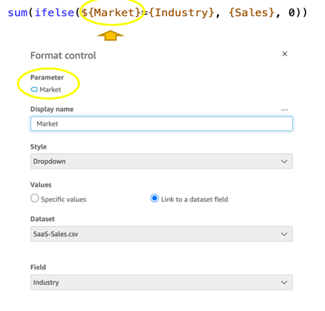
Instead of creating a control parameter to use in a calculated field, you might be able to use the field with a dropdown filter control.
Text field vs. Dropdown (or List) filter controls
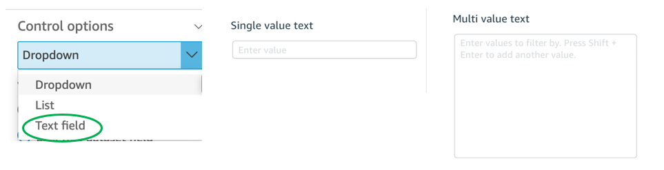
When you are designing an analysis, you can add a filter control for the visuals you want to filter. if the data type of the field is string, you have several choices for the type of control filter. Text field which displays a text box where you can enter a single entry or multiple entries is suggested for the better performance, rather than Dropdown (or List) which requires to fetch the values to populate a list that you can select a single or multiple values.
On-sheet controls
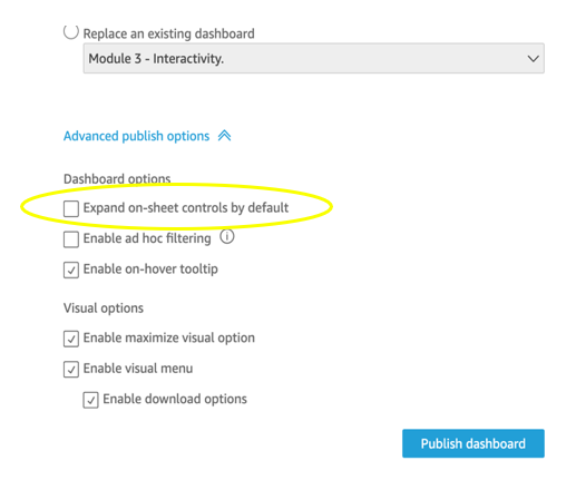
The control panel at the top of the dashboard is collapsible by default, but this setting allows you to have an expanded state while publishing the dashboard. If this setting is enabled, QuickSight prioritizes the calls in order to fetch the controls’ values before the visual loads. If any of the controls have high cardinality, it could impact the performance of loading the dashboard. Evaluate this need against the fact that QuickSight persists last-used control values and the reader might not actually need to adjust controls as a first step.
Visual types: Charts
In this section, we provide advice when using Charts.
Use ‘Hide the “other” category’ when your dimension has less than the cutoff limit
You can choose to limit how many data points you want to display in your visual, before they are added to the other category. This category contains the aggregated data for all the data beyond the cutoff limit for the visual type you are using – either the one you impose or the one based on display limits. If you know your dimension has less than the cutoff limit, use this option. This will improve your dashboard performance.
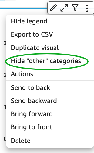
The other category does not show on scatter plots, heat maps, maps, tables (tabular reports), or key performance indicators (KPIs). It also doesn’t show on line charts when the x-axis is a date.
Visual types: Tables and pivot tables
In this section, we provide advice when using tables and pivot tables.
Use the Values field well when displaying a raw table view
If you want to output all the raw data into table, you can use Group by fields, Values fields, or a mix of them. The most performant approach is set every field into Values. When using Group by, a query is first run under the hood followed by the Group by function, therefore all the data is pulled from the database, which is expensive.
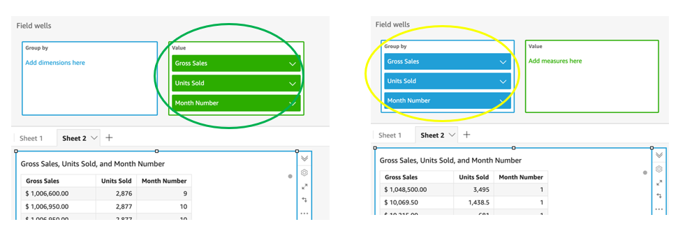
Deploy a minimal set of rows, columns, metrics, and table calculations
If you include too many combinations of rows, columns, metrics, and table calculations in one pivot table, you risk overwhelming the viewer. You can also run into the computational limitations of the underlying database. To reduce the level of complexity and potential errors, you can take the following actions:
- Apply filters to reduce the data included in for the visual
- Use fewer fields in the Row and Column field wells
- Use as few fields as possible in the Values field well
- Create additional pivot tables so that each displays fewer metrics
- Reduce subtotals, totals and conditional formatting when possible
Uncollapsed columns are always the simplest case and will likely remain more performant outside of a few cases.
Visual queries sequence
The execution of the individual visual sequence is left to right, then top to bottom. Understanding the sequence of execution can be helpful: you can rearrange visuals on your dashboard without losing the context. Place heavier visuals further down in the dashboard, and place lightweight KPI and insight visuals near the top to display “above-the-fold” content sooner, which improves the dashboard performance’s perception for your readers.
Embedding
Our final set of recommendations are in regards to embedding.
Remove user management flows from the critical path
Most times, user management and authentication flows (such as DescribeUser and RegisterUser APIs) can run asynchronously on the host application.
Consider registering the user in advance before the actual embedding, so that the overhead is removed from every analytics page visit.
Authenticate the user on your website in advance, and acquire any Amazon Cognito or AWS Security Token Service (Amazon STS) session tokens (if required) in advance (for example, at user login time or home page visit). This reduces additional runtime latency overhead when a user visits an analytics page.
Move workloads from clients to the web server or backend services
If a QuickSight dashboard is embedded on a webpage on the host application, which performs other activities too, play close attention to the sequence of API calls on the host. The QuickSight dashboard load might be gated by other heavy API calls on the host application. Move the logic to the web server or backend services as much as possible to limit contention on the browser.
Don’t tear down the embedding iFrame when the user navigates away from analytics section
When the user moves temporarily to a non-analytics page of your web application (especially in single-page applications), instead of removing the embedding iframe from DOM, you can hide it from the user while keeping the iFrame in the page DOM elements. This allows you to resume the same session when the user navigates back to analytics section of your application, and they don’t need to wait for reload.
Use navigateToDashboard() and navigateToSheet() whenever possible
If you have multiple dashboards on your host application that don’t need to load concurrently, you can optimize the authentication flow by utilizing two APIs we expose, navigateToDashboard() or navigateToSheet(), in our JavaScript SDK. These APIs reuse the same iFrame for each load, while reusing the authentication token.
This technique has proven to be very effective for many of our embedding users.
For more information about these APIs, refer to Amazon QuickSight Embedding SDK.
Conclusion
In this post, we shared some tips and tricks for tuning the performance of your QuickSight dashboards. In 2021, we doubled our SPICE data limits to 500 million rows of data per dataset. In addition, incremental data refresh is available for SQL-based data sources such as Amazon Redshift, Amazon Athena, Amazon RDS, Amazon Aurora, PostgreSQL, MySQL, Oracle, SQL Server, MariaDB, Presto, Teradata or Snowflake up to every 15 minutes, which cuts down time between data updates by 75%. In 2022, we continue to innovate on your behalf to make QuickSight dashboard loads even more performant.
We look forward to your feedback on how these tips and tricks helped your dashboards load faster.
About the Authors
 Shekhar Kopuri is a Senior Software Development Manager for Amazon QuickSight. He leads the front platform engineering team that focusses on various aspects of front end experience including website performance. Before joining AWS, Shekhar led development of multiple provisioning and activation network OSS applications for a large global telecommunications service provider.
 Blake Carroll is a Senior Frontend Engineer for Amazon QuickSight. He works with the frontend platform engineering team with a focus on website performance and has previously been the frontend lead for initial reporting and theming functionality in QuickSight. Prior to joining Amazon, Blake was a co-founder in the digital interactive agency space working with national brands to produce creative web experiences.
 Vijay Chaudhari is a Senior Software Development Engineer for Amazon QuickSight, AWS’ cloud-native, fully managed BI service. Vijay started his career with IBM, writing software for the Information Management group. At Amazon, he has built backend applications for retail systems, and near real-time data pre-computation, reporting and analytics systems at Amazon scale. He is passionate about learning and solving new customer problems, and helping them adopt cloud native technologies.
 Wakana Vilquin-Sakashita is Specialist Solution Architect for Amazon QuickSight. She works closely with customers to help making sense of the data through visualization. Previously Wakana worked for S&P Global assisting customers to access data, insights and researches relevant for their business.
[$] Cleaning up dying control groups, 2022 edition
Post Syndicated from original https://lwn.net/Articles/895431/
Control groups are a useful system-management feature, but they can also
consume a lot of resources, especially if they hang around on the system
after they have been deleted. Roman Gushchin described the problems that can result at the
2019 Linux Storage, Filesystem, Memory-management and BPF Summit (LSFMM);
he returned during the 2022 LSFMM to revisit
the issue, especially as it relates to the memory controller. Progress has
been made, but the problem is not yet solved.
[$] CXL 2: Pooling, sharing, and I/O-memory resources
Post Syndicated from original https://lwn.net/Articles/894626/
During the final day of the 2022 Linux Storage,
Filesystem, Memory-management and BPF Summit (LSFMM), attention in the
memory-management track turned once again to the challenges posed by the
upcoming Compute Express Link (CXL) technology. Two sessions looked at
different problems posed by CXL memory, which can come and go over the
operation of the system. CXL offers a lot of flexibility, but changes will
be needed for the kernel to be able to take advantage of it.
Huang: Rust: A Critical Retrospective
Post Syndicated from original https://lwn.net/Articles/895773/
Andrew ‘bunnie’ Huang has posted an extensive review of
the Rust language derived from the experience of writing “over
100k lines” of code.
Rust is a difficult language for authoring code because it makes
these “cheats” hard – as long as you have the discipline of not
using “unsafe” constructions to make cheats easy. However, really
hard does not mean impossible – there were definitely some cheats
that got swept under the rug during the construction of Xous.This is where Rust really exceeded expectations for me. The
language’s structure and tooling was very good at hunting down
these cheats and refactoring the code base, thus curing the cancer
without killing the patient, so to speak. This is the point at
which Rust’s very strict typing and borrow checker converts from a
productivity liability into a productivity asset.
CVE-2022-22972: Critical Authentication Bypass in VMware Workspace ONE Access, Identity Manager, and vRealize Automation
Post Syndicated from Jake Baines original https://blog.rapid7.com/2022/05/19/cve-2022-22972-critical-authentication-bypass-in-vmware-workspace-one-access-identity-manager-and-vrealize-automation/

On May 18, 2022, VMware published VMSA-2022-0014 on CVE-2022-22972 and CVE-2022-22973. The more severe of the two vulnerabilities is CVE-2022-22972, a critical authentication bypass affecting VMware’s Workspace ONE Access, Identity Manager, and vRealize Automation solutions. The vulnerability allows attackers with network access to the UI to obtain administrative access without the need to authenticate. CVE-2022-22972 may be chained with CVE-2022-22973 to bypass authentication and obtain root access. A full list of affected products is available in VMware’s advisory.
At time of writing, there is no public proof of concept for CVE-2022-22972, and there have been no reports of exploitation in the wild. We expect this to change quickly, however, since Rapid7 researchers have seen similar VMware vulnerabilities come under attack quickly in recent weeks. In April 2022, we published details on CVE-2022-22954, a server-side template injection flaw that was widely exploited by threat actors targeting internet-facing VMware Workspace ONE and Identity Manager applications.
In conjunction with VMware’s advisory on May 18, the US Cybersecurity and Infrastructure Agency (CISA) published Emergency Directive 22-03 in response to VMSA-2022-0014. The directive requires all “Federal Civilian Executive Branch” agencies to either apply the patch or remove affected VMware installations from agency networks by May 24, 2022. CISA also released an additional alert emphasizing that threat actors are known to be chaining recent VMware vulnerabilities — CVE-2022-22954 and CVE-2022-22960 — to gain full control of vulnerable systems. CISA’s alert notes that the new vulnerabilities in VMSA-2022-0014 are likely to be exploited in the wild quickly:
Due to the [likely] rapid exploitation of these vulnerabilities, CISA strongly encourages all organizations with affected VMware products that are accessible from the internet — that did not immediately apply updates — to assume compromise.
Mitigation guidance
VMware customers should patch their Workspace ONE Access, Identity Manager, and vRealize Automation installations immediately, without waiting for a regular patch cycle to occur. VMware has instructions here on patching and applying workarounds.
Additionally, if your installation is internet-facing, consider taking steps to remove direct access from the internet. It may also be prudent to follow CISA’s guidance on post-exploitation detection methods found in Alert (AA22-138B).
Rapid7 customers
InsightVM and Nexpose customers can assess their VMware Workspace ONE Access and Identity Manager systems’ exposure to CVE-2022-22972 and CVE-2022-22973 with authenticated vulnerability checks for Unix-like systems available in the May 19, 2022 content release. (Note that VMware Workspace ONE Access is only able to be deployed on Linux from 20.x onward.) Additional vulnerability coverage will be evaluated as the need arises.
Eurovision 2022, the Internet effect version
Post Syndicated from João Tomé original https://blog.cloudflare.com/eurovision-2022-internet-trends/


There’s only one song contest that is more than six decades old and not only presents many new songs (ABBA, Celine Dion, Julio Iglesias and Domenico Modugno shined there), but also has a global stage that involves 40 countries — performers represent those countries and the public votes. The 66th edition of the Eurovision Song Contest, in Turin, Italy, had two semi-finals (May 10 and 12) and a final (May 14), all of them with highlights, including Ukraine’s victory. The Internet was impacted in more than one way, from whole countries to the fan and official broadcasters sites, but also video platforms.
On our Eurovision dedicated page, it was possible to see the level of Internet traffic in the 40 participant countries, and we tweeted some highlights during the final.
#Ukraine just won the #Eurovision in Turin, #Italy
Video platforms DNS traffic in Ukraine today, during the event, was 22% higher at 23:00 CEST compared to the previous Saturday. The @Eurovision final is being transmitted live via YouTube.
— @Cloudflare data. pic.twitter.com/juBmtDj1FP— Cloudflare Radar (@CloudflareRadar) May 14, 2022
First, some technicalities. The baseline for the values we use in the following charts is the average of the preceding week, except for the more granular minute by minute view that uses the traffic average of May 9 and 10 as baseline. To estimate the traffic to the several types of websites from the 40 participating countries, we use DNS name resolution data. In this blog post, we’re using CEST, Central European Summer Time.
It’s not often that an entertainment event has an impact on a country’s Internet. So, was there an impact on Eurovision nights?
Let’s start with aggregate Internet traffic to the 40 participant countries (Australia included). In the first May 10 semi-final, there seems to be a slight decrease in traffic during the contest — it makes sense if we think that most people were probably watching the broadcast on national TV (and not on YouTube, that was also transmitting live the event). Traffic was lower than in the previous period between 21:00 and 23:00 (the event was between 21:00 to 23:14), but it was back to normal at 23:00.
For the second semi-final that trend is less clear. But the May 14 final (that lasted from 21:00 CEST to 01:10) told a different story. Traffic was 6% lower than on the previous Saturday after 21:00, mostly around 22:00, and after 23:15 it was actually higher (between 4% and 6%) than before and continued that way until 02:00.
What happened at that 23:15 time in Eurovision? The last of the 25 songs at the contest was Estonia’s “Hope”, by Stefan, and it ended at 23:14 (also in this blog post we will also see how 23:16 was the highest spike in terms of DNS traffic to fan websites during the final). This is the Internet traffic in the participating countries on May 14 chart:
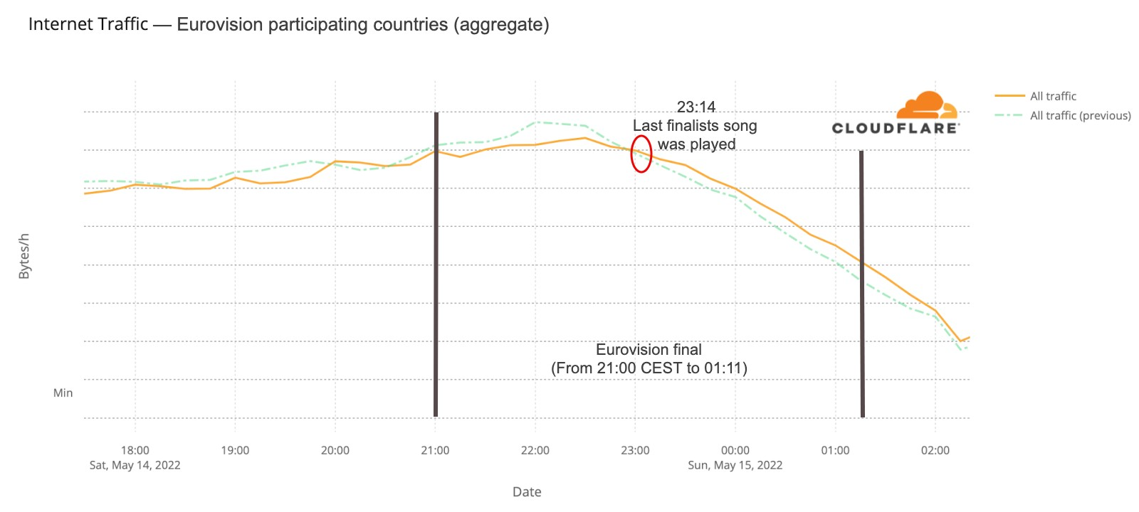
There were several countries that showed similar impact in terms of traffic change during at least the final. France, UK, Germany, Iceland, Greece and Switzerland are examples.
Eurovision & the UK
The UK was one of the countries where there seems to be more impact during the time of the grand final — last year, according to the ratings, eight million were watching the BBC transmission with the commentator Graham Norton. Traffic started to drop to lower levels than usual at 20:30 (a few minutes before the final) and was 20% lower at 22:00, starting to go closer to normal levels after 23:00, when the set of 25 finalists’ songs came to an end.
Here’s the UK’s Internet traffic trend during the Eurovision May 14 final:
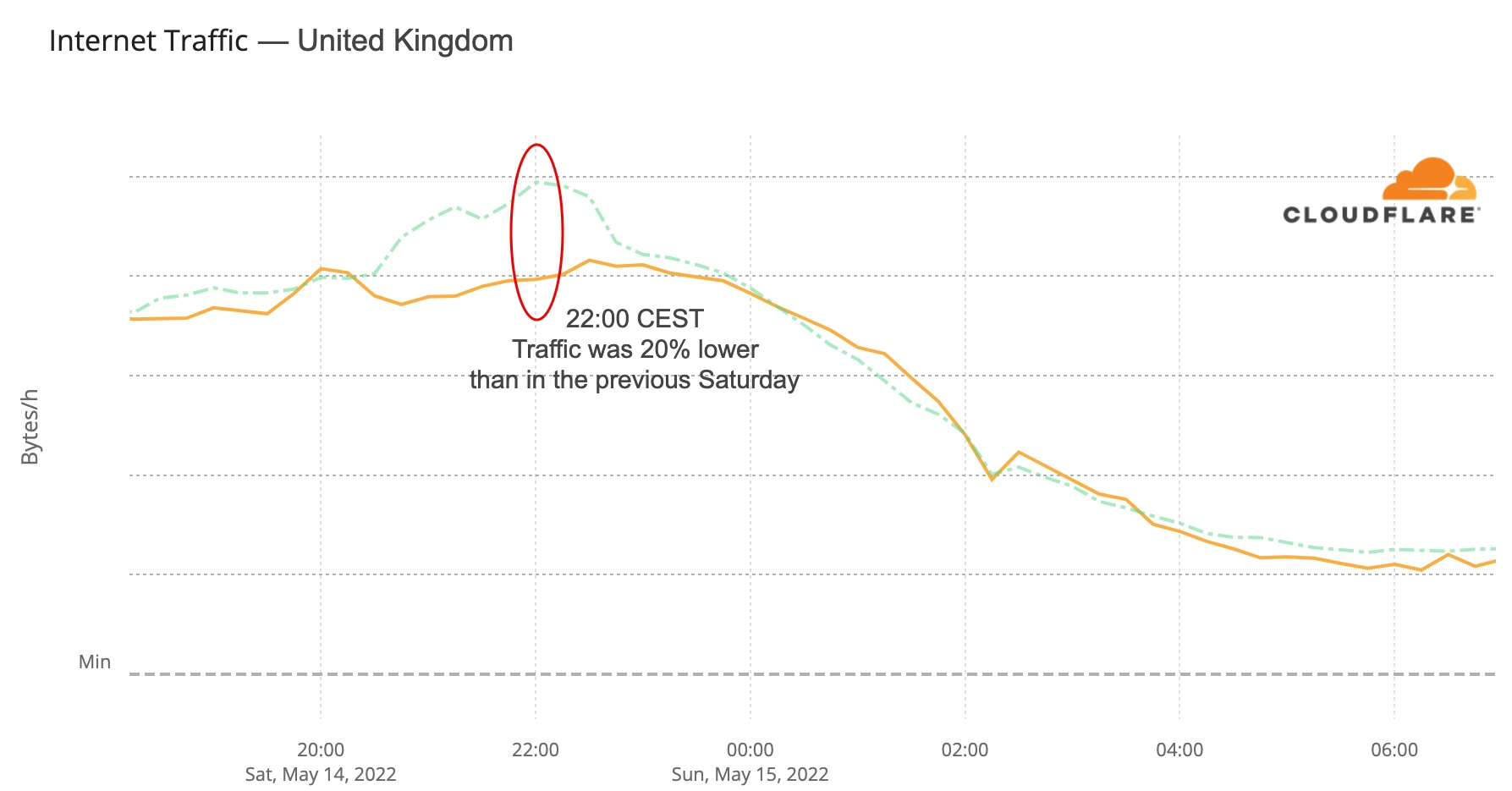
Fan sites: what a difference a winner makes
The most obvious thing to check in terms of impact are the fan websites. Eurovision has many, some general (there’s the OGAE, General Organisation of Eurovision Fans), others more local. And DNS traffic to them was clearly impacted.
The first semi-final, on May 10, had 33x more traffic than in the average of the previous week, with a clear 22:00 CEST spike. But the second semi-final, May 12, topped that, with 42x more traffic at the same time. The final, with the 25 finalists, clearly surpassed that and at 22:00 traffic was already 70x. But because the final was much longer (in the semi-finals it was around 23:00 that the finalists were announced), the peak was reached at 23:00, with 86x more traffic than usual.
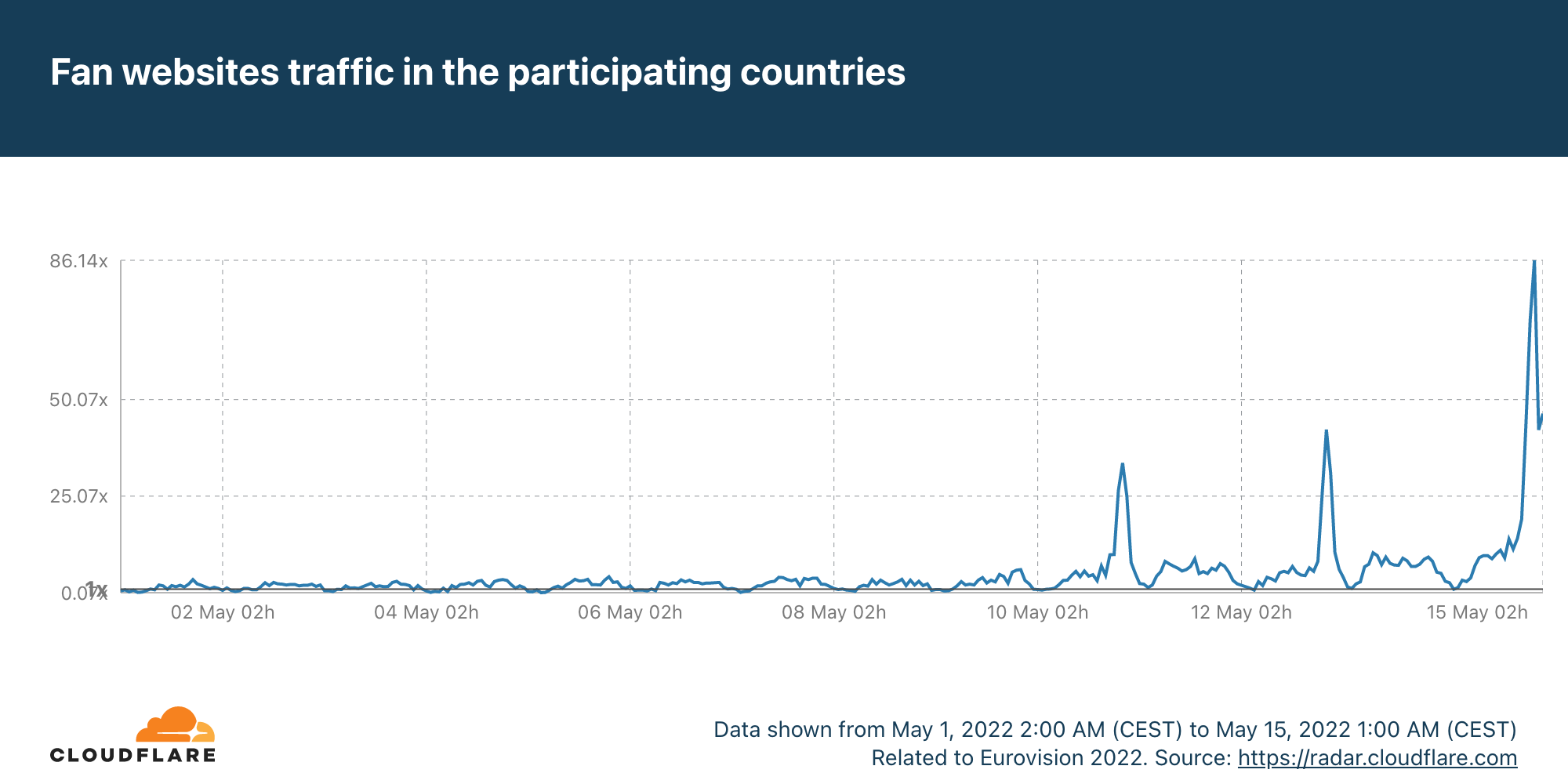
“We have a winner. The winner of the Eurovision Song Contest 2022 is… Ukraine!”.
— Alessandro Cattelan, Laura Pausini and Mika at 01:01 CEST, May 15, 2022.
Saturday’s final was more than four hours long (the semi-finals took little over two hours), and it finished a few minutes after 01:00 CEST. DNS traffic to fan websites dropped from 86x to 45x at midnight, but it went up again to 49x more traffic when it was already 01:00 CEST in most of Europe and Ukraine was announced the winner of Eurovision 2022. This next chart shows Saturday’s May 14 final traffic change to fan sites:
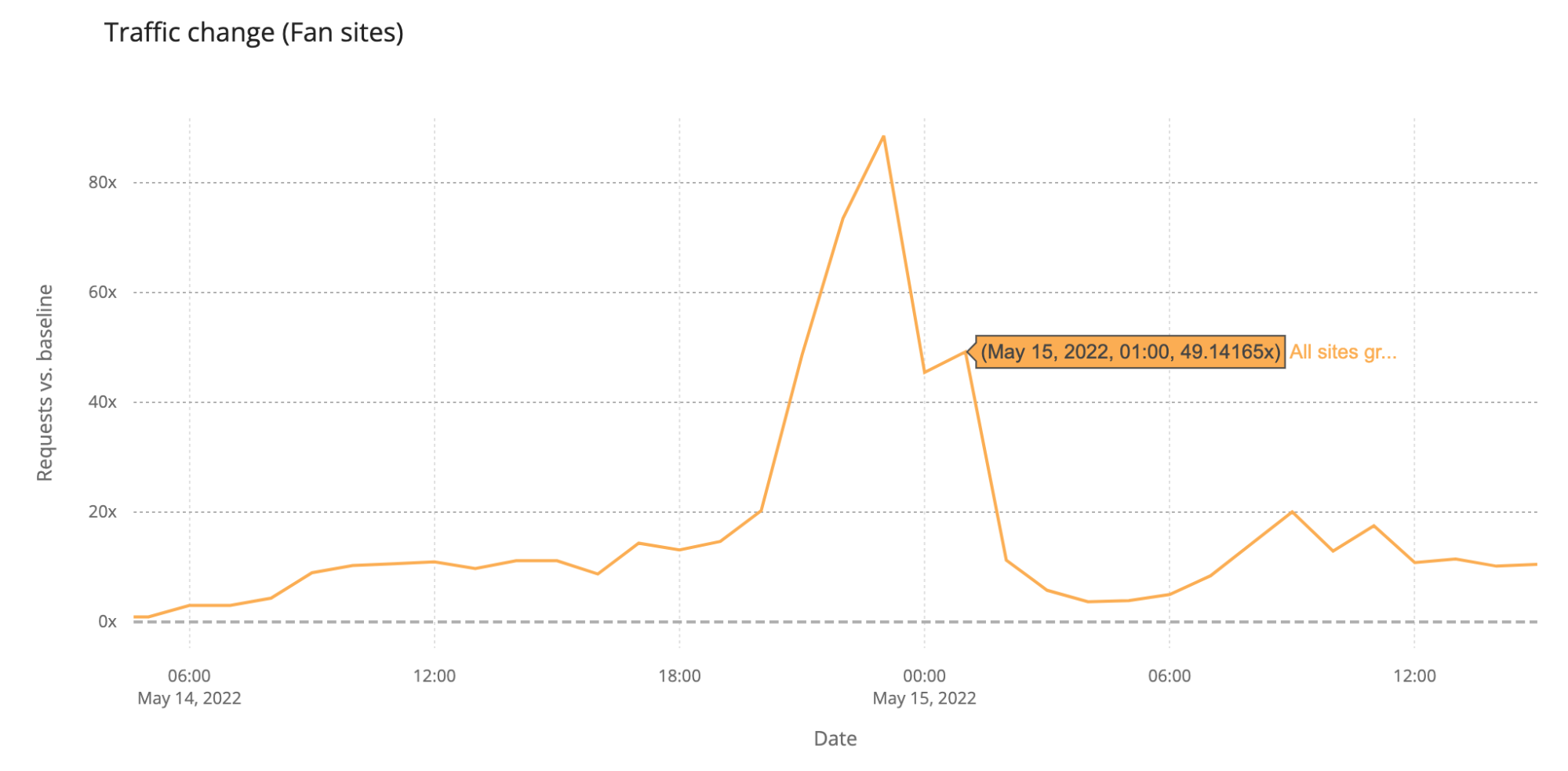
We can also clearly see that on Sunday morning, at 09:00, there was a 20x peak to fan sites, and also at 11:00 (17%).
Now, let’s go deeper by looking at a minute by minute view (the previous charts show hourly data) of DNS traffic to fan sites. In the two semi-finals it’s easy to see that the moment the finalists were announced, and the event was ending, around 23:12, was when traffic was higher. Here’s what the May 10 (yellow) and May 12 (green) two semi-finals fan sites growth looked like:
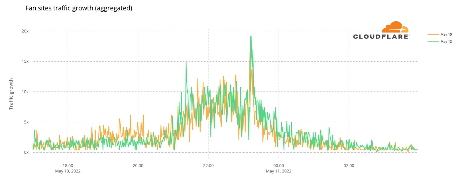
We can also spot some highlights in fan sites during the semi-final besides the finalists’ announcement, which we saw were definitely the most popular moments of the two nights. First, on May 10 there was more traffic before the event (21:00) than on May 12, so people seem to have greater expectations of the first Eurovision 2022 event of the week. In terms of spikes (before the winners’ announcements), we created a list of moments in time with more interest to the fan websites and connected them to the events that were taking place at that time in Eurovision (ordered by impact):
First semi-final, May 10
#1. 22:47 Sum up of all the songs.
#2. 22:25 Norway’s song (Subwoolfer, “Give That Wolf a Banana”).
#3. 21:42 Bulgaria’s song (Intelligent Music Project, “Intention”).
#4. 21:51 Moldova’s song (Zdob și Zdub and Advahov Brothers, “Trenulețul”).
#5. 22:20 Greece’s song (Amanda Georgiadi Tenfjord, “Die Together”).
Second semi-final, May 12
#1. 21:22 Between Serbia (Konstrakta, “In corpore sano”) and Azerbaijan (Nadir Rustamli, “Fade to Black”).
#2. 22:48 Voting period starts.
#3. 22:30 Czech Republic’s song (We Are Domi, “Lights Off”).
#4. 22:38 Laura Pausini & Mika performing (“Fragile” Sting cover song).
#5. 22:21 Belgium’s song (Jérémie Makiese, “Miss You”).
How about the May 14 final? This chart (followed by a ranking list) shows DNS traffic spikes in fan sites on Saturday’s final:
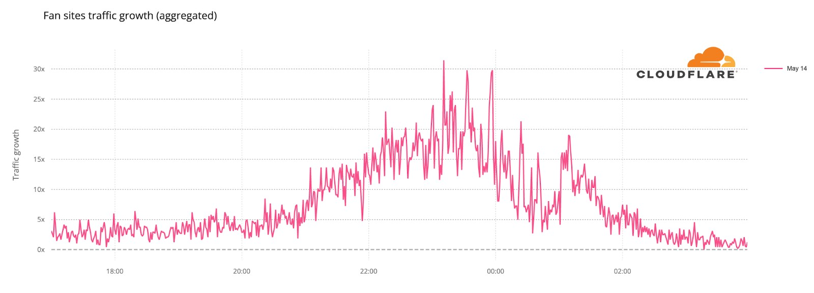
Final, May 14
#1. 23:11 Between Serbia (Konstrakta, “In corpore sano”) and Estonia (Stefan, “Hope”).
#2. 23:33 Sum up of all the songs.
#3. 23:57 Voting ended.
#4. 23:19 Sum up of all the songs.
#5. 23:01 Ending of the United Kingdom’s song (Sam Ryder, “Space Man”).
no words, just #teamSPACEMAN👩🚀 pure joy backstage after #Eurovision @SamRyderMusic @grahnort @BBCiPlayer pic.twitter.com/UMplMpFeXl
— BBC Eurovision🇬🇧 | 👩🚀#teamSPACEMAN (@bbceurovision) May 15, 2022
(UK’s performer and representative Sam Ryder with Graham Norton, the BBC commentator of Eurovision since 2009 — the BBC broadcasts the event since 1956.)
The broadcasters show
How about official national broadcaster websites? Around 23:00 CEST traffic to the aggregate of 40 broadcasters was generally higher on the semi-finals and final nights (represented in grey on the next chart). That’s more clear on the final at 23:00, when DNS traffic was 18% higher than in the previous Saturday (and 50% compared to the previous day). During the semi-finals the difference is more subtle, but at 23:00 traffic in both May 10 and 12 traffic was ~6% higher than in previous days.
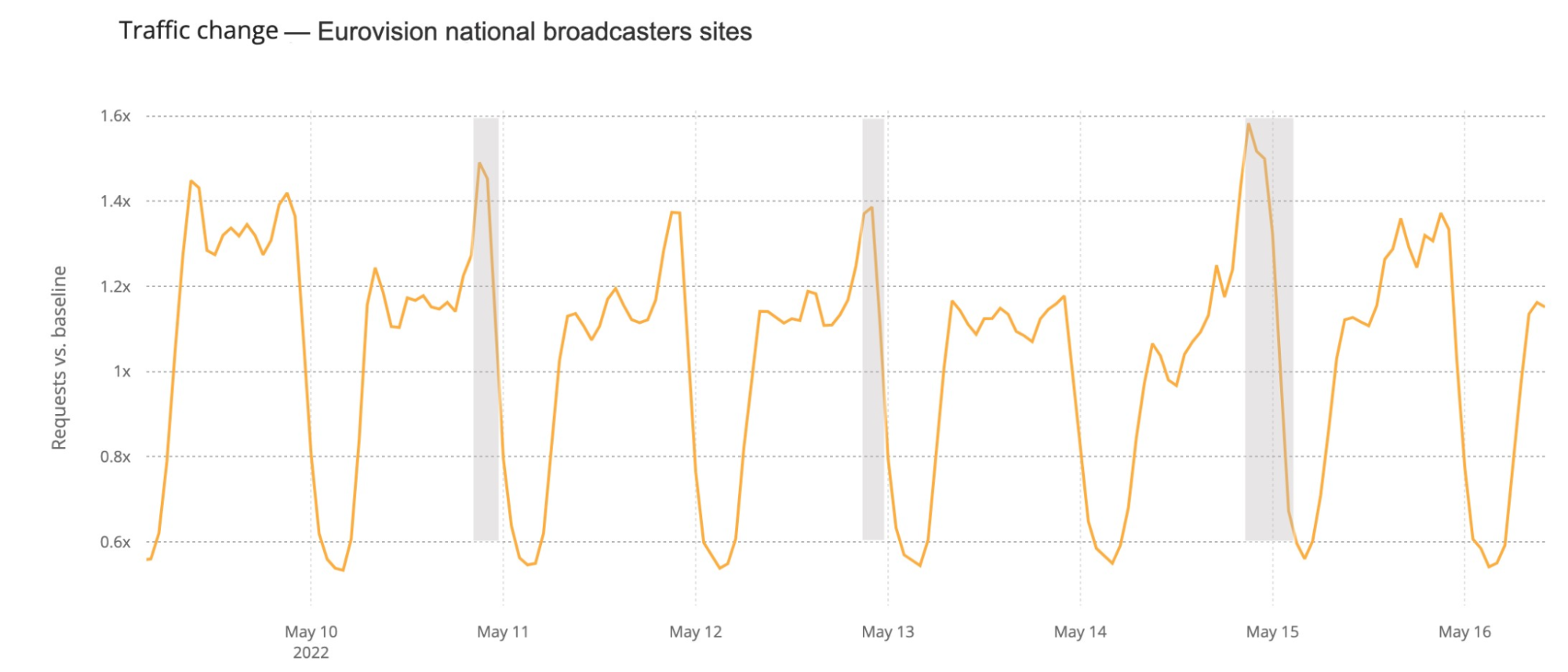
When we focus on the minute by minute view also on the broadcaster sites but on the three Eurovision evenings, the highest growth in traffic is also during the final (like we saw in the fan sites), mainly after 23:00, which seems normal, considering that the final was much longer in time than the semi-finals that ended around that time.
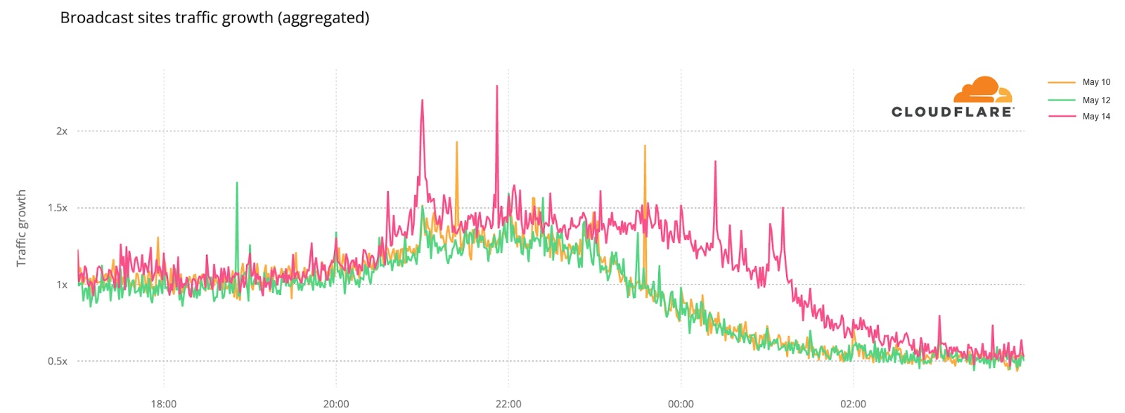
During the final (represented in pink in the previous chart), there were some clear spikes. We’ve added them to a ranking that also shows what was happening in the event at that time.
Broadcaster site spikes. Final, May 14
#1. 21:52 Best moments clip of the two semi-finals
#2. 21:00 Contest starts
#3. 00:24 Sam Ryder, the UK representative (with the song “Space Man”) being interviewed after reaching the #1 in the voting process.
#4. 01:09 Ukraine’s (Kalush Orchestra, “Stefania”) performance as the winner
#5. 01:02 Ukraine was announced as the Eurovision 2022 winner.
Video platforms: the post-final growth
Eurovision uses video platforms like YouTube and TikTok to share all the songs, clips of the events and performers and there was also a live transmission on YouTube of the three nights. Given that, we looked at DNS traffic to the video platforms in an aggregate for the 40 participating countries. So, was there an impact to this well known and high performing social and video platforms? The short answer is: yes.
The final was also the most evident example, especially after 23:15, when all the 25 finalists songs already performed and the event had two more hours of non-participant performances, video clips that summarize the songs and the voting process — the famous moment in Europe to find out who will get from each of the 40 participant countries the maximum of 12 points.
In this comparison between the semi-finals and final day, we can see how on May 10, the day of the first semi-final, video platform traffic had more growth before the contest started, which is not that surprising given that it was the first Eurovision 2022 event and there was perhaps curiosity to check who were the other contestants (by then Eurovision had videos of them all on YouTube).
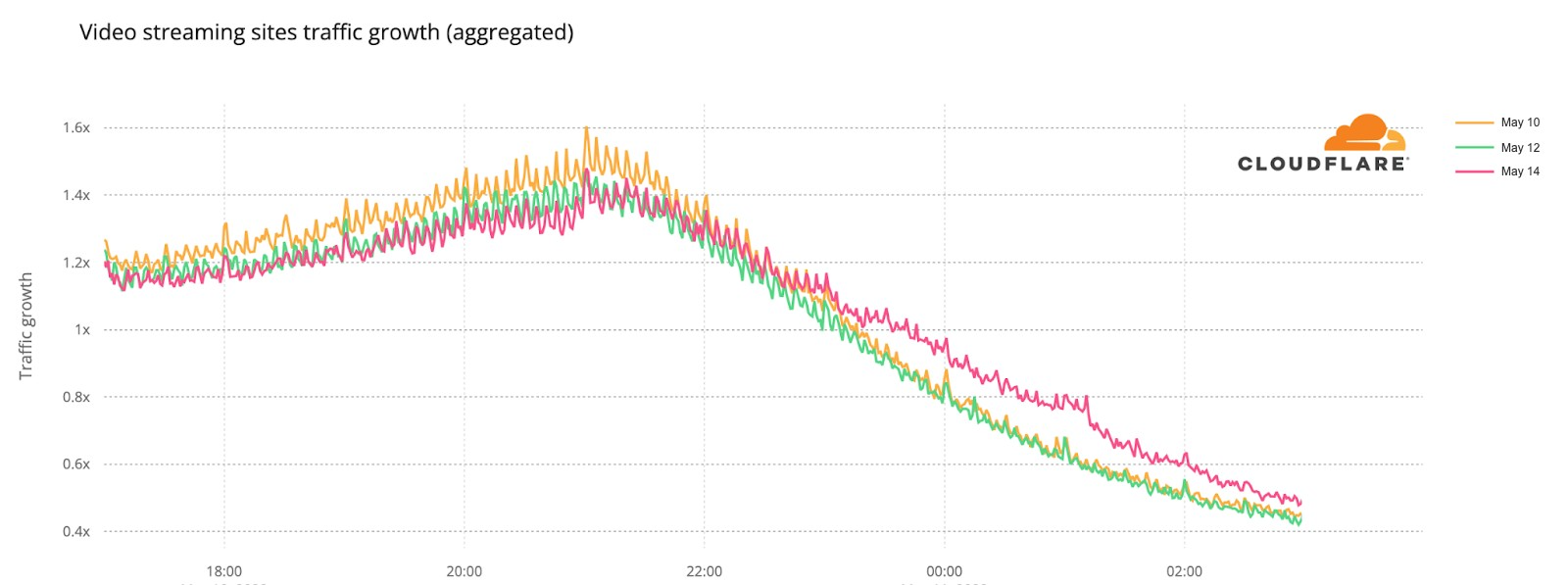
But the May 14 final shows more DNS traffic growth than the other Eurovision days after 23:16 (as we saw before, that was the time when all the finalists’ songs had already been performed). The difference in traffic compared to the semi-finals was higher at 1:11 CEST. That was the moment that the final came to an end on Saturday night, and at that time it reached 31% more traffic to video platforms than on May 10, and 38% than on May 12.
Australia’s impact (with an eight hours difference)
Australia was one of the 40 participants, and it had a major time difference (there’s an eight-hour difference to CEST). Continuing to look at video platforms, DNS traffic in Australia was 22% higher at 23:00 CEST (07:00 local time) than it was in the previous Saturday and continued high around 17% of increase a few hours after. Before the 23:00 peak, traffic was 20% higher at 22:00 and 17% at 21:00, when the event was beginning.
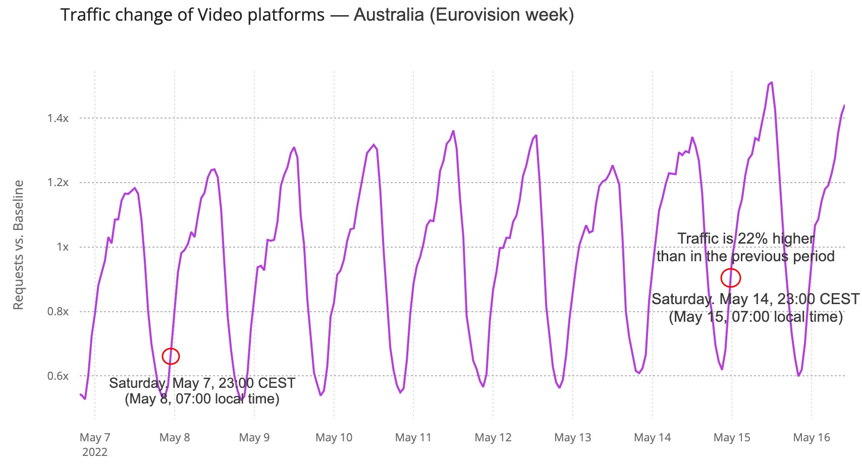
The winners & social media
Social media in general in the 40 participating countries wasn’t as impacted, but there was a 01:00 CEST spike during the final at around the time the decision to choose the winner was between Ukraine and the UK — at 01:01 Ukraine was announced the winner of Eurovision 2022.
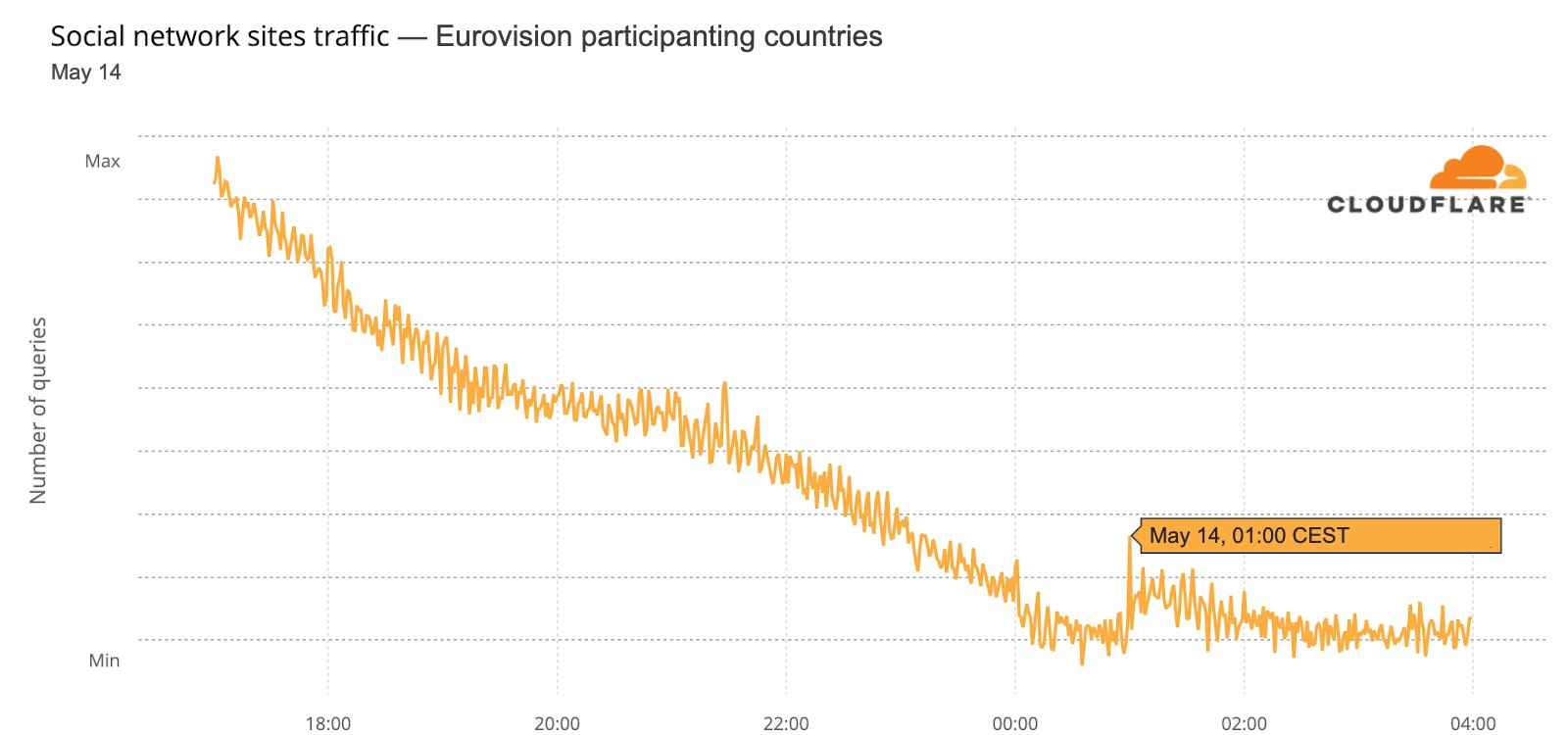
We can also see an impact on social media in Ukraine, when Kalush Orchestra’s “Stefania” song was announced the winner at Saturday’s, May 14, final (it was already after midnight, May 15). The usual traffic slowing down night trend that is seen in other days was clearly interrupted after 01:02 CEST (02:02 local time in Ukraine).
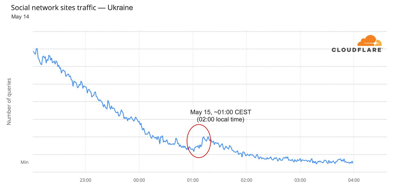
Conclusion: the Eurovision effect
When an event like Eurovision happens, there are different patterns on the Internet in the participating countries, usually all in Europe (although this year Australia was also there). Fan and broadcaster websites have specific impact because of the event, but in such a multimedia event, there are also some changes in video platforms’ DNS traffic.
And that trend goes as far as the Internet traffic of the participating countries at a more general level, something that seems to indicate that people, at least for some parts of Eurovision and in some countries, were more focused on their national TV broadcast.
The Internet is definitely a human-centric place, as we saw before in different moments like the 2022 Oscars, the Super Bowl, French elections, Ramadan or even the war on Ukraine and the impact on the open Internet in Russia.
Security updates for Thursday
Post Syndicated from original https://lwn.net/Articles/895771/
Security updates have been issued by Fedora (microcode_ctl, rubygem-nokogiri, and vim), Mageia (htmldoc, python-django, and python-oslo-utils), Red Hat (container-tools:2.0, kernel, kernel-rt, kpatch-patch, and pcs), SUSE (ardana-barbican, grafana, openstack-barbican, openstack-cinder, openstack-heat-gbp, openstack-horizon-plugin-gbp-ui, openstack-ironic, openstack-keystone, openstack-neutron-gbp, python-lxml, release-notes-suse-openstack-cloud, autotrace, curl, firefox, libslirp, php7, poppler, slurm_20_11, and ucode-intel), and Ubuntu (bind9, gnome-control-center, and libxrandr).