Netflix has open-sourced Escrow Buddy, which helps Security and IT teams ensure they have valid FileVault recovery keys for all their Macs in MDM.
To be a client systems engineer is to take joy in small endpoint automations that make your fellow employees’ day a little better. When somebody is unable to log into their FileVault-encrypted Mac, few words are more joyful to hear than a support technician saying, “I’ve got your back. Let’s look up the recovery key.”
Securely and centrally escrowing FileVault personal recovery keys is one of many capabilities offered by Mobile Device Management (MDM). A configuration profile that contains the FDERecoveryKeyEscrow payload will cause any new recovery key generated on the device, either by initially enabling FileVault or by manually changing the recovery key, to be automatically escrowed to your MDM for later retrieval if needed.
The problem of missing FileVault keys
However, just because you’re deploying the MDM escrow payload to your managed Macs doesn’t necessarily mean you have valid recovery keys for all of them. Recovery keys can be missing from MDM for numerous reasons:
FileVault may have been enabled prior to enrollment in MDM
The MDM escrow payload may not have been present on the Mac due to scoping issues or misconfiguration on your MDM
The Macs may be migrating from a different MDM in which the keys are stored
MDM database corruption or data loss events may have claimed some or all of your escrowed keys
Regardless of the cause, the effect is people who get locked out of their Macs must resort to wiping their computer and starting fresh — a productivity killer if your data is backed up, and a massive data loss event if it’s not backed up.
Less than ideal solutions
IT and security teams have approached this problem from multiple angles in the past. On a per-computer basis, a new key can be generated by disabling and re-enabling FileVault, but this leaves the computer in an unencrypted state briefly and requires multiple steps. The built-in fdesetup command line tool can also be used to generate a new key, but not all users are comfortable entering Terminal commands. Plus, neither of these ideas scale to meet the needs of a fleet of Macs hundreds or thousands strong.
Another approach has been to use a tool capable of displaying an onscreen text input field to the user in order to display a password prompt, and then pass the provided password as input to the fdesetup tool for generating a new key. However, this requires IT and security teams to communicate in advance of the remediation campaign to affected users, in order to give them the context they need to respond to the additional password prompt. Even more concerning, this password prompt approach has a detrimental effect on security culture because it contributes to “consent fatigue.” Users will be more likely to approve other types of password prompt, which may inadvertently prime them to be targeted by malware or ransomware.
The ideal solution would be one which can be automated across your entire fleet while not requiring any additional user interaction.
Crypt and its authorization plugin
macOS authorization plugins provide a way to connect with Apple’s authorization services API and participate in decisions around user login. They can also facilitate automations that require information available only in the “login window” context, such as the provided username and password.
Relatively few authorization plugins are broadly used within the Mac admin community, but one popular example is the Crypt agent. In its typical configuration the Crypt agent enforces FileVault upon login and escrows the resulting recovery key to a corresponding Crypt server. The agent also enables rotation of recovery keys after use, local storage and validation of recovery keys, and other features.
While the Crypt agent can be deployed standalone and configured to simply regenerate a key upon next login, escrowing keys to MDM isn’t Crypt’s primary use case. Additionally, not all organizations have the time, expertise, or interest to commit to hosting a Crypt server and its accompanying database, or auditing the parts of Crypt’s codebase relating to its server capabilities.
Introducing Escrow Buddy
Inspired by Crypt’s example, our Client Systems Engineering team created a minimal authorization plugin focused on serving the needs of organizations who escrow FileVault keys to MDM only. We call this new tool Escrow Buddy.
Escrow Buddy’s authorization plugin includes a mechanism that, when added to the macOS login authorization database, will use the logging in user’s credentials as input to the fdesetup tool to automatically and seamlessly generate a new key during login. By integrating with the familiar and trusted macOS login experience, Escrow Buddy eliminates the need to display additional prompts or on-screen messages.
Security and IT teams can take advantage of Escrow Buddy in three steps:
Ensure your MDM is deploying the FDERecoveryKeyEscrow payload to your managed Macs. This will ensure any newly generated FileVault key, no matter the method of generation, will be automatically escrowed to MDM.
Deploy Escrow Buddy. The latest installer is available here, and you can choose to deploy to all your managed Macs or just the subset for which you need to escrow new keys.
On Macs that lack a valid escrowed key, configure your MDM to run this command in root context:
That’s it! At next startup or login, the specified Macs should generate a new key, which will be automatically escrowed to your MDM when the Mac next responds to a SecurityInfo command. (Timing varies by MDM vendor but this is often during an inventory update.)
Community contribution
Netflix is making Escrow Buddy’s source available via the Mac Admins Open Source organization on GitHub, the home of many other important projects in the Mac IT and security community, including Nudge, InstallApplications, Outset, and the Munki signed builds. Thousands of organizations worldwide benefit from the tools and ideas shared by the Mac admin community, and Netflix is excited that Escrow Buddy will be among them.
The Escrow Buddy repository leverages GitHub Actions to streamline the process of building new codesigned and notarized releases when new changes are merged into the main branch. Our hope is that this will make it easy for contributors to collaborate and improve upon Escrow Buddy.
A rising tide…
Escrow Buddy represents our desire to elevate the industry standard around FileVault key regeneration. If your organization currently employs a password prompt workflow for this scenario, please consider trying Escrow Buddy instead. We hope you’ll find it more automatic, more supportive of security culture, and enables you to more often say “I’ve got your back” to your fellow employees who need a recovery key.
Maximizing immersion for our members is an important goal for the Netflix product and engineering teams to keep our members entertained and fully engaged in our content. Leveraging a good mix of mature and cutting-edge client device technologies to deliver a smooth playback experience with glitch-free in-app transitions is an important step towards achieving this goal. In this article we explain our journey towards productizing a better viewing experience for our members by utilizing features and capabilities in consumer streaming devices.
If you have a streaming device connected to your TV, such as a Roku Set Top Box (STB) or an Amazon FireTV Stick, you may have come across an option in the device display setting pertaining to content frame rate. Device manufacturers often call this feature “Match Content Frame Rate”, “Auto adjust display refresh rate” or something similar. If you’ve ever wondered what these features are and how they can improve your viewing experience, keep reading — the following sections cover the basics of this feature and explain the details of how the Netflix application uses it.
Problem
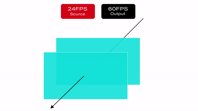
Netflix’s content catalog is composed of video captured and encoded in one of various frame rates ranging from 23.97 to 60 frames per second (fps). When a member chooses to watch a movie or a TV show on a source device (ex. Set-top box, Streaming stick, Game Console, etc…) the content is delivered and then decoded at its native frame rate, which is the frame rate it was captured and encoded in. After the decode step, the source device converts it to the HDMI output frame rate which was configured based on the capabilities of the HDMI input port of the connected sink device (TV, AVR, Monitor etc). In general, the output frame rate over HDMI is automatically set to 50fps for PAL regions and 60fps for NTSC regions.
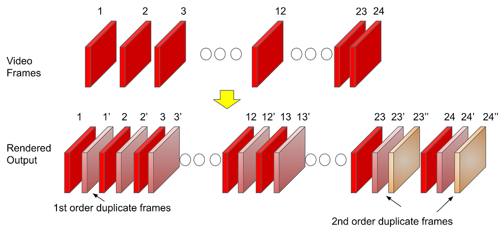
Netflix offers limited high frame rate content (50fps or 60fps), but the majority of our catalog and viewing hours can be attributed to members watching 23.97 to 30fps content. This essentially means that most of the time, our content goes through a process called frame rate conversion (aka FRC) on the source device which converts the content from its native frame rate to match the HDMI output frame rate by replicating frames. Figure 1 illustrates a simple FRC algorithm that converts 24fps content to 60fps.
Figure 1 : 3:2 pulldown technique to convert 24FPS content to 60FPS
Converting the content and transmitting it over HDMI at the output frame rate sounds logical and straightforward. In fact, FRC works well when the output frame rate is an integer multiple of the native frame rate ( ex. 24→48, 25→50, 30→60, 24→120, etc…). On the other hand, FRC introduces a visual artifact called Judder when non-integer multiple conversion is required (ex. 24→60, 25→60, etc…), which manifests as choppy video playback as illustrated below:
With JudderWithout Judder
It is important to note that the severity of the judder depends on the replication pattern. For this reason, judder is more prominent in PAL regions because of the process of converting 24fps content to 50fps over HDMI (see Figure 2):
Total of 50 frames must be transmitted over HDMI per second
Source device must replicate the original 24 frames to fill in the missing 26 frames
50 output frames from 24 original frames are derived as follows:
22 frames are duplicated ( total of 44 frames )
2 frames are repeated three times ( total of 6 frames )
Figure 2: Example of a 24 to 50fps frame rate conversion algorithm
As a review, judder is more pronounced when the frequency of the number of repeated frames is inconsistent and spread out e.g. in the scenario mentioned above, the frame replication factor varies between 2 and 3 resulting in a more prominent judder.
Judder Mitigation Solutions
Now that we have a better understanding of the issue, let’s review the solutions that Netflix has invested in. Due to the fragmented nature of device capabilities in the ecosystem, we explored multiple solutions to address this issue for as many devices as possible. Each unique solution leverages existing or new source device capabilities and comes with various tradeoffs.
Solution #1: Match HDMI frame rate to content Native Frame Rate
The first solution we explored and recently enabled leverages the capability of existing source & sink devices to change the outgoing frame rate on the HDMI link. Once this feature is enabled in the system settings, devices will match the HDMI output frame rate with the content frame rate, either exactly or an integer multiple, without user intervention.
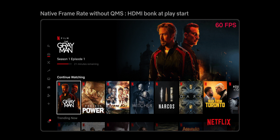
While this sounds like the perfect solution, devices that support older HDMI technologies e.g. HDMI v<2.1, can’t change the frame rate without also changing the HDMI data rate. This results in what is often referred as an “HDMI bonk” which causes the TV to display a blank screen momentarily. Not only is this a disruptive experience for members, but the duration of the blank screen varies depending on how fast the source and sink devices can resynchronize. Figure 3 below is an example of how this transition looks:
Figure 3: Native frame rate experience with screen blanking
Solution #2 : Match HDMI frame rate to content Native Frame Rate w/o screen blanking
Improvements in the recent HDMI standards (HDMI 2.1+) now allow a source device to send the video content at its native frame rate without needing an HDMI resynchronization. This is possible through an innovative technology called Quick Media Switching (QMS) which is an extension of Variable Refresh Rate (VRR) targeted for content playback scenarios. QMS allows a source device to maintain a constant data rate on the HDMI link even during transmission of content with different frame rates. It does so by adjusting the amount of non-visible padding data while keeping the amount of visible video data constant. Due to the constant HDMI data rate, the HDMI transmitter and receiver don’t need to resynchronize, leading to a seamless/glitch-free transition as illustrated in Figure 4.
HDMI QMS is positioned to be the ideal solution to address the problem we are presenting. Unfortunately, at present, this technology is relatively new and adoption into source and sink devices will take time.
Figure 4: Native frame rate experience without screen blanking using HDMI QMS
Solution #3: Frame Rate Conversion within Netflix Application
Apart from the above HDMI specification dependent solutions, it is possible for an application like Netflix to manipulate the presentation time stamp value of each video frame to minimize the effect of judder i.e. the application can present video frames to the underlying source device platform at a cadence that can help the source device to minimize the judder associated with FRC on the HDMI output link.
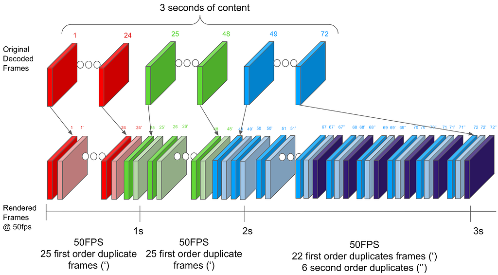
Let us understand this idea with the help of an example. Let’s go back to the same 24 to 50 fps FRC scenario that was covered earlier. But, instead of thinking about the FRC rate per second (24 ⇒ 50 fps), let’s expand the FRC calculation time period to 3 seconds (24*3 = 72 ⇒50*3 = 150 fps). For content with a native frame rate of 24 fps, the source device needs to get 72 frames from the streaming application in a period of 3 seconds. Now instead of sending 24 frames per second at a regular per second cadence, for each 3 second period the Netflix application can decide to send 25 frames in the first 2 seconds (25 x 2 = 50) and 22 frames in the 3rd second thereby still sending a total of 72 (50+22) frames in 3 seconds. This approach creates an even FRC in the first 2 seconds (25 frames replicated twice evenly) and in the 3rd second the source device can do a 22 to 50 fps FRC which will create less visual judder compared to the 24->50 fps FRC given a more even frame replication pattern. This concept is illustrated in Figure 5 below.
Figure 5: FRC Algorithm from Solution#3 for 24 to 50 fps conversion
NOTE: This solution was developed by David Zheng in the Partner Experience Technology team at Netflix. Watch out for an upcoming article going into further details of this solution.
How the Netflix Application Uses these Solutions
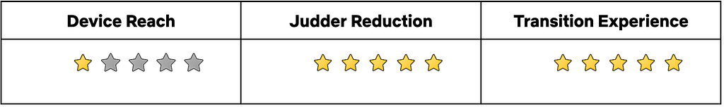
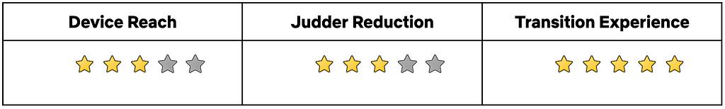
Given the possible solutions available to use and the associated benefits and limitations, the Netflix application running on a source device adapts to use one of these approaches based on factors such as source and sink device capabilities, user preferences and the specific use case within the Netflix application. Let’s walk through each of these aspects briefly.
Device Capability
Every source device that integrates the Netflix application is required to let the application know if it and the connected sink device have the ability to send and receive video content at its native frame rate. In addition, a source device is required to inform whether it can support QMS and perform a seamless playback start of any content at its native frame rate on the connected HDMI link.
As discussed in the introduction section, the presence of a system setting like “Match Content Frame Rate” typically indicates that a source device is capable of this feature.
User Preference
Even if a source device and the connected sink can support Native content frame rate streaming (seamless or non-seamless), a user might have selected not to do this via the source device system settings e.g. “Match Content Frame Rate” set to “Never”. Or they might have indicated a preference of doing this only when the native content frame rate play start can happen in a seamless manner e.g. “Match Content Frame Rate” set to “Seamless”.
The Netflix application needs to know this user selection in order to honor their preference. Hence, source devices are expected to relay this user preference to the Netflix application to help with this run-time decision making.
Netflix Use Case
In spite of source device capability and the user preferences collectively indicating that the Native Content Frame Rate streaming should be enabled, the Netflix application can decide to disable this feature for specific member experiences. As an example, when the user is browsing Netflix content in the home UI, we cannot play Netflix trailers in their Native frame rate due to the following reasons:
If using Solution # 1, when the Netflix trailers are encoded in varying content frame rates, switching between trailers will result in screen blanking, thereby making the UI browsing unusable.
If using Solution # 2, sending Netflix trailers in their Native frame rate would mean that the associated UI components (movement of cursor, asset selection etc) would also be displayed at the reduced frame rate and this will result in a sluggish UI browsing experience. This is because on HDMI output from the source device, both graphics (Netflix application UI) and video components will go out at the same frame rate (native content frame rate of the trailer) after being blended together on the source device.
To handle these issues we follow an approach as shown in Figure 6 below where we enable the Native Frame Rate playback experience only when the user selects a title and watches it in full screen with minimal graphical UI elements.
Figure 6: Native Frame Rate usage within Netflix application
Conclusion
This article presented features that aim to improve the content playback experience on HDMI source devices. The breadth of available technical solutions, user selectable preferences, device capabilities and the application of each of these permutations in the context of various in-app member journeys represent a typical engineering and product decision framework at Netflix. Here at Netflix, our goal is to maximize immersion for our members through introduction of new features that will improve their viewing experience and keep them fully engaged in our content.
Acknowledgements
We would like to acknowledge the hard work of a number of teams that came together to deliver the features being discussed in this document. These include Core UI and JS Player development, Netflix Application Software development, AV Test and Tooling (earlier article from this team), Partner Engineering and Product teams in the Consumer Engineering organization and our data science friends in the Data Science and Engineering organization at Netflix. Diagrams in this article are courtesy of our Partner Enterprise Platform XD team.
Native Frame Rate Playback was originally published in Netflix TechBlog on Medium, where people are continuing the conversation by highlighting and responding to this story.
In November 2022, we introduced a brand new tier — Basic with ads. This tier extended existing infrastructure by adding new backend components and a new remote call to our ads partner on the playback path. As we were gearing up for launch, we wanted to ensure it would go as smoothly as possible. To do this, we devised a novel way to simulate the projected traffic weeks ahead of launch by building upon the traffic migration framework described here. We used this simulation to help us surface problems of scale and validate our Ads algorithms.
Basic with ads was launched worldwide on November 3rd. In this blog post, we’ll discuss the methods we used to ensure a successful launch, including:
How we tested the system
Netflix technologies involved
Best practices we developed
Realistic Test Traffic
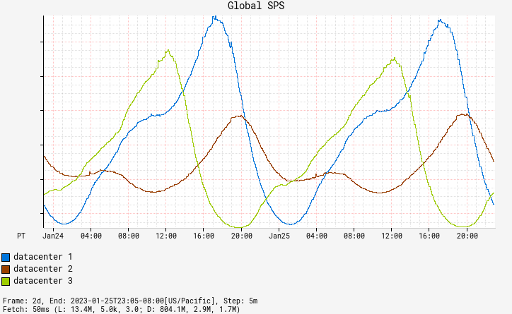
Netflix traffic ebbs and flows throughout the day in a sinusoidal pattern. New content or national events may drive brief spikes, but, by and large, traffic is usually smoothly increasing or decreasing. An exception to this trend is when we redirect traffic between AWS data centers during regional evacuations, which leads to sudden spikes in traffic in multiple regions. Region evacuations can occur at any time, for a variety of reasons.
Fig. 1: Traffic Patterns
While evaluating options to test anticipated load and evaluate our ad selection algorithms at scale, we realized that mimicking member viewing behavior in combination with the seasonality of our organic traffic with abrupt regional shifts were important requirements. Replaying real traffic and making it appear as Basic with ads traffic was a better solution than artificially simulating Netflix traffic. Replay traffic enabled us to test our new systems and algorithms at scale before launch, while also making the traffic as realistic as possible.
The Setup
A key objective of this initiative was to ensure that our customers were not impacted. We used member viewing habits to drive the simulation, but customers did not see any ads as a result. Achieving this goal required extensive planning and implementation of measures to isolate the replay traffic environment from the production environment.
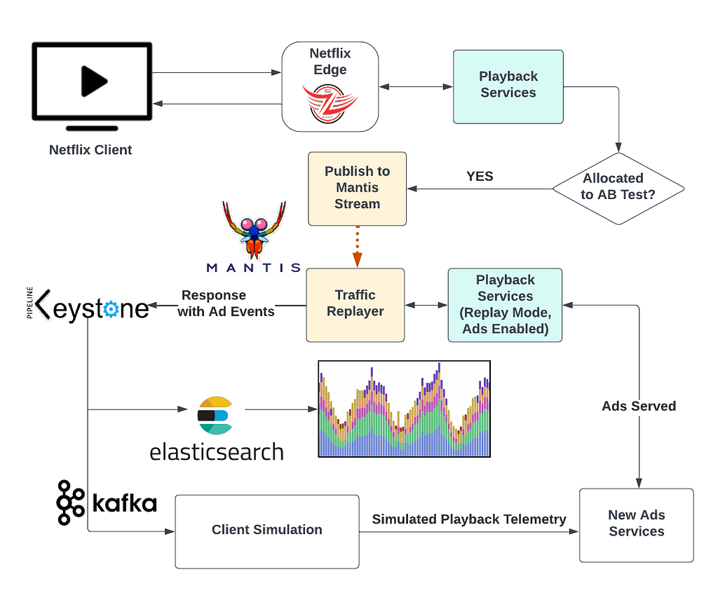
Netflix’s data science team provided projections of what the Basic with ads subscriber count would look like a month after launch. We used this information to simulate a subscriber population through our AB testing platform. When traffic matching our AB test criteria arrived at our playback services, we stored copies of those requests in a Mantis stream.
Next, we launched a Mantis job that processed all requests in the stream and replayed them in a duplicate production environment created for replay traffic. We set the services in this environment to “replay traffic” mode, which meant that they did not alter state and were programmed to treat the request as being on the ads plan, which activated the components of the ads system.
The replay traffic environment generated responses containing a standard playback manifest, a JSON document containing all the necessary information for a Netflix device to start playback. It also included metadata about ads, such as ad placement and impression-tracking events. We stored these responses in a Keystone stream with outputs for Kafka and Elasticsearch. A Kafka consumer retrieved the playback manifests with ad metadata and simulated a device playing the content and triggering the impression-tracking events. We used Elasticsearch dashboards to analyze results.
Ultimately, we accurately simulated the projected Basic with ads traffic weeks ahead of the launch date.
Fig. 2: The Traffic Replay Setup
The Rollout
To fully replay the traffic, we first validated the idea with a small percentage of traffic. The Mantis query language allowed us to set the percentage of replay traffic to process. We informed our engineering and business partners, including customer support, about the experiment and ramped up traffic incrementally while monitoring the success and error metrics through Lumen dashboards. We continued ramping up and eventually reached 100% replay. At this point we felt confident to run the replay traffic 24/7.
To validate handling traffic spikes caused by regional evacuations, we utilized Netflix’s region evacuation exercises which are scheduled regularly. By coordinating with the team in charge of region evacuations and aligning with their calendar, we validated our system and third-party touchpoints at 100% replay traffic during these exercises.
We also constructed and checked our ad monitoring and alerting system during this period. Having representative data allowed us to be more confident in our alerting thresholds. The ads team also made necessary modifications to the algorithms to achieve the desired business outcomes for launch.
Finally, we conducted chaos experiments using the ChAP experimentation platform. This allowed us to validate our fallback logic and our new systems under failure scenarios. By intentionally introducing failure into the simulation, we were able to identify points of weakness and make the necessary improvements to ensure that our ads systems were resilient and able to handle unexpected events.
The availability of replay traffic 24/7 enabled us to refine our systems and boost our launch confidence, reducing stress levels for the team.
Takeaways
The above summarizes three months of hard work by a tiger team consisting of representatives from various backend teams and Netflix’s centralized SRE team. This work helped ensure a successful launch of the Basic with ads tier on November 3rd.
To briefly recap, here are a few of the things that we took away from this journey:
Accurately simulating real traffic helps build confidence in new systems and algorithms more quickly.
Large scale testing using representative traffic helps to uncover bugs and operational surprises.
Replay traffic has other applications outside of load testing that can be leveraged to build new products and features at Netflix.
What’s Next
Replay traffic at Netflix has numerous applications, one of which has proven to be a valuable tool for development and launch readiness. The Resilience team is streamlining this simulation strategy by integrating it into the CHAP experimentation platform, making it accessible for all development teams without the need for extensive infrastructure setup. Keep an eye out for updates on this.
The Compute team at Netflix is charged with managing all AWS and containerized workloads at Netflix, including autoscaling, deployment of containers, issue remediation, etc. As part of this team, I work on fixing strange things that users report.
This particular issue involved a custom internal FUSE filesystem: ndrive. It had been festering for some time, but needed someone to sit down and look at it in anger. This blog post describes how I poked at /procto get a sense of what was going on, before posting the issue to the kernel mailing list and getting schooled on how the kernel’s wait code actually works!
Here, our management engine has made an HTTP call to the Docker API’s unix socket asking it to kill a container. Our containers are configured to be killed via SIGKILL. But this is strange. kill(SIGKILL) should be relatively fatal, so what is the container doing?
$ docker exec -it 6643cd073492 bash
OCI runtime exec failed: exec failed: container_linux.go:380: starting container process caused: process_linux.go:130: executing setns process caused: exit status 1: unknown
Hmm. Seems like it’s alive, but setns(2) fails. Why would that be? If we look at the process tree via ps awwfux, we see:
It is in the process of exiting, but it seems stuck. The only child is the ndrive process in Z (i.e. “zombie”) state, though. Zombies are processes that have successfully exited, and are waiting to be reaped by a corresponding wait() syscall from their parents. So how could the kernel be stuck waiting on a zombie?
# ls /proc/1544450/task
1544450  1544574
Ah ha, there are two threads in the thread group. One of them is a zombie, maybe the other one isn’t:
Indeed it is not a zombie. It is trying to become one as hard as it can, but it’s blocking inside FUSE for some reason. To find out why, let’s look at some kernel code. If we look at zap_pid_ns_processes(), it does:
/*
 * Reap the EXIT_ZOMBIE children we had before we ignored SIGCHLD.
 * kernel_wait4() will also block until our children traced from the
 * parent namespace are detached and become EXIT_DEAD.
 */
do {
        clear_thread_flag(TIF_SIGPENDING);
        rc = kernel_wait4(-1, NULL, __WALL, NULL);
} while (rc != -ECHILD);
which is where we are stuck, but before that, it has done:
/* Don't allow any more processes into the pid namespace */
disable_pid_allocation(pid_ns);
which is why docker can’t setns() — the namespace is a zombie. Ok, so we can’t setns(2), but why are we stuck in kernel_wait4()? To understand why, let’s look at what the other thread was doing in FUSE’s request_wait_answer():
/*
 * Either request is already in userspace, or it was forced.
 * Wait it out.
 */
wait_event(req->waitq, test_bit(FR_FINISHED, &req->flags));
Ok, so we’re waiting for an event (in this case, that userspace has replied to the FUSE flush request). But zap_pid_ns_processes()sent a SIGKILL! SIGKILL should be very fatal to a process. If we look at the process, we can indeed see that there’s a pending SIGKILL:
Viewing process status this way, you can see 0x100 (i.e. the 9th bit is set) under SigPnd, which is the signal number corresponding to SIGKILL. Pending signals are signals that have been generated by the kernel, but have not yet been delivered to userspace. Signals are only delivered at certain times, for example when entering or leaving a syscall, or when waiting on events. If the kernel is currently doing something on behalf of the task, the signal may be pending. Signals can also be blocked by a task, so that they are never delivered. Blocked signals will show up in their respective pending sets as well. However, man 7 signal says: “The signals SIGKILL and SIGSTOP cannot be caught, blocked, or ignored.” But here the kernel is telling us that we have a pending SIGKILL, aka that it is being ignored even while the task is waiting!
Red Herring: How do Signals Work?
Well that is weird. The wait code (i.e. include/linux/wait.h) is used everywhere in the kernel: semaphores, wait queues, completions, etc. Surely it knows to look for SIGKILLs. So what does wait_event() actually do? Digging through the macro expansions and wrappers, the meat of it is:
So it loops forever, doing prepare_to_wait_event(), checking the condition, then checking to see if we need to interrupt. Then it does cmd, which in this case is schedule(), i.e. “do something else for a while”. prepare_to_wait_event() looks like:
long prepare_to_wait_event(struct wait_queue_head *wq_head, struct wait_queue_entry *wq_entry, int state) { unsigned long flags; long ret = 0;
spin_lock_irqsave(&wq_head->lock, flags); if (signal_pending_state(state, current)) { /* * Exclusive waiter must not fail if it was selected by wakeup, * it should "consume" the condition we were waiting for. * * The caller will recheck the condition and return success if * we were already woken up, we can not miss the event because * wakeup locks/unlocks the same wq_head->lock. * * But we need to ensure that set-condition + wakeup after that * can't see us, it should wake up another exclusive waiter if * we fail. */ list_del_init(&wq_entry->entry); ret = -ERESTARTSYS; } else { if (list_empty(&wq_entry->entry)) { if (wq_entry->flags & WQ_FLAG_EXCLUSIVE) __add_wait_queue_entry_tail(wq_head, wq_entry); else __add_wait_queue(wq_head, wq_entry); } set_current_state(state); } spin_unlock_irqrestore(&wq_head->lock, flags);
It looks like the only way we can break out of this with a non-zero exit code is if signal_pending_state() is true. Since our call site was just wait_event(), we know that state here is TASK_UNINTERRUPTIBLE; the definition of signal_pending_state() looks like:
static inline int signal_pending_state(unsigned int state, struct task_struct *p) { if (!(state & (TASK_INTERRUPTIBLE | TASK_WAKEKILL))) return 0; if (!signal_pending(p)) return 0;
Our task is not interruptible, so the first if fails. Our task should have a signal pending, though, right?
static inline int signal_pending(struct task_struct *p)
{
        /*
         * TIF_NOTIFY_SIGNAL isn't really a signal, but it requires the same
         * behavior in terms of ensuring that we break out of wait loops
         * so that notify signal callbacks can be processed.
         */
        if (unlikely(test_tsk_thread_flag(p, TIF_NOTIFY_SIGNAL)))
                return 1;
        return task_sigpending(p);
}
As the comment notes, TIF_NOTIFY_SIGNAL isn’t relevant here, in spite of its name, but let’s look at task_sigpending():
static inline int task_sigpending(struct task_struct *p)
{
        return unlikely(test_tsk_thread_flag(p,TIF_SIGPENDING));
}
Hmm. Seems like we should have that flag set, right? To figure that out, let’s look at how signal delivery works. When we’re shutting down the pid namespace in zap_pid_ns_processes(), it does:
Using PIDTYPE_MAX here as the type is a little weird, but it roughly indicates “this is very privileged kernel stuff sending this signal, you should definitely deliver it”. There is a bit of unintended consequence here, though, in that __send_signal_locked() ends up sending the SIGKILL to the shared set, instead of the individual task’s set. If we look at the __fatal_signal_pending() code, we see:
But it turns out this is a bit of a red herring (althoughittookawhile for me to understand that).
How Signals Actually Get Delivered To a Process
To understand what’s really going on here, we need to look at complete_signal(), since it unconditionally adds a SIGKILL to the task’s pending set:
sigaddset(&t->pending.signal, SIGKILL);
but why doesn’t it work? At the top of the function we have:
/*
 * Now find a thread we can wake up to take the signal off the queue.
 *
 * If the main thread wants the signal, it gets first crack.
 * Probably the least surprising to the average bear.
 */
if (wants_signal(sig, p))
        t = p;
else if ((type == PIDTYPE_PID) || thread_group_empty(p))
        /*
         * There is just one thread and it does not need to be woken.
         * It will dequeue unblocked signals before it runs again.
         */
        return;
but as Eric Biederman described, basically every thread can handle a SIGKILL at any time. Here’s wants_signal():
So… if a thread is already exiting (i.e. it has PF_EXITING), it doesn’t want a signal. Consider the following sequence of events:
1. a task opens a FUSE file, and doesn’t close it, then exits. During that exit, the kernel dutifully calls do_exit(), which does the following:
exit_signals(tsk); /* sets PF_EXITING */
2. do_exit() continues on to exit_files(tsk);, which flushes all files that are still open, resulting in the stack trace above.
3. the pid namespace exits, and enters zap_pid_ns_processes(), sends a SIGKILL to everyone (that it expects to be fatal), and then waits for everyone to exit.
4. this kills the FUSE daemon in the pid ns so it can never respond.
5. complete_signal() for the FUSE task that was already exiting ignores the signal, since it has PF_EXITING.
6. Deadlock. Without manually aborting the FUSE connection, things will hang forever.
Solution: don’t wait!
It doesn’t really make sense to wait for flushes in this case: the task is dying, so there’s nobody to tell the return code of flush() to. It also turns out that this bug can happen with several filesystems (anything that calls the kernel’s wait code in flush(), i.e. basically anything that talks to something outside the local kernel).
Individual filesystems will need to be patched in the meantime, for example the fix for FUSE is here, which was released on April 23 in Linux 6.3.
While this blog post addresses FUSE deadlocks, there are definitely issues in the nfs code and elsewhere, which we have not hit in production yet, but almost certainly will. You can also see it as a symptom of other filesystem bugs. Something to look out for if you have a pid namespace that won’t exit.
This is just a small taste of the variety of strange issues we encounter running containers at scale at Netflix. Our team is hiring, so please reach out if you also love red herrings and kernel deadlocks!
The authorization team at Netflix recently sponsored work to add Attribute Based Access Control (ABAC) support to AuthZed’s open source Google Zanzibar inspired authorization system, SpiceDB. Netflix required attribute support in SpiceDB to support core Netflix application identity constructs. This post discusses why Netflix wanted ABAC support in SpiceDB, how Netflix collaborated with AuthZed, the end result–SpiceDB Caveats, and how Netflix may leverage this new feature.
Netflix is always looking for security, ergonomic, or efficiency improvements, and this extends to authorization tools. Google Zanzibar is exciting to Netflix as it makes it easier to produce authorization decision objects and reverse indexes for resources a principal can access.
Last year, while experimenting with Zanzibar approaches to authorization, Netflix found SpiceDB, the open source Google Zanzibar inspired permission system, and built a prototype to experiment with modeling. The prototype uncovered trade-offs required to implement Attribute Based Access Control in SpiceDB, which made it poorly suited to Netflix’s core requirements for application identities.
Why did Netflix Want Caveated Relationships?
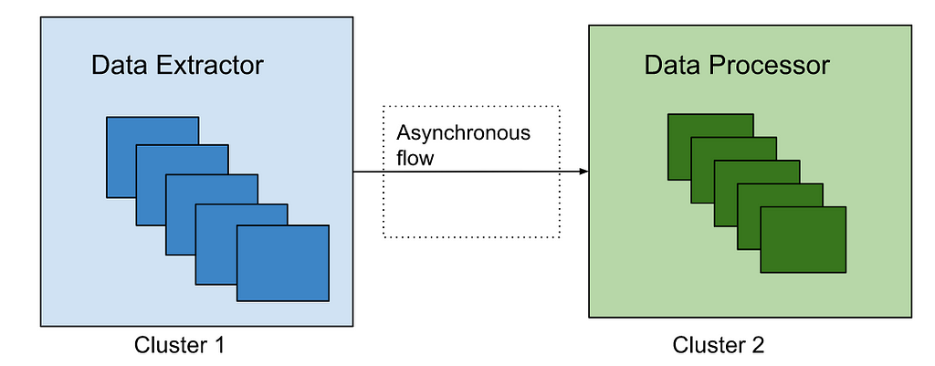
Netflix application identities are fundamentally attribute based: e.g. an instance of the Data Processor runs in eu-west-1 in the test environment with a public shard.
Authorizing these identities is done not only by application name, but by specifying specific attributes on which to match. An application owner might want to craft a policy like “Application members of the EU data processors group can access a PI decryption key”. This is one normal relationship in SpiceDB. But, they might also want to specify a policy for compliance reasons that only allows access to the PI key from data processor instances running in the EU within a sensitive shard. Put another way, an identity should only be considered to have the “is member of the EU-data-processors group” if certain identity attributes (like region==eu) match in addition to the application name. This is a Caveated SpiceDB relationship.
Netflix Modeling Challenges Before Caveats
SpiceDB, being a Relationship Based Access Control (ReBAC) system, expected authorization checks to be performed against the existence of a specific relationship between objects. Users fit this model — they have a single user ID to describe who they are. As described above, Netflix applications do not fit this model. Their attributes are used to scope permissions to varying degrees.
Netflix ran into significant difficulties in trying to fit their existing policy model into relations. To do so Netflix’s design required:
An event based mechanism that could ingest information about application autoscaling groups. An autoscaling group isn’t the lowest level of granularity, but it’s relatively close to the lowest level where we’d typically see authorization policy applied.
Ingest the attributes describing the autoscaling group and write them as separate relations. That is for the data-processor, Netflix would need to write relations describing the region, environment, account, application name, etc.
At authZ check time, provide the attributes for the identity to check, e.g. “can app bar in us-west-2 access this document.” SpiceDB is then responsible for figuring out which relations map back to the autoscaling group, e.g. name, environment, region, etc.
A cleanup process to prune stale relationships from the database.
What was problematic about this design? Aside from being complicated, there were a few specific things that made Netflix uncomfortable. The most salient being that it wasn’t resilient to an absence of relationship data, e.g. if a new autoscaling group started and reporting its presence to SpiceDB had not yet happened, the autoscaling group members would be missing necessary permissions to run. All this meant that Netflix would have to write and prune the relationship state with significant freshness requirements. This would be a significant departure from its existing policy based system.
While working through this, Netflix hopped into the SpiceDB Discord to chat about possible solutions and found an open community issue: the caveated relationships proposal.
The Beginning of SpiceDB Caveats
The SpiceDB community had already explored integrating SpiceDB with Open Policy Agent (OPA) and concluded it strayed too far from Zanzibar’s core promise of global horizontal scalability with strong consistency. With Netflix’s support, the AuthZed team pondered a Zanzibar-native approach to Attribute-Based Access Control.
The requirements were captured and published as the caveated relationships proposal on GitHub for feedback from the SpiceDB community. The community’s excitement and interest became apparent through comments, reactions, and conversations on the SpiceDB Discord server. Clearly, Netflix wasn’t the only one facing challenges when reconciling SpiceDB with policy-based approaches, so Netflix decided to help! By sponsoring the project, Netflix was able to help AuthZed prioritize engineering effort and accelerate adding Caveats to SpiceDB.
Building SpiceDB Caveats
Quick Intro to SpiceDB
The SpiceDB Schema Language lays the rules for how to build, traverse, and interpret SpiceDB’s Relationship Graph to make authorization decisions. SpiceDB Relationships, e.g., document:readme writer user:emilia, are stored as relationships that represent a graph within a datastore like CockroachDB or PostgreSQL. SpiceDB walks the graph and decomposes it into subproblems. These subproblems are assigned through consistent hashing and dispatched to a node in a cluster running SpiceDB. Over time, each node caches a subset of subproblems to support a distributed cache, reduce the datastore load, and achieve SpiceDB’s horizontal scalability.
SpiceDB Caveats Design
The fundamental challenge with policies is that their input arguments can change the authorization result as understood by a centralized relationships datastore. If SpiceDB were to cache subproblems that have been “tainted” with policy variables, the likelihood those are reused for other requests would decrease and thus severely affect the cache hit rate. As you’d suspect, this would jeopardize one of the pillars of the system: its ability to scale.
Once you accept that adding input arguments to the distributed cache isn’t efficient, you naturally gravitate toward the first question: what if you keep those inputs out of the cached subproblems? They are only known at request-time, so let’s add them as a variable in the subproblem! The cost of propagating those variables, assembling them, and executing the logic pales compared to fetching relationships from the datastore.
The next question was: how do you integrate the policy decisions into the relationships graph? The SpiceDB Schema Languages’ core concepts are Relations and Permissions; these are how a developer defines the shape of their relationships and how to traverse them. Naturally, being a graph, it’s fitting to add policy logic at the edges or the nodes. That leaves at least two obvious options: policy at the Relation level, or policy at the Permission level.
After iterating on both options to get a feel for the ergonomics and expressiveness the choice was policy at the relation level. After all, SpiceDB is a Relationship Based Access Control (ReBAC) system. Policy at the relation level allows you to parameterize each relationship, which brought about the saying “this relationship exists, but with a Caveat!.” With this approach, SpiceDB could do request-time relationship vetoing like so:
definition human {}

caveat the_answer(received int) {
  received == 42
}
definition the_answer_to_life_the_universe_and_everything {
  relation humans: human with the_answer
  permission enlightenment = humans
Netflix and AuthZed discussed the concept of static versus dynamic Caveats as well. A developer would define static Caveat expressions in the SpiceDB Schema, while dynamic Caveats would have expressions defined at run time. The discussion centered around typed versus dynamic programming languages, but given SpiceDB’s Schema Language was designed for type safety, it seemed coherent with the overall design to continue with static Caveats. To support runtime-provided policies, the choice was to introduce expressions as arguments to a Caveat. Keeping the SpiceDB Schema easy to understand was a key driver for this decision.
For defining Caveats, the main requirement was to provide an expression language with first-class support for partially-evaluated expressions. Google’s CEL seemed like the obvious choice: a protobuf-native expression language that evaluates in linear time, with first-class support for partial results that can be run at the edge, and is not turing complete. CEL expressions are type-safe, so they wouldn’t cause as many errors at runtime and can be stored in the datastore as a compiled protobuf. Given the near-perfect requirement match, it does make you wonder what Google’s Zanzibar has been up to since the white paper!
To execute the logic, SpiceDB would have to return a third response CAVEATED, in addition to ALLOW and DENY, to signal that a result of a CheckPermission request depends on computing an unresolved chain of CEL expressions.
SpiceDB Caveats needed to allow static input variables to be stored before evaluation to represent the multi-dimensional nature of Netflix application identities. Today, this is called “Caveat context,” defined by the values written in a SpiceDB Schema alongside a Relation and those provided by the client. Think of build time variables as an expansion of a templated CEL expression, and those take precedence over request-time arguments. Here is an example:
caveat the_answer(received int, expected int) {
  received == expected
}
Lastly, to deal with scenarios where there are multiple Caveated subproblems, the decision was to collect up a final CEL expression tree before evaluating it. The result of the final evaluation can be ALLOW, DENY, or CAVEATED. Things get trickier with wildcards and SpiceDB APIs, but let’s save that for another post! If the response is CAVEATED, the client receives a list of missing variables needed to properly evaluate the expression.
To sum up! The primary design decisions were:
Caveats defined at the Relation-level, not the Permission-level
Keep Caveats in line with SpiceDB Schema’s type-safe nature
Support well-typed values provided by the caller
Use Google’s CEL to define Caveat expressions
Introduce a new result type: CAVEATED
How do SpiceDB Caveats Change Authorizing Netflix Identities?
SpiceDB Caveats simplify this approach by allowing Netflix to specify authorization policy as they have in the past for applications. Instead of needing to have the entire state of the authorization world persisted as relations, the system can have relations and attributes of the identity used at authorization check time.
Now Netflix can write a Caveat similar to match_fine , described below, that takes lists of expected attributes, e.g. region, account, etc. This Caveat would allow the specific application named by the relation as long as the context of the authorization check had an observed account, stack, detail, region, and extended attribute values that matched the values in their expected counterparts. This playground has a live version of the schema, relations, etc. with which to experiment.
With the playground we can also make assertions that can mirror the behavior we’d see from the CheckPermission API. These assertions make it clear that our caveats work as expected.
Netflix and AuthZed are both excited about the collaboration’s outcome. Netflix has another authorization tool it can employ and SpiceDB users have another option with which to perform rich authorization checks. Bridging the gap between policy based authorization and ReBAC is a powerful paradigm that is already benefiting companies looking to Zanzibar based implementations for modernizing their authorization stack.
Hundreds of millions of customers tune into Netflix every day, expecting an uninterrupted and immersive streaming experience. Behind the scenes, a myriad of systems and services are involved in orchestrating the product experience. These backend systems are consistently being evolved and optimized to meet and exceed customer and product expectations.
When undertaking system migrations, one of the main challenges is establishing confidence and seamlessly transitioning the traffic to the upgraded architecture without adversely impacting the customer experience. This blog series will examine the tools, techniques, and strategies we have utilized to achieve this goal.
The backend for the streaming product utilizes a highly distributed microservices architecture; hence these migrations also happen at different points of the service call graph. It can happen on an edge API system servicing customer devices, between the edge and mid-tier services, or from mid-tiers to data stores. Another relevant factor is that the migration could be happening on APIs that are stateless and idempotent, or it could be happening on stateful APIs.
We have categorized the tools and techniques we have used to facilitate these migrations in two high-level phases. The first phase involves validating functional correctness, scalability, and performance concerns and ensuring the new systems’ resilience before the migration. The second phase involves migrating the traffic over to the new systems in a manner that mitigates the risk of incidents while continually monitoring and confirming that we are meeting crucial metrics tracked at multiple levels. These include Quality-of-Experience(QoE) measurements at the customer device level, Service-Level-Agreements (SLAs), and business-level Key-Performance-Indicators(KPIs).
This blog post will provide a detailed analysis of replay traffic testing, a versatile technique we have applied in the preliminary validation phase for multiple migration initiatives. In a follow-up blog post, we will focus on the second phase and look deeper at some of the tactical steps that we use to migrate the traffic over in a controlled manner.
Replay Traffic Testing
Replay traffic refers to production traffic that is cloned and forked over to a different path in the service call graph, allowing us to exercise new/updated systems in a manner that simulates actual production conditions. In this testing strategy, we execute a copy (replay) of production traffic against a system’s existing and new versions to perform relevant validations. This approach has a handful of benefits.
Replay traffic testing enables sandboxed testing at scale without significantly impacting production traffic or user experience.
Utilizing cloned real traffic, we can exercise the diversity of inputs from awide range of devices and device application software versions in production. This is particularly important for complex APIs that have many high cardinality inputs. Replay traffic provides the reach and coverage required to test the ability of the system to handle infrequently used input combinations andedge cases.
This technique facilitates validation on multiple fronts. It allows us to assert functional correctness and provides a mechanism to load test the system and tune the system and scaling parameters for optimal functioning.
By simulating a real production environment, we can characterize system performance over an extended period while considering the expected and unexpected traffic pattern shifts. It provides a good read on the availability and latency ranges under different production conditions.
Provides a platform to ensure that essential operational insights, metrics, logging, and alerting are in place before migration.
Replay Solution
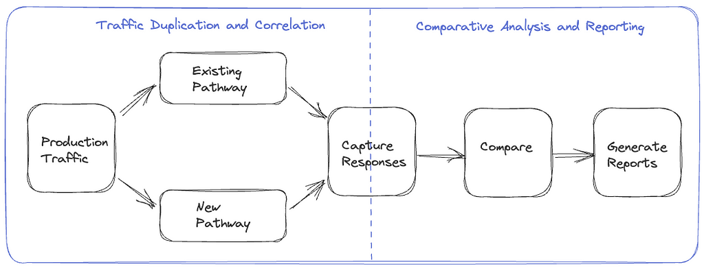
The replay traffic testing solution comprises two essential components.
Traffic Duplication and Correlation: The initial step requires the implementation of a mechanism to clone and fork production traffic to the newly established pathway, along with a process to record and correlate responses from the original and alternative routes.
Comparative Analysis and Reporting: Following traffic duplication and correlation, we need a framework to compare and analyze the responses recorded from the two paths and get a comprehensive report for the analysis.
Replay Testing Framework
We have tried different approaches for the traffic duplication and recording step through various migrations, making improvements along the way. These include options where replay traffic generation is orchestrated on the device, on the server, and via a dedicated service. We will examine these alternatives in the upcoming sections.
Device Driven
In this option, the device makes a request on the production path and the replay path, then discards the response on the replay path. These requests are executed in parallel to minimize any potential delay on the production path. The selection of the replay path on the backend can be driven by the URL the device uses when making the request or by utilizing specific request parameters in routing logic at the appropriate layer of the service call graph. The device also includes a unique identifier with identical values on both paths, which is used to correlate the production and replay responses. The responses can be recorded at the most optimal location in the service call graph or by the device itself, depending on the particular migration.
Device Driven Replay
The device-driven approach’s obvious downside is that we are wasting device resources. There is also a risk of impact on device QoE, especially on low-resource devices. Adding forking logic and complexity to the device code can create dependencies on device application release cycles that generally run at a slower cadence than service release cycles, leading to bottlenecks in the migration. Moreover, allowing the device to execute untested server-side code paths can inadvertently expose an attack surface area for potential misuse.
Server Driven
To address the concerns of the device-driven approach, the other option we have used is to handle the replay concerns entirely on the backend. The replay traffic is cloned and forked in the appropriate service upstream of the migrated service. The upstream service calls the existing and new replacement services concurrently to minimize any latency increase on the production path. The upstream service records the responses on the two paths along with an identifier with a common value that is used to correlate the responses. This recording operation is also done asynchronously to minimize any impact on the latency on the production path.
Server Driven Replay
The server-driven approach’s benefit is that the entire complexity of replay logic is encapsulated on the backend, and there is no wastage of device resources. Also, since this logic resides on the server side, we can iterate on any required changes faster. However, we are still inserting the replay-related logic alongside the production code that is handling business logic, which can result in unnecessary coupling and complexity. There is also an increased risk that bugs in the replay logic have the potential to impact production code and metrics.
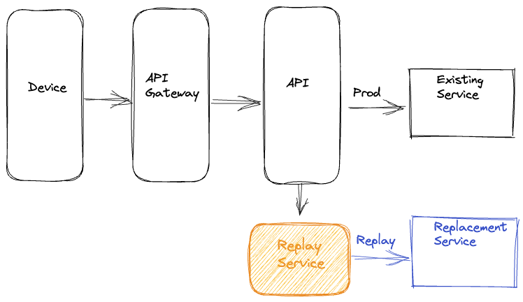
Dedicated Service
The latest approach that we have used is to completely isolate all components of replay traffic into a separate dedicated service. In this approach, we record the requests and responses for the service that needs to be updated or replaced to an offline event stream asynchronously. Quite often, this logging of requests and responses is already happening for operational insights. Subsequently, we use Mantis, a distributed stream processor, to capture these requests and responses and replay the requests against the new service or cluster while making any required adjustments to the requests. After replaying the requests, this dedicated service also records the responses from the production and replay paths for offline analysis.
Dedicated Replay Service
This approach centralizes the replay logic in an isolated, dedicated code base. Apart from not consuming device resources and not impacting device QoE, this approach also reduces any coupling between production business logic and replay traffic logic on the backend. It also decouples any updates on the replay framework away from the device and service release cycles.
Analyzing Replay Traffic
Once we have run replay traffic and recorded a statistically significant volume of responses, we are ready for the comparative analysis and reporting component of replay traffic testing. Given the scale of the data being generated using replay traffic, we record the responses from the two sides to a cost-effective cold storage facility using technology like Apache Iceberg. We can then create offline distributed batch processing jobs to correlate & compare the responses across the production and replay paths and generate detailed reports on the analysis.
Normalization
Depending on the nature of the system being migrated, the responses might need some preprocessing before being compared. For example, if some fields in the responses are timestamps, those will differ. Similarly, if there are unsorted lists in the responses, it might be best to sort them before comparing. In certain migration scenarios, there may be intentional alterations to the response generated by the updated service or component. For instance, a field that was a list in the original path is represented as key-value pairs in the new path. In such cases, we can apply specific transformations to the response on the replay path to simulate the expected changes. Based on the system and the associated responses, there might be other specific normalizations that we might apply to the response before we compare the responses.
Comparison
After normalizing, we diff the responses on the two sides and check whether we have matching or mismatching responses. The batch job creates a high-level summary that captures some key comparison metrics. These include the total number of responses on both sides, the count of responses joined by the correlation identifier, matches and mismatches. The summary also records the number of passing/ failing responses on each path. This summary provides an excellent high-level view of the analysis and the overall match rate across the production and replay paths. Additionally, for mismatches, we record the normalized and unnormalized responses from both sides to another big data table along with other relevant parameters, such as the diff. We use this additional logging to debug and identify the root cause of issues driving the mismatches. Once we discover and address those issues, we can use the replay testing process iteratively to bring down the mismatch percentage to an acceptable number.
Lineage
When comparing responses, a common source of noise arises from the utilization of non-deterministic or non-idempotent dependency data for generating responses on the production and replay pathways. For instance, envision a response payload that delivers media streams for a playback session. The service responsible for generating this payload consults a metadata service that provides all available streams for the given title. Various factors can lead to the addition or removal of streams, such as identifying issues with a specific stream, incorporating support for a new language, or introducing a new encode. Consequently, there is a potential for discrepancies in the sets of streams used to determine payloads on the production and replay paths, resulting in divergent responses.
A comprehensive summary of data versions or checksums for all dependencies involved in generating a response, referred to as a lineage, is compiled to address this challenge. Discrepancies can be identified and discarded by comparing the lineage of both production and replay responses in the automated jobs analyzing the responses. This approach mitigates the impact of noise and ensures accurate and reliable comparisons between production and replay responses.
Comparing Live Traffic
An alternative method to recording responses and performing the comparison offline is to perform a live comparison. In this approach, we do the forking of the replay traffic on the upstream service as described in the `Server Driven` section. The service that forks and clones the replay traffic directly compares the responses on the production and replay path and records relevant metrics. This option is feasible if the response payload isn’t very complex, such that the comparison doesn’t significantly increase latencies or if the services being migrated are not on the critical path. Logging is selective to cases where the old and new responses do not match.
Replay Traffic Analysis
Load Testing
Besides functional testing, replay traffic allows us to stress test the updated system components. We can regulate the load on the replay path by controlling the amount of traffic being replayed and the new service’s horizontal and vertical scale factors. This approach allows us to evaluate the performance of the new services under different traffic conditions. We can see how the availability, latency, and other system performance metrics, such as CPU consumption, memory consumption, garbage collection rate, etc, change as the load factor changes. Load testing the system using this technique allows us to identify performance hotspots using actual production traffic profiles. It helps expose memory leaks, deadlocks, caching issues, and other system issues. It enables the tuning of thread pools, connection pools, connection timeouts, and other configuration parameters. Further, it helps in the determination of reasonable scaling policies and estimates for the associated cost and the broader cost/risk tradeoff.
Stateful Systems
We have extensively utilized replay testing to build confidence in migrations involving stateless and idempotent systems. Replay testing can also validate migrations involving stateful systems, although additional measures must be taken. The production and replay paths must have distinct and isolated data stores that are in identical states before enabling the replay of traffic. Additionally, all different request types that drive the state machine must be replayed. In the recording step, apart from the responses, we also want to capture the state associated with that specific response. Correspondingly in the analysis phase, we want to compare both the response and the related state in the state machine. Given the overall complexity of using replay testing with stateful systems, we have employed other techniques in such scenarios. We will look at one of them in the follow-up blog post in this series.
Summary
We have adopted replay traffic testing at Netflix for numerous migration projects. A recent example involved leveraging replay testing to validate an extensive re-architecture of the edge APIs that drive the playback component of our product. Another instance included migrating a mid-tier service from REST to gRPC. In both cases, replay testing facilitated comprehensive functional testing, load testing, and system tuning at scale using real production traffic. This approach enabled us to identify elusive issues and rapidly build confidence in these substantial redesigns.
Upon concluding replay testing, we are ready to start introducing these changes in production. In an upcoming blog post, we will look at some of the techniques we use to roll out significant changes to the system to production in a gradual risk-controlled way while building confidence via metrics at different levels.
Streaming alert evaluation scales much better than the traditional approach of polling time-series databases.
It allows us to overcome high dimensionality/cardinality limitations of the time-series database.
It opens doors to support more exciting use-cases.
Engineers want their alerting system to be realtime, reliable, and actionable. While actionability is subjective and may vary by use-case, reliability is non-negotiable. In other words, false positives are bad but false negatives are the absolute worst!
A few years ago, we were paged by our SRE team due to our Metrics Alerting System falling behind — critical application health alerts reached engineers 45 minutes late! As we investigated the alerting delay, we found that the number of configured alerts had recently increased dramatically, by 5 times! The alerting system queried Atlas, our time series database on a cron for each configured alert query, and was seeing an elevated throttle rate and excessive retries with backoffs. This, in turn, increased the time between two consecutive checks for an alert, causing a global slowdown for all alerts. On further investigation, we discovered that one user had programmatically created tens of thousands of new alerts. This user represented a platform team at Netflix, and their goal was to build alerting automation for their users.
While we were able to put out the immediate fire by disabling the newly created alerts, this incident raised some critical concerns around the scalability of our alerting system. We also heard from other platform teams at Netflix who wanted to build similar automation for their users who, given our state at the time, wouldn’t have been able to do so without impacting Mean Time To Detect (MTTD) for all others. Rather, we were looking at an order of magnitude increase in the number of alert queries just over the next 6 months!
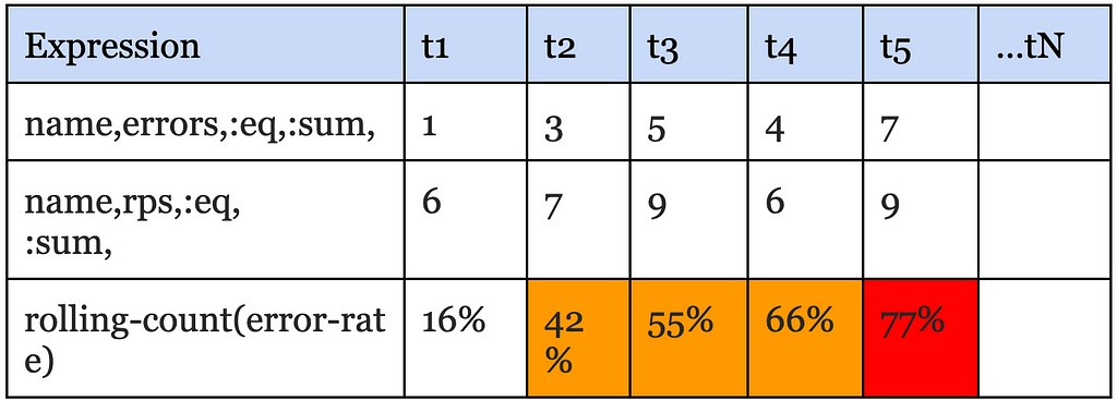
Since querying Atlas was the bottleneck, our first instinct was to scale it up to meet the increased alert query demand; however, we soon realized that would increase Atlas cost prohibitively. Atlas is an in-memory time-series database that ingests multiple billions of time-series per day and retains the last two weeks of data. It is already one of the largest services at Netflix both in size and cost. While Atlas is architected around compute & storage separation, and we could theoretically just scale the query layer to meet the increased query demand, every query, regardless of its type, has a data component that needs to be pushed down to the storage layer. To serve the increasing number of push down queries, the in-memory storage layer would need to scale up as well, and it became clear that this would push the already expensive storage costs far higher. Moreover, common database optimizations like caching recently queried data don’t really work for alerting queries because, generally speaking, the last received datapoint is required for correctness. Take for example, this alert query that checks if errors as a % of total RPS exceeds a threshold of 50% for 4 out of the last 5 minutes:
Say if the datapoint received for the last time interval leads to a positive evaluation for this query, relying on stale/cached data would either increase MTTD or result in the perception of a false negative, at least until the missing data is fetched and evaluated. It became clear to us that we needed to solve the scalability problem with a fundamentally different approach. Hence, we started down the path of alert evaluation via real-time streaming metrics.
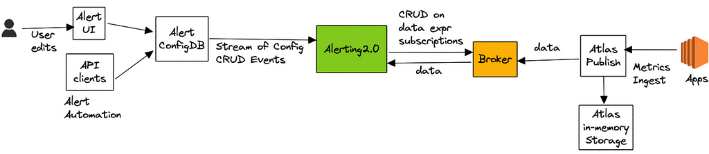
High Level Architecture
The idea, at a high level, was to avoid the need to query the Atlas database almost entirely and transition most alert queries to streaming evaluation.
Alert queries are submitted either via our Alerting UI or by API clients, which are then saved to a custom config database that supports streaming config updates (full snapshot + update notifications). The Alerting Service receives these config updates and hashes every new or updated alert query for evaluation to one of its nodes by leveraging Edda Slots. The node responsible for evaluating a query, starts by breaking it down into a set of “data expressions” and with them subscribes to an upstream “broker” service. Data expressions define what data needs to be sourced in order to evaluate a query. For the example query listed above, the data expressions are name,errors,:eq,:sum and name,rps,:eq,:sum. The broker service acts as a subscription manager that maps a data expression to a set of subscriptions. In addition, it also maintains a Query Index of all active data expressions which is consulted to discern if an incoming datapoint is of interest to an active subscriber. The internals here are outside the scope of this blog post.
Next, the Alerting service (via the atlas-eval library) maps the received data points for a data expression to the alert query that needs them. For alert queries that resolve to more than one data expression, we align the incoming data points for each one of those data expressions on the same time boundary before emitting the accumulated values to the final eval step. For the example above, the final eval step would be responsible for computing the ratio and maintaining the rolling-count, which is keeping track of the number of intervals in which the ratio crossed the threshold as shown below:
The atlas-eval library supports streaming evaluation for most if not all Query, Data, Math and Stateful operators supported by Atlas today. Certain operators such as offset, integral, des are not supported on the streaming path.
OK, Results?
First and foremost, we have successfully alleviated our initial scalability problem with the polling based architecture. Today, we run 20X the number of queries we used to run a few years ago, with ease and at a fraction of what it would have cost to scale up the Atlas storage layer to serve the same volume. Multiple platform teams at Netflix programmatically generate and maintain alerts on behalf of their users without having to worry about impacting other users of the system. We are able to maintain strong SLAs around Mean Time To Detect (MTTD) regardless of the number of alerts being evaluated by the system.
Additionally, streaming evaluation allowed us to relax restrictions around high cardinality that our users were previously running into — alert queries that were rejected by Atlas Backend before due to cardinality constraints are now getting checked correctly on the streaming path. In addition, we are able to use Atlas Streaming to monitor and alert on some very high cardinality use-cases, such as metrics derived from free-form log data.
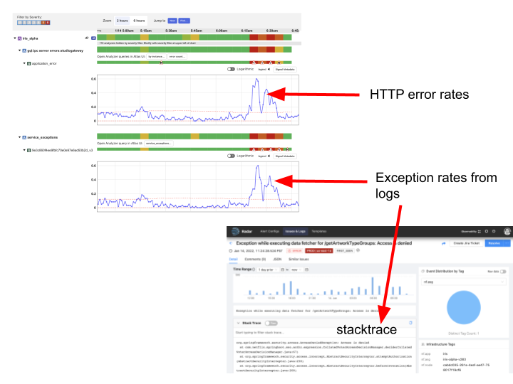
Finally, we switched Telltale, our holistic application health monitoring system, from polling a metrics cache to using realtime Atlas Streaming. The fundamental idea behind Telltale is to detect anomalies on SLI metrics (for example, latency, error rates, etc). When such anomalies are detected, Telltale is able to compute correlations with similar metrics emitted from either upstream or downstream services. In addition, it also computes correlations between SLI metrics and custom metrics like the log derived metrics mentioned above. This has proven to be valuable towards reducing Mean Time to Recover (MTTR). For example, we are able to now correlate increased error rates with increased rate of specific exceptions occurring in logs and even point to an exemplar stacktrace, as shown below:
Our logs pipeline fingerprints every log message and attaches a (very high cardinality) fingerprint tag to a log events counter that is then emitted to Atlas Streaming. Telltale consumes this metric in a streaming fashion to identify fingerprints that correlate with anomalies seen in SLI metrics. Once an anomaly is found, we query the logs backend with the fingerprint hash to obtain the exemplar stacktrace. What’s more is we are now able to identify correlated anomalies (and exceptions) occurring in services that may be N hops away from the affected service. A system like Telltale becomes more effective as more services are onboarded (and for that matter the full service graph), because otherwise it becomes difficult to root cause the problem, especially in a microservices-based architecture. A few years ago, as noted in this blog, only about a hundred services were using Telltale; thanks to Atlas Streaming we have now managed to onboard thousands of other services at Netflix.
Finally, we realized that once you remove limits on the number of monitored queries, and start supporting much higher metric dimensionality/cardinality without impacting the cost/performance profile of the system, it opens doors to many exciting new possibilities. For example, to make alerts more actionable, we may now be able to compute correlations between SLI anomalies and custom metrics with high cardinality dimensions, for example an alert on elevated HTTP error rates may be able to point to impacted customer cohorts, by linking to precisely correlated exemplars. This would help developers with reproducibility.
Transitioning to the streaming path has been a long journey for us. One of the challenges was difficulty in debugging scenarios where the streaming path didn’t agree with what is returned by querying the Atlas database. This is especially true when either the data is not available in Atlas or the query is not supported because of (say) cardinality constraints. This is one of the reasons it has taken us years to get here. That said, early signs indicate that the streaming paradigm may help with tackling a cardinal problem in observability — effective correlation between the metrics & events verticals (logs, and potentially traces in the future), and we are excited to explore the opportunities that this presents for Observability in general.
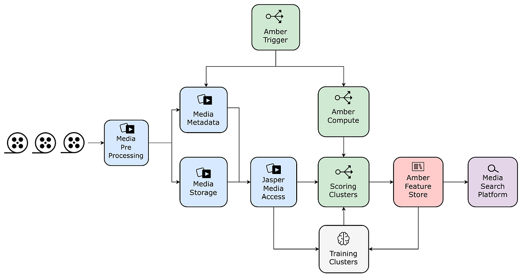
Netflix leverages machine learning to create the best media for our members. Earlier we shared the details of one of these algorithms, introduced how our platform team is evolving the media-specific machine learning ecosystem, and discussed how data from these algorithms gets stored in our annotation service.
Much of the ML literature focuses on model training, evaluation, and scoring. In this post, we will explore an understudied aspect of the ML lifecycle: integration of model outputs into applications.
An example of using Machine Learning to find shots of Eleven in Stranger Things and surfacing the results in studio application for the consumption of Netflix video editors.
Specifically, we will dive into the architecture that powers search capabilities for studio applications at Netflix. We discuss specific problems that we have solved using Machine Learning (ML) algorithms, review different pain points that we addressed, and provide a technical overview of our new platform.
Overview
At Netflix, we aim to bring joy to our members by providing them with the opportunity to experience outstanding content. There are two components to this experience. First, we must provide the content that will bring them joy. Second, we must make it effortless and intuitive to choose from our library. We must quickly surface the most stand-out highlights from the titles available on our service in the form of images and videos in the member experience.
These multimedia assets, or “supplemental” assets, don’t just come into existence. Artists and video editors must create them. We build creator tooling to enable these colleagues to focus their time and energy on creativity. Unfortunately, much of their energy goes into labor-intensive pre-work. A key opportunity is to automate these mundane tasks.
Use cases
Use case #1: Dialogue search
Dialogue is a central aspect of storytelling. One of the best ways to tell an engaging story is through the mouths of the characters. Punchy or memorable lines are a prime target for trailer editors. The manual method for identifying such lines is a watchdown (aka breakdown).
An editor watches the title start-to-finish, transcribes memorable words and phrases with a timecode, and retrieves the snippet later if the quote is needed. An editor can choose to do this quickly and only jot down the most memorable moments, but will have to rewatch the content if they miss something they need later. Or, they can do it thoroughly and transcribe the entire piece of content ahead of time. In the words of one of our editors:
Watchdowns / breakdown are very repetitive and waste countless hours of creative time!
Scrubbing through hours of footage (or dozens of hours if working on a series) to find a single line of dialogue is profoundly tedious. In some cases editors need to search across many shows and manually doing it is not feasible. But what if scrubbing and transcribing dialogue is not needed at all?
Ideally, we want to enable dialogue search that supports the following features:
Search across one title, a subset of titles (e.g. all dramas), or the entire catalog
Search by character or talent
Multilingual search
Use case #2: Visual search
A picture is worth a thousand words. Visual storytelling can help make complex stories easier to understand, and as a result, deliver a more impactful message.
Artists and video editors routinely need specific visual elements to include in artworks and trailers. They may scrub for frames, shots, or scenes of specific characters, locations, objects, events (e.g. a car chasing scene in an action movie), or attributes (e.g. a close-up shot). What if we could enable users to find visual elements using natural language?
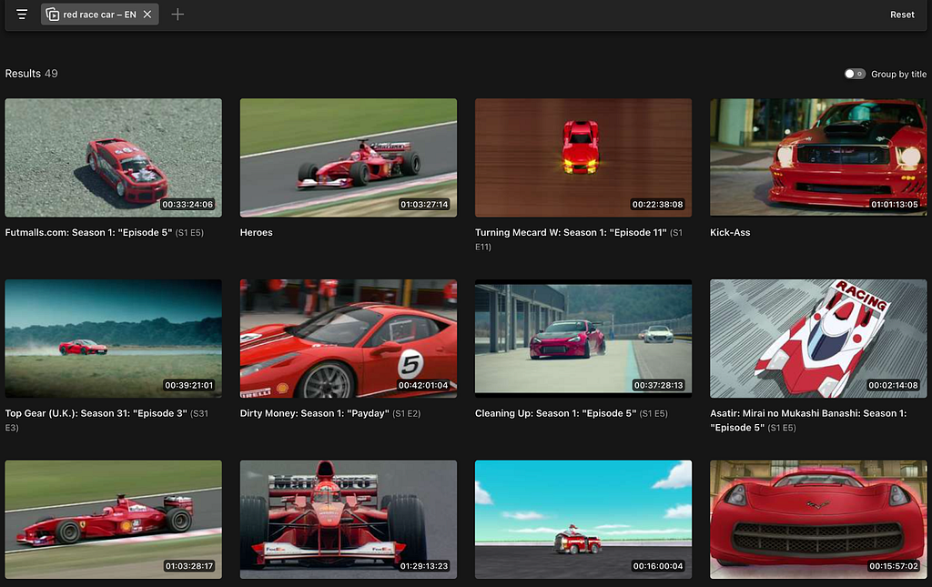
Here is an example of the desired output when the user searches for “red race car” across the entire content library.
User searching for “red race car”
Use case #3: Reverse shot search
Natural-language visual search offers editors a powerful tool. But what if they already have a shot in mind, and they want to find something that just looks similar? For instance, let’s say that an editor has found a visually stunning shot of a plate of food from Chef’s Table, and she’s interested in finding similar shots across the entire show.
User provides a sample image to find other similar images
Prior engineering work
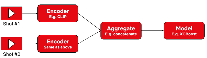
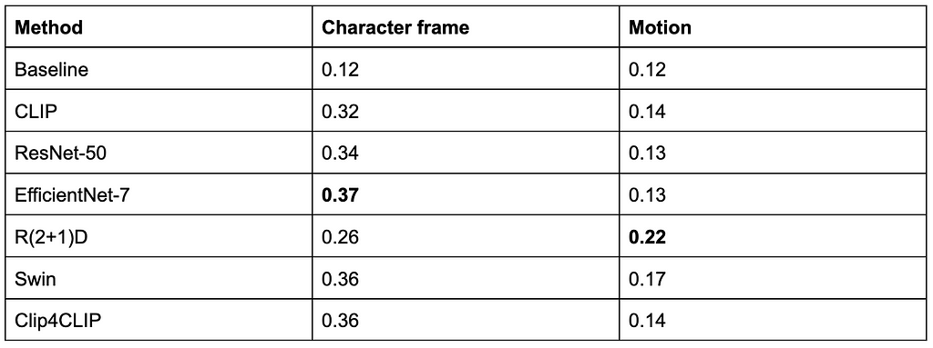
Approach #1: on-demand batch processing
Our first approach to surface these innovations was a tool to trigger these algorithms on-demand and on a per-show basis. We implemented a batch processing system for users to submit their requests and wait for the system to generate the output. Processing took several hours to complete. Some ML algorithms are computationally intensive. Many of the samples provided had a significant number of frames to process. A typical 1 hour video could contain over 80,000 frames!
After waiting for processing, users downloaded the generated algo outputs for offline consumption. This limited pilot system greatly reduced the time spent by our users to manually analyze the content. Here is a visualization of this flow.
On-demand batch processing system flow
Approach #2: enabling online request with pre-computation
After the success of this approach we decided to add online support for a couple of algorithms. For the first time, users were able to discover matches across the entire catalog, oftentimes finding moments they never knew even existed. They didn’t need any time-consuming local setup and there was no delays since the data was already pre-computed.
Interactive system with pre-computed data flow
The following quote exemplifies the positive reception by our users:
“We wanted to find all the shots of the dining room in a show. In seconds, we had what normally would have taken 1–2 people hours/a full day to do, look through all the shots of the dining room from all 10 episodes of the show. Incredible!” Dawn Chenette, Design Lead
This approach had several benefits for product engineering. It allowed us to transparently update the algo data without users knowing about it. It also provided insights into query patterns and algorithms that were gaining traction among users. In addition, we were able to perform a handful of A/B tests to validate or negate our hypotheses for tuning the search experience.
Pain points
Our early efforts to deliver ML insights to creative professionals proved valuable. At the same time we experienced growing engineering pains that limited our ability to scale.
Maintaining disparate systems posed a challenge. They were first built by different teams on different stacks, so maintenance was expensive. Whenever ML researchers finished a new algorithm they had to integrate it separately into each system. We were near the breaking point with just two systems and a handful of algorithms. We knew this would only worsen as we expanded to more use cases and more researchers.
The online application unlocked the interactivity for our users and validated our direction. However, it was not scaling well. Adding new algos and onboarding new use cases was still time consuming and required the effort of too many engineers. These investments in one-to-one integrations were volatile with implementation timelines varying from a few weeks to several months. Due to the bespoke nature of the implementation, we lacked catalog wide searches for all available ML sources.
In summary, this model was a tightly-coupled application-to-data architecture, where machine learning algos were mixed with the backend and UI/UX software code stack. To address the variance in the implementation timelines we needed to standardize how different algorithms were integrated — starting from how they were executed to making the data available to all consumers consistently. As we developed more media understanding algos and wanted to expand to additional use cases, we needed to invest in system architecture redesign to enable researchers and engineers from different teams to innovate independently and collaboratively. Media Search Platform (MSP) is the initiative to address these requirements.
Although we were just getting started with media-search, search itself is not new to Netflix. We have a mature and robust search and recommendation functionality exposed to millions of our subscribers. We knew we could leverage learnings from our colleagues who are responsible for building and innovating in this space. In keeping with our “highly aligned, loosely coupled” culture, we wanted to enable engineers to onboard and improve algos quickly and independently, while making it easy for Studio and product applications to integrate with the media understanding algo capabilities.
Making the platform modular, pluggable and configurable was key to our success. This approach allowed us to keep the distributed ownership of the platform. It simultaneously provided different specialized teams to contribute relevant components of the platform. We used services already available for other use cases and extended their capabilities to support new requirements.
Next we will discuss the system architecture and describe how different modules interact with each other for end-to-end flow.
Architecture
System Architecture
Netflix engineers strive to iterate rapidly and prefer the “MVP” (minimum viable product) approach to receive early feedback and minimize the upfront investment costs. Thus, we didn’t build all the modules completely. We scoped the pilot implementation to ensure immediate functionalities were unblocked. At the same time, we kept the design open enough to allow future extensibility. We will highlight a few examples below as we discuss each component separately.
Interfaces – API & Query
Starting at the top of the diagram, the platform allows apps to interact with it using either gRPC or GraphQL interfaces. Having diversity in the interfaces is essential to meet the app-developers where they are. At Netflix, gRPC is predominantly used in backend-to-backend communication. With active GraphQL tooling provided by our developer productivity teams, GraphQL has become a de-facto choice for UI — backend integration. You can find more about what the team has built and how it is getting used in these blog posts. In particular, we have been relying on Domain Graph Service Framework for this project.
During the query schema design, we accounted for future use cases and ensured that it will allow future extensions. We aimed to keep the schema generic enough so that it hides implementation details of the actual search systems that are used to execute the query. Additionally it is intuitive and easy to understand yet feature rich so that it can be used to express complex queries. Users have flexibility to perform multimodal search with input being a simple text term, image or short video. As discussed earlier, search could be performed against the entire Netflix catalog, or it could be limited to specific titles. Users may prefer results that are organized in some way such as group by a movie, sorted by timestamp. When there are a large number of matches, we allow users to paginate the results (with configurable page size) instead of fetching all or a fixed number of results.
Search Gateway
The client generated input query is first given to the Query processing system. Since most of our users are performing targeted queries such as — search for dialogue “friends don’t lie” (from the above example), today this stage performs lightweight processing and provides a hook to integrate A/B testing. In the future we plan to evolve it into a “query understanding system” to support free-form searches to reduce the burden on users and simplify client side query generation.
The query processing modifies queries to match the target data set. This includes “embedding” transformation and translation. For queries against embedding based data sources it transforms the input such as text or image to corresponding vector representation. Each data source or algorithm could use a different encoding technique so, this stage ensures that the corresponding encoding is also applied to the provided query. One example why we need different encoding techniques per algorithm is because there is different processing for an image — which has a single frame while video — which contains a sequence of multiple frames.
With global expansion we have users where English is not a primary language. All of the text-based models in the platform are trained using English language so we translate non-English text to English. Although the translation is not always perfect it has worked well in our case and has expanded the eligible user base for our tool to non-English speakers.
Once the query is transformed and ready for execution, we delegate search execution to one or more of the searcher systems. First we need to federate which query should be routed to which system. This is handled by the Query router and Searcher-proxy module. For the initial implementation we have relied on a single searcher for executing all the queries. Our extensible approach meant the platform could support additional searchers, which have already been used to prototype new algorithms and experiments.
A search may intersect or aggregate the data from multiple algorithms so this layer can fan out a single query into multiple search executions. We have implemented a “searcher-proxy” inside this layer for each supported searcher. Each proxy is responsible for mapping input query to one expected by the corresponding searcher. It then consumes the raw response from the searcher before handing it over to the Results post-processor component.
The Results post-processor works on the results returned by one or more searchers. It can rank results by applying custom scoring, populate search recommendations based on other similar searches. Another functionality we are evaluating with this layer is to dynamically create different views from the same underlying data.
For ease of coordination and maintenance we abstracted the query processing and response handling in a module called — Search Gateway.
Searchers
As mentioned above, query execution is handled by the searcher system. The primary searcher used in the current implementation is called Marken — scalable annotation service built at Netflix. It supports different categories of searches including full text and embedding vector based similarity searches. It can store and retrieve temporal (timestamp) as well as spatial (coordinates) data. This service leverages Cassandra and Elasticsearch for data storage and retrieval. When onboarding embedding vector data we performed an extensive benchmarking to evaluate the available datastores. One takeaway here is that even if there is a datastore that specializes in a particular query pattern, for ease of maintainability and consistency we decided to not introduce it.
We have identified a handful of common schema types and standardized how data from different algorithms is stored. Each algorithm still has the flexibility to define a custom schema type. We are actively innovating in this space and recently added capability to intersect data from different algorithms. This is going to unlock creative ways of how the data from multiple algorithms can be superimposed on each other to quickly get to the desired results.
Algo Execution & Ingestion
So far we have focused on how the data is queried but, there is an equally complex machinery powering algorithm execution and the generation of the data. This is handled by our dedicated media ML Platform team. The team specializes in building a suite of media-specific machine learning tooling. It facilitates seamless access to media assets (audio, video, image and text) in addition to media-centric feature storage and compute orchestration.
For this project we developed a custom sink that indexes the generated data into Marken according to predefined schemas. Special care is taken when the data is backfilled for the first time so as to avoid overwhelming the system with huge amounts of writes.
Last but not the least, our UI team has built a configurable, extensible library to simplify integrating this platform with end user applications. Configurable UI makes it easy to customize query generation and response handling as per the needs of individual applications and algorithms. The future work involves building native widgets to minimize the UI work even further.
Summary
The media understanding platform serves as an abstraction layer between machine learning algos and various applications and features. The platform has already allowed us to seamlessly integrate search and discovery capabilities in several applications. We believe future work in maturing different parts will unlock value for more use cases and applications. We hope this post has offered insights into how we approached its evolution. We will continue to share our work in this space, so stay tuned.
At Netflix, all of our digital media assets (images, videos, text, etc.) are stored in secure storage layers. We built an asset management platform (AMP), codenamed Amsterdam, in order to easily organize and manage the metadata, schema, relations and permissions of these assets. It is also responsible for asset discovery, validation, sharing, and for triggering workflows.
Amsterdam service utilizes various solutions such as Cassandra, Kafka, Zookeeper, EvCache etc. In this blog, we will be focusing on how we utilize Elasticsearch for indexing and search the assets.
Amsterdam is built on top of three storage layers.
The first layer, Cassandra, is the source of truth for us. It consists of close to a hundred tables (column families) , the majority of which are reverse indices to help query the assets in a more optimized way.
The second layer is Elasticsearch, which is used to discover assets based on user queries. This is the layer we’d like to focus on in this blog. And more specifically, how we index and query over 7TB of data in a read-heavy and continuously growing environment and keep our Elasticsearch cluster healthy.
And finally, we have an Apache Iceberg layer which stores assets in a denormalized fashion to help answer heavy queries for analytics use cases.
Elasticsearch Integration
Elasticsearch is one of the best and widely adopted distributed, open source search and analytics engines for all types of data, including textual, numerical, geospatial, structured or unstructured data. It provides simple APIs for creating indices, indexing or searching documents, which makes it easy to integrate. No matter whether you use in-house deployments or hosted solutions, you can quickly stand up an Elasticsearch cluster, and start integrating it from your application using one of the clients provided based on your programming language (Elasticsearch has a rich set of languages it supports; Java, Python, .Net, Ruby, Perl etc.).
One of the first decisions when integrating with Elasticsearch is designing the indices, their settings and mappings. Settings include index specific properties like number of shards, analyzers, etc. Mapping is used to define how documents and their fields are supposed to be stored and indexed. You define the data types for each field, or use dynamic mapping for unknown fields. You can find more information on settings and mappings on Elasticsearch website.
Most applications in content and studio engineering at Netflix deal with assets; such as videos, images, text, etc. These applications are built on a microservices architecture, and the Asset Management Platform provides asset management to those dozens of services for various asset types. Each asset type is defined in a centralized schema registry service responsible for storing asset type taxonomies and relationships. Therefore, it initially seemed natural to create a different index for each asset type. When creating index mappings in Elasticsearch, one has to define the data type for each field. Since different asset types could potentially have fields with the same name but with different data types; having a separate index for each type would prevent such type collisions. Therefore we created around a dozen indices per asset type with fields mapping based on the asset type schema. As we onboarded new applications to our platform, we kept creating new indices for the new asset types. We have a schema management microservice which is used to store the taxonomy of each asset type; and this programmatically created new indices whenever new asset types were created in this service. All the assets of a specific type use the specific index defined for that asset type to create or update the asset document.
Fig 1. Indices based on Asset Types
As Netflix is now producing significantly more originals than it used to when we started this project a few years ago, not only did the number of assets grow dramatically but also the number of asset types grew from dozens to several thousands. Hence the number of Elasticsearch indices (per asset type) as well as asset document indexing or searching RPS (requests per second) grew over time. Although this indexing strategy worked smoothly for a while, interesting challenges started coming up and we started to notice performance issues over time. We started to observe CPU spikes, long running queries, instances going yellow/red in status.
Usually the first thing to try is to scale up the Elasticsearch cluster horizontally by increasing the number of nodes or vertically by upgrading instance types. We tried both, and in many cases it helps, but sometimes it is a short term fix and the performance problems come back after a while; and it did for us. You know it is time to dig deeper to understand the root cause of it.
It was time to take a step back and reevaluate our ES data indexing and sharding strategy. Each index was assigned a fixed number of 6 shards and 2 replicas (defined in the template of the index). With the increase in the number of asset types, we ended up having approximately 900 indices (thus 16200 shards). Some of these indices had millions of documents, whereas many of them were very small with only thousands of documents. We found the root cause of the CPU spike was unbalanced shards size. Elasticsearch nodes storing those large shards became hot spots and queries hitting those instances were timing out or very slow due to busy threads.
We changed our indexing strategy and decided to create indices based on time buckets, rather than asset types. What this means is, assets created between t1 and t2 would go to the T1 bucket, assets created between t2 and t3 would go to the T2 bucket, and so on. So instead of persisting assets based on their asset types, we would use their ids (thus its creation time; because the asset id is a time based uuid generated at the asset creation) to determine which time bucket the document should be persisted to. Elasticsearch recommends each shard to be under 65GB (AWS recommends them to be under 50GB), so we could create time based indices where each index holds somewhere between 16–20GB of data, giving some buffer for data growth. Existing assets can be redistributed appropriately to these precreated shards, and new assets would always go to the current index. Once the size of the current index exceeds a certain threshold (16GB), we would create a new index for the next bucket (minute/hour/day) and start indexing assets to the new index created. We created an index template in Elasticsearch so that the new indices always use the same settings and mappings stored in the template.
We chose to index all versions of an asset in the the same bucket – the one that keeps the first version. Therefore, even though new assets can never be persisted to an old index (due to our time based id generation logic, they always go to the latest/current index); existing assets can be updated, causing additional documents for those new asset versions to be created in those older indices. Therefore we chose a lower threshold for the roll over so that older shards would still be well under 50GB even after those updates.
Fig 2. Indices based on Time Buckets
For searching purposes, we have a single read alias that points to all indices created. When performing a query, we always execute it on the alias. This ensures that no matter where documents are, all documents matching the query will be returned. For indexing/updating documents, though, we cannot use an alias, we use the exact index name to perform index operations.
To avoid the ES query for the list of indices for every indexing request, we keep the list of indices in a distributed cache. We refresh this cache whenever a new index is created for the next time bucket, so that new assets will be indexed appropriately. For every asset indexing request, we look at the cache to determine the corresponding time bucket index for the asset. The cache stores all time-based indices in a sorted order (for simplicity we named our indices based on their starting time in the format yyyyMMddHHmmss) so that we can easily determine exactly which index should be used for asset indexing based on the asset creation time. Without using the time bucket strategy, the same asset could have been indexed into multiple indices because Elasticsearch doc id is unique per index and not the cluster. Or we would have to perform two API calls, first to identify the specific index and then to perform the asset update/delete operation on that specific index.
It is still possible to exceed 50GB in those older indices if millions of updates occur within that time bucket index. To address this issue, we added an API that would split an old index into two programmatically. In order to split a given bucket T1 (which stores all assets between t1 and t2) into two, we choose a time t1.5 between t1 and t2, create a new bucket T1_5, and reindex all assets created between t1.5 and t2 from T1 into this new bucket. While the reindexing is happening, queries / reads are still answered by T1, so any new document created (via asset updates) would be dual-written into T1 and T1.5, provided that their timestamp falls between t1.5 and t2. Finally, once the reindexing is complete, we enable reads from T1_5, stop the dual write and delete reindexed documents from T1.
In fact, Elasticsearch provides an index rollover feature to handle the growing indicex problem https://www.elastic.co/guide/en/elasticsearch/reference/6.0/indices-rollover-index.html. With this feature, a new index is created when the current index size hits a threshold, and through a write alias, the index calls will point to the new index created. That means, all future index calls would go to the new index created. However, this would create a problem for our update flow use case, because we would have to query multiple indices to determine which index contains a particular document so that we can update it appropriately. Because the calls to Elasticsearch may not be sequential, meaning, an asset a1 created at T1 can be indexed after another asset a2 created at T2 where T2>T1, the older asset a1 can end up in the newer index while the newer asset a2 is persisted in the old index. In our current implementation, however, by simply looking at the asset id (and asset creation time), we can easily find out which index to go to and it is always deterministic.
One thing to mention is, Elasticsearch has a default limit of 1000 fields per index. If we index all types to a single index, wouldn’t we easily exceed this number? And what about the data type collisions we mentioned above? Having a single index for all data types could potentially cause collisions when two asset types define different data types for the same field. We also changed our mapping strategy to overcome these issues. Instead of creating a separate Elasticsearch field for each metadata field defined in an asset type, we created a single nested type with a mandatory field called `key`, which represents the name of the field on the asset type, and a handful of data-type specific fields, such as: `string_value`, `long_value`, `date_value`, etc. We would populate the corresponding data-type specific field based on the actual data type of the value. Below you can see a part of the index mapping defined in our template, and an example from a document (asset) which has four metadata fields:
Fig 3. Snippet of the index mappingFig 4. Snippet of nested metadata field on a stored document
As you see above, all asset properties go under the same nested field `metadata` with a mandatory `key` field, and the corresponding data-type specific field. This ensures that no matter how many asset types or properties are indexed, we would always have a fixed number of fields defined in the mapping. When searching for these fields, instead of querying for a single value (cameraId == 42323243), we perform a nested query where we query for both key and the value (key == cameraId AND long_value == 42323243). For more information on nested queries, please refer to this link.
Fig 5. Search/Indexing RPS
After these changes, the indices we created are now balanced in terms of data size. CPU utilization is down from an average of 70% to 10%. In addition, we are able to reduce the refresh interval time on these indices from our earlier setting 30 seconds to 1 sec in order to support use cases like read after write, which enables users to search and get a document after a second it was created
Fig 6. CPU Spike with Old indexing strategyFig 7. CPU Usage with New indexing strategy
We had to do a one time migration of the existing documents to the new indices. Thankfully we already have a framework in place that can query all assets from Cassandra and index them in Elasticsearch. Since doing full table scans in Cassandra is not generally recommended on large tables (due to potential timeouts), our cassandra schema contains several reverse indices that help us query all data efficiently. We also utilize Kafka to process these assets asynchronously without impacting our real time traffic. This infrastructure is used not only to index assets to Elasticsearch, but also to perform administrative operations on all or some assets, such as bulk updating assets, scanning / fixing problems on them, etc. Since we only focused on Elasticsearch indexing in this blog, we are planning to create another blog to talk about this infrastructure later.
At Netflix, we built the asset management platform (AMP) as a centralized service to organize, store and discover the digital media assets created during the movie production. Studio applications use this service to store their media assets, which then goes through an asset cycle of schema validation, versioning, access control, sharing, triggering configured workflows like inspection, proxy generation etc. This platform has evolved from supporting studio applications to data science applications, machine-learning applications to discover the assets metadata, and build various data facts.
During this evolution, quite often we receive requests to update the existing assets metadata or add new metadata for the new features added. This pattern grows over time when we need to access and update the existing assets metadata. Hence we built the data pipeline that can be used to extract the existing assets metadata and process it specifically to each new use case. This framework allowed us to evolve and adapt the application to any unpredictable inevitable changes requested by our platform clients without any downtime. Production assets operations are performed in parallel with older data reprocessing without any service downtime. Some of the common supported data reprocessing use cases are listed below.
Production Use Cases
Real-Time APIs (backed by the Cassandra database) for asset metadata access don’t fit analytics use cases by data science or machine learning teams. We build the data pipeline to persist the assets data in the iceberg in parallel with cassandra and elasticsearch DB. But to build the data facts, we need the complete data set in the iceberg and not just the new. Hence the existing assets data was read and copied to the iceberg tables without any production downtime.
Asset versioning scheme is evolved to support the major and minor version of assets metadata and relations update. This feature support required a significant update in the data table design (which includes new tables and updating existing table columns). Existing data got updated to be backward compatible without impacting the existing running production traffic.
Elasticsearch version upgrade which includes backward incompatible changes, so all the assets data is read from the primary source of truth and reindexed again in the new indices.
Data Sharding strategy in elasticsearch is updated to provide low search latency (as described in blog post)
Design of new Cassandra reverse indices to support different sets of queries.
Automated workflows are configured for media assets (like inspection) and these workflows are required to be triggered for old existing assets too.
Assets Schema got evolved that required reindexing all assets data again in ElasticSearch to support search/stats queries on new fields.
Bulk deletion of assets related to titles for which license is expired.
Updating or Adding metadata to existing assets because of some regressions in client application/within service itself.
Data Reprocessing Pipeline Flow
Figure 1. Data Reprocessing Pipeline Flow
Data Extractor
Cassandra is the primary data store of the asset management service. With SQL datastore, it was easy to access the existing data with pagination regardless of the data size. But there is no such concept of pagination with No-SQL datastores like Cassandra. Some features are provided by Cassandra (with newer versions) to support pagination like pagingstate, COPY, but each one of them has some limitations. To avoid dependency on data store limitations, we designed our data tables such that the data can be read with pagination in a performant way.
Mainly we read the assets data either by asset schema types or time bucket based on asset creation time. Data sharding completely based on the asset type may have created the wide rows considering some types like VIDEO may have many more assets compared to others like TEXT. Hence, we used the asset types and time buckets based on asset creation date for data sharding across the Cassandra nodes. Following is the example of tables primary and clustering keys defined:
Figure 2. Cassandra Table Design
Based on the asset type, first time buckets are fetched which depends on the creation time of assets. Then using the time buckets and asset types, a list of assets ids in those buckets are fetched. Asset Id is defined as a cassandra Timeuuid data type. We use Timeuuids for AssetId because it can be sorted and then used to support pagination. Any sortable Id can be used as the table primary key to support the pagination. Based on the page size e.g. N, first N rows are fetched from the table. Next page is fetched from the table with limit N and asset id < last asset id fetched.
Figure 3. Cassandra Data Fetch Query
Data layers can be designed based on different business specific entities which can be used to read the data by those buckets. But the primary id of the table should be sortable to support the pagination.
Sometimes we have to reprocess a specific set of assets only based on some field in the payload. We can use Cassandra to read assets based on time or an asset type and then further filter from those assets which satisfy the user’s criteria. Instead we use Elasticsearch to search those assets which are more performant.
After reading the asset ids using one of the ways, an event is created per asset id to be processed synchronously or asynchronously based on the use case. For asynchronous processing, events are sent to Apache Kafka topics to be processed.
Data Processor
Data processor is designed to process the data differently based on the use case. Hence, different processors are defined which can be extended based on the evolving requirements. Data can be processed synchronously or asynchronously.
Synchronous Flow: Depending on the event type, the specific processor can be directly invoked on the filtered data. Generally, this flow is used for small datasets.
Asynchronous Flow: Data processor consumes the data events sent by the data extractor. Apache Kafka topic is configured as a message broker. Depending on the use case, we have to control the number of events processed in a time unit e.g. to reindex all the data in elasticsearch because of template change, it is preferred to re-index the data at certain RPS to avoid any impact on the running production workflow. Async processing has the benefit to control the flow of event processing with Kafka consumers count or with controlling thread pool size on each consumer. Event processing can also be stopped at any time by disabling the consumers in case production flow gets any impact with this parallel data processing. For fast processing of the events, we use different settings of Kafka consumer and Java executor thread pool. We poll records in bulk from Kafka topics, and process them asynchronously with multiple threads. Depending on the processor type, events can be processed at high scale with right settings of consumer poll size and thread pool.
Each of these use cases mentioned above looks different, but they all need the same reprocessing flow to extract the old data to be processed. Many applications design data pipelines for the processing of the new data; but setting up such a data processing pipeline for the existing data supports handling the new features by just implementing a new processor. This pipeline can be thoughtfully triggered anytime with the data filters and data processor type (which defines the actual action to be performed).
Error Handling
Errors are part of software development. But with this framework, it has to be designed more carefully as bulk data reprocessing will be done in parallel with the production traffic. We have set up the different clusters of data extractor and processor from the main Production cluster to process the older assets data to avoid any impact of the assets operations live in production. Such clusters may have different configurations of thread pools to read and write data from database, logging levels and connection configuration with external dependencies.
Figure 4: Processing clusters
Data processors are designed to continue processing the events even in case of some errors for eg. There are some unexpected payloads in old data. In case of any error in the processing of an event, Kafka consumers acknowledge that event is processed and send those events to a different queue after some retries. Otherwise Kafka consumers will continue trying to process the same message again and block the processing of other events in the topic. We reprocess data in the dead letter queue after fixing the root cause of the issue. We collect the failure metrics to be checked and fixed later. We have set up the alerts and continuously monitor the production traffic which can be impacted because of the bulk old data reprocessing. In case any impact is noticed, we should be able to slow down or stop the data reprocessing at any time. With different data processor clusters, this can be easily done by reducing the number of instances processing the events or reducing the cluster to 0 instances in case we need a complete halt.
Best Practices
Depending on existing data size and use case, processing may impact the production flow. So identify the optimal event processing limits and accordingly configure the consumer threads.
If the data processor is calling any external services, check the processing limits of those services because bulk data processing may create unexpected traffic to those services and cause scalability/availability issues.
Backend processing may take time from seconds to minutes. Update the Kafka consumer timeout settings accordingly otherwise different consumer may try to process the same event again after processing timeout.
Verify the data processor module with a small data set first, before trigger processing of the complete data set.
Collect the success and error processing metrics because sometimes old data may have some edge cases not handled correctly in the processors. We are using the Netflix Atlas framework to collect and monitor such metrics.
Acknowledgements
Burak Bacioglu and other members of the Asset Management platform team have contributed in the design and development of this data reprocessing pipeline.
At Netflix, we test hundreds of different device types every day, ranging from streaming sticks to smart TVs, to ensure that new version releases of the Netflix SDK continue to provide the exceptional Netflix experience that our customers expect. We also collaborate with our Partners to integrate the Netflix SDK onto their upcoming new devices, such as TVs and set top boxes. This program, known as Partner Certification, is particularly important for the business because device expansion historically has been crucial for new Netflix subscription acquisitions. The Netflix Test Studio (NTS) platform was created to support Netflix SDK testing and Partner Certification by providing a consistent automation solution for both Netflix and Partner developers to deploy and execute tests on “Netflix Ready” devices.
Over the years, both Netflix SDK testing and Partner Certification have gradually transitioned upstream towards a shift-left testing strategy. This requires the automation infrastructure to support large-scale CI, which NTS was not originally designed for. NTS 2.0 addresses this very limitation of NTS, as it has been built by taking the learnings from NTS 1.0 to re-architect the system into a platform that significantly improves reliable device testing at scale while maintaining the NTS user experience.
Background
The Test Workflow in NTS
We first describe the device testing workflow in NTS at a high level.
Tests: Netflix device tests are defined as scripts that run against the Netflix application. Test authors at Netflix write the tests and register them into the system along with information that specifies the hardware and software requirements for the test to be able to run correctly, since tests are written to exercise device- and Netflix SDK-specific features which can vary.
One feature that is unique to NTS as an automation system is the support for user interactions in device tests, i.e. tests that require user input or action in the middle of execution. For example, a test might ask the user to turn the volume button up, play an audio clip, then ask the user to either confirm the volume increase or fail the assertion. While most tests are fully automated, these semi-manual tests are often valuable in the device certification process, because they help us verify the integration of the Netflix SDK with the Partner device’s firmware, which we have no control over, and thus cannot automate.
Test Target: In both the Netflix SDK and Partner testing use cases, the test targets are generally production devices, meaning they may not necessarily provide ssh / root access. As such, operations on devices by the automation system may only be reliably carried out through established device communication protocols such as DIAL or ADB, instead of through hardware-specific debugging tools that the Partners use.
Test Environment: The test targets are located both internally at Netflix and inside the Partner networks. To normalize the diversity of networking environments across both the Netflix and Partner networks and create a consistent and controllable computing environment on which users can run certification testing on their devices, Netflix provides a customized embedded computer to Partners called the Reference Automation Environment (RAE). The devices are in turn connected to the RAE, which provides access to the testing services provided by NTS.
Device Onboarding: Before a user can execute tests, they must make their device known to NTS and associate it with their Netflix Partner account in a process called device onboarding. The user achieves this by connecting the device to the RAE in a plug-and-play fashion. The RAE collects the device properties and publishes this information to NTS. The user then goes to the UI to claim the newly-visible device so that its ownership is associated with their account.
Device and Test Selection: To run tests, the user first selects from the browser-based web UI (the “NTS UI”) a target device from the list of devices under their ownership (Figure 1).
Figure 1: Device selection in the NTS UI.
After a device has been selected, the user is presented with all tests that are applicable to the device being developed (Figure 2). The user then selects the subset of tests they are interested in running, and submits them for execution by NTS.
Figure 2: Test selection in the NTS UI.
Tests can be executed as a single test run or as part of a batch run. In the latter case, additional execution options are available, such as the option to run multiple iterations of the same test or re-run tests on failure (Figure 3).
Figure 3: Batch run options in the NTS UI.
Test Execution: Once the tests are launched, the user will get a view of the tests being run, with a live update of their progress (Figure 4).
Figure 4: The NTS UI batch execution view.
If the test is a manual test, prompts will appear in the UI at certain points during the test execution (Figure 5). The user follows the instructions in the prompt and clicks on the prompt buttons to notify the test to continue.
Figure 5: An example confirmation prompt in the NTS UI.
Defining the Stakeholders
To better define the business and system requirements for NTS, we must first identify who the stakeholders are and what their roles are in the business. For the purposes of this discussion, the major stakeholders in NTS are the following:
System Users: The system users are the Partners (system integrators) and the Partner Engineers that work with them. They select the certification targets, run tests, and analyze the results.
Test Authors: The test authors write the test cases that are to be run against the certification targets (devices). They are generally a subset of the system users, and are familiar or involved with the development of the Netflix SDK and UI.
System Developers: The system developers are responsible for developing the NTS platform and its components, adding new features, fixing bugs, maintaining uptime, and evolving the system architecture over time.
From the Use Cases to System Requirements
With the business workflows and stakeholders defined, we can articulate a set of high level system requirements / design guidelines that NTS should in theory follow:
Scheduling Non-requirement: The devices that are used in NTS form a pool of heterogeneous resources that have a diverse range of hardware constraints. However, NTS is built around the use case where users come in with a specific resource or pool of similar resources in mind and are searching for a subset of compatible tests to run on the target resource(s). This contrasts with test automation systems where users come in with a set of diverse tests, and are searching for compatible resources on which to run the tests. Resource sharing is possible, but it is expected to be manually coordinated between the users because the business workflows that use NTS often involve physical ownership of the device anyway. For these reasons, advanced resource scheduling is not a user requirement of this system.
Test Execution Component: Similar to other workflow automation systems, running tests in NTS involve performing tasks external to the target. These include controlling the target device, keeping track of the device state / connectivity, setting up test accounts for the test execution, collecting device logs, publishing test updates, validating test input parameters, and uploading test results, just to name a few. Thus, there needs to be a well-defined test execution stack that sits outside of the device under test to coordinate all these operations.
Proper State Management: Test execution statuses need to be accurately tracked, so that multiple users can follow what is happening while the test is running. Furthermore, certain tests require user interactions via prompts, which necessitate the system keeping track of messages being passed back and forth from the UI to the device. These two use cases call for a well-defined data model for representing test executions, as well as a system that provides consistent and reliable test execution state management.
Higher Level Execution Semantics: As noted from the business workflow description, users may want to run tests in batches, run multiple iterations of a test case, retry failing tests up to a given number of times, cancel tests in single or at the batch level, and be notified on the completion of a batch execution. Given that the execution of a single test case is already complex as is, these user features call for the need to encapsulate single test executions as the unit of abstraction that we can then use to define higher level execution semantics for supporting said features in a consistent manner.
Automated Supervision: Running tests on prototype hardware inherently comes with reliability issues, not to mention that it takes place in a network environment which we do not necessarily control. At any point during a test execution, the target device can run into any number of errors stemming from either the target device itself, the test execution stack, or the network environment. When this happens, the users should not be left without test execution updates and incomplete test results. As such, multiple levels of supervision need to be built into the test system, so that test executions are always cleaned up in a reliable manner.
Test Orchestration Component: The requirements for proper state management, higher level execution semantics, and automated supervision call for a well-defined test orchestration stack that handles these three aspects in a consistent manner. To clearly delineate the responsibilities of test orchestration from those of test execution, the test orchestration stack should be separate from and sit on top of the test execution component abstraction (Figure 6).
Figure 6: The workflow cases in NTS.
System Scalability: Scalability in NTS has different meaning for each of the system’s stakeholders. For the users, scalability implies the ability to always be able to run and interact with tests, no matter the scale (notwithstanding genuine device unavailability). For the test authors, scalability implies the ease of defining, extending, and debugging certification test cases. For the system developers, scalability implies the employment of distributed system design patterns and practices that scale up the development and maintenance velocities required to meet the needs of the users.
Adherence to the Paved Path: At Netflix, we emphasize building out solutions that use paved-path tooling as much as possible (see posts here and here). JVM and Kafka support are the most relevant components of the paved-path tooling for this article.
The Evolution of NTS
With the system requirements properly articulated, let us do a high-level walkthrough of the NTS 1.0 as implemented and examine some of its shortcomings with respect to meeting the requirements.
Test Execution Stack
In NTS 1.0, the test execution stack is partitioned into two components to address two orthogonal concerns: maintaining the test environment and running the actual tests. The RAE serves as the foundation for addressing the first concern. On the RAE sits the first component of the test execution stack, the device agent. The device agent is a monolithic daemon running on the RAE that manages the physical connections to the devices under test (DUTs), and provides an RPC API abstraction over physical device management and control.
Complementing the device agent is the test harness, which manages the actual test execution. The test harness accepts HTTP requests to run a single test case, upon which it will spin off a test executor instance to drive and manage the test case’s execution through RPC calls to the device agent managing the target device (see the NTS 1.0 blog post for details). Throughout the lifecycle of the test execution, the test harness publishes test updates to a message bus (Kafka in this case) that other services consume from.
Because the device agent provides a hardware abstraction layer for device control, the business logic for executing tests that resides in the test harness, from invoking device commands to publishing test results, is device-independent. This provides freedom for the component to be developed and deployed as a cloud-native application, so that it can enjoy the benefits of the cloud application model, e.g. write once run everywhere, automatic scalability, etc. Together, the device agent and the test harness form what is called the Hybrid Execution Context (HEC), i.e. the test execution is co-managed by a cloud and edge software stack (Figure 7).
Figure 7: The test execution stack (Hybrid Execution Context) in NTS 1.0.
Because the test harness contains all the common test execution business logic, it effectively acts as an “SDK” that device tests can be written on top of. Consequently, test case definitions are packaged as a common software library that the test harness imports on startup, and are executed as library methods called by the test executors in the test harness. This development model complements the write once run everywhere development model of test harness, since improvements to the test harness generally translate to test case execution improvements without any changes made to the test definitions themselves.
As noted earlier, executing a single test case against a device consists of many operations involved in the setup, runtime, and teardown of the test. Accordingly, the responsibility for each of the operations was divided between the device agent and test harness along device-specific and non-device-specific lines. While this seemed reasonable in theory, oftentimes there were operations that could not be clearly delegated to one or the other component. For example, since relevant logs are emitted by both software inside and outside of the device during a test, test log collection becomes a responsibility for both the device agent and test harness.
Presentation Layer
While the test harness publishes test events that eventually make their way into the test results store, the test executors and thus the intermediate test execution states are ephemeral and localized to the individual test harness instances that spun them. Consequently, a middleware service called the test dispatcher sits in between the users and the test harness to handle the complexity of test executor “discovery” (see the NTS 1.0 blog post for details). In addition to proxying test run requests coming from the users to the test harness, the test dispatcher most importantly serves materialized views of the intermediate test execution states to the users, by building them up through the ingestion of test events published by the test harness (Figure 8).
Figure 8: The presentation layer in NTS 1.0.
This presentation layer that is offered by the test dispatcher is more accurately described as a console abstraction to the test execution, since users rely on this service to not just follow the latest updates to a test execution, but also to interact with the tests that require user interaction. Consequently, bidirectionality is a requirement for the communications protocol shared between the test dispatcher service and the user interface, and as such, the WebSocket protocol was adopted due to its relative simplicity of implementation for both the test dispatcher and the user interface (web browsers in this case). When a test executes, users open a WebSocket session with the test dispatcher through the UI, and materialized test updates flow to the UI through this session as they are consumed by the service. Likewise, test prompt responses / cancellation requests flow from the UI back to the test dispatcher via the same session, and the test dispatcher forwards the message to the appropriate test executor instance in the test harness.
Batch Execution Stack
In NTS 1.0, the unit of abstraction for running tests is the single test case execution, and both the test execution stack and presentation layer was designed and implemented with this in mind. The construct of a batch run containing multiple tests was introduced only later in the evolution of NTS, being motivated by a set of related user-demanded features: the ability to run and associate multiple tests together, the ability to retry tests on failure, and the ability to be notified when a group of tests completes. To address the business logic of managing batch runs, a batch executor was developed, separate from both the test harness and dispatcher services (Figure 9).
Figure 9: The batch execution stack in NTS 1.0.
Similar to the test dispatcher service, the batch execution service proxies batch run requests coming from the users, and is ultimately responsible for dispatching the individual test runs in the batch through the test harness. However, the batch execution service maintains its own data model of the test execution that is separate from and thus incompatible with that materialized by the test dispatcher service. This is a necessary difference considering the unit of abstraction for running tests using the batch execution service is the batch run.
Examining the Shortcomings of NTS 1.0
Having described the major system components at a high level, we can now analyze some of the shortcomings of the system in detail:
Inconsistent Execution Semantics: Because batch runs were introduced as an afterthought, the semantics of batch executions in relation to those of the individual test executions were never fully clarified in implementation. In addition, the presence of both the test dispatcher and batch executor created a bifurcation in test executions management, where neither service alone satisfied the users’ needs. For example, a single test that is kicked off as part of a batch run through the batch executor must be canceled through the test dispatcher service. However, cancellation is only possible if the test is in a running state, since the test dispatcher has no information about tests prior to their execution. Behaviors such as this often resulted in the system appearing inconsistent and unintuitive to the users, while presenting a knowledge overhead for the system developers.
Test Execution Scalability and Reliability: The test execution stack suffered two technical issues that hampered its reliability and ability to scale. The first is in the partitioning of the test execution stack into two distinct components. While this division had emerged naturally from the setup of the business workflow, the device agent and test harness are fundamentally two pieces of a common stack separated by a control plane, i.e. the network. The conditions of the network at the Partner sites are known to be inconsistent and sometimes unreliable, as there might be traffic congestion, low bandwith, or unique firewall rules in place. Furthermore, RPC communications between the device agent and test harness are not direct, but go through a few more system components (e.g. gateway services). For these reasons, test executions in practice often suffer from a host of stability, reliability, and latency issues, most of which we cannot take action upon.
The second technical issue is in the implementation of the test executors hosted by the test harness. When a test case is run, a full thread is spawned off to manage its execution, and all intermediate test execution state is stored in thread-local memory. Given that much of the test execution lifecycle is involved with making blocking RPC calls, this choice of implementation in practice limits the number of tests that can effectively be run and managed per test harness instance. Moreover, the decision to maintain intermediate test execution state only in thread-local memory renders the test harness fragile, as all test executors running on a given test harness instance will be lost along with their data if the instance goes down. Operational issues stemming from the brittle implementation of the test executors and from the partitioning of the test execution stack frequently exacerbate each other, leading to situations where test executions are slow, unreliable, and prone to infrastructure errors.
Presentation Layer Scalability: In theory, the dispatcher service’s WebSocket server can scale up user sessions to the maximum number of HTTP connections allowed by the service and host configuration. However, the service was designed to be stateless so as to reduce the codebase size and complexity. This meant that the dispatcher service had to initialize a new Kafka consumer, read from the beginning of the target partition, filter for the relevant test updates, and build the intermediate test execution state on the fly each time a user opened a new WebSocket session with the service. This was a slow and resource-intensive process, which limited the scalability of the dispatcher service as an interactive test execution console for users in practice.
Test Authoring Scalability: Because the common test execution business logic was bundled with the test harness as a de facto SDK, test authors had to actually be familiar with the test harness stack in order to define new test cases. For the test authors, this presented a huge learning curve, since they had to learn a large codebase written in a programming language and toolchain that was completely different from those used in Netflix SDK and UI. Since only the test harness maintainers can effectively contribute test case definitions and improvements, this became a bottleneck as far as development velocity was concerned.
Unreliable State Management: Each of the three core services has a different policy with respect to test execution state management. In the test harness, state is held in thread-local memory, while in the test dispatcher, it is built on the fly by reading from Kafka with each new console session. In the batch executor, on the other hand, intermediate test execution states are ignored entirely and only test results are stored. Because there is no persistence story with regards to intermediate test execution state, and because there is no data model to represent test execution states consistently across the three services, it becomes very difficult to coordinate and track test executions. For example, two WebSocket sessions to the same test execution are generally not reproducible if user interactions such as prompt responses are involved, since each session has its own materialization of the test execution state. Without the ability to properly model and track test executions, supervision of test executions is consequently non-existent.
Moving To an Intentional Architecture
The evolution of NTS can best be described as that of an emergent system architecture, with many features added over time to fulfill the users’ ever-increasing needs. It became apparent that this model brought forth various shortcomings that prevented it from satisfying the system requirements laid out earlier. We now discuss the high-level architectural changes we have made with NTS 2.0, which was built with an intentional design approach to address the system requirements of the business problem.
Decoupling Test Definitions
In NTS 2.0, tests are defined as scripts against the Netflix SDK that execute on the device itself, as opposed to library code that is dependent on and executes in the test harness. These test definitions are hosted on a separate service where they can be accessed by the Netflix SDK on devices located in the Partner networks (Figure 10).
Figure 10: Decoupling the test definitions from the test execution stack in NTS 2.0.
This change brings several distinct benefits to the system. The first is that the new setup is more aligned with device certification, where ultimately we are testing the integration of the Netflix SDK with the target device’s firmware. The second is that we are able to consolidate instrumentation and logging onto a single stack, which simplifies the debugging process for the developers. In addition, by having tests be defined using the same programming language and toolchain used to develop the Netflix UI, the learning curve for writing and maintaining tests is significantly reduced for the test authors. Finally, this setup strongly decouples test definitions from the rest of the test execution infrastructure, allowing for the two to be developed separately in parallel with improved velocity.
Defining the Job Execution Model
A proper job execution model with concise semantics has been defined in NTS 2.0 to address the inconsistent semantics between single test and batch executions (Figure 11). The model is summarized as follows:
The base unit of test execution is the batch. A batch consists of one or more test cases to be run sequentially on the target device.
The base unit of test orchestration is the job. A job is a template containing a list of test cases to be run, configurations for test retries and job notifications, and information on the target device.
All test run requests create a job template, from which batches are instantiated for execution. This includes single test run requests.
Upon batch completion, a new batch may be instantiated from the source job, but containing only the subset of the test cases that failed earlier. Whether or not this occurs depends on the source job’s test retries configuration.
A job is considered finished when its instantiated batches and subsequent retries have completed. Notifications may then be sent out according to the job’s configuration.
Cancellations are applicable to either the single test execution level or the batch execution level. Jobs are considered canceled when its current batch instantiation is canceled.
Figure 11: The job execution model in NTS 2.0.
The newly-defined job execution model thoroughly clarifies the semantics of single test and batch executions while remaining consistent with all existing use cases of the system, and has informed the re-architecting of both the test execution and orchestration components, which we will discuss in the next few sections.
Replacement of the Control Plane
In NTS 1.0, the device agent at the edge and the test harness in the cloud communicate to each other via RPC calls proxied by intermediate gateway services. As noted in great detail earlier, this setup brought many stability, reliability, and latency issues that were observed in test executions. With NTS 2.0, this point-to-point-based control plane is replaced with a message bus-based control plane that is built on MQTT and Kafka (Figure 12).
MQTT is an OASIS standard messaging protocol for the Internet of Things (IoT) and was designed as a highly lightweight yet reliable publish/subscribe messaging transport that is ideal for connecting remote devices with a small code footprint and minimal network bandwidth. MQTT clients connect to the MQTT broker and send messages prefixed with a topic. The broker is responsible for receiving all messages, filtering them, determining who is subscribed to which topic, and sending the messages to the subscribed clients accordingly. The key features that make MQTT highly appealing to us are its support for request retries, fault tolerance, hierarchical topics, client authentication and authorization, per-topic ACLs, and bi-directional request/response message patterns, all of which are crucial for the business use cases around NTS.
Since the paved-path solution at Netflix supports Kafka, a bridge is established between the two protocols to allow cloud-side services to communicate with the control plane (Figure 12). Through the bridge, MQTT messages are converted directly to Kafka records, where the record key is set to be the MQTT topic that the message was assigned to. We take advantage of this construction by having test execution updates published on MQTT contain the test_id in the topic. This forces all updates for a given test execution to effectively appear on the same Kafka partition with a well-defined message order for consumption by NTS component cloud services.
The introduction of the new control plane has enabled communications between different NTS components to be carried out in a consistent, scalable, and reliable manner, regardless of where the components were located. One example of its use is described in our earlier blog post about reliable devices management. The new control plane sets the foundations for the evolution of the test execution stack in NTS 2.0, which we discuss next.
Migration from a Hybrid to Local Execution Context
The test execution component is completely migrated over from the cloud to the edge in NTS 2.0. This includes functionality from the batch execution stack in NTS 1.0, since batch executions are the new base unit of test execution. The migration immediately addresses the long standing problems of network reliability and latency in test executions, since the entire test execution stack now sits together in the same isolated environment, the RAE, instead of being partitioned by a control plane.
Figure 12: The test execution stack (Local Execution Context) and the control plane in NTS 2.0.
During the migration, the test harness and the device agent components were modularized, as each aspect of test execution management — device state management, device communications protocol management, batch executions management, log collection, etc — was moved into a dedicated system service running on the RAE that communicated with the other components via the new control plane (Figure 12). Together with the new control plane, these new local modules form what is called the Local Execution Context (LEC). By consolidating test execution management onto the edge and thus in close proximity to the device, the LEC becomes largely immune from the many network-related scalability, reliability, and stability issues that the HEC model frequently encounters. Alongside with the decoupling of test definitions from the test harness, the LEC has significantly reduced the complexity of the test execution stack, and has paved the way for its development to be parallelized and thus scalable.
Proper State Modeling with Event Sourcing
Test orchestration covers many aspects: support for the established job execution model (kicking off and running jobs), consistent state management for test executions, reconciliation of user interaction events with test execution state, and overall job execution supervision. These functions were divided amongst the three core services in NTS 1.0, but without a consistent model of the intermediate execution states that they can rely upon for coordination, test orchestration as defined by the system requirements could not be reliably achieved. With NTS 2.0, a unified data schema for test execution updates is defined according to the job execution model, with the data itself persisted in storage as an append-only log. In this state management model, all updates for a given test execution, including user interaction events, are stored as a totally-ordered sequence of immutable records ordered by time and grouped by the test_id. The append-only property here is a very powerful feature, because it gives us the ability to materialize a test execution state at any intermediate point in time simply by replaying the append-only log for the test execution from the beginning up until the given timestamp. Because the records are immutable, state materializations are always fully reproducible.
Since the test execution stack continuously publishes test updates to the control plane, state management at the test orchestration layer simply becomes a matter of ingesting and storing these updates in the correct order in accordance with the Event Sourcing Pattern. For this, we turn to the solution provided by Alpakka-Kafka, whose adoption we have previously pioneered in the implementation of our devices management platform (Figure 13). To summarize here, we chose Alpakka-Kafka as the basis of the test updates ingestion infrastructure because it fulfilled the following technical requirements: support for per-partition in-order processing of events, back-pressure support, fault tolerance, integration with the paved-path tooling, and long-term maintainability. Ingested updates are subsequently persisted into a log store backed by CockroachDB. CockroachDB was chosen as the backing store because it is designed to be horizontally scalable and it offers the SQL capabilities needed for working with the job execution data model.
Figure 13: The event sourcing pipeline in NTS 2.0, powered by Alpakka-Kafka.
With proper event sourcing in place and the test execution stack fully migrated over to the LEC, the remaining functionality in the three core services is consolidated into dedicated single service in NTS 2.0, effectively replacing and improving upon the former three in all areas where test orchestration was concerned. The scalable state management solution provided by this test orchestration service becomes the foundation for scalable presentation and job supervision in NTS 2.0, which we discuss next.
Scaling Up the Presentation Layer
The new test orchestration service serves the presentation layer, which, as with NTS 1.0, provides a test execution console abstraction implemented using WebSocket sessions. However, for the console abstraction to be truly reliable and functional, it needs to fulfill several requirements. The first and foremost is that console sessions must be fully reproducible, i.e. two users interacting with the same test execution should observe the exact same behavior. This was an area that was particularly problematic in NTS 1.0. The second is that console sessions must scale up with the number of concurrent users in practice, i.e. sessions should not be resource-intensive. The third is that communications between the session console and the user should be minimal and efficient, i.e. new test execution updates should be delivered to the user only once. This requirement implies the need for maintaining session-local memory to keep track of delivered updates. Finally, the test orchestration service itself needs to be able to intervene in console sessions, e.g. send session liveness updates to the users on an interval schedule or notify the users of session termination if the service instance hosting the session is shutting down.
To handle all of these requirements in a consistent yet scalable manner, we turn to the Actor Model for inspiration. The Actor Model is a concurrency model in which actors are the universal primitive of concurrent computation. Actors send messages to each other, and in response to incoming messages, they can perform operations, create more actors, send out other messages, and change their future behavior. Actors also maintain and modify their own private state, but they can only affect each other’s states indirectly through messaging. In-depth discussions of the Actor Model and its many applications can be found here and here.
Figure 14: The presentation layer in NTS 2.0.
The Actor Model naturally fits the mental model of the test execution console, since the console is fundamentally a standalone entity that reacts to messages (e.g. test updates, service-level notifications, and user interaction events) and maintains internal state. Accordingly, we modeled test execution sessions as such using Akka Typed, a well-known and highly-maintained actor system implementation for the JVM (Figure 14). Console sessions are instantiated when a WebSocket connection is opened by the user to the service, and upon launch, the console begins fetching new test updates for the given test_id from the data store. Updates are delivered to the user over the WebSocket connection and saved to session-local memory as record to keep track of what has already been delivered, while user interaction events are forwarded back to the LEC via the control plane. The polling process is repeated on a cron schedule (every 2 seconds) that is registered to the actor system’s scheduler during console instantiation, and the polling’s data query pattern is designed to be aligned with the service’s state management model.
Putting in Job Supervision
As a distributed system whose components communicate asynchronously and are involved with prototype embedded devices, faults frequently occur throughout the NTS stack. These faults range from device loops and crashes to the RAE being temporarily disconnected from the network, and generally result in missing test updates and/or incomplete test results if left unchecked. Such undefined behavior is a frequent occurrence in NTS 1.0 that impedes the reliability of the presentation layer as an accurate view of test executions. In NTS 2.0, multiple levels of supervision are present across the system to address this class of issues. Supervision is carried out through checks that are scheduled throughout the job execution lifecycle in reaction to the job’s progress. These checks include:
Handling response timeouts for requests sent from the test orchestration service to the LEC.
Handling test “liveness”, i.e. ensuring that updates are continuously present until the test execution reaches a terminal state.
Handling test execution timeouts.
Handling batch execution timeouts.
When these faults occur, the checks will discover them and automatically clean up the faulting test execution, e.g. marking test results as invalid, releasing the target device from reservation, etc. While some checks exist in the LEC stack, job-level supervision facilities mainly reside in the test orchestration service, whose log store can be reliably used for monitoring test execution runs.
Discussion
System Behavioral Reliability
The importance of understanding the business problem space and cementing this understanding through proper conceptual modeling cannot be underscored enough. Many of the perceived reliability issues in NTS 1.0 can be attributed to undefined behavior or missing features. These are an inevitable occurrence in the absence of conceptual modeling and thus strongly codified expectations of system behavior. With NTS 2.0, we properly defined from the very beginning the job execution model, the data schema for test execution updates according to the model, and the state management model for test execution states (i.e. the append-only log model). We then implemented various system-level features that are built upon these formalisms, such as event-sourcing of test updates, reproducible test execution console sessions, and job supervision. It is this development approach, along with the implementation choices made along the way, that empowers us to achieve behavioral reliability across the NTS system in accordance with the business requirements.
System Scalability
We can examine how each component in NTS 2.0 addresses the scalability issues that are present in its predecessor:
LEC Stack: With the consolidation of the test execution stack fully onto the RAE, the challenge of scaling up test executions is now broken down into two separate problems:
Whether or not the LEC stack can support executing as many tests simultaneously as the maximum number of devices that can be connected to the RAE.
Whether or not the communications between the edge and the cloud can scale with the number of RAEs in the system.
The first problem is naturally resolved by hardware-imposed limitations on the number of connected devices, as the RAE is an embedded appliance. The second refers to the scalability of the NTS control plane, which we will discuss next.
Control Plane: With the replacement of the point-to-point RPC-based control plane with a message bus-based control plane, system faults stemming from Partner networks have become a rare occurrence and RAE-edge communications have become scalable. For the MQTT side of the control plane, we used HiveMQ as the cloud MQTT broker. We chose HiveMQ because it met all of our business use case requirements in terms of performance and stability (see our adoption report for details), and came with the MQTT-Kafka bridging support that we needed.
Event Sourcing Infrastructure: The event-sourcing solution provided by Alpakka-Kafka and CockroachDB has already been demonstrated to be very performant, scalable, and fault tolerant in our earlier work on reliable devices management.
Presentation Layer: The current implementation of the test execution console abstraction using actors removed the practical scaling limits of the previous implementation. The real advantage of this implementation model is that we can achieve meaningful concurrency and performance without having to worry about the low-level details of thread pool management and lock-based synchronization. Notably, systems built on Akka Typed have been shown to support roughly 2.5 million actors per GB of heap and relay actor messages at a throughput of nearly 50 million messages per second.
To be thorough, we performed basic load tests on the presentation layer using the Gatling load-testing framework to verify its scalability. The simulated test scenario per request is as follows:
Open a test execution console session (i.e. WebSocket connection) in the test orchestration service.
Wait for 2 to 3 minutes (randomized), during which the session will be polling the data store at 2 second intervals for test updates.
Close the session.
This scenario is comparable to the typical NTS user workflow that involves the presentation layer. The load test plan is as follows:
Burst ramp-up requests to 1000 over 5 seconds.
Add 80 new requests per second for 10 minutes.
Wait for all requests to complete.
We observed that, in load tests of a single client machine (2.4 GHz, 8-Core, 32 GB RAM) running against a small cluster of 3 AWS m4.xlarge instances, we were able to peg the client at over 10,900 simultaneous live WebSocket connections before the client’s limits were reached (Figure 15). On the server side, neither CPU nor memory utilization appeared significantly impacted for the duration of the tests, and the database connection pool was able to handle the query load from all the data store polling (Figures 16–18). We can conclude from these load test results that scalability of the presentation layer has been achieved with the new implementation.
Figure 15: WebSocket sessions and handshake response time percentiles over time during the load testing.Figure 16: CPU usage over time during the load testing.Figure 17: Available memory over time during the load testing.Figure 18: Database requests per second over time during the load testing.
Job Supervision: While the actual business logic may be complex, job supervision itself is a very lightweight process, as checks are reactively scheduled in response to events across the job execution cycle. In implementation, checks are scheduled through the Akka scheduler and run using actors, which have been shown above to scale very well.
Development Velocity
The design decisions we have made with NTS 2.0 have simplified the NTS architecture and in the process made the platform run tests observably much faster, as there are simply a lot less moving components to work with. Whereas it used to take roughly 60 seconds to run through a “Hello, World” device test from setup to teardown, now it takes less than 5 seconds. This has translated to increased development velocity for our users, who can now iterate their test authoring and device integration / certification work much more frequently.
In NTS 2.0, we have thoroughly added multiple levels of observability across the stack using paved-path tools, from contextual logging to metrics to distributed tracing. Some of these capabilities were previously not available in NTS 1.0 because the component services were built prior to the introduction of paved-path tooling at Netflix. Combined with the simplification of the NTS architecture, this has increased development velocity for the system maintainers by an order of magnitude, as user-reported issues in general can now be tracked down and fixed within the same day as they were reported, for example.
Costs Reduction
Though our discussion of NTS 1.0 focused on the three core services, in reality there are many auxiliary services in between that coordinate different aspects of a test execution, such as RPC requests proxying from cloud to edge, test results collection, etc. Over the course of building NTS 2.0, we have deprecated a total of 10 microservices whose roles have been either obsolesced by the new architecture or consolidated into the LEC and test orchestration service. In addition, our work has paved the way for the eventual deprecation of 5 additional services and the evolution of several others. The consolidation of component services along with the increase in development and maintenance velocity brought about by NTS 2.0 has significantly reduced the business costs of maintaining the NTS platform, in terms of both compute and developer resources.
Conclusion
Systems design is a process of discovery and can be difficult to get right on the first iteration. Many design decisions need to be considered in light of the business requirements, which evolve over time. In addition, design decisions must be regularly revisited and guided by implementation experience and customer feedback in a process of value-driven development, while avoiding the pitfalls of an emergent model of system evolution. Our in-field experience with NTS 1.0 has thoroughly informed the evolution of NTS into a device testing solution that better satisfies the business workflows and requirements we have while scaling up developer productivity in building out and maintaining this solution.
Though we have brought in large changes with NTS 2.0 that addressed the systemic shortcomings of its predecessor, the improvements discussed here are focused on only a few components of the overall NTS platform. We have previously discussed reliable devices management, which is another large focus domain. The overall reliability of the NTS platform rests on significant work made in many other key areas, including devices onboarding, the MQTT-Kafka transport, authentication and authorization, test results management, and system observability, which we plan to discuss in detail in future blog posts. In the meantime, thanks to this work, we expect NTS to continue to scale with increasing workloads and diversity of workflows over time according to the needs of our stakeholders.
At Netflix, to promote and recommend the content to users in the best possible way there are many Media Algorithm teams which work hand in hand with content creators and editors. Several of these algorithms aim to improve different manual workflows so that we show the personalized promotional image, trailer or the show to the user.
These media focused machine learning algorithms as well as other teams generate a lot of data from the media files, which we described in our previous blog, are stored as annotations in Marken. We designed a unique concept called Annotation Operations which allows teams to create data pipelines and easily write annotations without worrying about access patterns of their data from different applications.
Goals
Annotation Operations
Lets pick an example use case of identifying objects (like trees, cars etc.) in a video file. As described in the above picture
During the first run of the algorithm it identified 500 objects in a particular Video file. These 500 objects were stored as annotations of a specific schema type, let’s say Objects, in Marken.
The Algorithm team improved their algorithm. Now when we re-ran the algorithm on the same video file it created 600 annotations of schema type Objects and stored them in our service.
Notice that we cannot update the annotations from previous runs because we don’t know how many annotations a new algorithm run will result into. It is also very expensive for us to keep track of which annotation needs to be updated.
The goal is that when the consumer comes and searches for annotations of type Objects for the given video file then the following should happen.
Before Algo run 1, if they search they should not find anything.
After the completion of Algo run 1, the query should find the first set of 500 annotations.
During the time when Algo run 2 was creating the set of 600 annotations, clients search should still return the older 500 annotations.
When all of the 600 annotations are successfully created, they should replace the older set of 500.
So now when clients search annotations for Objects then they should get 600 annotations.
Does this remind you of something? This seems very similar (not exactly same) to a distributed transaction.
Typically, an algorithm run can have 2k-5k annotations. There are many naive solutions possible for this problem for example:
Write different runs in different databases. This is obviously very expensive.
Write algo runs into files. But we cannot search or present low latency retrievals from files
Etc.
Instead our challenge was to implement this feature on top of Cassandra and ElasticSearch databases because that’s what Marken uses. The solution which we present in this blog is not limited to annotations and can be used for any other domain which uses ES and Cassandra as well.
Marken Architecture
Marken’s architecture diagram is as follows. We refer the reader to our previous blog article for details. We use Cassandra as a source of truth where we store the annotations while we index annotations in ElasticSearch to provide rich search functionalities.
Marken Architecture
Our goal was to help teams at Netflix to create data pipelines without thinking about how that data is available to the readers or the client teams. Similarly, client teams don’t have to worry about when or how the data is written. This is what we call decoupling producer flows from clients of the data.
Lifecycle of a movie goes through a lot of creative stages. We have many temporary files which are delivered before we get to the final file of the movie. Similarly, a movie has many different languages and each of those languages can have different files delivered. Teams generally want to run algorithms and create annotations using all those media files.
Since algorithms can be run on a different permutations of how the media files are created and delivered we can simplify an algorithm run as follows
Annotation Schema Type — identifies the schema for the annotation generated by the Algorithm.
Annotation Schema Version — identifies the schema version of the annotation generated by the Algorithm.
PivotId — a unique string identifier which identifies the file or method which is used to generate the annotations. This could be the SHA hash of the file or simply the movie Identifier number.
Given above we can describe the data model for an annotation operation as follows.
We already explained AnnotationType, AnnotationTypeVersion and PivotId above.
OperationNumber is an auto incremented number for each new operation.
OperationStatus — An operation goes through three phases, Started, Finished and Canceled.
IsActive — Whether an operation and its associated annotations are active and searchable.
As you can see from the data model that the producer of an annotation has to choose an AnnotationOperationKey which lets them define how they want UPSERT annotations in an AnnotationOperation. Inside, AnnotationOperationKey the important field is pivotId and how it is generated.
Cassandra Tables
Our source of truth for all objects in Marken in Cassandra. To store Annotation Operations we have the following main tables.
AnnotationOperationById — It stores the AnnotationOperations
AnnotationIdByAnnotationOperationId — it stores the Ids of all annotations in an operation.
Since Cassandra is NoSql, we have more tables which help us create reverse indices and run admin jobs so that we can scan all annotation operations whenever there is a need.
ElasticSearch
Each annotation in Marken is also indexed in ElasticSearch for powering various searches. To record the relationship between annotation and operation we also index two fields
annotationOperationId — The ID of the operation to which this annotation belongs
isAnnotationOperationActive — Whether the operation is in an ACTIVE state.
APIs
We provide three APIs to our users. In following sections we describe the APIs and the state management done within the APIs.
StartAnnotationOperation
When this API is called we store the operation with its OperationKey (tuple of annotationType, annotationType Version and pivotId) in our database. This new operation is marked to be in STARTED state. We store all OperationIDs which are in STARTED state in a distributed cache (EVCache) for fast access during searches.
StartAnnotationOperation
UpsertAnnotationsInOperation
Users call this API to upsert the annotations in an Operation. They pass annotations along with the OperationID. We store the annotations and also record the relationship between the annotation IDs and the Operation ID in Cassandra. During this phase operations are in isAnnotationOperationActive = ACTIVE and operationStatus = STARTED state.
Note that typically in one operation run there can be 2K to 5k annotations which can be created. Clients can call this API from many different machines or threads for fast upserts.
UpsertAnnotationsInOperation
FinishAnnotationOperation
Once the annotations have been created in an operation clients call FinishAnnotationOperation which changes following
Marks the current operation (let’s say with ID2) to be operationStatus = FINISHED and isAnnotationOperationActive=ACTIVE.
We remove the ID2 from the Memcache since it is not in STARTED state.
Any previous operation (let’s say with ID1) which was ACTIVE is now marked isAnnotationOperationActive=FALSE in Cassandra.
Finally, we call updateByQuery API in ElasticSearch. This API finds all Elasticsearch documents with ID1 and marks isAnnotationOperationActive=FALSE.
FinishAnnotationOperation
Search API
This is the key part for our readers. When a client calls our search API we must exclude
any annotations which are from isAnnotationOperationActive=FALSE operations or
for which Annotation operations are currently in STARTED state. We do that by excluding the following from all queries in our system.
To achieve above
We add a filter in our ES query to exclude isAnnotationOperationStatus is FALSE.
We query EVCache to find out all operations which are in STARTED state. Then we exclude all those annotations with annotationId found in memcache. Using memcache allows us to keep latencies for our search low (most of our queries are less than 100ms).
Error handling
Cassandra is our source of truth so if an error happens we fail the client call. However, once we commit to Cassandra we must handle Elasticsearch errors. In our experience, all errors have happened when the Elasticsearch database is having some issue. In the above case, we created a retry logic for updateByQuery calls to ElasticSearch. If the call fails we push a message to SQS so we can retry in an automated fashion after some interval.
Future work
In near term, we want to write a high level abstraction single API which can be called by our clients instead of calling three APIs. For example, they can store the annotations in a blob storage like S3 and give us a link to the file as part of the single API.
In 2007, Netflix started offering streaming alongside its DVD shipping services. As the catalog grew and users adopted streaming, so did the opportunities for creating and improving our recommendations. With a catalog spanning thousands of shows and a diverse member base spanning millions of accounts, recommending the right show to our members is crucial.
Why should members care about any particular show that we recommend? Trailers and artworks provide a glimpse of what to expect in that show. We have been leveraging machine learning (ML) models to personalize artwork and to help our creatives create promotional content efficiently.
Our goal in building a media-focused ML infrastructure is to reduce the time from ideation to productization for our media ML practitioners. We accomplish this by paving the path to:
Accessing and processing media data (e.g. video, image, audio, and text)
Training large-scale models efficiently
Productizing models in a self-serve fashion in order to execute on existing and newly arriving assets
Storing and serving model outputs for consumption in promotional content creation
In this post, we will describe some of the challenges of applying machine learning to media assets, and the infrastructure components that we have built to address them. We will then present a case study of using these components in order to optimize, scale, and solidify an existing pipeline. Finally, we’ll conclude with a brief discussion of the opportunities on the horizon.
Infrastructure challenges and components
In this section, we highlight some of the unique challenges faced by media ML practitioners, along with the infrastructure components that we have devised to address them.
Media Access: Jasper
In the early days of media ML efforts, it was very hard for researchers to access media data. Even after gaining access, one needed to deal with the challenges of homogeneity across different assets in terms of decoding performance, size, metadata, and general formatting.
To streamline this process, westandardized media assets with pre-processing steps that create and store dedicated quality-controlled derivatives with associated snapshotted metadata. In addition, we provide a unified library that enables ML practitioners to seamlessly access video, audio, image, and various text-based assets.
Media Feature Storage: Amber Storage
Media feature computation tends to be expensive and time-consuming. Many ML practitioners independently computed identical features against the same asset in their ML pipelines.
To reduce costs and promote reuse, we have built a feature store in order to memoize features/embeddings tied to media entities. This feature store is equipped with a data replication system that enables copying data to different storage solutions depending on the required access patterns.
Compute Triggering and Orchestration: Amber Orchestration
Productized models must run over newly arriving assets for scoring. In order to satisfy this requirement, ML practitioners had to develop bespoke triggering and orchestration components per pipeline. Over time, these bespoke components became the source of many downstream errors and were difficult to maintain.
Amber is a suite of multiple infrastructure components that offers triggering capabilities to initiate the computation of algorithms with recursive dependency resolution.
Training Performance
Media model training poses multiple system challenges in storage, network, and GPUs. We have developed a large-scale GPU training cluster based on Ray, which supports multi-GPU / multi-node distributed training. We precompute the datasets, offload the preprocessing to CPU instances, optimize model operators within the framework, and utilize a high-performance file system to resolve the data loading bottleneck, increasing the entire training system throughput 3–5 times.
Serving and Searching
Media feature values can be optionally synchronized to other systems depending on necessary query patterns. One of these systems is Marken, a scalable service used to persist feature values as annotations, which are versioned and strongly typed constructs associated with Netflix media entities such as videos and artwork.
This service provides a user-friendly query DSL for applications to perform search operations over these annotations with specific filtering and grouping. Marken provides unique search capabilities on temporal and spatial data by time frames or region coordinates, as well as vector searches that are able to scale up to the entire catalog.
ML practitioners interact with this infrastructure mostly using Python, but there is a plethora of tools and platforms being used in the systems behind the scenes. These include, but are not limited to, Conductor, Dagobah, Metaflow, Titus, Iceberg, Trino, Cassandra, Elastic Search, Spark, Ray, MezzFS, S3, Baggins, FSx, and Java/Scala-based applications with Spring Boot.
Case study: scaling match cutting using the media ML infra
The Media Machine Learning Infrastructure is empowering various scenarios across Netflix, and some of them are described here. In this section, we showcase the use of this infrastructure through the case study of Match Cutting.
Background
Match Cutting is a video editing technique. It’s a transition between two shots that uses similar visual framing, composition, or action to fluidly bring the viewer from one scene to the next. It is a powerful visual storytelling tool used to create a connection between two scenes.
Figure 2 – a series of frame match cuts from Wednesday.
In an earlier post, we described how we’ve used machine learning to find candidate pairs. In this post, we will focus on the engineering and infrastructure challenges of delivering this feature.
Where we started
Initially, we built Match Cutting to find matches across a single title (i.e. either a movie or an episode within a show). An average title has 2k shots, which means that we need to enumerate and process ~2M pairs.
Figure 3- The original Match Cutting pipeline before leveraging media ML infrastructure components.
This entire process was encapsulated in a single Metaflow flow. Each step was mapped to a Metaflow step, which allowed us to control the amount of resources used per step.
Step 1
We download a video file and produce shot boundary metadata. An example of this data is provided below:
SB = {0: [0, 20], 1: [20, 30], 2: [30, 85], …}
Each key in the SB dictionary is a shot index and each value represents the frame range corresponding to that shot index. For example, for the shot with index 1 (the second shot), the value captures the shot frame range [20, 30], where 20 is the start frame and 29 is the end frame (i.e. the end of the range is exclusive while the start is inclusive).
Using this data, we then materialized individual clip files (e.g. clip0.mp4, clip1.mp4, etc) corresponding to each shot so that they can be processed in Step 2.
Step 2
This step works with the individual files produced in Step 1 and the list of shot boundaries. We first extract a representation (aka embedding) of each file using a video encoder (i.e. an algorithm that converts a video to a fixed-size vector) and use that embedding to identify and remove duplicate shots.
In the following example SB_deduped is the result of deduplicating SB:
# the second shot (index 1) was removed and so was clip1.mp4
SB_deduped = {0: [0, 20], 2: [30, 85], …}
SB_deduped along with the surviving files are passed along to step 3.
Step 3
We compute another representation per shot, depending on the flavor of match cutting.
Step 4
We enumerate all pairs and compute a score for each pair of representations. These scores are stored along with the shot metadata:
[
  # shots with indices 12 and 729 have a high matching score
  {shot1: 12, shot2: 729, score: 0.96},
  # shots with indices 58 and 419 have a low matching score
  {shot1: 58, shot2: 410, score: 0.02},
  …
]
Step 5
Finally, we sort the results by score in descending order and surface the top-K pairs, where K is a parameter.
The problems we faced
This pattern works well for a single flavor of match cutting and finding matches within the same title. As we started venturing beyond single-title and added more flavors, we quickly faced a few problems.
Lack of standardization
The representations we extract in Steps 2 and Step 3 are sensitive to the characteristics of the input video files. In some cases such as instance segmentation, the output representation in Step 3 is a function of the dimensions of the input file.
Not having a standardized input file format (e.g. same encoding recipes and dimensions) created matching quality issues when representations across titles with different input files needed to be processed together (e.g. multi-title match cutting).
Wasteful repeated computations
Segmentation at the shot level is a common task used across many media ML pipelines. Also, deduplicating similar shots is a common step that a subset of those pipelines shares.
We realized that memoizing these computations not only reduces waste but also allows for congruence between algo pipelines that share the same preprocessing step. In other words, having a single source of truth for shot boundaries helps us guarantee additional properties for the data generated downstream. As a concrete example, knowing that algo A and algoB both used the same shot boundary detection step, we know that shot index i has identical frame ranges in both. Without this knowledge, we’ll have to check if this is actually true.
Gaps in media-focused pipeline triggering and orchestration
Our stakeholders (i.e. video editors using match cutting) need to start working on titles as quickly as the video files land. Therefore, we built a mechanism to trigger the computation upon the landing of new video files. This triggering logic turned out to present two issues:
Lack of standardization meant that the computation was sometimes re-triggered for the same video file due to changes in metadata, without any content change.
Many pipelines independently developed similar bespoke components for triggering computation, which created inconsistencies.
Additionally, decomposing the pipeline into modular pieces and orchestrating computation with dependency semantics did not map to existing workflow orchestrators such as Conductor and Meson out of the box. The media machine learning domain needed to be mapped with some level of coupling between media assets metadata, media access, feature storage, feature compute and feature compute triggering, in a way that new algorithms could be easily plugged with predefined standards.
This is where Amber comes in, offering a Media Machine Learning Feature Development and Productization Suite, gluing all aspects of shipping algorithms while permitting the interdependency and composability of multiple smaller parts required to devise a complex system.
Each part is in itself an algorithm, which we call an Amber Feature, with its own scope of computation, storage, and triggering. Using dependency semantics, an Amber Feature can be plugged into other Amber Features, allowing for the composition of a complex mesh of interrelated algorithms.
Match Cutting across titles
Step 4 entails a computation that is quadratic in the number of shots. For instance, matching across a series with 10 episodes with an average of 2K shots per episode translates into 200M comparisons. Matching across 1,000 files (across multiple shows) would take approximately 200 trillion computations.
Setting aside the sheer number of computations required momentarily, editors may be interested in considering any subset of shows for matching. The naive approach is to pre-compute all possible subsets of shows. Even assuming that we only have 1,000 video files, this means that we have to pre-compute 2¹⁰⁰⁰ subsets, which is more than the number of atoms in the observable universe!
Ideally, we want to use an approach that avoids both issues.
Where we landed
The Media Machine Learning Infrastructure provided many of the building blocks required for overcoming these hurdles.
Standardized video encodes
The entire Netflix catalog is pre-processed and stored for reuse in machine learning scenarios. Match Cutting benefits from this standardization as it relies on homogeneity across videos for proper matching.
Shot segmentation and deduplication reuse
Videos are matched at the shot level. Since breaking videos into shots is a very common task across many algorithms, the infrastructure team provides this canonical feature that can be used as a dependency for other algorithms. With this, we were able to reuse memoized feature values, saving on compute costs and guaranteeing coherence of shot segments across algos.
Orchestrating embedding computations
We have used Amber’s feature dependency semantics to tie the computation of embeddings to shot deduplication. Leveraging Amber’s triggering, we automatically initiate scoring for new videos as soon as the standardized video encodes are ready. Amber handles the computation in the dependency chain recursively.
Feature value storage
We store embeddings in Amber, which guarantees immutability, versioning, auditing, and various metrics on top of the feature values. This also allows other algorithms to be built on top of the Match Cutting output as well as all the intermediate embeddings.
Compute pairs and sink to Marken
We have also used Amber’s synchronization mechanisms to replicate data from the main feature value copies to Marken, which is used for serving.
Media Search Platform
Used to serve high-scoring pairs to video editors in internal applications via Marken.
The following figure depicts the new pipeline using the above-mentioned components:
Figure 4 – Match cutting pipeline built using media ML infrastructure components. Interactions between algorithms are expressed as a feature mesh, and each Amber Feature encapsulates triggering and compute.
Conclusion and Future Work
The intersection of media and ML holds numerous prospects for innovation and impact. We examined some of the unique challenges that media ML practitioners face and presented some of our early efforts in building a platform that accommodates the scaling of ML solutions.
In addition to the promotional media use cases we discussed, we are extending the infrastructure to facilitate a growing set of use cases. Here are just a few examples:
ML-based VFX tooling
Improving recommendations using a suite of content understanding models
Enriching content understanding ML and creative tooling by leveraging personalization signals and insights
In future posts, we’ll dive deeper into more details about the solutions built for each of the components we have briefly described in this post.
When members are shown a title on Netflix, the displayed artwork, trailers, and synopses are personalized. That means members see the assets that are most likely to help them make an informed choice. These assets are a critical source of information for the member to make a decision to watch, or not watch, a title. The stories on Netflix are multidimensional and there are many ways that a single story could appeal to different members. We want to show members the images, trailers, and synopses that are most helpful to them for making a watch decision.
In a previous blog post we explained how our artwork personalization algorithm can pick the best image for each member, but how do we create a good set of images to choose from? What data would you like to have if you were designing an asset suite?
In this blog post, we talk about two approaches to create effective artwork. Broadly, they are:
The top-down approach, where we preemptively identify image properties to investigate, informed by our initial beliefs.
The bottom-up approach, where we let the data naturally surface important trends.
The role of promotional artwork
Great promotional media helps viewers discover titles they’ll love. In addition to helping members quickly find titles already aligned with their tastes, they help members discover new content. We want to make artwork that is compelling and personally relevant, but we also want to represent the title authentically. We don’t want to make clickbait.
Here’s an example: Purple Hearts is a film about an aspiring singer-songwriter who commits to a marriage of convenience with a soon-to-deploy Marine.This title has storylines that might appeal to both fans of romance as well as military and war themes. This is reflected in our artwork suite for this title.
Images for the title “Purple Hearts”
Creative Insights
To create suites that are relevant, attractive, and authentic, we’ve relied on creative strategists and designers with intimate knowledge of the titles to recommend and create the right art for upcoming titles. To supplement their domain expertise, we’ve built a suite of tools to help them look for trends. By inspecting past asset performance from thousands of titles that have already been launched on Netflix, we achieve a beautiful intersection of art & science. However, there are some downsides to this approach: It is tedious to manually scrub through this large collection of data, and looking for trends this way could be subjective and vulnerable to confirmation bias.
Creators often have years of experience and expert knowledge on what makes a good piece of art. However, it is still useful to test our assumptions, especially in the context of the specific canvases we use on the Netflix product. For example, certain traditional art styles that are effective in traditional media like movie posters might not translate well to the Netflix UI in your living room. Compared to a movie poster or physical billboard, Netflix artwork on TV screens and mobile phones have very different size, aspect ratios, and amount of attention paid to them. As a consequence, we need to conduct research into the effectiveness of artwork on our unique user interfaces instead of extrapolating from established design principles.
Given these challenges, we develop data-driven recommendations and surface them to creators in an actionable, user-friendly way. These insights complement their extensive domain expertise in order to help them to create more effective asset suites. We do this in two ways, a top-down approach that can find known features that have worked well in the past, and a bottom-up approach that surfaces groups of images with no prior knowledge or assumptions.
Top-down approach
In our top-down approach, we describe an image using attributes and find features that make images successful. We collaborate with experts to identify a large set of features based on their prior knowledge and experience, and model them using Computer Vision and Machine Learning techniques. These features range from low level features like color and texture, to higher level features like the number of faces, composition, and facial expressions.
An example of the features we might capture for this image include: number of people (two), where they’re facing (facing each other), emotion (neutral to positive), saturation (low), objects present (military uniform)
We can use pre-trained models/APIs to create some of these features, like face detection and object labeling. We also build internal datasets and models for features where pre-trained models are not sufficient. For example, common Computer Vision models can tell us that an image contains two people facing each other with happy facial expressions — are they friends, or in a romantic relationship? We have built human-in-the-loop tools to help experts train ML models rapidly and efficiently, enabling them to build custom models for subjective and complex attributes.
Once we describe an image with features, we employ various predictive and causal methods to extract insights about which features are most important for effective artwork, which are leveraged to create artwork for upcoming titles. An example insight is that when we look across the catalog, we found that single person portraits tend to perform better than images featuring more than one person.
Single Character Portraits
Bottom-up approach
The top-down approach can deliver clear actionable insights supported by data, but these insights are limited to the features we are able to identify beforehand and model computationally. We balance this using a bottom-up approach where we do not make any prior guesses, and let the data surface patterns and features. In practice, we surface clusters of similar images and have our creative experts derive insights, patterns and inspiration from these groups.
One such method we use for image clustering is leveraging large pre-trained convolutional neural networks to model image similarity. Features from the early layers often model low level similarity like colors, edges, textures and shape, while features from the final layers group images depending on the task (eg. similar objects if the model is trained for object detection). We could then use an unsupervised clustering algorithm (like k-means) to find clusters within these images.
Using our example title above, one of the characters in Purple Hearts is in the Marines. Looking at clusters of images from similar titles, we see a cluster that contains imagery commonly associated with images of military and war, featuring characters in military uniform.
An example cluster of imagery related to military and war.
Sampling some images from the cluster above, we see many examples of soldiers or officers in uniform, some holding weapons, with serious facial expressions, looking off camera. A creator could find this pattern of images within the cluster below, confirm that the pattern has worked well in the past using performance data, and use this as inspiration to create final artwork.
A creator can draw inspiration from images in the cluster to the left, and use this to create effective artwork for new titles, such as the image for Purple Hearts on the right.
Similarly, the title has a romance storyline, so we find a cluster of images that show romance. From such a cluster, a creator could infer that showing close physical proximity and body language convey romance, and use this as inspiration to create the artwork below.
On the flip side, creatives can also use these clusters to learn what not to do. For example, here are images within the same cluster with military and war imagery above. If, hypothetically speaking, they were presented with historical evidence that these kinds of images didn’t perform well for a given canvas, a creative strategist could infer that highly saturated silhouettes don’t work as well in this context, confirm it with a test to establish a causal relationship, and decide not to use it for their title.
A creator can also spot patterns that didn’t work in the past, and avoid using it for future titles.
Member clustering
Another complementary technique is member clustering, where we group members based on their preferences. We can group them by viewing behavior, or also leverage our image personalization algorithm to find groups of members that positively responded to the same image asset. As we observe these patterns across many titles, we can learn to predict which user clusters might be interested in a title, and we can also learn which assets might resonate with these user clusters.
As an example, let’s say we are able to cluster Netflix members into two broad clusters — one that likes romance, and another that enjoys action. We can look at how these two groups of members responded to a title after its release. We might find that 80% of viewers of Purple Hearts belong to the romance cluster, while 20% belong to the action cluster. Furthermore, we might find that a representative romance fan (eg. the cluster centroid) responds most positively to images featuring the star couple in an embrace. Meanwhile, viewers in the action cluster respond most strongly to images featuring a soldier on the battlefield. As we observe these patterns across many titles, we can learn to predict which user clusters might be interested in similar upcoming titles, and we can also learn which themes might resonate with these user clusters. Insights like these can guide artwork creation strategy for future titles.
Conclusion
Our goal is to empower creatives with data-driven insights to create better artwork. Top-down and bottom-up methods approach this goal from different angles, and provide insights with different tradeoffs.
Top-down features have the benefit of being clearly explainable and testable. On the other hand, it is relatively difficult to model the effects of interactions and combinations of features. It is also challenging to capture complex image features, requiring custom models. For example, there are many visually distinct ways to convey a theme of “love”: heart emojis, two people holding hands, or people gazing into each others’ eyes and so on, which are all very visually different. Another challenge with top-down approaches is that our lower level features could miss the true underlying trend. For example, we might detect that the colors green and blue are effective features for nature documentaries, but what is really driving effectiveness may be the portrayal of natural settings like forests or oceans.
In contrast, bottom-up methods model complex high-level features and their combinations, but their insights are less explainable and subjective. Two users may look at the same cluster of images and extract different insights. However, bottom-up methods are valuable because they can surface unexpected patterns, providing inspiration and leaving room for creative exploration and interpretation without being prescriptive.
The two approaches are complementary. Unsupervised clusters can give rise to observable trends that we can then use to create new testable top-down hypotheses. Conversely, top-down labels can be used to describe unsupervised clusters to expose common themes within clusters that we might not have spotted at first glance. Our users synthesize information from both sources to design better artwork.
There are many other important considerations that our current models don’t account for. For example, there are factors outside of the image itself that might affect its effectiveness, like how popular a celebrity is locally, cultural differences in aesthetic preferences or how certain themes are portrayed, what device a member is using at the time and so on. As our member base becomes increasingly global and diverse, these are factors we need to account for in order to create an inclusive and personalized experience.
Acknowledgements
This work would not have been possible without our cross-functional partners in the creative innovation space. We would like to specifically thank Ben Klein and Amir Ziai for helping to build the technology we describe here.
At Netflix, we have hundreds of micro services each with its own data models or entities. For example, we have a service that stores a movie entity’s metadata or a service that stores metadata about images. All of these services at a later point want to annotate their objects or entities. Our team, Asset Management Platform, decided to create a generic service called Marken which allows any microservice at Netflix to annotate their entity.
Annotations
Sometimes people describe annotations as tags but that is a limited definition. In Marken, an annotation is a piece of metadata which can be attached to an object from any domain. There are many different kinds of annotations our client applications want to generate. A simple annotation, like below, would describe that a particular movie has violence.
Movie Entity with id 1234 has violence.
But there are more interesting cases where users want to store temporal (time-based) data or spatial data. In Pic 1 below, we have an example of an application which is used by editors to review their work. They want to change the color of gloves to rich black so they want to be able to mark up that area, in this case using a blue circle, and store a comment for it. This is a typical use case for a creative review application.
An example for storing both time and space based data would be an ML algorithm that can identify characters in a frame and wants to store the following for a video
In a particular frame (time)
In some area in image (space)
A character name (annotation data)
Pic 1 : Editors requesting changes by drawing shapes like the blue circle shown above.
Goals for Marken
We wanted to create an annotation service which will have the following goals.
Allows to annotate any entity. Teams should be able to define their data model for annotation.
Annotations can be versioned.
The service should be able to serve real-time, aka UI, applications so CRUD and search operations should be achieved with low latency.
All data should be also available for offline analytics in Hive/Iceberg.
Schema
Since the annotation service would be used by anyone at Netflix we had a need to support different data models for the annotation object. A data model in Marken can be described using schema — just like how we create schemas for database tables etc.
Our team, Asset Management Platform, owns a different service that has a json based DSL to describe the schema of a media asset. We extended this service to also describe the schema of an annotation object.
In the above example, the application wants to represent in a video a rectangular area which spans a range of time.
Schema’s name is BOUNDING_BOX
Schemas can have versions. This allows users to make add/remove properties in their data model. We don’t allow incompatible changes, for example, users can not change the data type of a property.
The data stored is represented in the “properties” section. In this case, there are two properties
boundingBox, with type “bounding_box”. This is basically a rectangular area.
boxTimeRange, with type “time_range”. This allows us to specify start and end time for this annotation.
Geometry Objects
To represent spatial data in an annotation we used the Well Known Text (WKT) format. We support following objects
Point
Line
MultiLine
BoundingBox
LinearRing
Our model is extensible allowing us to easily add more geometry objects as needed.
Temporal Objects
Several applications have a requirement to store annotations for videos that have time in it. We allow applications to store time as frame numbers or nanoseconds.
To store data in frames clients must also store frames per second. We call this a SampleData with following components:
sampleNumber aka frame number
sampleNumerator
sampleDenominator
Annotation Object
Just like schema, an annotation object is also represented in JSON. Here is an example of annotation for BOUNDING_BOX which we discussed above.
The first component is the unique id of this annotation. An annotation is an immutable object so the identity of the annotation always includes a version. Whenever someone updates this annotation we automatically increment its version.
An annotation must be associated with some entity which belongs to some microservice. In this case, this annotation was created for a movie with id “1234”
We then specify the schema type of the annotation. In this case it is BOUNDING_BOX.
Actual data is stored in the metadata section of json. Like we discussed above there is a bounding box and time range in nanoseconds.
Base schemas
Just like in Object Oriented Programming, our schema service allows schemas to be inherited from each other. This allows our clients to create an “is-a-type-of” relationship between schemas. Unlike Java, we support multiple inheritance as well.
We have several ML algorithms which scan Netflix media assets (images and videos) and create very interesting data for example identifying characters in frames or identifying match cuts. This data is then stored as annotations in our service.
As a platform service we created a set of base schemas to ease creating schemas for different ML algorithms. One base schema (TEMPORAL_SPATIAL_BASE) has the following optional properties. This base schema can be used by any derived schema and not limited to ML algorithms.
Temporal (time related data)
Spatial (geometry data)
And another one BASE_ALGORITHM_ANNOTATION which has the following optional properties which is typically used by ML algorithms.
label (String)
confidenceScore (double) — denotes the confidence of the generated data from the algorithm.
algorithmVersion (String) — version of the ML algorithm.
By using multiple inheritance, a typical ML algorithm schema derives from both TEMPORAL_SPATIAL_BASE and BASE_ALGORITHM_ANNOTATION schemas.
Given the goals of the service we had to keep following in mind.
Our service will be used by a lot of internal UI applications hence the latency for CRUD and search operations must be low.
Besides applications we will have ML algorithm data stored. Some of this data can be on the frame level for videos. So the amount of data stored can be large. The databases we pick should be able to scale horizontally.
We also anticipated that the service will have high RPS.
Some other goals came from search requirements.
Ability to search the temporal and spatial data.
Ability to search with different associated and additional associated Ids as described in our Annotation Object data model.
Full text searches on many different fields in the Annotation Object
Stem search support
As time progressed the requirements for search only increased and we will discuss these requirements in detail in a different section.
Given the requirements and the expertise in our team we decided to choose Cassandra as the source of truth for storing annotations. For supporting different search requirements we chose ElasticSearch. Besides to support various features we have bunch of internal auxiliary services for eg. zookeeper service, internationalization service etc.
Marken architecture
Above picture represents the block diagram of the architecture for our service. On the left we show data pipelines which are created by several of our client teams to automatically ingest new data into our service. The most important of such a data pipeline is created by the Machine Learning team.
One of the key initiatives at Netflix, Media Search Platform, now uses Marken to store annotations and perform various searches explained below. Our architecture makes it possible to easily onboard and ingest data from Media algorithms. This data is used by various teams for eg. creators of promotional media (aka trailers, banner images) to improve their workflows.
Search
Success of Annotation Service (data labels) depends on the effective search of those labels without knowing much of input algorithms details. As mentioned above, we use the base schemas for every new annotation type (depending on the algorithm) indexed into the service. This helps our clients to search across the different annotation types consistently. Annotations can be searched either by simply data labels or with more added filters like movie id.
We have defined a custom query DSL to support searching, sorting and grouping of the annotation results. Different types of search queries are supported using the Elasticsearch as a backend search engine.
Full Text Search — Clients may not know the exact labels created by the ML algorithms. As an example, the label can be ‘shower curtain’. With full text search, clients can find the annotation by searching using label ‘curtain’ . We also support fuzzy search on the label values. For example, if the clients want to search ‘curtain’ but they wrongly typed ‘curtian` — annotation with the ‘curtain’ label will be returned.
Stem Search — With global Netflix content supported in different languages, our clients have the requirement to support stem search for different languages. Marken service contains subtitles for a full catalog of titles in Netflix which can be in many different languages. As an example for stem search , `clothing` and `clothes` can be stemmed to the same root word `cloth`. We use ElasticSearch to support stem search for 34 different languages.
Temporal Annotations Search — Annotations for videos are more relevant if it is defined along with the temporal (time range with start and end time) information. Time range within video is also mapped to the frame numbers. We support labels search for the temporal annotations within the provided time range/frame number also.
Spatial Annotation Search — Annotations for video or image can also include the spatial information. For example a bounding box which defines the location of the labeled object in the annotation.
Temporal and Spatial Search — Annotation for video can have both time range and spatial coordinates. Hence, we support queries which can search annotations within the provided time range and spatial coordinates range.
Semantics Search — Annotations can be searched after understanding the intent of the user provided query. This type of search provides results based on the conceptually similar matches to the text in the query, unlike the traditional tag based search which is expected to be exact keyword matches with the annotation labels. ML algorithms also ingest annotations with vectors instead of actual labels to support this type of search. User provided text is converted into a vector using the same ML model, and then search is performed with the converted text-to-vector to find the closest vectors with the searched vector. Based on the clients feedback, such searches provide more relevant results and don’t return empty results in case there are no annotations which exactly match to the user provided query labels. We support semantic search using Open Distro for ElasticSearch . We will cover more details on Semantic Search support in a future blog article.
Semantic search
Range Intersection — We recently started supporting the range intersection queries across multiple annotation types for a specific title in the real time. This allows the clients to search with multiple data labels (resulted from different algorithms so they are different annotation types) within video specific time range or the complete video, and get the list of time ranges or frames where the provided set of data labels are present. A common example of this query is to find the `James in the indoor shot drinking wine`. For such queries, the query processor finds the results of both data labels (James, Indoor shot) and vector search (drinking wine); and then finds the intersection of resulting frames in-memory.
Search Latency
Our client applications are studio UI applications so they expect low latency for the search queries. As highlighted above, we support such queries using Elasticsearch. To keep the latency low, we have to make sure that all the annotation indices are balanced, and hotspot is not created with any algorithm backfill data ingestion for the older movies. We followed the rollover indices strategy to avoid such hotspots (as described in our blog for asset management application) in the cluster which can cause spikes in the cpu utilization and slow down the query response. Search latency for the generic text queries are in milliseconds. Semantic search queries have comparatively higher latency than generic text searches. Following graph shows the average search latency for generic search and semantic search (including KNN and ANN search) latencies.
Average search latencySemantic search latency
Scaling
One of the key challenges while designing the annotation service is to handle the scaling requirements with the growing Netflix movie catalog and ML algorithms. Video content analysis plays a crucial role in the utilization of the content across the studio applications in the movie production or promotion. We expect the algorithm types to grow widely in the coming years. With the growing number of annotations and its usage across the studio applications, prioritizing scalability becomes essential.
Data ingestions from the ML data pipelines are generally in bulk specifically when a new algorithm is designed and annotations are generated for the full catalog. We have set up a different stack (fleet of instances) to control the data ingestion flow and hence provide consistent search latency to our consumers. In this stack, we are controlling the write throughput to our backend databases using Java threadpool configurations.
Cassandra and Elasticsearch backend databases support horizontal scaling of the service with growing data size and queries. We started with a 12 nodes cassandra cluster, and scaled up to 24 nodes to support current data size. This year, annotations are added approximately for the Netflix full catalog. Some titles have more than 3M annotations (most of them are related to subtitles). Currently the service has around 1.9 billion annotations with data size of 2.6TB.
Analytics
Annotations can be searched in bulk across multiple annotation types to build data facts for a title or across multiple titles. For such use cases, we persist all the annotation data in iceberg tables so that annotations can be queried in bulk with different dimensions without impacting the real time applications CRUD operations latency.
One of the common use cases is when the media algorithm teams read subtitle data in different languages (annotations containing subtitles on a per frame basis) in bulk so that they can refine the ML models they have created.
Future work
There is a lot of interesting future work in this area.
Our data footprint keeps increasing with time. Several times we have data from algorithms which are revised and annotations related to the new version are more accurate and in-use. So we need to do cleanups for large amounts of data without affecting the service.
Intersection queries over a large scale of data and returning results with low latency is an area where we want to invest more time.
Acknowledgements
Burak Bacioglu and other members of the Asset Management Platform contributed in the design and development of Marken.
This post is for all data practitioners, who are interested in learning about bootstrapping, standardization and automation of batch data pipelines at Netflix.
You may remember Dataflow from the post we wrote last year titled Data pipeline asset management with Dataflow. That article was a deep dive into one of the more technical aspects of Dataflow and didn’t properly introduce this tool in the first place. This time we’ll try to give justice to the intro and then we will focus on one of the very first features Dataflow came with. That feature is called sample workflows, but before we start in let’s have a quick look at Dataflow in general.
Dataflow
Dataflow is a command line utility built to improve experience and to streamline the data pipeline development at Netflix. Check out this high level Dataflow help command output below:
Options: --docker-image TEXT Url of the docker image to run in. --run-in-docker Run dataflow in a docker container. -v, --verbose Enables verbose mode. --version Show the version and exit. --help Show this message and exit.
As you can see Dataflow CLI is divided into four main subject areas (or commands). The most commonly used one is dataflow project, which helps folks in managing their data pipeline repositories through creation, testing, deployment and few other activities.
The dataflow migration command is a special feature, developed single handedly by Stephen Huenneke, to fully automate the communication and tracking of a data warehouse table changes. Thanks to the Netflix internal lineage system (built by Girish Lingappa) Dataflow migration can then help you identify downstream usage of the table in question. And finally it can help you craft a message to all the owners of these dependencies. After your migration has started Dataflow will also keep track of its progress and help you communicate with the downstream users.
Dataflow mock command is another standalone feature. It lets you create YAML formatted mock data files based on selected tables, columns and a few rows of data from the Netflix data warehouse. Its main purpose is to enable easy unit testing of your data pipelines, but it can technically be used in any other situations as a readable data format for small data sets.
All the above commands are very likely to be described in separate future blog posts, but right now let’s focus on the dataflow sample command.
Sample workflows
Dataflow sample workflows is a set of templates anyone can use to bootstrap their data pipeline project. And by “sample” we mean “an example”, like food samples in your local grocery store. One of the main reasons this feature exists is just like with food samples, to give you “a taste” of the production quality ETL code that you could encounter inside the Netflix data ecosystem.
All the code you get with the Dataflow sample workflows is fully functional, adjusted to your environment and isolated from other sample workflows that others generated. This pipeline is safe to run the moment it shows up in your directory. It will, not only, build a nice example aggregate table and fill it up with real data, but it will also present you with a complete set of recommended components:
clean DDL code,
proper table metadata settings,
transformation job (in a language of choice) wrapped in an optional WAP (Write, Audit, Publish) pattern,
sample set of data audits for the generated data,
and a fully functional unit test for your transformation logic.
And last, but not least, these sample workflows are being tested continuously as part of the Dataflow code change protocol, so you can be sure that what you get is working. This is one way to build trust with our internal user base.
Next, let’s have a look at the actual business logic of these sample workflows.
Business Logic
There are several variants of the sample workflow you can get from Dataflow, but all of them share the same business logic. This was a conscious decision in order to clearly illustrate the difference between various languages in which your ETL could be written in. Obviously not all tools are made with the same use case in mind, so we are planning to add more code samples for other (than classical batch ETL) data processing purposes, e.g. Machine Learning model building and scoring.
The example business logic we use in our template computes the top hundred movies/shows in every country where Netflix operates on a daily basis. This is not an actual production pipeline running at Netflix, because it is a highly simplified code but it serves well the purpose of illustrating a batch ETL job with various transformation stages. Let’s review the transformation steps below.
Step 1: on a daily basis, incrementally, sum up all viewing time of all movies and shows in every country
WITH STEP_1 AS (
   SELECT
       title_id
       , country_code
       , SUM(view_hours) AS view_hours
   FROM some_db.source_table
   WHERE playback_date = CURRENT_DATE
   GROUP BY
       title_id
       , country_code
)
Step 2: rank all titles from most watched to least in every county
WITH STEP_2 AS (
   SELECT
       title_id
       , country_code
       , view_hours
       , RANK() OVER (
          PARTITION BY country_code
          ORDER BY view_hours DESC
       ) AS title_rank
   FROM STEP_1
)
Step 3: filter all titles to the top 100
WITH STEP_3 AS (
   SELECT
       title_id
       , country_code
       , view_hours
       , title_rank
   FROM STEP_2
   WHERE title_rank <= 100
)
Now, using the above simple 3-step transformation we will produce data that can be written to the following Iceberg table:
CREATE TABLE IF NOT EXISTS ${TARGET_DB}.dataflow_sample_results (
  title_id INT COMMENT "Title ID of the movie or show."
  , country_code STRING COMMENT "Country code of the playback session."
  , title_rank INT COMMENT "Rank of a given title in a given country."
  , view_hours DOUBLE COMMENT "Total viewing hours of a given title in a given country."
)
COMMENT
  "Example dataset brought to you by Dataflow. For more information on this
   and other examples please visit the Dataflow documentation page."
PARTITIONED BY (
  date DATE COMMENT "Playback date."
)
STORED AS ICEBERG;
As you can infer from the above table structure we are going to load about 19,000 rows into this table on a daily basis. And they will look something like this:
 sql> SELECT * FROM foo.dataflow_sample_results
      WHERE date = 20220101 and country_code = 'US'
      ORDER BY title_rank LIMIT 5;

 title_id | country_code | title_rank | view_hours | date
----------+--------------+------------+------------+----------
 11111111 | US           |          1 |   123      | 20220101
 44444444 | US           |          2 |   111      | 20220101
 33333333 | US           |          3 |   98       | 20220101
 55555555 | US           |          4 |   55       | 20220101
 22222222 | US           |          5 |   11       | 20220101
(5 rows)
With the business logic out of the way, we can now start talking about the components, or the boiler-plate, of our sample workflows.
Components
Let’s have a look at the most common workflow components that we use at Netflix. These components may not fit into every ETL use case, but are used often enough to be included in every template (or sample workflow). The workflow author, after all, has the final word on whether they want to use all of these patterns or keep only some. Either way they are here to start with, ready to go, if needed.
Workflow Definitions
Below you can see a typical file structure of a sample workflow package written in SparkSQL.
Above bolded files define a series of steps (a.k.a. jobs) their cadence, dependencies, and the sequence in which they should be executed.
This is one way we can tie components together into a cohesive workflow. In every sample workflow package there are three workflow definition files that work together to provide flexible functionality. The sample workflow code assumes a daily execution pattern, but it is very easy to adjust them to run at different cadence. For the workflow orchestration we use Netflix homegrown Maestro scheduler.
The main workflow definition file holds the logic of a single run, in this case one day-worth of data. This logic consists of the following parts: DDL code, table metadata information, data transformation and a few audit steps. It’s designed to run for a single date, and meant to be called from the daily or backfill workflows. This main workflow can also be called manually during development with arbitrary run-time parameters to get a feel for the workflow in action.
The daily workflow executes the main one on a daily basis for the predefined number of previous days. This is sometimes necessary for the purpose of catching up on some late arriving data. This is where we define a trigger schedule, notifications schemes, and update the “high water mark” timestamps on our target table.
The backfill workflow executes the main for a specified range of days. This is useful for restating data, most often because of a transformation logic change, but sometimes as a response to upstream data updates.
DDL
Often, the first step in a data pipeline is to define the target table structure and column metadata via a DDL statement. We understand that some folks choose to have their output schema be an implicit result of the transform code itself, but the explicit statement of the output schema is not only useful for adding table (and column) level comments, but also serves as one way to validate the transform logic.
Generally, we prefer to execute DDL commands as part of the workflow itself, instead of running outside of the schedule, because it simplifies the development process. See below example of hooking the table creation SQL file into the main workflow definition.
The metadata step provides context on the output table itself as well as the data contained within. Attributes are set via Metacat, which is a Netflix internal metadata management platform. Below is an example of plugging that metadata step in the main workflow definition
Optionally, this step can use the Write-Audit-Publish pattern to ensure that data is correct before it is made available to the rest of the company. See example below:
Audit steps can be defined to verify data quality. If a “blocking” audit fails, the job will halt and the write step is not committed, so invalid data will not be exposed to users. This step is optional and configurable, see a partial example of an audit from the main workflow below.
A successful write will typically be followed by a metadata call to set the valid time (or high-water mark) of a dataset. This allows other processes, consuming our table, to be notified and start their processing. See an example high water mark job from the main workflow definition.
Unit test artifacts are also generated as part of the sample workflow structure. They consist of data mocks, the actual test code, and a simple execution harness depending on the workflow language. See the bolded file below.
These unit tests are intended to test one “unit” of data transform in isolation. They can be run during development to quickly capture code typos and syntax issues, or during automated testing/deployment phase, to make sure that code changes have not broken any tests.
We want unit tests to run quickly so that we can have continuous feedback and fast iterations during the development cycle. Running code against a production database can be slow, especially with the overhead required for distributed data processing systems like Apache Spark. Mocks allow you to run tests locally against a small sample of “real” data to validate your transformation code functionality.
Languages
Over time, the extraction of data from Netflix’s source systems has grown to encompass a wider range of end-users, such as engineers, data scientists, analysts, marketers, and other stakeholders. Focusing on convenience, Dataflow allows for these differing personas to go about their work seamlessly. A large number of our data users employ SparkSQL, pyspark, and Scala. A small but growing contingency of data scientists and analytics engineers use R, backed by the Sparklyr interface or other data processing tools, like Metaflow.
With an understanding that the data landscape and the technologies employed by end-users are not homogenous, Dataflow creates a malleable path toward. It solidifies different recipes or repeatable templates for data extraction. Within this section, we’ll preview a few methods, starting with sparkSQL and python’s manner of creating data pipelines with dataflow. Then we’ll segue into the Scala and R use cases.
To begin, after installing Dataflow, a user can run the following command to understand how to get started.
Create a sample workflow based on selected RECIPE and land it in the specified TARGET_PATH.
Currently supported workflow RECIPEs are: spark-sql, pyspark, scala and sparklyr.
If TARGET_PATH: - if not specified, current directory is assumed - points to a directory, it will be used as the target location
Options: --source-path TEXT Source path of the sample workflows. --workflow-shortname TEXT Workflow short name. --workflow-id TEXT Workflow ID. --skip-info Skip the info about the workflow sample. --help Show this message and exit.
Once again, let’s assume we have a directory called stranger-data in which the user creates workflow templates in all four languages that Dataflow offers. To better illustrate how to generate the sample workflows using Dataflow, let’s look at the full command one would use to create one of these workflows, e.g:
$ cd stranger-data
$ dataflow sample workflow spark-sql ./sparksql-workflow
By repeating the above command for each type of transformation language we can arrive at the following directory structure
Earlier we talked about the business logic of these sample workflows and we showed the Spark SQL version of that example data transformation. Now let’s discuss different approaches to writing the data in other languages.
PySpark
This partial pySpark code below will have the same functionality as the SparkSQL example above, but it utilizes Spark dataframes Python interface.
As you can see we try to make Netflix data engineering life easier by offering paved paths and suggestions on how to structure their code, while trying to keep the variety of options wide enough so they can pick and choose what works best for them in any particular case.
Having a well-defined set of defaults for data pipeline creation across Netflix makes onboarding easier, provides standardization and centralization best practices. Let’s review them below.
Onboarding
Ramping up on a new team or a business vertical always takes some effort, especially in a “highly aligned, loosely coupled” culture. Having a well-documented starting point removes some of the struggle that comes with starting from scratch and considerably speeds up the first iteration of the development cycle.
Standardization
Standardization makes life easier for new team members as well as those already familiar with the domain and tech stack.
Some transfer of work between people or teams is inevitable. Having standardized layout and patterns removes friction from this exchange. Also, code reviews and suggestions are easier to manage when working from a similar baseline.
Standardization also makes project layout more intuitive and minimizes risk of human error as the codebase evolves.
Centralized Best Practices
Data infrastructure evolves continually. Having easy access to a centralized set of good defaults is critical to ensure that best practices evolve along with the technology, and that users are aware of what’s the latest on the tech-stack menu.
Even better, Dataflow offers executable best practices, which present these concepts in the context of an actual use case. Instead of reading documentation, you can initialize a “real” project, change it as needed, and iterate from there.
Hopefully you won’t need to wait another year to read about other features of Dataflow. Here are a few topics that we could write about next. Please have a look at the subjects below and, if you feel strongly about any of them, let us know in the comments section:
Branch driven deployment — to explain how Dataflow lets anyone customize their CI/CD jobs based on the git branch for easy testing in isolated environments.
Local SparkSQL unit testing— to clarify how Dataflow helps in making robust unit tests for Spark SQL transform code, with ease.
Data migrations made easy — to show how Dataflow can be used to plan a table migration, support the communication with downstream users and help in monitoring it to completion.
When you are binge-watching the latest season of Stranger Things or Ozark, we strive to deliver the best possible video quality to your eyes. To do so, we continuously push the boundaries of streaming video quality and leverage the best video technologies. For example, we invest in next-generation, royalty-free codecs and sophisticated video encoding optimizations. Recently, we added another powerful tool to our arsenal: neural networks for video downscaling. In this tech blog, we describe how we improved Netflix video quality with neural networks, the challenges we faced and what lies ahead.
How can neural networks fit into Netflix video encoding?
There are, roughly speaking, two steps to encode a video in our pipeline:
Video preprocessing, which encompasses any transformation applied to the high-quality source video prior to encoding. Video downscaling is the most pertinent example herein, which tailors our encoding to screen resolutions of different devices and optimizes picture quality under varying network conditions. With video downscaling, multiple resolutions of a source video are produced. For example, a 4K source video will be downscaled to 1080p, 720p, 540p and so on. This is typically done by a conventional resampling filter, like Lanczos.
Video encoding using a conventional video codec, like AV1. Encoding drastically reduces the amount of video data that needs to be streamed to your device, by leveraging spatial and temporal redundancies that exist in a video.
We identified that we can leverage neural networks (NN) to improve Netflix video quality, by replacing conventional video downscaling with a neural network-based one. This approach, which we dub “deep downscaler,” has a few key advantages:
A learned approach for downscaling can improve video quality and be tailored to Netflix content.
It can be integrated as a drop-in solution, i.e., we do not need any other changes on the Netflix encoding side or the client device side. Millions of devices that support Netflix streaming automatically benefit from this solution.
A distinct, NN-based, video processing block can evolve independently, be used beyond video downscaling and be combined with different codecs.
Of course, we believe in the transformative potential of NN throughout video applications, beyond video downscaling. While conventional video codecs remain prevalent, NN-based video encoding tools are flourishing and closing the performance gap in terms of compression efficiency. The deep downscaler is our pragmatic approach to improving video quality with neural networks.
Our approach to NN-based video downscaling
The deep downscaler is a neural network architecture designed to improve the end-to-end video quality by learning a higher-quality video downscaler. It consists of two building blocks, a preprocessing block and a resizing block. The preprocessing block aims to prefilter the video signal prior to the subsequent resizing operation. The resizing block yields the lower-resolution video signal that serves as input to an encoder. We employed an adaptive network design that is applicable to the wide variety of resolutions we use for encoding.
Architecture of the deep downscaler model, consisting of a preprocessing block followed by a resizing block.
During training, our goal is to generate the best downsampled representation such that, after upscaling, the mean squared error is minimized. Since we cannot directly optimize for a conventional video codec, which is non-differentiable, we exclude the effect of lossy compression in the loop. We focus on a robust downscaler that is trained given a conventional upscaler, like bicubic. Our training approach is intuitive and results in a downscaler that is not tied to a specific encoder or encoding implementation. Nevertheless, it requires a thorough evaluation to demonstrate its potential for broad use for Netflix encoding.
Improving Netflix video quality with neural networks
The goal of the deep downscaler is to improve the end-to-end video quality for the Netflix member. Through our experimentation, involving objective measurements and subjective visual tests, we found that the deep downscaler improves quality across various conventional video codecs and encoding configurations.
For example, for VP9 encoding and assuming a bicubic upscaler, we measured an average VMAF Bjøntegaard-Delta (BD) rate gain of ~5.4% over the traditional Lanczos downscaling. We have also measured a ~4.4% BD rate gain for VMAF-NEG. We showcase an example result from one of our Netflix titles below. The deep downscaler (red points) delivered higher VMAF at similar bitrate or yielded comparable VMAF scores at a lower bitrate.
Besides objective measurements, we also conducted human subject studies to validate the visual improvements of the deep downscaler. In our preference-based visual tests, we found that the deep downscaler was preferred by ~77% of test subjects, across a wide range of encoding recipes and upscaling algorithms. Subjects reported a better detail preservation and sharper visual look. A visual example is shown below.
Left: Lanczos downscaling; right: deep downscaler. Both videos are encoded with VP9 at the same bitrate and were upscaled to FHD resolution (1920×1080). You may need to zoom in to see the visual difference.
We also performed A/B testing to understand the overall streaming impact of the deep downscaler, and detect any device playback issues. Our A/B tests showed QoE improvements without any adverse streaming impact. This shows the benefit of deploying the deep downscaler for all devices streaming Netflix, without playback risks or quality degradation for our members.
How do we apply neural networks at scale efficiently?
Given our scale, applying neural networks can lead to a significant increase in encoding costs. In order to have a viable solution, we took several steps to improve efficiency.
The neural network architecture was designed to be computationally efficient and also avoid any negative visual quality impact. For example, we found that just a few neural network layers were sufficient for our needs. To reduce the input channels even further, we only apply NN-based scaling on luma and scale chroma with a standard Lanczos filter.
We implemented the deep downscaler as an FFmpeg-based filter that runs together with other video transformations, like pixel format conversions. Our filter can run on both CPU and GPU. On a CPU, we leveraged oneDnn to further reduce latency.
Integrating neural networks into our next-generation encoding platform
The Encoding Technologies and Media Cloud Engineering teams at Netflix have jointly innovated to bring Cosmos, our next-generation encoding platform, to life. Our deep downscaler effort was an excellent opportunity to showcase how Cosmos can drive future media innovation at Netflix. The following diagram shows a top-down view of how the deep downscaler was integrated within a Cosmos encoding microservice.
A top-down view of integrating the deep downscaler into Cosmos.
A Cosmos encoding microservice can serve multiple encoding workflows. For example, a service can be called to perform complexity analysis for a high-quality input video, or generate encodes meant for the actual Netflix streaming. Within a service, a Stratum function is a serverless layer dedicated to running stateless and computationally-intensive functions. Within a Stratum function invocation, our deep downscaler is applied prior to encoding. Fueled by Cosmos, we can leverage the underlying Titus infrastructure and run the deep downscaler on all our multi-CPU/GPU environments at scale.
What lies ahead
The deep downscaler paves the path for more NN applications for video encoding at Netflix. But our journey is not finished yet and we strive to improve and innovate. For example, we are studying a few other use cases, such as video denoising. We are also looking at more efficient solutions to applying neural networks at scale. We are interested in how NN-based tools can shine as part of next-generation codecs. At the end of the day, we are passionate about using new technologies to improve Netflix video quality. For your eyes only!
Acknowledgments
We would like to acknowledge the following individuals for their help with the deep downscaler project:
Lishan Zhu, Liwei Guo, Aditya Mavlankar, Kyle Swanson and Anush Moorthy (Video Image and Encoding team), Mariana Afonso and Lukas Krasula (Video Codecs and Quality team), Ameya Vasani (Media Cloud Engineering team), Prudhvi Kumar Chaganti (Streaming Encoding Pipeline team), Chris Pham and Andy Rhines (Data Science and Engineering team), Amer Ather (Netflix performance team), the Netflix Metaflow team and Prof. Alan Bovik (University of Texas at Austin).
At Netflix, part of what we do is build tools to help our creatives make exciting videos to share with the world. Today, we’d like to share some of the work we’ve been doing on match cuts.
In film, a match cut is a transition between two shots that uses similar visual framing, composition, or action to fluidly bring the viewer from one scene to the next. It is a powerful visual storytelling tool used to create a connection between two scenes.
[Spoiler alert] consider this scene from Squid Game:
The players voted to leave the game after red-light green-light, and are back in the real world. After a rough night, Gi Hung finds another calling card and considers returning to the game. As he waits for the van, a series of powerful match cuts begins, showing the other characters doing the exact same thing. We never see their stories, but because of the way it was edited, we instinctively understand that they made the same decision. This creates an emotional bond between these characters and ties them together.
A more common example is a cut from an older person to a younger person (or vice versa), usually used to signify a flashback (or flashforward). This is sometimes used to develop the story of a character. This could be done with words verbalized by a narrator or a character, but that could ruin the flow of a film, and it is not nearly as elegant as a single well executed match cut.
An example from Oldboy. A child wipes their eyes on a train, which cuts to a flashback of a younger child also wiping their eyes. We as the viewer understand that the next scene must be from this child’s upbringing.A flashforward from a young Indian Jones to an older Indian Jones conveys to the viewer that what we just saw about his childhood makes him the person he is today.
Here is one of the most famous examples from Stanley Kubrik’s 2001: A Space Odyssey. A bone is thrown into the air. As it spins, a single instantaneous cut brings the viewer from the prehistoric first act of the film into the futuristic second act. This highly artistic cut suggests that mankind’s evolution from primates to space technology is natural and inevitable.
Match cutting is also widely used outside of film. They can be found in trailers, like this sequence of shots from the trailer for Firefly Lane.
Match cutting is considered one of the most difficultvideo editing techniques, because finding a pair of shots that match can take days, if not weeks. An editor typically watches one or more long-form videos and relies on memory or manual tagging to identify shots that would match to a reference shot observed earlier.
A typical two hour movie might have around 2,000 shots, which means there are roughly 2 million pairs of shots to compare. It quickly becomes impossible to do this many comparisons manually, especially when trying to find match cuts across a 10 episode series, or multiple seasons of a show, or across multiple different shows.
What’s needed in the art of match cutting is tools to help editors find shots that match well together, which is what we’ve started building.
Our Initial Approach
Collecting training data is much more difficult compared to more common computer vision tasks. While some types of match cuts are more obvious, others are more subtle and subjective.
For instance, consider this match cut from Lawrence of Arabia. A man blows a match out, which cuts into a long, silent shot of a sunrise. It’s difficult to explain why this works, but many creatives recognize this as one of the greatest match cuts in film.
To avoid such complexities, we started with a more well-defined flavor of match cuts: ones where the visual framing of a person is aligned, aka frame matching. This came from the intuition of our video editors, who said that a large percentage of match cuts are centered around matching the silhouettes of people.
We tried several approaches, but ultimately what worked well for frame matching was instance segmentation. The output of segmentation models gives us a pixel mask of which pixels belong to which objects. We take the segmentation output of two different frames, and compute intersection over union (IoU) between the two. We then rank pairs using IoU and surface high-scoring pairs as candidates.
A few other details were added along the way. To deal with not having to brute force every single pair of frames, we only took the middle frame of each shot, since many frames look visually similar within a single shot. To deal with similar frames from different shots, we performed image deduplication upfront. In our early research, we simply discarded any mask that wasn’t a person to keep things simple. Later on, we added non-person masks back to be able to find frame match cuts of animals and objects.
A series of frame match cuts of animals from Our planet.Object frame match from Paddington 2.
Action and Motion
At this point, we decided to move onto a second flavor of match cutting: action matching. This type of match cut involves the continuation of motion of object or person A’s motion to the object or person B’s motion in another shot (A and B can be the same so long as the background, clothing, time of day, or some other attribute changes between the two shots).
To capture this type of information, we had to move beyond image level and extend into video understanding, action recognition, and motion. Optical flow is a common technique used to capture motion, so that’s what we tried first.
Consider the following shots and the corresponding optical flow representations:
A red pixel means the pixel is moving to the right. A bluepixel means the pixel is moving to the left. The intensity of the color represents the magnitude of the motion. The optical flow representations on the right show a temporal average of all the frames. While averaging can be a simple way to match the dimensionality of the data for clips of different duration, the downside is that some valuable information is lost.
When we substituted optical flow in as the shot representations (replacing instance segmentation masks) and used cosine similarity in place of IoU, we found some interesting results.
We saw that a large percentage of the top matches were actually matching based on similar camera movement. In the example above, purple in the optical flow diagram means the pixel is moving up. This wasn’t what we were expecting, but it made sense after we saw the results. For most shots, the number of background pixels outnumbers the number of foreground pixels. Therefore, it’s not hard to see why a generic similarity metric giving equal weight to each pixel would surface many shots with similar camera movement.
Here are a couple of matches found using this method:
While this wasn’t what we were initially looking for, our video editors were delighted by this output, so we decided to ship this feature as is.
Our research into true action matching still remains as future work, where we hope to leverage action recognition and foreground-background segmentation.
Match cutting system
The two flavors of match cutting we explored share a number of common components. We realized that we can break the process of finding matching pairs into five steps.
System diagram for match cutting. The input is a video file (film or series episode) and the output is K match cut candidates of the desired flavor. Each colored square represents a different shot. The original input video is broken into a sequence of shots in step 1. In Step 2, duplicate shots are removed (in this example the fourth shot is removed). In step 3, we compute a representation of each shot depending on the flavor of match cutting that we’re interested in. In step 4 we enumerate all pairs and compute a score for each pair. Finally, in step 5, we sort pairs and extract the top K (e.g. K=3 in this illustration).
1- Shot segmentation
Movies, or episodes in a series, consist of a number of scenes. Scenes typically transpire in a single location and continuous time. Each scene can be one or many shots- where a shot is defined as a sequence of frames between two cuts. Shots are a very natural unit for match cutting, and our first task was to segment a movie into shots.
Stranger Things season 1 episode 1 broken down into scenes and shots.
Shots are typically a few seconds long, but can be much shorter (less than a second) or minutes long in rare cases. Detecting shot boundaries is largely a visual task and very accurate computer vision algorithms have been designed and are available. We used an in-house shot segmentation algorithm, but similar results can be achieved with open source solutions such as PySceneDetect and TransNet v2.
2- Shot deduplication
Our early attempts surfaced many near-duplicate shots. Imagine two people having a conversation in a scene. It’s common to cut back and forth as each character delivers a line.
These near-duplicate shots are not very interesting for match cutting and we quickly realized that we need to filter them out. Given a sequence of shots, we identified groups of near-duplicate shots and only retained the earliest shot from each group.
Identifying near-duplicate shots
Given the following pair of shots, how do you determine if the two are near-duplicates?
You would probably inspect the two visually and look for differences in colors, presence of characters and objects, poses, and so on. We can use computer vision algorithms to mimic this approach. Given a shot, we can use an algorithm that’s been trained on a large dataset of videos (or images) and can describe it using a vector of numbers.
An encoder represents a shot from Stranger Things using a vector of numbers.
Given this algorithm (typically called an encoder in this context), we can extract a vector (aka embedding) for a pair of shots, and compute how similar they are. The vectors that such encoders produce tend to be high dimensional (hundreds or thousands of dimensions).
To build some intuition for this process, let’s look at a contrived example with 2 dimensional vectors.
Three shots from Stranger Things and the corresponding vector representations.
The following is a depiction of these vectors:
Shots 1 and 3 are near-duplicates. The vectors representing these shots are close to each other. All shots are from Stranger Things.
Shots 1 and 3 are near-duplicates and we see that vectors 1 and 3 are close to each other. We can quantify closeness between a pair of vectors using cosine similarity, which is a value between -1 and 1. Vectors with cosine similarity close to 1 are considered similar.
The following table shows the cosine similarity between pairs of shots:
Shots 1 and 3 have high cosine similarity (0.96) and are considered near-duplicates while shots 1 and 2 have a smaller cosine similarity value (0.42) and are not considered near-duplicates. Note that the cosine similarity of a vector with itself is 1 (i.e. it’s perfectly similar to itself) and that cosine similarity is commutative. All shots are from Stranger Things.
This approach helps us to formalize a concrete algorithmic notion of similarity.
3- Compute representations
Steps 1 and 2 are agnostic to the flavor of match cutting that we’re interested in finding. This step is meant for capturing the matching semantics that we are interested in. As we discussed earlier, for frame match cutting, this can be instance segmentation, and for camera movement, we can use optical flow.
However, there are many other possible options to represent each shot that can help us do the matching. These can be heuristically defined ahead of time based on our knowledge of the flavors, or can be learned from labeled data.
4- Compute pair scores
In this step, we compute a similarity score for all pairs. The similarity score function takes a pair of representations and produces a number. The higher this number, the more similar the pairs are deemed to be.
Steps 3 and 4 for a pair of shots from Stranger Things. In this example the representation is the person instance segmentation mask and the metric is IoU.
5- Extract top-K results
Similar to the first two steps, this step is also agnostic to the flavor. We simply rank pairs by the computed score in step 4, and take the top K (a parameter) pairs to be surfaced to our video editors.
Using this flexible abstraction, we have been able to explore many different options by picking different concrete implementations for steps 3 and 4.
Dataset
How well does this system work? To answer this question, we decided to collect a labeled dataset of approximately 20k labeled pairs. Each pair was annotated by 3 video editors. For frame match cutting, the three video editors were in perfect agreement (i.e. all three selected the same label) 84% of the time. For motion match cutting, which is a more nuanced and subjective task, perfect agreement was 75%.
We then took the majority label for each pair and used it to evaluate our model.
We started with 100 movies, which produced 128k shots and 8.2 billion unique pairs. This diagram depicts the process of reducing this set down to the final set of 19,305 pairs that were annotated.
Evaluation
Binary classification with frozen embeddings
With the above dataset with binary labels, we are armed to train our first model. We extracted fixed embeddings from a variety of image, video, and audio encoders (a model or algorithm that extracts a representation given a video clip) for each pair and then aggregated the results into a single feature vector to learn a classifier on top of.
We extracted fixed embeddings using the same encoder for each shot. Then we aggregated the embeddings and passed the aggregation results to a classification model.
We surface top ranking pairs to video editors. A high quality match cutting system places match cuts at the top of the list by producing higher scores. We used Average Precision (AP) as our evaluation metric. AP is an information retrieval metric that is suitable for ranking scenarios such as ours. AP ranges between 0 and 1, where higher values reflect a higher quality model.
The following table summarizes our results:
Reporting AP on the test set. Baseline is a random ranking of the pairs, which for AP is equivalent to the positive prevalence of each task in expectation.
A second approach we considered was metric learning. This approach gives us transformed embeddings which can be indexed and retrieved using Approximate Nearest Neighbor (ANN) methods.
Reporting AP on the test set. Baseline is a random ranking of the pairs similar to the previous section.
Leveraging ANN, we have been able to find matches across hundreds of shows (on the order of tens of millions of shots) in seconds.
If you’re interested in more technical details make sure you take a look at our preprint paperhere.
Conclusion
There are many more ideas that have yet to be tried: other types of match cuts such as action, light, color, and sound, better representations, and end-to-end model training, just to name a few.
We’ve only scratched the surface of this work and will continue to build tools like this to empower our creatives. If this type of work interests you, we are always looking for collaboration opportunities and hiring great machine learning engineers, researchers, and interns to help build exciting tools.
We’ll leave you with this teaser for Firefly Lane, edited by Aly Parmelee, which was the first piece made with the help of the match cutting tool:
By: Peter Cioni (Netflix), Alex Schworer (Netflix), Mac Moore (Conductor Tech.), Rachel Kelley (AWS), Ranjit Raju (AWS)
Rendering is core to the the VFX process
VFX studios around the world create amazing imagery for Netflix productions. Nearly every show that is produced today includes digital visual effects, from the creatures in Stranger Things, to recreating historic London in Bridgerton.
Netflix production teams work with a global roster of VFX studios (both large and small) and their artists to create this amazing imagery. But it’s not easy: to pull this off, VFX studios need to build and operate serious technical infrastructure (compute, storage, networking, and software licensing), otherwise known as a “render farm.”
Rendering is the final step in the VFX creation process, and processing on a render farm often can take several hours to complete just a single frame of a show, even when this process runs on the latest high-end hardware. Many shows have needs that exceed 100,000 frames, so aggregate rendering time can impact the timely delivery of a show on Netflix.
We’ve found that when VFX teams dedicate more compute capacity to rendering, they are able to handle more projects, iterations, and schedule crunches while maintaining on-time deliveries. This ultimately results in more compelling entertainment for Netflix members.
“Without cloud-based rendering, this ambitious project would not have met its targeted delivery date! Over the last four months, cloud-based rendering has accounted for over 50% of all frames rendered for the show, and has given the VFX vendor the ability to consistently deliver 4K UHD EXRs.” — Glenn Kelly, VFX Producer, Dance Monsters
The infrastructure challenge
For small and mid-sized VFX studios, scaling up and managing infrastructure is a perennial challenge: it takes considerable capital, technical talent, and scale to get the most out of a render farm, especially when building out infrastructure on-premises or in a local datacenter. At the same time, with VFX complexity and scale demands by studios like Netflix reaching new levels, it’s really hard for VFX teams to accurately estimate how much infrastructure is too much (or too little!).
Example rendering workload over a project’s lifespan vs the capability of on-premises infrastructure (in cores required)
Cloud infrastructure providers like AWS offer an attractive option for VFX rendering with pay as you go pricing, especially when combined with cost effective interruptible instances, like Amazon Elastic Compute Cloud (EC2) Spot instances.
But there’s a problem: while the cloud has potential to enable more creativity with enhanced flexibility, VFX studios often have trouble finding the technical resources they need in order to tap into the cloud. Every VFX studio has a slightly different architecture and workflow, and a one-size-fits-all solution often isn’t enough to bridge the gap.
Forging relationships to assist VFX studios
Netflix is proud to announce that we have teamed-up with key partners AWS and Conductor Technologies to provide our diverse roster of VFX studios around the globe with special access to essential resources that simplify the migration path to cloud infrastructure. As a result of these collaborations with AWS and Conductor Technologies, VFX studios working on Netflix projects receive dedicated technical support, hands-on solutions architecture engagement, and streamlined rate cards for both compute pricing and licensing costs. VFX studios of varying sizes and locations can leverage these solutions to meet the unique rendering needs of their productions.
AWS
AWS provides a suite of services that a VFX studio, regardless of size, can use to leverage the cloud, including AWS Thinkbox Deadline, Amazon File Cache, and Render Farm Deployment Kit on AWS (RFDK). Rendering on AWS provides the flexibility to control how quickly a project is completed. Once a rendering pipeline is integrated with AWS, studios can scale rendering workloads to thousands, or even tens of thousands, of cores in minutes. They can also scale down just as quickly as they scale up, providing incredible compute elasticity and cost control. Netflix is collaborating with AWS to help VFX studios by connecting them to the best AWS resources to help get their render workloads up and running on the cloud.
“Cloud technology has introduced new ways for studios and artists across the globe to create incredible content,” said Antony Passemard, general manager of Creative Tools at AWS. “We look forward to working alongside Netflix to enable access for more creators to streamlined infrastructure and high-performance compute power on the world’s leading cloud. This partnership will be compelling for any company that wants to bring the breadth and depth of the AWS portfolio into their workflows, built with the highest standards for security, speed, and resilience.”
Conductor Technologies
Netflix also has a collaboration with Conductor Technologies, a SaaS platform that enables VFX studios to leverage cloud rendering infrastructure by streamlining the transition to cloud-based workflows. Conductor works on three simple principles: ease of use, collaboration, and optimizing turnaround time. It supports the industry’s most widely used software applications — via direct plug-ins, and is available on multi-cloud platform services. Additionally, Conductor supports render management systems — including AWS Thinkbox Deadline and Pixar’s Tractor.
The collaboration is designed to help studios of all sizes within Netflix’s ecosystem tap into near-infinite compute in a matter of minutes, offload their render workloads, and reduce the overhead of compute and licensing costs with the Netflix and Conductor pricing agreement.
“Netflix has repeatedly proven itself a pioneer in the entertainment industry, and embracing the cloud for rendering at scale furthers this pattern. We’re thrilled to help Netflix reduce barriers to digital content production and look forward to seeing what incredible worlds are brought to life as a result,” said Mac Moore, Conductor CEO.
Just the beginning
This announcement is just the start, and we hope to expand the scope of technical solutions that our VFX studios around the globe can access as part of our relationship with these vendor partners and others.
Ultimately, Netflix is committed to supporting a healthy VFX ecosystem. In establishing this initiative, our goal is to ensure that the studios that work on Netflix productions have access to the technical resources they need to create amazing stories for our members to enjoy. This program is just one example of the many ways Netflix strives to entertain the world.
Welcome to the first post in our multi-part series on how Netflix is developing and using machine learning (ML) to help creators make better media — from TV shows to trailers to movies to promotional art and so much more.
Media is at the heart of Netflix. It’s our medium for delivering a range of emotions and experiences to our members. Through each engagement, media is how we bring our members continued joy.
This blog series will take you behind the scenes, showing you how we use the power of machine learning to create stunning media at a global scale.
At Netflix, we launch thousands of new TV shows and movies every year for our members across the globe. Each title is promoted with a custom set of artworks and video assets in support of helping each title find their audience of fans. Our goal is to empower creators with innovative tools that support them in effectively and efficiently create the best media possible.
With media-focused ML algorithms, we’ve brought science and art together to revolutionize how content is made. Here are just a few examples:
We maintain a growing suite of video understanding models that categorize characters, storylines, emotions, and cinematography. These timecode tags enable efficient discovery, freeing our creators from hours of categorizing footage so they can focus on creative decisions instead.
We arm our creators with rich insights derived from our personalization system, helping them better understand our members and gain knowledge to produce content that maximizes their joy.
We invest in novel algorithms for bringing hard-to-execute editorial techniques easily to creators’ fingertips, such as match cutting and automated rotoscoping/matting.
One of our competitive advantages is the instant feedback we get from our members and creator teams, like the success of assets for content choosing experiences and internal asset creation tools. We use these measurements to constantly refine our research, examining which algorithms and creative strategies we invest in. The feedback we collect from our members also powers our causal machine learning algorithms, providing invaluable creative insights on asset generation.
In this blog series, we will explore our media-focused ML research, development, and opportunities related to the following areas:
Computer vision: video understanding search and match cut tools
VFX and Computer graphics: matting/rotoscopy, volumetric capture to digitize actors/props/sets, animation, and relighting
Audio and Speech
Content: understanding, extraction, and knowledge graphs
Infrastructure and paradigms
We are continuously investing in the future of media-focused ML. One area we are expanding into is multimodal content understanding — a fundamental ML research that utilizes multiple sources of information or modality (e.g. video, audio, closed captions, scripts) to capture the full meaning of media content. Our teams have demonstrated value and observed success by modeling different combinations of modalities, such as video and text, video and audio, script alone, as well as video, audio and scripts together. Multimodal content understanding is expected to solve the most challenging problems in content production, VFX, promo asset creation, and personalization.
We are also using ML to transform the way we create Netflix TV shows and movies. Our filmmakers are embracing Virtual Production (filming on specialized light and MoCap stages while being able to view a virtual environment and characters). Netflix is building prototype stages and developing deep learning algorithms that will maximize cost efficiency and adoption of this transformational tech. With virtual production, we can digitize characters and sets as 3D models, estimate lighting, easily relight scenes, optimize color renditions, and replace in-camera backgrounds via semantic segmentation.
Most importantly, in close collaboration with creators, we are building human-centric approaches to creative tools, from VFX to trailer editing. Context, not control, guides the work for data scientists and algorithm engineers at Netflix. Contributors enjoy a tremendous amount of latitude to come up with experiments and new approaches, rapidly test them in production contexts, and scale the impact of their work. Our leadership in this space hinges on our reliance on each individual’s ideas and drive towards a common goal — making Netflix the home of the best content and creative experience in the world.
Working on media ML at Netflix is a unique opportunity to push the boundaries of what’s technically and creatively possible. It’s a cutting edge and quickly evolving research area. The progress we’ve made so far is just the beginning. Our goal is to research and develop machine learning and computer vision tools that put power into the hands of creators and support them in making the best media possible.
We look forward to sharing our work with you across this blog series and beyond.
If these types of challenges interest you, please let us know! We are always looking for great people who are inspired by machine learning and computer vision to join our team.
To provide the best experiences, we use technologies like cookies to store and/or access device information. Consenting to these technologies will allow us to process data such as browsing behavior or unique IDs on this site. Not consenting or withdrawing consent, may adversely affect certain features and functions.
Functional
Always active
The technical storage or access is strictly necessary for the legitimate purpose of enabling the use of a specific service explicitly requested by the subscriber or user, or for the sole purpose of carrying out the transmission of a communication over an electronic communications network.
Preferences
The technical storage or access is necessary for the legitimate purpose of storing preferences that are not requested by the subscriber or user.
Statistics
The technical storage or access that is used exclusively for statistical purposes.The technical storage or access that is used exclusively for anonymous statistical purposes. Without a subpoena, voluntary compliance on the part of your Internet Service Provider, or additional records from a third party, information stored or retrieved for this purpose alone cannot usually be used to identify you.
Marketing
The technical storage or access is required to create user profiles to send advertising, or to track the user on a website or across several websites for similar marketing purposes.