Post Syndicated from Netflix Technology Blog original https://netflixtechblog.com/rebuilding-netflix-video-processing-pipeline-with-microservices-4e5e6310e359
Liwei Guo, Anush Moorthy, Li-Heng Chen, Vinicius Carvalho, Aditya Mavlankar, Agata Opalach, Adithya Prakash, Kyle Swanson, Jessica Tweneboah, Subbu Venkatrav, Lishan Zhu
This is the first blog in a multi-part series on how Netflix rebuilt its video processing pipeline with microservices, so we can maintain our rapid pace of innovation and continuously improve the system for member streaming and studio operations. This introductory blog focuses on an overview of our journey. Future blogs will provide deeper dives into each service, sharing insights and lessons learned from this process.
The Netflix video processing pipeline went live with the launch of our streaming service in 2007. Since then, the video pipeline has undergone substantial improvements and broad expansions:
- Starting with Standard Dynamic Range (SDR) at Standard-Definitions, we expanded the encoding pipeline to 4K and High Dynamic Range (HDR) which enabled support for our premium offering.
- We moved from centralized linear encoding to distributed chunk-based encoding. This architecture shift greatly reduced the processing latency and increased system resiliency.
- Moving away from the use of dedicated instances that were constrained in quantity, we tapped into Netflix’s internal trough created due to autoscaling microservices, leading to significant improvements in computation elasticity as well as resource utilization efficiency.
- We rolled out encoding innovations such as per-title and per-shot optimizations, which provided significant quality-of-experience (QoE) improvement to Netflix members.
- By integrating with studio content systems, we enabled the pipeline to leverage rich metadata from the creative side and create more engaging member experiences like interactive storytelling.
- We expanded pipeline support to serve our studio/content-development use cases, which had different latency and resiliency requirements as compared to the traditional streaming use case.
Our experience of the last decade-and-a-half has reinforced our conviction that an efficient, flexible video processing pipeline that allows us to innovate and support our streaming service, as well as our studio partners, is critical to the continued success of Netflix. To that end, the Video and Image Encoding team in Encoding Technologies (ET) has spent the last few years rebuilding the video processing pipeline on our next-generation microservice-based computing platform Cosmos.
From Reloaded to Cosmos
Reloaded
Starting in 2014, we developed and operated the video processing pipeline on our third-generation platform Reloaded. Reloaded was well-architected, providing good stability, scalability, and a reasonable level of flexibility. It served as the foundation for numerous encoding innovations developed by our team.
When Reloaded was designed, we focused on a single use case: converting high-quality media files (also known as mezzanines) received from studios into compressed assets for Netflix streaming. Reloaded was created as a single monolithic system, where developers from various media teams in ET and our platform partner team Content Infrastructure and Solutions (CIS)¹ worked on the same codebase, building a single system that handled all media assets. Over the years, the system expanded to support various new use cases. This led to a significant increase in system complexity, and the limitations of Reloaded began to show:
- Coupled functionality: Reloaded was composed of a number of worker modules and an orchestration module. The setup of a new Reloaded module and its integration with the orchestration required a non-trivial amount of effort, which led to a bias towards augmentation rather than creation when developing new functionalities. For example, in Reloaded the video quality calculation was implemented inside the video encoder module. With this implementation, it was extremely difficult to recalculate video quality without re-encoding.
- Monolithic structure: Since Reloaded modules were often co-located in the same repository, it was easy to overlook code-isolation rules and there was quite a bit of unintended reuse of code across what should have been strong boundaries. Such reuse created tight coupling and reduced development velocity. The tight coupling among modules further forced us to deploy all modules together.
- Long release cycles: The joint deployment meant that there was increased fear of unintended production outages as debugging and rollback can be difficult for a deployment of this size. This drove the approach of the “release train”. Every two weeks, a “snapshot” of all modules was taken, and promoted to be a “release candidate”. This release candidate then went through exhaustive testing which attempted to cover as large a surface area as possible. This testing stage took about two weeks. Thus, depending on when the code change was merged, it could take anywhere between two and four weeks to reach production.
As time progressed and functionalities grew, the rate of new feature contributions in Reloaded dropped. Several promising ideas were abandoned owing to the outsized work needed to overcome architectural limitations. The platform that had once served us well was now becoming a drag on development.
Cosmos
As a response, in 2018 the CIS and ET teams started developing the next-generation platform, Cosmos. In addition to the scalability and the stability that the developers already enjoyed in Reloaded, Cosmos aimed to significantly increase system flexibility and feature development velocity. To achieve this, Cosmos was developed as a computing platform for workflow-driven, media-centric microservices.
The microservice architecture provides strong decoupling between services. Per-microservice workflow support eases the burden of implementing complex media workflow logic. Finally, relevant abstractions allow media algorithm developers to focus on the manipulation of video and audio signals rather than on infrastructural concerns. A comprehensive list of benefits offered by Cosmos can be found in the linked blog.
Building the Video Processing Pipeline in Cosmos
Service Boundaries
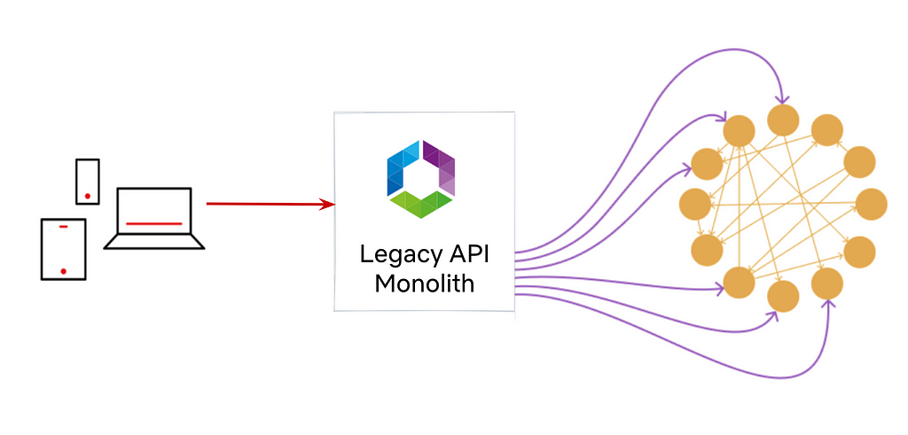
In the microservice architecture, a system is composed of a number of fine-grained services, with each service focusing on a single functionality. So the first (and arguably the most important) thing is to identify boundaries and define services.
In our pipeline, as media assets travel through creation to ingest to delivery, they go through a number of processing steps such as analyses and transformations. We analyzed these processing steps to identify “boundaries” and grouped them into different domains, which in turn became the building blocks of the microservices we engineered.
As an example, in Reloaded, the video encoding module bundles 5 steps:
1. divide the input video into small chunks
2. encode each chunk independently
3. calculate the quality score (VMAF) of each chunk
4. assemble all the encoded chunks into a single encoded video
5. aggregate quality scores from all chunks
From a system perspective, the assembled encoded video is of primary concern while the internal chunking and separate chunk encodings exist in order to fulfill certain latency and resiliency requirements. Further, as alluded to above, the video quality calculation provides a totally separate functionality as compared to the encoding service.
Thus, in Cosmos, we created two independent microservices: Video Encoding Service (VES) and Video Quality Service (VQS), each of which serves a clear, decoupled function. As implementation details, the chunked encoding and the assembling were abstracted away into the VES.
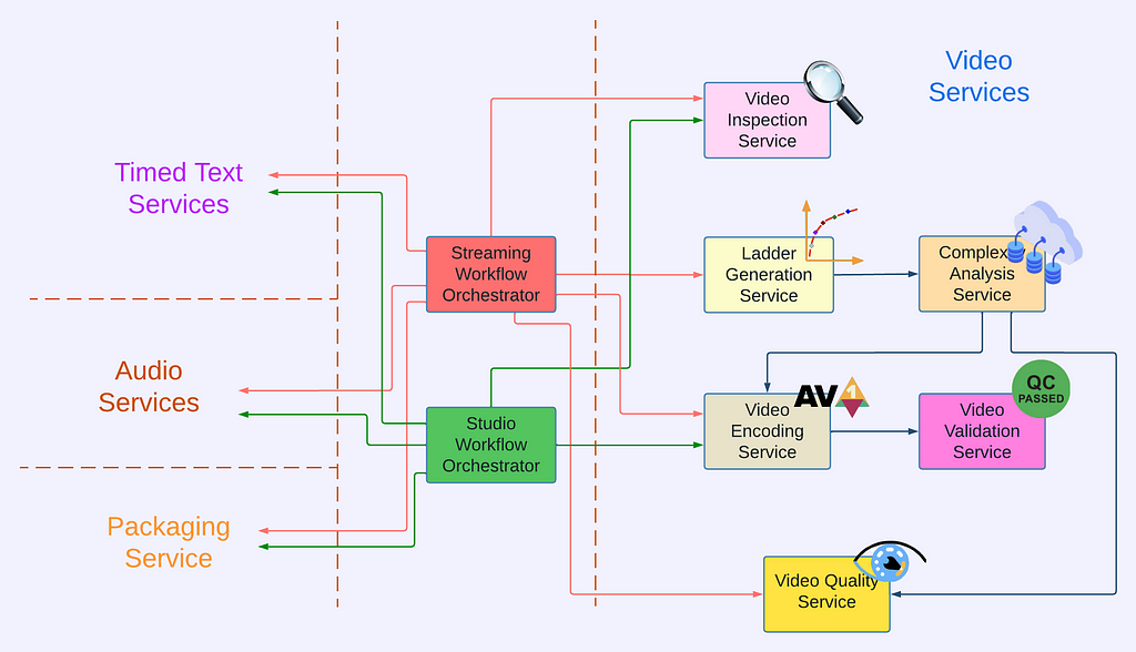
Video Services
The approach outlined above was applied to the rest of the video processing pipeline to identify functionalities and hence service boundaries, leading to the creation of the following video services².
- Video Inspection Service (VIS): This service takes a mezzanine as the input and performs various inspections. It extracts metadata from different layers of the mezzanine for downstream services. In addition, the inspection service flags issues if invalid or unexpected metadata is observed and provides actionable feedback to the upstream team.
- Complexity Analysis Service (CAS): The optimal encoding recipe is highly content-dependent. This service takes a mezzanine as the input and performs analysis to understand the content complexity. It calls Video Encoding Service for pre-encoding and Video Quality Service for quality evaluation. The results are saved to a database so they can be reused.
- Ladder Generation Service (LGS): This service creates an entire bitrate ladder for a given encoding family (H.264, AV1, etc.). It fetches the complexity data from CAS and runs the optimization algorithm to create encoding recipes. The CAS and LGS cover much of the innovations that we have previously presented in our tech blogs (per-title, mobile encodes, per-shot, optimized 4K encoding, etc.). By wrapping ladder generation into a separate microservice (LGS), we decouple the ladder optimization algorithms from the creation and management of complexity analysis data (which resides in CAS). We expect this to give us greater freedom for experimentation and a faster rate of innovation.
- Video Encoding Service (VES): This service takes a mezzanine and an encoding recipe and creates an encoded video. The recipe includes the desired encoding format and properties of the output, such as resolution, bitrate, etc. The service also provides options that allow fine-tuning latency, throughput, etc., depending on the use case.
- Video Validation Service (VVS): This service takes an encoded video and a list of expectations about the encode. These expectations include attributes specified in the encoding recipe as well as conformance requirements from the codec specification. VVS analyzes the encoded video and compares the results against the indicated expectations. Any discrepancy is flagged in the response to alert the caller.
- Video Quality Service (VQS): This service takes the mezzanine and the encoded video as input, and calculates the quality score (VMAF) of the encoded video.
Service Orchestration
Each video service provides a dedicated functionality and they work together to generate the needed video assets. Currently, the two main use cases of the Netflix video pipeline are producing assets for member streaming and for studio operations. For each use case, we created a dedicated workflow orchestrator so the service orchestration can be customized to best meet the corresponding business needs.
For the streaming use case, the generated videos are deployed to our content delivery network (CDN) for Netflix members to consume. These videos can easily be watched millions of times. The Streaming Workflow Orchestrator utilizes almost all video services to create streams for an impeccable member experience. It leverages VIS to detect and reject non-conformant or low-quality mezzanines, invokes LGS for encoding recipe optimization, encodes video using VES, and calls VQS for quality measurement where the quality data is further fed to Netflix’s data pipeline for analytics and monitoring purposes. In addition to video services, the Streaming Workflow Orchestrator uses audio and timed text services to generate audio and text assets, and packaging services to “containerize” assets for streaming.
For the studio use case, some example video assets are marketing clips and daily production editorial proxies. The requests from the studio side are generally latency-sensitive. For example, someone from the production team may be waiting for the video to review so they can decide the shooting plan for the next day. Because of this, the Studio Workflow Orchestrator optimizes for fast turnaround and focuses on core media processing services. At this time, the Studio Workflow Orchestrator calls VIS to extract metadata of the ingested assets and calls VES with predefined recipes. Compared to member streaming, studio operations have different and unique requirements for video processing. Therefore, the Studio Workflow Orchestrator is the exclusive user of some encoding features like forensic watermarking and timecode/text burn-in.
Where we are now
We have had the new video pipeline running alongside Reloaded in production for a few years now. During this time, we completed the migration of all necessary functionalities from Reloaded, began gradually shifting over traffic one use case at a time, and completed the switchover in September of 2023.
While it is still early days, we have already seen the benefits of the new platform, specifically the ease of feature delivery. Notably, Netflix launched the Advertising-supported plan in November 2022. Processing Ad creatives posed some new challenges: media formats of Ads are quite different from movie and TV mezzanines that the team was familiar with, and there was a new set of media processing requirements related to the business needs of Ads. With the modularity and developer productivity benefits of Cosmos, we were able to quickly iterate the pipeline to keep up with the changing requirements and support a successful product launch.
Summary
Rebuilding the video pipeline was a huge undertaking for the team. We are very proud of what we have achieved, and also eager to share our journey with the technical community. This blog has focused on providing an overview: a brief history of our pipeline and the platforms, why the rebuilding was necessary, what these new services look like, and how they are being used for Netflix businesses. In the next blog, we are going to delve into the details of the Video Encoding Service (VES), explaining step-by-step the service creation, and sharing lessons learned (we have A LOT!). We also plan to cover other video services in future tech blogs. Follow the Netflix Tech Blog to stay up to date.
Acknowledgments
A big shout out to the CIS team for their outstanding work in building the Cosmos platform and their receptiveness to feedback from service developers.
We want to express our appreciation to our users, the Streaming Encoding Pipeline team, and the Video Engineering team. Just like our feedback helps iron out the platform, the feedback from our users has been instrumental in building high-quality services.
We also want to thank Christos Bampis and Zhi Li for their significant contributions to video services, and our two former team members, Chao Chen and Megha Manohara for contributing to the early development of this project.
Footnotes
- Formerly known as Media Cloud Engineering/MCE team.
- The actual number of video services is more than listed here. Some of them are Netflix-specific and thus omitted from this blog.
![]()
Rebuilding Netflix Video Processing Pipeline with Microservices was originally published in Netflix TechBlog on Medium, where people are continuing the conversation by highlighting and responding to this story.