Post Syndicated from Paulo R. Deolindo Jr. original https://blog.zabbix.com/zabbix-in-exploratory-data-analysis-rehearsal-part-1/25802/
Abstract
Imagine your happiness when you start a new enterprise device and application monitoring project using Zabbix[i]. Indeed, doing this is so easy that the first results bring up a lot of satisfaction very quickly. For example, when you apply a specific template [ii]in a specific host and the data comes (like magic) and you can create some dashboards with these data and visualize then.
If you haven’t done this yet, you must try it as soon as possible. You can create a web server host using both Apache or Nginx web services, applying the appropriate template and getting metrics by HTTP checks: “Apache by HTTP” template or “Nginx by HTTP” template. You will see interesting metrics being collected and you will be able to create and view some graphs or dashboards. But the work is not finished yet, because using Zabbix, you can do much more!
In this article, I’ll talk about how we can think of new metrics, new use cases, how to support our business and help the company with important results and insights using exploratory data analysis introducing and implementing some data science concepts using only Zabbix.
What is our goal?
Testing and learning some new Zabbix functions introduced from 6.0 version, compare some results and discuss insights.
Contextualizing
Let’s keep the focus on the web server metrics. However, all the results of this study can be used later in different scenarios.
The web server runs nginx version 1.18.0 and we are using “Nginx by HTTP” template to collect the following metrics:
- HTTP agent master item: get_stub_status
- Dependent items[i]:
Nginx: Connections accepted per second
Nginx: Connections active
Nginx: Connections dropped per second
Nginx: Connections handled per second
Nginx: Connections reading
Nginx: Connections waiting
Nginx: Connections writing
Nginx: Requests per second
Nginx: Requests total
Nginx: Version
Nginx: Service response time
Nginx: Service status
That are the possibilities at the moment and below we have a simple dashboard created to view the initial results:

All widgets are reflecting metrics collected by using out-of-the-box “Nginx by HTTP” template.
Despite being Zabbix specialist and having some knowledge about our monitored application, there are some questions we need to ask ourselves. These questions do not need to be exhaustive, but they are relevant for our exercise. So, let’s jump to the next topic.
Generating new metrics! Bringing up some thoughts!
Let’s think about the collected metrics in the beginning of this monitoring project:
- Why the does number of requests only increase?
- When did we have more or fewer connections, considering for example, the last hour?
- What’s the percentage change comparing the current hour with the previous one?
- Which value can be representing the best or the worst response time performance?
- Considering some collected values, can we predict an application downtime?
- Can we detect anomalies in the application based on the amount of collected values and application behavior?
- How to stablish a baseline? Is it possible?
These are some questions we need to answer using this article and the next ones to come.
Generating new metrics
1st step: Let’s create a new template. From “nginx by HTTP”, clone it and change its name to “Nginx by HTTP modified”;
2nd step: Modify the “Nginx: Requests total” item, adding a new pre-processing step: “Simple change”. It will look like the image below:

It’s a Dependent item from the Master item “Nginx: Get stub status page” and the last one is based on HTTP agent to retrieve the main metric. So, if the number of the total connections always increase, the current value will be decreased from the last collected value. A simple mathematical operation: subtraction. And then, from this moment on we’ll have the number of new connections per minute.
The formula for the “Simple change” pre-processing step can be represented using the following images:

I also suggest you change the name of the item to: “Nginx: Requests at last minute”.
I can add some Tags[i] too. These tags can be used in the future to filter the views and so on.

Same metrics variations
With the modified nginx template we can retrieve how many new connections our web application receives per minute and then, we can create new metrics from the previous one. Using Zabbix timeshift[i] [ii]function, we can create metrics such as the number of connections:
- At the last hour
- Today so far and Yesterday
- This week and at the previous week
- This month and the previous month
- This year and at the previous year
- Etc
This exercise can be very interesting. Let’s create some Calculated items with the following formulas:
sum(//nginx.requests.total,1h:now/h) # Somatório de novas conexões na hora anterior
sum(//nginx.requests.total,1h:now/h+1h) # Somatório de novas conexões da hora atual
In Zabbix official documentation we have lots of examples to creating Calculated items using “time shift” parameter. Please, see this link.
Improving our dashboard
Using the new metrics, we can improve our dashboard and enhance the data visualization. Briefly:

The same framework could be used to show the daily, weekly, monthly and yearly data, depending on your business rule, of course. Please, be patient because some items will have some delay in collecting operation (monthly, yearly, etc).
Basic statistics metrics using Zabbix
As we know, it is perfectly possible to generate some statistics values with Zabbix by using Calculated items. However, there are questions that can guide us to other thoughts and some answers will come in format of metrics, again.
- Today, which response time was the best?
- And if we think about the worst response time?
- And about the average?
We can start with these basic statistics and then, growing up latter.

All data in dashboard above were retrieved using simple Zabbix functions.
The best response time today so far.
min(//net.tcp.service.perf[http,”{HOST.CONN}”,”{$NGINX.STUB_STATUS.PORT}”],1d:now/d+1d)
The worst response time today so far.
max(//net.tcp.service.perf[http,”{HOST.CONN}”,”{$NGINX.STUB_STATUS.PORT}”],1d:now/d+1d)
The average of the response time today so far.
avg(//net.tcp.service.perf[http,”{HOST.CONN}”,”{$NGINX.STUB_STATUS.PORT}”],1d:now/d+1d)
It’s ok. Nothing is new, so far. But let’s check some thoughts.
Why we are Looking for the best, the worst and the average using min, max e avg functions, instead of trendmin, trendmax e trendavg functions? The Trend-based functions retrieve data from trends tables, while History-based functions calculates in “real time”. If you wish to use History-based functions to calculate something in a short period, ok. But if you wish to use it to calculate some values considering a long period such as month or year… hum! It can be complicated, and it can take a lot of resources of your infrastructure power.
We need to remember an important thing: to use Trend-based functions, we must consider only data retrieved until the last full hour, because we have to consider the trend-cache sync process.
Look at the dashboard below, this time, using Trend-based Functions for the statistics.

Look at the current results. Basically, they are the same. There aren’t so many differences and, I guess, using it’s an intelligent way to retrieve the desired values.
Insights
If a response time is too short such as 0.06766 (the best of the day) and another value is too big and is representing the worst response time, such as 3.1017, can you imagine which and how many values exist between then?

How to calculate de average? You know: the sum of all collected values within a period, divided by the number of values.
So far, so good. The avg or trendavg functions can retrieve this average based on the desired period. However, if you look at the graph above, you will see some “peaks” in certain periods. These “peaks” are called “outliers”. The outliers are influencers of the average.
The outliers are important but because it exists, the average sometimes may not represent the reality. Think about this: a response time of the web application having stayed between 0.0600 and 0.0777 at the previous hour. During a specific minute within the same monitored period, for some reason, the response time was 3.0123. In this case, the average will increase. But, what if we discard the outlier? Obviously, the average will be as expected. In this case, the outlier was a deviation, “an error in the matrix”. So, we need to be able to calculate de average or other estimative location for our values, without the outlier.
And we cannot forget: if we are looking for anomalies based on the web application response time, we need to consider the outliers. If not, I guess, outliers can be removed on the calculation for now.
Ok! Outliers can influence the common average. So, how can we calculate something without the outliers?
About data timeline, we can affirm that the database is respecting the collected timestamp. Look at the collected data below:
| 2023-04-06 16:24:50 1680809090 0.06977 |
| 2023-04-06 16:23:50 1680809030 0.06981 |
| 2023-04-06 16:22:50 1680808970 0.07046 |
| 2023-04-06 16:21:50 1680808910 0.0694 |
| 2023-04-06 16:20:50 1680808850 0.06837 |
| 2023-04-06 16:19:50 1680808790 0.06941 |
| 2023-04-06 16:18:53 1680808733 3.1101 |
| 2023-04-06 16:17:51 1680808671 0.06942 |
| 2023-04-06 16:16:50 1680808610 0.07015 |
| 2023-04-06 16:15:50 1680808550 0.06971 |
| 2023-04-06 16:14:50 1680808490 0.07029 |
For the average, the timestamp or the collected order will not be important. However, if we ignore its timestamp and order the values from smallest to biggest, we’ll get something like this:
| 0.06837 |
0.0694 |
0.06941 |
0.06942 |
0.06971 |
0.06977 |
0.06981 |
0.07015 |
0.07029 |
0.07046 |
3.1101 |
Table 1.0 – 11 collected values, ordered by from smallest to biggest
In this case, the values are ordered by from the smallest one to the biggest one, ignoring their timestamp.
Look at the outlier at the end. It’s not important for us right now.
The timeline has an odd number of values and the value in green, is the central value. The Median. And what if it was an even number of values? How could we calculate the median? There is a formula for it.
| 0.0694 |
0.06941 |
0.06942 |
0.06971 |
0.06977 |
0.06981 |
0.07015 |
0.07029 |
0.07046 |
3.1101 |
Table 2.0 – 10 collected values, ordered by from smallest to biggest
Now, we have two groups of values. There is not a central position.
This time, we can use the median formula (in general): Calculate de average for the last value for the “Group A” and the first value for the “Group B”. Look at the timeline below and the values in green and orange colors.
Despite considering the concept of median, we can also use the percentile calculation.
In most of cases, the median has a synonymous: “50th percentile”.
I’m proposing you an exercise:
1. You must create a Zabbix trapper item and send to it the following values using zabbix-sender:
0.06837, 0.0694, 0.06941, 0.06942, 0.06971, 0.06977, 0.06981, 0.07015, 0.07029, 0.07046, 3.1101
# for x in `cat numbers.txt`; do zabbix_sender -z 159.223.145.187 -s “Web server A” -k percentile.test -o “$x”; done
At the end, we’ll have 11 values in Zabbix database, and we’ll calculate the 50th percentile
2. You must create a Zabbix Calculated item with the following formula:
percentile(//percentile.test,#11,50)
In this case, we can read it: consider the last 11 values and return the value in the 50th position in the array. And you can check in advance the result using “Test” button in Zabbix.

Now, we’ll work with an even number of values, excluding the value 0.06837. Our values for the next test will be:
0.0694, 0.06941, 0.06942, 0.06971, 0.06977, 0.06981, 0.07015, 0.07029, 0.07046, 3.1101
Please, before sending the values with zabbix-sender again, clear the history and trends for this Calculated item and then, adjust the formula:
percentile(//percentile.test,#10,50)
Checking the result, something curious happened: the 50th percentile was the same value.
There is a simple explanation for this.
Considering the last 10 values, in green we have the “Group A” and in orange, we have the “Group B”. The value retrieved using 50th percentile formula occupies the same position in both first and second tests.

We can test it again but this time, let’s change the formula to 51st percentile. The next value will be the first value for the second group.
percentile(//percentile.test,#10,51)

The result was changed. Now, we have something different to work and then, in the next steps, we’ll retrieve the median.
So, the percentile can be considered the central value for an odd number of values, but when we have an even number of values, the result cannot be the expected.
Average ou Percentile?
Two different calculations. Two different results. Neither the first is wrong nor the second. Both values can be considered correct, but we need some context for this affirmation.
The average is considering the outliers. The last one, percentile, is not.
Let’s update our dashboard.

We don’t need to prove anything to anyone about the values, but we need to show the values and their context.
It’s simple: If the median is the central value, we can retrieve the average for the 50th percentile and 51st percentile, in this case. Remember, our new connections are being collected every minute, so at the end of each hour, we’ll have an even number of values.
Fantastic. We can calculate de median in a simple way:
(last(//percentile.50.input.values)+last(//percentile.51.input.values))/2
This is the median formula in this case using Zabbix. Let’s check the results in our dashboard.

Partial conclusion
In this article, we have just explored some Zabbix functions to calculate basic statistics and bring up some insights about a symbolic web application and its response time.
There is no absolute truth about those metrics but each one of them needs a context.
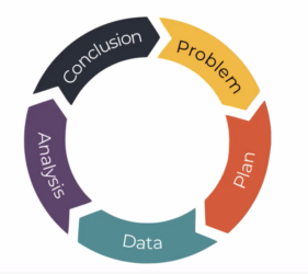
In Exploratory Data Analysis, asking questions can guide us to interesting answers, but remember that we need to know where we are going or what we wish.
With Zabbix, you and me can perform a Data Scientist function, knowing Zabbix too and knowing it very well.
You don’t need to use python or R for all tasks in Data Science. We’ll talk about it in next articles for this series.
Keep in mind: Zabbix is your friend. Let’s learn Zabbix and get wonderful results!
_____________
[1] Infográfico Zabbix (unirede.net)
[1] [1] https://www.unirede.net/zabbix-templates-onde-conseguir/
[1] https://www.unirede.net/monitoramento-de-certificados-digitais-de-websites-com-zabbix-agent2/
[1] Tagging: Monitorando todos os serviços! – YouTube
[1] [1] Timeshift – YouTube