Post Syndicated from Abhinav Sarin original https://aws.amazon.com/blogs/big-data/migrate-amazon-quicksight-across-aws-accounts/
This blog post is co-written by Glen Douglas and Alex Savchenko from Integrationworx.
Enterprises that follow an Agile software development lifecycle (SDLC) process for their dashboard development and deployment typically have distinct environments for development, staging, QA and test, and production. One recommended approach when developing using AWS is to create multiple AWS accounts corresponding to the various environments. Amazon QuickSight is a fully managed, serverless business intelligence service offered by AWS for building interactive dashboards. With QuickSight, you can share dashboards with your internal users, or embed dashboards into your applications for external users or customers, scaling to 100s of 1000s of users with no servers or infrastructure to maintain. When an account is created on QuickSight, it corresponds to the underlying AWS account. So, when dashboards are created in the development environment, you need to migrate these assets to a higher environment to be in alignment with current DevOps practices. This requires cross-account dashboard migration. This post outlines the steps involved in migrating dashboards from one account to another.
Solution overview
The following diagram shows the architecture of how QuickSight accounts are mapped to AWS accounts. In this post, we outline the steps involved in migrating QuickSight assets in the dev account to the prod account.

Migrating QuickSight dashboards from a dev account to a prod account involves converting the underlying dev dashboard assets into JSON and then recreating them in prod. QuickSight provides a robust set of APIs to create QuickSight assets, such as dashboards, analysis, datasets, and themes. You can run these APIs via the AWS Command Line Interface (AWS CLI) or through SDKs available for various programming languages. For this post, we use the AWS CLI for illustration; for regular usage, we recommend you implement this with the AWS SDK.
To set up the AWS CLI, see Developing Applications with the QuickSight API.
The following diagram illustrates the high-level steps to migrate QuickSight assets from one account to another. First, we need prepare the dataset and data sources, and create the analysis, template, and dashboards in the dev account.

Next, we use the dev template with the test dataset and data sources to promote the dashboards.

You can create any QuickSight entity programmatically using APIs (for example, create-dataset and create-datasources). Another API allows generating a JSON representation of the entity that was created (such as describe-dataset and describe-datasource). Analysis entity is an exception—as of this writing, there are no APIs for creating or generating a JSON representation. All analysis entities must be created using the AWS Management Console for the first time. From that point on, you can programmatically manage analysis using templates.
Definitions
The following table defines the parameters used in this post.
| Environment Name |
Demo Reference |
AWS Account ID |
QuickSight Account Name |
| Source (Dev) |
Source account |
31********64
|
QS-Dev |
| Target (Test) |
Target account |
86********55
|
QS-Test |
The following figure summarizes the QuickSight objects and AWS Identity and Access Management (IAM) resources that are referenced in the migration between accounts. The QuickSight objects from the source account are referenced and recreated in the target account.

The following table summarizes the QuickSight objects used in this post for migration from the source account (dev) to the target account (test). As part of the migration, the name of the data source is changed in order to denote the change in underlying data used in the target environment. As we demonstrate in this post, a QuickSight template is created in the source account only. This template contains the information about the source dashboard that is to be created in the target account.
| QuickSight Object Type |
Object Name (Source) |
Object Name (Target) |
| Data Source |
QS_Dev |
QS_Test |
| Dataset |
sporting_event_ticket_info |
sporting_event_ticket_info |
| Dashboard |
Sporting_event_ticket_info_dashboard
|
Sporting_event_ticket_info_dashboard
|
| Template |
sporting_event_ticket_info_template |
|
For this post, we use an Amazon RDS for PostgreSQL database as the dataset and create a QuickSight visualization using the database table sporting_event_ticket_info. You can use any of the data sources that QuickSight supports or easily test this process using a spreadsheet. The dashboard to be migrated from the development environment shows data from the corresponding dev database (QS_Dev).
Prerequisites
Consider the situation in which you need to migrate a QuickSight dashboard from a source (or dev) environment to a target (or test) environment. The migration requires the following prerequisites:
Step 1: Enable permissions to migrate QuickSight objects
To facilitate using AWS CLI commands and sharing QuickSight templates from the source account to the target account, we perform the following actions in the source environment:
1a) Create an IAM policy.
1b) Create a new IAM group and attach the policy.
1c) Create a new IAM user and assign it to the group.
1d) Invite the IAM user created to the QuickSight (dev) account.
1e) Create another reader policy in the source (dev) account to grant access to the target (test) account.
1f) Create a deployer role in the source account.
Step 1a: Create an IAM policy
You start by creating IAM resources. For this post, we create an IAM policy called Dev-QuickSightAdmin, which is used by IAM users and roles in the source account. The purpose of this policy is to allow a user in the source account to perform various actions on QuickSight objects.
- To get started, as the admin user, sign in to the IAM console.
- In the navigation pane, choose Policies.
- Choose Create policy.
- In the Service section, select Choose a service and choose QuickSight.
- Under Actions, select the following permissions:
- List – ListAnalysis, ListDashboards, ListDataSets, ListDataSources, ListTemplates
- Read – DescribeAnalysis, DescribeDashboard, DescribeDataSet, DescribeDataSource, DescribeTemplate
- Write – CreateTemplate, UpdateTemplate
- Permissions management – DescribeTemplatePermissions, UpdateTemplatePermissions
- Select the appropriate resources.
You can restrict the resources and Region based on your requirement. We allow all resources for this post.
- Review and create the policy.
Step 1b: Create a new IAM group
Create a new IAM group Dev-grp-QuickSightAdmin and assign the Dev-QuickSightAdmin policy (from Step 1a) to the group in the source account.
Step 1c: Create a new IAM user
Create a new IAM user called Dev-qs-admin-user and assign it to the Dev-grp-QuickSightAdmin group. You use this user later to run the AWS CLI commands in the source account. Alternately, you can use an existing IAM user for this purpose.
Step 1d: Invite the IAM user to the QuickSight (dev) account
Sign in to QuickSight in the source (dev) account and invite the user from Step 1c to QuickSight. Assign the role of ADMIN and for IAM user, choose Yes to indicate that this is an IAM user.

Step 1e: Create another reader policy in the source (dev) account
In the source (dev) account, create another IAM policy, called Dev-QuickSightReader, to grant access to the target (test) account. The purpose of this policy is to allow the target account to perform list and read actions on QuickSight objects in the source account.
- On the IAM console, choose Policies in the navigation pane.
- Choose Create policy.
- In the Service section, select Choose a service and choose QuickSight.
- Under Actions, make sure that All QuickSight actions is not selected.
- Under Access level, select List and Read.
- Select the following permissions:
- List – ListAnalysis, ListDashboards, ListDataSets, ListDataSources, ListTemplates
- Read – DescribeAnalysis, DescribeDashboard, DescribeDataSet, DescribeDataSource, DescribeTemplate
- Review and create the policy.
Verify the reader IAM policy Dev-QuickSightReader shows only the list and read access level for QuickSight services when complete.
Step 1f: Create a deployer role in the source account (dev)
You now create an IAM role called Dev-QuickSight-Deployer in the source account (dev). This role is specifically assigned to the target account ID and assigned the QuickSightReader policy, as noted in the previous step. This allows the external AWS target (test) account to read the QuickSight template contained in the source (dev) account.
- On the IAM console, choose Roles in the navigation pane.
- Choose Create role.
- Select Another AWS account and provide the account ID of the target account.
- In the Attach permissions policies section, attach the
Dev-QuickSightReader
- In the Add tags section, add any tags (optional).
- Choose Next.
- In the Review section, assign a role name (we use
Dev-QuickSight-Deployer).
- Enter a role description.
- Choose Create role.
You have completed the creation of the policy, group, and user in the source account. The next step is to configure the permissions in the target account.
- Switch from the source account to the target account.
- In the target account, sign in to the IAM console and repeat the steps in this section to create the
Test-QuickSightAdmin policy and Test-grp-QuickSightAdmin group, and assign the policy to the group. Test-QuicksightAdmin should have following permissions:
- List – ListAnalysis, ListDashboards, ListDataSets, ListDataSources, ListTemplates
- Read – DescribeAnalysis, DescribeDashboard, DescribeDataSet, DescribeDataSource, DescribeTemplate
- Write – CreateTemplate, UpdateTemplate, Createdatasource, CreateDashboard, UpdateDataSet
- Permissions management – DescribeTemplatePermissions, UpdateTemplatePermissions
- Tag: TagResource, UntagResource
- Create the IAM user
Test-qs-admin-user and add it to the Test-grp-QuickSightAdmin group
- Sign in to QuickSight and invite the test user.
One final step is to add Test-qs-admin-user as a trusted entity in the Dev-QuickSight-Deployer role. The reason is the target account needs cross-account access. We use the IAM user Test-qs-admin-user to create the dashboard in the test account.
- Switch back to the source (dev) account.
- Select role and search for the
Dev-QuickSight-Deployer role.
- Choose Trust relationships.
- Edit the trust relationship and add the following ARN in the Principal section of the policy:
arn:aws:iam::86XXXXX55:user/Test-qs-admin-user.

Step 2: Prepare QuickSight objects in the source account
To migrate QuickSight objects to a target environment, we perform the following actions in the source environment:
2a) Prepare the data source file.
2b) Prepare the dataset file.
2c) Create a dashboard template.
Step 2a: Prepare the data source file
Data sources represent connections to specific sources of data and are made available within a QuickSight account. Multiple data source types are supported within QuickSight, including a variety of relational databases, flat files, JSON semi-structured data files, and software as a service (SaaS) data providers.
Any QuickSight dashboards and datasets to be migrated to the target environment must have their corresponding data sources also migrated within the target environment.
In this step, you create a JSON file with the data source information from the source environment. Then you use the create-data-source AWS CLI command in the target environment with the JSON file as input.
- First, identify the data source for your implementation by running the
list-data-sources command in the source (dev) account:
aws quicksight list-data-sources --aws-account-id 31********64
The following code shows the top portion of the command output:
{
    "Status": 200,
    "DataSources": [
        {
            "Arn": "arn:aws:quicksight:us-east-1:31********64:datasource/4b98fee7-4df1-4dc2-8ca3-115c1c1839ab"",
            "DataSourceId": "4b98fee7-4df1-4dc2-8ca3-115c1c1839ab",
            "Name": "QS_Dev",
            "Type": "POSTGRESQL",
            "Status": "CREATION_SUCCESSFUL",
            "CreatedTime": "2020-12-16T20:42:37.280000-08:00",
            "LastUpdatedTime": "2020-12-16T20:42:37.280000-08:00",
            "DataSourceParameters": {
                "RdsParameters": {
                    "InstanceId": "dmslabinstance",
                    "Database": "sportstickets"
                }
            },
            "SslProperties": {
                "DisableSsl": false
            }
        },
- Run the
describe-data-source command, using the DataSourceId from the previous list-data-source command output.
This command provides details about the data source, which we use to create the data source in the target account.
aws quicksight describe-data-source --aws-account-id 31********64 --data-source-id "4b98fee7-4df1-4dc2-8ca3-115c1c1839ab "
The following is the resulting output:
{
    "Status": 200,
    "DataSource": {
        "Arn": "arn:aws:quicksight:us-east-1:31*******64:datasource/4b98fee7-4df1-4dc2-8ca3-115c1c1839ab",
        "DataSourceId": "4b98fee7-4df1-4dc2-8ca3-115c1c1839ab",
        "Name": "QS_Dev",
        "Type": "POSTGRESQL",
        "Status": "CREATION_SUCCESSFUL",
        "CreatedTime": "2020-12-16T20:42:37.280000-08:00",
        "LastUpdatedTime": "2020-12-16T20:42:37.280000-08:00",
        "DataSourceParameters": {
            "RdsParameters": {
                "InstanceId": "dmslabinstance",
                "Database": "sportstickets"
            }
        },
        "SslProperties": {
            "DisableSsl": false
        }
    },
    "RequestId": "c2455720-118c-442d-9ba3-4f446cb543f1"
}
If you’re migrating more than one data source, you need to repeat the step for each data source.
- Use the output from the
describe-data-source command to create a JSON file called create-data-source-cli-input.json, which represents the data source that is being migrated.
The contents of the following JSON file reference the data source information (name, host, credentials) for the target environment:
{
    "AwsAccountId": "86********55",
    "DataSourceId": "QS_Test",
    "Name": "QS_Test",
    "Type": "POSTGRESQL",
    "DataSourceParameters": {
        "PostgreSqlParameters": {
            "Host": "dmslabinstance.***********.us-east-1.rds.amazonaws.com",
            "Port": 5432,
            "Database": "sportstickets"
        }
    },
    "Credentials": {
        "CredentialPair": {
            "Username": "xxxxxxx",
            "Password": "yyyyyyy"
        }
    },
    "Permissions": [
        {
            "Principal": "arn:aws:quicksight:us-east-1:86********55:user/default/Test-qs-admin-user",
            "Actions": [
                "quicksight:UpdateDataSourcePermissions",
                "quicksight:DescribeDataSource",
                "quicksight:DescribeDataSourcePermissions",
                "quicksight:PassDataSource",
                "quicksight:UpdateDataSource",
                "quicksight:DeleteDataSource"
            ]
        }
    ],
    "Tags": [
        {
            "Key": "Name",
            "Value": "QS_Test"
        }
    ]
}
For this post, because the target environment is connecting to the same data source as the source environment, the values in the JSON can simply be provided from the previous describe-data-source command output.
Step 2b: Prepare the dataset file
Datasets provide an abstraction layer in QuickSight, which represents prepared data from a data source in the QuickSight account. The intent of prepared datasets is to enable reuse in multiple analyses and sharing amongst QuickSight users. A dataset can include calculated fields, filters, and changed file names or data types. When based on a relational database, datasets can join tables within QuickSight, or as part of the underlying SQL query used to define the dataset.
The sample dataset sporting_event_ticket_info represents a single table; however, in a relational database, datasets can join tables within QuickSight, or as part of the underlying SQL query used to define the dataset.

Similar to the process used for data sources, you create a JSON file representing the datasets from the source account.
- Run the
list-data-sets command to get all datasets from the source account:
aws quicksight list-data-sets --aws-account-id 31********64
The following code is the output:
{
            "Arn": "arn:aws:quicksight:us-east-1:31********64:dataset/24b1b03a-86ce-41c7-9df7-5be5343ff9d9",
            "DataSetId": "24b1b03a-86ce-41c7-9df7-5be5343ff9d9",
            "Name": "sporting_event_ticket_info",
            "CreatedTime": "2020-12-16T20:45:36.672000-08:00",
            "LastUpdatedTime": "2020-12-16T20:45:36.835000-08:00",
            "ImportMode": "SPICE"
}
- Run the describe-data-set command, specifying the DataSetId from the previous command’s response:
aws quicksight describe-data-set --aws-account-id 31********64 --data-set-id "24b1b03a-86ce-41c7-9df7-5be5343ff9d9"
The following code shows the output:
{
    "Status": 200,
    "DataSet": {
        "Arn": "arn:aws:quicksight:us-east-1:31********64:dataset/24b1b03a-86ce-41c7-9df7-5be5343ff9d9",
        "DataSetId": "24b1b03a-86ce-41c7-9df7-5be5343ff9d9",
        "Name": "sporting_event_ticket_info",
        "CreatedTime": "2020-12-16T20:45:36.672000-08:00",
        "LastUpdatedTime": "2020-12-16T20:45:36.835000-08:00",
        "PhysicalTableMap": {
            "d7ec8dff-c136-4c9a-a338-7017a95a4473": {
                "RelationalTable": {
                    "DataSourceArn": "arn:aws:quicksight:us-east-1:31********64:datasource/f72f8c2a-f9e2-4c3c-8221-0b1853e920b2",
                    "Schema": "dms_sample",
                    "Name": "sporting_event_ticket_info",
                    "InputColumns": [
                        {
                            "Name": "ticket_id",
                            "Type": "DECIMAL"
                        },
                        {
                            "Name": "event_id",
                            "Type": "INTEGER"
                        },
                        {
                            "Name": "sport",
                            "Type": "STRING"
                        },
                        {
                            "Name": "event_date_time",
                            "Type": "DATETIME"
                        },
                        {
                            "Name": "home_team",
                            "Type": "STRING"
                        },
                        {
                            "Name": "away_team",
                            "Type": "STRING"
                        },
                        {
                            "Name": "location",
                            "Type": "STRING"
                        },
                        {
                            "Name": "city",
                            "Type": "STRING"
                        },
                        {
                            "Name": "seat_level",
                            "Type": "DECIMAL"
                        },
                        {
                            "Name": "seat_section",
                            "Type": "STRING"
                        },
                        {
                            "Name": "seat_row",
                            "Type": "STRING"
                        },
                        {
                            "Name": "seat",
                            "Type": "STRING"
                        },
                        {
                            "Name": "ticket_price",
                            "Type": "DECIMAL"
                        },
                        {
                            "Name": "ticketholder",
                            "Type": "STRING"
                        }
                    ]
                }
            }
        },
        "LogicalTableMap": {
            "d7ec8dff-c136-4c9a-a338-7017a95a4473": {
                "Alias": "sporting_event_ticket_info",
                "DataTransforms": [
                    {
                        "TagColumnOperation": {
                            "ColumnName": "city",
                            "Tags": [
                                {
                                    "ColumnGeographicRole": "CITY"
                                }
                            ]
                        }
                    }
                ],
                "Source": {
                    "PhysicalTableId": "d7ec8dff-c136-4c9a-a338-7017a95a4473"
                }
            }
        },
        "OutputColumns": [
            {
                "Name": "ticket_id",
                "Type": "DECIMAL"
            },
            {
                "Name": "event_id",
                "Type": "INTEGER"
            },
            {
                "Name": "sport",
                "Type": "STRING"
            },
            {
                "Name": "event_date_time",
                "Type": "DATETIME"
            },
            {
                "Name": "home_team",
                "Type": "STRING"
            },
            {
                "Name": "away_team",
                "Type": "STRING"
            },
            {
                "Name": "location",
                "Type": "STRING"
            },
            {
                "Name": "city",
                "Type": "STRING"
            },
            {
                "Name": "seat_level",
                "Type": "DECIMAL"
            },
            {
                "Name": "seat_section",
                "Type": "STRING"
            },
            {
                "Name": "seat_row",
                "Type": "STRING"
            },
            {
                "Name": "seat",
                "Type": "STRING"
            },
            {
                "Name": "ticket_price",
                "Type": "DECIMAL"
            },
            {
                "Name": "ticketholder",
                "Type": "STRING"
            }
        ],
        "ImportMode": "SPICE",
        "ConsumedSpiceCapacityInBytes": 318386511
    },
    "RequestId": "8c6cabb4-5b9d-4607-922c-1916acc9da1a"
}
- Based on the dataset description, create a JSON file based on the template file (
create-data-set-cli-input-sql.json) with the details listed in the describe-data-set command output:
{

    "AwsAccountId": "86********55",
    "DataSetId": "24b1b03a-86ce-41c7-9df7-5be5343ff9d9",
    "Name": "person",
    "PhysicalTableMap": {
        "23fb761f-df37-4242-9f23-ba61be20a0df": {
            "RelationalTable": {
                "DataSourceArn": "arn:aws:quicksight:us-east-1: 86********55:datasource/QS_Test",
                "Schema": "dms_sample",
                "Name": " sporting_event_ticket_info ",
                "InputColumns": [

                        {
                            "Name": "ticket_id",
                            "Type": "DECIMAL"
                        },
                        {
                            "Name": "event_id",
                            "Type": "INTEGER"
                        },
                        {
                            "Name": "sport",
                            "Type": "STRING"
                        },
                        {
                            "Name": "event_date_time",
                            "Type": "DATETIME"
                        },
                        {
                            "Name": "home_team",
                            "Type": "STRING"
                        },
                        {
                            "Name": "away_team",
                            "Type": "STRING"
                        },
                        {
                            "Name": "location",
                            "Type": "STRING"
                        },
                        {
                            "Name": "city",
                            "Type": "STRING"
                        },
                        {
                            "Name": "seat_level",
                            "Type": "DECIMAL"
                        },
                        {
                            "Name": "seat_section",
                            "Type": "STRING"
                        },
                        {
                            "Name": "seat_row",
                            "Type": "STRING"
                        },
                        {
                            "Name": "seat",
                            "Type": "STRING"
                        },
                        {
                            "Name": "ticket_price",
                            "Type": "DECIMAL"
                        },
                        {
                            "Name": "ticketholder",
                            "Type": "STRING"
                        }
                    ]
                }
            }
        },
        "LogicalTableMap": {
            "23fb761f-df37-4242-9f23-ba61be20a0df": {
                "Alias": "person",
                "Source": {
                    "PhysicalTableId": "23fb761f-df37-4242-9f23-ba61be20a0df"
                }
            }
        },
    "ImportMode": "SPICE",
    "Permissions": [
        {
            "Principal": "arn:aws:quicksight:us-east-1: 86********55:user/default/Test-qs-admin-user",
            "Actions": [
                "quicksight:UpdateDataSetPermissions",
                "quicksight:DescribeDataSet",
                "quicksight:DescribeDataSetPermissions",
                "quicksight:PassDataSet",
                "quicksight:DescribeIngestion",
                "quicksight:ListIngestions",
                "quicksight:UpdateDataSet",
                "quicksight:DeleteDataSet",
                "quicksight:CreateIngestion",
                "quicksight:CancelIngestion"
            ]
        }
    ],
    "Tags": [
        {
            "Key": "Name",
            "Value": "QS_Test"
        }
    ]
}
The DataSource Arn should reference the ARN of the existing data source (in this case, the source created in the previous step).
Step 2c: Create a QuickSight template
A template in QuickSight is an entity that encapsulates the metadata that describes an analysis. A template provides a layer of abstraction from a specific analysis by using placeholders for the underlying datasets used to create the analysis. When we replace dataset placeholders in a template, we can recreate an analysis for a different dataset that follows the same schema as the original analysis.
You can also share templates across accounts. This feature, combined with the dataset placeholders in a template, provides the means to migrate a dashboard from one account to another.
- To create a template, begin by using the
list-dashboards command to get list of available dashboards in the source environment:
aws quicksight list-dashboards --aws-account-id 31********64
The command output can be lengthy, depending on the number of dashboards in the source environment.
- Search for the “
Name” of the desired dashboard in the output file and copy the corresponding DashboardId to use in the next step:
{
            "Arn": "arn:aws:quicksight:us-east-1:31********64:dashboard/c5345f81-e79d-4a46-8203-2763738489d1",
            "DashboardId": "c5345f81-e79d-4a46-8203-2763738489d1",
            "Name": "Sportinng_event_ticket_info_dashboard",
            "CreatedTime": "2020-12-18T01:30:41.209000-08:00",
            "LastUpdatedTime": "2020-12-18T01:30:41.203000-08:00",
            "PublishedVersionNumber": 1,
            "LastPublishedTime": "2020-12-18T01:30:41.209000-08:00"
        }
- Run the
describe-dashboard command for the DashboardId copied in the preceding step:
aws quicksight describe-dashboard --aws-account-id 31********64 --dashboard-id "c5345f81-e79d-4a46-8203-2763738489d1"
The response should look like the following code:
{
    "Status": 200,
    "Dashboard": {
        "DashboardId": "c5345f81-e79d-4a46-8203-2763738489d1",
        "Arn": "arn:aws:quicksight:us-east-1:31********64:dashboard/c5345f81-e79d-4a46-8203-2763738489d1",
        "Name": "Sportinng_event_ticket_info_dashboard",
        "Version": {
            "CreatedTime": "2020-12-18T01:30:41.203000-08:00",
            "Errors": [],
            "VersionNumber": 1,
            "SourceEntityArn": "arn:aws:quicksight:us-east-1:31*******64:analysis/daddefc4-c97c-4460-86e0-5b488ec29cdb",
            "DataSetArns": [
                "arn:aws:quicksight:us-east-1:31********64:dataset/24b1b03a-86ce-41c7-9df7-5be5343ff9d9"
            ]
        },
        "CreatedTime": "2020-12-18T01:30:41.209000-08:00",
        "LastPublishedTime": "2020-12-18T01:30:41.209000-08:00",
        "LastUpdatedTime": "2020-12-18T01:30:41.203000-08:00"
    },
    "RequestId": "be9e60a6-d271-4aaf-ab6b-67f2ba5c1c20"
}
- Use the details obtained from the
describe-dashboard command to create a JSON file based on the file create-template-cli-input.json.
The following code represents the input for creating a QuickSight template:
 {
    "AwsAccountId": "31********64",
    "TemplateId": "Sporting_event_ticket_info_template",
    "Name": "Sporting event ticket info template",
    "SourceEntity": {
        "SourceAnalysis": {
            "Arn": "arn:aws:quicksight:us-east-1:31********64:analysis/daddefc4-c97c-4460-86e0-5b488ec29cdb",
            "DataSetReferences": [
                {
                    "DataSetPlaceholder": "TicketInfo",
                    "DataSetArn": "arn:aws:quicksight:us-east-1:31********64:dataset/24b1b03a-86ce-41c7-9df7-5be5343ff9d9"
                }
            ]
        }
    },
    "VersionDescription": "1"
}
- Run the
create-template command to create a template object based on the file you created.
For example, the JSON file named create-template-cli-input.json would be run as follows:
aws quicksight create-template --cli-input-json file://./create-template-cli-input.json
The following is the expected response for the create-template command:
{
    "Status": 202,
    "Arn": "arn:aws:quicksight:us-east-1:31********64:template/Sporting_event_ticket_info_template",
    "VersionArn": "arn:aws:quicksight:us-east-1:31********64:template/Sporting_event_ticket_info_template/version/1",
    "TemplateId": "Sporting_event_ticket_info_template",
    "CreationStatus": "CREATION_IN_PROGRESS",
    "RequestId": "c32e4eb1-ecb6-40fd-a2da-cce86e15660a"
}
The template is created in the background, as noted by the CreationStatus. Templates aren’t visible within the QuickSight UI; they’re a developer-managed or admin-managed asset that is only accessible via the APIs.
- To check status of the template, run the
describe-template command:
aws quicksight describe-template --aws-account-id 31********64 --template-id "Sporting_event_ticket_info_template"
The expected response for the describe-template command should indicate a Status of CREATION_SUCCESSFUL:
{
    "Status": 200,
    "Template": {
        "Arn": "arn:aws:quicksight:us-east-1:31********64:template/Sporting_event_ticket_info_template",
        "Name": "Sporting event ticket info template",
        "Version": {
            "CreatedTime": "2020-12-18T01:56:49.135000-08:00",
            "VersionNumber": 1,
            "Status": "CREATION_SUCCESSFUL",
            "DataSetConfigurations": [
                {
                    "Placeholder": "TicketInfo",
                    "DataSetSchema": {
                        "ColumnSchemaList": [
                            [
                        {
                            "Name": "ticket_id",
                            "Type": "DECIMAL"
                        },
                        {
                            "Name": "event_id",
                            "Type": "INTEGER"
                        },
                        {
                            "Name": "sport",
                            "Type": "STRING"
                        },
                        {
                            "Name": "event_date_time",
                            "Type": "DATETIME"
                        },
                        {
                            "Name": "home_team",
                            "Type": "STRING"
                        },
                        {
                            "Name": "away_team",
                            "Type": "STRING"
                        },
                        {
                            "Name": "location",
                            "Type": "STRING"
                        },
                        {
                            "Name": "city",
                            "Type": "STRING"
                        },
                        {
                            "Name": "seat_level",
                            "Type": "DECIMAL"
                        },
                        {
                            "Name": "seat_section",
                            "Type": "STRING"
                        },
                        {
                            "Name": "seat_row",
                            "Type": "STRING"
                        },
                        {
                            "Name": "seat",
                            "Type": "STRING"
                        },
                        {
                            "Name": "ticket_price",
                            "Type": "DECIMAL"
                        },
                        {
                            "Name": "ticketholder",
                            "Type": "STRING"
                        }
                        ]
                    },
                    "ColumnGroupSchemaList": []
                }
            ],
            "Description": "1",
            "SourceEntityArn": "arn:aws:quicksight:us-east-1:31********64:analysis/daddefc4-c97c-4460-86e0-5b488ec29cdb"
        },
        "TemplateId": "Sporting_event_ticket_info_template",
        "LastUpdatedTime": "2020-12-18T01:56:49.125000-08:00",
        "CreatedTime": "2020-12-18T01:56:49.125000-08:00"
    },
    "RequestId": "06c61098-2a7e-4b0c-a27b-1d7fc1742e06"
}
- Take note of the
TemplateArn value in the output to use in subsequent steps.
- After you verify the template has been created, create a second JSON file (
TemplatePermissions.json) and replace the Principal value with the ARN for the target account:
[
{
"Principal": "arn:aws:iam::86*******55:root",
"Actions": ["quicksight:UpdateTemplatePermissions","quicksight:DescribeTemplate"]
}
]
- Use this JSON file as the input for the update-template-permissions command, which allows cross-account read access from the source template (source account) to the target account:
aws quicksight update-template-permissions --aws-account-id 31********64 --template-id "Sporting_event_ticket_info_template" --grant-permissions file://./TemplatePermission.json --profile default
This command permits the target account to view the template in the source account. The expected response for the update-template-permissions command should look like the following code:
{
    "Status": 200,
    "TemplateId": "Sporting_event_ticket_info_template",
    "TemplateArn": "arn:aws:quicksight:us-east-1:31********64:template/Sporting_event_ticket_info_template",
    "Permissions": [
        {
            "Principal": "arn:aws:iam::86********55:root",
            "Actions": [
                "quicksight:UpdateTemplatePermissions",
                "quicksight:DescribeTemplate"
            ]
        }
    ],
    "RequestId": "fa153511-5674-4891-9018-a8409ad5b8b2"
}
At this point, all the required work in the source account is complete. The next steps use the AWS CLI configured for the target account.
Step 3: Create QuickSight resources in the target account
To create the data sources and data templates in the target account, you perform the following actions in the target environment using Test-qs-admin-user:
3a) Create a data source in the target account.
3b) Create datasets in the target account.
3c) Create dashboards in the target account.
Step 3a: Create a data source in the target account
To create a data source in your target account, complete the following steps:
- Use the data source file created in Step 2a to run the
create-data-source command in the target environment:
aws quicksight create-data-source --cli-input-json file://./create-data-source-cli-input.json
The response from the command should indicate the creation is in progress:
{
    "Status": 202,
    "Arn": "arn:aws:quicksight:us-east-1:86********55:datasource/QS_Test",
    "DataSourceId": "QS_Test",
    "CreationStatus": "CREATION_IN_PROGRESS",
    "RequestId": "3bf160e2-a5b5-4c74-8c67-f651bef9b729"
}
- Use the describe-data-source command to validate that the data source was created successfully:
aws quicksight describe-data-source --aws-account-id 86********55 --data-source-id "QS_Test"
The following code shows the response:
{
    "Status": 200,
    "DataSource": {
        "Arn": "arn:aws:quicksight:us-east-1:86********55:datasource/QS_Test",
        "DataSourceId": "QS_Test",
        "Name": "QS_Test",
        "Type": "POSTGRESQL",
        "Status": "CREATION_SUCCESSFUL",
        "CreatedTime": "2020-12-21T12:11:30.734000-08:00",
        "LastUpdatedTime": "2020-12-21T12:11:31.236000-08:00",
        "DataSourceParameters": {
            "PostgreSqlParameters": {
                "Host": "dmslabinstance.*************.us-east-1.rds.amazonaws.com",
                "Port": 5432,
                "Database": "sportstickets"
            }
        },
        "SslProperties": {
            "DisableSsl": false
        }
    },
    "RequestId": "fbb72f11-1f84-4c57-90d2-60e3cbd20454"}
- Take note of the
DataSourceArn value to reference later when creating the dataset.
The data source should now be available within QuickSight. Keep in mind that the data source is visible to the Test-qs-admin-user user, so you must sign in as Test-qs-admin-user and open QuickSight. For this post, the input JSON file renamed the data source to reflect the test environment. Alternatively, sign in to the target QuickSight account and choose Create new dataset to view the available data source.

Step 3b: Create datasets in the target account
Now that the data source is in the target environment, you’re ready to create your datasets.
- Use the
create-data-set command to create the dataset using the create-data-set-cli-input-sql.json created in Step 2b.
Make sure to replace the DataSourceARN in create-data-set-cli-input-sql.json with the Data SourceArn value shown in the describe-data-source command in Step 3a.
aws quicksight create-data-set --cli-input-json file://./create-data-set-cli-input-sql.json
The following code shows our results:
{
    "Status": 201,
    "Arn": "arn:aws:quicksight:us-east-1:86********55:dataset/24b1b03a-86ce-41c7-9df7-5be5343ff9d9",
    "DataSetId": "24b1b03a-86ce-41c7-9df7-5be5343ff9d9",
    "IngestionArn": "arn:aws:quicksight:us-east-1:86********55:dataset/24b1b03a-86ce-41c7-9df7-5be5343ff9d9/ingestion/d819678e-89da-4392-b550-04221a0e4c11",
    "IngestionId": "d819678e-89da-4392-b550-04221a0e4c11",
    "RequestId": "d82caa28-ca43-4c18-86ab-5a92b6b5aa0c"
}
- Make note of the ARN of the dataset to use in a later step.
- Validate that the dataset was created using the
describe-data-set command:
aws quicksight describe-data-set --aws-account-id 86********55 --data-set-id "24b1b03a-86ce-41c7-9df7-5be5343ff9d9"
Alternately, sign in to QuickSight to see new the new datasets on the list.

Step 3c: Create dashboards in the target account
Now that you shared the template with the target account in Step 2c, the final step is to create a JSON file that contains details about the dashboard to migrate to the target account.
- Create a JSON file (
create-dashboard-cli-input.json) based on the following sample code, and provide the target account and the source account that contains the template:
{
    "AwsAccountId": "86********55",
    "DashboardId": "TicketanalysisTest",
    "Name": "Sportinng_event_ticket_info_dashboard",
    "Permissions": [
        {
            "Principal": "arn:aws:quicksight:us-east-1:86********55:user/default/Test-qs-admin-user",
            "Actions": [
                "quicksight:DescribeDashboard",
                "quicksight:ListDashboardVersions",
                "quicksight:UpdateDashboardPermissions",
                "quicksight:QueryDashboard",
                "quicksight:UpdateDashboard",
                "quicksight:DeleteDashboard",
                "quicksight:DescribeDashboardPermissions",
                "quicksight:UpdateDashboardPublishedVersion"
            ]
        }
    ],
    "SourceEntity": {
        "SourceTemplate": {
            "DataSetReferences": [
                {
                   "DataSetPlaceholder": "TicketInfo",
                    "DataSetArn": "arn:aws:quicksight:us-east-1:86********55:dataset/24b1b03a-86ce-41c7-9df7-5be5343ff9d9"
                }
            ],
            "Arn": "arn:aws:quicksight:us-east-1:31********64:template/Sporting_event_ticket_info_template"
        }
    },
    "VersionDescription": "1",
    "DashboardPublishOptions": {
        "AdHocFilteringOption": {
            "AvailabilityStatus": "DISABLED"
        },
        "ExportToCSVOption": {
            "AvailabilityStatus": "ENABLED"
        },
        "SheetControlsOption": {
            "VisibilityState": "EXPANDED"
        }
    }
}
The preceding JSON file has a few important values:
- The
Principal value in the Permissions section references a QuickSight user (Test-qs-admin-user) in the target QuickSight account, which is assigned various actions on the new dashboard to be created.
- The
DataSetPlaceholder in the SourceTemplate must use the same name as specified in the template created in Step 2c. This applies to all DataSetPlaceholder values if more than one is referenced in the dashboard.
- The
DataSetArn value is the ARN of the dataset created in Step 3b.
- The ARN value in the
SourceTemplate section references the ARN of the template created in the source account in Step 2c.
- After you create the file, run the
create-dashboard command to create the dashboard in the target QuickSight account:
aws quicksight create-dashboard --cli-input-json file://./create-dashboard-cli-input.json
The following code shows the response:
{
    "Status": 202,
    "Arn": "arn:aws:quicksight:us-east-1:86********55:dashboard/TicketanalysisTest",
    "VersionArn": "arn:aws:quicksight:us-east-1:86********55:dashboard/TicketanalysisTest/version/1",
    "DashboardId": "TicketanalysisTest",
    "CreationStatus": "CREATION_IN_PROGRESS",
    "RequestId": "d57fa0fb-4736-441d-9e74-c5d64b3e4024"
}
- Open QuickSight for the target account to see the newly created dashboard.
Use the same Test-qs-admin-user to sign in to QuickSight. The following screenshot shows that the provided DashboardId is part of the URL.

Like any QuickSight dashboard, you can share the dashboard with users and groups within the target QuickSight account.
The QuickSight CLI includes additional commands for performing operations to update existing datasets and dashboards in a QuickSight account. You can use these commands to promote new versions of existing dashboards.
Clean up your resources
As a matter of good practice, when migration is complete, you should revoke the cross-account role created in Step 1 that allows trusted account access. Similarly, you should disable or remove any other user accounts and permissions created as part of this process.
Conclusion
This post demonstrated an approach to migrate QuickSight objects from one QuickSight account to another. You can use this solution as a general-purpose method to move QuickSight objects between any two accounts or as a way to support SDLC practices for managing and releasing versions of QuickSight solutions in operational environments.
For more information about automating dashboard deployment, customizing access to the QuickSight console, configuring for team collaboration, and implementing multi-tenancy and client user segregation, check out the video Admin Level-Up Virtual Workshop, V2 on YouTube.
About the authors
 Abhinav Sarin is a senior partner solutions architect at Amazon Web Services, his core interests include databases, data analytics and machine learning. He works with AWS customers/partners to provide guidance and technical assistance on database projects, helping them improve the value of their solutions when using AWS.
 Michael Heyd is a Solutions Architect with Amazon Web Services and is based in Vancouver, Canada. Michael works with enterprise AWS customers to transform their business through innovative use of cloud technologies. Outside work he enjoys board games and biking.
 Glen Douglas is an Enterprise Architect with over 25 years IT experience and is a Managing Partner at Integrationworx. He works with clients to solve challenges with data integration, master data management, analytics and data engineering, in a variety of industries and computing platforms. Glen is involved in all aspects of client solution definition through project delivery and has been TOGAF 8 & 9 certified since 2008.
 Alex Savchenko is a Senior Data Specialist with Integrationworx. He is TOGAF 9 certified and has over 22 years experience applying deep knowledge in data movement, processing, and analytics in a variety of industries and platforms.


 Ian Liao is a Data Visualization Engineer with the Data & Analytics Global Specialty Practice in AWS Professional Services.


 Daiki Itoh is a Business Development Manager for Amazon QuickSight in Japan.
 Chirag Dhull is a Principal Product Marketing Manager for Amazon QuickSight.


 Nitin Aggarwal is a Senior Solutions Architect at AWS, where helps digital native customers with architecting data analytics solutions and providing technical guidance on various AWS services. He brings more than 16 years of experience in software engineering and architecture roles for various large-scale enterprises.
 Gaurav Sharma is a Solutions Architect at AWS. He works with digital native business customers providing architectural guidance on AWS services.
 Vivek Kumar is a Solutions Architect at AWS. He works with digital native business customers providing architectural guidance on AWS services.


 Lillie Atkins is a Product Manager for Amazon QuickSight, Amazon Web Service’s cloud-native, fully managed BI service.


 Julia Soscia is a Solutions Architect Manager with Amazon Web Services on the Startup team, based out of New York City. Her main focus is to help startups create well-architected environments on the AWS cloud platform and build their business. She enjoys skiing on the weekends in Vermont and visiting the many art museums across New York City.
 Mitesh Patel is a Senior Solutions Architect at AWS. He works with customers in SMB to help them develop scalable, secure and cost effective solutions in AWS. He enjoys helping customers in modernizing applications using microservices and implementing serverless analytics platform.
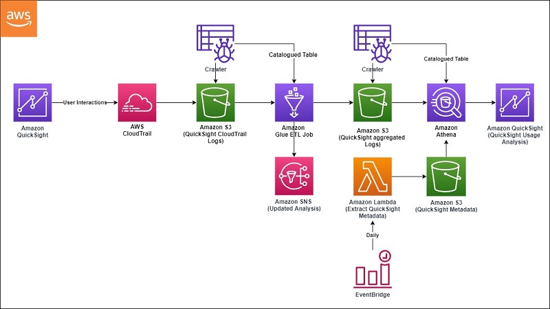
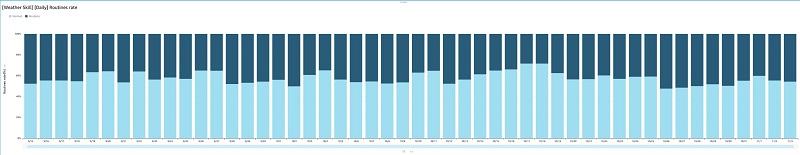
 QuickSight visualization


 Sunil Salunkhe is a Senior Solution Architect working with Strategic Accounts on their vision to leverage the cloud to drive aggressive growth strategies. He practices customer obsession by solving their complex challenges in all the aspects of the cloud journey including scale, security and reliability. While not working, he enjoys playing cricket and go cycling with his wife and a son.
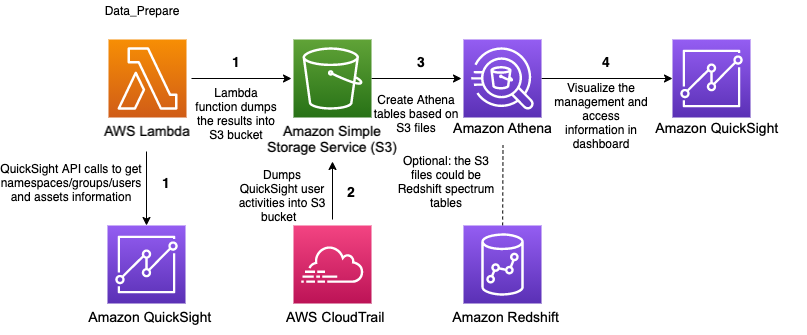


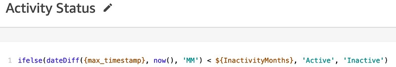
 Similarly, we can create other parameters such as

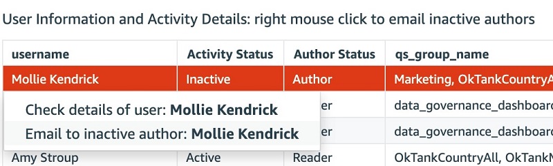
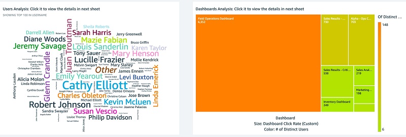

 The following screenshots show the Dashboards Analysis tab.
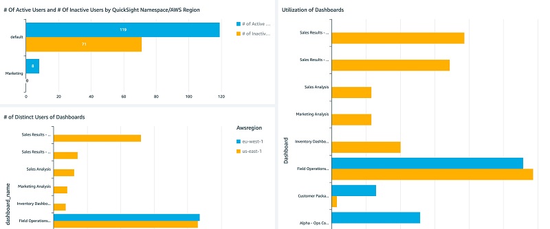
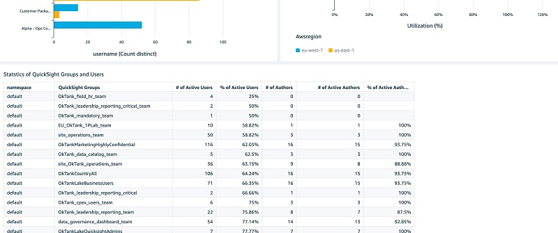
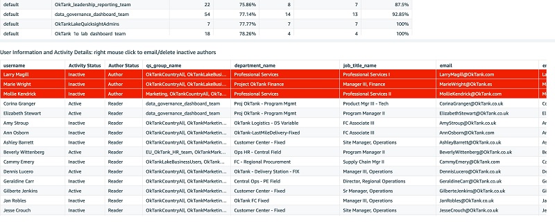
 You can interactively play with the sample dashboard in the following
  Ying Wang is a Data Visualization Engineer with the Data & Analytics Global Specialty Practice in AWS Professional Services.
 Jill Florant manages Customer Success for the Amazon QuickSight Service team


 Pablo Redondo Sanchez is a Senior Solutions Architect at Amazon Web Services. He is a data enthusiast and works with customers to help them achieve better insights and faster outcomes from their data analytics workflows. In his spare time, Pablo enjoys woodworking and spending time outdoor with his family in Northern California.