Tag Archives: Engineering

The uphill climb of making diff lines performant

Post Syndicated from Luke Ghenco original https://github.blog/engineering/architecture-optimization/the-uphill-climb-of-making-diff-lines-performant/


Pull requests are the beating heart of GitHub. As engineers, this is where we spend a good portion of our time. And at GitHub’s scale—where pull requests can range from tiny one-line fixes to changes spanning thousands of files and millions of lines—the pull request review experience has to stay fast and responsive.

We recently shipped the new React-based experience for the Files changed tab (now the default experience for all users). One of our main goals was to ensure a more performant experience across the board, especially for large pull requests. That meant investing in, and consistently prioritizing, the hard problems like optimized rendering, interaction latency, and memory consumption.

For most users before optimization, the experience was fast and responsive. But when viewing large pull requests, performance would noticeably decline. For example, we observed that in extreme cases, the JavaScript heap could exceed 1 GB, DOM node counts surpassed 400,000, and page interactions became extremely sluggish or even unusable. Interaction to Next Paint (INP) scores (a key metric in determining responsiveness) were above acceptable levels, resulting in an experience where users could quantifiably feel the input lag.

Our recent improvements to the Files changed tab have meaningfully improved some of these core performance metrics. While we covered several of these changes briefly in a recent changelog, we’re going to cover them in more detail here. Read on for why they mattered, what we measured, and how those updates improved responsiveness and memory pressure across the board and especially in large pull requests.

Performance improvements by pull request size and complexity

As we started to investigate and plan our next steps for improving these performance issues, it became clear early on that there wouldn’t be one silver bullet. Techniques that preserve every feature and browser-native behavior can still hit a ceiling at the extreme end. Meanwhile, mitigations designed to keep the worst-case from tipping over can be the wrong tradeoff for everyday reviews.

Instead of looking for a single solution, we began developing a set of strategies. We selected multiple targeted approaches, each designed to address a specific pull request size and complexity.

Those strategies focused on the following themes:

  • Focused optimizations for diff-line components. Make the primary diff experience efficient for most pull requests. Medium and large reviews stay fast without sacrificing expected behavior, like native find-in-page.
  • Gracefully degrade with virtualization. Keep the experience usable for the largest pull requests. Prioritize responsiveness and stability by limiting what is rendered at any moment.
  • Invest in foundational components and rendering improvements. These compound across every pull request size, regardless of which mode a user ends up in.

With these strategies in mind, let’s explore the specific steps we took to address these challenges and how our initial iterations set the stage for the improvements that followed.

First steps: Optimizing diff lines

With our team’s goal of improving pull request performance, we had three main objectives:

  1. Reduce memory and JavaScript heap size.
  2. Reduce the DOM node count.
  3. Reduce our average INP and significantly improve our p95 and p99 measurements

To hit these goals, we focused on simplification: less state, fewer elements, less JavaScript, and fewer React components. Before we look at the results and new architecture, let’s take a step back and look at where we started.

What worked and what didn’t with v1

In v1, each diff line was expensive to render. In unified view, a single line required roughly 10 DOM elements; in split view, closer to 15. That’s before syntax highlighting, which adds many more <span> tags and drives the DOM count even higher.

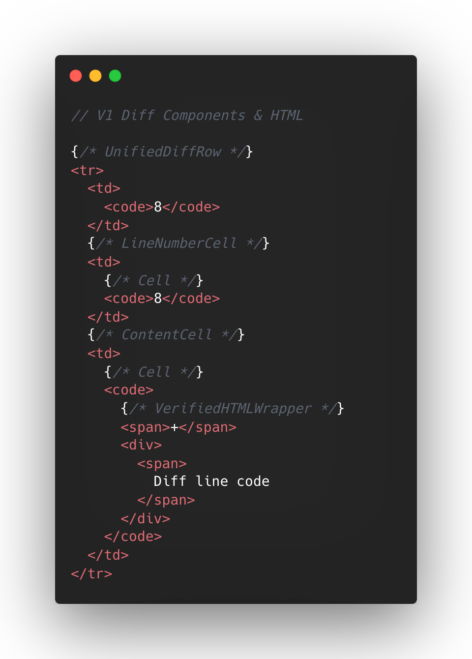
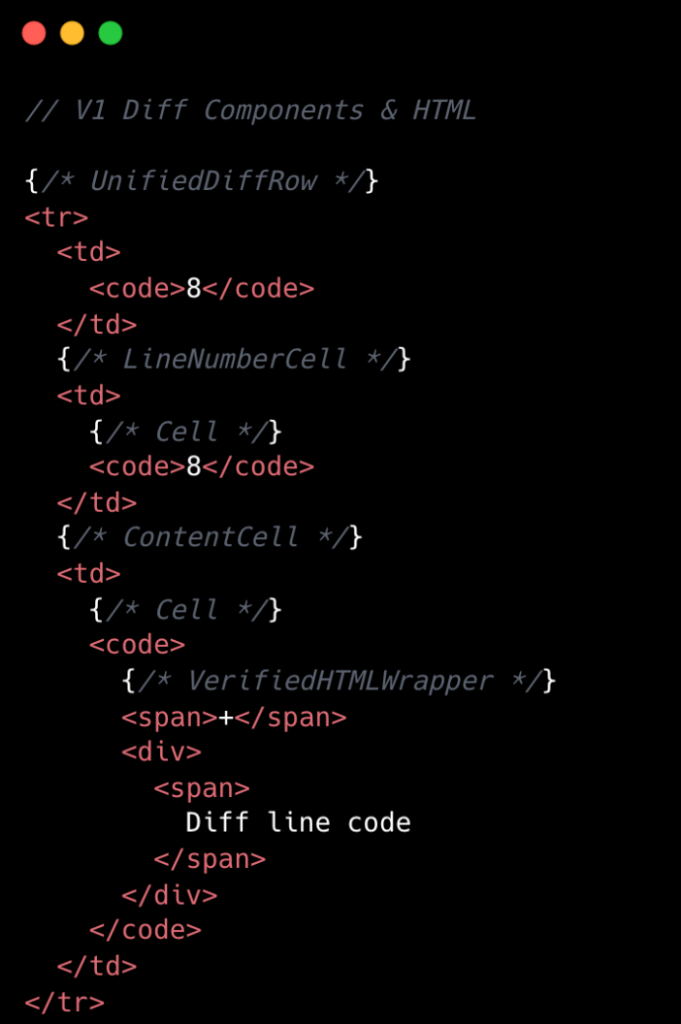
The following is a simplified visual of the React Component structure mixed with the DOM tree elements for v1 diffs.

V1 Diff Components and HTML. We had 8 react components for a single diff line.

At the React layer, unified diffs typically contain at least eight components per line, while the split view contain a minimum of 13. And these numbers represent baseline counts; extra UI states like comments, hover, and focus could add more components on top.

This approach made sense to us in v1, when we first ported the diff lines to React from our classic Rails view. Our original plan centered around lots of small reusable React components and maintaining DOM tree structure.

But we also ended up attaching a lot of React event handlers in our small components, often five to six per component. On a small scale, that was fine, but on a large scale that compounded quickly. A single diff line could carry 20+ event handlers multiplied across thousands of lines.

Beyond performance impact, it also increased complexity for developers. This is a familiar scenario where you implement an initial design, only to discover later its limitations when faced with the demands of unbounded data.

To summarize, for every v1 diff line there would be:

  • Minimum of 10-15 DOM tree elements
  • Minimum of 8-13 React Components
  • Minimum of 20 React Event Handlers
  • Lots of small re-usable React Components

This v1 strategy proved unsustainable for our largest pull requests, as we consistently observed that larger pull request sizes directly led to slower INP and increased JavaScript heap usage. We needed to determine the best path for improving this setup.

Small changes make a large impact: v2

No change is too small when it comes to performance, especially at scale. For example, we removed unnecessary <code> tags from our line number cells. While dropping two DOM nodes per diff line might appear minor, across 10,000 lines, that’s 20,000 fewer nodes in the DOM. These kinds of targeted, incremental optimizations, no matter how small, compound to create a much faster and more efficient experience. By not overlooking these details, we ensured that every opportunity for improvement was captured, amplifying the overall impact on our largest pull requests.

Refer to the images below to see how v1 looks compared to v2.

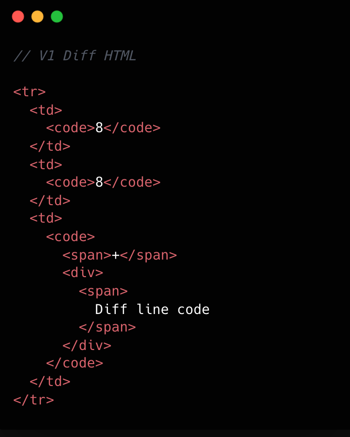
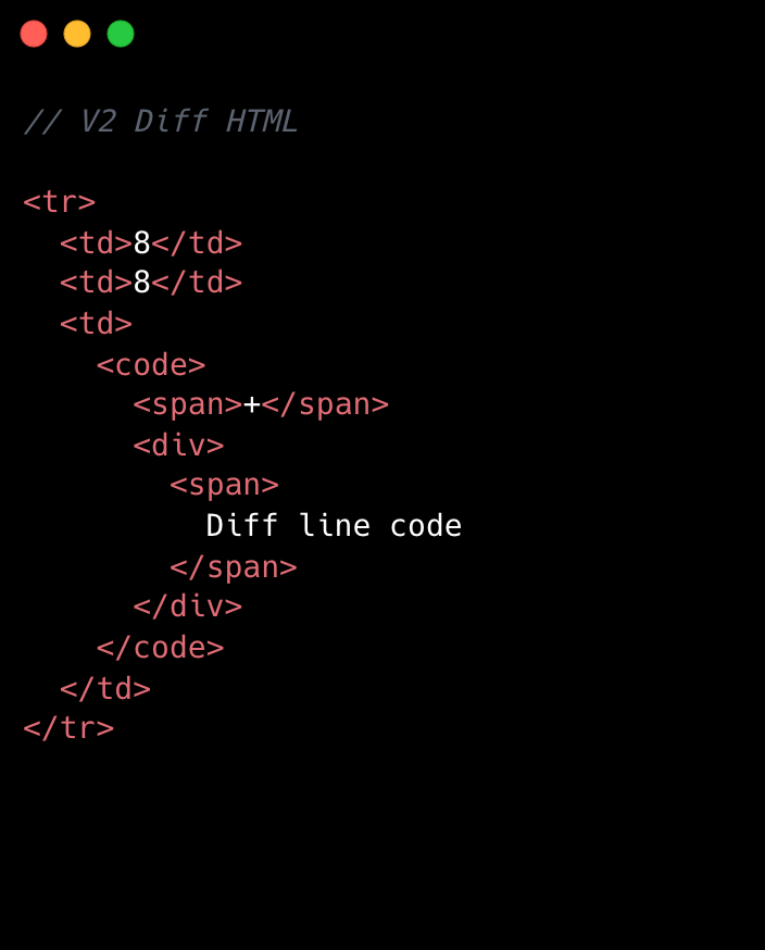
V1 HTML DOM structure. It is a typical HTML table structure with <tr> elements and <td> elements.
V2 HTML DOM structure. It is a typical HTML table structure with <tr> elements and <td> elements. The difference between V1 and V2 is the lack of <code> tags in the diff line number elements.

This becomes clearer if we look at the component structure behind this HTML:

V1 Diff Components and HTML. We had 8 react components for a single diff line.
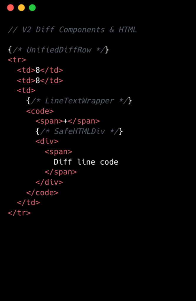
V2 Diff Components and HTML. We had 3 react components for a single diff line.

We went from eight components per diff line to two. Most of the v1 components were thin wrappers that let us share code between Split and Unified views. But that abstraction had a cost: each wrapper carried logic for both views, even though only one rendered at a time. In v2, we gave each view its own dedicated component. Some code is duplicated, but the result is simpler and faster.

Simplifying the component tree

For v2, we removed deeply nested component trees, opting for dedicated components for each split and unified diff line. While this led to some code duplication, it simplified data access and reduced complexity.

Event handling is now managed by a single top-level handler using data-attribute values. So, for instance, when you click and drag to select multiple diff lines, the handler checks each event’s data-attribute to determine which lines to highlight, instead of each line having its own mouse enter function. This approach streamlines both code and improves performance.

Moving complex state to conditionally rendered child components

The most impactful change from v1 to v2 was moving app state for commenting and context menus into their respective components. Given GitHub’s scale, where some pull requests exceed thousands of lines of code, it isn’t practical for every line to carry complex commenting state when only a small subset of lines will ever have comments or menus open. By moving the commenting state into the nested components for each diff line, we ensured that the diff-line component’s main responsibility is just rendering code—aligning more closely with the Single Responsibility Principle.

O(1) data access and less “useEffect” hooks

In v1, we gradually accumulated a lot of O(n) lookups across shared data stores and component state. We also introduced extra re-rendering through useEffect hooks scattered throughout the diff-line component tree.

To address this in v2, we adopted a two-part strategy. First, we restricted useEffect usage strictly to the top level of diff files. We also established linting rules to prevent the introduction of useEffect hooks in line-wrapping React components. This approach enables accurate memoization of diff line components and ensures reliable, predictable behavior.

Next, we redesigned our global and diff state machines to utilize O(1) constant time lookups by employing JavaScript Map. This let us build fast, consistent selectors for common operations throughout our codebase, such as line selection and comment management. These changes have enhanced code quality, improved performance, and reduced complexity by maintaining flattened, mapped data structures.

Now, any given diff line simply checks a map by passing the file path and the line number to determine whether or not there are comments on that line. An access might look like: commentsMap[‘path/to/file.tsx’][‘L8’]

Did it work?

Definitely. The page runs faster than it ever did, and JavaScript heap and INP numbers are massively reduced. For a numeric look, check out the results below. These metrics were evaluated on a pull request using a split diff setting with 10,000 line changes in the diff comparison.

Metric v1 v2 Improvement 
Total lines of code  2,800 2,000  27% less 
Total unique component types  19 10  47% fewer 
Total components rendered  ~183,504 ~50,004  74% fewer 
Total DOM nodes  ~200,000 ~180,000  10% fewer 
Total memory usage  ~150-250 MB ~80-120 MB  ~50% less 
INP on a large pull request using m1 MacBook pro with 4x slowdown:  ~450 ms ~100 ms  ~78% faster 

As you can see, this effort had a massive impact, but the improvements didn’t end there.

Virtualization for our largest pull requests

When you’re working with massive pull requests—p95+ (those with over 10,000 diff lines and surrounding context lines)—the usual performance tricks just don’t cut it. Even the most efficient components will struggle if we try to render tens of thousands of them at once. That’s where window virtualization steps in.

In front-end development, window virtualization is a technique that keeps only the visible portion of a large list or dataset in the DOM at any given time. Instead of loading everything (which would crush memory and slow things to a crawl), it dynamically renders just what you see on screen, and swaps in new elements as you scroll. This approach is like having a moving “window” over your data, so your browser isn’t bogged down by off-screen content.

To make this happen, we integrated TanStack Virtual into our diff view, ensuring that only the visible portion of the diff list is present in the DOM at any time. The impact was huge: we saw a 10X reduction in JavaScript heap usage and DOM nodes for p95+ pull requests. INP fell from 275–700+ milliseconds (ms) to just 40–80 ms for those big pull requests. By only showing what’s needed, the experience is much faster.

Further performance optimizations

To push performance even further, we tackled several major areas across our stack, each delivering meaningful wins for speed and responsiveness. By focusing on trimming unnecessary React re-renders and honing our state management, we cut down wasted computation, making UI updates noticeably faster and interactions smoother.

On the styling front, we swapped out heavy CSS selectors (e.g. :has(...)) and re-engineered drag and resize handling with GPU transforms, eliminating forced layouts and sluggishness and giving users a crisp, efficient interface for complex actions.

We also stepped up our monitoring game with interaction-level INP tracking, diff-size segmentation, and memory tagging, all surfaced in a Datadog dashboard. This continues to give our developers real-time, actionable metrics to spot and squash bottlenecks before they become issues.

On the server side, we optimized rendering to hydrate only visible diff lines. This slashed our time-to-interactive and keeps memory usage in check, ensuring that even huge pull requests feel fast and responsive on load.

Finally, with progressive diff loading and smart background fetches, users are now able to see and interact with content sooner. No more waiting for a massive number of diffs to finish loading.

All together, these targeted optimizations made our UI feel lighter, faster, and ready for anything our users throw at it.

Diff-initely better: The power of streamlined performance

This exciting journey to streamline the diff line architecture yielded substantial improvements in performance, efficiency and maintainability. By reducing unnecessary DOM nodes, simplifying our React component tree, and relocating complex state to conditionally rendered child components, we achieved faster rendering times and lower memory consumption. The adoption of more O(1) data access patterns and stricter rules for state management further optimized performance. This made our UI more responsive (faster INP!) and easier to reason with.

These measurable gains demonstrate that targeted refactoring, even within our large and mature codebase, can deliver meaningful benefits to all users—and that sometimes focusing on small, simple improvements can have the largest impact. To see the performance gains in action, go check out your open pull requests.

The post The uphill climb of making diff lines performant appeared first on The GitHub Blog.

Launching Cloudflare’s Gen 13 servers: trading cache for cores for 2x edge compute performance

Post Syndicated from Syona Sarma original https://blog.cloudflare.com/gen13-launch/

Two years ago, Cloudflare deployed our 12th Generation server fleet, based on AMD EPYC™ Genoa-X processors with their massive 3D V-Cache. That cache-heavy architecture was a perfect match for our request handling layer, FL1 at the time. But as we evaluated next-generation hardware, we faced a dilemma — the CPUs offering the biggest throughput gains came with a significant cache reduction. Our legacy software stack wasn’t optimized for this, and the potential throughput benefits were being capped by increasing latency.

This blog describes how the FL2 transition, our Rust-based rewrite of Cloudflare’s core request handling layer, allowed us to prove Gen 13’s full potential and unlock performance gains that would have been impossible on our previous stack. FL2 removes the dependency on the larger cache, allowing for performance to scale with cores while maintaining our SLAs. Today, we are proud to announce the launch of Cloudflare’s Gen 13 based on AMD EPYC™ 5th Gen Turin-based servers running FL2, effectively capturing and scaling performance at the edge. 

What AMD EPYCTurin brings to the table

AMD’s EPYC™ 5th Generation Turin-based processors deliver more than just a core count increase. The architecture delivers improvements across multiple dimensions of what Cloudflare servers require.

  • 2x core count: up to 192 cores versus Gen 12’s 96 cores, with SMT providing 384 threads

  • Improved IPC: Zen 5’s architectural improvements deliver better instructions-per-cycle compared to Zen 4

  • Better power efficiency: Despite the higher core count, Turin consumes up to 32% fewer watts per core compared to Genoa-X

  • DDR5-6400 support: Higher memory bandwidth to feed all those cores

However, Turin’s high density OPNs make a deliberate tradeoff: prioritizing throughput over per core cache. Our analysis across the Turin stack highlighted this shift. For example, comparing the highest density Turin OPN to our Gen 12 Genoa-X processors reveals that Turin’s 192 cores share 384MB of L3 cache. This leaves each core with access to just 2MB, one-sixth of Gen 12’s allocation. For any workload that relies heavily on cache locality, which ours did, this reduction posed a serious challenge.

Generation

Processor

Cores/Threads

L3 Cache/Core

Gen 12

AMD Genoa-X 9684X

96C/192T

12MB (3D V-Cache)

Gen 13 Option 1

AMD Turin 9755

128C/256T

4MB

Gen 13 Option 2

AMD Turin 9845

160C/320T

2MB

Gen 13 Option 3

AMD Turin 9965

192C/384T

2MB

Diagnosing the problem with performance counters

For our FL1 request handling layer, NGINX- and LuaJIT-based code, this cache reduction presented a significant challenge. But we didn’t just assume it would be a problem; we measured it.

During the CPU evaluation phase for Gen 13, we collected CPU performance counters and profiling data to identify exactly what was happening under the hood using AMD uProf tool. The data showed:

  • L3 cache miss rates increased dramatically compared to Gen 12’s server equipped with 3D V-cache processors

  • Memory fetch latency dominated request processing time as data that previously stayed in L3 now required trips to DRAM

  • The latency penalty scaled with utilization as we pushed CPU usage higher, and cache contention worsened

L3 cache hits complete in roughly 50 cycles; L3 cache misses requiring DRAM access take 350+ cycles, an order of magnitude difference. With 6x less cache per core, FL1 on Gen 13 was hitting memory far more often, incurring latency penalties.

The tradeoff: latency vs. throughput 

Our initial tests running FL1 on Gen 13 confirmed what the performance counters had already suggested. While the Turin processor could achieve higher throughput, it came at a steep latency cost.

Metric

Gen 12 (FL1)

Gen 13 – AMD Turin 9755 (FL1)

Gen 13 – AMD Turin 9845 (FL1)

Gen 13 – AMD Turin 9965 (FL1)

Delta

Core count

baseline

+33%

+67%

+100%

FL throughput

baseline

+10%

+31%

+62%

Improvement

Latency at low to moderate CPU utilization

baseline

+10%

+30%

+30%

Regression

Latency at high CPU utilization

baseline

> 20% 

> 50% 

> 50% 

Unacceptable

The Gen 13 evaluation server with AMD Turin 9965 that generated 60% throughput gain was compelling, and the performance uplift provided the most improvement to Cloudflare’s total cost of ownership (TCO). 

But a more than 50% latency penalty is not acceptable. The increase in request processing latency would directly impact customer experience. We faced a familiar infrastructure question: do we accept a solution with no TCO benefit, accept the increased latency tradeoff, or find a way to boost efficiency without adding latency?

Incremental gains with performance tuning

To find a path to an optimal outcome, we collaborated with AMD to analyze the Turin 9965 data and run targeted optimization experiments. We systematically tested multiple configurations:

  • Hardware Tuning: Adjusting hardware prefetchers and Data Fabric (DF) Probe Filters, which showed only marginal gains

  • Scaling Workers: Launching more FL1 workers, which improved throughput but cannibalized resources from other production services

  • CPU Pinning & Isolation: Adjusting workload isolation configurations to find optimal mix, with limited success 

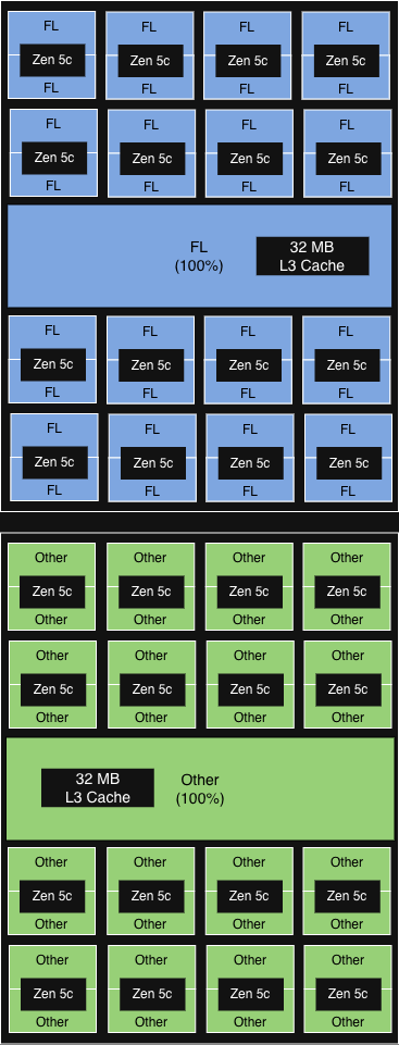
The configuration that ultimately provided the most value was AMD’s Platform Quality of Service (PQOS). PQOS extensions enable fine-grained regulation of shared resources like cache and memory bandwidth. Since Turin processors consist of one I/O Die and up to 12 Core Complex Dies (CCDs), each sharing an L3 cache across up to 16 cores, we put this to the test. Here is how the different experimental configurations performed. 

First, we used PQOS to allocate a dedicated L3 cache share within a single CCD for FL1, the gains were minimal. However, when we scaled the concept to the socket level, dedicating an entire CCD strictly to FL1, we saw meaningful throughput gains while keeping latency acceptable.

Configuration

Description

Illustration

Performance gain

NUMA-aware core affinity 
(equivalent to PQOS at socket level)

6 out of 12 CCD (aligned with NUMA domain) run FL.


32MB L3 cache in each CCD shared among all cores. 

>15% incremental 

throughput gain

PQOS config 1

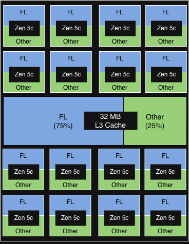
1 of 2 vCPU on each physical core in each CCD runs FL. 


FL gets 75% of the 32MB L3 cache of each CCD.

< 5% incremental throughput gain


Other services show minor signs of degradation

PQOS config 2

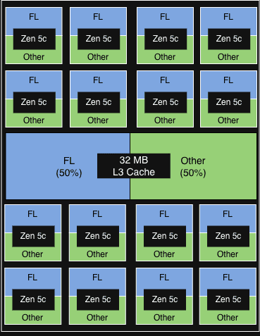
1 of 2 vCPU in each physical core in each CCD runs FL.


FL gets 50% of the 32MB L3 cache of each CCD.

< 5% incremental throughput gain

PQOS config 3

2 vCPU on 50% of the physical core in each CCD runs FL. 


FL gets 50% of  the 32MB L3 cache of each CCD.

< 5% incremental throughput gain

The opportunity: FL2 was already in progress

Hardware tuning and resource configuration provided modest gains, but to truly unlock the performance potential of the Gen 13 architecture, we knew we would have to rewrite our software stack to fundamentally change how it utilized system resources.

Fortunately, we weren’t starting from scratch. As we announced during Birthday Week 2025, we had already been rebuilding FL1 from the ground up. FL2 is a complete rewrite of our request handling layer in Rust, built on our Pingora and Oxy frameworks, replacing 15 years of NGINX and LuaJIT code.

The FL2 project wasn’t initiated to solve the Gen 13 cache problem — it was driven by the need for better security (Rust’s memory safety), faster development velocity (strict module system), and improved performance across the board (less CPU, less memory, modular execution).

FL2’s cleaner architecture, with better memory access patterns and less dynamic allocation, might not depend on massive L3 caches the way FL1 did. This gave us an opportunity to use the FL2 transition to prove whether Gen 13’s throughput gains could be realized without the latency penalty.

Proving it out: FL2 on Gen 13

As the FL2 rollout progressed, production metrics from our Gen 13 servers validated what we had hypothesized.

Metric

Gen 13 AMD Turin 9965 (FL1)

Gen 13 AMD Turin 9965 (FL2)

FL requests per CPU%

baseline

50% higher

Latency vs Gen 12

baseline

70% lower

Throughput vs Gen 12

62% higher

100% higher

The out-of-the-box efficiency gains on our new FL2 stack were substantial, even before any system optimizations. FL2 slashed the latency penalty by 70%, allowing us to push Gen 13 to higher CPU utilization while strictly meeting our latency SLAs. Under FL1, this would have been impossible.

By effectively eliminating the cache bottleneck, FL2 enables our throughput to scale linearly with core count. The impact is undeniable on the high-density AMD Turin 9965: we achieved a 2x performance gain, unlocking the true potential of the hardware. With further system tuning, we expect to squeeze even more power out of our Gen 13 fleet.


Generational improvement with Gen 13

With FL2 unlocking the immense throughput of the high-core-count AMD Turin 9965, we have officially selected these processors for our Gen 13 deployment. Hardware qualification is complete, and Gen 13 servers are now shipping at scale to support our global rollout.

Performance improvements

Gen 12 

Gen 13 

Processor

AMD EPYC™ 4th Gen Genoa-X 9684X

AMD EPYC™ 5th Gen Turin 9965

Core count

96C/192T

192C/384T

FL throughput

baseline

Up to +100%

Performance per watt

baseline

Up to +50%

Gen 13 business impact

Up to 2x throughput vs Gen 12 for uncompromising customer experience: By doubling our throughput capacity while staying within our latency SLAs, we guarantee our applications remain fast and responsive, and able to absorb massive traffic spikes.

50% better performance/watt vs Gen 12 for sustainable scaling: This gain in power efficiency not only reduces data center expansion costs, but allows us to process growing traffic with a vastly lower carbon footprint per request.

60% higher rack throughput vs Gen 12 for global edge upgrades: Because we achieved this throughput density while keeping the rack power budget constant, we can seamlessly deploy this next generation compute anywhere in the world across our global edge network, delivering top tier performance exactly where our customers want it.

Gen 13 + FL2: ready for the edge 

Our legacy request serving layer FL1 hit a cache contention wall on Gen 13, forcing an unacceptable tradeoff between throughput and latency. Instead of compromising, we built FL2. 

Designed with a vastly leaner memory access pattern, FL2 removes our dependency on massive L3 caches and allows linear scaling with core count. Running on the Gen 13 AMD Turin platform, FL2 unlocks 2x the throughput and a 50% boost in power efficiency all while keeping latency within our SLAs. This leap forward is a great reminder of the importance of hardware-software co-design. Unconstrained by cache limits, Gen 13 servers are now ready to be deployed to serve millions of requests across Cloudflare’s global network.

If you’re excited about working on infrastructure at global scale, we’re hiring.

Inside Gen 13: how we built our most powerful server yet

Post Syndicated from Syona Sarma original https://blog.cloudflare.com/gen13-config/

A few months ago, Cloudflare announced the transition to FL2, our Rust-based rewrite of Cloudflare’s core request handling layer. This transition accelerates our ability to help build a better Internet for everyone. With the migration in the software stack, Cloudflare has refreshed our server hardware design with improved hardware capabilities and better efficiency to serve the evolving demands of our network and software stack. Gen 13 is designed with 192-core AMD EPYC™ Turin 9965 processor, 768 GB of DDR5-6400 memory, 24 TB of PCIe 5.0 NVMe storage, and dual 100 GbE port network interface card.

Gen 13 delivers:

  • Up to 2x throughput compared to Gen 12 while staying within latency SLA

  • Up to 50% improvement in performance / watt efficiency, reducing data center expansion costs

  • Up to 60% higher throughput per rack keeping rack power budget constant

  • 2x memory capacity, 1.5x storage capacity, 4x network bandwidth

  • Introduced PCIe encryption hardware support in addition to memory encryption

  • Improved support for thermally demanding powerful drop-in PCIe accelerators

This blog post covers the engineering rationale behind each major component selection: what we evaluated, what we chose, and why.

Generation

Gen 13 Compute

Previous Gen 12 Compute

Form Factor

2U1N, Single socket

2U1N, Single socket

Processor

AMD EPYC™ 9965
Turin 192-Core Processor

AMD EPYC™ 9684X
Genoa-X 96-Core Processor

Memory

768GB of DDR5-6400 x12 memory channel

384GB of DDR5-4800 x12 memory channel

Storage

x3 E1.S NVMe

 Samsung PM9D3a 7.68TB /
Micron 7600 Pro 7.68TB

x2 E1.S NVMe 

Samsung PM9A3 7.68TB /
Micron 7450 Pro 7.68TB

Network

Dual 100 GbE OCP 3.0 

Intel Ethernet Network Adapter E830-CDA2 /
NVIDIA Mellanox ConnectX-6 Dx

Dual 25 GbE OCP 3.0

Intel Ethernet Network Adapter E810-XXVDA2 /
NVIDIA Mellanox ConnectX-6 Lx

System Management

DC-SCM 2.0 ASPEED AST2600 (BMC) + AST1060 (HRoT)

DC-SCM 2.0 ASPEED AST2600 (BMC) + AST1060 (HRoT)

Power Supply

1300W, Titanium Grade

800W, Titanium Grade


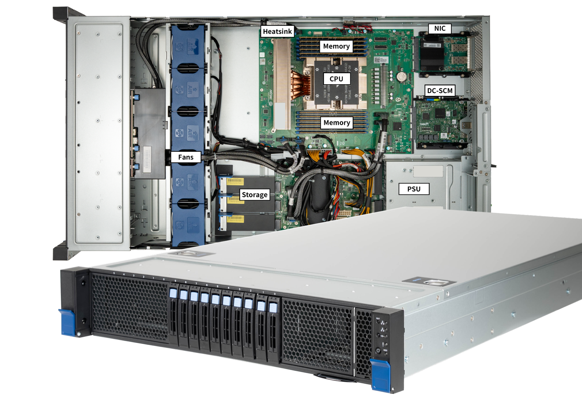
Figure: Gen 13 server

CPU

Gen 12

AMD EPYC™ 9684X Genoa-X 96-Core (400W TDP, 1152 MB L3 Cache)

Gen 13

AMD EPYC™ 9965 Turin Dense 192-Core (500W TDP, 384 MB L3 Cache)

During the design phase, we evaluated several 5th generation AMD EPYC™ Processors, code-named Turin, in Cloudflare’s hardware lab: AMD Turin 9755, AMD Turin 9845, and AMD Turin 9965. The table below summarizes the differences in specifications of the candidates for Gen 13 servers against the AMD Genoa-X 9684X used in our Gen 12 servers. Notably, all three candidates offer increases in core count but with smaller L3 cache per core. However, with the migration to FL2, the new workloads are less dependent on L3 cache and scale up well with the increased core count to achieve up to 100% increase in throughput.

The three CPU candidates are designed to target different use cases: AMD Turin 9755 offers superior per-core performance, AMD Turin 9965 trades per-core performance for efficiency, and AMD Turin 9845 trades core count for lower socket power. We evaluated three CPUs in the production environment.

CPU Model

AMD Genoa-X 9684X

AMD Turin 9755

AMD Turin 9845

AMD Turin 9965

For server platform

Gen 12

Gen 13 candidate

Gen 13 candidate

Gen 13 candidate

# of CPU Cores

96

128

160

192

# of Threads

192

256

320

384

Base Clock

2.4 GHz

2.7 GHz

2.1 GHz

2.25 GHz

Max Boost Clock

3.7 GHz

4.1 GHz

3.7 GHz

3.7 GHz

All Core Boost Clock

3.42 GHz

4.1 GHz

3.25 GHz

3.35 GHz

Total L3 Cache

1152 MB

512 MB

320 MB

384 MB

L3 cache per core

12 MB / core

4 MB / core

2 MB / core

2 MB / core

Maximum configurable TDP

400W

500W

390W

500W

Why AMD Turin 9965?

First, FL2 ended the L3 cache crunch.

L3 cache is the large, last-level cache shared among all CPU cores on the same compute die to store frequently used data. It bridges the gap between slow main memory external to the CPU, and the fast but smaller L1 and L2 cache on the CPU, reducing the latency for the CPU to access data.

Some may notice that the 9965 has only 2 MB of L3 cache per core, an 83.3% reduction from the 12 MB per core on Gen 12’s Genoa-X 9684X. Why trade away the very cache advantage that gave Gen 12 its edge? The answer lies in how our workloads have evolved.

Cloudflare has migrated from FL1 to FL2, a complete rewrite of our request handling layer in Rust. With the new software stack, Cloudflare’s request processing pipeline has become significantly less dependent on large L3 cache. FL2 workloads scale nearly linearly with core count, and the 9965’s 192 cores provide a 2x increase in hardware threads over Gen 12.

Second, performance per total cost of ownership (TCO). During production evaluation, the 9965’s 192 cores delivered the highest aggregate requests per second of the three candidates, and its performance-per-watt scaled favorably at 500W TDP, yielding superior rack-level TCO.

Gen 12 

Gen 13 

Processor

AMD EPYC™ 4th Gen Genoa-X 9684X

AMD EPYC™ 5th Gen Turin 9965

Core count

96C/192T

192C/384T

FL throughput

Baseline

Up to +100%

Performance per watt

Baseline

Up to +50%

Third, operational simplicity. Our operational teams have a strong preference for fewer, higher-density servers. Managing a fleet of 192-core machines means fewer nodes to provision, patch, and monitor per unit of compute delivered. This directly reduces operational overhead across our global network.

Finally, they are forward compatible. The AMD processor architecture supports DDR5-6400, PCIe Gen 5.0, CXL 2.0 Type 3 memory across all SKUs. AMD Turin 9965 has the highest number of high-performing cores per socket in the industry, maximizing the compute density per socket, maintaining competitiveness and relevance of the platform for years to come. By moving to AMD Turin 9965 from AMD Genoa-X 9684X, we get longer security support from AMD, extending the useful life of the Gen 13 server before they become obsolete and need to be refreshed.

Memory

Gen 12

12x 32GB DDR5-4800 2Rx8 (384 GB total, 4 GB/core)

Gen 13

12x 64GB DDR5-6400 2Rx4 (768 GB total, 4 GB/core)

Because the AMD Turin processor has twice the core count of the previous generation, it demands more memory resources, both in capacity and in bandwidth, to deliver throughput gains.

Maximizing bandwidth with 12 channels

The chosen AMD EPYC™ 9965 CPU supports twelve memory channels, and for Gen 13, we are populating every single one of them. We’ve selected 64 GB DDR5-6400 ECC RDIMMs in a “one DIMM per channel” (1DPC) configuration.

This setup provides 614 GB/s of peak memory bandwidth per socket, a 33.3% increase compared to our Gen 12 server platform. By utilizing all 12 channels, we ensure that the CPU is never “starved” for data, even during the most memory-intensive parallel workloads.

Populating all twelve channels in a balanced configuration — equal capacity per channel, with no mixed configurations — is common best practice. This matters operationally: AMD Turin processors interleave across all memory channels with the same DIMM type, same memory capacity and same rank configuration. Interleaving increases memory bandwidth by spreading contiguous memory access across all memory channels in the interleave set instead of sending all memory access to a single or a small subset of memory channels. 

The 4 GB per core “sweet spot”

Our Gen 12 servers are configured with 4GB per core. We revisited that decision as we designed Gen 13.

Cloudflare launches a lot of new products and services every month, and each new product or service demands an incremental amount of memory capacity. These accumulate over time and could become an issue of memory pressure, if memory capacity is not sized appropriately.

Initial requirement considered a memory-to-core ratio between 4 GB and 6 GB per core. With 192 cores on the AMD Turin 9965, that translates to a range of 768 GB to 1152 GB. Note that at higher capacities,  DIMM module capacity granularity are typically 16GB increments. With 12 channels in a 1DPC configuration, our options are 12x 48GB (576 GB), 12x 64GB (768 GB), or 12x 96GB (1152 GB).

  • 12x 48GB = 576 GB, or 1.5 GB/thread. The memory capacity of this configuration is too low; this would starve memory-hungry workloads and violate the lower bound.

  • 12x 96GB = 1152 GB, or 3.0 GB/thread. This would be a 50% capacity increase per core and would also result in higher power consumption and a substantial increase in cost, especially in the current market conditions where memory prices are 10x of what they were a year ago.

  • 12x 64GB = 768 GB, or 2.0 GB/thread (4 GB/core). This configuration is consistent with our Gen 12 memory to core ratio, and represents a 2x increase in memory capacity per server. Keeping the memory capacity configuration at 4 GB per core provides sufficient capacity for workloads that scale with core count, like our primary workload, FL, and provide sufficient memory capacity headroom for future growth without overprovisioning.

FL2 uses memory more efficiently than FL1 did: our internal measures show FL2 uses less than half the CPU of FL1, and far less than half the memory. The capacity freed up by the software stack migration provides ample headroom to support Cloudflare growth for the next few years.

The decision: 12x 64GB for 768 GB total. This maintains the proven 4 GB/core ratio, provides a 2x total capacity increase over Gen 12, and stays within the DIMM cost curve sweet spot.

Efficiency through dual rank

In Gen 12, we demonstrated that dual-rank DIMMs provide measurably higher memory throughput than single-rank modules, with advantages of up to 17.8% at a 1:1 read-write ratio. Dual-rank DIMMs are faster because they allow the memory controller to access one rank while another is refreshing. That same principle carries forward here.

Our requirement also calls for approximately 1 GB/s of memory bandwidth per hardware thread. With 614 GB/s of peak bandwidth across 384 threads, we deliver 1.6 GB/s per thread, comfortably exceeding the minimum. Production analysis has shown that Cloudflare workloads are not memory-bandwidth-bound, so we bank the headroom as margin for future workload growth.

By opting for 2Rx4 DDR5 RDIMMs at maximum supported 6400MT/s, we ensure we get the lowest latency and best performance from our Gen 13 platform memory configuration.

Storage

Gen 12

x2 E1.S NVMe PCIe 4.0, 16 TB total

Samsung PM9A3 7.68TB

Micron 7450 Pro 7.68TB

Gen 13

x3 E1.S NVMe PCIe 5.0, 24 TB total

Samsung PM9D3a 7.68TB

Micron 7600 Pro 7.68TB

+10x U.2 NVMe PCIe 5.0 option

Our storage architecture underwent a transformation in Gen 12 when we pivoted from M.2 to EDSFF E1.S. For Gen 13, we are increasing the storage capacity and the bandwidth to align with the latest technology. We have also added a front drive bay for flexibility to add up to 10x U.2 drives to keep pace with Cloudflare storage product growth. 

The move to PCIe 5.0

Gen 13 is configured with PCIe Gen 5.0 NVMe drives. While Gen 4.0 served us well, the move to Gen 5.0 ensures that our storage subsystem can serve data at improved latency, and keep up with increased storage bandwidth demand from the new processor. 

16 TB to 24 TB

Beyond the speed increase, we are physically expanding the array from two to three NVMe drives. Our Gen 12 server platform was designed with four E1.S storage drive slots, but only two slots were populated with 8TB drives. The Gen 13 server platform uses the same design with four E1.S storage drive slots available, but with three slots populated with 8TB drives. Why add a third drive? This increases our storage capacity per server from 16TB to 24TB, ensuring we are expanding our global storage capacity to maintain and improve CDN cache performance. This supports growth projections for Durable Objects, Containers, and Quicksilver services, too.

Front drive bay to support additional drives

For Gen 13, the chassis is designed with a front drive bay that can support up to ten U.2 PCIe Gen 5.0 NVMe drives. The front drive bay provides the option for Cloudflare to use the same chassis across compute and storage platforms, as well as the flexibility to convert a compute SKU to a storage SKU when needed. 

Endurance and reliability

We designed our servers to have a 5-year operational life and require storage drives endurance to sustain 1 DWPD (Drive Writes Per Day) over the full server lifespan.

Both the Samsung PM9D3a and Micron 7600 Pro meet the 1 DWPD specification with a hardware over-provisioning (OP) of approximately 7%. If future workload profiles demand higher endurance, we have the option to hold back additional user capacity to increase effective OP.

NVMe 2.0 and OCP NVMe 2.0 compliance

Both the Samsung PM9D3a and Micron 7600 adopt the NVMe 2.0 specification (up from NVMe 1.4) and the OCP NVMe Cloud SSD Specification 2.0. Key improvements include Zoned Namespaces (ZNS) for better write amplification management, Simple Copy Command for intra-device data movement without crossing the PCIe bus, and enhanced Command and Feature Lockdown for tighter security controls. The OCP 2.0 spec also adds deeper telemetry and debug capabilities purpose-built for datacenter operations, which aligns with our emphasis on fleet-wide manageability.

Thermal efficiency

The storage drives will continue to be in the E1.S 15mm form factor. Its high-surface-area design is essential for cooling these new Gen 5.0 controllers, which can pull upwards of 25W under sustained heavy I/O. The 2U chassis provides ample airflow over the E1.S drives as well as U.2 drive bays, a design advantage we validated in Gen 12 when we made the decision to move from 1U to 2U.

Network

Gen 12

Dual 25 GbE port OCP 3.0 NIC 

Intel E810-XXVDA2

NVIDIA Mellanox ConnectX-6 Lx

Gen 13

Dual 100 GbE port OCP 3.0 NIC

Intel E830-CDA2

NVIDIA Mellanox ConnectX-6 Dx

For more than eight years, dual 25 GbE was the backbone of our fleet. Since 2018 it has served us well, but as the CPU has improved to serve more requests and our products scale, we’ve officially hit the wall. For Gen 13, we are quadrupling our per-port bandwidth.

Why 100 GbE and why now?

Network Interface Card (NIC) bandwidth must keep pace with compute performance growth. With 192 modern cores, our 25 GbE links will become a measurable bottleneck. Production data from our co-locations worldwide over a week showed that, on our Gen 12, P95 bandwidth per port is consistently >50% of available bandwidth. Since throughput is doubling per server on Gen 13, we are at risk of saturating the NIC bandwidth.


Figure: on Gen 12, P95 bandwidth per port is consistently >50% of available bandwidth

The decision to go to 100 GbE rather than 50 GbE was driven by industry economics: 50 GbE transceiver volumes remain low in the industry, making them a poor supply chain bet. Dual 100 GbE ports also give us 200 Gb/s of aggregate bandwidth per server, future-proofing against the next several years of traffic growth.

Hardware choices and compatibility

We are maintaining our dual-vendor strategy to ensure supply chain resilience, a lesson hard-learned during the pandemic when single-sourcing the Gen 11 NIC left us scrambling.

Both NICs are compliant with OCP 3.0 SFF/TSFF form factor with the integrated pull tab, maintaining chassis commonality with Gen 12 and ensuring field technicians need no new tools or training for swaps.

PCIe Allocation

The OCP 3.0 NIC slot is allocated PCIe 4.0 x16 lanes on the motherboard, providing 256 Gb/s of bidirectional bandwidth, more than enough for dual 100 GbE (200 Gb/s aggregate) with room to spare.

Management

Gen 12

Project Argus Data Center Secure Control Module 2.0

Gen 13

Project Argus Data Center Secure Control Module 2.0

PCIe encryption

We are maintaining the architectural shift, introduced in Gen 12, of separating management and security-related components from the motherboard onto the Project Argus Data Center Secure Control Module 2.0.


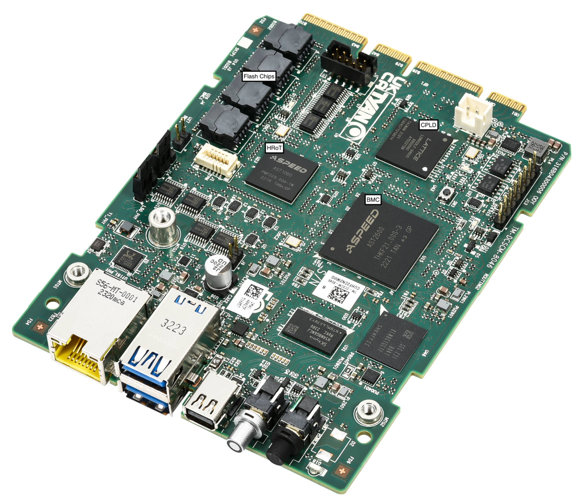
Figure: Project Argus DC-SCM 2.0

Continuity with DC-SCM 2.0

We are carrying forward the Data Center Secure Control Module 2.0 (DC-SCM 2.0) standard. By decoupling management and security functions from the motherboard, we ensure that the “brains” of the server’s security stay modular and protected.

The DC-SCM module houses our most critical components:

  • Basic Input/Output System (BIOS)

  • Baseboard Management Controller (BMC)

  • Hardware Root of Trust (HRoT) and TPM (Infineon SLB 9672)

  • Dual BMC/BIOS flash chips for redundancy

Why we are staying the course with DC-SCM 2.0

The decision to keep this architecture for Gen 13 is driven by the proven security gains we saw in the previous generation. By offloading these functions to a dedicated module, we maintain:

  • Rapid recovery: Dual image redundancy allows for near-instant restoration of BIOS/UEFI and BMC firmware if an accidental corruption or a malicious update is detected.

  • Physical resilience: The Gen 13 chassis also moves the intrusion detection mechanism further from the flat edge of the chassis, making physical intercept harder.

  • PCIe encryption: In addition to TSME (Transparent Secure Memory Encryption) for CPU-to-memory encryption that was already enabled since our Gen 10 platforms, AMD Turin 9965 processor for Gen 13 extends encryption to PCIe traffic, this ensures data is protected in transit across every bus in the system.

  • Operational consistency: Sticking with the Gen 12 management stack means our security audits, deployment, provisioning, and operational standard procedure remain fully compatible. 

Power

Gen 12

800W 80 PLUS Titanium CRPS

Gen 13

1300W 80 PLUS Titanium CRPS

As we upgrade the compute and networking capability of the server, the power envelope of our servers has naturally expanded. Gen 13 are equipped with bigger power supplies to deliver the power needed.

The jump to 1300W

While our Gen 12 nodes operated comfortably with 800W 80 PLUS Titanium CRPS (Common Redundant Power Supply), the Gen 13 specification requires a larger power supply. We have selected a 1300W 80 PLUS Titanium CRPS.

Power consumption of Gen 13 during typical operation has risen to 850W, a 250W increase over the 600W seen in Gen 12. The primary contributors are the 500W TDP CPU (up from 400W), doubling of the memory capacity and the additional NVMe drive.

Why 1300W instead of 1000W? The current PSU ecosystem lacks viable, high-efficiency options at 1000W. To ensure supply chain reliability, we moved to the next industry-standard tier of 1300W. 

EU Lot 9 is a regulation that requires servers deploying in the European Union to have power supplies with efficiency at 10%, 20%, 50% and 100% load to be at or above the percentage threshold specified in the regulation. The threshold matches 80 PLUS Power Supply certification program titanium grade PSU requirement. We chose a titanium grade PSU for Gen 13 to maintain full compliance with EU Lot 9, ensuring that the servers can be deployed in our European data centers and beyond. 

Thermal design: 2U pays dividends again

The 2U1N form factor we adopted in Gen 12 continues to pay dividends. Gen 13 uses 5x 80mm fans (up from 4x in Gen 12) to handle the increased thermal load from the 500W CPU. The larger fan volume, combined with the 2U chassis airflow characteristics, means fans operate well below maximum duty cycle at typical ambient temperatures, keeping fan power in the < 50W range per fan.

Drop-in accelerator support

Gen 12

x2 single width FHFL or x1 double width FHFL

Gen 13

x2 double width FHFL

Maintaining the modularity of our fleet is a core requirement for our server design. This requirement enabled Cloudflare to quickly retrofit and deploy GPUs globally to more than 100 cities in 2024. In Gen 13, we are continuing the support of high-performance PCIe add-in cards.

On Gen 13, the 2U chassis layout is updated and configured to support more demanding power and thermal requirements. While Gen 12 was limited to a single double-width GPU, the Gen 13 architecture now supports two double-width PCIe cards.

A launchpad to scale Cloudflare to greater heights

Every generation of Cloudflare servers is an exercise in balancing competing constraints: performance versus power, capacity versus cost, flexibility versus simplicity. Gen 13 comes with 2x core count, 2x memory capacity, 4x network bandwidth, 1.5x storage capacity, and future-proofing for accelerator deployments — all while improving total cost of ownership and maintaining a robust management feature set and security posture that our global fleet demands.

Gen 13 servers are fully qualified and will be deployed to serve millions of requests across Cloudflare’s global network in more than 330 cities. As always, Cloudflare’s journey to serve the Internet as efficiently as possible does not end here. As the deployment of Gen 13 begins, we are planning the architecture for Gen 14.

If you are excited about helping build a better Internet, come join us. We are hiring.

From firefighting to building: How AI agents restored our team’s core productivity

Post Syndicated from Grab Tech original https://engineering.grab.com/from-firefighting-to-building

Abstract

Grab’s Analytics Data Warehouse (ADW) team supports over 1,000 users each month and manages an extensive repository of more than 15,000 tables, which powers approximately 50% of all queries within our data lake.
However, the manual process of addressing “quick questions” is time-consuming and labor-intensive, thus creating a bottleneck in our operations.

The team was drowning in repetitive requests, spending approximately 40% of their time or an equivalent of roughly 2 days every week, on tasks like:

  • Answering the same questions about data definitions
  • Tracing data sources and troubleshooting
  • Running quality checks to verify data integrity
  • Basic enhancement requests

We deployed a multi-agent AI system that autonomously answers simpler questions and collaboratively addresses more complex requests. This led us to reclaim significant engineering bandwidth and unlock hundreds of hours of productivity monthly.

Solution

Tech stack

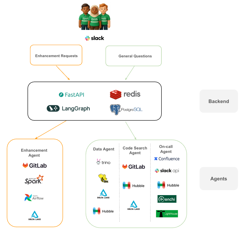
  • FastAPI and LangGraph: We use FastAPI to handle requests and LangGraph to manage the complex state and cyclical logic required for multi-agent collaboration. Unlike simple Large Language Model (LLM) calls, LangGraph allows our agents to loop back, ask for more information, or hand off tasks to one another.
  • Redis & PostgreSQL: Redis handles our caching and real-time session needs, while PostgreSQL serves as the persistent memory, storing conversation history and agent metadata.
Figure 1. Architecture tech stack.
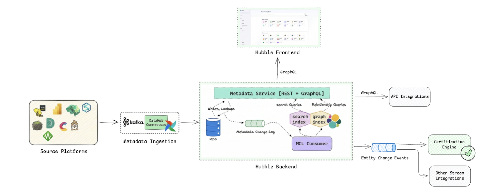
  • Hubble: A centralized metadata management platform and data catalog, built on open-source DataHub.
  • Genchi: A data quality observability platform that enforces data contracts.
  • Lighthouse: A platform that tracks execution status and monitors pipeline health.

From request to resolution

The journey begins in Slack. When a user submits a request, it is categorized into one of two streams:

  • Enhancement requests: These are routed to the Enhancement Agent, which interacts directly with our core engineering tools like GitLab, Apache Spark, and Airflow to propose and test code changes.
  • General questions: These are funneled through our investigation pathway. The system orchestrates a “huddle” between the Data Agent (querying Trino, Hive, or Delta Lake), the Code Search Agent (analyzing GitLab), and the On-call Agent (checking Confluence and Slack for ongoing incidents).

By decoupling the “brain” (the LLM) from the “hands” (the specialized agents and tools), we created a system that is both capable and easy to debug.

Why specialized agents beat a single “Super AI”

We could have built one massive AI trained to handle every question, but specialized agents are easier to build, maintain, and improve than a monolithic system.

The table below illustrates the comparison between a single AI system and a multi-agent system:

Approach Advantages Challenges
Single AI (Monolithic) One model to maintain, single inference call Hard to debug, changes affect everything, generalist performance
Multi-Agent System Focused expertise, modular updates, specialist accuracy Sequential execution adds latency, coordination complexity

We chose the multi-agent approach because maintainability and accuracy mattered more than shaving off a few seconds of latency. When you’re replacing a multi-hour manual investigation, taking a few minutes for a precise answer is a massive leap in operational throughput.

The architecture: Two pathways, five specialized agents

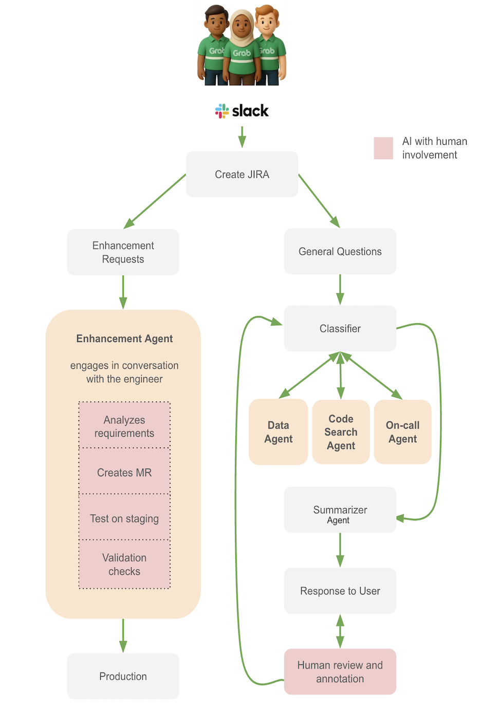
When a question arrives through Slack, the system first determines which pathway to take:

  • Enhancement pathway: Enhancement requests → Enhancement Agent (handles code changes)
  • Investigation pathway: Investigation questions → Classifier → Specialized agents → Summarizer agent
Figure 2. Agent workflows, using a Classifier that controls communication flow and task delegation.

Enhancement pathway: Semi-Automated code changes

For requests like “Can you add a new column for customer_segment?” or “We need to change the aggregation logic for revenue”, the Enhancement Agent handles the heavy lifting.

Enhancement Agent receives user requirements and proposes code changes:

  • Gathers context: schema, lineage, dependencies, existing codebase.
  • Generates code changes and creates a merge request (MR).
  • Runs changes in a test environment.
  • Flags governance concerns (Personally Identifiable Information (PII) classification, Service Level Agreements (SLAs), backward compatibility).

The workflow:

  1. User creates a JIRA request.
  2. Agent analyzes requirements and gathers context through interactive dialogue with the engineer.
  3. Agent creates an MR with suggested code.
  4. Engineer reviews the MR.
  5. If valid, agent runs changes in test environment.
  6. Engineer reviews results against test cases.
  7. If tests pass, engineer merges the MR.

Why is the workflow semi-automated by design? Code changes to production pipelines require human judgment. The agent accelerates the process by doing the research, writing the code, and running tests, but humans make the final approval.

Investigation pathway: Four agents working together

For questions like “Why does this data look wrong?” or “Where does this metric come from?”, the system uses a coordinated team of specialists.

The Classifier is the first responder for investigation questions. It:

  • Parses the question to extract key information (tables, scripts, specific data requests).
  • Detects guardrail violations (PII requests, out-of-scope queries).
  • Determines which specialist agents are needed and in what sequence.
  • Provides reasoning and task descriptions for each recommended agent.

Example: For the question “Why does this ID look wrong?”, the Classifier routes the question to: Data Agent → Code Search Agent → On-call Agent (if needed).

Data Agent performs the data investigation:

  • Enhances the prompt’s context with the table and column metadata.
  • Executes queries with guardrails (PII detection, command validation).
  • Validates schemas to avoid unnecessary scans and hallucinations.
  • Retrieves sample data with LLM exploratory comments.

Example: It queries vehicle_id from the table to validate the user’s observation against the actual data.

Code Search Agent analyzes the code:

  • Traces column transformations through the codebase.
  • Follows table lineage through multiple transformation steps.
  • Generates plain-language explanations of transformation logic.
  • Highlights divergences from documentation or stakeholder expectations.

Example: It can trace a vehicle_id column from the final table back through 5 transformation steps to the original source, explaining each change along the way.

On-call Agent monitors production systems and assists with urgent issues:

  • Searches Slack channels for announcements about outages, source table failures, and delays.
  • Checks observability platforms for pipeline health, logs, and retry policies.
  • Validates data quality metrics (null counts, duplicates, range validation).
  • Produces incident notes and initial Root Cause Analysis (RCA) when issues are identified.

Example: If the Data Agent detects SLA breaches or missing partitions, it may consult the On-call Agent for production context.

Summarizer Agent refines responses from the previous agents:

  • Handles conflicting information.
  • Combines responses into a coherent narrative.
  • Makes the answer concise and structured.
  • Ensures consistency across agent findings.

Generating the summary is the final step before human review.

Seeing the system in action

The best way to understand how this multi-agent system works is to see it handle real scenarios. Let’s walk through two common situations our team faces daily.

Scenario 1: Adding a new column

The request: A stakeholder raises a JIRA ticket requesting, “Please add a customer_segment column to the rides table. Source data is available in the user_profiles table.”

In the traditional workflow, a data engineer would spend a significant portion of their afternoon clarifying requirements, developing and testing code, similar to the workflow steps in “Figure 2: Agent workflows”.

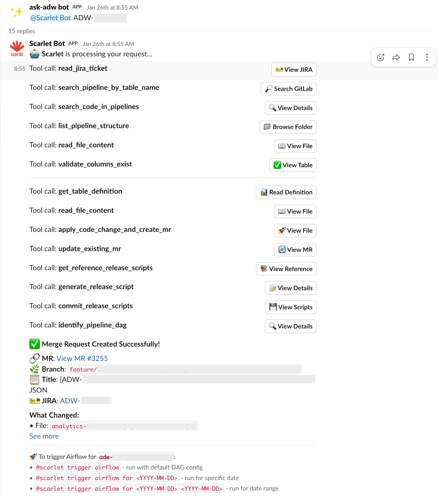
With the Enhancement Agent, the entire process is completed autonomously in minutes. The agent performs these tasks in sequence:

  1. Read the JIRA ticket: Agent fetches the ticket details to understand the exact requirements: what column needs to be added, which table is involved, and where the source data comes from.
  2. Discover the relevant code: Using intelligent search capabilities, it locates the specific pipeline files in our codebase that need modification. It navigates through the repository structure to find the right transformation scripts.
  3. Run validation checks: Before making any changes, it validates:
    • The requested column exists in the upstream source table.
    • The column doesn’t already exist in the target table.
    • Schema compatibility and data quality requirements are met.
  4. Generate database schema changes: The agent references existing Data Definition Language (DDL) scripts to understand the standard format, then automatically generates the necessary schema modification scripts. These scripts are added to the MR alongside the code changes.
  5. Create the MR: All changes, including code modifications and schema scripts, are packaged into an MR with proper documentation, making it ready for review.
  6. Enable pipeline execution: Once the MR is validated, users can interact with the bot to trigger the data pipeline and start testing their changes on Airflow. They can optionally specify date ranges or other parameters to control the test runs.

The entire process, from ticket to deployable MR, completes autonomously in minutes, with full traceability at every step.

Figure 3. Enhancement Agent workflow.

Scenario 2: Investigating faulty-looking data

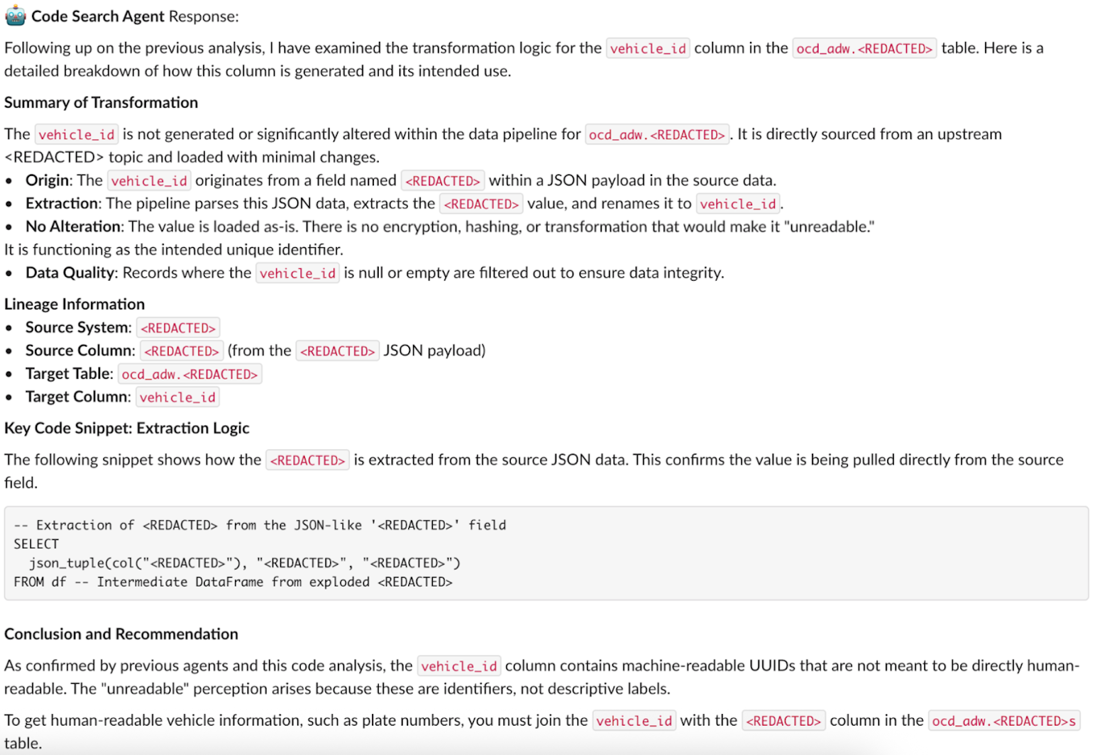
The question: “Why is the ID in the vehicles table unreadable?”

Traditionally, the data engineer typically performs these steps:

  1. Search through various data catalogs to locate relevant information.
  2. Manually track the data’s origin and transformation path.
  3. Validate SQL queries.
  4. Examine logs.

This is how it looks with agents:

Step 1: Classifier analyzes the question

  • Parses the question: determines all three specialist agents are needed.
  • Plans the sequence: Data Agent → Code Search Agent → On-call Agent
  • Provides reasoning: “Need to verify data format, trace transformation logic, and check for production incidents”.

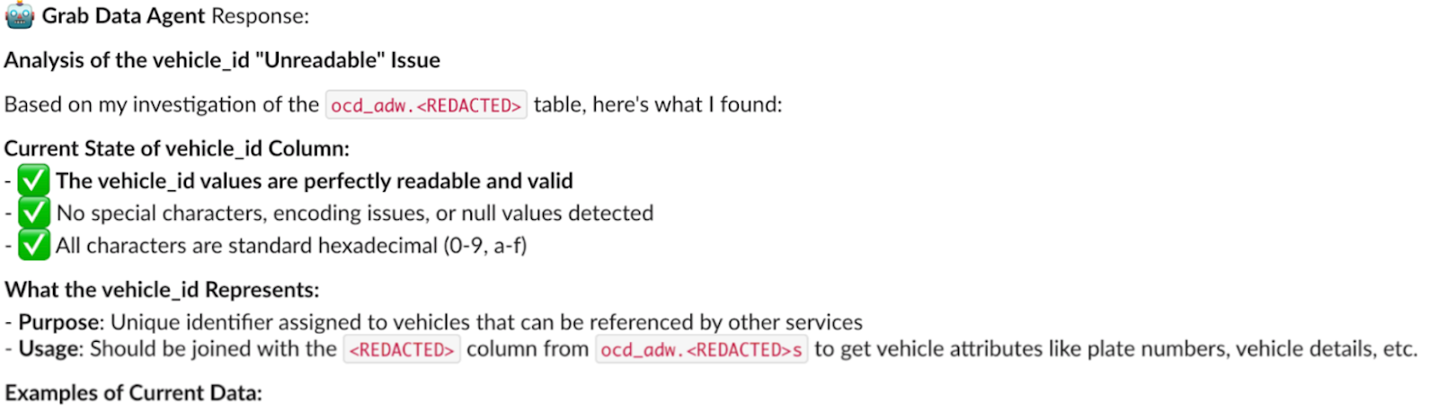
Step 2: Data Agent investigates

  • Retrieves metadata, which helps in building a SQL query for exploring samples.
  • Queries actual data. The result confirms the user’s observation with the actual sample and identifies that IDs appear in Universally Unique Identifier (UUID) format, and they’re “unreadable”.
  • Searches Grab’s data catalog to find dimension tables that can help decipher UUID in a more human-readable format.
  • Finds an appropriate dimension table and builds a join query to test readability.

Conclusion from Data Agent: “The ID column contains UUID format values. These can be joined with dim_vehicles table to get human-readable vehicle names. The format is consistent and valid—not corrupted data.”

Figure 4. Data Agent response.

Step 3: Code Search Agent traces lineage

  • Scans the transformation and lineage logic in the codebase to see exactly how the ID is extracted. It discovers that the ID is a raw UUID from a JSON payload directly from the source system.
  • Queries the source table for samples directly. The “unreadable” text pattern matches the data in the vehicles table, confirming that it is not a bug introduced by Spark transformations.

Conclusion from Code Search Agent: “The ‘unreadable’ UUID format comes directly from the source system. No transformation is applied. This is not a bug introduced by our Spark pipelines—it’s the native format from the upstream system”.

Figure 5. Code Search Agent response.

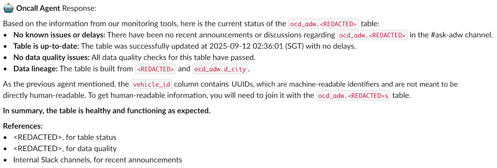
Step 4: On-call Agent checks production health

  • Checks Airflow pipeline status.
  • Searches Slack channels for incidents.
  • Checks data quality metrics.

Conclusion from On-call Agent: “No production incidents detected. Pipeline running successfully. Data quality metrics are within normal ranges. No recent complaints or issues reported in communication channels.”

Figure 6. On-call Agent response.

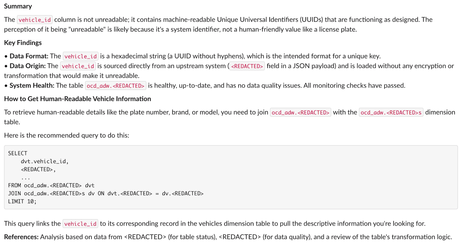
Step 5: Summarizer Agent synthesizes the answer

  • User concern: ID values appear “unreadable”.
  • Data Agent finding: IDs are valid UUIDs, can be joined with dim_vehicles for readable names.
  • Code Search finding: UUID format comes directly from source system, not a transformation bug.
  • On-call finding: No production issues, pipeline healthy, data quality normal.

Provides a structured answer to: “Why is the ID in the vehicles table unreadable?”

Figure 7. Summarizer Agent response.

Step 6: Human review and delivery
The answer is posted on Slack, and a data engineer can review the response and approve it.

The initial response time has been reduced to just a few minutes, in contrast to the previous hours-long manual search.

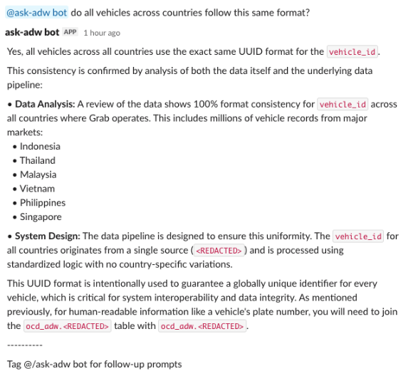
Step 7: Continue conversation
After an answer is posted, anyone can engage in a continued conversation with the agents, restarting the loop.

Figure 8. Continuing the conversation.

Optimizing the architecture

Building the system was one challenge. Making it production-ready was another.

Our initial prototype worked in controlled demos, but real-world usage revealed critical gaps. Users asked complex questions, conversations grew long, and edge cases exposed vulnerabilities. Here’s how we optimized the system to handle production demands while maintaining accuracy and safety.

Challenge 1: Excessive context

In multi-agent systems, context accumulates fast. Information is continuously passed from one agent to the next. Without careful management, excessive context and tokens cause performance degradation.

Our solution:
The orchestrator maintains a rich state throughout execution, tracking three critical elements:

  • Conversation and tooling history: Full message context for each agent.
  • Execution tracking: Which agents have run, current progress, and execution steps.
  • Agent responses: Structured responses from each agent, passed to subsequent agents.

This state is carefully managed to ensure each agent has the right context without overwhelming token limits.

  • Token tracking: Every message is counted using tiktoken, giving us real-time visibility into our token budget.
  • Intelligent summarization: When token limits are exceeded, earlier messages are automatically summarized while retaining information relevant to the original question. Recent messages and critical context remain unsummarized to preserve accuracy.
  • Retrieval-Augmented Generation (RAG) context pruning: We reduce context from tool outputs when enhancing prompts:
    • Instead of passing full code files to the Code Search Agent, we use smaller LLM models to extract the most relevant code snippets and a short description.
    • For database queries, we apply filters to retrieve only the top relevant results.
  • Handoffs Pattern: The previous agent returns its response to a central orchestrator. The orchestrator cleans the context, prunes unnecessary tokens, and invokes the next agent.

The result:
Agents can handle extended investigations without drowning in excessive context, maintaining performance even in complex, multi-turn conversations.

Challenge 2: Excessive tool usage

Our initial design presented a significant performance bottleneck due to excessive tool usage. Early models were equipped with a large and unwieldy set of over 30 distinct tools, each structured similarly to a generic API. Since tool calling is part of an agent’s prompt, agents had to process verbose tool descriptions and outputs, which degraded efficiency.

Our solution:
We focused on tool design based on real-world usage scenarios:

  • Included only the relevant portions required for decision-making.
  • Aggressively truncated verbose information from tool outputs.
  • Streamlined tool descriptions to be concise and actionable.

The result:
By significantly reducing the data load agents needed to process during inference, we achieved a substantial leap in system responsiveness and throughput.

Challenge 3: Risky code executions

AI agents with database access and code generation capabilities pose significant risks. Without proper safeguards, they could access sensitive PII data, execute dangerous SQL operations, run expensive queries, or generate breaking code changes. We needed to make the system safe.

Our solution:
We implemented multiple layers of safety to protect against misuse from both agents and users:

Layer 1: Input classification
Before any agent executes, the Classifier detects:

  • PII requests: Questions asking for personally identifiable information
  • Out-of-scope queries: Requests beyond the agent’s capabilities

Layer 2: SQL validation before execution
The Data Agent validates every query for:

  • PII column access: Checks against column metadata to ensure it doesn’t access confidential information.
  • Data definition and manipulation language (DDL/DML) operations: The agent doesn’t have access to DELETE, DROP, TRUNCATE, or UPDATE operations, but this check acts as an additional safeguard.
  • Slow queries: Detects missing partition filters or excessive date ranges that could cause expensive full-table scans.
  • Schema validation: Confirms tables and columns exist before execution.

Layer 3: Timeout protection
All database queries have strict execution limits to prevent runaway queries from impacting system performance.

Layer 4: Enhancement agent controls
For the Enhancement Agent, which generates code changes:

  • Cannot commit to master/main directly: All changes go through MRs.
  • Mandatory human review: A human reviewer must validate all inputs before execution.
  • Test environment first: Changes run in staging before production deployment.

The result:
A safe environment where AI agents can operate in production without compromising security or stability. Users and engineers trust the system because they know it has robust guardrails protecting critical data and systems.

Challenge 4: Ensuring user trust

Even with RAG and guardrails, AI agents aren’t perfect. Hallucinations, misinterpretations, and edge cases could erode user trust.

Our solution:
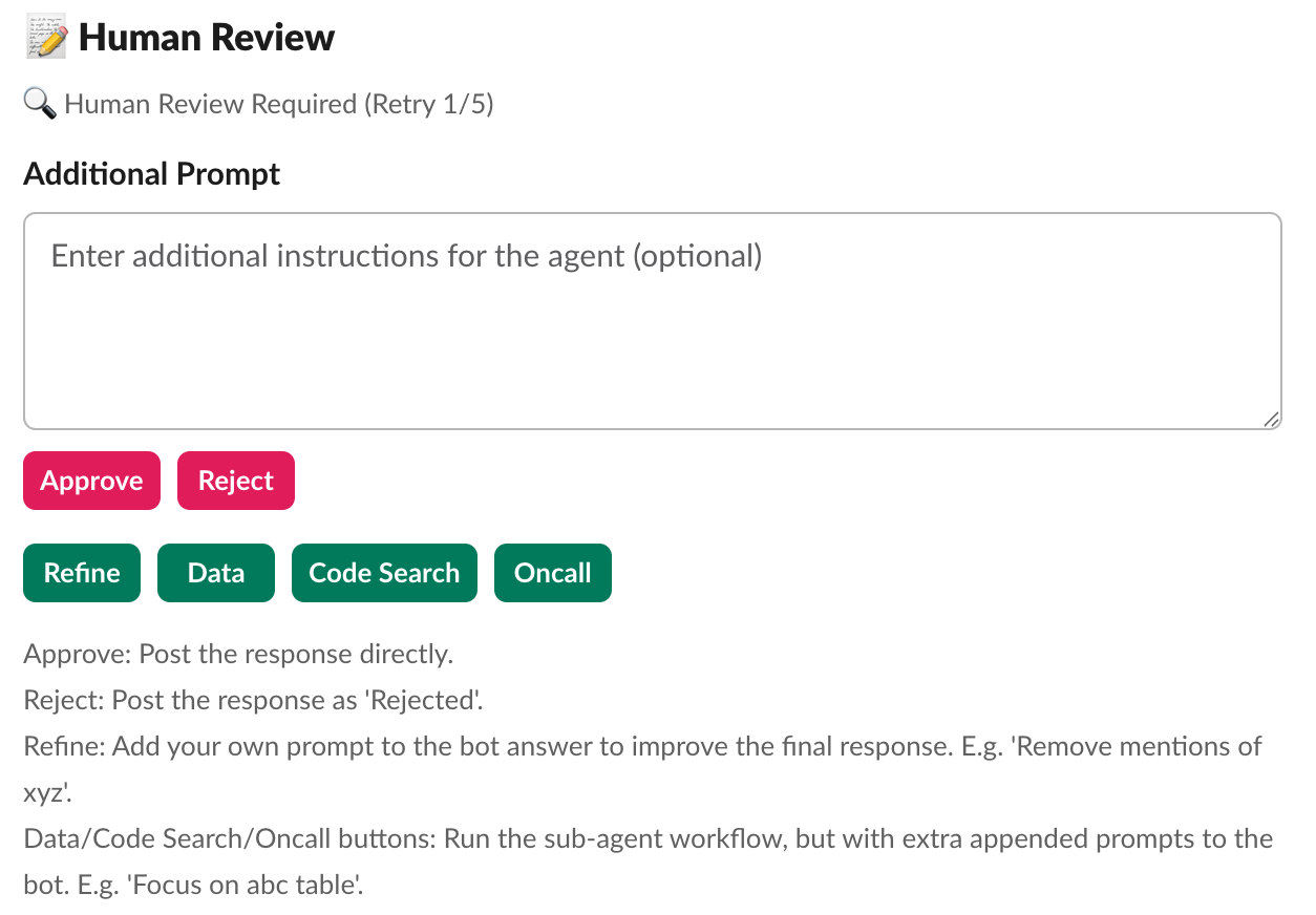
After generating a summarized response, the multi-agent system routes to human reviewers who can take five actions:

  • Approve: Post the response as-is and add a footnote that the response has been deemed accurate by a human reviewer.
  • Reject: Mark the response as incorrect and log it for improvement. The response will not be posted, protecting users from bad information.
  • Refine: Add a prompt to improve the summarized response from the sub-agents. The system regenerates the answer with additional guidance.
  • Re-route to Sub-Agents: Send the question to a specific agent with additional context. For example: “Data Agent, can you check the last 30 days instead of 7 days?”
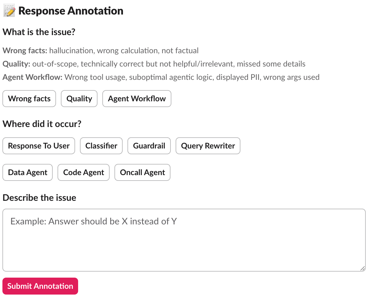
  • Annotate: Provide structured feedback to the response, where it gets saved to a database for continuous improvement.
Figure 9. Human review.
Figure 10. Annotations.

The result:
This human-in-the-loop model ensures answers are accurate and reliable, increasing user trust in the responses. The annotations help us iteratively improve the model’s future responses.

Challenge 5: Balancing speed and quality

Our initial design withheld AI-generated responses until authorized by an engineering team member. This introduced a bottleneck in the response process, potentially leaving inquiries unresolved for extended periods, particularly during peak workload times.

Our solution:
We redesigned the process to allow responses to be posted without immediate human review, provided they are clearly and prominently marked as unreviewed. All posts can still be reviewed and modified by the on-call engineer as needed, but users get answers immediately rather than waiting.

The result:
This approach maintains a crucial balance between response speed and quality:

  • Users get fast answers when they need them.
  • Transparency (unreviewed label) sets appropriate expectations.
  • Engineers still review all responses to catch errors and improve the system.
  • Feedback loop remains intact for continuous learning.

Challenge 6: Closing the feedback loop

Collecting feedback through annotations was just the first step. Without systematic analysis, we had a gold mine of information about what worked and what didn’t, but we weren’t learning from it. Every rejected response was a lesson unlearned, every annotation a pattern unrecognized. We needed to close the loop.

Our solution:
We transformed annotations from passive records into an active improvement engine through five mechanisms:

  1. Automated evaluation: Random annotations are pulled to create test cases for offline evaluation. This ensures the system is tested against real-world failure scenarios, not just synthetic test cases we invented.
  2. Pattern analysis: We analyze annotations to identify systemic issues:
    • Is the Classifier consistently routing to the wrong agents?
    • Does a specific agent have quality issues?
    • Are certain types of queries prone to hallucinations?
    • Do particular table schemas cause confusion?
  3. Quality metrics: Tracking annotation rates over time measures system reliability and identifies regression. If the rejection rate suddenly increases, we know something has changed that needs investigation.
  4. Targeted improvements: Annotations guide where to focus development effort:
    • Improving prompts: Refining agent system prompts with better examples.
    • Adding guardrails: Enhancing input classification to catch problematic queries earlier.
    • Enhancing specific agents: Adding examples or tools to handle struggling query types.
  5. Training data: Annotated failures can be used to:
    • Fine-tune models on domain-specific patterns.
    • Improve few-shot examples in prompts.
    • Build regression test suites from actual failures.

The result:
The system transformed from static to continuous learning. Every mistake became an opportunity for improvement, and the system got smarter with each interaction. We had data-driven insights guiding our optimization priorities, ensuring we focused on the highest-impact improvements.

Impact

The deployment of this multi-agent system yielded transformative results across key performance indicators, shifting the team’s entire operational dynamic.

  • Automated resolution:The bots now autonomously handle the majority of standard user inquiries and a significant portion of common enhancement requests.
  • Velocity gains: The time required to resolve issues has seen an order-of-magnitude reduction, effectively eliminating the support backlog. Simple inquiries are autonomously answered and brought to a resolution within minutes.
  • Productivity gains: The team has successfully reclaimed several full-time equivalents (FTE) worth of engineering bandwidth, shifting hundreds of hours from reactive support to proactive roadmap delivery.

With this newfound capacity unlocked, the data engineering team pivots from reactive support to proactive, high-value work, ultimately leading to “happier downstream users.”

Conclusions

Our journey from overwhelmed data engineers to a team empowered by AI agents revealed three core principles that made this transformation possible:

Multi-Agent architecture: Specialists over generalists
Specialized AI agents outperform a single generalist by mastering specific domains (e.g., data quality, code analysis). This modularity allows for independent improvement, easy additions, and clear responsibilities, boosting maintainability and flexibility.

Strategic human oversight: Building trust through transparency
Routing AI responses through human reviewers achieved rapid adoption through trust and continuous system improvement by generating annotated training feedback.

Focus on augmentation: Automating repetitive tasks
AI agents operate autonomously on repetitive tasks (context gathering, running queries, checking logs) with human oversight if needed, and collaborate with us in augmenting higher-value work: architectural decisions and building new capabilities.

Join us

Grab is a leading superapp in Southeast Asia, operating across the deliveries, mobility, and digital financial services sectors. Serving over 900 cities in eight Southeast Asian countries: Cambodia, Indonesia, Malaysia, Myanmar, the Philippines, Singapore, Thailand, and Vietnam. Grab enables millions of people every day to order food or groceries, send packages, hail a ride or taxi, pay for online purchases or access services such as lending and insurance, all through a single app. We operate supermarkets in Malaysia under Jaya Grocer and Everrise, which enables us to bring the convenience of on-demand grocery delivery to more consumers in the country. As part of our financial services offerings, we also provide digital banking services through GXS Bank in Singapore and GXBank in Malaysia. Grab was founded in 2012 with the mission to drive Southeast Asia forward by creating economic empowerment for everyone. Grab strives to serve a triple bottom line. We aim to simultaneously deliver financial performance for our shareholders and have a positive social impact, which includes economic empowerment for millions of people in the region, while mitigating our environmental footprint.

Powered by technology and driven by heart, our mission is to drive Southeast Asia forward by creating economic empowerment for everyone. If this mission speaks to you, join our team today!

Continuous AI for accessibility: How GitHub transforms feedback into inclusion

Post Syndicated from Carie Fisher original https://github.blog/ai-and-ml/github-copilot/continuous-ai-for-accessibility-how-github-transforms-feedback-into-inclusion/


For years, accessibility feedback at GitHub didn’t have a clear place to go.

Unlike typical product feedback, accessibility issues don’t belong to any single team—they cut across the entire ecosystem. For example, a screen reader user might report a broken workflow that touches navigation, authentication, and settings. A keyboard-only user might hit a trap in a shared component used across dozens of pages. A low vision user might flag a color contrast issue that affects every surface using a shared design element. No single team owns any of these problems—but every one of them blocks a real person.

These reports require coordination that our existing processes weren’t originally built for. Feedback was often scattered across backlogs, bugs lingered without owners, and users followed up to silence. Improvements were often promised for a mythical “phase two” that rarely materialized.

We knew we needed to change this. But before we could build something better, we had to lay the groundwork—centralizing scattered reports, creating templates, and triaging years of backlog. Only once we had that foundation in place could we ask: How can AI make this easier?

The answer was an internal workflow, powered by GitHub Actions, GitHub Copilot, and GitHub Models, that ensures every piece of user and customer feedback becomes a tracked, prioritized issue. When someone reports an accessibility barrier, their feedback is captured, reviewed, and followed through until it’s addressed. We didn’t want AI to replace human judgment—we wanted it to handle repetitive work so humans could focus on fixing the software.

This is how we went from chaos to a system where every piece of accessibility feedback is tracked, prioritized, and acted on—not eventually, but continuously.

Accessibility as a living system

Continuous AI for accessibility weaves inclusion into the fabric of software development. It’s not a single product or a one-time audit—it’s a living methodology that combines automation, artificial intelligence, and human expertise.

This philosophy connects directly to our support for the 2025 Global Accessibility Awareness Day (GAAD) pledge: strengthening accessibility across the open source ecosystem by ensuring user and customer feedback is routed to the right teams and translated into meaningful platform improvements.

The most important breakthroughs rarely come from code scanners—they come from listening to real people. But listening at scale is hard, which is why we needed technology to help amplify those voices. We built a feedback workflow that functions less like a static ticketing system and more like a dynamic engine—leveraging GitHub products to clarify, structure, and track user and customer feedback, turning it into implementation-ready solutions.

Designing for people first

Before jumping into solutions, we stepped back to understand who this system needed to serve:

  • Issue submitters: Community managers, support agents, and sales reps submit issues on behalf of users and customers. They aren’t always accessibility experts, so they need a system that guides them and teaches accessibility concepts in the flow of work.
  • Accessibility and service teams: Engineers and designers responsible for fixes need structured, actionable data—reproducible steps, WCAG mapping, severity scores, and clear ownership.
  • Program and product managers: Leadership needs visibility into pain points by category, trends, and progress over time to allocate resources strategically.

With these personas in mind, we knew we wanted to 1) treat feedback as data flowing through a pipeline and 2) build a system able to evolve with us.

How feedback flows

With that foundation set, we built an architecture around an event-driven pattern, where each step triggers a GitHub Action that orchestrates what comes next—ensuring consistent handling no matter where the feedback originates. We built this system largely by hand starting in mid-2024. Today, tools like Agentic Workflows let you create GitHub Actions using natural language—meaning this kind of system could be built in a fraction of the time.

The workflow reacts to key events: Issue creation launches GitHub Copilot analysis via the GitHub Models API, status changes initiate hand-offs between teams, and resolution triggers submitter follow-up with the user. Every Action can also be triggered manually or re-run as needed—automation covers the common path, while humans can step in at any point.

Feedback isn’t just captured—it continuously flows through the right channels, providing visibility, structure, and actionability at every stage.

*Click images to enlarge.

A left-to-right flowchart showing the seven steps of the feedback workflow in sequence: Intake, Copilot Analysis, Submitter Review, Accessibility Team Review, Link Audits, Close Loop, and Improvement. Feedback loops show that Submitter Review can re-run Copilot Analysis, Close Loop can return to Accessibility Team Review, and Improvement feeds updated prompts back to Copilot Analysis.

1. Actioning intake

Feedback can come from anywhere—support tickets, social media posts, email, direct outreach—but most users choose the GitHub accessibility discussion board. It’s where they can work together and build community around shared experiences. Today, 90% of the accessibility feedback flows through that single channel. Because posts are public, other users can confirm the problem, add context, or suggest workarounds—so issues often arrive with richer detail than a support ticket ever could. Regardless of the source, every piece of feedback gets acknowledged within five business days, and even feedback we can’t act on gets a response pointing to helpful resources.

When feedback requires action from internal teams, a team member manually creates a tracking issue using our custom accessibility feedback issue template. Issue templates are pre-defined forms that standardize how information is collected when opening a new issue. The template captures the initial context—what the user reported, where it came from, and which components are involved—so nothing is lost between intake and triage.

This is where automation kicks in. Creating the issue triggers a GitHub Action that engages GitHub Copilot, and a second Action adds the issue to a project board, providing a centralized view of current status, surfacing trends, and helping identify emerging needs.

A left-to-right flowchart where user or customer feedback enters through Discussion Board, Support Ticket, Social Media, Email, or Direct Outreach, moves to an Acknowledge and Validate step, branches at a validity decision, and either proceeds to Create Issue or loops back through Request More Details to the user.

2. GitHub Copilot analysis

With the tracking issue created, a GitHub Action workflow programmatically calls the GitHub Models API to analyze the report. We chose stored prompts over model fine-tuning so that anyone on the team can update the AI’s behavior through a pull request—no retraining pipeline, no specialized ML knowledge required.

We configured GitHub Copilot using custom instructions developed by our accessibility subject matter experts. Our prompt serves two roles: triage analysis, which classifies issues by WCAG violation, severity, and affected user group, and accessibility coaching, where GitHub Copilot acts as a subject-matter expert to help teams write and review accessible code.

These instruction files point to our accessibility policies, component library, and internal documentation that details how we interpret and apply WCAG success criteria. When our standards evolve, the team updates the markdown and instruction files via pull request—the AI’s behavior changes with the next run, not the next training cycle. For a detailed walkthrough of this approach, see our guide on optimizing GitHub Copilot custom instructions for accessibility.

The automation works in two steps. First, an Action fires on issue creation and triggers GitHub Copilot to analyze the report. GitHub Copilot populates approximately 80% of the issue’s metadata automatically—over 40 data points including issue type, user segment, original source, affected components, and enough context to understand the user’s experience. The remaining 20% requires manual input from the team member. GitHub Copilot then posts a comment on the issue containing:

  • A summary of the problem and user impact
  • Suggested WCAG success criteria for potential violations
  • Severity level (sev1 through sev4, where sev1 is critical)
  • Impacted user groups (screen reader users, keyboard users, low vision users, etc.)
  • Recommended team assignment (design, engineering, or both)
  • A checklist of low-barrier accessibility tests so the submitter can verify the issue

Then a second Action fires on that comment, parses the response, applies labels based on the severity GitHub Copilot assigned, updates the issue’s status on the project board, and assigns it to the submitter for review.

If GitHub Copilot’s analysis seems off, anyone can flag it by opening an issue describing what it got wrong and what it should have said—feeding directly into our continuous improvement process.

A left-to-right flowchart where a newly created issue triggers Action 1, which feeds the report along with custom instructions and WCAG documentation into Copilot Analysis. Copilot posts a comment with its findings, then Action 2 parses that comment and branches into four parallel outcomes: applying labels, applying metadata, adding to the project board, and assigning the submitter.

3. Submitter review

Before we act on GitHub Copilot’s recommendations, two layers of review happen—starting with the issue submitter.

The submitter attempts to replicate the problem the user reported. The checklist GitHub Copilot provides in its comment guides our community managers, support agents, and sales reps through expert-level testing procedures—no accessibility expertise required. Each item includes plain-language explanations, step-by-step instructions, and links to tools and documentation.

Example questions include:

  • Can you navigate the page using only a keyboard? Press “Tab” to move through interactive elements. Can you reach all buttons, links, and form fields? Can you see where your focus is at all times?
  • Do images have descriptive alt text? Right-click an image and select “Inspect” to view the markup. Does the alt attribute describe the image’s purpose, or is it a generic file name?
  • Are interactive elements clearly labeled? Using a screen reader, navigate to a button or link. Is its purpose announced clearly? Alternatively, review the accessibility tree in your browser’s developer tools to inspect how elements are exposed to assistive technologies.

If the submitter can replicate the problem, they mark the issue as reviewed, which triggers the next GitHub Action. If they can’t reproduce it, they reach out to the user for more details. Once new information arrives, the submitter can re-run the GitHub Copilot analysis—either by manually triggering the Action from the Actions tab or by removing and re-adding the relevant label to kick it off automatically. AI provides the draft, but humans provide the verification.

A left-to-right flowchart where the submitter receives the issue with Copilot’s checklist, attempts to replicate the problem, and reaches a decision. If replicable, the issue is marked as reviewed and moves to the accessibility team. If not replicable, the submitter contacts the user for more details. When new information arrives, the submitter re-runs Copilot analysis, which loops back to the replication step.

4. Accessibility team review

Once the submitter marks the issue as reviewed, a GitHub Action updates its status on the workflow project board and adds it to a separate accessibility first responder board. This alerts the accessibility team—engineers, designers, champions, testing vendors, and managers—that GitHub Copilot’s analysis is ready for their review.

The team validates GitHub Copilot’s analysis—checking the severity level, WCAG mapping, and category labels—and corrects anything the AI got wrong. When there’s a discrepancy, we assume the human is correct. We log these corrections and use them to refine the prompt files, improving future accuracy.

Once validated, the team determines the resolution approach:

  • Documentation or settings update: Provide the solution directly to the user.
  • Code fix by the accessibility team: Create a pull request directly.
  • Service team needed: Assign the issue to the appropriate service team and track it through resolution.

With a path forward set, the team marks the issue as triaged. An Action then reassigns it to the submitter, who communicates the plan to the user—letting them know what’s being done and what to expect.

A left-to-right flowchart where a reviewed issue triggers an Action that updates the project board and adds it to the first responder board. The accessibility team validates Copilot’s analysis, logs any corrections, then determines a resolution: provide documentation, create a code fix, or assign to a service team. All three paths converge at marking the issue as triaged, which triggers an Action that reassigns it to the submitter to communicate the plan to the user.

5. Linking to audits

As part of the review process, the team connects user and customer feedback to our formal accessibility audit system.

Roughly 75–80% of the time, reported issues correspond to something we already know about from internal audits. Instead of creating duplicates, we find the existing internal audit issue and add a customer-reported label. This lets us prioritize based on real-world impact—a sev2 issue might technically be less critical than a sev1, but if multiple users are reporting it, we bump up its priority.

If the feedback reveals something new, we create a new audit issue and link it to the tracking issue.

A left-to-right flowchart where the team checks whether an existing audit issue covers the reported problem. If one exists, they link it and add a customer-reported label. If not, they create a new audit issue and link it. Both paths converge at updating priority based on real-world impact.

6. Closing the loop

This is the most critical step for trust. Users who take the time to report accessibility barriers deserve to know their feedback led to action.

Once a resolution path is set, the submitter reaches out to the original user to let them know the plan—what’s being fixed, and what to expect. When the fix ships, the submitter follows up again and asks the user to test it. Because most issues originate from the community discussion board, we post confirmations there for everyone to see.

If the user confirms the fix works, we close the tracking issue. If the fix doesn’t fully address the problem, the submitter gathers more details and the process loops back to the accessibility team review. We don’t close issues until the user confirms the fix works for them.

A left-to-right flowchart where the submitter communicates the resolution plan to the user and monitors until the fix ships. The user is asked to test the fix. If it works, the issue is closed. If it doesn’t, the submitter gathers more details and the process loops back to the accessibility team review.

7. Continuous improvement

The workflow doesn’t end when an issue closes—it feeds back into itself.

When submitters or accessibility team members spot inaccuracies in GitHub Copilot’s output, they open a new issue requesting a review of the results. Every GitHub Copilot analysis comment includes a link to create this issue at the bottom, so the feedback loop is built into the workflow itself. The team reviews the inaccuracy, and the correction becomes a pull request to the custom instruction and prompt files described earlier.

We also automate the integration of new accessibility guidance. A separate GitHub Action scans our internal accessibility guide repository weekly and incorporates changes into GitHub Copilot’s custom instructions automatically.

The goal isn’t perfection—it’s continuous improvement. Each quarter, we review accuracy metrics and refine our instructions. These reviews feed into quarterly and fiscal year reports that track resolution times, WCAG failure patterns, and feedback volume trends—giving leadership visibility into both progress and persistent gaps. The system gets smarter over time, and now we have the data to show it.

A left-to-right flowchart with two parallel loops. In the first, an inaccuracy is spotted, a review issue is opened, the team creates a pull request to update the prompt files, and the changes merge to improve future analyses. In the second, a weekly Action scans the accessibility guide repository and auto-updates Copilot's custom instructions. Both loops feed into quarterly reviews that produce fiscal year reports tracking resolution times, WCAG failure patterns, and feedback volume trends.

Impact in numbers

A year ago, nearly half of accessibility feedback sat unresolved for over 300 days. Today, that backlog isn’t just smaller—it’s gone. And the improvements don’t stop there.

  • 89% of issues now close within 90 days (up from 21%)
  • 62% reduction in average resolution time (118 days → 45 days)
  • 70% reduction in manual administrative time
  • 1,150% increase in issues resolved within 30 days (4 → 50 year-over-year)
  • 50% reduction in critical sev1 issues
  • 100% of issues closed within 60 days in our most recent quarter

We track this through automated weekly and quarterly reports generated by GitHub Actions—surfacing which WCAG criteria fail most often and how resolution times trend over time.

Beyond the numbers

A user named James emailed us to report that the GitHub Copilot CLI was inaccessible. Decorative formatting created noise for screen readers, and interactive elements were impossible to navigate.

A team member created a tracking issue. Within moments, GitHub Copilot analyzed the report—mapping James’s description to specific technical concepts, linking to internal documentation, and providing reproduction steps so the submitter could experience the product exactly as James did.

With that context, the team member realized our engineering team had already shipped accessible CLI updates earlier in the year—James simply wasn’t aware.

They replied immediately. His response? “Thanks for pointing out the –screen-reader mode, which I think will help massively.”

Because the AI workflow identified the problem correctly, we turned a frustration into a resolution in hours.

But the most rewarding result isn’t the speed—it’s the feedback from users. Not just that we responded, but that the fixes actually worked for them:

  • “Huge thanks to the team for updating the contributions graph in the high contrast theme. The addition of borders around the grid edges is a small but meaningful improvement. Keep it up!”
  • “Let’s say you want to create several labels for your GitHub-powered workflow: bug, enhancement, dependency updates… But what if you are blind? Before you had only hex codes randomly thrown at you… now it’s fixed, and those colors have meaningful English names. Well done, GitHub!”
  • “This may not be very professional but I literally just screamed! This fix has actually made my day… Before this I was getting my wife to manage the GitHub issues but now I can actually navigate them by myself! It means a lot that I can now be a bit more independent so thank you again.”

That independence is the point. Every workflow, every automation, every review—it all exists so moments like these are the expectation, not the exception.

The bigger picture

Stories like these remind us why the foundation matters. Design annotations, code scanners, accessibility champions, and testing with people with disabilities—these aren’t replaced by AI. They are what make AI-assisted workflows effective. Without that human foundation, AI is just a faster way to miss the point.

We’re still learning, and the system is still evolving. But every piece of feedback teaches us something, and that knowledge now flows continuously back to our team, our users, and the tools we build. 

If you maintain a repository—whether it’s a massive enterprise project or a weekend open-source library—you can build this kind of system today. Start small. Create an issue template for accessibility. Add a .github/copilot-instructions.md file with your team’s accessibility standards. Let AI handle the triage and formatting so your team can focus on what really matters: writing more inclusive code.

And if you hit an accessibility barrier while using GitHub, please share your feedback. It won’t disappear into a backlog. We’re listening—and now we have the system to follow through.

The post Continuous AI for accessibility: How GitHub transforms feedback into inclusion appeared first on The GitHub Blog.

Enabling R8 optimization at scale with AI-assisted debugging

Post Syndicated from Grab Tech original https://engineering.grab.com/r8-optimization-at-scale-with-ai-assisted-debugging

Grab is Southeast Asia’s leading superapp, providing a suite of services that bring essential needs to users throughout the region. Its offerings include ride-hailing, food delivery, parcel delivery, mobile payments, and more. With safety, efficiency, and user-centered design at heart, Grab remains dedicated to solving everyday issues and improving the lives of millions. As our app continues to expand, we identified platform-level performance challenges that were affecting user experience across the board. In this article, we share how we successfully enabled R8 optimization for the Grab Android app, achieving significant improvements in app size, startup time, and stability through innovative AI-assisted debugging techniques.

Introduction

Since 2024, our team observed a concerning trend: Application Not Responding (ANR) rates were spiking across the Grab app. Unlike typical isolated issues, the data revealed that ANRs were happening everywhere, not confined to specific features or modules. This pattern pointed to platform-level causes, with our analysis showing strong correlations between ANRs and several factors like memory pressure (particularly when garbage collection was triggered), ad-heavy user flows, overhead from heavy use of Jetpack Compose within XML layouts, and XML views within Compose code.

The Android community had long proven that R8 optimization (beyond basic code shrinking) could deliver substantial performance gains and app size reductions. As Grab has been adopting Jetpack Compose over the last two years, Google’s Jetpack Compose performance documentation specifically recommends R8 optimization for Compose-heavy apps. This made it a natural solution for our systemic performance issues.

The challenge at scale

However, enabling R8 optimization for Grab’s Android app was far from straightforward. Our app operates at a massive scale with over 9 million lines of code and more than a hundred engineers actively working on it daily. While we had basic R8 shrinking enabled, advanced optimization had proven challenging despite multiple attempts over six years (earlier with adopting DexGuard, later with R8 optimization).

In 2022, we almost succeeded with R8 optimization after successfully rolling it out onto our early access build. We were unfortunately faced with critical roadblocks that compelled us to put the project on hold. After analyzing our previous attempts and the current project situation, we identified three fundamental challenges that had to be solved simultaneously.

This article explains how we tackled each challenge through targeted innovations, including AI-assisted debugging for slow investigation cycles, pragmatic testing strategy for validation at scale, and optimized feedback loop for rapid iteration.

Understanding R8 optimization

Before diving into our solution, it’s important to understand what R8 optimization actually provides beyond basic R8 shrinking.

Figure 1. The R8 processing pipeline involves multiple interconnected phases that transform, analyze, and optimize code. Understanding this complexity helps explain both the benefits of optimization and why debugging issues become challenging.

What we had in place

With minifyEnabled=true and shrinkResources=true using proguard-android.txt, we already had:

  • Tree shaking (shrink phase): Removes unused/unreachable code.
  • Code minification (obfuscation): Renames classes/methods to short names.
  • Resource shrinking: Removes unused XML files and drawables.
  • Desugaring: Java 8+ compatibility.

What’s new with optimization

By switching to proguard-android-optimize.txt, we gained access to:

  • Method inlining: Replaces method calls with actual code, reducing call overhead.
  • Class merging: Makes code more compact by combining similar classes.
  • Constant folding: Pre-computes constant expressions at compile time.
  • Dead code elimination: More aggressive than tree shaking, removes unreachable branches.
  • Devirtualization: Converts virtual calls to direct calls when possible.

These optimizations work together to improve runtime performance while significantly reducing app size.

Three core challenges

Despite R8’s clear benefits, enabling it at Grab’s scale remains hard. Lessons from prior attempts and current project context surfaced three fundamental challenges we needed to solve.

Challenge 1: Slow debugging

R8 optimization issues are notoriously difficult to debug:

  • Code is obfuscated, class names become a, b, c.
  • Code is modified, inlined, merged, and optimized beyond recognition.
  • Stack traces are unreadable without proper mapping files when crashes occur.
  • Pinpointing the root cause requires manual reverse engineering.

The challenge was compounded by limited bandwidth and high labor requirements. Most issues had to be either addressed directly or have solutions provided for other teams to fix. Manual decompilation, deobfuscation, and context gathering for each issue are inherently time-consuming, making the investigation cycle prohibitively slow.

Challenge 2: Testing at scale

R8 optimization affects every corner of the app. Unlike feature-specific changes, enabling optimization transforms how the entire codebase is compiled, inlined, and optimized. A single misconfiguration or missing keep rule can break seemingly unrelated features across different modules and Software Development Kits (SDKs).

When we first enabled R8 optimization, the impact was immediate and widespread—most of the app’s features simply stopped working correctly. This presented us with a deeper problem: not just how to test, but what kind of testing strategy would actually give us confidence to roll out to production.

In theory, R8 optimization works reliably with standard codebases that follow Google’s and the community’s best practices. However, considering the large scale of Grab’s project, legacy code patterns, reflection usage, and SDK integrations have been accumulated over the years, creating numerous edge cases.

This combination makes comprehensive testing necessary, but at our scale, it’s nearly impossible to execute due to:

  • Full regression testing: Requires significant effort from all teams across the organization.
  • Quality Assurance (QA) resource constraints: Exhaustive testing is impractical.
  • High-quality bar: At Grab, app stability and zero runtime errors are non-negotiable standards.

This creates a catch-22: we need broad coverage because consistency can’t be guaranteed everywhere, yet the scale makes that coverage infeasible.

Challenge 3: Slow feedback

Due to the large scale of the project, compiling a build with R8 optimization enabled on a standard engineering laptop is physically impossible. This created a significant bottleneck: a slow feedback loop where every experimental change required a remote Continuous Integration (CI) build to verify, with each R8-optimized build taking up to 2 hours to complete.

Additionally, R8 treats debug and release build types differently. At Grab, we have a QA build for QA testing. This is a debug build type with R8 enabled, pointed to our staging environment. We had to ensure this QA build’s R8 configuration matched our production build exactly. This alignment was critical for catching R8-specific issues during QA testing that would actually reflect production behavior.

Our three-innovation solution

To overcome these three fundamental challenges, we developed a comprehensive strategy centered on targeted innovations that addressed each bottleneck:

Innovation 1: AI-assisted debugging

Solving challenge 1:

How do we speed up the investigation of R8 issues in obfuscated, optimized code at scale? The answer is in emerging AI technology that wasn’t available during our previous attempts.

The AI context at Grab:

Unlike 2022 and earlier attempts, the landscape had changed dramatically. After the LLM explosion, Grab proactively promoted Large Language Model (LLM) usage to boost engineering productivity. Over the past two years, Grab has dedicated 1 to 2 months annually for engineers to learn how to use AI efficiently. This investment in AI literacy became crucial for this project.

This year, my team gained experience building Model Context Protocol (MCP) servers and identified an opportunity: applying this technology to solve the R8 debugging challenge.

Our solution:

At Grab, we use GitLab for Continuous Integration and Continuous Delivery (CI/CD). To tackle R8 debugging bottlenecks, we built a comprehensive solution combining:

Build MCP tools: Eliminate manual reverse engineering

  • Automatic Android Application Package (APK) decompilation: Parse and decompile APKs.
  • Stack trace deobfuscation: Automatically map obfuscated traces to source code.
  • Class/method context fetching: Pull relevant decompiled code sections for analysis.

AI and CI pipeline workflow:

We developed a systematic two-phase approach for investigating and fixing each runtime issue, combining AI assistance with parallel testing. The phase breakdown is as follows:

Phase 1: MCP server tools for debugging

  1. Detect runtime issue: From End-to-End (E2E) tests, QA testing, or crash reports.
  2. MCP tool orchestrates APK analysis: Coordinates decompilation tools for reverse engineering.
  3. MCP tool provides decompiled code context: Pulls and decompiles problematic code sections.
  4. Engineer and AI analysis: The engineer uses AI assistance to analyze the decompiled code context and note down multiple solution approaches.

Phase 2: GitLab CI integration

We leveraged the GitLab CLI tool (glab) and instructed AI to use it for interacting with our CI pipeline:

  1. AI creates multiple Merge Requests (MRs): Using glab CLI, AI creates merge requests for different solution approaches from Phase 1, each triggering CI compilation.
  2. Track progress: Maintain an MD file as the source of truth for the investigation, containing all notes about the issue (root cause analysis, test cases, test branches, CI build status).
  3. AI fetches APK from CI: Using glab CLI to retrieve built APKs from completed CI pipelines.
  4. Verify: Ask AI to use Android Debug Bridge (ADB) to install APK, then manually test the fix.
  5. Iterate: If issues remain, loop back to step 2 for further analysis.

Why this worked:

Our approach functions as an AI assistant that:

  • Decodes the obfuscated code automatically.
  • Finds the relevant code sections without manual searching.
  • Suggests multiple solutions based on the context provided by the MCP tools.
  • Creates multiple test branches simultaneously and runs parallel CI builds to test different approaches.
  • Tracks everything to ensure no progress is lost on complex investigations.

Instead of testing solutions one-by-one (waiting 2 hours per build), AI creates multiple MRs in parallel, dramatically accelerating the verification process. Engineers focus on making decisions about which solutions to pursue while the AI handles both the mechanical work and the parallel experimentation.

The impact: Accelerating investigation

While investigating a single R8 issue might still take days, our MCP tools dramatically accelerated critical investigation tasks. Manual tasks that previously took hours for decompilation, deobfuscation, and context gathering were reduced to minutes. Additionally, AI assistance significantly sped up the analysis phase, helping engineers quickly identify patterns, suggest solutions, and explore multiple approaches in parallel, both analytically and through simultaneous CI builds, further accelerating the overall investigation process.

Innovation 2: Pragmatic testing strategy

Solving challenge 2:

How do we do testing at scale? How do we validate R8 optimization across a mature codebase containing more than seven million lines of code when comprehensive testing is necessary but impossible? Our solution came from a critical insight about R8 issues at scale.

Testing approaches that don’t work with R8:

  • Unit tests: Run on Java Virtual Machine (JVM), while R8 optimizations affect Android Runtime behavior – fundamentally different environments.
  • UI tests with R8: Community solutions exist as Gradle plugins, but our tests run on Bazel – complex setup and reliability concerns.

Key insight:

From our experience, R8 issues tend to share similar root causes across the codebase. Legacy patterns like reflection usage, parser implementations, and dynamic class loading follow consistent patterns within a large codebase. This insight led to two key advantages:

  • Fix one, help many: Fixing one place often resolves issues in others.
  • Pattern recognition: Once we identify a pattern, we can search the codebase to find similar issues instead of waiting for QA to discover them.

If we could identify and fix these pattern-based issues, we could address many problems without testing every corner of the app. We decided to start with critical paths and expand from there. This “ripple effect” strategy began at the center with the most important flows, then expanded by identifying common root causes and similar patterns across the codebase.

We designed a progressive risk-based validation strategy:

  • Stage 1: E2E tests – pattern discovery phase: Fortunately, we had existing E2E tests covering most critical paths in the project, and they could be executed with R8 optimization enabled. Initially, all E2E tests failed after enabling optimization. This became our opportunity for pattern discovery. We systematically fixed issues and applied our pattern-based approach to resolve similar problems across the project.

  • Stage 2: QA smoke tests – coverage expansion: After E2E tests stabilized, we requested our QA team to run smoke tests on critical flows, especially those not covered by E2E automation. This caught additional edge cases and validated that the pattern-based fixes we applied were effective across different user journeys. We fixed any issues that appeared during this phase.

  • Stage 3: Daily QA build enablement – real-world integration: After confirming stability in controlled testing, we made a significant decision to enable R8 optimization in our daily QA build (the build our QA team uses for daily feature testing). This integrated R8 optimization into the normal development workflow without requiring additional testing effort.

  • Stage 4: Regression testing and Grab Early Access (GEA) – parallel production-scale validation: After confirming stability in daily QA builds, we moved to production-scale validation with two parallel tracks. Every release at Grab includes regression testing covering all critical paths and new features. With R8 optimization now enabled in the QA build, we ran regression tests using this build for a few weeks, providing sustained validation across multiple release cycles. One week after regression testing, we rolled out to GEA, Grab’s internal production release channel for Grab employees and partners. While GEA users typically receive features one week before general production rollout, for this R8 optimization project, we extended the GEA phase to 2 weeks, given the significance of the change. With hundreds of daily active users using the app in real-world production conditions during this extended period, we encountered only one remaining R8 issue during the GEA phase. This combination of regression testing and real-world GEA production usage gave us the confidence needed before full production rollout.

Pattern-based issue resolution:

Throughout these validation phases, when we identified R8 issues, we followed a systematic pattern-based resolution process.

  1. Identify the issue: Catch the failure through E2E, QA, or monitoring.
  2. Find the pattern: Analyze the root cause to identify if it’s a common pattern across the codebase.
  3. Detect similar instances: Search the entire codebase to find the same pattern across different modules and the internal SDKs.
  4. Coordinate fixes: Create tickets requesting teams to modify their code to prevent the same issue in their modules.

This approach required cross-team coordination for fixing, but critically, not for testing. The difference is significant: asking teams to fix identified issues in their modules is much more scalable than requiring all teams to perform comprehensive testing upfront.

Production rollout results:

When we made it to production, only one issue escaped to production. Notably, we had actually detected this issue through our pattern-based approach during testing and created a ticket for the responsible team to fix it. However, with ongoing daily development, the team missed one instance when implementing the fix, which caused the production issue.

This demonstrates that while our testing strategy worked effectively, human coordination challenges can still occur at scale. With a project of this scale, having only one small production issue is considered a highly successful rollout.

This approach transformed an “impossible” comprehensive testing problem into a manageable, systematic validation process, reducing what would have been months of coordinated testing effort to days, proving that a smart strategy can overcome resource constraints.

Innovation 3: Optimized feedback loop

Solving challenge 3:

The slow feedback challenge—2-hour CI builds and QA configuration misalignment—created a bottleneck for R8 debugging. We addressed this through a comprehensive infrastructure strategy targeting these critical areas:

Remote compilation to enable local build and fast feedback loop:

At Grab, we used to use Mainframer for remote execution to handle slow performance on local Gradle builds. However, since migrating to Bazel (only for the debug build without R8 enabled), we removed the large-scale Mainframer setup for every engineer. From that experience, to tackle the local compilation blocker for R8 builds, we decided to deploy a new Mainframer setup, a much smaller one with one powerful Amazon Elastic Compute Cloud (EC2) instance, serving as a solution for local compilation in a short time.

This targeted deployment transformed physically impossible local R8 builds into a manageable remote process, enabling engineers to test R8 changes without requiring powerful local hardware.

The performance improvement was substantial: from up to 2 hours in CI to around 1 hour with Mainframer—a ~50% reduction that enabled rapid iteration cycles essential for R8 debugging.

QA build configuration alignment:

We eliminated the critical gap between QA and production R8 behavior by aligning build configurations exactly. The key change was setting debuggable = false for QA builds while maintaining the environment configuration.

buildTypes {
    debug {
        if (isQaBuild()) {
            minifyEnabled true
            shrinkResources true
            debuggable false
            buildConfigField 'boolean', 'DEBUG', 'true'
            ...
        }
    }
}

From our understanding, R8 applies different optimization levels based on the debuggable flag, with more aggressive optimizations when debuggable=false. This ensured our QA testing reflected actual production R8 processing. We preserved DEBUG = true to maintain staging environment routing while achieving R8 parity.

This infrastructure foundation was essential, providing faster feedback loops that accelerated verification and investigation, while the QA build configuration matching production exactly was critical for catching real production issues during testing.

A lucky break

Perhaps most surprising: the R8 flakiness issue that blocked us in 2022 (Issue #240077160) appears to have been resolved by the R8 team. We encountered no build determinism issues during this attempt, which significantly smoothed our path to production.

Results

After ~10 weeks of systematic implementation led by one engineer collaborating with multiple teams across the organization, we achieved substantial improvements using Android Gradle Plugin 8.6.1 with R8 version 8.6.39:

  • Stability: Around 25% reduction in ANR rates.
  • App size: Reduced by 21.6MB (16% decrease) in download size on our reference device (zipped APK).
  • Performance: Nearly 27% improvement in startup time. After enabling R8 optimization, we saw ~12% app startup improvement. However, during our analysis, we discovered that our existing baseline and startup profiles implementation was incorrect. After proper implementation, the combination of R8 optimization plus the corrected profiles delivered the full 27% improvement.

These results exceeded our initial targets and validated the significant effort required to enable R8 optimization at scale.

What’s next

Our journey doesn’t end here. We’re exploring several areas for continued optimization:

  • R8 full mode: More extreme/aggressive optimization than the current mode for additional performance benefits.
  • Revisit R8 keep rules: Clean up unnecessary rules that prevent optimization, and implement a governance solution to guardrail R8 rules in our pre-merge CI pipeline.
  • Dead code removal for experiment framework: We discovered a solution to help R8 understand our experiment framework flags and remove dead branches for fully turned-off features.

Conclusion

Enabling R8 optimization for the Grab Android app at scale required innovation beyond traditional debugging approaches. By combining AI-assisted debugging, pragmatic testing strategies, and infrastructure investment, we overcame challenges that had blocked previous attempts for many years.

For other teams considering R8 optimization at scale: the journey is challenging, but the results speak for themselves. With the right tools, strategy, and team collaboration, it’s achievable even for the largest codebases.

Join us

Grab is a leading superapp in Southeast Asia, operating across the deliveries, mobility, and digital financial services sectors. Serving over 900 cities in eight Southeast Asian countries: Cambodia, Indonesia, Malaysia, Myanmar, the Philippines, Singapore, Thailand, and Vietnam. Grab enables millions of people every day to order food or groceries, send packages, hail a ride or taxi, pay for online purchases or access services such as lending and insurance, all through a single app. We operate supermarkets in Malaysia under Jaya Grocer and Everrise, which enables us to bring the convenience of on-demand grocery delivery to more consumers in the country. As part of our financial services offerings, we also provide digital banking services through GXS Bank in Singapore and GXBank in Malaysia. Grab was founded in 2012 with the mission to drive Southeast Asia forward by creating economic empowerment for everyone. Grab strives to serve a triple bottom line. We aim to simultaneously deliver financial performance for our shareholders and have a positive social impact, which includes economic empowerment for millions of people in the region, while mitigating our environmental footprint.

Powered by technology and driven by heart, our mission is to drive Southeast Asia forward by creating economic empowerment for everyone. If this mission speaks to you, join our team today!
Reclaiming Terabytes: Optimizing Android image caching with TLRU

Post Syndicated from Grab Tech original https://engineering.grab.com/reclaiming-tetabytes-optimizing-android-image-caching-with-tlru

Introduction

In a previous post, we discussed Project Bonsai, our initiative to reduce the Grab app’s download size. We successfully reduced the Android Application Package (APK) download size by 26%. This reduction offers a substantial advantage: it minimizes download friction, allowing users to download the app, even on slower networks. However, the battle for storage doesn’t end after installation.

The Grab app includes a wide range of features and workflows that heavily depend on image content, particularly in services like transportation and e-commerce. Although some images are packaged within the app binary, a large majority are downloaded from Grab’s server at runtime. To optimize the app’s performance and minimize server expenses, the downloaded images are cached in the app’s storage. This reduces both load times and traffic to Grab’s image server, resulting in better user experience and lower costs. Although we use Least Recently Used (LRU) cache to manage storage, many images can remain in the app storage for extended periods, even if they are no longer relevant.

This blog details how we addressed this challenge in our Grab Android app by evolving our standard LRU cache into a Time-Aware Least Recently Used (TLRU) cache. This evolution allows us to reclaim storage space without compromising user experience or increasing server costs.

Understanding LRU cache limitations

Note: In this article, when “cache” or “image cache” is mentioned, it specifically refers to disk cache, which is the persistent storage on the device’s file system, rather than in-memory cache.

The Grab Android app uses the Glide library as its primary image loading framework. Glide provides excellent features for efficient image loading, caching, and display. At its core, by default, Glide uses a cloned version of Jake Wharton’s DiskLruCache for disk-based caching.

To prevent unlimited cache growth, we configured the LRU cache with a maximum size limit of 100 MB. However, our analytics revealed that the 90th percentile (P90) of users were consistently reaching this 100 MB limit, meaning the cache was constantly at capacity. Conversely, for users whose cache hadn’t yet reached the 100 MB threshold, images were never removed, even if they were outdated by several months and no longer relevant.

Our analysis revealed that image caching was a major contributor to the app’s disk footprint, and without proactive management, this would only worsen as we continued adding features and content to Grab’s superapp.

How DiskLruCache works

The LRU cache algorithm manages storage by maintaining entries in access order and automatically evicting the oldest unused entries when space is needed.

Figure 1 and 2 illustrates how LRU cache trimming works. These diagrams present an LRU cache with a maximum size of 100 MB containing three cache entries totaling 95 MB. When a new 25 MB cache entry is added, it exceeds the cache’s maximum size.

Figure 1. A new cache entry is added to an LRU cache that’s near its 100 MB capacity, exceeding the limit.
Figure 2. The LRU cache automatically trims the least recently used entry to bring the total size back within the 100 MB limit.

The challenge

While DiskLruCache efficiently manages cache size, it has a critical limitation: It does not account for the age of cached content. Due to the lack of time-based eviction rules, the cache does not remove outdated entries until it exceeds the maximum size. This meant that stale promotional images, images from infrequently used features, and outdated content continued occupying disk space indefinitely, as long as the cache remained under the size limit.

What we needed was a cache mechanism that could:

  • Maintain LRU cache benefits: Preserve efficient caching for users who actively use the app features.

  • Remove stale content based on time: Automatically identify and evict outdated entries, not just rely on storage constraints.

  • Protect user experience: Ensure images still load quickly without cache misses.

  • Keep server costs low: Avoid increased server requests from premature cache evictions.

These requirements pointed us toward an enhanced LRU approach. We needed to enhance LRU with time awareness while preserving its proven size-management capabilities.

TLRU cache: The solution

To address these limitations, we developed a new LRU cache variant named TLRU that extends traditional LRU by introducing time-based eviction while maintaining size-based cache management.

Core TLRU attributes

TLRU introduces three core attributes to manage cache entries:

  • Time-To-Live (TTL): A threshold that determines when a cache entry is considered expired. An entry is expired if (current_time - last_accessed) > TTL. Expired entries are automatically removed during cache operations.

  • Minimum cache size threshold: A safety net that ensures a baseline set of essential images always remains cached, even when entries expire. This prevents complete cache deletion when users haven’t used the app for more than the TTL period, maintaining app responsiveness for returning users instead of starting with an empty cache.

  • Maximum cache size: Inherited from LRU cache, this enforces the upper storage limit (100 MB in our case). When exceeded, the least recently used entries are evicted regardless of their age.

Together, these attributes ensure TLRU maintains optimal cache size by managing both storage constraints and temporal relevance, reducing app disk footprint without impacting user experience.

TLRU cache trimming in action

To better understand how TLRU works in practice, let’s walk through a comprehensive example. The following diagrams demonstrate how the TLRU cache evaluates and trims entries based on both time and size constraints.

Our TLRU cache configuration includes:

  • Maximum cache size: 100 MB – the storage limit that triggers size-based eviction.

  • Minimum size threshold: 20 MB – the safety net that protects essential cached content.

  • TTL: 20 days – entries older than this are considered expired.

Each cache entry includes last_accessed metadata containing the timestamp of its most recent access. When an entry is first created, this timestamp is initialized with the creation time. This timestamp determines whether an entry has expired based on the formula:

Entry is expired if: (current_time - last_accessed) > TTL

For this walkthrough, we’ll use current_time = Day 100 as our starting point.

Initial cache state analysis

Our example begins with three existing cache entries totaling 95 MB, approaching the 100 MB limit:

  • Item 1 (8 MB, last accessed Day 82): At 18 days old
  • Item 2 (30 MB, last accessed Day 81): At 19 days old
  • Item 3 (57 MB, last accessed Day 80): At exactly 20 days old, valid at the TTL threshold

When a new 10 MB item is added on Day 100, the cache grows to 105 MB, exceeding our 100 MB limit and triggering size-based eviction.

Figure 3. Initial TLRU cache state and the impact of adding new entries.

Size-based eviction process

When the cache exceeds its 100 MB limit, TLRU applies traditional LRU eviction logic. Item 3 is selected for eviction because:

  • It is the least recently used entry (oldest access time).

  • This demonstrates TLRU maintaining LRU behavior for size enforcement, regardless of expiration status.

Figure 4. Size-based eviction removes the least recently used entry to enforce storage limits.

Time-based eviction process

Five days later (Day 105), Item 1 and Item 2 cross the expiration threshold:

Despite operating well below the size limit (48 MB < 100 MB), TLRU evaluates expired entries for time-based eviction. Item 2 is removed because it’s expired, and the cache remains above the minimum threshold. Item 1, although also expired, is protected by the minimum threshold rule; removing it would leave only 10 MB, which falls below the 20 MB minimum.

Figure 5. Time-based eviction and minimum threshold protection working together.

TLRU behavior summary

This comprehensive example demonstrates TLRU’s three core mechanisms:

  • Size-based eviction: Enforces storage limits using traditional LRU ordering (Item 3 removed despite being valid).

  • Time-based eviction: Proactively removes expired content when safe to do so (Item 2 removed for age).

  • Minimum threshold protection: Preserves essential cache functionality even with expired content (Item 1 protected despite expiration).

Technical implementation

Rather than building an image cache from scratch, we recognized that Glide’s bundled DiskLruCache (originally from Jake Wharton’s implementation) already provided a mature, battle-tested foundation. This implementation is widely adopted across the Android ecosystem and handles complex edge cases like crash recovery, thread safety, and performance optimization that would require substantial effort to replicate.

Our approach was pragmatic, we cloned Glide’s DiskLruCache and extended it to support time-based expiration. This strategy allowed us to inherit the existing reliability while adding the temporal awareness we needed for TLRU.

To understand our implementation, we’ll first explore how the original DiskLruCache works, then dive into the specific modifications we made to transform it into TLRU.

Understanding DiskLruCache

DiskLruCache provides a simple cache solution that stores key-value pairs on disk, while also keeping track of their usage to evict the least recently used items when the cache reaches its maximum size. Here is an overview of how DiskLruCache is implemented:

  • Data storage: DiskLruCache stores its data in a specified directory, creating files for each entry.

  • Key-based access: Each entry has a unique key (typically a hash generated by the image loader) used to create the filename of the cached entry.

  • Atomic writes: When adding an entry, it creates a temporary file and writes the data to it. If successful, it atomically renames the temporary file to the final filename.

  • Cache retrieval: When reading from the cache, it looks up the key, opens the corresponding file on disk, and returns an InputStream to read the data.

  • Size management: It maintains a maximum cache size limit. When exceeded, it removes the least recently used items until it is within the specified limit.

The central component that enables this functionality is the journaling mechanism, detailed in the following section.

The journaling mechanism

The journaling mechanism in DiskLruCache is designed to maintain consistency and prevent data corruption in the cache. The journal file records all cache operations, such as adding, updating, or removing entries. The journaling mechanism is essential in rebuilding the cache metadata during initialization and performing journal compaction to clean up the journal file.

Figure 6. Example of the journaling mechanism in DiskLruCache.

Journal file format:

The journal file is a plain text file that records cache operations line by line.

  • DIRTY: Indicates the start of a write operation to a cache entry.

  • CLEAN: Indicates that a cache entry was successfully written and closed.

  • REMOVE: Indicates that a cache entry was removed from the cache.

  • READ: Indicates that a cache entry was read.

To gain a comprehensive understanding of the journal file format, refer to the following detailed explanation.

  • Key information: Each line includes the key and other relevant information, such as the lengths of the cache entry files.

  • Cache initialization: Upon initialization, DiskLruCache reads the journal file to reconstruct cache metadata in memory, determining file associations, lengths, and access order. If the journal file is corrupted or missing, the cache will be considered invalid, and DiskLruCache will remove all cache files and start fresh.

  • Cache operations and journal updates: When performing cache operations like adding, updating, or removing entries, DiskLruCache appends corresponding lines to the journal file, recording the operation details. For example, when starting to write a new cache entry, it writes a DIRTY line with the key, and when the write is successful, it appends a CLEAN line with the key and lengths.

  • Synchronization and consistency: DiskLruCache uses synchronization to ensure that only one thread can access the cache at a time, preventing race conditions and data corruption. It also uses a journalWriter (java.io.Writer) instance to append operations to the journal file, ensuring that the file is always in a consistent state.

  • Journal compaction: Over time, the journal file may grow with redundant operations. DiskLruCache periodically compacts the journal by creating a new file that contains only the current cache metadata, then atomically replaces the old file. The compaction process usually happens when the journal file size exceeds a certain threshold.

DiskLruCache ensures consistency and prevents data corruption by using this journaling mechanism, making it a reliable solution for disk-based caching.

Modifying DiskLruCache for TLRU

With a solid understanding of DiskLruCache’s architecture, we can now explore how we extended it to implement the TLRU cache attributes defined earlier.

Three primary modifications to DiskLruCache:

Tracking last access time

To support time-based eviction, the cache needs to track when each entry was last accessed. This information m ust persist across app restarts, so it’s stored in the journal file itself.

Modified journal format:

READ [Cache-Key] [Access-Timestamp]
CLEAN [Cache-Key] [File-Size]-[Access-Timestamp]

The timestamps are added to READ and CLEAN operations:

  • READ entries record when a cache entry is accessed, updating its last-access time.

  • CLEAN entries record the creation time when a new entry is successfully added to the cache.

Figure 7. Example of a TLRU journal file.

Time-based eviction logic

The TLRU cache leverages the existing LRU ordering to optimize expiration checking. For each cache operation, it checks if the least recently accessed entry has expired before proceeding with time-based trimming.

The diagram below shows how the TLRU cache makes the decision to remove the cache entries.

Figure 8. TLRU eviction decision flow – evaluating cache entries based on time expiration and size constraints.

The algorithm leverages the sorted nature of the cache: if the least recently accessed entry hasn’t expired, no other entries need checking. If it has expired, the cache trim operation walks through entries from oldest to newest, removing all expired ones.

Backward-compatible migration

With an extensive user base, invalidating existing cached images would cause millions of users to experience poor performance while creating massive server traffic spikes and infrastructure costs.

One of the challenges was retrieving last-access timestamps from existing LRU entries, as file system APIs do not offer reliable access time data. Our solution was to set the last-access time of all existing entries to the migration timestamp. This approach preserves all cached content and establishes a consistent baseline, although it necessitates waiting one TTL period to realize the full benefits of eviction.

We also ensured bidirectional compatibility – the original LRU implementation can read TLRU journal files by ignoring timestamp suffixes, enabling safe rollbacks if needed.

Upon completing our TLRU implementation, we focused on determining optimal values for the three core attributes: TTL duration, minimum threshold, and maximum cache size. These parameters are crucial for balancing storage optimization and cache performance, requiring careful tuning based on real user behavior.

Finding optimal configuration values

Finding optimal configuration values requires systematic experimentation and data-driven decision-making. Controlled experiments to compare the cache hit ratio with baseline LRU performance must be conducted.

Note: Cache hit ratio, our key success metric, gauges efficiency by the percentage of requests served from cache versus requiring server downloads. Lower ratios lead to higher server costs and increased user data consumption.

Our success criteria is for a cache hit ratio decrease of no more than 3 percentage points (pp) during the transition to TLRU. For instance, a decrease from 59% to 56% hit ratio would result in 7% increase in server requests. This threshold balances storage optimization with acceptable performance impact.

To mitigate potential server cost impact from our maximum acceptable 3 pp cache hit ratio drop, we worked with the server team to optimize image delivery infrastructure, enabling a confident TLRU rollout without infrastructure cost concerns.

Impact and results

After fully rolling out TLRU to production, we significantly optimized storage while preserving user experience. Post-implementation stabilization, the P95 total app size reduced by approximately 50 MB. This meant that 95% of our users experienced storage reduction up to 50 MB, with the top 5% seeing even greater savings.

With over 100 million downloads of the Grab Android app, even conservative estimates show terabytes of storage reclaimed across all user devices worldwide. This translates to better device performance, especially on low-end devices, and improved user satisfaction.

Critically, we maintained our success criteria: cache hit ratio stayed within target thresholds (no more than 3 pp decrease), with no increase in infrastructure costs. The seamless migration preserved all existing cache data without disruption.

Conclusion

At Grab, we believe that every byte matters. Our users trust us with their device storage, and we take that responsibility seriously. The TLRU implementation exemplifies our commitment to user experience. We don’t just build features, we optimize them to ensure our app respects our users’ devices. The petabytes of storage reclaimed across millions of devices aren’t just a technical achievement; it’s a reflection of our dedication to creating a lighter, faster, more respectful mobile experience.

The implementation demonstrates that meaningful improvements can be achieved through thoughtful modifications to existing, well-tested libraries. Our focus on backward compatibility and safe migration ensured zero disruption for Grab’s users, proving that user experience and technical innovation can coexist.

Join Us

Grab is Southeast Asia’s leading superapp, serving over 900 cities across eight countries (Cambodia, Indonesia, Malaysia, Myanmar, the Philippines, Singapore, Thailand, and Vietnam). Through a single platform, millions of users access mobility, delivery, and digital financial services, including ride-hailing, food delivery, payments, lending, and digital banking via GXS Bank and GXBank. Founded in 2012, Grab’s mission is to drive Southeast Asia forward by creating economic empowerment for everyone while delivering sustainable financial performance and positive social impact.

Powered by technology and driven by heart, our mission is to drive Southeast Asia forward by creating economic empowerment for everyone. If this mission speaks to you, join our team today!

How we rebuilt the search architecture for high availability in GitHub Enterprise Server

Post Syndicated from David Tippett original https://github.blog/engineering/architecture-optimization/how-we-rebuilt-the-search-architecture-for-high-availability-in-github-enterprise-server/


So much of what you interact with on GitHub depends on search—obviously the search bars and filtering experiences like the GitHub Issues page, but it is also the core of the releases page, projects page, the counts for issues and pull requests, and more. Given that search is such a core part of the GitHub platform, we’ve spent the last year making it even more durable. That means, less time spent managing GitHub Enterprise Server, and more time working on what your customers care most about. 

In recent years, GitHub Enterprise Server administrators had to be especially careful with search indexes, the special database tables optimized for searching. If they didn’t follow maintenance or upgrade steps in exactly the right order, search indexes could become damaged and need repair, or they might get locked and cause problems during upgrades. Quick context if you’re not running High Availability (HA) setups, they’re designed to keep GitHub Enterprise Server running smoothly even if part of the system fails. You have a primary node that handles all the writes and traffic, and replica nodes that stay in sync and can take over if needed.

Diagram labeled 'HA Architecture' with two boxes: 'Primary Node' and 'Replica Node.' Across both of them there exists an 'Elasticsearch Cluster' with a nested box on each node labeled 'ES Instance.' A pink arrow points from the Primary Node’s ES Instance to the Replica Node’s ES Instance, indicating replication or failover in a high-availability setup.

Much of this difficulty comes from how previous versions of Elasticsearch, our search database of choice, were integrated. HA GitHub Enterprise Server installations use a leader/follower pattern. The leader (primary server) receives all the writes, updates, and traffic. Followers (replicas) are designed to be read-only. This pattern is deeply ingrained into all of the operations of GitHub Enterprise Server.

This is where Elasticsearch started running into issues. Since it couldn’t support having a primary node and a replica node, GitHub engineering had to create an Elasticsearch cluster across the primary and replica nodes. This made replicating data straightforward and additionally gave some performance benefits, since each node could locally handle search requests. 

Diagram showing 'Primary Node' and 'Replica Node' as part of an 'Elasticsearch Cluster.' The Primary Node contains 'Primary Shard 1,' and the Replica Node contains 'Primary Shard 2.' A pink arrow points from an empty shard slot on the 'Primary Node' to Shard 2, representing the unwanted move of a primary shard to the 'Replica Node.'

Unfortunately, the problems of clustering across servers eventually began to outweigh the benefits. For example, at any point Elasticsearch could move a primary shard (responsible for receiving/validating writes) to a replica. If that replica was then taken down for maintenance, GitHub Enterprise Server could end up in a locked state. The replica would wait for Elasticsearch to be healthy before starting up, but Elasticsearch couldn’t become healthy until the replica rejoined.

For a number of GitHub Enterprise Server releases, engineers at GitHub tried to make this mode more stable. We implemented checks to ensure Elasticsearch was in a healthy state, as well as other processes to try and correct drifting states. We went as far as attempting to build a “search mirroring” system that would allow us to move away from the clustered mode. But database replication is incredibly challenging and these efforts needed consistency.

What changed?

After years of work, we’re now able to use Elasticsearch’s Cross Cluster Replication (CCR) feature to support HA GitHub Enterprise. 

“But David,” you say, “That’s replication between clusters. How does that help here?” 

I’m so glad you asked. With this mode, we’re moving to use several, “single-node” Elasticsearch clusters. Now each Enterprise server instance will operate as independent single node Elasticsearch clusters.

Diagram showing two boxes labeled 'Primary Node' and 'Replica Node.' Each box contains a dashed rectangle labeled 'Elasticsearch Instance / Cluster.' A double-headed pink arrow labeled 'Replicate Index Data (CCR)' connects the two boxes, illustrating bidirectional data replication between the primary and replica Elasticsearch clusters.

CCR lets us share the index data between nodes in a way that is carefully controlled and natively supported by Elasticsearch. It copies data once it’s been persisted to the Lucene segments (Elasticsearch’s underlying data store). This ensures we’re replicating data that has been durably persisted within the Elasticsearch cluster.

In other words, now that Elasticsearch supports a leader/follower pattern, GitHub Enterprise Server administrators will no longer be left in a state where critical data winds up on read-only nodes.

Under the hood

Elasticsearch has an auto-follow API, but it only applies to indexes created after the policy exists. GitHub Enterprise Server HA installations already have a long-lived set of indexes, so we need a bootstrap step that attaches followers to existing indexes, then enables auto-follow for anything created in the future.

Here’s a sample of what that workflow looks like:

function bootstrap_ccr(primary, replica):
  # Fetch the current indexes on each 
  primary_indexes = list_indexes(primary)
  replica_indexes = list_indexes(replica)

  # Filter out the system indexes
  managed = filter(primary_indexes, is_managed_ghe_index)
  
  # For indexes without follower patterns we need to
  #   initialize that contract
  for index in managed:
    if index not in replica_indexes:
      ensure_follower_index(replica, leader=primary, index=index)
    else:
      ensure_following(replica, leader=primary, index=index)

  # Finally we will setup auto-follower patterns 
  #   so new indexes are automatically followed
  ensure_auto_follow_policy(
    replica,
    leader=primary,
    patterns=[managed_index_patterns],
    exclude=[system_index_patterns]
  )

This is just one of the new workflows we’ve created to enable CCR in GitHub Enterprise Server. We’ve needed to engineer custom workflows for failover, index deletion, and upgrades. Elasticsearch only handles the document replication, and we’re responsible for the rest of the index’s lifecycle. 

How to get started with CCR mode 

To get started using the new CCR mode, reach out to [email protected] and let them know you’d like to use the new HA mode for GitHub Enterprise Server. They’ll set up your organization so that you can download the required license.

Once you’ve downloaded your new license, you’ll need to set `ghe-config app.elasticsearch.ccr true`. With that finished, administrators can run a `config-apply` or an upgrade on your cluster to move to 3.19.1, which is the first release to support this new architecture.  

When your GitHub Enterprise Server restarts, Elasticsearch will migrate your installation to use the new replication method. This will consolidate all the data onto the primary nodes, break clustering across nodes, and restart replication using CCR. This update may take some time depending on the size of your GitHub Enterprise Server instance.

While the new HA method is optional for now, we’ll be making it our default over the next two years. We want to ensure there’s ample time for GitHub Enterprise administrators to get their feedback in, so now is the time to try it out. 

We’re excited for you to start using the new HA mode for a more seamless experience managing GitHub Enterprise Server. 

Want to get the most out of search on your High Availability GitHub Enterprise Server deployment? Reach out to support to get set up with our new search architecture!

The post How we rebuilt the search architecture for high availability in GitHub Enterprise Server appeared first on The GitHub Blog.

The most-seen UI on the Internet? Redesigning Turnstile and Challenge Pages

Post Syndicated from Leo Bacevicius original https://blog.cloudflare.com/the-most-seen-ui-on-the-internet-redesigning-turnstile-and-challenge-pages/

You’ve seen it. Maybe you didn’t register it consciously, but you’ve seen it. That little widget asking you to verify you’re human. That full-page security check before accessing a website. If you’ve spent any time on the Internet, you’ve encountered Cloudflare’s Turnstile widget or Challenge Pages — likely more times than you can count.


The Turnstile widget – a familiar sight across millions of websites

When we say that a large portion of the Internet sits behind Cloudflare, we mean it. Our Turnstile widget and Challenge Pages are served 7.67 billion times every single day. That’s not a typo. Billions. This might just be the most-seen user interface on the Internet.

And that comes with enormous responsibility.

Designing a product with billions of eyeballs on it isn’t just challenging — it requires a fundamentally different approach. Every pixel, every word, every interaction has to work for someone’s grandmother in rural Japan, a teenager in São Paulo, a visually impaired developer in Berlin, and a busy executive in Lagos. All at the same time. In moments of frustration.

Today we’re sharing the story of how we redesigned Turnstile and Challenge Pages. It’s a story told in three parts, by three of us: the design process and research that shaped our decisions (Leo), the engineering challenge of deploying changes at unprecedented scale (Ana), and the measurable impact on billions of users (Marina).

Let’s start with how we approached the problem from a design perspective.

Part 1: The design process

The problem

Let’s be honest: nobody likes being asked to prove they’re human. You know you’re human. I know I’m human. The only one who doesn’t seem convinced is that little widget standing between you and the website you’re trying to access. At best, it’s a minor inconvenience. At worst? You’ve probably wanted to throw your computer out the window in a fit of rage. We’ve all been there. And no one would blame you.


Turnstile integrated into a login flow

As the world warms up to what appears to be an inevitable AI revolution, the need for security verification is only increasing. At Cloudflare, we’ve seen a significant rise in bot attacks — and in response, organizations are investing more heavily in security measures. That means more challenges being issued to more end users, more often.

The numbers tell the story:

2023: 2.14B daily

2024: 3B daily

2025: 5.35B daily

That’s a 58.1% average increase in security checks, year over year. More security checks mean more opportunities for end user frustration. The more companies integrate these verification systems to protect themselves and their customers, the higher the chance that someone, somewhere, is going to have a bad experience.

We knew it was time to take a hard look at our flagship products and ask ourselves: Are we doing right by the billions of people who encounter these experiences? Are we fulfilling our mission to build a better Internet — not just a more secure one, but a more human one?

The answer, we discovered, was: we could do better.

The design audit

Before redesigning anything, we needed to understand what we were working with. We started by conducting a comprehensive audit of every state, every error message, and every interaction across both Turnstile and Challenge Pages.

What we found wasn’t the best.


The state of inconsistency in the Turnstile widget. Multiple states with no unified approach

The inconsistencies were glaring. We had no unified approach across the multitude of different error scenarios. Some messages were overly verbose and technical (“Your device clock is set to a wrong time or this challenge page was accidentally cached by an intermediary and is no longer available”). Others were too vague to be helpful (“Timed out”). The visual language varied wildly — different layouts, different hierarchies, different tones of voice.

We also examined the feedback we’d received online. Social media, support tickets, community forums — we read it all. The frustration was palpable, and much of it was avoidable.

Take our feedback mechanism, for example. We offered users feedback options like “The widget sometimes fails” versus “The widget fails all the time.” But what’s the difference, really? And how were they supposed to know how often it failed? We were asking users to interpret ambiguous options during their most frustrated moments. The more we left open to interpretation, the less useful the feedback became — and the more frustration we saw across social channels.


The previous feedback screen: “The widget sometimes fails” vs “The widget fails all the time” — what’s the difference?

Our Challenge Pages — the full-page security blocks that appear when we detect suspicious activity or when site owners have heightened security settings — had similar issues. Some states were confusing. Others used too much technical jargon. Many failed to provide actionable guidance when users needed it most.


The state of inconsistency on the Challenge pages. Multiple states with no unified approach

The audit was humbling. But it gave us a clear picture of where we needed to focus.

Mapping the user journey

To design better experiences, we first needed to understand every possible path a user could take. What was the happy path? Was there even one? And what were the unhappy paths that led to escalating frustration?


Mapping the complete user journey — from initial encounter through error scenarios, with sentiment tracking

This was a true cross-functional effort. We worked closely with engineers like Ana who knew the technical ins and outs of every edge case, and with Marina on the product side who understood not just how the product worked, but how users felt about it — the love and the hate we’d see online.

We have some of the smartest people working on bot protection at Cloudflare. But intelligence and clarity aren’t the same thing. There’s a delicate balance between technical complexity and user simplicity. Only when these two dance together successfully can we communicate information in a way that actually makes sense to people.

And here’s the thing: the messaging has to work for everyone. A person of any age. Any mental or physical capability. Any cultural background. Any level of technical sophistication. That’s what designing at scale really means — you can’t ignore edge cases, since, at such scale, they are no longer edge cases.

Establishing a unified information architecture

One of the most influential books in UX design is Steve Krug’s Don’t Make Me Think. The core principle is simple: every moment a user spends trying to interpret, understand, or decode your interface is a moment of friction. And friction, especially in moments of frustration, leads to abandonment.

Our audit revealed that we were asking users to think far too much. Different pieces of information occupied the same space in the UI across different states. There was no consistent visual hierarchy. Users encountering an error state in Turnstile would find information in a completely different place than they would on a Challenge Page.

We made a fundamental decision: one information architecture to rule them all.


Visual diagram displaying a unified information architecture with a consistent structure across Turnstile widget and Challenge pages

Both Turnstile and Challenge Pages would now follow the same structural pattern. The same visual hierarchy. The same placement for actions, for explanatory text, for links to documentation.

Did this constrain our design options? Absolutely. We had to say no to a lot of creative ideas that didn’t fit the framework. But constraints aren’t the enemy of good design — they’re often its best friend. By limiting our options, we could go deeper on the details that actually mattered.

For users, the benefit is profound: they don’t need to re-learn what each piece of the UI means. Error states look consistent. Help links are always in the same place. Once you understand one state, you understand them all. That’s cognitive load reduced to a minimum — exactly where it should be during a security verification.

What user research taught us

How do you keep yourself accountable when redesigning something that billions of people see? You test. A lot.

We recruited 8 participants across 8 different countries, deliberately seeking diversity in age, digital savviness, and cultural background. We weren’t looking for tech-savvy early adopters — we wanted to understand how the redesign would work for everyone.

Our approach was rigorous: participants saw both the current experience and proposed changes, without knowing which was “old” or “new.” We counterbalanced positioning to eliminate bias. And we did not just test our new ideas, but also challenged our assumptions about what needed changing in the first place.


Two different versions of a Turnstile being tested in an A/B test

Some things didn’t need fixing

One hypothesis: should we align with competitors? Most CAPTCHA providers show “I am human” across all states. We use distinct content — “Verify you are human,” then “Verifying…,” then “Success!”

Were we overcomplicating things? We tested it head-to-head.

Our approach won decisively. For the interactivity state, “Verify you are human” scored 5 out of 8 points versus just 3 for “I am human.” For the verifying state, it was even more dramatic — 7.5 versus 0.5. Users wanted to know what was happening, not just be told what they were.


User testing results: users strongly favored our approach over the competitor-style design

This experiment didn’t ship as a feature, but it was invaluable. It gave us confidence we weren’t just being different for the sake of it. Some things were already right.

But these needed to change

The research surfaced four areas where we were failing users:

Help, not bureaucracy. When users encountered errors, we offered “Send Feedback.” In testing, they were baffled. “Who am I sending this to? The website? Cloudflare? My ISP?” More importantly, we discovered something fundamental: at the moment of maximum frustration, people don’t want to file a report — they want to fix the problem. We replaced “Send Feedback” with “Troubleshoot” — a single word that promises action rather than bureaucracy.


The problematic “Send Feedback” prompt: users didn’t know who they were sending feedback to

Attention, not alarm. We’d used red backgrounds liberally for errors. The reaction in testing was visceral — participants felt they had failed, felt powerless. Even for simple issues that would resolve with a retry, users assumed the worst and gave up. Red at full saturation wasn’t communicating “Here’s something to address.” It was communicating “You have failed, and there’s nothing you can do.” The fix: red only for icons, never for text or backgrounds.


The evolution: from the states with unclear error state description in red to much clearer and concise error communication in neutral-color text.

Scannable, not verbose. We’d tried to be thorough, explaining errors in technical detail. It backfired. Non-technical users found it alienating. Technical users didn’t need it. Everyone was trying to read it in the tiny real estate of a widget. The lesson: less is more, especially in constrained spaces during stressful moments.

Accessible to everyone. Our audit revealed 10px fonts in some states. Grey text that technically met AA (at least 4.5:1 for normal text and 3:1 for large text) compliance but was difficult to read in practice. “Technically compliant” isn’t good enough when you’re serving the entire Internet.

We set a clear goal: to meet the WCAG 2.2 AAA standard— the highest and most stringent level of web accessibility compliance, designed to make content accessible to the broadest range of users, including those with severe disabilities. Throughout the redesign, when visual consistency conflicted with readability, readability won. Every time.

This extended beyond vision. We designed for screen reader users, keyboard-only navigators, and people with color vision variations — going beyond what automated compliance tools can catch.

And accessibility isn’t just about impairments — it’s about language. What fits in English, overflows in German. What’s concise in Spanish is ambiguous in Japanese. Supporting over 40 languages forced us to radically simplify. The same “Unable to connect to website / Troubleshoot” pattern now works across English, Bulgarian, Danish, German, Greek, Japanese, Indonesian, Russian, Slovak, Slovenian, Serbian, Filipino, and many more.


The redesigned error state across 12 languages — consistent layout despite varying text lengths 

Final redesign

So what did we actually ship?

First, let’s talk about what we didn’t change. The happy path — “Verify you are human” → “Verifying…” → “Success!” — tested exceptionally well. Users understood what was happening at each stage. The distinct content for each state, which we’d worried might be overcomplicating things, was actually our competitive advantage.


The happy path: Verify you are human → Verifying → Success! These states tested well and remained largely unchanged

But for the states that needed work, we made significant changes guided by everything we learned.

Simplified, scannable content

We radically reduced the amount of text in error states. Instead of verbose explanations like “Your device clock is set to a wrong time or this challenge page was accidentally cached by an intermediary and is no longer available,” we now show:

  1. A clear, simple state name (e.g., “Incorrect device time”)

  2. A prominent “Troubleshoot” link

That’s it. The detailed guidance now lives in a dedicated modal screen that opens when users need it — giving them room to actually read and follow troubleshooting steps.


The troubleshooting modal: detailed guidance when users need it, without cluttering the widget

The troubleshooting modal provides context (“This error occurs when your device’s clock or calendar is inaccurate. To complete this website’s security verification process, your device must be set to the correct date and time in your time zone.”), numbered steps to try, links to documentation, and — only after the user has tried to resolve the issue — an option to submit feedback to Cloudflare. Help first, feedback second.

AAA accessibility compliance

Every state now meets WCAG 2.2 AAA standards for contrast and readability. Font sizes have established minimums. Interactive elements are clearly focusable and properly announced by screen readers.

Unified experience across Turnstile and Challenge pages

Whether users encounter the compact Turnstile widget or a full Challenge Page, the information architecture is now consistent. Same hierarchy. Same placement. Same mental model.

Challenge Pages now follow a clean structure: the website name and favicon at the top, a clear status message (like “Verification successful” or “Your browser is out of date”), and actionable guidance below. No more walls of orange or red text. No more technical jargon without context.


Re-designed Challenge page states with clear troubleshooting instructions.

Validated across languages

Every piece of content was tested in over 40 supported languages. Our process involved three layers of validation:

  1. Initial design review by the design team

  2. Professional translation by our qualified vendor

  3. Final review by native-speaking Cloudflare employees

This wasn’t just about translation accuracy — it was about ensuring the visual design held up when content length varied dramatically between languages.

The complete picture

The result is a security verification experience that’s clearer, more accessible, less frustrating, and — crucially — just as secure. We didn’t compromise on protection to improve the experience. We proved that good design and strong security aren’t in conflict.


Re-designed Turnstile widgets on the left and a re-designed Challenge page on the right

But designing the experience was only half the battle. Shipping it to billions of users? That’s where Ana comes in.

Part 2: Shipping to billions

Beyond centering a div

Some may say the hardest part of being a Frontend Engineer is centering a div. In reality, the real challenge often lies much deeper, especially when working close to the platform primitives. Building a critical piece of Internet infrastructure using native APIs forces you to think differently about UI development, tradeoffs, and long-term maintainability.

In our case, we use Rust to handle the UI for both the Turnstile widget and the Challenge page. This decision brought clear benefits in terms of safety and consistency across platforms, but it also increased frontend complexity. Many of us are used to the ergonomics of modern frameworks like React, where common UI interactions come almost for free. Working with Rust meant reimplementing even simple interactions using lower level constructs like document.getElementById, createElement, and appendChild.

On top of that, compile times and strict checks naturally slowed down rapid UI iteration compared to JavaScript based frameworks. Debugging was also more involved, as the tooling ecosystem is still evolving. These constraints pushed us to be more deliberate, more thoughtful, and ultimately more disciplined in how we approached UI development.

Small visual changes, big global impact

What initially looked like small visual tweaks such as padding adjustments or alignment changes quickly revealed a much bigger challenge: internationalization.

Once translations were available, we had to ensure that content remained readable and usable across 38 languages and 16 different UI states. Text length variability alone required careful design decisions. Some translations can be 30 to 300 percent longer than English. A short English string like “Stuck?” becomes “Tidak bisa melanjutkan?” in Indonesian or “Es geht nicht weiter?” in German, dramatically changing layout requirements.

Right-to-left language support added another layer of complexity. Supporting Arabic, Persian or Farsi, and Hebrew meant more than flipping text direction. Entire layouts had to be mirrored, including alignment, navigation patterns, directional icons, and animation flows. Many of these elements are implicitly designed with left-to-right assumptions, so we had to revisit those decisions and make them truly bidirectional.

Ordered lists also required special care. Not every culture uses the Western 1, 2, 3 numbering system, and hardcoding numeric sequences can make interfaces feel foreign or incorrect. We leaned on locale-aware numbering and fully translatable list formats to ensure ordering felt natural and culturally appropriate in every language.

Building confidence through testing

As we started listing action points in feedback reports, correctness became even more critical. Every action needed to render properly, trigger the right flow, and behave consistently across states, languages, and edge cases.

To get there, we invested heavily in testing. Unit tests helped us validate logic in isolation, while end-to-end tests ensured that new states and languages worked as expected in real scenarios. This testing foundation gave us confidence to iterate safely, prevented regressions, and ensured that feedback reports remained reliable and actionable for users.

The outcome

What began as a set of technical constraints turned into an opportunity to build a more robust, inclusive, and well-tested UI system. Working with fewer abstractions and closer to the browser primitives forced us to rethink assumptions, improve our internationalization strategy, and raise the overall quality bar.

The result is not just a solution that works, but one we trust. And that trust is what allows us to keep improving, even when centering a div turns out to be the easy part.

Part 3: The impact

Designing for billions of people is a responsibility we take seriously. At this scale, it is essential to leverage measurable data to tell us the real impact of our design choices. As we prepare to roll out these changes, we are focusing on five key metrics that will tell us if we’ve truly succeeded in making the Internet’s most-seen UI more human.

1. Challenge Completion Rate

Our primary north star is the Challenge Solve Rate: the percentage of issued challenges that are successfully completed. By moving away from technical jargon like “intermediary caching” and toward simple, actionable labels like “Incorrect device time,” we expect a significant uptick in CSR. A higher CSR doesn’t mean we’re being easier on bots; it means we’re removing the hurdles that were accidentally tripping up legitimate human users.

2. Time to Complete

Every second a user spends on a challenge page is a second they aren’t getting the information that they need. Our research showed that users were often paralyzed by choice when seeing a wall of red text. With our new scannable, neutral-color design, we are tracking Time to Complete to ensure users can identify and resolve issues in seconds rather than minutes.

3. Abandonment Rate Changes

In the past, our liberal use of “saturated red” caused a visceral reaction: users felt they had failed and simply gave up. By reserving red only for icons and using a unified architecture, we aim to reduce Abandonment Rates. We want users to feel empowered to click Troubleshoot rather than feeling powerless and clicking away.

4. Support Ticket Volume

One of the bigger shifts from a product perspective is our new Troubleshooting Modal. By providing clear, numbered steps directly within the widget, we are building self-service support into the UI. We expect this to result in a measurable decrease in support ticket volume for both our customers and our own internal teams.

5. Social Sentiment

We know that security challenges are rarely loved, but they shouldn’t be hated because they are confusing. We are monitoring Social Sentiment across community forums, feedback reports, and social channels to see if the conversation shifts from “this widget is broken” to “I had an issue, but I fixed it”.

As a Product Manager, my goal is often invisible security — the best challenge is the one the user never sees. But when a challenge must be seen, it should be an assistant, not a bouncer. This redesign proves that AAA accessibility and high-security standards aren’t in competition; they are two sides of the same coin. By unifying the architecture of Turnstile and Challenge Pages, we’ve built a foundation that allows us to iterate faster and protect the Internet more humanely than ever before.

Looking ahead

This redesign is a foundation, not a finish line.

We’re continuing to monitor how users interact with the new experience, and we’re committed to iterating based on what we learn. The feedback mechanisms we’ve built into the new design — the ones that actually help users troubleshoot, rather than just asking them to report problems — will give us richer insights than we’ve ever had before.

We’re also watching how the security landscape evolves. As bot attacks grow more sophisticated, and as AI continues to blur the line between human and automated behavior, the challenge of verification will only get harder. Our job is to stay ahead — to keep improving security without making the human experience worse.

If you encounter the new Turnstile or Challenge Pages and have feedback, we want to hear it. Reach out through our community forums or use the feedback mechanisms built into the experience itself.

Shedding old code with ecdysis: graceful restarts for Rust services at Cloudflare

Post Syndicated from Manuel Olguín Muñoz original https://blog.cloudflare.com/ecdysis-rust-graceful-restarts/


ecdysis | ˈekdəsəs |

noun

the process of shedding the old skin (in reptiles) or casting off the outer
cuticle (in insects and other arthropods).

How do you upgrade a network service, handling millions of requests per second around the globe, without disrupting even a single connection?

One of our solutions at Cloudflare to this massive challenge has long been ecdysis, a Rust library that implements graceful process restarts where no live connections are dropped, and no new connections are refused. 

Last month, we open-sourced ecdysis, so now anyone can use it. After five years of production use at Cloudflare, ecdysis has proven itself by enabling zero-downtime upgrades across our critical Rust infrastructure, saving millions of requests with every restart across Cloudflare’s global network.

It’s hard to overstate the importance of getting these upgrades right, especially at the scale of Cloudflare’s network. Many of our services perform critical tasks such as traffic routing, TLS lifecycle management, or firewall rules enforcement, and must operate continuously. If one of these services goes down, even for an instant, the cascading impact can be catastrophic. Dropped connections and failed requests quickly lead to degraded customer performance and business impact.

When these services need updates, security patches can’t wait. Bug fixes need deployment and new features must roll out. 

The naive approach involves waiting for the old process to be stopped before spinning up the new one, but this creates a window of time where connections are refused and requests are dropped. For a service handling thousands of requests per second in a single location, multiply that across hundreds of data centers, and a brief restart becomes millions of failed requests globally.

Let’s dig into the problem, and how ecdysis has been the solution for us — and maybe will be for you.

Links: GitHub | crates.io | docs.rs

Why graceful restarts are hard

The naive approach to restarting a service, as we mentioned, is to stop the old process and start a new one. This works acceptably for simple services that don’t handle real-time requests, but for network services processing live connections, this approach has critical limitations.

First, the naive approach creates a window during which no process is listening for incoming connections. When the old process stops, it closes its listening sockets, which causes the OS to immediately refuse new connections with ECONNREFUSED. Even if the new process starts immediately, there will always be a gap where nothing is accepting connections, whether milliseconds or seconds. For a service handling thousands of requests per second, even a gap of 100ms means hundreds of dropped connections.

Second, stopping the old process kills all already-established connections. A client uploading a large file or streaming video gets abruptly disconnected. Long-lived connections like WebSockets or gRPC streams are terminated mid-operation. From the client’s perspective, the service simply vanishes.

Binding the new process before shutting down the old one appears to solve this, but also introduces additional issues. The kernel normally allows only one process to bind to an address:port combination, but the SO_REUSEPORT socket option permits multiple binds. However, this creates a problem during process transitions that makes it unsuitable for graceful restarts.

When SO_REUSEPORT is used, the kernel creates separate listening sockets for each process and load balances new connections across these sockets. When the initial SYN packet for a connection is received, the kernel will assign it to one of the listening processes. Once the initial handshake is completed, the connection then sits in the accept() queue of the process until the process accepts it. If the process then exits before accepting this connection, it becomes orphaned and is terminated by the kernel. GitHub’s engineering team documented this issue extensively when building their GLB Director load balancer.

How ecdysis works

When we set out to design and build ecdysis, we identified four key goals for the library:

  1. Old code can be completely shut down post-upgrade.

  2. The new process has a grace period for initialization.

  3. New code crashing during initialization is acceptable and shouldn’t affect the running service.

  4. Only a single upgrade runs in parallel to avoid cascading failures.

ecdysis satisfies these requirements following an approach pioneered by NGINX, which has supported graceful upgrades since its early days. The approach is straightforward: 

  1. The parent process fork()s a new child process.

  2. The child process replaces itself with a new version of the code with execve().

  3. The child process inherits the socket file descriptors via a named pipe shared with the parent.

  4. The parent process waits for the child process to signal readiness before shutting down.


Crucially, the socket remains open throughout the transition. The child process inherits the listening socket from the parent as a file descriptor shared via a named pipe. During the child’s initialization, both processes share the same underlying kernel data structure, allowing the parent to continue accepting and processing new and existing connections. Once the child completes initialization, it notifies the parent and begins accepting connections. Upon receiving this ready notification, the parent immediately closes its copy of the listening socket and continues handling only existing connections. 

This process eliminates coverage gaps while providing the child a safe initialization window. There is a brief window of time when both the parent and child may accept connections concurrently. This is intentional; any connections accepted by the parent are simply handled until completion as part of the draining process.

This model also provides the required crash safety. If the child process fails during initialization (e.g., due to a configuration error), it simply exits. Since the parent never stopped listening, no connections are dropped, and the upgrade can be retried once the problem is fixed.

ecdysis implements the forking model with first-class support for asynchronous programming through Tokio and systemd integration:

  • Tokio integration: Native async stream wrappers for Tokio. Inherited sockets become listeners without additional glue code. For synchronous services, ecdysis supports operation without async runtime requirements.

  • systemd-notify support: When the systemd_notify feature is enabled, ecdysis automatically integrates with systemd’s process lifecycle notifications. Setting Type=notify-reload in your service unit file allows systemd to track upgrades correctly.

  • systemd named sockets: The systemd_sockets feature enables ecdysis to manage systemd-activated sockets. Your service can be socket-activated and support graceful restarts simultaneously.

Platform note: ecdysis relies on Unix-specific syscalls for socket inheritance and process management. It does not work on Windows. This is a fundamental limitation of the forking approach.

Security considerations

Graceful restarts introduce security considerations. The forking model creates a brief window where two process generations coexist, both with access to the same listening sockets and potentially sensitive file descriptors.

ecdysis addresses these concerns through its design:

Fork-then-exec: ecdysis follows the traditional Unix pattern of fork() followed immediately by execve(). This ensures the child process starts with a clean slate: new address space, fresh code, and no inherited memory. Only explicitly-passed file descriptors cross the boundary.

Explicit inheritance: Only listening sockets and communication pipes are inherited. Other file descriptors are closed via CLOEXEC flags. This prevents accidental leakage of sensitive handles.

seccomp compatibility: Services using seccomp filters must allow fork() and execve(). This is a tradeoff: graceful restarts require these syscalls, so they cannot be blocked.

For most network services, these tradeoffs are acceptable. The security of the fork-exec model is well understood and has been battle-tested for decades in software like NGINX and Apache.

Code example

Let’s look at a practical example. Here’s a simplified TCP echo server that supports graceful restarts:

use ecdysis::tokio_ecdysis::{SignalKind, StopOnShutdown, TokioEcdysisBuilder};
use tokio::{net::TcpStream, task::JoinSet};
use futures::StreamExt;
use std::net::SocketAddr;

#[tokio::main]
async fn main() {
    // Create the ecdysis builder
    let mut ecdysis_builder = TokioEcdysisBuilder::new(
        SignalKind::hangup()  // Trigger upgrade/reload on SIGHUP
    ).unwrap();

    // Trigger stop on SIGUSR1
    ecdysis_builder
        .stop_on_signal(SignalKind::user_defined1())
        .unwrap();

    // Create listening socket - will be inherited by children
    let addr: SocketAddr = "0.0.0.0:8080".parse().unwrap();
    let stream = ecdysis_builder
        .build_listen_tcp(StopOnShutdown::Yes, addr, |builder, addr| {
            builder.set_reuse_address(true)?;
            builder.bind(&addr.into())?;
            builder.listen(128)?;
            Ok(builder.into())
        })
        .unwrap();

    // Spawn task to handle connections
    let server_handle = tokio::spawn(async move {
        let mut stream = stream;
        let mut set = JoinSet::new();
        while let Some(Ok(socket)) = stream.next().await {
            set.spawn(handle_connection(socket));
        }
        set.join_all().await;
    });

    // Signal readiness and wait for shutdown
    let (_ecdysis, shutdown_fut) = ecdysis_builder.ready().unwrap();
    let shutdown_reason = shutdown_fut.await;

    log::info!("Shutting down: {:?}", shutdown_reason);

    // Gracefully drain connections
    server_handle.await.unwrap();
}

async fn handle_connection(mut socket: TcpStream) {
    // Echo connection logic here
}

The key points:

  1. build_listen_tcp creates a listener that will be inherited by child processes.

  2. ready() signals to the parent process that initialization is complete and that it can safely exit.

  3. shutdown_fut.await blocks until an upgrade or stop is requested. This future only yields once the process should be shut down, either because an upgrade/reload was executed successfully or because a shutdown signal was received.

When you send SIGHUP to this process, here’s what ecdysis does…

…on the parent process:

  • Forks and execs a new instance of your binary.

  • Passes the listening socket to the child.

  • Waits for the child to call ready().

  • Drains existing connections, then exits.

…on the child process:

  • Initializes itself following the same execution flow as the parent, except any sockets owned by ecdysis are inherited and not bound by the child.

  • Signals readiness to the parent by calling ready().

  • Blocks waiting for a shutdown or upgrade signal.

Production at scale

ecdysis has been running in production at Cloudflare since 2021. It powers critical Rust infrastructure services deployed across 330+ data centers in 120+ countries. These services handle billions of requests per day and require frequent updates for security patches, feature releases, and configuration changes.

Every restart using ecdysis saves hundreds of thousands of requests that would otherwise be dropped during a naive stop/start cycle. Across our global footprint, this translates to millions of preserved connections and improved reliability for customers.

ecdysis vs alternatives

Graceful restart libraries exist for several ecosystems. Understanding when to use ecdysis versus alternatives is critical to choosing the right tool.

tableflip is our Go library that inspired ecdysis. It implements the same fork-and-inherit model for Go services. If you need Go, tableflip is a great option!

shellflip is Cloudflare’s other Rust graceful restart library, designed specifically for Oxy, our Rust-based proxy. shellflip is more opinionated: it assumes systemd and Tokio, and focuses on transferring arbitrary application state between parent and child. This makes it excellent for complex stateful services, or services that want to apply such aggressive sandboxing that they can’t even open their own sockets, but adds overhead for simpler cases.

Start building

ecdysis brings five years of production-hardened graceful restart capabilities to the Rust ecosystem. It’s the same technology protecting millions of connections across Cloudflare’s global network, now open-sourced and available for anyone!

Full documentation is available at docs.rs/ecdysis, including API reference, examples for common use cases, and steps for integrating with systemd.

The examples directory in the repository contains working code demonstrating TCP listeners, Unix socket listeners, and systemd integration.

The library is actively maintained by the Argo Smart Routing & Orpheus team, with contributions from teams across Cloudflare. We welcome contributions, bug reports, and feature requests on GitHub.

Whether you’re building a high-performance proxy, a long-lived API server, or any network service where uptime matters, ecdysis can provide a foundation for zero-downtime operations.

Start building: github.com/cloudflare/ecdysis

Cursor at Grab: Adoption and impact

Post Syndicated from Grab Tech original https://engineering.grab.com/cursor-at-grab-adoption-and-impact

Adoption overview

The illustration below encapsulates how Cursor is scaled across Grab, achieving rapid and widespread adoption that accelerated software development and empowered non-technical teams to build solutions.

Figure 1: Adoption overview of AI tool Cursor in Grab.

Multi-tool strategy

Grab embraces a multi-tool strategy for AI coding assistants. Rather than committing to a single solution, we experiment with multiple tools simultaneously, allowing us to compare outcomes and adopt what works. This approach keeps us flexible in a space that evolves quickly. We covered this philosophy in a previous post.

Growth

We introduced Cursor in late 2024 as one of several tools in our AI engineering toolkit. Adoption grew quickly—98% of tech Grabbers became monthly active users, and about 75% use it weekly. For comparison, Google’s 2025 State of AI-Assisted Software Development report highlights that even among high-performing teams, AI coding tool adoption seldom surpasses 70%. Notably, Cursor’s appeal extended beyond engineering, with non-technical teams incorporating it into their workflows.

A standout metric is Cursor’s suggestion acceptance rate, which is around 50%, surpassing the industry average of 30%. This indicates two key insights: first, the suggestions are sufficiently relevant for engineers to accept them half of the time; second, engineers maintain a critical review process rather than accepting suggestions indiscriminately. We attribute this relevance to continuous feedback loops and environment-specific tuning, ensuring suggestions remain aligned with Grab’s codebase and conventions.

Extent of adoption

Raw adoption figures don’t provide the complete picture. We aimed to determine whether engineers were truly incorporating Cursor into their daily workflows or merely experimenting with it sporadically.

The data indicates genuine integration. Approximately half of Cursor users engage with it 10 or more days each month, with some teams achieving full adoption. Over 98% of merge requests now incorporate Cursor in some capacity. Engineers actively share tips and workflows via a dedicated Slack channel, fostering an organic knowledge base.

Across various teams, we’ve observed significant transitions from light usage to moderate and power user levels over the past six months.

Engineer utilization patterns

The most common patterns we see are unit test generation, code refactoring, cross-repository navigation, bug fixing, and automation of routine tasks like API scaffolding or commit messages.

Test generation is particularly popular. Writing tests manually is tedious, and Cursor’s ability to generate and iteratively refine tests has become a standard part of many engineers’ workflows. Cross-repository navigation helps with onboarding and context-switching—engineers can ask Cursor questions about unfamiliar codebases rather than hunting through documentation.

Qualitative feedback confirms what the adoption numbers suggest: tasks that took a full day to complete now take hours. Engineers report tackling refactors and test additions they would have otherwise skipped due to time pressure. Cursor doesn’t just speed up existing work; it makes previously impractical work feasible.

Integration with Grab’s stack

Integrating Cursor effectively at Grab required custom tooling. We built solutions for monorepo indexing to handle Grab’s scale and to distribute preconfigured rules that align Cursor’s suggestions with Grab-specific coding conventions. This integration ensures that Cursor understands our environment rather than offering generic suggestions.

What’s next

Cursor is one tool in a broader toolkit. Our multi-tool strategy means we’re also investing in terminal-based workflows and GrabGPT for internal knowledge retrieval. Different tools suit different workflows. The aim is to empower users, not to restrict them.

Beyond engineering, we’re expanding AI-assisted development to new personas. Our AI Upskilling workshops have trained several hundred Grabbers across five countries, including executive committee members and senior leaders who have built and deployed their own apps. Non-engineers in Financial Planning and Analysis (FP&A), Operations, and regional teams are now building tools with the assitance of AI to solve their own pain points.

Our product design team has launched an initiative empowering designers to directly implement production fixes. Designers have successfully merged hundreds of merge requests, often with same-day turnaround, facilitating quicker iterations on UI fixes without the engineering queue delay. This process requires designers to be trained in Git fundamentals prior to gaining access, with initial reviews conducted by design managers.

Cursor has become part of daily work at Grab. But adoption is only half the question — the other half is impact. We’ve been running a parallel effort to measure productivity effects rigorously, using fixed-effects regression to isolate Cursor’s contribution from other factors. Early findings show a dose-response relationship: productivity gains scale with usage intensity, and the effects hold up to statistical scrutiny.

We will address the measurement methodology and present our findings in a subsequent post.

Join us

Grab is a leading superapp in Southeast Asia, operating across the deliveries, mobility and digital financial services sectors. Serving over 800 cities in eight Southeast Asian countries, Grab enables millions of people everyday to order food or groceries, send packages, hail a ride or taxi, pay for online purchases or access services such as lending and insurance, all through a single app. Grab was founded in 2012 with the mission to drive Southeast Asia forward by creating economic empowerment for everyone. Grab strives to serve a triple bottom line – we aim to simultaneously deliver financial performance for our shareholders and have a positive social impact, which includes economic empowerment for millions of people in the region, while mitigating our environmental footprint.

Powered by technology and driven by heart, our mission is to drive Southeast Asia forward by creating economic empowerment for everyone. If this mission speaks to you, join our team today!
From pixels to characters: The engineering behind GitHub Copilot CLI’s animated ASCII banner

Post Syndicated from Aaron Winston original https://github.blog/engineering/from-pixels-to-characters-the-engineering-behind-github-copilot-clis-animated-ascii-banner/


Most people think ASCII art is simple, and a nostalgic remnant of the early internet. But when the GitHub Copilot CLI team asked for a small entrance banner for the new command-line experience, they discovered the opposite: An ASCII animation in a real-world terminal is one of the most constrained UI engineering problems you can take on.

Part of what makes this even more interesting is the moment we’re in. Over the past year, CLIs have seen a surge of investment as AI-assisted and agentic workflows move directly into the terminal. But unlike the web—where design systems, accessibility standards, and rendering models are well-established—the CLI world is still fragmented. Terminals behave differently, have few shared standards, and offer almost no consistent accessibility guidelines. That reality shaped every engineering decision in this project.

Different terminals interpret ANSI color codes differently. Screen readers treat fast-changing characters as noise. Layout engines vary. Buffers flicker. Some users override global colors for accessibility. Others throttle redraw speed. There is no canvas, no compositor, no consistent rendering model, and no standard animation framework.

So when an animated Copilot mascot flying into the terminal appeared, it looked playful. But behind it was serious engineering work, unexpected complexity, a custom design toolchain, and a tight pairing between a designer and a long-time CLI engineer.

That complexity only became fully visible once the system was built. In the end, animating a three-second ASCII banner required over 6,000 lines of TypeScript—most of it dedicated not to visuals, but to handling terminal inconsistencies, accessibility constraints, and maintainable rendering logic.

This is the technical story of how it came together.

Why animated ASCII is a hard engineering problem

Before diving into the build process, it’s worth calling out why this problem space is more advanced than it looks.

Terminals don’t have a canvas

Unlike browsers (DOM), native apps (views), or graphics frameworks (GPU surfaces), terminals treat output as a stream of characters. There’s no native concept of:

  • Frames
  • Sprites
  • Z-index
  • Rasterized pixels
  • Animation tick rates

Because of this, every “frame” has to be manually repainted using cursor movements and redraw commands. There’s no compositor smoothing anything over behind the scenes. Everything is stdout writes + ANSI control sequences.

ANSI escape codes are inconsistent, and terminal color is its own engineering challenge

ANSI escape codes like \x1b[35m (bright magenta) or \x1b[H (cursor home) behave differently across terminals—not just in how they render, but in whether they’re supported at all. Some environments (like Windows Command Prompt or older versions of PowerShell) have limited or no ANSI support without extra configuration.

But even in terminals that do support ANSI, the hardest part isn’t the cursor movement. It’s the colors.

When you’re building a CLI, you realistically have three approaches:

  1. Use no color at all. This guarantees broad compatibility, but makes it harder to highlight meaning or guide users’ attention—especially in dense CLI output.
  2. Use richer color modes (3-bit, 4-bit, 8-bit, or truecolor) that aren’t uniformly supported or customizable. This introduces a maintenance headache: Different terminals, themes, and accessibility profiles render the same color codes differently, and users often disagree about what “good” colors look like.
  3. Use a minimal, customizable palette (usually 4-bit colors) that most terminals allow users to override in their preferences. This is the safest path, but it limits how accurately you can represent a brand palette—and it forces you to design for environments with widely varying contrast and theme choices.

For the Copilot CLI animation, this meant treating color as a semantic system, not a literal one: Instead of committing specific RGB values, the team mapped high-level “roles” (eyes, goggles, shadow, border) to ANSI colors that degrade gracefully across different terminals and accessibility settings.

Accessibility is a first-class concern

Terminals are used by developers with a wide range of visual abilities—not just blind users with screen readers, but also low-vision users, color-blind users, and anyone working in high-contrast or customized themes.

That means:

  • Rapid re-renders can create auditory clutter for screen readers
  • Color-based meaning must degrade safely, since bold, dim, or subtle hues may not be perceivable
  • Low-vision users may not see contrast differences that designers expect
  • Animations must be opt-in, not automatic
  • Clearing sequences must avoid confusing assistive technologies

This is also why the Copilot CLI animation ended up behind an opt-in flag early on—accessibility constraints shaped the architecture from the start. 

These constraints guided every decision in the Copilot CLI animation. The banner had to work when colors were overridden, when contrast was limited, and even when the animation itself wasn’t visible.

Ink (React for the terminal) helps, but it’s not an animation engine

Ink lets you build terminal interfaces using React components, but:

  • It re-renders on every state change
  • It doesn’t manage frame deltas
  • It doesn’t synchronize with terminal paint cycles
  • It doesn’t solve flicker or cursor ghosting

Which meant animation logic had to be handcrafted.

Frame-based ASCII animation has no existing workflow for designers

There are tools for ASCII art, but virtually none for:

  • Frame-by-frame editing
  • Multi-color ANSI previews
  • Exporting color roles
  • Generating Ink-ready components
  • Testing contrast and accessibility

Even existing ANSI preview tools don’t simulate how different terminals remap colors or handle cursor updates, which makes accurate design iteration almost impossible without custom tooling. So the team had to build one.

Part 1: A request that didn’t fit any workflow

Cameron Foxly (@cameronfoxly), a brand designer at GitHub with a background in animation, was asked to create a banner for the Copilot CLI.

“Normally, I’d build something in After Effects and hand off assets,” Cameron said. “But engineers didn’t have the time to manually translate animation frames into a CLI. And honestly, I wanted something more fun.”

He’d seen the static ASCII intro in Claude Code and knew Copilot deserved more personality.

The 3D Copilot mascot flying in to reveal the CLI logo felt right. But after attempting to create just one frame manually, the idea quickly ran into reality.

“It was a nightmare,” Cameron said. “If this is going to exist, I need to build my own tool.”

Part 2: Building an ASCII animation editor from scratch

Cameron opened an empty repository in VS Code, and began asking GitHub Copilot for help scaffolding an animation MVP that could:

  • Read text files as frames
  • Render them sequentially
  • Control timing
  • Clear the screen without flicker
  • Add a primitive “UI”

Within an hour, he had a working prototype that was monochrome, but functional.

Simplified early animation loop

Below is a simplified example variation of the frame loop logic Cameron prototyped:

import fs from "fs";
import readline from "readline";

/**
 * Load ASCII frames from a directory.
 */
const frames = fs
  .readdirSync("./frames")
  .filter(f => f.endsWith(".txt"))
  .map(f => fs.readFileSync(`./frames/${f}`, "utf8"));

let current = 0;

function render() {
  // Move cursor to top-left of terminal
  readline.cursorTo(process.stdout, 0, 0);

  // Clear the screen below the cursor
  readline.clearScreenDown(process.stdout);

  // Write the current frame
  process.stdout.write(frames[current]);

  // Advance to next frame
  current = (current + 1) % frames.length;
}

// 75ms = ~13fps. Higher can cause flicker in some terminals.
setInterval(render, 75);

This introduced the first major obstacle: color. The prototype worked in monochrome, but the moment color was added, inconsistencies across terminals—and accessibility constraints—became the dominant engineering problem.

Part 3: ANSI color theory and the real-world limitations

The Copilot brand palette is vibrant and high-contrast, which is great for web but exceptionally challenging for terminals.

ANSI terminals support:

  • 16-color mode (standard)
  • 256-color mode (extended)
  • Sometimes truecolor (“24-bit”) but inconsistently

Even in 256-color mode, terminals remap colors based on:

  • User themes
  • Accessibility settings
  • High-contrast modes
  • Light/dark backgrounds
  • OS-level overrides

Which means you can’t rely on exact hues. You have to design with variability in mind.

Cameron needed a way to paint characters with ANSI color roles while previewing how they look in different terminals.

He took a screenshot of the Wikipedia ANSI table, handed it to Copilot, and asked it to scaffold a palette UI for his tool.

Adding a color “brush” tool

A simplified version:

function applyColor(char, color) {
  // Minimal example: real implementation needed support for roles,
  // contrast testing, and multiple ANSI modes.
  const codes = {
    magenta: "\x1b[35m",
    cyan: "\x1b[36m",
    white: "\x1b[37m"
  };

  return `${codes[color]}${char}\x1b[0m`; // Reset after each char
}

This enabled Cameron to paint ANSI-colored ASCII like you would in Photoshop, one character at a time.

But now he had to export it into the real Copilot CLI codebase.

Part 4: Exporting to Ink (React for the terminal)

Ink is a React renderer for building CLIs using JSX components. Instead of writing to the DOM, components render to stdout.

Cameron asked Copilot to help generate an Ink component that would:

  • Accept frames
  • Render them line-by-line
  • Animate them with state updates
  • Integrate cleanly into the CLI codebase

Simplified Ink frame renderer

import React from "react";
import { Box, Text } from "ink";

/**
 * Render a single ASCII frame.
 */
export const CopilotBanner = ({ frame }) => (
  <Box flexDirection="column">
    {frame.split("\n").map((line, i) => (
      <Text key={i}>{line}</Text>
    ))}
  </Box>
);

And a minimal animation wrapper:

export const AnimatedBanner = () => {
  const [i, setI] = React.useState(0);

  React.useEffect(() => {
    const id = setInterval(() => setI(x => (x + 1) % frames.length), 75);
    return () => clearInterval(id);
  }, []);

  return <CopilotBanner frame={frames[i]} />;
};

This gave Cameron the confidence to open a pull request (his first engineering pull request in nine years at GitHub).

“Copilot filled in syntax I didn’t know,” Cameron said. “But I still made all the architectural decisions.”

Now it was time for the engineering team to turn a prototype into something production-worthy.

Part 5: Terminal animation isn’t solved technology

Andy Feller (@andyfeller), a long-time GitHub engineer behind the GitHub CLI, partnered with Cameron to bring the animation into the Copilot CLI codebase.

Unlike browsers—which share rendering engines, accessibility APIs, and standards like WCAG—terminal environments are a patchwork of behaviors inherited from decades-old hardware like the VT100. There’s no DOM, no semantic structure, and only partial agreement on capabilities across terminals. This makes even “simple” UI design problems in the terminal uniquely challenging, especially as AI-driven workflows push CLIs into daily use for more developers.

“There’s no framework for terminal animations,” Andy explained. “We had to figure out how to do this without flickering, without breaking accessibility, and across wildly different terminals.”

Andy broke the engineering challenges into four broad categories:

Challenge 1: From banner to ready without flickering

Most terminals repaint the entire viewport when new content arrives. At the same time, CLIs come with a strict usability expectation: when developers run a command, they want to get to work immediately. Any animation that flickers, blocks input, or lingers too long actively degrades the experience.

This created a core tension the team had to resolve: how to introduce a brief, animated banner without slowing startup, stealing focus, or destabilizing the terminal render loop.

In practice, this was complicated by the fact that terminals behave differently under load. Some:

  • Throttle fast writes
  • Reveal cleared frames momentarily
  • Buffer output differently
  • Repaint the cursor region inconsistently

To avoid flicker while keeping the CLI responsive across popular terminals like iTerm2, Windows Terminal, and VS Code, the team had to carefully coordinate several interdependent concerns:

  • Keeping the animation under three seconds so it never delayed user interaction
  • Separating static and non-static components to minimize unnecessary redraws
  • Initializing MCP servers, custom agents, and user setup without blocking render
  • Working within Ink’s asynchronous re-rendering model

The result was an animation treated as a non-blocking, best-effort enhancement—visible when it could be rendered safely, but never at the expense of startup performance or usability.

Challenge 2: Brand color mapping in ANSI

“ANSI color consistency simply doesn’t exist,” Andy said. 

Most modern terminals support 8-bit color, allowing CLIs to choose from 256 colors. However, how those colors are actually rendered varies widely based on terminal themes, OS settings, and user accessibility overrides. In practice, CLIs can’t rely on exact hues—or even consistent contrast—across environments.

The Copilot banner introduced an additional complexity: although it’s rendered using text characters, the block-letter Copilot logo functions as a graphical object, not readable body text. Under accessibility guidelines, non-text graphical elements have different contrast requirements than text, and they must remain perceivable without relying on fine detail or precise color matching.

To account for this, the team deliberately chose a minimal 4-bit ANSI palette—one of the few color modes most terminals allow users to customize—to ensure the animation remained legible under high-contrast themes, low-vision settings, and color overrides.

This meant the team had to:

  • Treat the Copilot wordmark as non-text graphical content with appropriate contrast requirements
  • Select ANSI color codes that approximate the Copilot palette without relying on exact hues
  • Satisfy WCAG contrast guidance for both text and non-text elements
  • Ensure the animation remained legible in light and dark terminals
  • Degrade gracefully when users override terminal colors for accessibility
  • Test color combinations across multiple terminal emulators and theme configurations

Rather than encoding brand colors directly, the animation maps semantic roles—such as borders, eyes, highlights, and text—to ANSI color slots that terminals can reinterpret safely. This allows the banner to remain recognizable without assuming control over the user’s color environment.

Dark mode version of the GitHub Copilot CLI banner.
Light mode version of the GitHub Copilot CLI banner.

Challenge 3: Making the animation maintainable

Cameron’s prototype was a great starting point for Andy to incorporate into the Copilot CLI but it wasn’t without its challenges:

  • Banner consisted of ~20 animation frames covering an 11×78 area
  • There are ~10 animation elements to stylize in any given frame
  • Needed a way to separate the text of the frame from the colors involved
  • Each frame mapped hard coded colors to row and column coordinates
  • Each frame required precise timing to display Cameron’s vision

First, the animation was broken down into distinct animation elements that could be used to create separate light and dark themes:

type AnimationElements =
    | "block_text"
    | "block_shadow"
    | "border"
    | "eyes"
    | "head"
    | "goggles"
    | "shine"
    | "stars"
    | "text";

type AnimationTheme = Record<AnimationElements, ANSIColors>;

const ANIMATION_ANSI_DARK: AnimationTheme = {
    block_text: "cyan",
    block_shadow: "white",
    border: "white",
    eyes: "greenBright",
    head: "magentaBright",
    goggles: "cyanBright",
    shine: "whiteBright",
    stars: "yellowBright",
    text: "whiteBright",
};

const ANIMATION_ANSI_LIGHT: AnimationTheme = {
    block_text: "blue",
    block_shadow: "blackBright",
    border: "blackBright",
    eyes: "green",
    head: "magenta",
    goggles: "cyan",
    shine: "whiteBright",
    stars: "yellow",
    text: "black",
};

Next, the overall animation and subsequent frames would capture content, color, duration needed to animate the banner:

interface AnimationFrame {
    title: string;
    duration: number;
    content: string;
    colors?: Record<string, AnimationElements>; // Map of "row,col" positions to animation elements
}

interface Animation {
    metadata: {
        id: string;
        name: string;
        description: string;
    };
    frames: AnimationFrame[];
}

Then, each animation frame was captured to separate frame content from stylistic and animation details, resulting in over 6,000 lines of TypeScript to safely animate three seconds of the Copilot logo across terminals with wildly different rendering and accessibility behaviors:

    const frames: AnimationFrame[] = [
        {
            title: "Frame 1",
            duration: 80,
            content: `
┌┐
││


││
└┘`,
            colors: {
                "1,0": "border",
                "1,1": "border",
                "2,0": "border",
                "2,1": "border",
                "10,0": "border",
                "10,1": "border",
                "11,0": "border",
                "11,1": "border",
            },
        },
        {
            title: "Frame 2",
            duration: 80,
            content: `
┌──     ──┐
│         │
 █▄▄▄
 ███▀█
 ███ ▐▌
 ███ ▐▌
   ▀▀█▌
   ▐ ▌
    ▐
│█▄▄▌     │
└▀▀▀    ──┘`,
            colors: {
                "1,0": "border",
                "1,1": "border",
                "1,2": "border",
                "1,8": "border",
                "1,9": "border",
                "1,10": "border",
                "2,0": "border",
                "2,10": "border",
                "3,1": "head",
                "3,2": "head",
                "3,3": "head",
                "3,4": "head",
                "4,1": "head",
                "4,2": "head",
                "4,3": "goggles",
                "4,4": "goggles",
                "4,5": "goggles",
                "5,1": "head",
                "5,2": "goggles",
                "5,3": "goggles",
                "5,5": "goggles",
                "5,6": "goggles",
                "6,1": "head",
                "6,2": "goggles",
                "6,3": "goggles",
                "6,5": "goggles",
                "6,6": "goggles",
                "7,3": "goggles",
                "7,4": "goggles",
                "7,5": "goggles",
                "7,6": "goggles",
                "8,3": "eyes",
                "8,5": "head",
                "9,4": "head",
                "10,0": "border",
                "10,1": "head",
                "10,2": "head",
                "10,3": "head",
                "10,4": "head",
                "10,10": "border",
                "11,0": "border",
                "11,1": "head",
                "11,2": "head",
                "11,3": "head",
                "11,8": "border",
                "11,9": "border",
                "11,10": "border",
            },
        },

Finally, each animation frame is rendered building segments of text based on consecutive color usage with the necessary ANSI escape codes:

           {frameContent.map((line, rowIndex) => {
                const truncatedLine = line.length > 80 ? line.substring(0, 80) : line;
                const coloredChars = Array.from(truncatedLine).map((char, colIndex) => {
                    const color = getCharacterColor(rowIndex, colIndex, currentFrame, theme, hasDarkTerminalBackground);
                    return { char, color };
                });

                // Group consecutive characters with the same color
                const segments: Array<{ text: string; color: string }> = [];
                let currentSegment = { text: "", color: coloredChars[0]?.color || theme.COPILOT };

                coloredChars.forEach(({ char, color }) => {
                    if (color === currentSegment.color) {
                        currentSegment.text += char;
                    } else {
                        if (currentSegment.text) segments.push(currentSegment);
                        currentSegment = { text: char, color };
                    }
                });
                if (currentSegment.text) segments.push(currentSegment);

                return (
                    <Text key={rowIndex} wrap="truncate">
                        {segments.map((segment, segIndex) => (
                            <Text key={segIndex} color={segment.color}>
                                {segment.text}
                            </Text>
                        ))}
                    </Text>
                );
            })}

Challenge 4: Accessibility-first design

The engineering team approached the banner with the same philosophy as the GitHub CLI’s accessibility work:

  • Respect global color overrides both in terminal and system preferences
  • After the first use, avoid animations unless explicitly enabled via the Copilot CLI configuration file
  • Minimize ANSI instructions that can confuse assistive tech

“CLI accessibility is under researched,” Andy noted. “We’ve learned a lot from users who are blind as well as users with low vision, and those lessons shaped this project.”

Because of this, the animation is opt-in and gated behind its own flag—so it’s not something developers see by default. And when developers run the CLI in –screen-reader mode, the banner is automatically skipped so no decorative characters or motion are sent to assistive technologies.

Part 6: An architecture built to scale

By the end of the refactor, the team had:

  • Frames stored as plain text
  • Animation elements
  • Themes as simple mappings
  • A runtime colorization step
  • Ink-driven timing and rendering
  • A maintainable foundation for future animations

This pattern—storing frames as plain text, layering semantic roles, and applying themes at runtime—isn’t specific to Copilot. It’s a reusable approach for anyone building terminal UIs or animations.

Part 7: What this project reveals about building for the terminal

A “simple ASCII banner” turned into:

  • A frame-based animation tool that didn’t exist
  • A custom ANSI color palette strategy
  • A new Ink component
  • A maintainable rendering architecture
  • Accessibility-first CLI design choices
  • A designer’s first engineering contribution
  • Real-world testing across diverse terminals
  • Open source contributions from the community

“The most rewarding part was stepping into open source for the first time,” Cameron said. “With Copilot, I was able to build out  my MVP ASCII animation tool into a full open source app at ascii-motion.app,. Someone fixed a typo in my README, and it made my day.”

As Andy pointed out, building accessible experiences for CLIs is still largely unexplored territory and far behind the tooling and standards available for the web.

Today, developers are already contributing to Cameron’s ASCII Motion tool, and the Copilot CLI team can ship new animations without rebuilding the system.

This is what building for the terminal demands: deep understanding of constraints, discipline around accessibility, and the willingness to invent tooling where none exists.

Use GitHub Copilot in your terminal

The GitHub Copilot CLI brings AI-assisted workflows directly into your terminal — including commands for explaining code, generating files, refactoring, testing, and navigating unfamiliar projects.

Try GitHub Copilot CLI >

The post From pixels to characters: The engineering behind GitHub Copilot CLI’s animated ASCII banner appeared first on The GitHub Blog.

Docker lazy loading at Grab: Accelerating container startup times

Post Syndicated from Grab Tech original https://engineering.grab.com/docker-lazy-loading

Introduction

At Grab, we’ve been exploring ways to dramatically reduce container startup times for our data platforms. Large container images for services like Airflow and Spark Connect were taking minutes to download, causing slow cold starts and poor auto-scaling performance. This blog post shares our journey implementing Docker image lazy loading using eStargz and Seekable OCI (SOCI) technologies, the results we achieved, and the lessons learned along the way.

Results: The numbers speak for themselves

Benchmark results

Our initial testing on fresh nodes (nodes without cached images) showed dramatic improvements in image pull times as shown in Figure 1.

Figure 1. Table of results.

The key advantage of lazy loading is the reduction in image pull time, especially on “fresh” nodes that do not have the image cached. By analyzing detailed pod events, we can see the precise impact of using the stargz snapshotter.

During our SOCI benchmark testing, we observed an important distinction between SOCI and eStargz: SOCI maintains the same application startup time as standard images, while eStargz takes longer. For example, with Airflow, both overlayFS and SOCI achieved 5.0 seconds startup time, while eStargz took 25.0 seconds. This demonstrates that lazy loading doesn’t eliminate download time; it redistributes it. SOCI’s approach of maintaining separate indexes allows it to optimize the download-to-startup time trade-off more effectively, keeping application startup performance on par with standard images while still dramatically reducing image pull time.

Production performance

The production deployment of SOCI lazy loading has delivered significant, measurable improvements across our data platforms. Both Airflow and Spark Connect now experience 30-40% faster startup times, directly improving our ability to handle traffic spikes and scale efficiently. These improvements translate to better auto-scaling responsiveness, reduced resource waste during initialization, and improved user experience for data processing workloads. The sustained performance gains observed over time demonstrate that lazy loading is a stable, production-ready optimization that delivers consistent value.

Figure 2 and 3 illustrates the P95 startup time improvements for both services:

Figure 2. Production results: Airflow P95 startup time.
Figure 3. Production results: Spark Connect P95 startup time.

It is important to note that P95 startup time includes both the image download/pull time and the application startup time itself. This metric captures the entire system performance for both cold and hot starts on fresh and hot nodes, showing the overall system improvement rather than just cold start performance.

During the production deployment and monitoring, we gained valuable insights on SOCI configuration tuning. Following AWS’s recommended configuration from their blog on Introducing Seekable OCI: Parallel Pull Mode for Amazon EKS, we optimized our SOCI snapshotter settings:

  • Increased max_concurrent_downloads_per_image from 5 to 10.

  • Increased max_concurrent_unpacks_per_image from 3 to 10.

  • Increased concurrent_download_chunk_size from 8MB to 16MB (aligning with AWS’s recommendation for Elastic Container Registry (ECR)).

This configuration tuning led to a significant performance improvement: image download time on a fresh node was reduced from 60 seconds to 24 seconds, representing a 60% improvement. The key lesson here is that default SOCI configurations may not be optimal for all environments, and tuning these parameters based on your infrastructure (especially when using ECR) can yield substantial gains.

Technical background: How Docker lazy loading works

Container root filesystem (rootfs) and file organization

A container’s root filesystem, or rootfs, is the directory structure that the container sees as its root (/). It contains all the files and directories necessary for an application to run, including the application itself, its dependencies, system libraries, and configuration files. It’s an isolated filesystem, separate from the host machine’s filesystem.

The rootfs is built from a series of read-only layers that come from the container image. Each instruction in an image’s Dockerfile creates a new layer, representing a set of filesystem changes. When a container is launched, a new writable layer, often called the “container layer,” is added on top of the stack of read-only image layers. Any changes made to the running container, such as writing new files or modifying existing ones, are written to this writable layer. The underlying image layers remain untouched. This is known as a copy-on-write (CoW) mechanism.

In containerd, a snapshotter is a plugin responsible for managing container filesystems. Its primary job is to take the layers of an image and assemble them into a rootfs for a container. The default snapshotter in containerd is overlayFS, which uses the Linux kernel’s OverlayFS driver to efficiently stack layers. To assemble the rootfs, the overlayFS snapshotter creates a “merged” view of the read-only image layers:

Figure 4. How OverlayFS assembles the container filesystem.
  • lowerdir: The read-only image layers are used as the lowerdir in OverlayFS. These are the immutable layers from the container image.

  • upperdir: A new, empty directory is created to be the upperdir. This is the writable layer for the container where any changes are stored.

  • merged: The merged directory is the unified view of the lowerdir and upperdir. This is what is presented to the container as its rootfs.

When a container reads a file, it’s read from the merged view. When a container writes a file, it’s written to the upperdir using a copy-on-write mechanism. This is an efficient way to manage container filesystems, as it avoids duplicating files and allows for fast container startup.

The problem: Traditional container image pull

To understand the benefits of lazy loading, we first need to understand the traditional container image pull process:

  1. Download layers: The container runtime downloads all layer tarballs that make up the image.

  2. Unpack layers: Each layer is unpacked and extracted onto the host’s disk.

  3. Create snapshot: The snapshotter combines these layers into a single, unified filesystem, known as the container’s rootfs.

  4. Start container: Only after all layers are downloaded and unpacked can the container start.

This process is slow, especially for large images, as the entire image must be present on the host before the container can launch.

The solution: Remote snapshotter

To address the slow startup issue with large images, we use a remote snapshotter solution. A remote snapshotter is a special type of snapshotter that doesn’t require all image data to be locally present. Instead of downloading and unpacking all the layers, it creates a “snapshot” that points to the remote location of the data (like a container registry). The actual file content is then fetched on-demand when the container tries to read a file for the first time.

While a traditional snapshotter like overlayFS uses directories on the local disk as its lowerdir, a remote snapshotter creates a virtual lowerdir that is backed by the remote registry. This is typically done using FUSE (Filesystem in Userspace). The remote snapshotter creates a FUSE filesystem that presents the contents of the remote layer as if it were a local directory. This FUSE mount is then used as the lowerdir for the overlayFS driver. This allows the remote snapshotter to integrate with the existing overlayFS infrastructure while adding the capability of lazy-loading data from a remote source.

There are two main formats that enable remote snapshotters: eStargz and SOCI.

eStargz format

eStargz is a backward-compatible extension of the standard OCI tar.gz layer format. It has several key features that enable lazy loading:

  • Individually compressed files: Each file within the layer (and even chunks of large files) is compressed individually. This is the key that allows for random access to file contents.

  • TOC (table of contents): A JSON file named stargz.index.json is located at the end of the layer. This TOC contains metadata for every file, including its name, size, and, most importantly, its offset within the layer blob.

  • Footer: A small footer at the very end of the layer contains the offset of the TOC, allowing it to be easily located by reading only the last few bytes of the layer.

  • Chunking and verification: Large files can be broken down into smaller chunks, each with its own entry in the TOC. Each chunk also has a chunkDigest in its TOC entry, allowing for independent verification of each downloaded piece of data.

  • Prefetch landmark: A special file, .prefetch.landmark, can be placed in the layer to mark the end of “prioritized files”. This allows the snapshotter to intelligently prefetch the most important files for the container’s workload.

The stargz snapshotter uses the eStargz format to enable lazy loading. Here’s how it works:

  1. Mount request: When containerd calls the Mount function, it’s the main entry point for creating a new filesystem for a layer.

  2. Resolve and read TOC: The snapshotter fetches the layer’s footer, then fetches the stargz.index.json TOC from the remote registry. This TOC contains all the file metadata needed to create a virtual filesystem.

  3. Mount FUSE filesystem: With the TOC in memory, the snapshotter creates a virtual filesystem using FUSE. The container can now start, as it has a valid rootfs, even though most of the file content has not been downloaded.

  4. On-demand fetching: When the container performs a file operation like read(), the FUSE filesystem intercepts the call. The snapshotter checks a local disk cache for the requested bytes. If the data is not cached, it issues an HTTP Range request to the container registry to download only the required chunk of the layer.

  5. Remote fetching and caching: The downloaded data is returned to the container and also written to the local cache for subsequent reads.

  6. Prefetching for optimization: After the FUSE filesystem is mounted, a background goroutine begins downloading the prioritized files (up to the .prefetch.landmark) and can also be configured to download the entire rest of the layer in the background.

For a deeper understanding of the eStargz format and stargz snapshotter, see the stargz-snapshotter overview documentation.

SOCI format

SOCI is a technology open sourced by AWS that enables containers to launch faster by lazily loading the container image. SOCI works by creating an index (SOCI Index) of the files within an existing container image. SOCI borrows some of the design principles from stargz-snapshotter but takes a different approach:

  • Separate index: A SOCI index is generated separately from the container image and is stored in the registry as an OCI Artifact, linked back to the container image by OCI Reference Types.

  • No image conversion: This means that the container images do not need to be converted, image digests do not change, and image signatures remain valid.

  • Native Bottlerocket support: SOCI is natively supported on Bottlerocket OS.

For a deeper understanding of the SOCI format, see the soci-snapshotter documentation.

Building and deploying lazy-loaded images

Setting up snapshotters in EKS

When using EKS with containerd as the container runtime, you can configure remote snapshotters to enable lazy loading. Here’s how to set them up:

For stargz-snapshotter (eStargz): You need to install the containerd-stargz-grpc service first, then register it as a proxy plugin in containerd’s configuration:

# /etc/containerd/config.toml
[proxy_plugins]
[proxy_plugins.stargz]
type = "snapshot"
address = "/run/containerd-stargz-grpc/containerd-stargz-grpc.sock"

For detailed installation instructions, see the stargz-snapshotter installation documentation. The setup can be baked into an AMI for production use or tested via user data from node bootstrap scripts.

For SOCI snapshotter (Bottlerocket): On Bottlerocket nodes, enable the SOCI snapshotter via user data:

# Enable SOCI snapshotter
[settings.container-runtime]
snapshotter = "soci"

SOCI is natively supported on Bottlerocket, so no additional daemon installation is required.

Building lazy-loaded images

eStargz images can be built natively using Docker Buildx by setting the output compression to estargz:

docker buildx build 
  --platform linux/amd64 
  --output type=registry,oci-mediatypes=true,compression=estargz,force-compression=true 
  --tag $ECR_REGISTRY/airflow:$TAG 
  .

SOCI doesn’t require rebuilding images; you only need to generate a SOCI index for existing images. Since Docker doesn’t natively support SOCI index generation yet, workaround solutions include using the AWS SOCI Index Builder Using Lambda Functions or integrating SOCI index generation into your CI/CD pipeline as described in this blog post.

Key takeaway: Why we chose SOCI

We started our exploration with eStargz but ultimately chose SOCI for production deployment. The key reason is scalability and alignment with our strategy to use Bottlerocket OS for enhancing Kubernetes pod startup and security. SOCI is natively supported by Bottlerocket, which means service teams don’t need to set up and maintain the more complicated stargz snapshotter across all EKS clusters. This makes the implementation easier to maintain and provides better support from AWS.

Additionally, we learned that lazy loading doesn’t eliminate the time required to download image data; it redistributes it from startup time to runtime. While this dramatically improves cold start performance, it’s important to monitor application performance closely and tune configuration parameters based on your workload and infrastructure. We achieved a 60% improvement by optimizing SOCI’s parallel pull mode settings, demonstrating the value of proper configuration tuning.

Conclusion

Docker image lazy loading with SOCI offers a significant opportunity to improve the performance and efficiency of our services at Grab. Our testing and production deployments have shown:

  • 4x faster image pull times on fresh nodes.

  • 29-34% improvement in P95 startup times for production workloads.

  • 60% improvement in image download times with proper configuration tuning.

The implementation path is clear, low-risk, and builds on proven components. This technology is production-ready, and we’re continuing to scale it across more services.

References

Join us

Grab is a leading superapp in Southeast Asia, operating across the deliveries, mobility and digital financial services sectors. Serving over 800 cities in eight Southeast Asian countries, Grab enables millions of people everyday to order food or groceries, send packages, hail a ride or taxi, pay for online purchases or access services such as lending and insurance, all through a single app. Grab was founded in 2012 with the mission to drive Southeast Asia forward by creating economic empowerment for everyone. Grab strives to serve a triple bottom line – we aim to simultaneously deliver financial performance for our shareholders and have a positive social impact, which includes economic empowerment for millions of people in the region, while mitigating our environmental footprint.

Powered by technology and driven by heart, our mission is to drive Southeast Asia forward by creating economic empowerment for everyone. If this mission speaks to you, join our team today!
From deployment slop to production reality: How BriX bridges the gap with enterprise-grade AI infrastructure

Post Syndicated from Grab Tech original https://engineering.grab.com/brix

Abstract

You’ve vibe-coded an AI assistant that’s a game-changer for your team. It works perfectly on your laptop. But when you try to deploy it company-wide, everything falls apart.

This is what is known as “deployment slop”—the messy reality when quick AI prototypes hit the enterprise world. Your tool suddenly becomes unreliable, insecure, and impossible to maintain. Different teams run different versions. Security flags it. IT won’t touch it. Your innovation dies.

BriX solves this. It’s a platform that takes your working AI prototype and makes it production-ready—without forcing you to become a full-stack developer. BriX handles the hard parts such as security, scaling, and data connections, so you can focus on building great tools. Switch between AI models like Claude or GPT with a click. Connect securely to your company’s data sources. Deploy once, and it just works—for everyone.

This article shows how BriX transforms AI deployment from an engineering bottleneck into a configuration task, enabling domain experts to ship enterprise-grade AI tools in days instead of months.

Introduction

Building AI tools has never been easier. With ChatGPT, Claude, and other Large Language Models (LLMs), anyone can prototype a useful AI assistant in an afternoon. Data analysts build metric query tools; product managers create research assistants. This rapid experimentation—”vibe coding”—has sparked innovation across organizations.

But then comes the hard part: deployment.

That brilliant tool you built on your laptop? It works great for you. But when your boss asks you to “roll it out to the whole company,” you hit a wall. Suddenly you need:

  • Security reviews (Is it leaking sensitive data?)
  • Reliability guarantees (What happens when 500 people use it at once?)
  • Access controls (Who can see what data?)
  • Audit trails (Who asked what, and when?)
  • Consistent behavior (Why does it give different answers to different people?)

Most builders aren’t DevOps engineers. They’re domain experts who had a good idea. So these tools either:

  • Never get deployed (innovation dies in a Jupyter notebook); or
  • Get deployed badly (creating “Deployment Slop”—a mess of insecure, unreliable scripts).

The three failure modes of deployment slop

The chaos problem: Everyone’s running a different version

Marketing copies your script and tweaks the prompts. Finance changed the model from GPT-4 to Claude because it’s cheaper. Sales adds their own data sources. Within weeks, you have:

  • Five different versions of “the same tool”.
  • Wildly different answers to the same question.
  • No one knows which version is “correct”.
  • Teams making decisions based on inconsistent data.

Potential risk: A senior executive receiving conflicting answers from different teams, resulting in a loss of trust.

The reliability problem: It works until it doesn’t

Your laptop script was built for one user (you). Now 50 people are using it simultaneously. The result:

  • Timeouts and crashes during peak hours.
  • No error handling (users see cryptic Python stack traces).
  • Rate limits hit on API calls.
  • No monitoring or alerts when things break.
  • You become the “on-call” support person for a side project.

Potential risk: The tool fails during a critical metric review leaving folks to find the solution manually.

The security problem: Accidental data leaks

Your prototype connects directly to production databases. It has your personal credentials hardcoded. There’s no:

  • Access control (everyone sees all data, including sensitive info).
  • Audit trail (no record of who queried what).
  • Data governance (PII might be exposed).
  • Compliance review (legal and security teams don’t even know it exists).

Potential risk: An employee inadvertently querying PII, resulting in a potential breach.

Who gets hit hardest?

This problem is especially painful for semi-technical builders—the domain experts who understand the business problem but aren’t DevOps engineers:

  • Product Managers who write SQL but not Kubernetes configs.
  • Data Analysts who know Python but not cloud security.
  • Marketing Ops who build dashboards but not CI/CD pipelines.
  • HR Analytics who understand people data but not infrastructure scaling.

The traditional solution is to “hand it to Engineering,” but they are backlogged for months. By the time they rebuild your tool “properly,” the business need has changed.

Solution: Enter BriX: From prototype to production in days, not months

BriX is a platform that solves the deployment problem by centralizing all the hard infrastructure work. Instead of forcing every builder to become a DevOps expert, BriX provides the production-ready foundation so you can focus on building great AI tools.

The core insight: Deployment doesn’t have to be an engineering problem. It can be a configuration problem.

What BriX does

Think of BriX as the “production layer” for AI tools. You bring your working prototype. BriX handles security, scaling, data connections, monitoring, audit trails, and consistent behavior across teams.

You configure. BriX deploys.

Figure 1. BriX infrastructure

The three core capabilities

Choose your AI model (Model agnosticism)

Different tasks need different models. BriX lets you switch between models with a dropdown—Claude, GPT, Gemini, or others. Test which works best. Change models without rewriting code. Optimize for cost vs. performance.

Example: Your finance tool uses GPT-4 for complex analysis, but a new better model is available. Change it in BriX with one click—no code changes needed.

Figure 2. Model selection interface

Connect to enterprise data securely (Model Context Protocols)

This is where BriX really shines. Your AI tool needs data—metrics, customer info, documentation. But connecting to enterprise systems securely is hard.

Model Context Protocols (MCPs) are BriX’s solution. Think of them as secure, pre-built connectors to your company’s data sources.

Why MCPs matter:

  • Security built-in: No hardcoded credentials, proper access controls.
  • Certified data: Connect only to approved, governed data sources.
  • No custom integration: Pre-built connectors, not custom API code.
  • Audit trails: Every query is logged automatically.

Example: Your marketing tool can query the metrics system to get conversion rates, search the knowledge base for campaign guidelines, and pull customer data from the data lake —all through secure, governed connections.

Technical note: MCPs use a standardized protocol, so adding new data sources doesn’t require rebuilding your tool. BriX handles the complexity.

Figure 3. BriX chat user interface

Ensure consistent behavior (System prompts and context)

Remember the “chaos problem” where everyone runs different versions? BriX solves this with centralized configurations by allowing you to lock it down for the users:

  • System prompts: Define your AI’s personality, tone, and guardrails once.
  • Context files: Upload reference documents that every instance uses.
  • Global enforcement: All users get the same behavior automatically.

Example: Your customer support tool has a system prompt that says “Always be empathetic, never make promises about refunds, escalate to humans for complaints.” Every support agent’s AI follows these rules—no exceptions.


Figure 4. The builder’s view

Additional feature: Flexible interfaces and collaboration

Beyond the core infrastructure, BriX offers flexible ways to consume these tools. BriX goes beyond conversational interfaces—you can host custom UIs built with any frontend framework while BriX handles the AI backend. Users can also generate and share analyses as persistent reports, turning individual queries into institutional knowledge accessible across teams via shareable links—complete with data, visualizations, and AI insights.

Figure 5. Share feature interface

The BriX workflow: A real example

Let’s see how a product manager would use BriX:

Step 1: Upload your prototype

  • You’ve built a Jupyter notebook that queries metrics and generates reports.
  • Upload it to BriX (or connect your GitHub repo).

Step 2: Configure (Not code)

  • Choose your AI model: Claude 4.5 Sonnet
  • Connect data sources: Midas (metrics), Hubble (data lake)
  • Set system prompt: “You’re a data analyst. Always cite sources. Format numbers with commas.”
  • Upload context: Your company’s metrics definitions guide.

Step 3: Lock

  • Lock all the configurations of your BriX.
  • Share with your team.
Figure 6. BriX landing page

Figure 7. The user’s view (Locks and edit not available)

Step 4: It just works

  • Certification by design with Brick Quality residing with the brick admin.
  • Focused use cases have specific system prompts, context – minimizing hallucination concerns.
  • People can use it simultaneously (BriX handles scaling).
  • Everyone gets consistent answers (same model, same prompts).
  • All queries are logged (audit trail automatic).
  • The security team is happy (proper access controls).
  • You’re not on-call (BriX monitors and alerts).

Time to production: 3 Days, not 3 months.

Under the hood: The BriX architecture

BriX is built on a synchronous streaming architecture—a design that prioritizes real-time responsiveness without sacrificing enterprise security. Think of it like a live sports broadcast: you see the action as it happens, not a delayed replay.

Figure 8. BriX architecture

Here’s how a single user request flows through the system, from question to answer.

The request journey: Six layers

User Question
      ↓
[1] The Frontend — Real-Time Streaming
      ↓
[2] The Gateway — FastAPI Backend
      ↓
[3] The Brain — LangGraph Orchestration
      ↓
[4] Memory — Hot and Cold Storage
      ↓
[5] Security — Identity Propagation ("On-Behalf-Of" Flow)
      ↓
[6] Data Processing — Full Context, Not Fragments
      ↓
Response streams back to user in real-time

Let’s break down each layer.

Layer 1: The frontend — Real-time streaming

  • Technology: React (TypeScript)
  • User experience: ChatGPT-style interface

The User types a question: “What’s our conversion rate in Singapore last month?”

The frontend opens a persistent connection to BriX servers. As the AI processes the question, updates stream back instantly:

  • “🤔 Thinking…”
  • “📊 Querying metrics database…”
  • “✅ Found 3 relevant data points…”
    [Final answer appears]

Why streaming matters:

Traditional approach BriX approach
❌ User waits 30 seconds, sees nothing, then gets full answer (feels broken). ✅ User sees progress every second (feels responsive and trustworthy).

Technical implementation: Server-Sent Events (SSE) for real-time updates without WebSocket complexity.

Layer 2: The Gateway — FastAPI backend

  • Technology: FastAPI (Python)
  • Role: Central traffic controller

What it does:

  • Receives all incoming requests
  • Authenticates users (checks SSO tokens)
  • Routes requests to the appropriate agent
  • Manages rate limiting (prevents abuse)
  • Handles errors gracefully

Why FastAPI?

  • ⚡ Fast (async/await for concurrent requests)
  • 🔒 Secure (built-in authentication)
  • 📈 Scalable (handles thousands of concurrent users)

Layer 3: The Brain — LangGraph orchestration

  • Technology: LangGraph (AI workflow framework)
  • Role: The “main agent” that coordinates everything.

Think of LangGraph as a smart router that understands intent and delegates work.

Example flow:

User asks: “Compare our Singapore and Malaysia conversion rates, then explain why they differ”.

LangGraph analyzes the question:

  • Task 1: Query metrics (needs Midas MCP)
  • Task 2: Compare data (needs calculation)
  • Task 3: Explain differences (needs context/knowledge base)

LangGraph delegates to specialized “MCPs”:

  • Midas MCP: Queries Midas for conversion data
  • LLM Agent: Calculates the difference
  • Glean MCP: Searches knowledge base for regional factors

LangGraph synthesizes: Combines results into coherent answer
Why modular “Bricks”?

  • ✅ Reliability: Each Brick is specialized (fewer hallucinations)
  • ✅ Maintainability: Update one Brick without breaking others
  • ✅ Extensibility: Add new Bricks for new use cases

Layer 4: Memory — Hot and cold storage

BriX uses a two-tier memory system to balance speed and durability:

Hot memory (Redis):

  • ⚡ Ultra-fast: In-memory storage (microsecond access).
  • 🔄 Session management: Tracks active conversations.
  • 🔒 Distributed locks: Prevents race conditions when multiple requests happen simultaneously.
  • 💨 Temporary: Data expires after session ends.

Cold memory (PostgreSQL):

  • 💾 Persistent: Data stored permanently
  • 📜 Audit trail: Every query, response, and action logged
  • 🔍 Searchable: Users can search past conversations
  • 📊 Analytics: Track usage patterns and performance

Example scenario:

  • You ask BriX a question → Hot memory tracks your active session
  • You close the browser → Session data moves to cold memory
  • You return tomorrow → BriX loads your history from cold memory
  • You continue the conversation → New session in hot memory

Result: Fast responses + complete history + full auditability

Layer 5: Security — Identity propagation (“On-Behalf-Of” flow)

This is where BriX’s security model shines. Instead of using a single “service account” to access all data, BriX uses your credentials for every query.

How it works:

Step 1: Authentication (Login)

  • You log in via SSO (e.g., Okta, Azure AD)
  • BriX receives a secure token that represents your identity
  • This token includes your permissions (what data you can access)

Step 2: Identity propagation (Query execution)

  • You ask: “Show me customer revenue data”
  • BriX doesn’t use its own credentials to query the database
  • Instead, BriX carries your token to the data source
  • The data source checks: “Does this user have permission to see revenue data?”
    • If yes → Returns data
    • If no → Access denied

Step 3: Audit trail

  • Every query is logged with:
    • Who asked (your user ID)
    • What they asked (the question)
    • What data was accessed (the query)
    • When it happened (timestamp)

Why this matters:

Traditional approach BriX approach
❌ Service account has access to ALL data. ✅ Each user only sees their authorized data.
❌ Can’t tell who accessed what. ✅ Complete audit trail per user.
❌ Security team nervous about AI tools. ✅ Security team approves (same controls as existing tools).
❌ One compromised credential = full breach. ✅ Breach limited to single user’s permissions.

Real-world example:

  • Finance analyst asks about revenue → Sees all financial data (authorized)
  • Marketing analyst asks same question → Sees only marketing budget (restricted)
  • Same AI tool, different permissions → Security enforced automatically

Technical term: This is called “identity propagation” or “on-behalf-of flow” in enterprise security.

Layer 6: Data processing — Full context, not fragments

The old way (Retrieval Augmented Generation (RAG)):

  1. User asks a question.
  2. System searches for relevant document chunks.
  3. System sends top 5 chunks to AI.
  4. AI answers based on fragments.

Problem: AI might miss context from other parts of the document.

The BriX way (Full context):

  1. User uploads a document.
  2. BriX feeds the entire document into the AI’s context window.
  3. AI reads and understands the full document.
  4. AI answers with complete context.

Why this works now: Modern AI models (Claude, GPT-4) have massive context windows (100K+ tokens). They can process entire documents, not just snippets—resulting in more accurate answers and fewer hallucinations.

Example:

Question: “What’s our refund policy for international orders?”

  • RAG approach: Finds 3 snippets about refunds → Might miss international-specific rules
  • BriX approach: Reads entire policy document → Finds exact international refund section

Architecture summary: Why this design works

Design choice Benefit User impact
Streaming architecture Real-time feedback Feels fast and responsive
Modular Bricks Specialized agents Fewer errors, more reliable
Hot/Cold memory Speed + durability Fast responses + full history
Identity propagation User-level security Only see authorized data
Full context processing Complete understanding More accurate answers

The result: An AI platform that feels as fast as ChatGPT but with enterprise-grade security and reliability.

What using BriX actually feels like

All the technical architecture is invisible to end users. Here’s what they actually see and experience.

Login: One click, no new passwords

What users see:

  • Visit BriX URL
  • Click “Log in with SSO” (uses your existing company login)
  • Redirects to familiar authentication screen
  • Logged in automatically

What users DON’T see:

  • No new account creation
  • No password to remember
  • No security questionnaire
  • BriX inherits your existing permissions automatically

Why this matters: Zero onboarding friction. If you can access your email, you can use BriX.

The app library: Your company’s AI tools

What users see: Company’s internal “App Store” for AI tools.

  • Each tool is pre-configured and vetted
  • Click to launch (no installation)
  • Tools are tailored to company’s data and processes

Using a Tool: ChatGPT-style interface

What users see:
See the AI “thinking” and “querying”—no black box waiting. Builds trust (“I can see it’s actually checking the data”).

Source citations:
Every answer includes a data source. Click to view original data. No “trust me” answers.

Conversational follow-ups:
“Why did it increase?” | “Compare to Malaysia” | “Show me a chart”

BriX remembers the context.

Data upload: Drag, drop, analyze

What users have:

  • Files are processed securely (encrypted).
  • AI reads the full content.
  • Users can ask questions about the files.
  • Files are only visible to the uploader (privacy).

Trustworthy answers: Certified data, not hallucinations

The problem BriX solves:

ChatGPT/Generic AI BriX
❌ Makes up data (“hallucinations”) ✅ Only uses your company’s real data
❌ No source citations ✅ Every answer cites the source
❌ Can’t access internal data ✅ Connects to your data lakes, metrics, docs
❌ Same answer for everyone ✅ Respects your permissions (you only see your data)

Why users trust it:

  • ✅ Specific number (not vague)
  • ✅ Source cited (can verify)
  • ✅ Certified data (governance approved)
  • ✅ Timestamp (know it’s current)
  • ✅ Can export/verify (transparency)

The impact: What BriX actually changes

BriX shifts how organizations build AI tools. Here’s what that looks like in practice.

From months to days

Traditional path BriX path
1. Domain expert has idea. 1. Domain expert has idea
2. Submits request to engineering. 2. Configures the idea in BriX.
3. Waits in backlog (weeks to months). 3. Tests with small group.
4. Engineering rebuilds it “properly”. 4. Deploys to production.
5. Tool finally launches. 5. Shares with team.

What changes:

  • ⚡ Speed (hours instead of months)
  • 👤 Ownership (domain experts maintain their tools)
  • 🔄 Iteration (refine based on feedback immediately)
  • ✅ Success rate (ideas get tested instead of dying in backlog)

True democratization

Who builds tools with BriX:

The shift isn’t just engineers anymore. We’re seeing:

  • Product managers building feature analysis tools.
  • Data analysts creating custom dashboards.
  • Marketing ops building campaign trackers.
  • Sales ops creating pipeline monitors.
  • HR analytics building retention tools.

What this means:

Domain expertise stays with domain experts (no translation loss). Engineering focuses on platforms (not individual tool requests). Innovation happens at business speed (not constrained by engineering capacity).

The reality check:

Not every domain expert will build tools (and that’s fine). Some tools still need engineering (complex integrations, custom logic). But the bottleneck shifts from “engineering capacity” to “good ideas.”

Flexibility without fragility

What you can change without rewriting code:

Swap AI models:

  • Dropdown menu selection (GPT-5, Claude, Gemini)
  • Different teams can setup different models for their BriX
  • Can test new models without rebuilding tools

Add data sources:

  • New MCP connector (one-time setup)
  • All existing tools can access the new source
  • No need to update individual tools

Update behavior globally:

  • Change system prompt in one place
  • All instances follow new rules immediately
  • Useful for policy updates, compliance changes

Real example: When a company needs to update data access policies:

  • Traditional approach: Update each tool individually (days/weeks)
  • BriX approach: Update system prompt once (minutes)

Security that enables (Not blocks)

The traditional trade-off:

  • Secure tools = slow approval, limited functionality
  • Fast tools = security nightmares, compliance issues

BriX’s approach: Security is built into the platform, not added per tool.

What’s automatic:

  • SSO authentication (no passwords to manage)
  • Identity propagation (users see only their authorized data)
  • Audit logging (every query tracked)

What this changes:

  • Security team reviews the platform once (not every tool)
  • Builders don’t need to become security experts
  • Compliance is automatic (audit trails, access controls)
  • Tools can move fast without sacrificing governance

Real impact: Security teams that previously rejected most AI proposals can pre-approve BriX. Then tools built on BriX inherit those security controls automatically.

BriX will:

  • Provide infrastructure for rapid AI tool deployment.
  • Make it easier for domain experts to productionize ideas.
  • Centralize security and governance.
  • Reduce (not eliminate) the engineering bottleneck.
  • Give you a path from prototype to production.

The real impact

The biggest change isn’t technical. It’s organizational.

BriX changes the conversation from:

“Can engineering build this for us?”

to:

“Let me try building this and see if it works”

That shift—from asking permission to testing ideas—is the real impact.
Some ideas will fail. That’s fine. The cost of testing is now low enough that failure is acceptable.

The ideas that succeed can scale immediately. That’s what matters.

Adoption: From zero to production reality

This isn’t theoretical. Real teams are using BriX right now:

  • The Universal Playground – Data analysts and product managers drop in to run quick analyses or ask questions—no setup, no credentials to configure. Just connect and go. It’s become the default “let me check something” tool.
  • Country Intelligence Assistant – Country Analytics built a specialized assistant that answers country-specific questions—market data, regulations, operational metrics. It’s now the go-to source for regional teams making local decisions.
  • Medallion Architecture Validator – A data engineer created a tool that validates table compliance with medallion architecture standards. What used to take manual reviews now happens instantly. Teams query it before deployments to catch issues early.
  • Conversion Funnel Analyzer – Product analyst built an assistant that tracks user conversion funnels step-by-step in a custom UI. Marketing and product teams use it daily to understand drop-off points without writing SQL.

Learnings/conclusion

The promise: Anyone can build AI tools.
The reality: Anyone can build prototypes, but production requires engineering expertise most people don’t have.

BriX bridges that gap.

What BriX does

For domain experts: Build and own tools without becoming DevOps experts. Iterate in hours, not months.
For engineering: Stop being the bottleneck. Secure the platform once, not every tool.
For the organization: Test more ideas. Scale what works. Automatic security and compliance.

Why BriX works: Three design principles

Building BriX taught us that successful enterprise AI platforms require:

Specialization over generalization
Users prefer 5 focused tools over 1 unpredictable tool. That’s why BriX uses modular “Bricks”—each specialized for specific tasks (data analysis, trend detection, document search). Narrow scope = better reliability.

Enablement over control
Deployment slop isn’t a problem to eliminate—it’s evidence of demand. Don’t kill experimentation; provide the path to production. BriX lets teams experiment locally, then offers the infrastructure to scale what works.

Reliability over features
Users forgive missing features. They don’t forgive unreliability. One slow response or wrong answer = they never come back. That’s why BriX prioritizes real-time streaming, certified data sources, and source citations over adding more capabilities.

The result: A platform that feels as fast as ChatGPT but with enterprise-grade security and governance.

Configure once. Analyze everywhere. Act fast.

BriX makes AI tool deployment a configuration problem, not an engineering problem.

Your domain experts have the ideas. BriX gives them the path to production.

What’s next

BriX solves deployment, but we’re not stopping there.

More data sources

We’re expanding the MCP library. If our company uses it, BriX should connect to it—securely and without custom engineering work.

Bring your own code

For technical builders who want custom logic without DevOps headaches, we’re launching a mono repo setup:

  • App owners own: Their code and business logic
  • BriX owns: Platform, security, scaling, maintenance

More BriX

Onboarding more BriX for different tech and non-tech personas.

Join us

Grab is a leading superapp in Southeast Asia, operating across the deliveries, mobility and digital financial services sectors. Serving over 800 cities in eight Southeast Asian countries, Grab enables millions of people everyday to order food or groceries, send packages, hail a ride or taxi, pay for online purchases or access services such as lending and insurance, all through a single app. Grab was founded in 2012 with the mission to drive Southeast Asia forward by creating economic empowerment for everyone. Grab strives to serve a triple bottom line – we aim to simultaneously deliver financial performance for our shareholders and have a positive social impact, which includes economic empowerment for millions of people in the region, while mitigating our environmental footprint.

Powered by technology and driven by heart, our mission is to drive Southeast Asia forward by creating economic empowerment for everyone. If this mission speaks to you, join our team today!
When protections outlive their purpose: A lesson on managing defense systems at scale

Post Syndicated from Thomas Kjær Aabo original https://github.blog/engineering/infrastructure/when-protections-outlive-their-purpose-a-lesson-on-managing-defense-systems-at-scale/


To keep a platform like GitHub available and responsive, it’s critical to build defense mechanisms. A whole lot of them. Rate limits, traffic controls, and protective measures spread across multiple layers of infrastructure. These all play a role in keeping the service healthy during abuse or attacks.

We recently ran into a challenge: Those same protections can quietly outlive their usefulness and start blocking legitimate users. This is especially true for protections added as emergency responses during incidents, when responding quickly means accepting broader controls that aren’t necessarily meant to be long-term. User feedback led us to clean up outdated mitigations and reinforced that observability is just as critical for defenses as it is for features.

We apologize for the disruption. We should have caught and removed these protections sooner. Here’s what happened.

What users reported

We saw reports on social media from people getting “too many requests” errors during normal, low-volume browsing, such as when following a GitHub link from another service or app, or just browsing around with no obvious pattern of abuse.

Screenshot of a 'Too many requests' screen encountered by users.
Users encountered a “Too many requests” error during normal browsing.

These were users making a handful of normal requests hitting rate limits that shouldn’t have applied to them.

What we found

Investigating these reports, we discovered the root cause: Protection rules added during past abuse incidents had been left in place. These rules were based on patterns that had been strongly associated with abusive traffic when they were created. The problem is that those same patterns were also matching some logged-out requests from legitimate clients.

These patterns are combinations of industry-standard fingerprinting techniques alongside platform-specific business logic — composite signals that help us distinguish legitimate usage from abuse. But, unfortunately, composite signals can occasionally produce false positives.

The composite approach did provide filtering. Among requests that matched the suspicious fingerprints, only about 0.5–0.9% were actually blocked; specifically, those that also triggered the business-logic rules. Requests that matched both criteria were blocked 100% of the time.

Chart showing percentage of fingerprint matches that were blocked by also triggering business-logic rules, fluctuating between 0.5-0.9% over 60 minutes
Not all fingerprint matches resulted in blocks — only those also matching business logic patterns.

The overall impact was small but consistent; however, for the customers who were affected, we recognize that any incorrect blocking is unacceptable and can be disruptive. To put all of this in perspective, the following shows the false-positive rate relative to total traffic.

Chart showing false positives as approximately 0.003-0.004% of total traffic, with a reference line at 100%
False positives represented roughly 0.003-0.004% of total traffic.

Although the percentage was low, it still meant that real users were incorrectly blocked during normal browsing, which is not acceptable. The chart below zooms in specifically on this false-positive pattern over time.

Chart showing false positive rate over 60 minutes, hovering around 0.003-0.004%
In the hour before cleanup, approximately 3-4 requests per 100,000 (0.003-0.004%) were incorrectly blocked.

This is a common challenge when defending platforms at scale. During active incidents, you need to respond quickly, and you accept some tradeoffs to keep the service available. The mitigations are correct and necessary at that moment. Those emergency controls don’t age well as threat patterns evolve and legitimate tools and usage change.

Without active maintenance, temporary mitigations become permanent, and their side effects compound quietly.

Tracing through the stack

The investigation itself highlighted why these issues can persist. When users reported errors, we traced requests across multiple layers of infrastructure to identify where the blocks occurred.

To understand why this tracing is necessary, it helps to see how protection mechanisms are applied throughout our infrastructure. We’ve built a custom, multi-layered protection infrastructure tailored to GitHub’s unique operational requirements and scale, building upon the flexibility and extensibility of open-source projects like HAProxy. Here’s a simplified view of how requests flow through these defense layers (simplified to avoid disclosing specific defense mechanisms and to keep the concepts broadly applicable):

Diagram showing user requests flowing through multiple infrastructure layers (Edge, Application, Service, Backend), with protection mechanisms at each layer including DDoS protection, rate limits, authentication, and access controls.

Each layer has legitimate reasons to rate-limit or block requests. During an incident, a protection might be added at any of these layers depending on where the abuse is best mitigated and what controls are fastest to deploy.

The challenge: When a request gets blocked, tracing which layer made that decision requires correlating logs across multiple systems, each with different schemas.

In this case, we started with user reports and worked backward:

  1. User reports provided timestamps and approximate behavior patterns.
  2. Edge tier logs showed the requests reaching our infrastructure.
  3. Application tier logs revealed 429 “Too Many Requests” responses.
  4. Protection rule analysis ultimately identified which rules matched these requests.

The investigation took us from external reports to distributed logs to rule configurations, demonstrating that maintaining comprehensive visibility into what’s actually blocking requests and where is essential.

The lifecycle of incident mitigations

Here’s how these protections outlived their purpose:

Diagram showing incident mitigation lifecycle: control added during incident, works initially, remains active over time without review, eventually blocks legitimate traffic.

Each mitigation was necessary when added. But the controls where we didn’t consistently apply lifecycle management (setting expiration dates, conducting post-incident rule reviews, or monitoring impact) became technical debt that accumulated until users noticed.

What we did

We reviewed these mitigations, analyzing what each one was blocking today versus what it was meant to block when created. We removed the rules that were no longer serving their purpose, and kept protections against ongoing threats.

What we’re building

Beyond the immediate fix, we’re improving the lifecycle management of protective controls:

  • Better visibility across all protection layers to trace the source of rate limits and blocks.
  • Treating incident mitigations as temporary by default. Making them permanent should require an intentional, documented decision.
  • Post-incident practices that evaluate emergency controls and evolve them into sustainable, targeted solutions.

Defense mechanisms – even those deployed quickly during incidents – need the same care as the systems they protect. They need observability, documentation, and active maintenance. When protections are added during incidents and left in place, they become technical debt that quietly accumulates.

Thanks to everyone who reported issues publicly! Your feedback directly led to these improvements. And thanks to the teams across GitHub who worked on the investigation and are building better lifecycle management into how we operate. Our platform, team, and community are better together!

The post When protections outlive their purpose: A lesson on managing defense systems at scale appeared first on The GitHub Blog.

Kinabalu AI SRE – Leveraging AI for scalable diagnostics and alert management (Part 1)

Post Syndicated from Grab Tech original https://engineering.grab.com/kinabalu-ai-sre

Introduction

If you’ve ever been on-call during an outage, you know the drill: a flood of alerts, five dashboards open, logs streaming from different places, a dozen threads in Slack, and still no clear picture. Context-switching kills velocity, and “where do I even start?” becomes the default question.

Kinabalu AI Site Reliability Engineering (AI SRE for short) is our attempt to transform this experience. It consolidates the right context in one place, analyzes it with assistive AI agents, and helps us move from alert to action quickly.

Target audience:

  • On-call engineers and incident commanders.
  • Service owners validating health, dependencies, and changes.
  • SRE/platform teams standardizing triage and root cause analysis (RCA) quality.

Background

Incidents today suffer from several issues, including alert overload, fragmented context across tools, slow RCA, operational redundancy from tool-hopping, and scattered runbooks that are hard to find and apply under pressure.

AI SRE solves these issues by serving a unified view that streamlines diagnostics and correlates signals to recommend the best next actions. This approach accelerates response time, further reducing time-to-resolution (TTR), lowers the cognitive load on on-calls by keeping all relevant context in one place, and strengthens collaboration through evidence-backed updates and clear ownership.

A typical user journey

Kinabalu’s AI SRE is a 24/7 automator reachable via Slack and a Web UI. It takes input in the form of an automated alert or a direct question and responds with an evidence-backed, actionable insight.

In a hypothetical user journey with AI SRE, the process might begin with a trigger. For instance, if a monitoring alert is triggered by a fivefold increase in a Datadog report and increasing latency for a service, AI SRE initiates an incident thread and gathers the initial context.

The following components of AI SRE are then executed in sequence:

Component 1: Auto-triage with context from incident records, tagging on severity, priority, owner/oncall, as well as issue types.

Component 2: AI SRE (static diagnostics) establishes correlations by

  • Metrics and dashboards: analyzes recent deltas and compares against time-of-day/week baselines.
  • Dependencies: checks upstream/downstream services to separate causes from symptoms.
  • Changes: retrieves recent deployments, config updates, and feature-flag flips.
  • Logs: clusters error signatures and tracks frequency shifts.

Delivers an incident summary with actionable insights, aRCA draft, and concrete recommendations (queries to run, rollback/feature-flag options, runbook links).

Component 3: Dynamic conversation.

  • Conversational follow-up where user enters questions in Slack, such as “List owners for impacted services”, or “Compare p95 across top markets”. AI SRE replies with evidence-backed answers and provides links for further drill-down.

Architecture

Under the hood, the backend combines a central signal aggregator with Model Context Protocol (MCP) servers for instant search, and a Large Language Model (LLM) powered intelligence layer that analyzes signals to auto-triage incidents and produce actionable insights.

Figure 1. SRE AI architecture.

Signal aggregator: Context engineering

We follow a Retrieval Augmented Generation (RAG) approach and are building a knowledge graph that stitches together incident signals across the stack. The aggregator ingests the information as follows:

  • Datadog (metrics, monitors)
  • Kibana/Elasticsearch (logs)
  • Grafana (dashboards)
  • Hystrix (circuit state)
  • GitLab/Jira (changes/issues)
  • CI/CD and deployment metadata
  • Service/product catalog (ownership, dependencies)

With this context, AI SRE agents can provide a clear view of what changed, when it changed, and who owns it, making incident understanding and debugging faster and more reliable in a near-real-time manner.

Figure 2. Examples of signal aggregation for building context.

Unified intelligence: An agentic approach

Agents can basically “normalize” the alerts and signals, meaning they standardize and interpret them for better understanding. They can semantically search through historical changes that can explain current symptoms, correlate co-occurring signals, and surface likely causes.

AI SRE uses the SuperAgent and A2A multi-agent frameworks to analyze incidents using two workflows, which can coexist.

  • For static diagnosis, a separate flow collects all data and logs for services via the MCP toolkit and sends them to A2A multi-agents for a deep-dive investigation.
  • For dynamic analysis, SuperAgent uses the MCP toolkit to investigate and pull real-time data.

Static diagnosis

The static diagnostics workflow starts with a trigger from Slack or the Web UI and ends with a comprehensive service health report. It coordinates six domain-specific sub-agents encompassing the areas of incident management, deployment, application, database, infrastructure, and external APIs. Each sub-agent pulls the relevant signals and runs targeted checks, producing detailed findings. The supervisor then synthesizes these into an investigation-ready brief. The brief contains a concise summary of suspects and blast radius, timeline, and recommended next steps. The briefs are grounded in logs and metrics, so engineers can quickly understand the impact and move toward resolution.

Figure 3. Examples of static diagnosis by AI SRE.

Dynamic chat

Users can inquire via Slack or the Web UI to receive an immediate, evidence-supported action plan. Examples of such questions include:

  • “How many recent deployments touched the food service?”
  • “How many Terraform changes in the past 5 minutes?”

Powered by our SuperAgent and MCP tool layer, dynamic chat queries live systems such as metrics, logs, deploy history, and configs. It then returns cited data, comparisons, and next-best actions. On-call engineers can diagnose issues and pull logs on the fly, before escalating actions (e.g., open a ticket, compare regions, list owners, suggest rollbacks). It’s human-in-the-loop (HITL) by design.

Figure 4. Example of examining related deployments within the same time frame.
Figure 5. Example of analyzing Splunk or DataDog alerts to identify the root cause of an issue.

MCP toolkit

The Kinabalu MCP Toolkit serves as a universal integration layer that empowers AI SRE by unifying 25 operational tools into a single, consistent interface. This comprehensive toolkit spans six key domains:

  • Incident and communications: Manages historical incidents, Slack thread context, and ticketing.
  • Internal platforms: Includes changelogs, experiments, rollout history, and automated analyses.
  • Knowledge and AI: Facilitates enterprise document search/chat and unstructured data analysis.
  • Service and configuration: Offers topology and configuration introspection.
  • Observability: Provides insights through metrics, logs, and profiling.
  • Deployment: Tracks recent releases and commit history.

The Kinabalu MCP Toolkit is designed to provide AI SRE with a 360 degree view of incidents, significantly accelerating root-cause discovery and response.

Conclusion

Our journey highlights the importance of structured context, robust diagnostic layers, and hybrid AI models for dependable incident automation. With Kinabalu AI SRE, we’re moving toward an ecosystem where alerts are normalized, evidence is automatically synthesized, and engineers can focus on higher level decision-making rather than firefighting.

Stay tuned for part 2, where we will cover the challenges, design decisions, and lessons that shaped Kinabalu AI SRE.

Join us

Grab is a leading superapp in Southeast Asia, operating across the deliveries, mobility and digital financial services sectors. Serving over 800 cities in eight Southeast Asian countries, Grab enables millions of people everyday to order food or groceries, send packages, hail a ride or taxi, pay for online purchases or access services such as lending and insurance, all through a single app. Grab was founded in 2012 with the mission to drive Southeast Asia forward by creating economic empowerment for everyone. Grab strives to serve a triple bottom line – we aim to simultaneously deliver financial performance for our shareholders and have a positive social impact, which includes economic empowerment for millions of people in the region, while mitigating our environmental footprint.

Powered by technology and driven by heart, our mission is to drive Southeast Asia forward by creating economic empowerment for everyone. If this mission speaks to you, join our team today!

Demystifying user journeys: Revolutionizing troubleshooting with auto tracking

Post Syndicated from Grab Tech original https://engineering.grab.com/auto-track-sdk

Introduction

Troubleshooting critical issues by deciphering a user’s journey on the Grab app is an extremely challenging task. With countless user journeys and multiple paths through the User Interface (UI), it’s akin to searching for a needle in a vast haystack. This challenge frequently resonates with us, the dedicated developers at Grab, as we strive to understand user behaviors, views, and interactions.

The challenge

The distinction between resolving an issue effectively versus spending hours on a wild goose chase is understanding our user journey in real-time.

The development team initially attempted to address the issue of the incomplete user journey tracking by implementing a system where a click stream event would be sent with every user interaction. However, this approach presented significant challenges due to the sheer volume of UI components—often numbering in the hundreds—and the reliance on individual developers to correctly instrument each one.

A common pitfall was that developers would occasionally overlook or forget to instrument certain user interactions, leading to breaks in the recorded user journey. This created a highly frustrating situation for both the development and product teams, as the integrity of the user journey data was consistently compromised. Despite continuous efforts to patch these bugs and address the omissions, the team found themselves in a perpetual state of reaction, constantly trying to catch up with newly discovered breaches rather than proactively preventing them. This reactive approach consumed valuable resources and hindered the ability to gain a complete and accurate understanding of user behavior.

Diagnosing system failures, application bugs, or poor user experiences in complex applications becomes inefficient without real-time performance metrics and detailed session tracking. When engineering teams rely on outdated or fragmented data, they are forced to piece together issue narratives reactively, long after the issues occur. This significantly delays the Mean Time To Resolution (MTTR). Such a reactive approach leads to increased downtime, higher operational costs, customer dissatisfaction, and a waste of developers’ time, as they spend more time “hunting” for clues rather than deploying solutions or new features.

Our ‘Eureka’ moment: AutoTrack SDK

The pivotal breakthrough that provides our unique advantage was the creation of auto tracking user journeys—our “Eureka” moment. To deliver this, we developed the new Software Development Kit (SDK) called AutoTrack.

AutoTrack is system that comprehensively records application state, UI view state, as well as user interactions – a solution that pieces together a chronicle of the user journey, from launch to interactions, as they navigate through the screens. AutoTrack SDK is built on the three core pillars:

  1. Application state
  2. User interactions
  3. UI screens

Let’s delve deeper into the mechanics of how this operates.

Application state

Understanding the application state is fundamental to comprehending user behavior and, consequently, executing effective troubleshooting. The application state provides crucial insights into how a user interacts with the app, particularly concerning its visibility and how it was initiated. This encompasses tracking when the app moves between the background and foreground, as well as the various launch mechanisms.

Figure 1. Application state user flow.

Key aspects of application state that are vital to monitor include:
Application lifecycle transitions:

  • Background state: When the app is running but not actively displayed to the user (e.g., the user switches to another app, or the device is locked). Understanding how frequently and for how long an app resides in the background can inform power consumption analysis and the effectiveness of background tasks.
  • Foreground state: When the app is actively in use and displayed to the user. Monitoring transitions into and out of the foreground provides a real-time view of user engagement.
  • Inactive state: A temporary state where the app is in the foreground but not receiving events (e.g., an incoming call temporarily interrupts the app).
  • Suspended state: An app that is in the background and has been explicitly suspended by the operating system to free up resources.
  • Terminated state: When the app has been completely closed or crashed. Differentiating between intentional termination and crashes is critical for identifying stability issues.

Application launch mechanisms:

The way an app is launched significantly impacts the initial user experience and can influence subsequent interactions. Tracking these different launch types is essential for understanding user entry points and for debugging issues that might be specific to a particular launch method.

  • Explicit user launch: This is the most straightforward launch mechanism, where the user directly taps on the app icon from their device’s home screen or app drawer. This indicates a deliberate intent to use the app and often signifies a primary entry point for regular users.
  • Deeplinks: Deeplinks are URLs that, when clicked, open a specific page or section within a mobile app rather than a web page. They are powerful tools for enhancing user experience and engagement by providing direct access to relevant content.
  • Push notifications: Push notifications are messages sent by an app to a user’s device even when the app is not actively in use. Tapping on a push notification often launches the app and directs the user to a specific context related to the notification’s content.
Figure 2. Code sample for tracking application lifecycle transition.

User interactions

Real-time session tracking is a crucial component in understanding user behavior and optimizing app performance. By meticulously tracking a wide array of user interactions, the system provides invaluable insights into how users navigate and engage with the app. This granular data forms the bedrock for constructing comprehensive user journeys, allowing development teams to visualise the path a user takes from their initial entry point to achieving their goals within the app.

This deep understanding of user interactions is the most important pillar in creating accurate and insightful user journey maps. These maps, in turn, are instrumental in identifying patterns of user behavior, both positive and negative. For instance, tracking helps to identify pain points, bugs, or areas of confusion that might lead to user frustration or abandonment.

Figure 3. Sample code for real-time session tracking.

UI screen

The system leverages lifecycle events from UIViewController (iOS), Activity (Android), and Fragments (Android) to accurately identify and track which specific screen is currently displayed to the user. This granular level of screen tracking is crucial because it significantly enriches the contextual information available to us. By understanding the precise UI that users are interacting with, we can account for the dynamic nature of our app. Different geographical regions, diverse user segments, and varying operational scenarios can lead to distinct user interfaces being presented. This capability ensures that our analysis and troubleshooting efforts are always based on the actual user experience, allowing for more precise problem identification and more effective solutions.

Figure 6. Sample code of UIViewController configuration.

UI screen data

On top of that, whenever the screen appears, we capture the screen metadata where we read the full screen hierarchy. With the Screen hierarchy JSON data at hand, we employ it to train an AI model. This model, consequently, can generate an HTML file, which mirrors the user’s screen and interaction.

Disclaimer: information is redacted in compliance with GDPR/PDPA, personal data protection laws.

Figure 7. Screen hierarchy.

Applications of AutoTrack

Key applications of AutoTrack data:

  • Reconstructing user journeys and reproducing elusive bugs: One of the most significant benefits of AutoTrack is its ability to meticulously record user interactions within the app. This detailed session data allows our teams to precisely recreate the user journey that led to a reported issue. For bugs that are notoriously difficult to reproduce, this capability is a game-changer, eliminating hours of manual guesswork and dramatically accelerating the identification and resolution of underlying problems.
  • Automated issue assignment: When an issue is reported, AutoTrack data can be leveraged to automatically assign it to the most relevant team. By analysing the context of the issue within the recorded session, including the specific features or modules involved, the system can intelligently route the problem to the engineers best equipped to address it. This automation reduces triage time, ensures issues are handled by subject matter experts, and improves overall response efficiency.
  • Automating UI test case generation: The rich dataset provided by AutoTrack offers a powerful foundation for automating the creation of UI test cases. By observing how users interact with the interface, we can automatically generate test scripts that mimic real-world usage patterns. This not only speeds up the testing phase but also leads to more comprehensive test coverage, identifying edge cases and user flows that might otherwise be missed by manually written tests.
  • Understanding analytics event triggers: AutoTrack data provides a granular view into when and why specific analytics events are triggered within the application. This allows us to validate the accuracy of our analytics instrumentation, ensure that events are firing as expected, and gain deeper insights into user behavior. By understanding the precise context surrounding event triggers, we can refine our data collection strategies and derive more meaningful insights from our analytics.

Key takeaways and what’s next

AutoTrack replaces fragile manual instrumentation with a unified, real-time view of application state, screen context, and user interactions. That end-to-end trace makes elusive bugs reproducible, routes issues to the right owners, and seeds reliable UI tests—turning guesswork into grounded evidence so teams can ship fixes faster and with greater confidence.

Looking ahead, we are expanding AutoTrack across surfaces and deepening the context it captures—pairing sessions with network and performance signals, strengthening privacy guardrails, and integrating with automated triage and test generation. Look forward to reading more of our deep dives on auto-generated UI tests and how these journeys will power proactive quality across Grab’s app.

Join us

Grab is a leading superapp in Southeast Asia, operating across the deliveries, mobility and digital financial services sectors. Serving over 800 cities in eight Southeast Asian countries, Grab enables millions of people everyday to order food or groceries, send packages, hail a ride or taxi, pay for online purchases or access services such as lending and insurance, all through a single app. Grab was founded in 2012 with the mission to drive Southeast Asia forward by creating economic empowerment for everyone. Grab strives to serve a triple bottom line – we aim to simultaneously deliver financial performance for our shareholders and have a positive social impact, which includes economic empowerment for millions of people in the region, while mitigating our environmental footprint.

Powered by technology and driven by heart, our mission is to drive Southeast Asia forward by creating economic empowerment for everyone. If this mission speaks to you, join our team today!
How Grab is accelerating growth with real-time personalization using Customer Data Platform scenarios

Post Syndicated from Grab Tech original https://engineering.grab.com/cdp-scenarios

Introduction

Delivering personalized user experiences in real-time is central to Grab’s strategy, but achieving this at scale poses significant engineering challenges. Grab’s Customer Data Platform (CDP) and Growth team has successfully delivered several real-time campaigns, driving significant business impact through enhanced personalization. These initiatives include high-impact use cases like immediate mall offers, timely traveler recommendations, precise ad retargeting, and proactive interventions during key user journey moments. At the core of these successes is Grab’s CDP, which rapidly deploys advanced real-time personalization via a powerful new capability called “Scenarios.”

About Grab’s CDP

Grab’s CDP is a centralized, reliable repository for user attributes, designed for freshness, governance, and reusability. Built on Grab’s Signal Marketplace framework, the CDP streamlines data management through automation and integration, supporting seamless interactions with internal services and toolings that power marketing, experimentation, ads, Machine Learning (ML) features, and external platforms, including Facebook, Google Ads, and TikTok.

The platform currently manages over 1,000 batch user attributes for Passengers, Drivers, and Merchants, powering diverse use cases from targeted marketing campaigns to operational decision-making across Grab’s entire ecosystem.

The need for real-time personalization

In our current CDP setup, user segments are primarily created for targeting using batch attributes that update once daily. While these batch updates provide valuable historical insights, they are not suitable for scenarios requiring real-time responsiveness. This delay prevents timely engagement with users, particularly when immediate actions can significantly enhance user experiences and conversion rates.

For example, when travelers land at an airport, they immediately benefit from timely suggestions for rides, dining options, or local attractions. Traditional batch processing cannot deliver the agility and responsiveness required for these dynamic scenarios.

Historically, real-time personalization at Grab relied heavily on engineering resources, which resulted in limited scalability and agility. Marketers and product teams often found themselves blocked by engineering bandwidth constraints, restricting experimentation and innovation.

Problem statement

The limitations of Grab’s existing personalization frameworks include:

  • Batch attribute delays: Daily updates are insufficient for scenarios requiring immediate user responses.

  • Limited dynamic enrichment: Difficulties in dynamically integrating real-time events with historical user data, weakens personalization effectiveness.

  • High engineering overhead: Custom solutions require extensive resources, limiting agility and innovation.

To overcome these challenges and support Grab’s vision for comprehensive personalization – including proactive recommendations and assistance – CDP needed robust real-time capabilities.

CDP Scenarios: Real-time personalization made simple

The Scenario feature revolutionizes real-time targeting within the CDP by utilizing user-initiated events, geo-fencing, historical profile data, and on-the-fly predictions. This empowers the business to deliver easy, quick, and flexible personalization without the need for complex engineering efforts.

Scenarios enable innovative use cases such as these:

  • Mall personalization: Real-time personalized offers upon arrival.
  • Traveler assistance: Immediate recommendations at airports or hotels.
  • Ad retargeting: Enhanced real-time ad targeting.
  • Conversion optimization: Timely intervention during user drop-off points.

Imagine predicting a user’s intent to drop off at a mall using both real-time and historical context. For instance, when a user books a ride to a mall, factors such as destination, time, cuisine preferences, and past behavior (e.g., affluence level) can help predict whether the user’s purpose is retail therapy, grocery shopping, or dining out. This prediction accounts for elements like time of day, day of the week, and mall location. Grab’s engineering teams can leverage this predicted intent (signal) to offer personalized actions, such as GrabPay discounts for shopping or exclusive dining offers for dinner.

Figure 1. Scenario in CDP.

Key features

  • Event-driven personalization: Real-time Scenarios triggered by Scribe events (Grab’s comprehensive event collection and tracking platform) combined with geo-fencing.
  • Historical context integration: Optionally enrich Scenarios using historical CDP data.
  • Predictive modeling: Deploy pre-trained models for instant user behavior predictions.
  • Self-serve graphical user interface (GUI): Enable marketers to create complex event sequences and validate Scenarios with synthetic data processed through Flink pipelines.
  • Headless application programming interfaces (APIs): Allow programmatic access and management of Scenarios.
Figure 2. Attributes for a scenario in CDP.

Self-serve Scenario creation

We designed an intuitive self-serve UI, embedded within the Grab app, empowering marketers to quickly define and deploy Scenarios. Users can specify event triggers, configure geo-fencing, incorporate historical user attributes, and select predictive models. Marketers can also validate Scenarios using synthetic data before deployment, ensuring accurate and realistic outcomes.

How it works:

  1. Select event triggers: Choose predefined events or define custom intra-session sequences via the GUI.
  2. Configure geo-fencing: Define Scenario activation locations, like airports or malls.
  3. Include historical attributes (optional): Utilize batch attributes from the CDP to enrich Scenarios.
  4. Select predictive models (optional): Train custom classifiers or pick from pre-trained Catwalk models.
  5. Define data sink: Choose between Amphawa (DynamoDB), Kafka, or both; potentially extendable to external destinations (e.g., Appsflyer).
  6. Once configured, metadata synchronizes automatically with our streaming service, and Scenarios become available for real-time consumption within an hour.

Proven impact: Real-world success

CDP Scenarios are already delivering measurable business results, with over 12 live production implementations. For instance, in a case study addressing Grab Unlimited subscription signup abandonment, we leveraged CDP Scenarios to increase signups by engaging users in real time within 15 minutes of them leaving the signup process.

Figure 3. Grab Unlimited sign-up journey.

To enhance conversion rates, personalized real-time nudges were deployed through Scenarios. For example, users who started the signup process but failed to complete it within 15 minutes received a follow-up notification, prompting them to finalize their registration.

Figure 4. Scenario flow for Grab Unlimited registration.

This scenario alone achieved more than a 3% uplift in subscriber conversions vs non-real-time acquisition campaigns, demonstrating Scenarios’ potential to significantly boost business outcomes.

Technical architecture: Low latency, high reliability

Figure 5. High-level scenario flow. Scenarios are designed for low latency (under 15 seconds) and high reliability.
  1. Event registration: Popular UI events from Scribe are whitelisted and immediately available; custom events are onboarded via the CDP web portal.
  2. Scenario creation: Users configure Scenarios through a user-friendly GUI, defining events, historical contexts, and predictive models.
  3. Real-time Flink processing: Incoming events trigger Scenarios, evaluating user historical data via StarRocks and performing real-time predictions using pre-trained models.
  4. Real-time data sync: Outcomes are synced back to Kafka or Amphawa (Grab’s internal feature store built on AWS DynamoDB), enriching data for use by subsequent services.
  5. Consumption by downstream services: Kafka streams or CDP’s Profile SDK facilitates immediate, personalized user experiences.

Advancing the future of real-time personalization

As we continue to innovate, we are focused on enhancing the capabilities of CDP Scenarios to support more complex and scalable personalization use cases. Here are some key areas of improvement we are exploring:

  • Optimized Scenario sharding for scalable processing: To accommodate the growing number of use cases, we plan to scale and orchestrate our Flink pipeline fleet in a headless manner. This approach will improve system stability and enable seamless management of complex Scenarios across the pipeline.

  • Enhanced signal distribution across multiple destinations: Currently, Scenario outputs are limited to a single topic or sink. To address the increasing diversity of use cases, we aim to expand signal distribution, allowing downstream consumers to access Scenario outcomes through multiple scalable and reliable channels.

  • Advanced scheduling and delayed triggering: While real-time computation of Scenario signals is effective, certain use cases require delayed activation for maximum impact. We are exploring ways to compute signals instantly but trigger actions at scheduled times, such as sending a push notification for booking a return Grab ride based on the average wait time at the drop-off location.

Conclusion: Revolutionizing real-time personalization

The launch of CDP Scenarios represents a significant milestone for Grab, paving the way for scalable, efficient, and user-friendly real-time personalization. Initial successes have demonstrated its immense potential, delivering notable improvements in user engagement and conversion rates. Looking ahead, we are committed to continuously advancing Scenarios by expanding its features, integrations, and applications to further elevate user experiences across the Grab ecosystem.

Join us

Grab is a leading superapp in Southeast Asia, operating across the deliveries, mobility and digital financial services sectors. Serving over 800 cities in eight Southeast Asian countries, Grab enables millions of people everyday to order food or groceries, send packages, hail a ride or taxi, pay for online purchases or access services such as lending and insurance, all through a single app. Grab was founded in 2012 with the mission to drive Southeast Asia forward by creating economic empowerment for everyone. Grab strives to serve a triple bottom line – we aim to simultaneously deliver financial performance for our shareholders and have a positive social impact, which includes economic empowerment for millions of people in the region, while mitigating our environmental footprint.

Powered by technology and driven by heart, our mission is to drive Southeast Asia forward by creating economic empowerment for everyone. If this mission speaks to you, join our team today!
A Decade of Defense: Celebrating Grab’s 10th Year Bug Bounty Program

Post Syndicated from Grab Tech original https://engineering.grab.com/a-decade-of-defense

Introduction

Ten years ago, we launched our bug bounty program in partnership with HackerOne. Beyond a security initiative, it represented an open invitation to collaborative development.
As pioneers in Southeast Asia, we began the program with 23 initial researchers, and it has since evolved into a global community of security researchers.

The strategic structure and scope of our Bug Bounty Program, combined with our continuous innovation and experimentation, have successfully captured the attention of the global security research community. Over the past decade, we have partnered with more than 850 active security researchers from HackerOne’s community of over 2 million cybersecurity professionals worldwide. These dedicated researchers work alongside us across borders and time zones, forming a collaborative defense network that helps protect over 187 million users throughout Southeast Asia. Their ongoing participation demonstrates both the maturity of our program and the trust we’ve built within the security research community.

This milestone reflects the strength of shared purpose and our sustained partnership with the HackerOne platform. It demonstrates the value of human connection and the collective understanding that security is stronger through collaboration. Here’s to a decade of partnership and to many more years of building a safer future, one collaboration at a time!

Figure 1. Ten years of achievements with our HackerOne partnership.

Evolution and growth: Adapting to a dynamic threat landscape

Over the past ten years, our program has consistently adapted to the dynamic threat landscape and integrated invaluable feedback from our research community. We have grown from a private initiative to a program that consistently ranks among the top 20 worldwide and among the top 3 in Asia on HackerOne. Key milestones from our journey include:

  • Expanding our horizons: Our scope significantly broadened in 2023-2024, continuously adding new assets and prominently including financial services in Indonesia and AI systems. This expansion provides researchers with more avenues to contribute to Grab’s security.
  • Focused mobile security: We introduced a dedicated bounty table for mobile-specific issues, recognizing the unique challenges of mobile security.
  • Incentivizing excellence: We regularly experiment with campaigns of various types and targets, diversifying our reward methods to include both financial rewards and recognition.
  • Evolving vulnerability focus: We’ve observed a significant shift in the types of vulnerabilities reported over the decade, moving from foundational issues in early years to more sophisticated and emerging categories recently.
Figure 2. The journey of our bug bounty program.

The global stage: Connecting with the best

Our program’s success is deeply rooted in its vibrant global community, which we actively foster through continuous engagement. Our strategy extends beyond the platform to major live hacking events, including the ThreatCon Live Hacking Event 2023 in Nepal and DEFCON 32’s Live Recon Village 2024 in Las Vegas. These initiatives have been instrumental in connecting us with a diverse pool of new talent and strengthening relationships with researchers across different continents. By meeting hackers where they are, we’ve not only brought new expertise into our ecosystem but also demonstrated our commitment to being an accessible and collaborative partner on a global scale.

The high participation and quality submissions from these events demonstrate the effectiveness of this approach. They’ve expanded our global security testing coverage and strengthened our standing within the worldwide cybersecurity community. Through ongoing interactions and submitted reports, we continue to see that security is a collaborative effort with no borders.

Exclusive anniversary celebrations: Global club campaigns

To commemorate our 10th anniversary, we launched three exclusive, invite-only campaigns with HackerOne’s regional clubs in Germany, Morocco, and India. These campaigns served as cultural exchanges, bringing fresh perspectives from outside our core Southeast Asian consumer markets. By engaging with these clubs, we expanded our researcher community and connected with security experts who understand different threat landscapes and methodologies, bringing outside perspectives to our systems.

In August, we also ran a broader anniversary campaign that drew significant participation from the researcher community, resulting in 461 submissions. xchopath was awarded the Best Hacker Bonus for their contributions during this campaign.

These campaigns expanded our global security testing coverage and strengthened relationships with international researcher communities. Beyond vulnerability reports, they functioned as knowledge-sharing initiatives. We connected directly with researchers to learn from their experience and feedback, creating a continuous loop of improvement. This international collaboration also informed our global expansion security strategy by providing insights into how different regions approach digital payments and authentication.

The anniversary campaigns allowed us to validate our security frameworks against diverse regulatory environments and advanced testing methodologies from established security markets, reinforcing our commitment to maintaining robust security standards.

Voices from our community

Behind every vulnerability report is a researcher who chose to help make Grab safer. Their perspectives reveal the human side of our security evolution. These individuals are not just cybersecurity experts; they are partners in our mission to protect millions of users and ensure a safe digital environment. Here are a few testimonies from participants in our past campaigns:

  • “The triage was very fast despite the time difference, which I really appreciated. The triaging experience was better than other programs. The huge scope and business portal with different user roles made it especially interesting to explore.” – ArtSec [H1 Germany club campaign participant]

  • “I liked that different countries have different features—this gives me more attack surface to explore. Response time was great, triage was very fast, and I appreciated Grab’s effort in providing fast responses. The scope was huge with a lot of wildcards for reconnaissance.” – Sicksec [H1 Morocco club campaign participant]

  • “More than 20 bugs were reported, and was particularly happy that bounties were being paid upon triage. The Germany team spent a lot of time on the educational part, especially for newcomers. Communication overall was very good, and the immediate response even outside working hours was really cool. SSO and authentication is my expertise and I liked that aspect of exploring the platform.” – Lauritz [H1 Germany club campaign participant]

The road ahead: Our commitment to a secure future

With a strong community of security researchers across countries and a decade of collaboration, we’ve built meaningful partnerships. Every vulnerability report represents trust, and every discovery reflects dedication to our shared mission. The program demonstrates our choice to build together rather than work in isolation, to protect rather than exploit, and to collaborate rather than compete.

While we celebrate our external community, the success of our program relies equally on our dedicated internal teams. Our cybersecurity teams form the operational foundation of this initiative. Their consistent responsiveness and researcher-focused approach have enabled vulnerability reporting to evolve into a genuine partnership, maintaining researcher trust and keeping Grab secure.

The next ten years will bring challenges we can’t yet imagine, from emerging threats in artificial intelligence to novel cryptographic approaches in a quantum-powered world. We will face them together as a community that spans cultures, time zones, and expertise.

Together, we’ll continue securing Southeast Asia’s digital future, one partnership, one discovery, one shared achievement at a time.

Join us

Grab is a leading superapp in Southeast Asia, operating across the deliveries, mobility, and digital financial services sectors. Serving over 800 cities in eight Southeast Asian countries, Grab enables millions of people every day to order food or groceries, send packages, hail a ride or taxi, pay for online purchases or access services such as lending and insurance, all through a single app. Grab was founded in 2012 with the mission to drive Southeast Asia forward by creating economic empowerment for everyone. Grab strives to serve a triple bottom line – we aim to simultaneously deliver financial performance for our shareholders and have a positive social impact, which includes economic empowerment for millions of people in the region, while mitigating our environmental footprint.

Powered by technology and driven by heart, our mission is to drive Southeast Asia forward by creating economic empowerment for everyone. If this mission speaks to you, join our team today!
Real-time data quality monitoring: Kafka stream contracts with syntactic and semantic test

Post Syndicated from Grab Tech original https://engineering.grab.com/real-time-data-quality-monitoring

Introduction

In today’s data-driven landscape, monitoring data quality has become a critical need for ensuring reliable and efficient data usage across domains. High-quality data is the backbone of AI innovation, driving efficiency and unlocking new opportunities. As decentralized data ownership grows, the ability to effectively monitor data quality is essential for maintaining reliability in data systems.

Kafka streams, as a vital component of real-time data processing, play a significant role in this ecosystem. However, unreliable data within Kafka streams can lead to errors and inefficiencies for downstream users, and monitoring the quality of data within these streams has always been a challenge. This blog introduces a solution that empowers stream users to define a data contract, specifying the rules that Kafka stream data must adhere to. By leveraging this user-defined data contract, the solution performs automated real-time data quality checks, identifies problematic data as it occurs, and promptly notifies stream owners. This ensures timely action, enabling effective monitoring and management of Kafka stream data quality while supporting the broader goals of data mesh and AI-driven innovation.

Problem statement

In the past, monitoring Kafka stream data processing lacked an effective solution for data quality validation. This limitation made it challenging to identify bad data, notify users in a timely manner, and prevent the cascading impact on downstream users from further escalating.

Challenges in syntactic and semantic issue identification:

  • Syntactic issues: Refers to schema mismatches between producers and consumers, which can lead to deserialization errors. While schema backward compatibility can be validated upon schema evolution, there are scenarios where the actual data in the Kafka topic does not align with the defined schema. For example, this can occur when a rogue Kafka producer is not using the expected schema for a given Kafka topic. Identifying the specific fields causing these syntactic issues is a typical challenge.
  • Semantic issues: Refers to inconsistencies or misalignments between producers and consumers about the expected pattern or significance of each field. Unlike Kafka stream schemas, which act as a data structure contract between producers and consumers, there is no existing framework for stakeholders to define and enforce field-level semantic rules, for example, the expected length or pattern of an identifier.

Timeliness challenge in data quality monitoring: There is no real-time mechanism to automatically validate data against predefined rules, timely identify quality issues, and promptly alert stream stakeholders. Without real-time stream validation, data quality issues can sometimes persist for periods of time, impacting various online and offline downstream systems before being discovered.

Observability challenge for troubleshooting bad data: Even when problematic data is identified, stream users face difficulties in pinpointing the exact “poison data” and understanding which fields are incompatible with the schema or violate semantic rules. This lack of visibility complicates Root Cause Analysis and resolution efforts.

Solution

Our Coban platform offers a standardized data quality test and observability solution at the platform level, consisting of the following components:

  • Data Contract Definition: Enables Kafka stream stakeholders to define contracts that include schema agreements, semantic rules that Kafka topic data must comply with, and Kafka stream ownership details for alerting and notifications.
  • Automated Test Execution: Provides a long running Test Runner to automatically execute real-time tests based on the defined contract.
  • Real-time Data Quality Issue Identification: Detects data issues at both syntactic and semantic levels in real-time.
  • Alerts and Result Observability: Alerts users, simplifying observation of data quality issues via the platform.

Architecture details

The solution includes three components: Data Contract Definition, Test Execution & Data Quality Issue Identification, and Result Observability as shown in the architecture diagram in figure 1. All mentions of “Flow” from here onwards refer to the corresponding processes illustrated in figure 1.

Figure 1. Real-time Kafka Stream Data Quality Monitoring Architecture diagram.

Data Contract Definition

The Coban Platform streamlines the process of defining Kafka stream data contracts, serving as a formal agreement among Kafka stream stakeholders. This includes the following components:

  • Kafka Stream Schema: Represents the schema used by the Kafka topic under test and helps the Test Runner to validate schema compatibility across data streams (Flow 1.1).
  • Kafka Stream Configuration: Encompasses essential configurations such as the endpoint and topic name, which the platform automatically populates (Flow 1.2).
  • Observability Metadata: Provides contact information for notifying Kafka stream stakeholders about data quality issues and includes alert configurations for monitoring (Flow 1.3).
  • Kafka Stream Semantic Test Rules: Empowers users to define intuitive semantic test rules at the field level. These rules include checks for string patterns, number ranges, constant values, etc. (Flow 1.5).
  • LLM-Based Semantic Test Rules Recommendation: Defining dozens if not hundreds of field-specific test rules can overwhelm users. To simplify this process, the Coban Platform uses LLM-based recommendations to predict semantic test rules using provided Kafka stream schemas and anonymized sample data (Flow 1.4). This feature helps users set up semantic rules efficiently, as demonstrated in the sample UI in figure 2.
Figure 2. Sample UI showcasing LLM-based Kafka stream schema field-level semantic test rules. Note that the data shown is entirely fictional.

Data Contract Transformation

Once defined, the Coban Platform’s transformation engine converts the data contract into configurations that the Test Runner can interpret (Flow 2.1). This transformation process includes:

  • Kafka Stream Schema: Translates the schema defined in the data contract into a schema reference that the Test Runner can parse.
  • Kafka Stream Configuration: Sets up the Kafka stream as a source for the Test Runner.
  • Observability metadata: Sets contact information as configurations of the Test Runner.
  • Kafka Stream Semantic Test Rules: Transforms human-readable semantic test rules into an inverse SQL query to capture the data that violates the defined rules.
Figure 3. Illustration of semantic test rules being converted from human-readable formats into inverse SQL queries.

Test Execution & Data Quality Issue Identification

Once the Test Configuration Transformation Engine generates the Test Runner configuration (Flow 2.1), the platform automatically deploys the Test Runner.

Test Runner

The Test Runner utilises FlinkSQL as the compute engine to execute the tests. FlinkSQL was selected for its flexibility in defining test rules as straightforward SQL statements, enabling our platform to efficiently convert data contracts into enforceable rules.

Test Execution Workflow And Problematic Data Identification

FlinkSQL consumes data from the Kafka topic under test (Flow 2.2) using its own consumer group, ensuring it doesn’t impact other consumers. It runs the inverse SQL query (Flow 2.3) to identify any data that violates the semantic rules or that is syntactically incorrect in the first place. Test Runner captures such data, packages it into a data quality issue event enriched with a test summary, the total count of bad records, and sample bad data, and publishes it to a dedicated Kafka topic (Flow 3.2). Additionally, the platform sinks all such data quality events to an AWS S3 bucket (Flow 3.1) to enable deeper observability and analysis.

Result Observability

Grab’s in-house data quality observability platform, Genchi, consumes problematic data captured by the Test Runner (Flow 3.3).

Alerting

Genchi sends Slack notifications (Flow 3.5) to stream owners specified in the data contract observability metadata. These notifications include detailed information about stream issues, such as links to sample data in Coban UI, observed windows, counts of bad records, and other relevant details.

Figure 4. Sample Slack notifications

Observability

Users can access the Coban UI (Flow 3.4), displaying Kafka stream test rules and sample bad records, highlighting fields and values that violate rules.

Figure 5. In this Sample Test Result, the highlighted fields indicate violations of the semantic test rules.

Impact

Since its deployment earlier this year, the solution has enabled Kafka stream users to define contracts with syntactic and semantic rules, automate test execution, and alert users when problematic data is detected, prompting timely action. It has been actively monitoring data quality across 100+ critical Kafka topics. The solution offers the capability to immediately identify and halt the propagation of invalid data across multiple streams.

Conclusion

We implemented and rolled out a solution to assist Grab engineers in effectively monitoring data quality in their Kafka streams. This solution empowers them to establish syntactic and semantic tests for their data. Our platform’s automatic testing feature enables real-time tracking of data quality, with instant alerts for any discrepancies. Additionally, we provide detailed visibility into test results, facilitating the easy identification of specific data fields that violate the rules. This accelerates the process of diagnosing and resolving issues, allowing users to swiftly address production data challenges.

What’s next

While our current solution emphasizes monitoring the quality of Kafka streaming data, further exploration will focus on tracing producers to pinpoint the origin of problematic data, as well as enabling more advanced semantic tests such as cross-field validations. Additionally, we aim to expand monitoring capabilities to cover broader aspects like data completeness and freshness, and integrate with Gable AI to detect Data Transfer Object (DTO) changes and semantic regressions in Go producers upon committing code to the Git repository. These enhancements will pave the way for a more robust, multidimensional data quality testing solution across a wider range.

References

Driving Data Quality with Data Contracts: A Comprehensive Guide to Building Reliable, Trusted, and Effective Data Platforms by Andrew Jones

Join us

Grab is a leading superapp in Southeast Asia, operating across the deliveries, mobility and digital financial services sectors. Serving over 800 cities in eight Southeast Asian countries, Grab enables millions of people everyday to order food or groceries, send packages, hail a ride or taxi, pay for online purchases or access services such as lending and insurance, all through a single app. Grab was founded in 2012 with the mission to drive Southeast Asia forward by creating economic empowerment for everyone. Grab strives to serve a triple bottom line – we aim to simultaneously deliver financial performance for our shareholders and have a positive social impact, which includes economic empowerment for millions of people in the region, while mitigating our environmental footprint.

Powered by technology and driven by heart, our mission is to drive Southeast Asia forward by creating economic empowerment for everyone. If this mission speaks to you, join our team today!